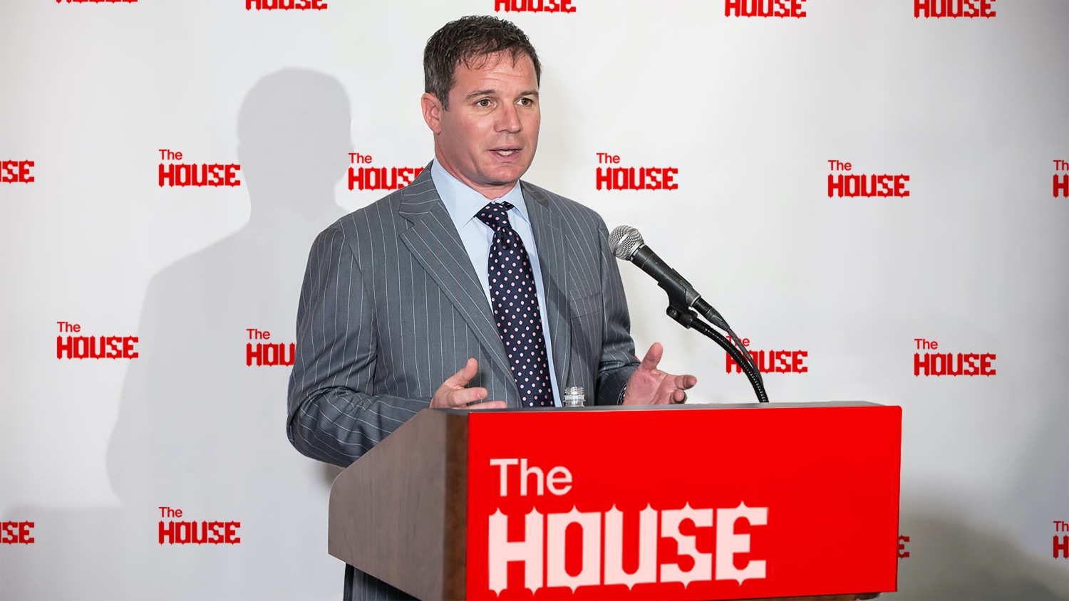
The House is a rebrand of Global Gaming Expo (G2E). It is a gaming industry trade show represented by American Gaming Association. It is annually held in Las Vegas, Macau, and Manila. G2E in Las Vegas is located in Sands Expo & Convention Center.
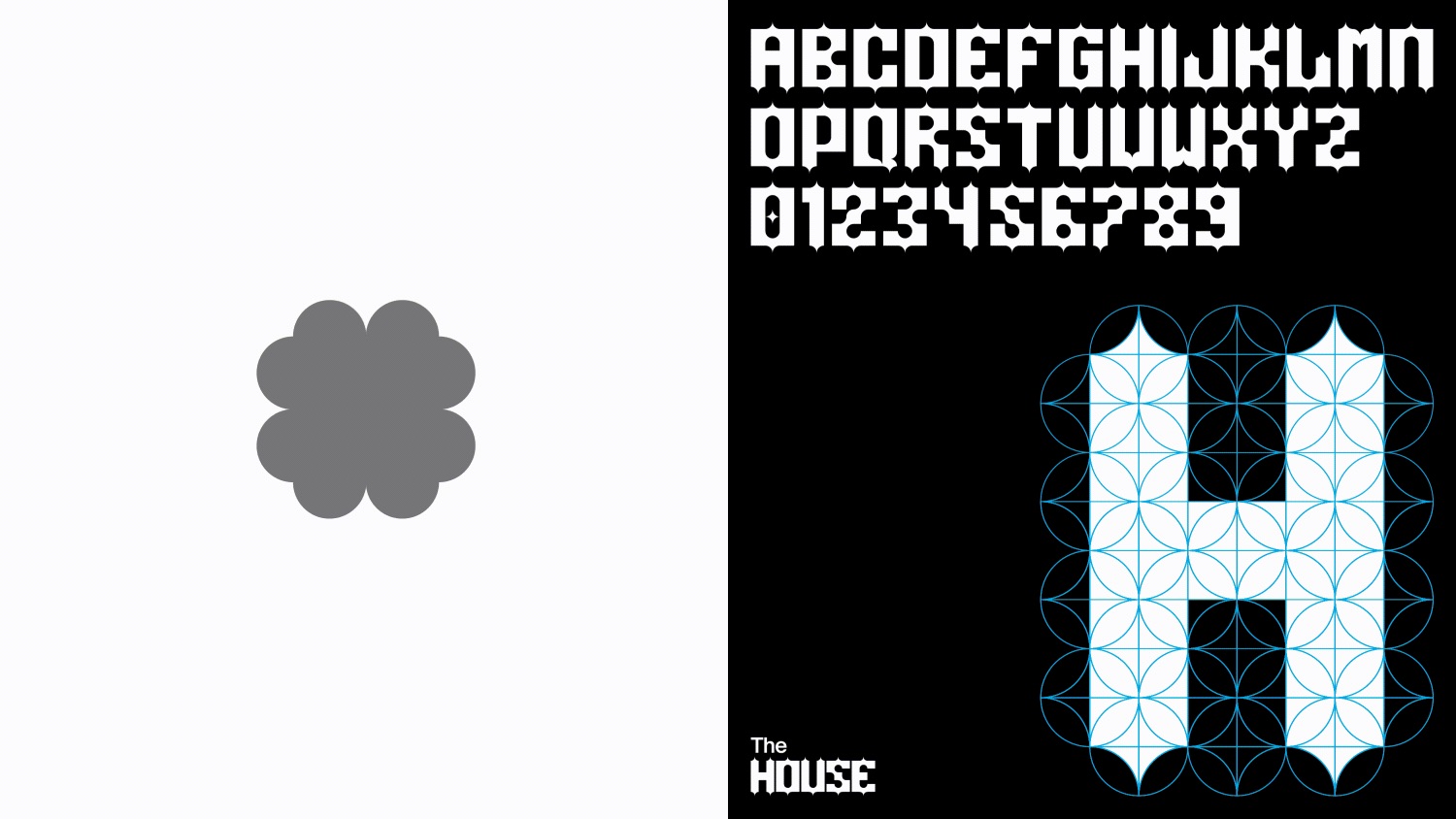
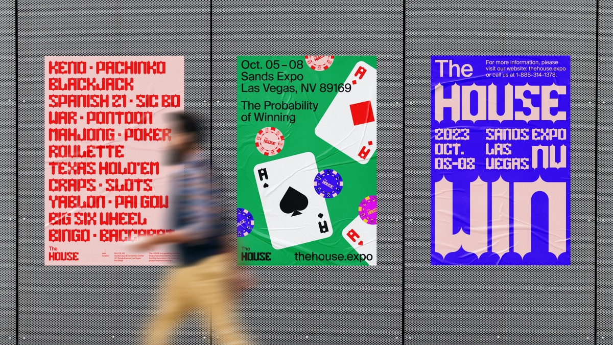
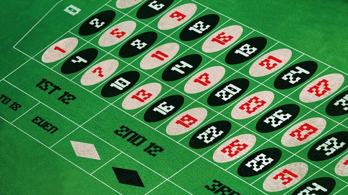
New brand name was given to target broader audience considering current audience mostly targets professionals. The typeface was created under the same grid that was inspired by the nature of casino games: which always involves luck. The grid is based on a four leaf clover shape which represents luck. The overall form of the The House’s main branding typeface follows sharpness that can be observed from playing card suit symbols.
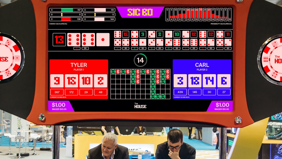
The House finally introduces “Arena,” where a guided tour through various casino games will be provided to visitors who are new to casinos. Visitors will challenge each other on different gaming rules. Visitors will challenge each other on different gaming rules. The implemented program that generates playing cards based on text-string QR Code on the HOUSE’s app allows users to scan their card to the interaction tables.
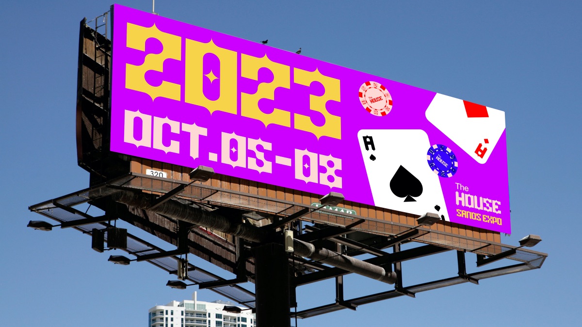
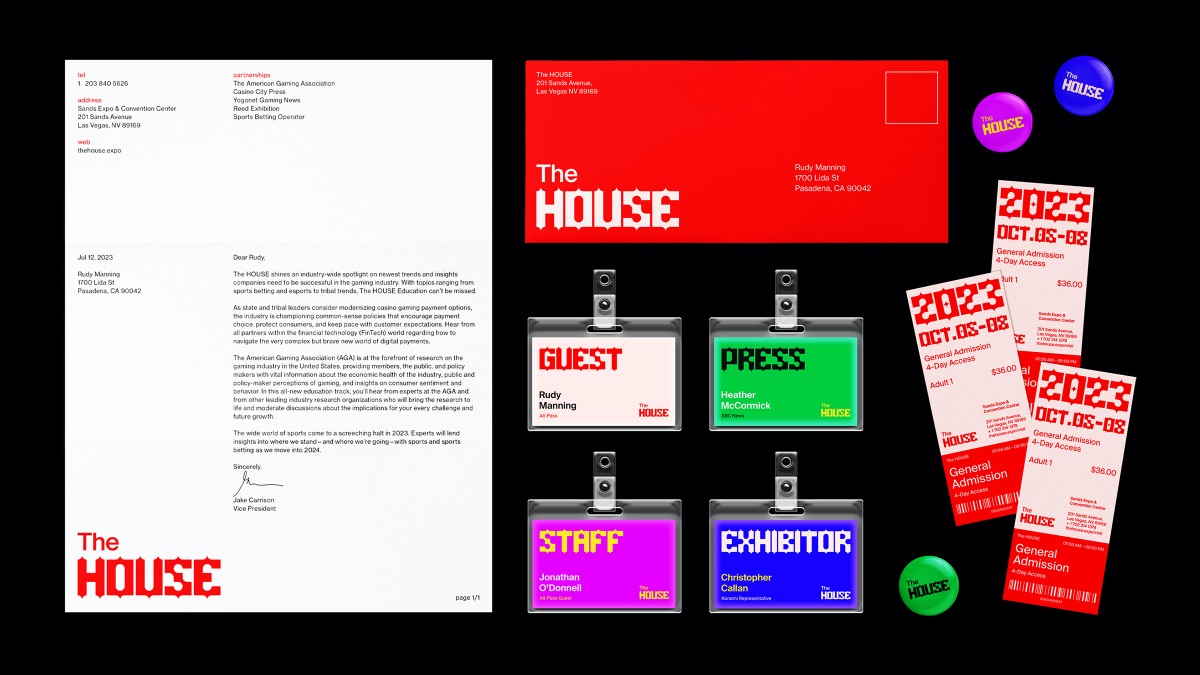
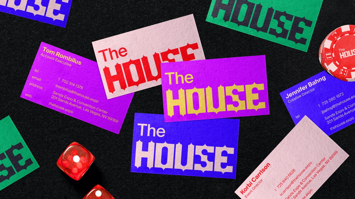
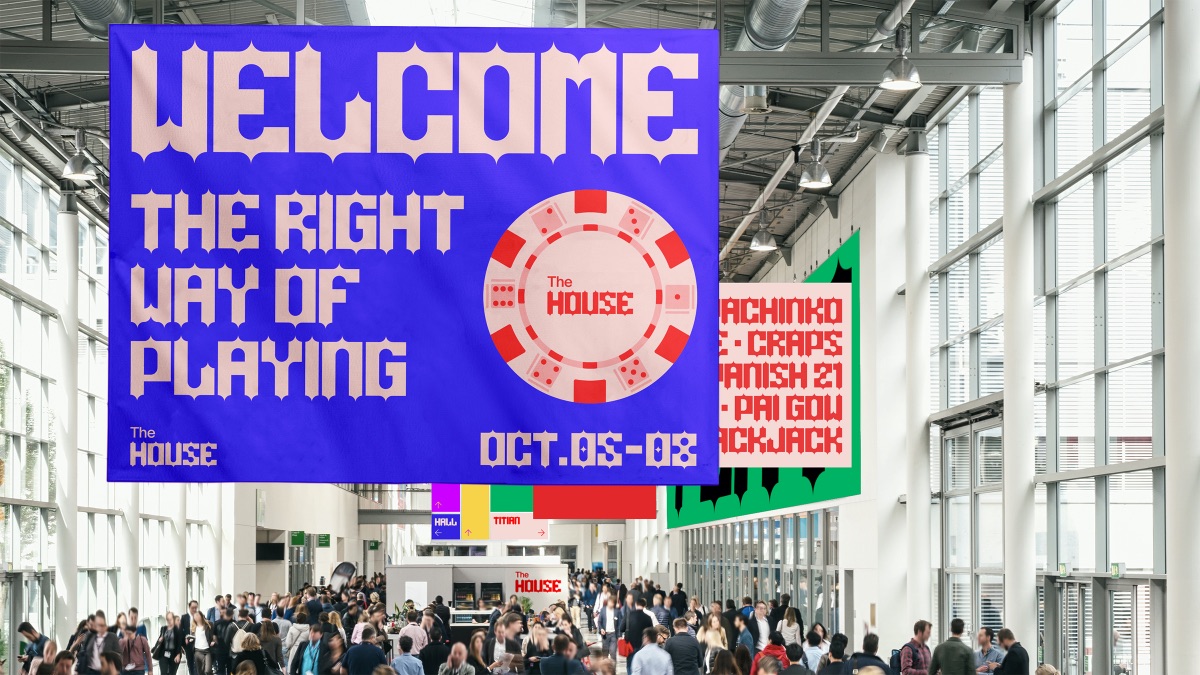
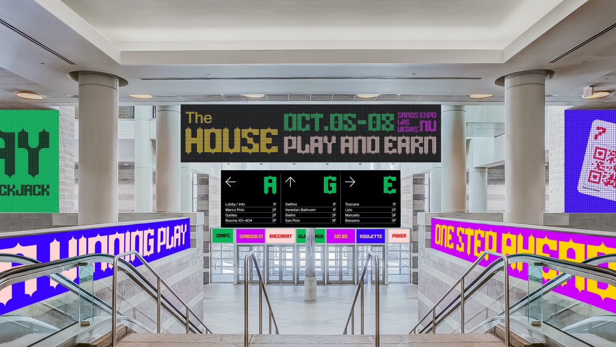
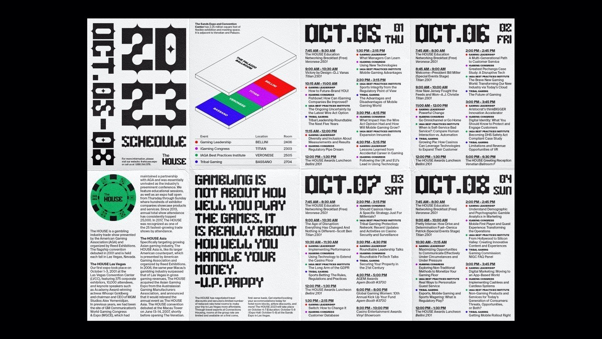
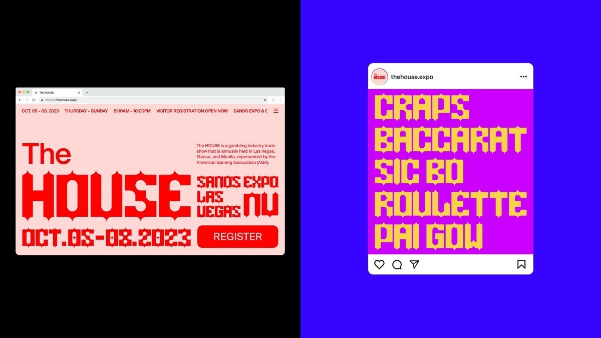
The House’s animated logo inspired by the action of spreading out the playing cards. Branding applications include custom typeface based on the grid that follows the brand’s core value, collaterals including business cards, name tags, tickets, envelopes and letterheads. It will be advertised through poster series, billboard banners, street lamp banners and social media. The website contains brief information with big typography, while Instagram shows featured games that will be held at the event. Staff Croupiers will be wearing uniforms and guests will receive the tote bag as a gift. Visitors will also get a cross-fold brochure that lists event schedule, brief information, and floor map.
CREDIT
- Agency/Creative: Eun Jung Bahng
- Article Title: The House Brand Redesign Concept
- Organisation/Entity: Student
- Project Type: Identity
- Project Status: Non Published
- Agency/Creative Country: United States
- Agency/Creative City: Los Angeles
- Market Region: North America
- Project Deliverables: Brand Redesign
- Industry: Entertainment
- Keywords: WBDS Student Design Awards 2021/22
-
Credits:
Educational Institution: ArtCenter College of Design
Educator's Name: Rudy Manning, Roy Tatum


