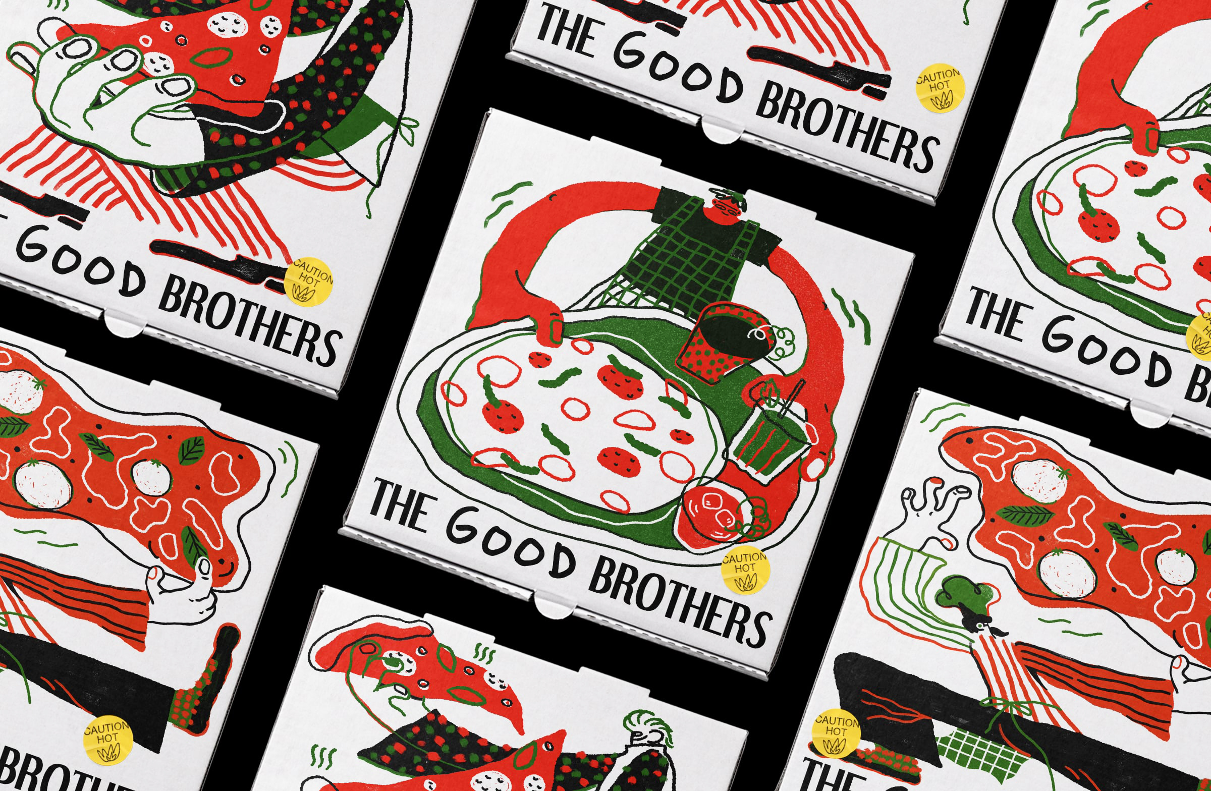
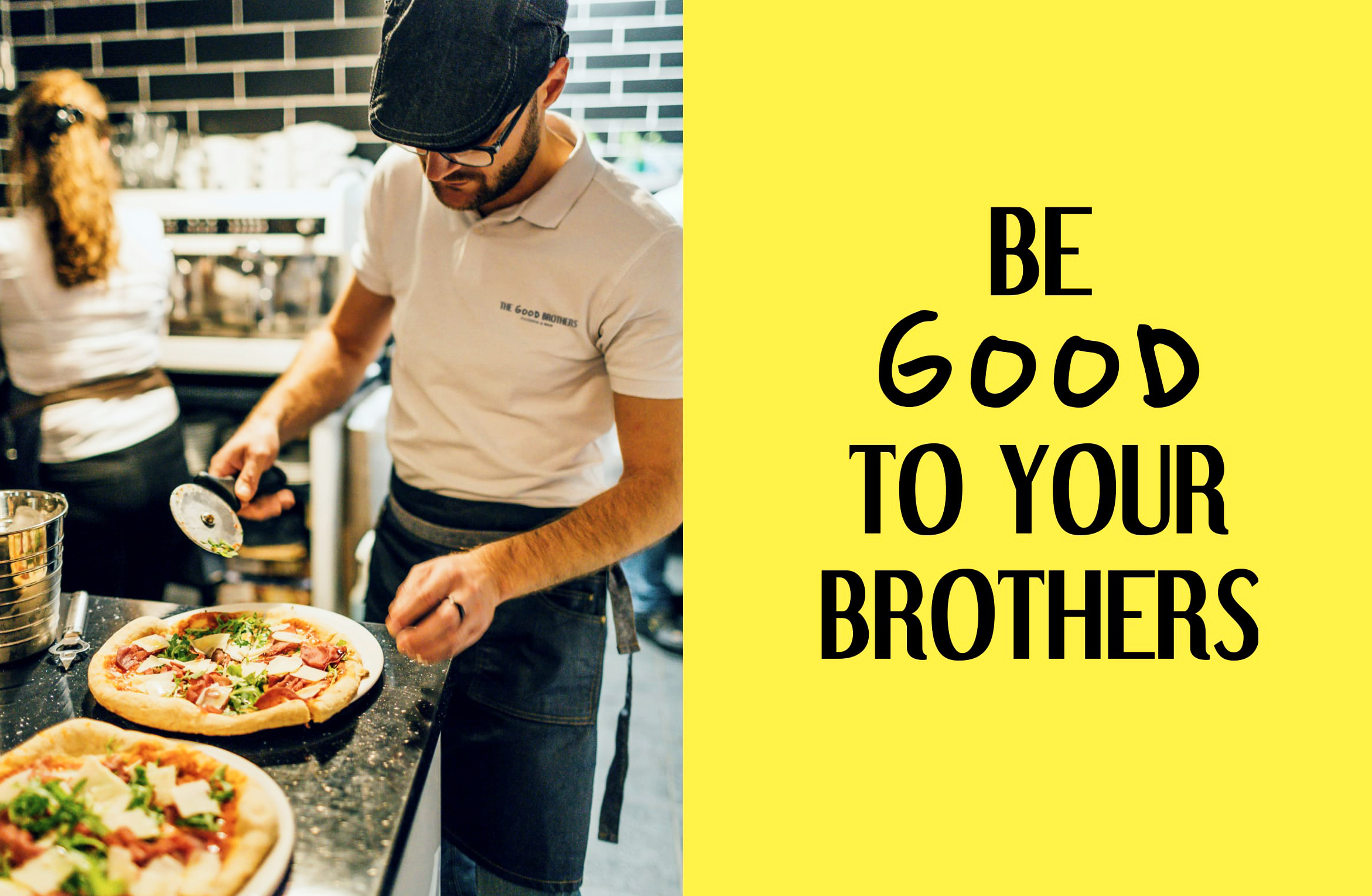
Now at the hand of its third generation, The Good Brothers Pizzeria & Bar is run by three brothers who would like to rebrand the restaurant as what they’ve best known for: a classic list of authentic pizza and calzones, inspired by their experience growing up as Italian-American who live in New York.
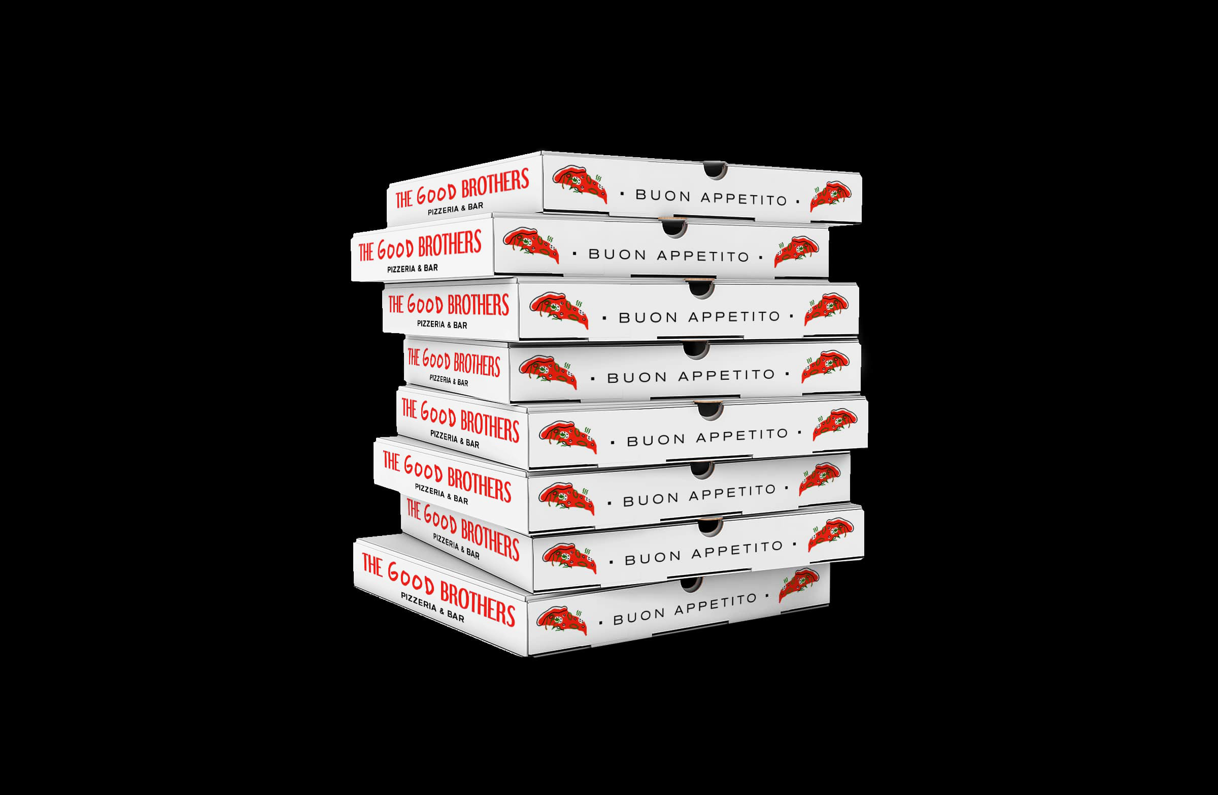
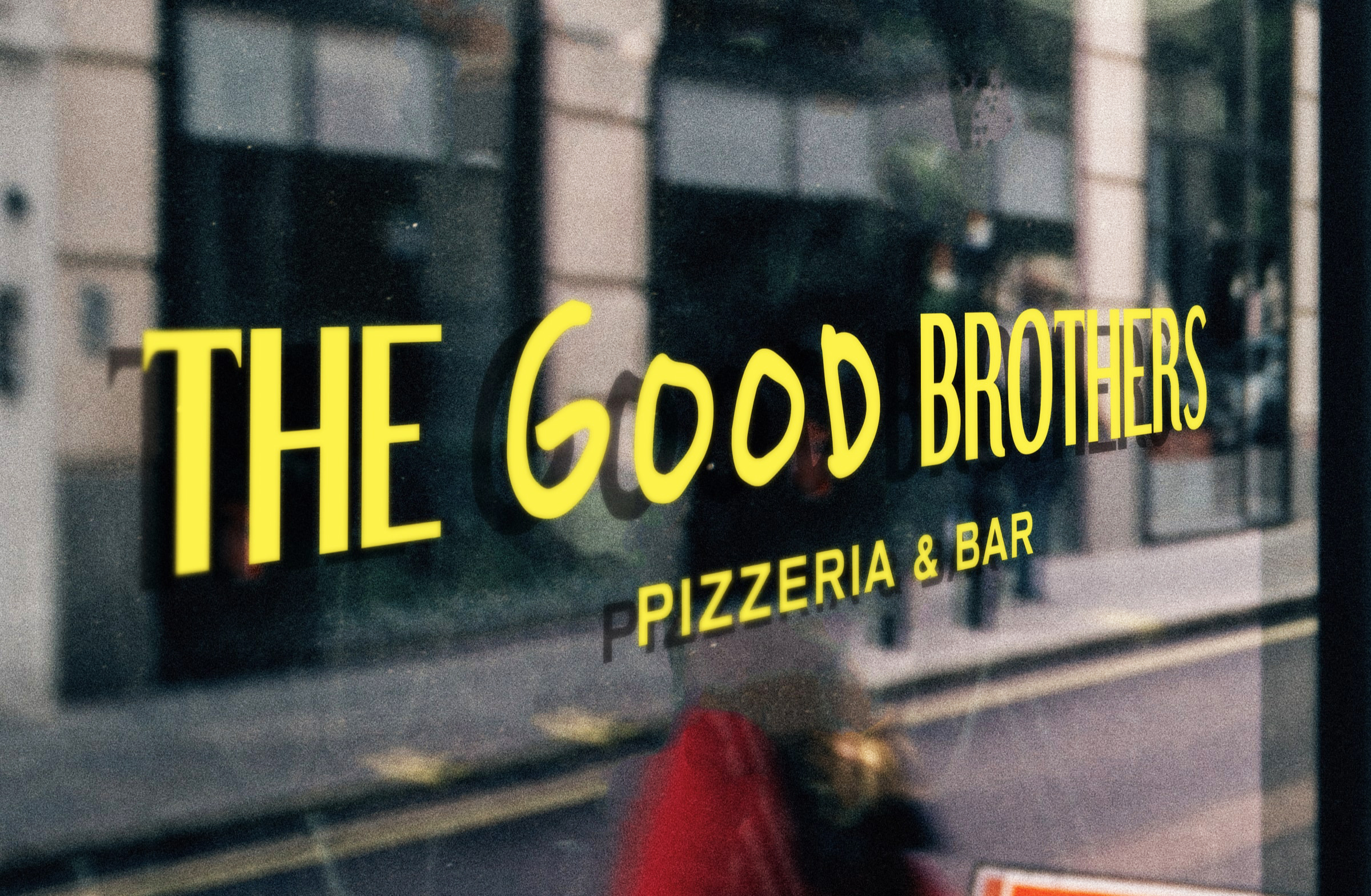
The brand is a celebration of childhood memories — therefore we introduced an art direction that showcases its childlike and nostalgic nature. The identity consists of a typeface that resembles classic pizzeria signage, with an additional twist of looseness by pairing it with a hand-drawn typography.
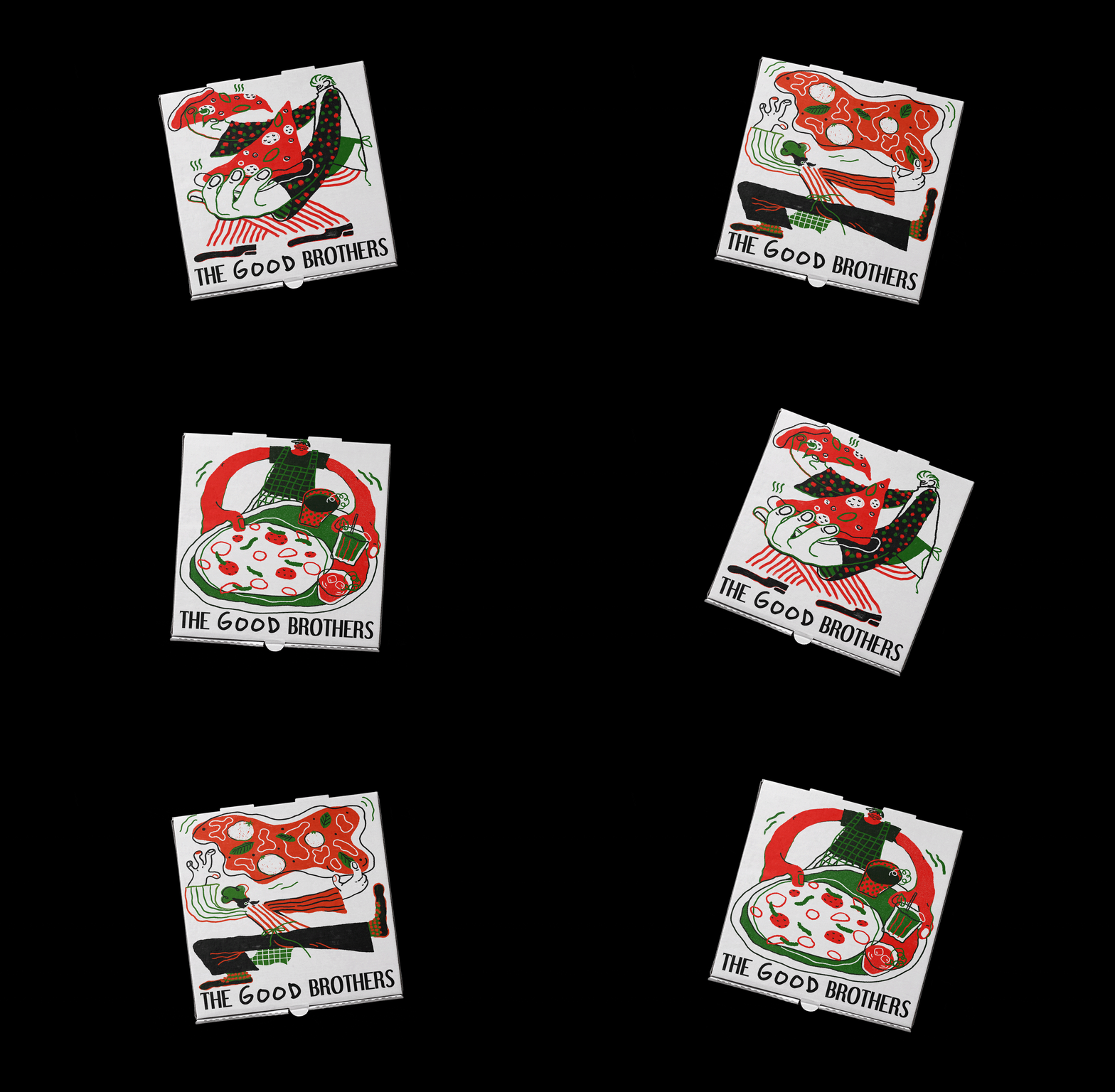
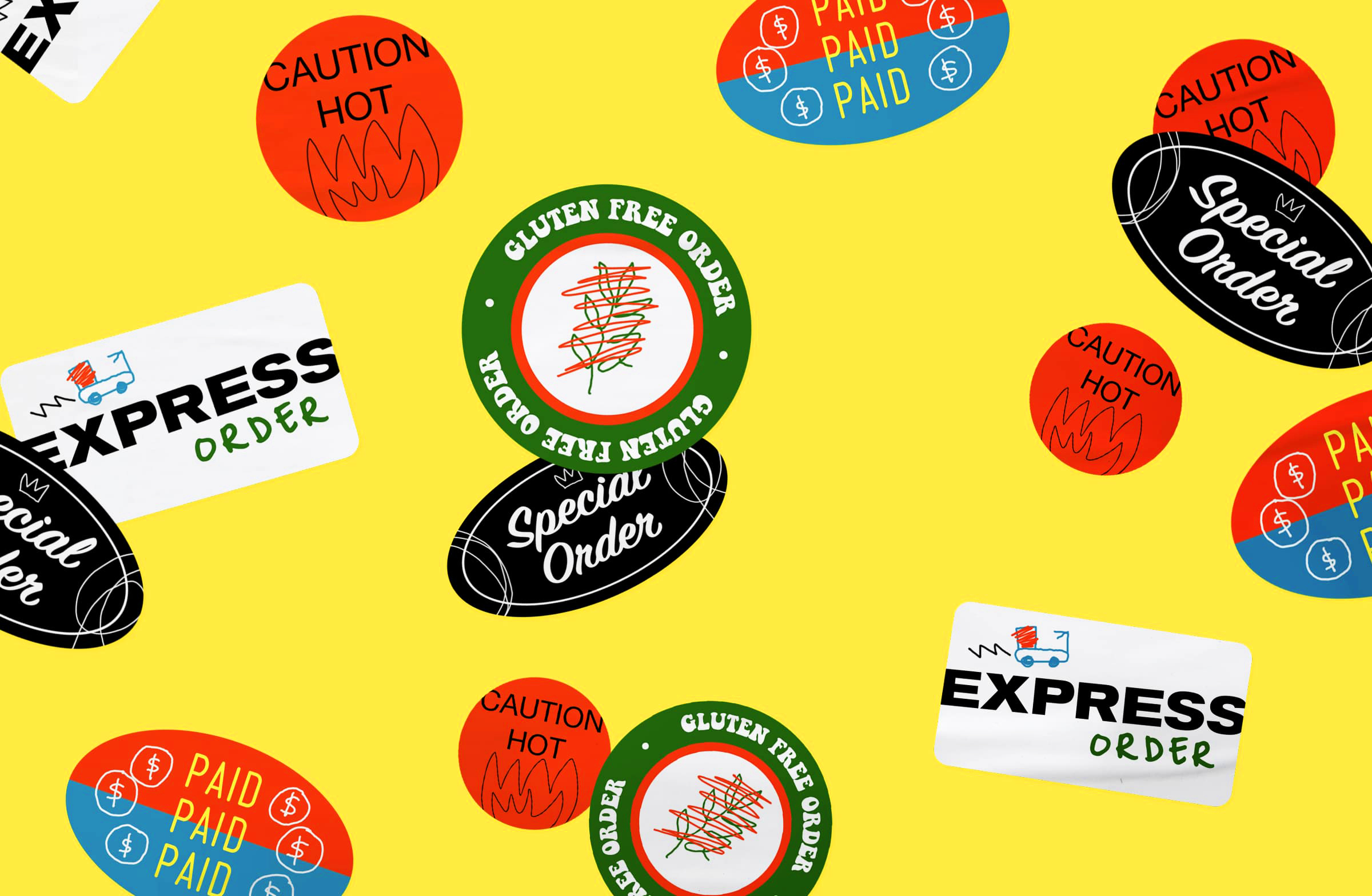
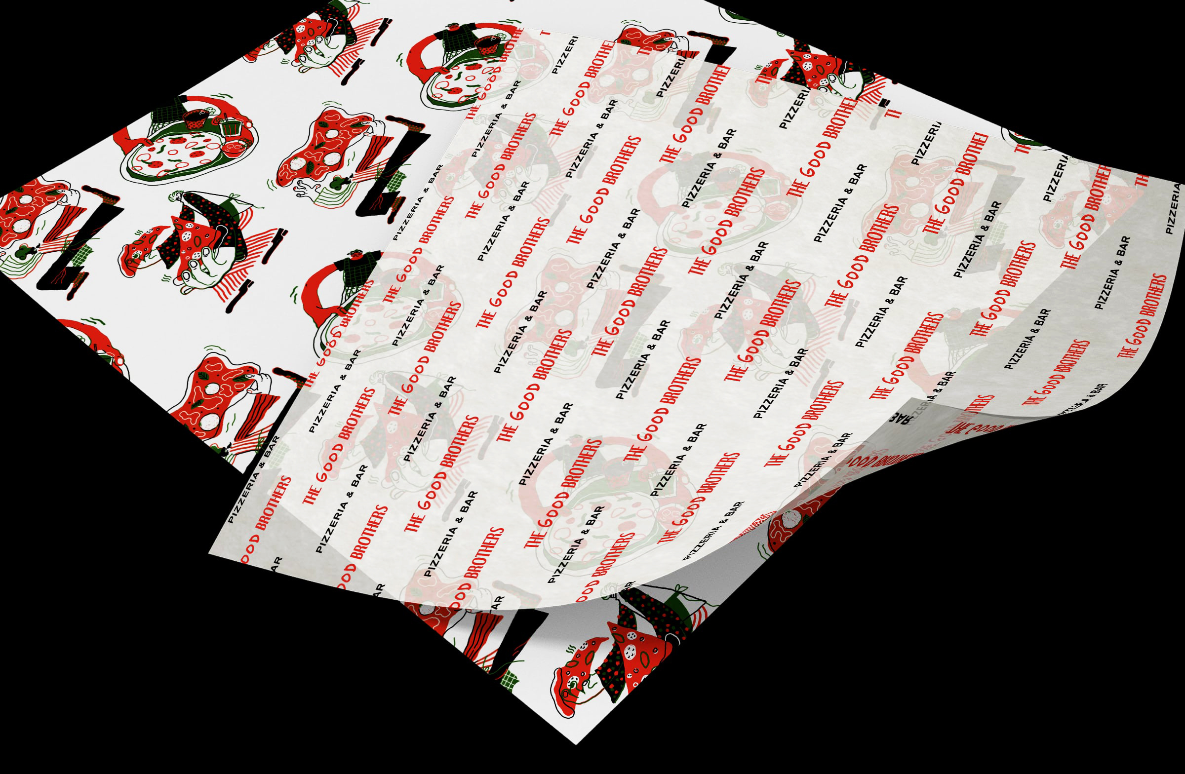
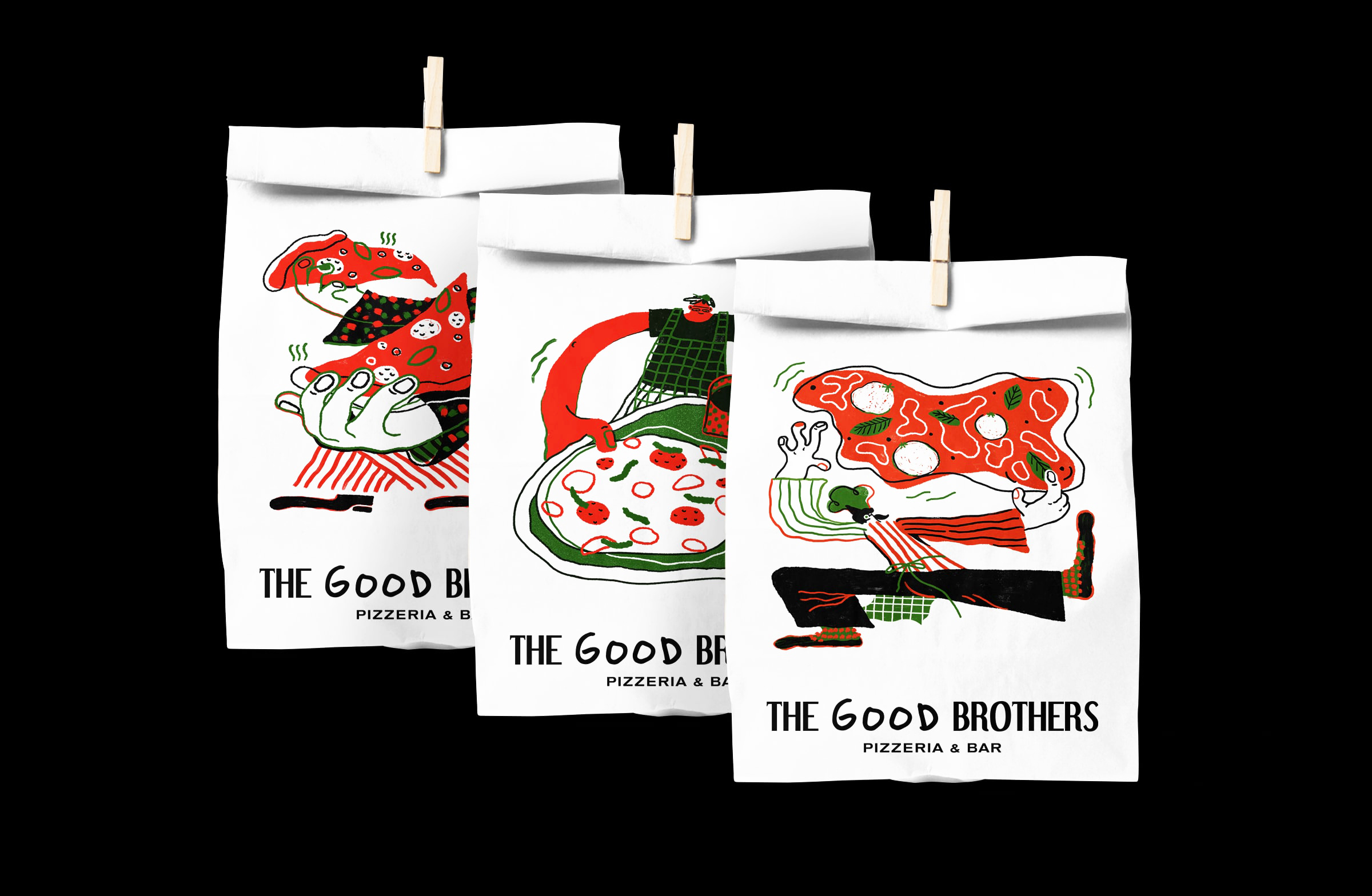
The illustrations on the pizza boxes are inspired by the brothers themselves, while the delivery stickers are inspired by the irregularity of children’s drawing, creating a playful look that captures the brand’s personal and wholesome sensibility.
CREDIT
- Agency/Creative: Kezia Gabriella
- Article Title: The Good Brothers Pizzeria and Bar
- Organisation/Entity: Freelance, Non Published Concept Design
- Project Type: Packaging
- Agency/Creative Country: Singapore
- Market Region: North America
- Project Deliverables: Brand Identity, Brand Naming, Branding, Illustration, Packaging Design, Research, Tone of Voice
- Format: Bag, Box, Wrap
- Substrate: Pulp Paper


