


In the world of fine spirits, there exists a realm of creativity that is as intriguing as it is captivating – the art of crafting exquisite whisky. Within this realm, the Goldfinch Wine Series stands as a testament to the fusion of tradition and innovation, where the delicate dance between wood and spirit gives rise to an exceptional collection that caters to the discerning palate of a whisky connoisseur. This series is a celebration of ingenuity, a harmonious blend of single malt Scotch whisky and the enchanting influence of diverse wine casks.
The tale begins with an ambitious vision: to reimagine the very essence of whisky-making. Goldfinch Whisky Merchants, known for their unwavering commitment to excellence, embarked on a journey to create an unparalleled experience for whisky enthusiasts. The crux of this endeavor lay in not merely crafting a new series of whisky, but in curating an entire universe of sensory delight. This vision encompassed a new brand identity, an elegantly redesigned bottle, and an array of label designs that would not only encapsulate the essence of the product but also serve as a work of art in themselves.
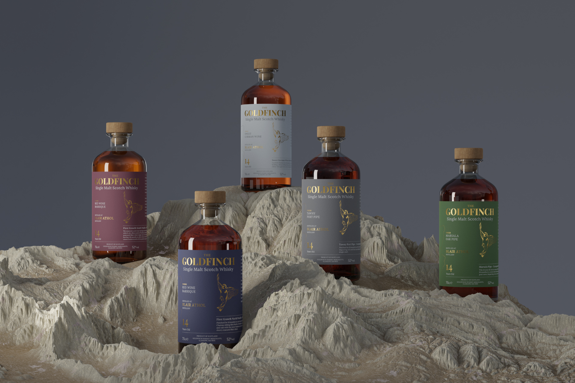
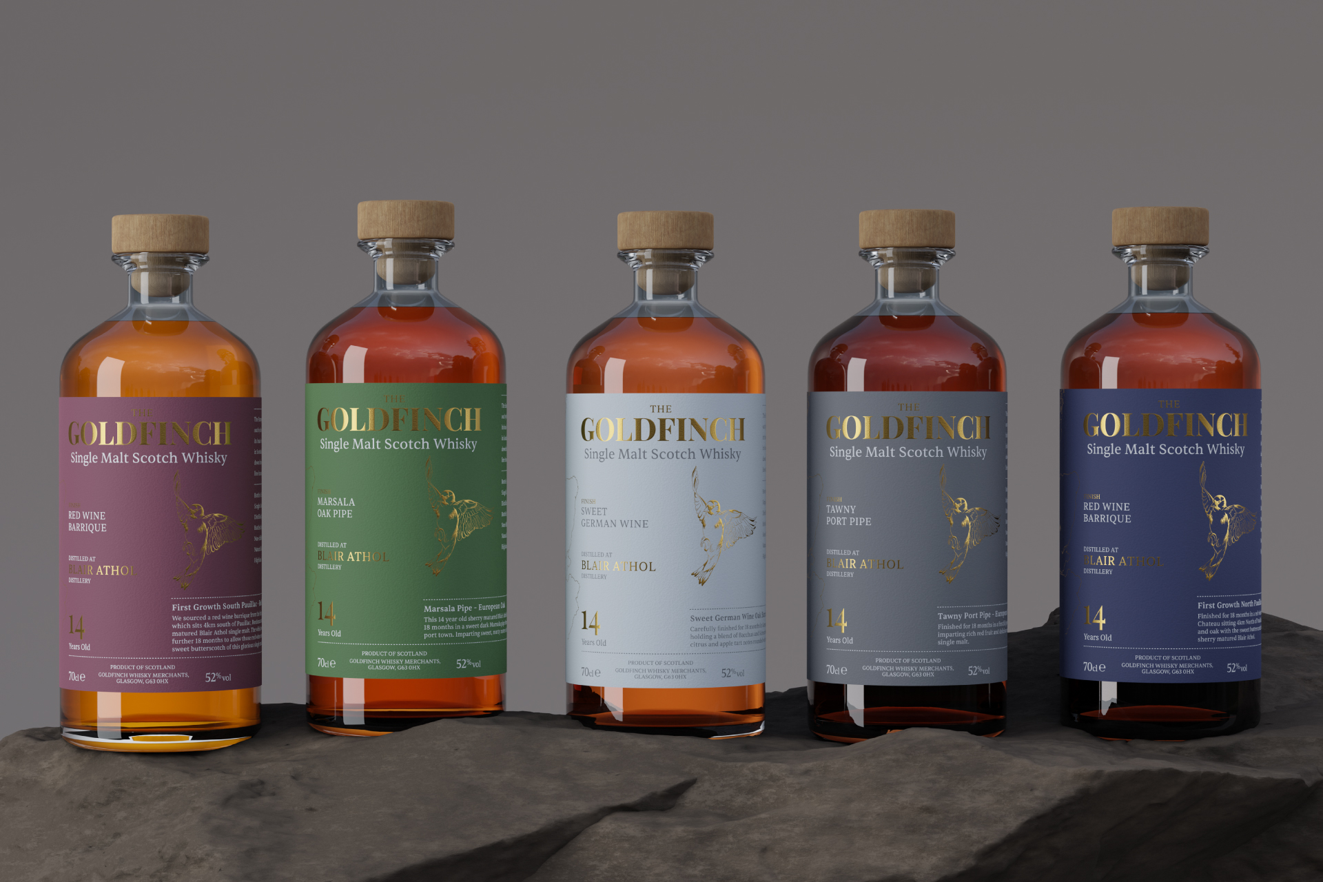
At the heart of this journey was the ingenious idea of marrying two distinct worlds – that of Scottish single malt scotch whisky and the rich heritage of European wines. The architects of the Goldfinch Wine Series embarked on an extraordinary experiment that would redefine the boundaries of flavor and complexity. The foundation was set with a selection of five sherry hogsheads, each cradling the precious liquid of Blair Athol single malt scotch whisky. These casks, carefully chosen for their distinct characteristics, would soon become vessels of transformation, a bridge between tradition and modernity.
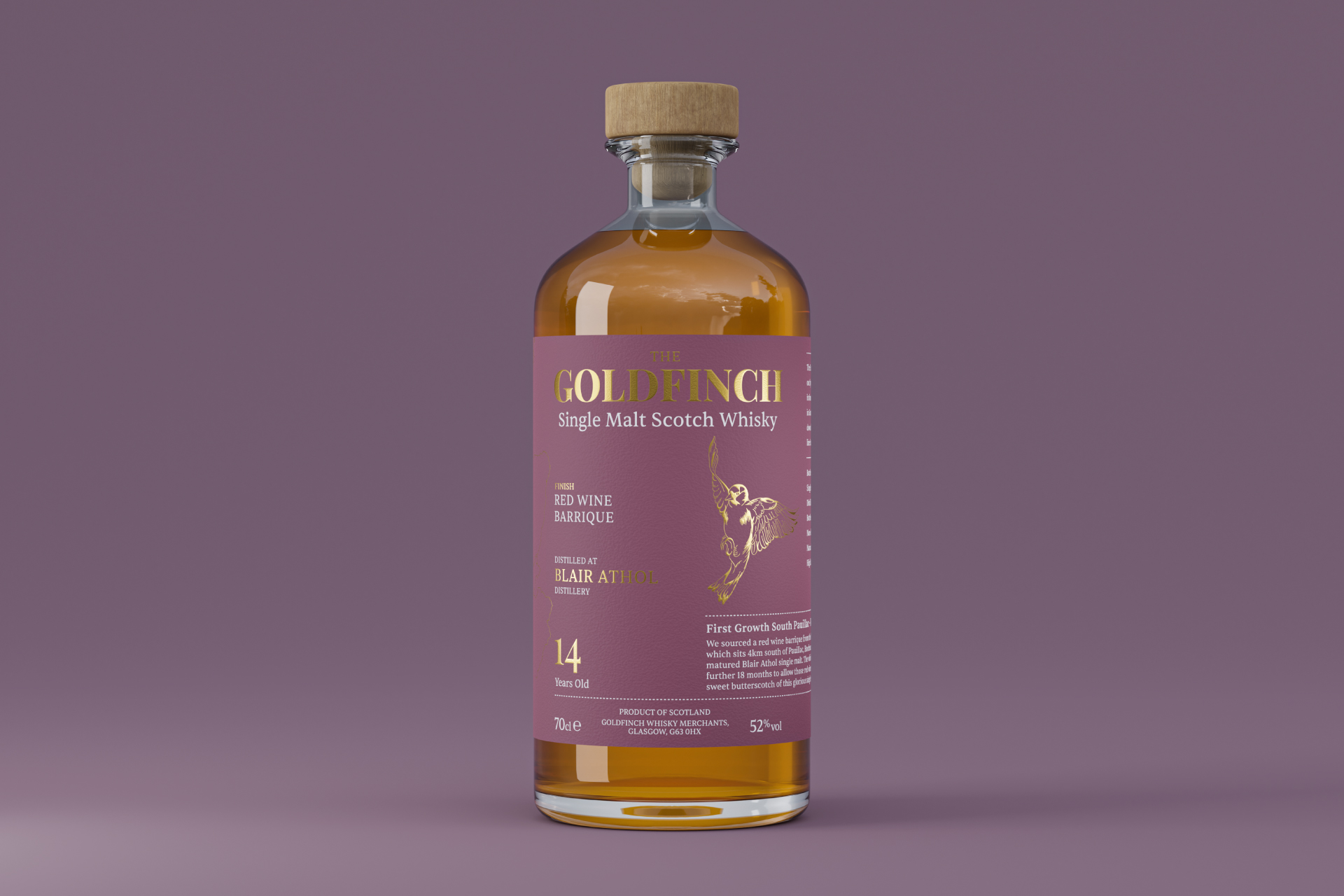
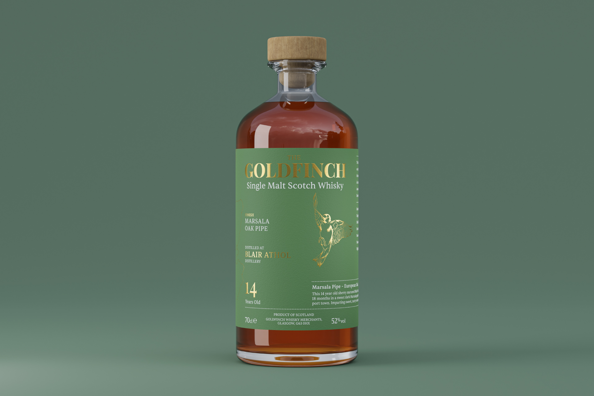
The true alchemy began when the team at Goldfinch Whisky Merchants embarked on a daring endeavor. The Blair Athol single malt, having matured gracefully within its original confines, was destined for a new odyssey. Enter the wine casks – each with its own storied past and unique attributes. European heritage was summoned in the form of Marsala Oak Pipe and Tawny Port Pipe, offering a glimpse into the sun-soaked vineyards of Italy and the fortified wine cellars of Portugal. But the journey did not end there. To create a symphony of flavors, two red wine barriques hailing from prestigious first growth Chateaux were enlisted. These French oak vessels bore the whispers of their vinous past, promising a tantalizing dance of tannins and character.
Diversity was key, and thus, the ensemble was enriched further with a sweet white wine cask from the heart of Germany. This addition was not just a nod to geographic variation, but a deliberate invitation to explore the delicate nuances that geography imparts to the art of whisky maturation. The German white wine cask held the promise of elegance and a touch of sweetness, elevating the series to a crescendo of sensory pleasure.
The most remarkable facet of the Goldfinch Wine Series, however, lay beyond the realms of casks and liquids. It resided within the intent to enable whisky enthusiasts to embark on an expedition of their own. The series was conceived as a roadmap for the curious, an invitation to dissect the artistry of whisky finishing. Each variant in the collection bore the distinct fingerprint of its final resting place, with the wine cask becoming a maestro that orchestrated the symphony of flavors and aromas.
The Marsala Oak Pipe imparted its raisin-rich opulence to the whisky, while the Tawny Port Pipe added layers of complexity with its dried fruit and nutty notes. The red wine barriques from Chateaux, renowned for their opulent red wines, contributed a depth of character that danced harmoniously with the whisky’s inherent qualities. And the sweet German white wine cask rounded off the composition with a delicate sweetness that caressed the senses.
The packaging itself became a canvas for this narrative. The brand identity was carefully crafted to reflect the series’ essence – a fusion of heritage and innovation. The redesigned bottle stood as a modern embodiment of the traditional whisky vessel, an elegant silhouette that housed the liquid treasure within. The label designs, like pieces of art, conveyed the essence of each variant, paying homage to the cask’s origin and the story it had to tell.
To extend this experience beyond the realm of reality, the Goldfinch Wine Series leapt into the digital world. A suite of 3D visuals was meticulously designed to grace the landscape of social media platforms. These visuals, crafted with the same precision and artistry as the whisky itself, allowed enthusiasts to immerse themselves in the world of Goldfinch, even before uncorking a bottle.
In every sense, the Goldfinch Wine Series emerged as a work of passion and innovation. It was a journey that began with the selection of casks, continued through the alchemical fusion of whisky and wine, and culminated in a sensory symphony that invited exploration and contemplation. This series stood as a tribute to the intricate dance between wood and spirit, an ode to the boundless possibilities that arise when tradition meets audacity.
As whisky enthusiasts raised their glasses to the Goldfinch Wine Series, they didn’t merely indulge in a libation; they embarked on an odyssey of flavors, a tale of craftsmanship, and an exploration of the very essence of artistry. Goldfinch Whisky Merchants had not just created a collection; they had woven a tapestry of experiences that would linger on the palate and in memory, an embodiment of the timeless truth that whisky, like life itself, is a journey meant to be savored.
CREDIT
- Agency/Creative: De:strukt Studio
- Article Title: The Goldfinch Wine Series New Brand Identity by De:strukt Studio
- Organisation/Entity: Agency
- Project Type: Product
- Project Status: Published
- Agency/Creative Country: United Kingdom
- Agency/Creative City: Edinburgh
- Market Region: Global
- Project Deliverables: 3D Modelling, Art Direction, Brand Design, Design, Packaging Design
- Industry: Food/Beverage
- Keywords: whisky, spirits, packaging, design, visualisation
-
Credits:
Creative Director: Riccardo Chapman


