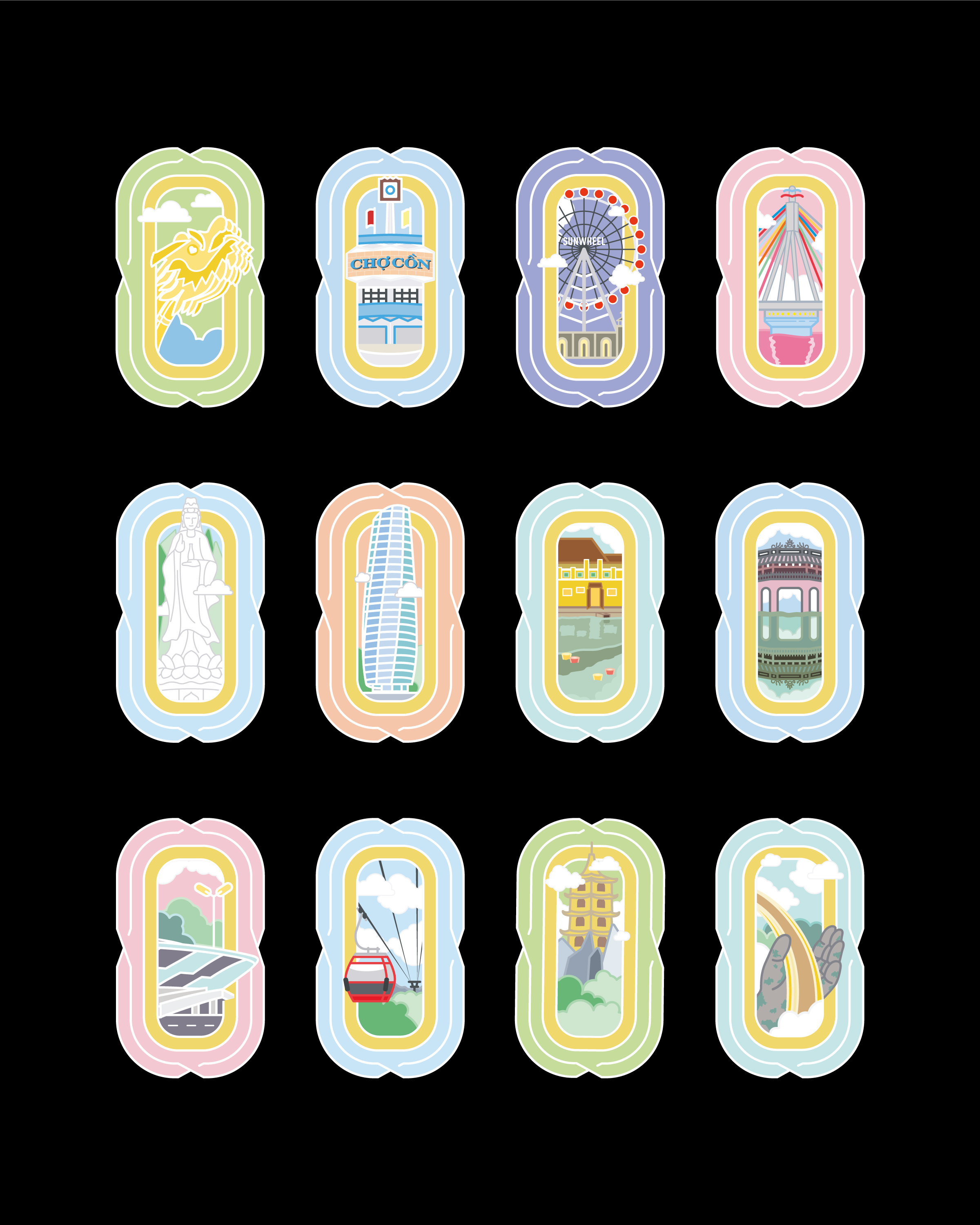
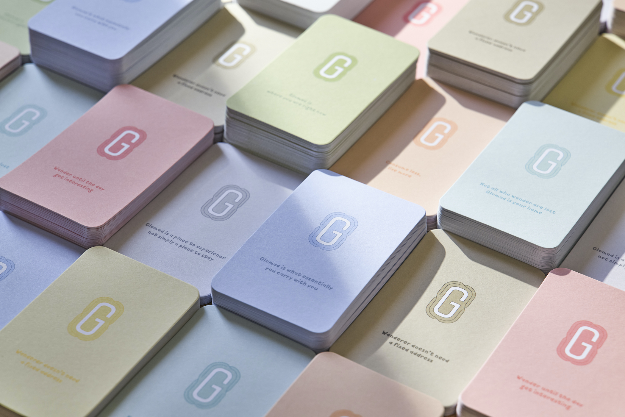
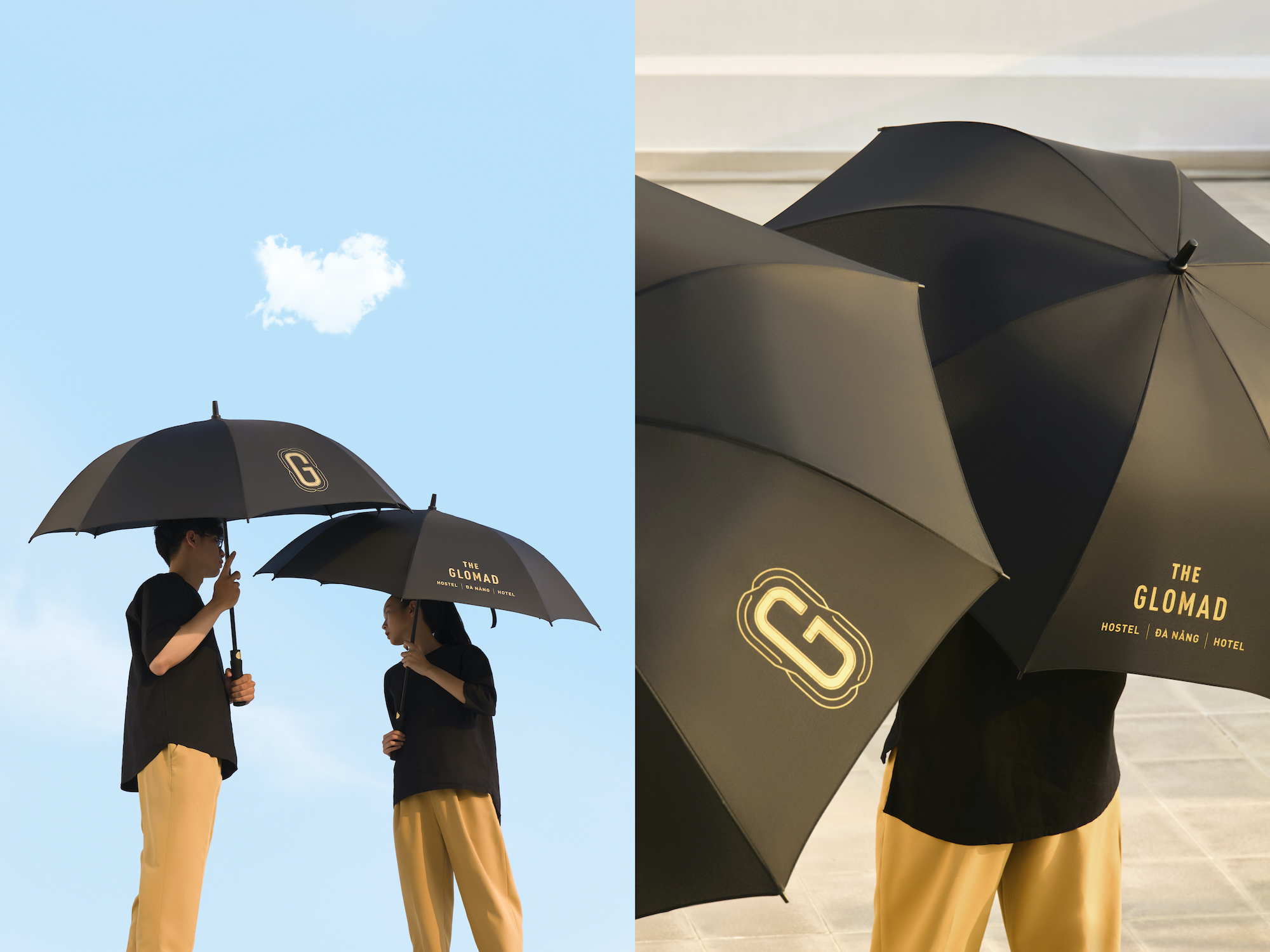
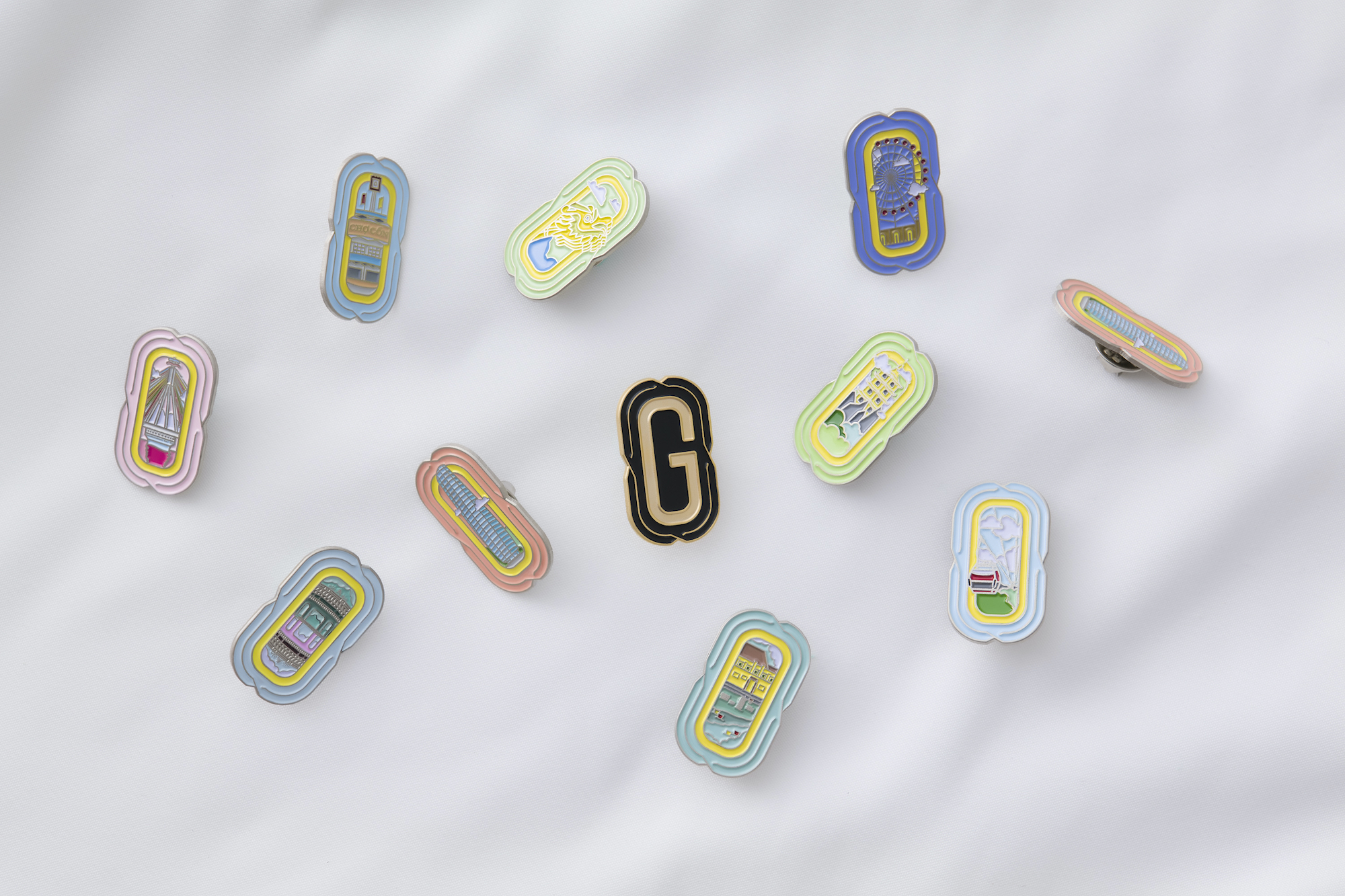
The Glomad Hotel is defined as a representation for boutique hotel concept aiming to served quality wanderlust with exploring and cool services. The place creates a true home for nomads as well as reflecting Đà Nẵng cultures. “Glomad” is a new word to represent a growing group of people who live a global nomadic lifestyle. Glomads are never at “home”, in the traditional sense of the word, but somehow always feel at home, which they define as any place they are or want to be. Therefore, the logo symbol G is inspired from the first viewport when traveling, the airplane window, combined with non-overlapping lines like airline routes. The logo symbol represents for the nonstop traveling routine of the glomad. The surrounding open lines means even though they come back to the same place, they will create a new experience every time. Also, we took great care in content details, creating a brand environment like Glomad is a travel friend will talk to you through collateral items.






CREDIT
- Agency/Creative: M — N Associates
- Article Title: The Glomad Hotel Branding
- Organisation/Entity: Agency, Published Commercial Design
- Project Type: Identity
- Agency/Creative Country: Vietnam
- Market Region: Asia
- Project Deliverables: Brand Architecture, Brand Creation, Brand Experience, Brand Guidelines, Brand Identity, Brand Naming, Brand Strategy, Brand World, Branding, Graphic Design, Identity System, Illustration, Packaging Design, Product Architecture, Product Naming, Research, Tone of Voice
- Industry: Hospitality
- Keywords: Glomad, Hotel, Da Nang, Vietnam, M-N Associates, M-N, M — N Associates, Associates, Wanderlust, Tourism, Travel, Hostel, Hospitality


