


Feroz estudio – The Gin&Tonic Book
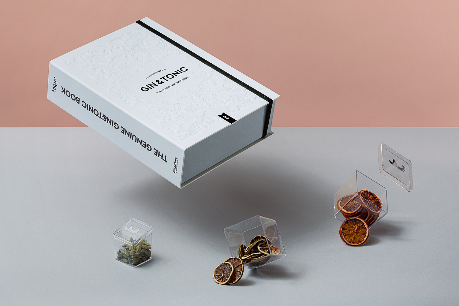
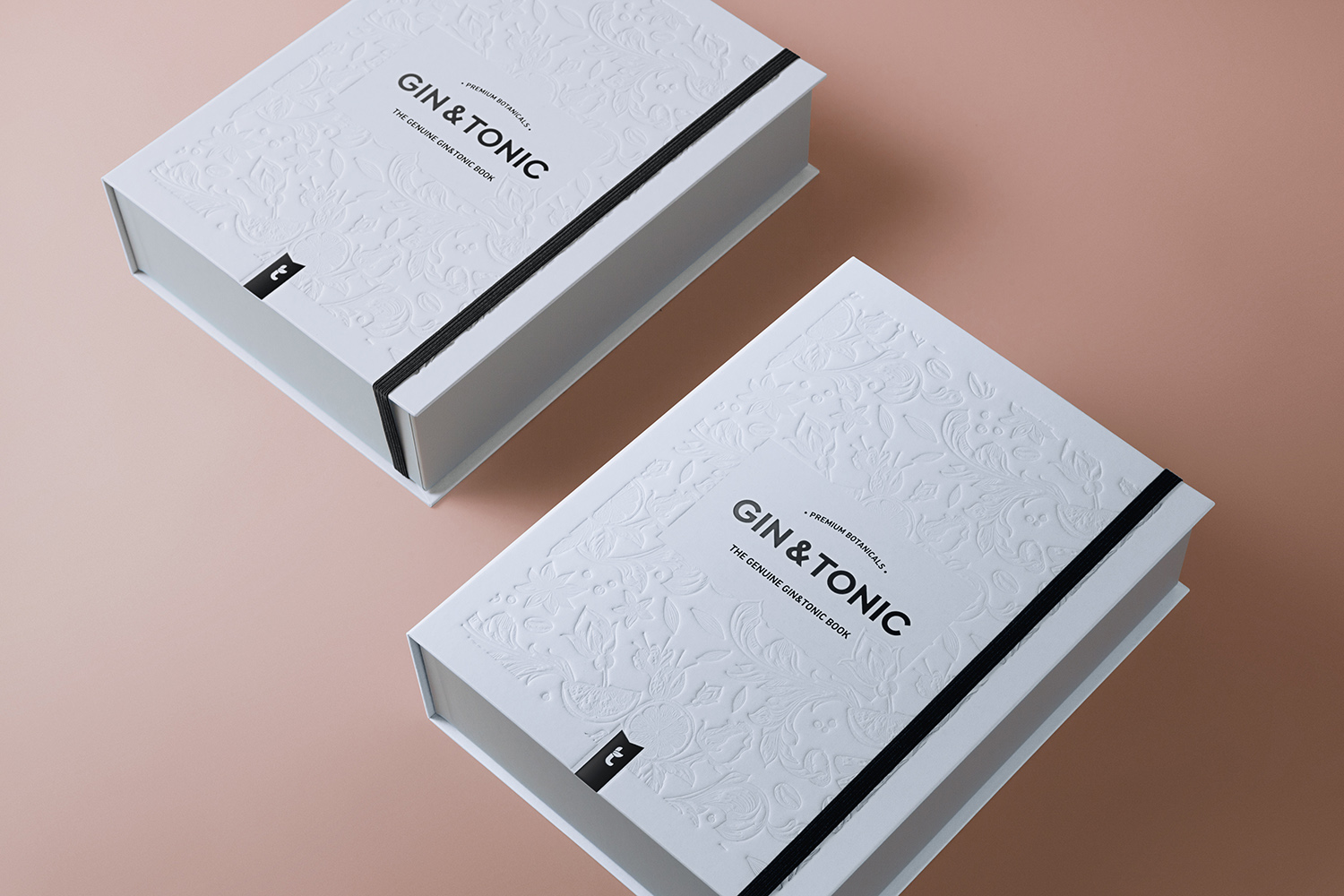
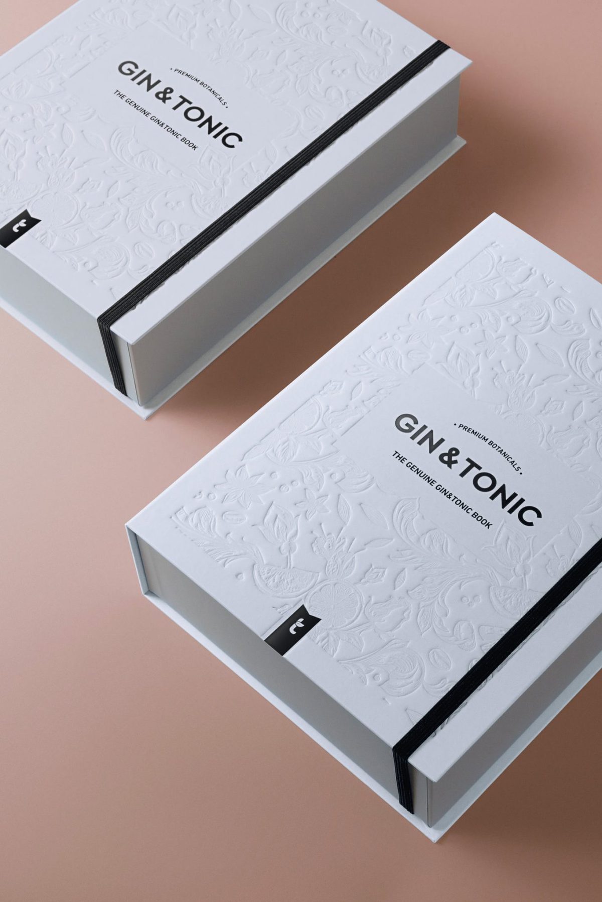
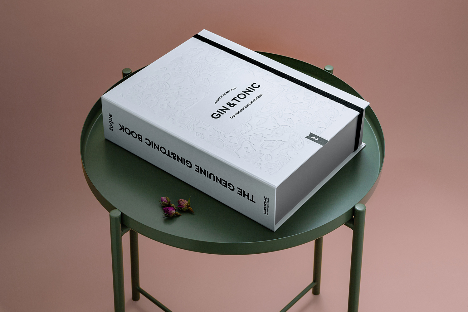
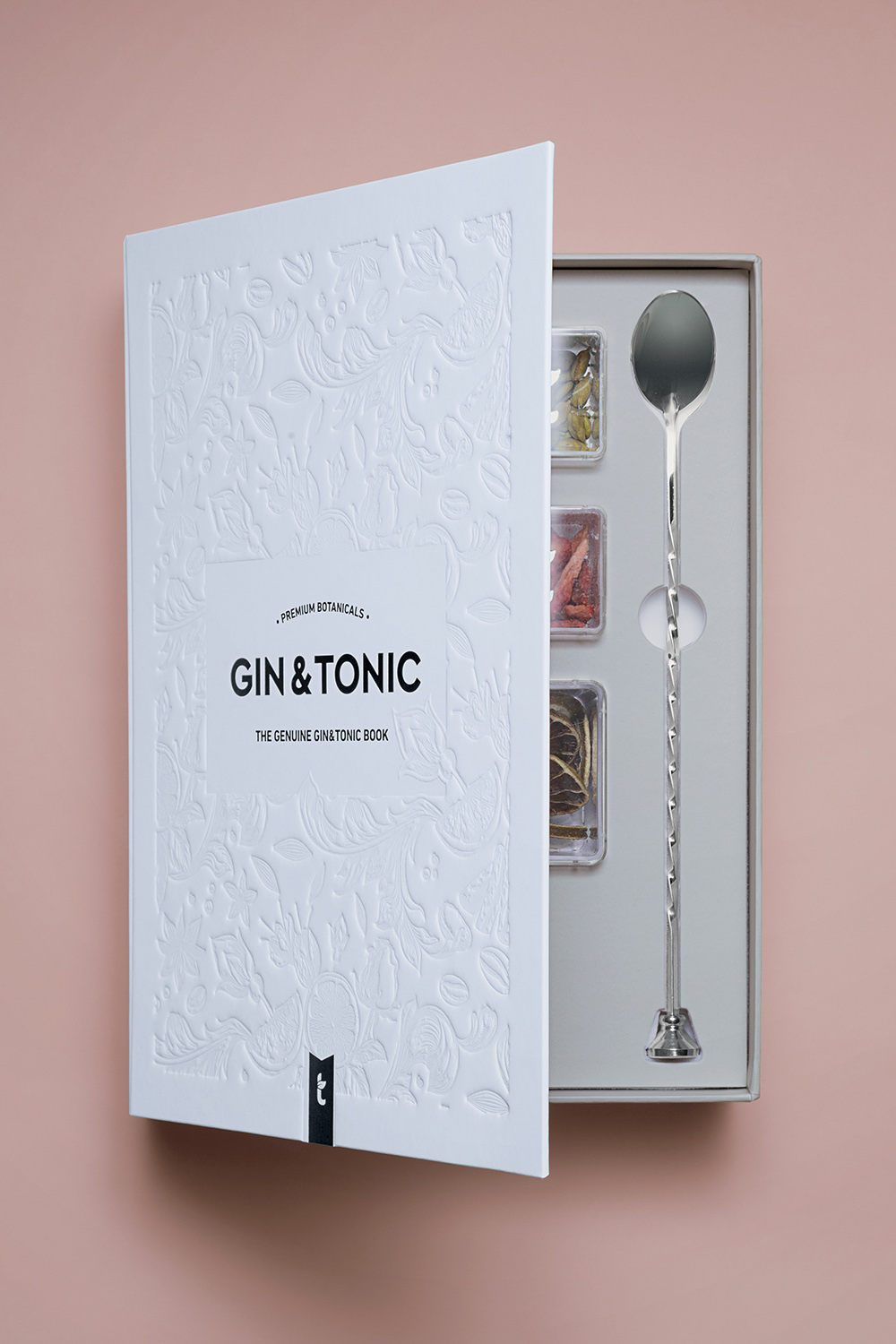
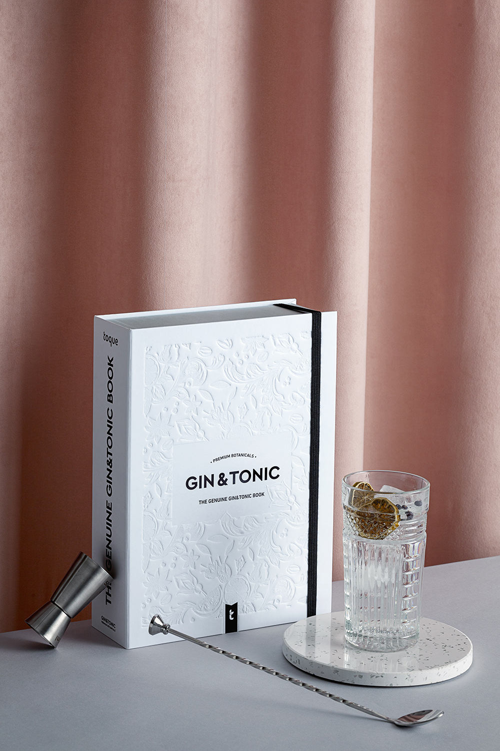
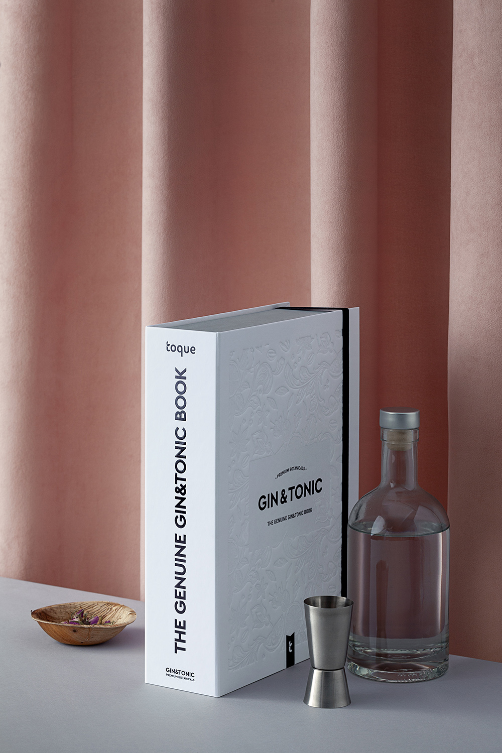
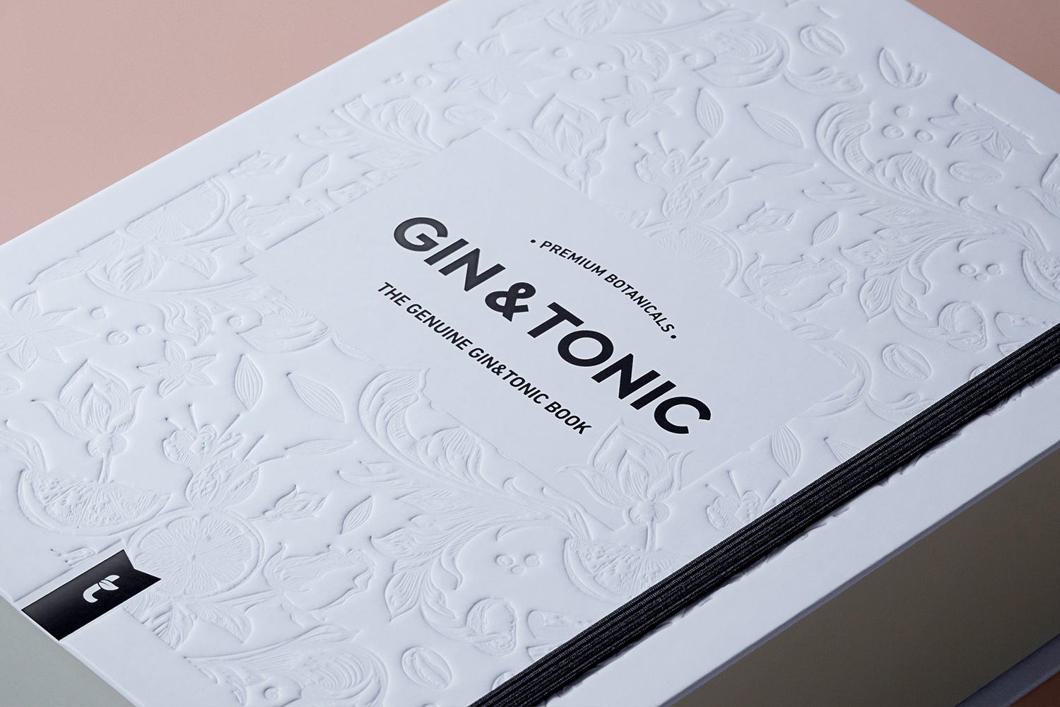
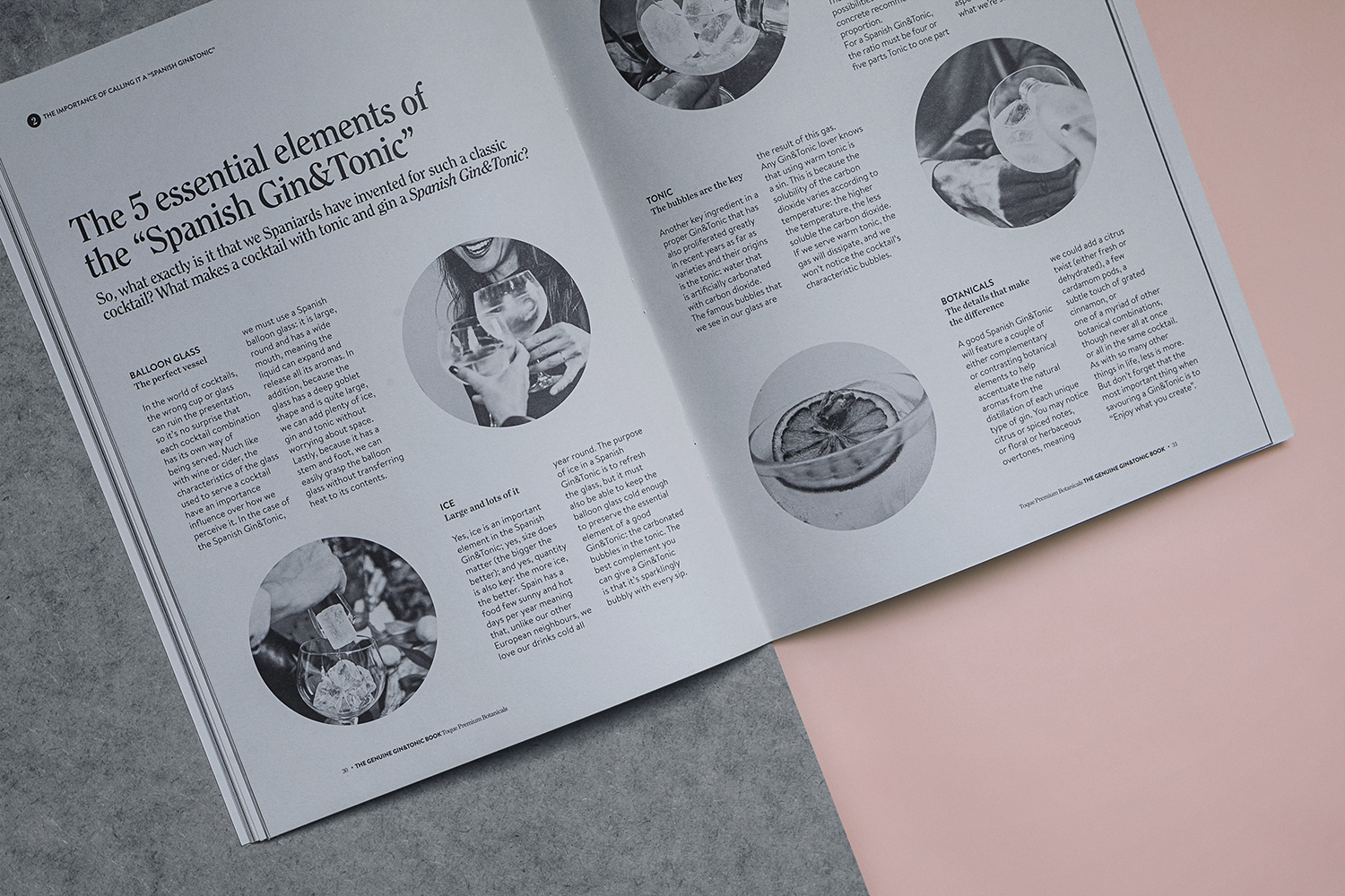
Toque is the brand specializing in seasonings and condiments for cooking and mixology, whose purpose is to make see what is really important lies in small things and that’s enough to learn to enjoy them to make everything change. Turning the routine into an experience that you can relish every day. Mixology is one of its main product lines, which through its botanical and citrus proposals seeks to turn a simple glass into a tasting, creative, unique and fun experience.Toque has a privileged position as a pioneer brand in launching this product to the market. This product is the genuine mixology kit for Gin &Tonic in Spain and seeking its renewal was to take a step in terms of product usability and appearance, taking advantage of its own visual territory, taking a parallel path regarding its competition and trying to maximize the packaging structure in relation to its content.With the aim of renewing the current design of the 10 botanicals box for Gin & Tonic, the proposal is based on generating a brand image related to the new graphic territory of the mixology range of products, focusing its content on the botanicals sold individually and in short, revitalize the life cycle of the product, providing greater attractiveness for the consumer.This need to provide a differential value regarding the competition seeking to claim the pioneering position of the brand with the aim of exploiting its facet as creator of the product, as well as looking for an alternative differentiating format, led to the choice of the structure of the box, alluding to the book. The result is an original box in book format that not only contains the basic tools to prepare an unforgettable gin&tonic along with eight botanicals and two citrus selected from the brand, but a booklet that deals with the origins, curiosities, perfect serve and use of the dressings with the famous cocktail. The choice of this structure makes it an ideal decorative object to integrate in the library or in the bar furniture of any home.This is emphasised in the hardcover with the floral&organic style blind embossed pattern of the mixology range and the black foil print finish of graphic elements. The inside cover, inner box and booklet were binded and printed on Fedrigoni´s Sirio Color Pearl in black spot color.Material & Print Specifications:Cover:Cardboard hardcover with Fedrigoni´s Arcodesign White bindingInside cover: Fedrigoni Sirio Color Pearl Packaging finishings: Blind Embossing, black block foil printBooklet: Black spot color printing on Fedrigoni´s Sirio Color Pearl

CREDIT
- Agency/Creative: Feroz estudio
- Article Title: The Gin&tonic Book Packaging Design for Toque Brand From Spain
- Organisation/Entity: Agency, Published Commercial Design
- Project Type: Packaging
- Agency/Creative Country: Spain
- Market Region: Europe
- Format: Box
- Substrate: Pulp Board, Pulp Carton, Pulp Paper


