


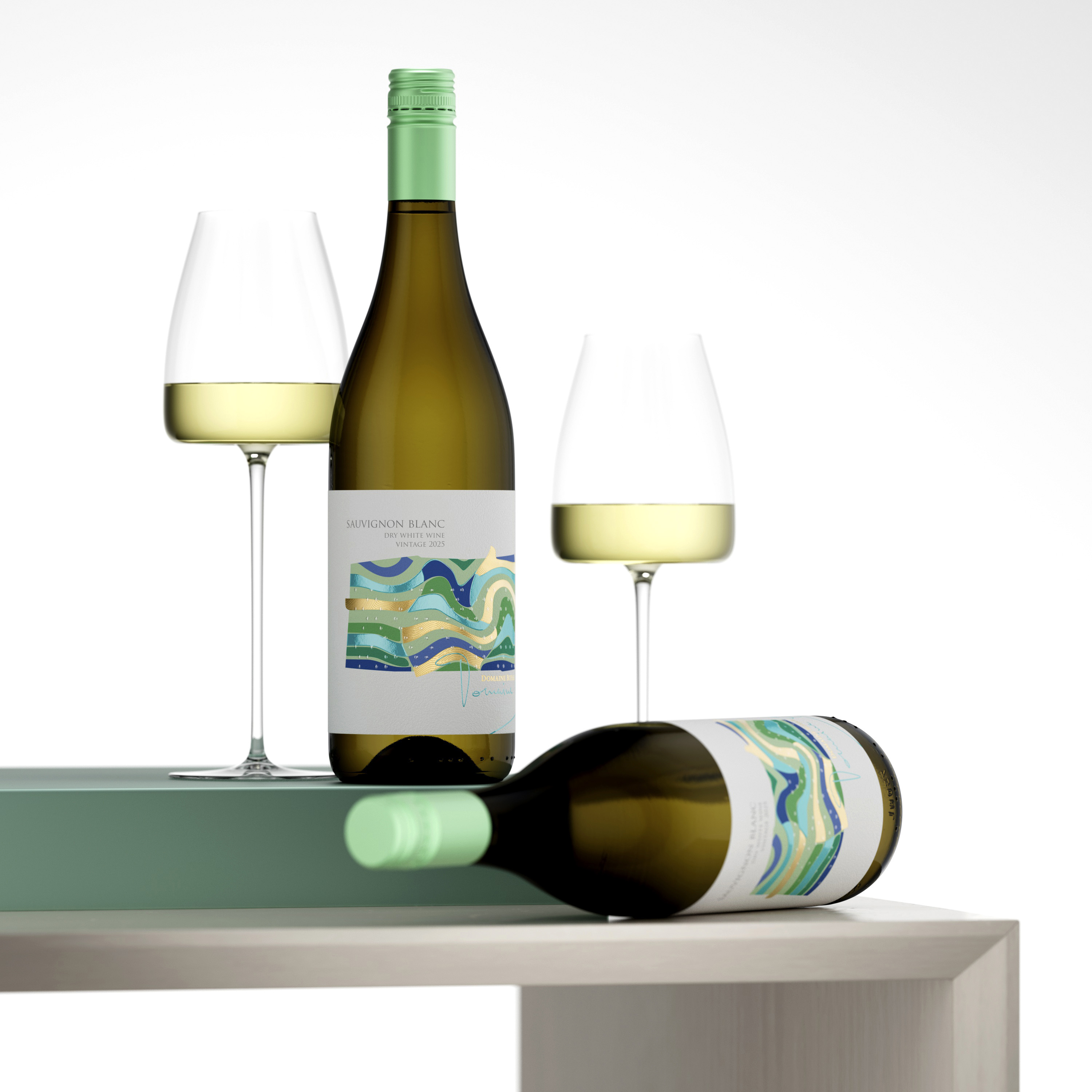
The essence of a modern Sauvignon Blanc is defined by its energy. For the Domaine Boyar 2025 vintage, my objective was to move beyond heavy, traditional aesthetics and instead embrace a fresh wine label design that vibrates with clarity. This project is a visual celebration of the vineyard’s pulse – a clean, rhythmic interpretation of the land and the crisp liquid it produces.
The Idea: A Woven Landscape of Purity
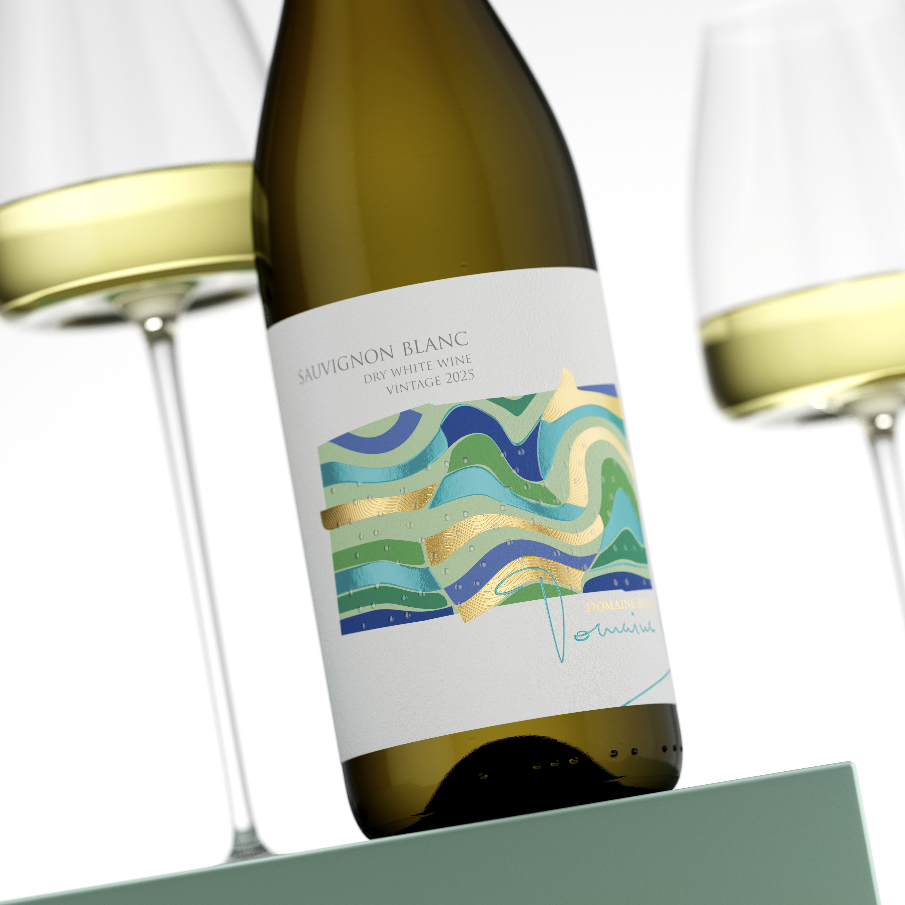
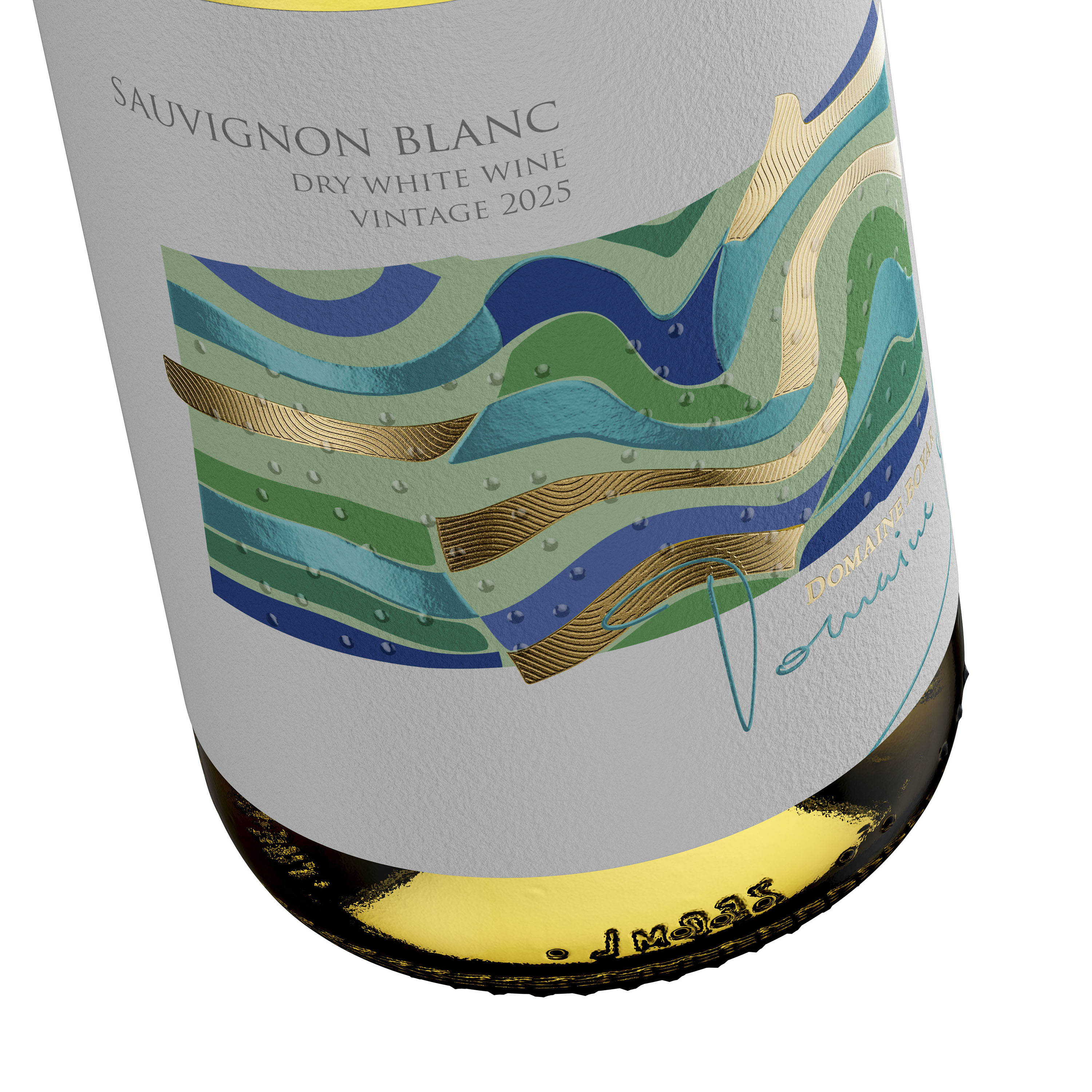
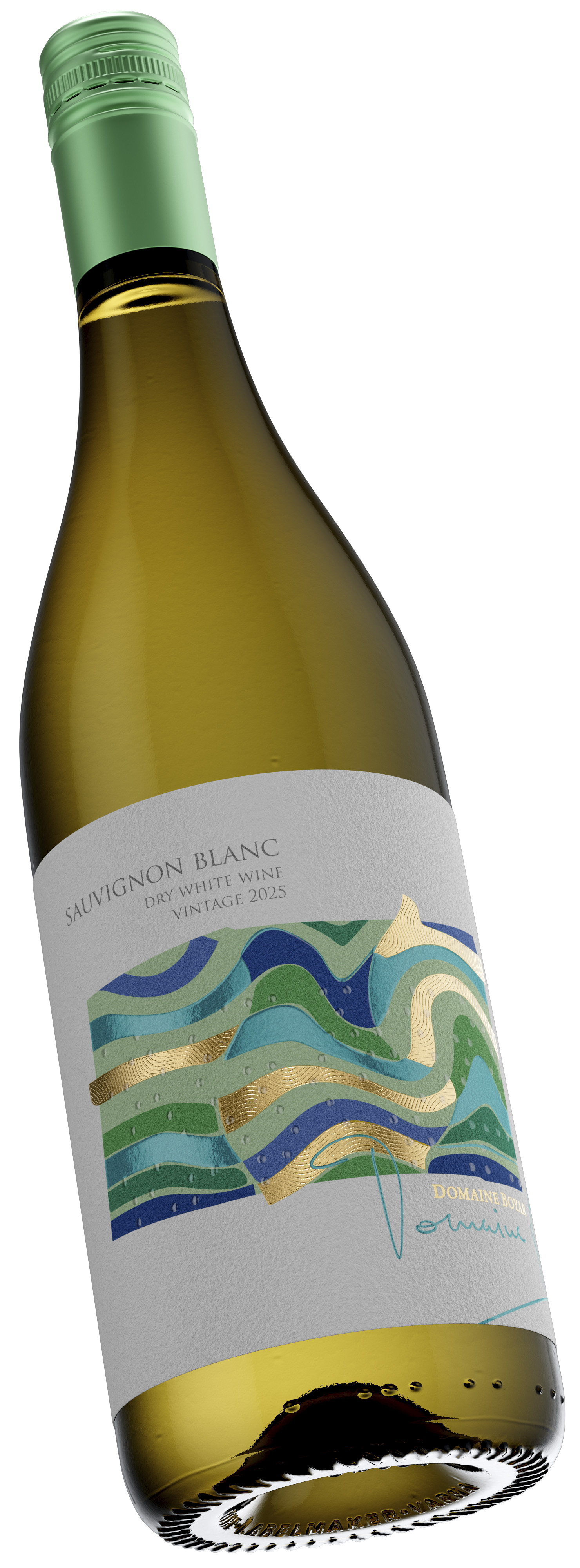
The vibrant blue and green motifs are inspired by the soul of traditional Bulgarian textiles, where strips of cotton cloth are woven into patterns of functional beauty. When viewed from above, these patterns mirror the striking aerial photography of the vineyard parcels themselves.
By translating this “woven” logic into a fresh wine label design, I created a patchwork of the terroir. It is an honest, vibrant representation of the organized rows of vines, captured in a moment of peak summer freshness. It’s not just a pattern; it’s the geometry of the earth, organized by human hands.
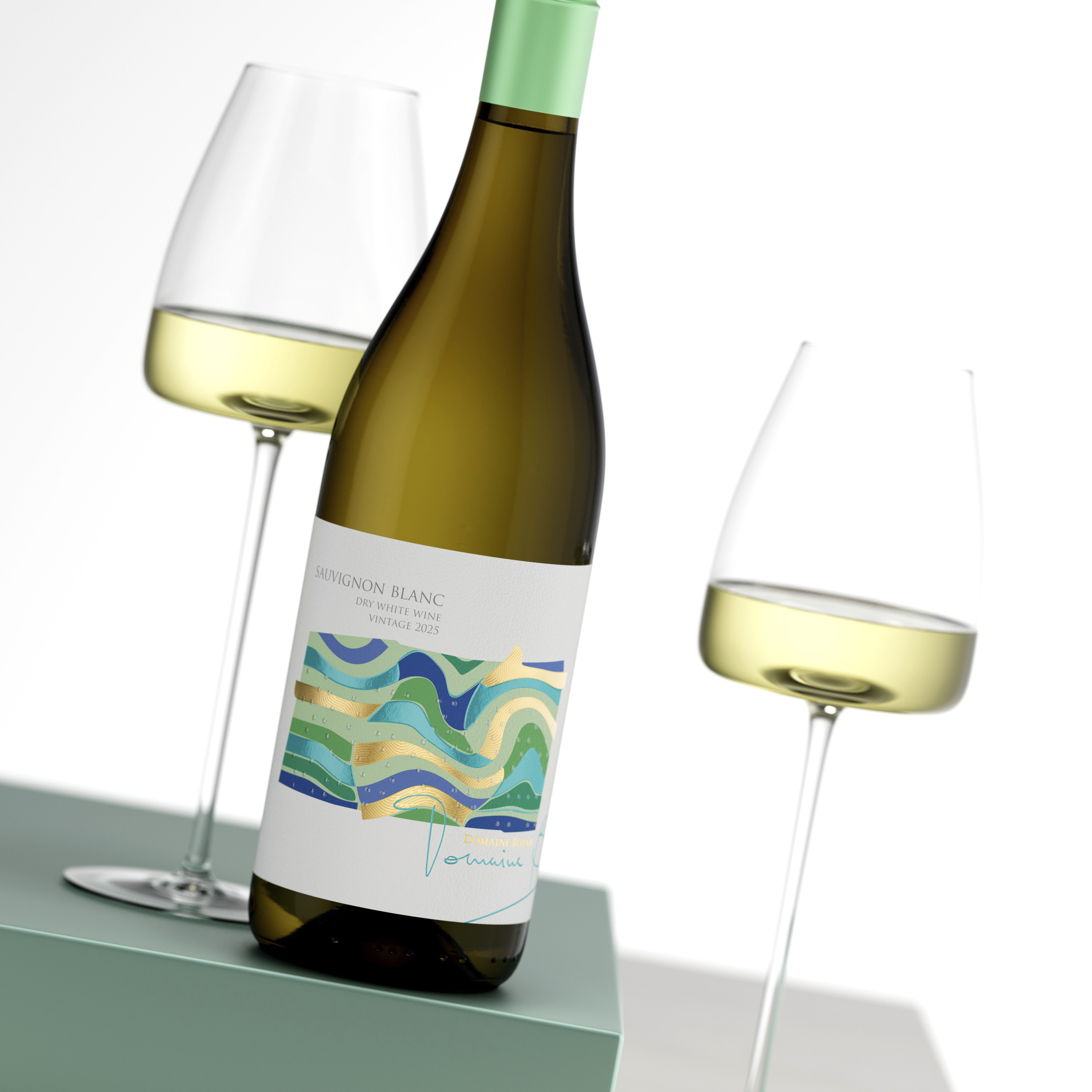
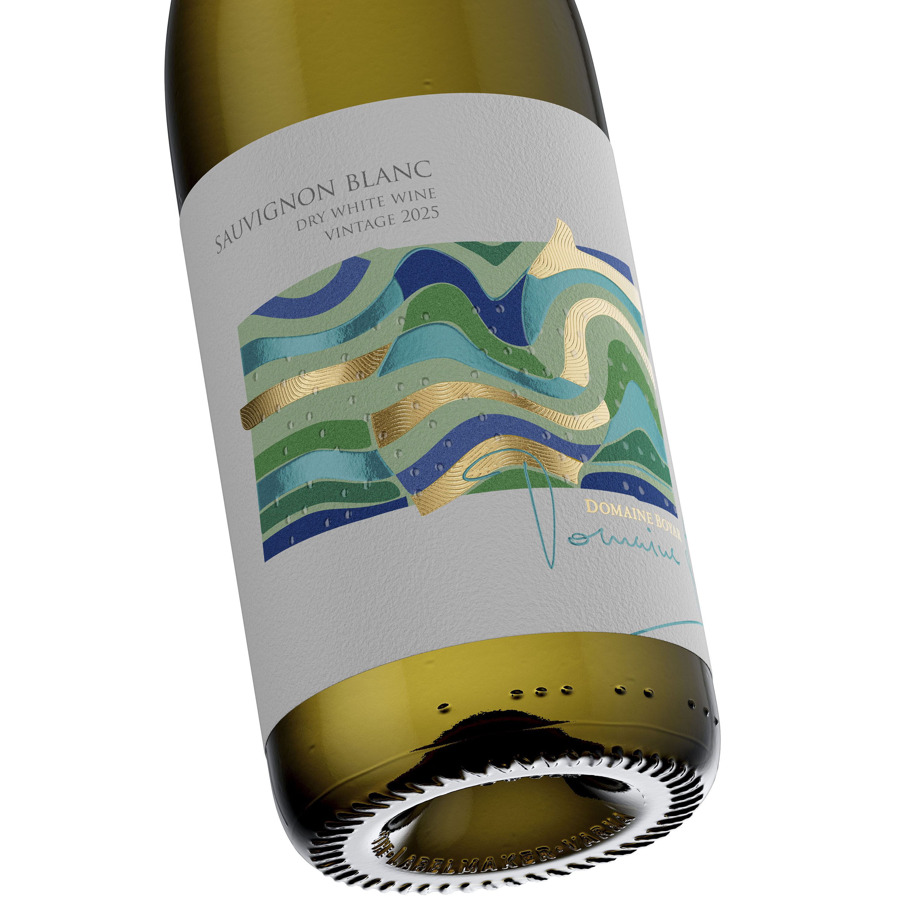
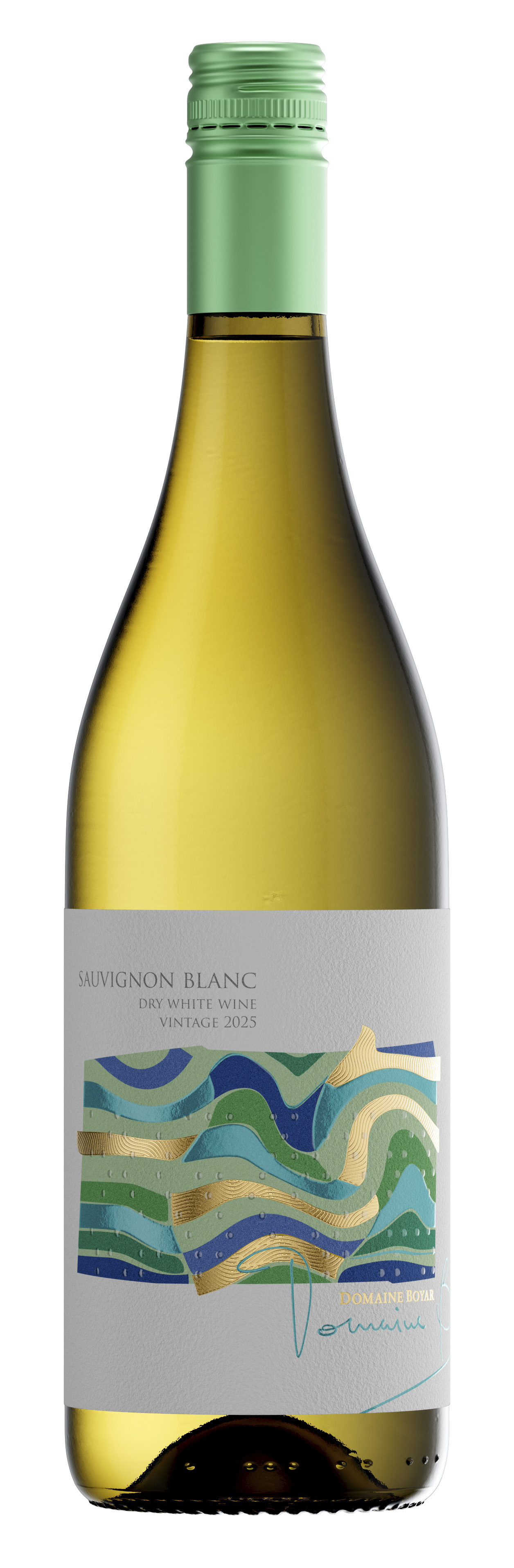
The silhouette of the bottle is an exercise in minimalism and impact. The mint-green capsule sets the tone, leading the eye to a label where white space and vibrant color live in perfect balance. It is a visual promise of the crisp, zesty experience waiting inside.
Design & Printing: Technical Clarity at Daga Print
To maintain the “clean” feel of the concept, the execution at Daga Print had to be surgical. In a fresh wine label design, there is no place to hide—every detail must be sharp, every texture purposeful. We chose a path of technical restraint to let the materials speak for themselves.
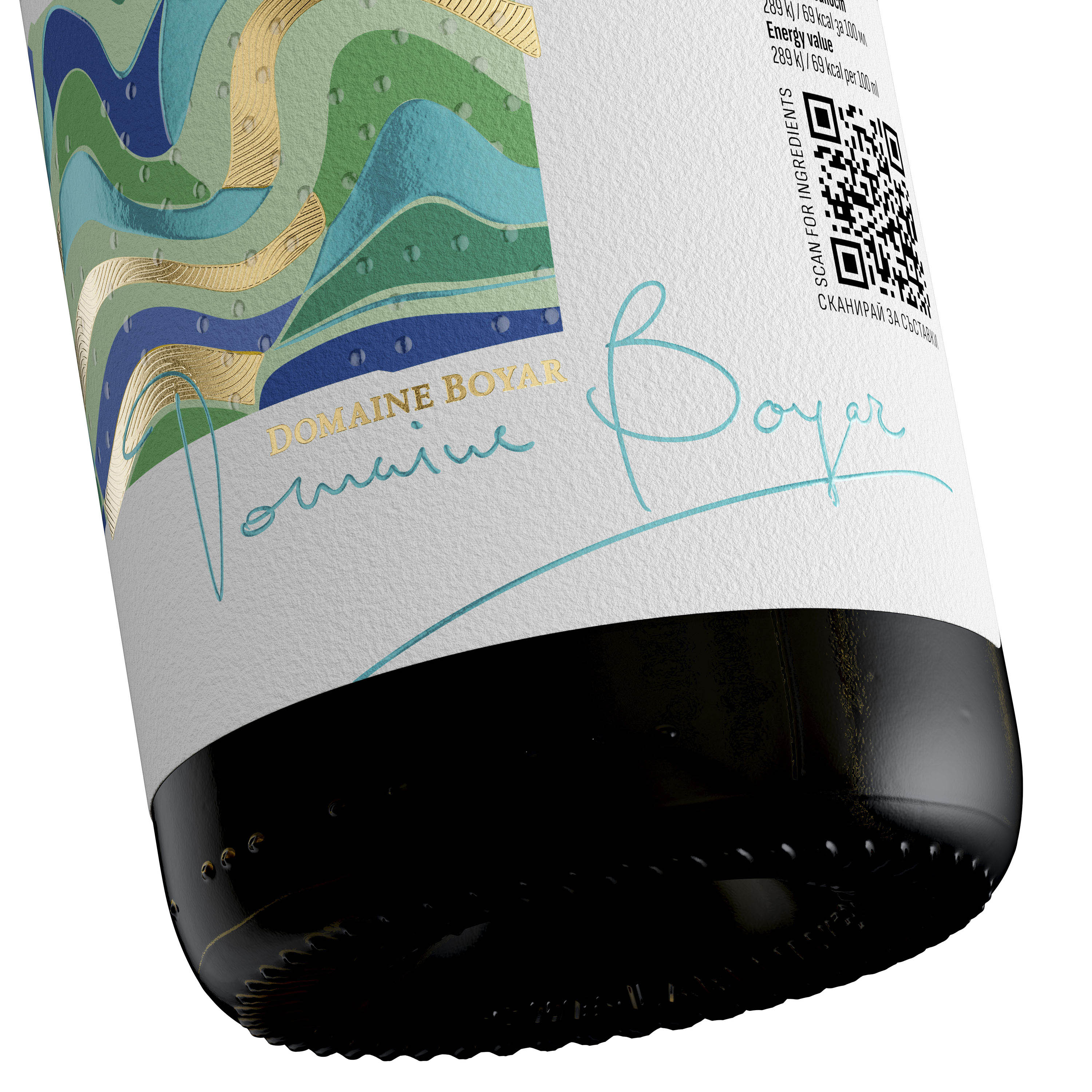
We selected Fasson Cotton Touch paper for its pure, matte tactile quality. It feels like natural fabric to the touch, grounding the design in a physical, organic reality. Using digital offset print, we achieved high-saturation greens and blues that look luminous against the white paper. The addition of high-build varnish creates a “dewy” effect on the waves, enhancing the overall sensation of moisture and cool temperatures.
The Rich Gold Foil acts as the sunlight within the design. I applied a special micro-embossed wavy pattern that mimics the precisely planted rows of the vineyard massifs. This isn’t about opulence; it’s about the glint of light on a well-tended field, providing a tactile sensation that reinforces the brand’s connection to the soil.
The Magic of Minimalism
The brilliance of this label lies in its technical restraint. I avoided heavy embellishments to keep the focus on the visual hierarchy. There are no sculptural 3D elements – only the elegant interplay of hot foil, micro-embossing, and high-build varnish. The result is a fresh wine label design that feels light, airy, and incredibly modern.
The contrast between the organic waves and the sharp, bespoke typography creates a dynamic energy. The Domaine Boyar signature flows across the “woven” vineyard rows, emphasizing the human craft behind the technical precision. It is a dialogue between the tradition of the winery and the forward-looking vision of the brand.
Market Impact: The Face of Modern Sauvignon Blanc
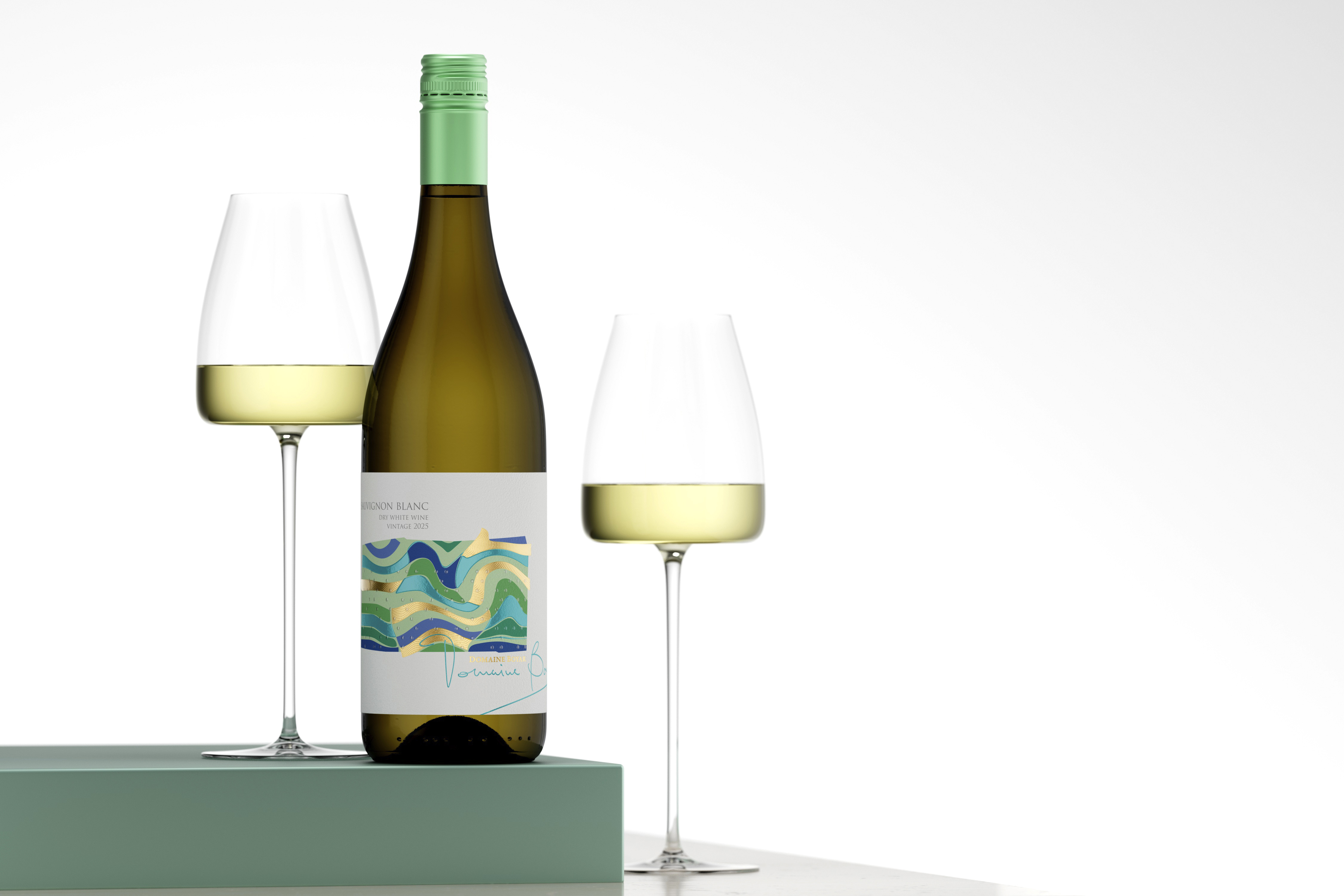
In today’s competitive market, consumers are looking for honesty and vibrancy. A bottle must communicate its character before the first pour. This collaboration with Daga Print ensures that the bottle stands out through its brightness and clarity. This fresh wine label design doesn’t just sit on the shelf; it illuminates it, signaling a wine that is approachable, crisp, and full of life.
Even in a relaxed, lifestyle setting, the design maintains its crisp identity. The micro-embossed gold catches the light like the morning sun over the vines, making the tactile packaging an integral part of the wine-drinking ritual. This project proves that purity is the ultimate sophistication.
By pairing Cotton Touch paper with the expert finishing of Daga Print, we have delivered a fresh wine label design that perfectly encapsulates the spirit of Sauvignon Blanc. It is a design that respects the wine as much as it respects the consumer’s eye for beauty.
Design at a Glance
CREDIT
- Agency/Creative: the Labelmaker
- Article Title: The Geometry of Vitality: A Fresh Wine Label Design for Domaine Boyar by the Labelmaker
- Organisation/Entity: Agency
- Project Type: Packaging
- Project Status: Published
- Agency/Creative Country: Bulgaria
- Agency/Creative City: Sofia
- Market Region: Europe
- Project Deliverables: Brand Creation, CGI, Graphic Design, Label Design, Packaging Design
- Format: Bottle
- Industry: Food/Beverage
- Keywords: Fresh wine label, Domaine Boyar, contemporary typography, wine branding, minimalist design, screwcap wine, artistic illustration, abstract patterns, premium paper texture, The Labelmaker, modern wine packaging, vibrant colors, brand identity, shelf standout
-
Credits:
Design & CGI Photo: the Labelmaker


