


The Creative Method – The Filpside Wine Range
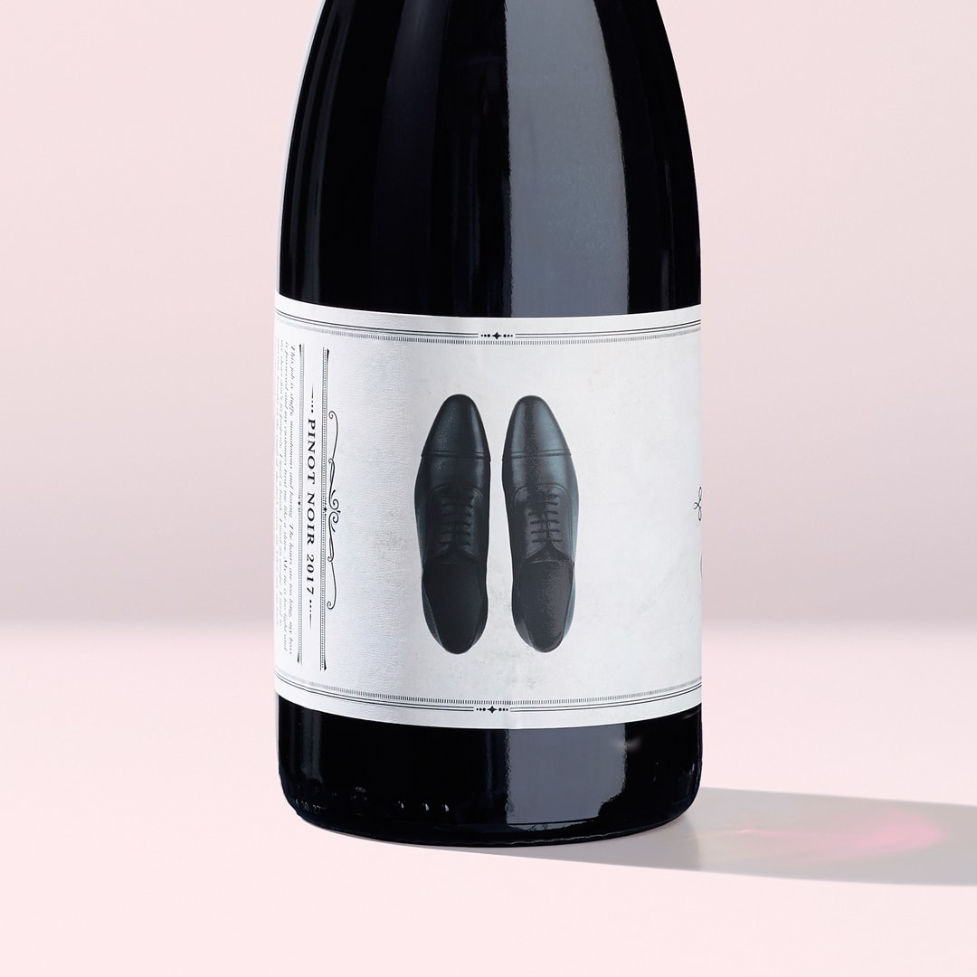
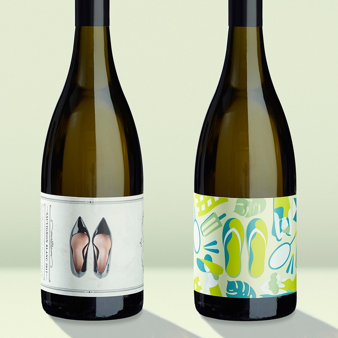
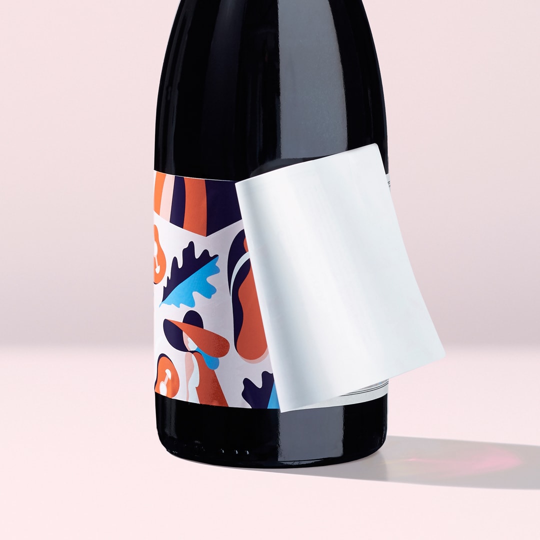
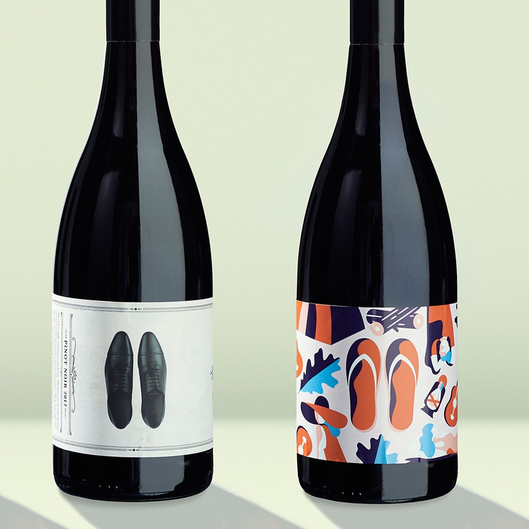
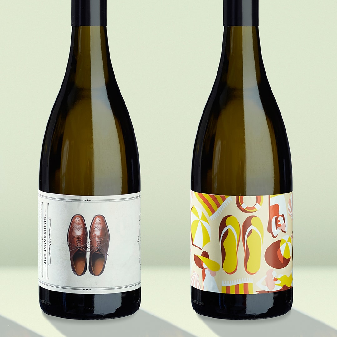
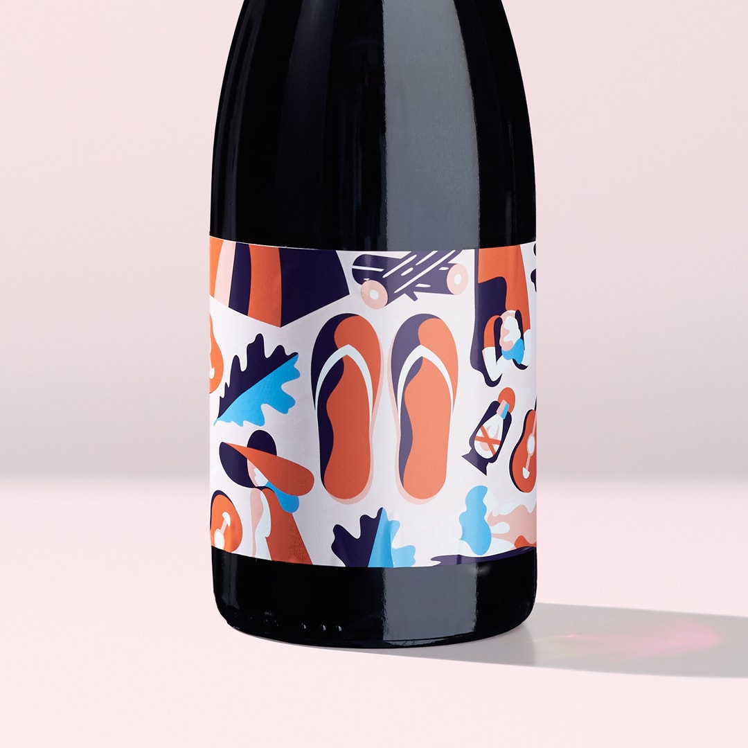
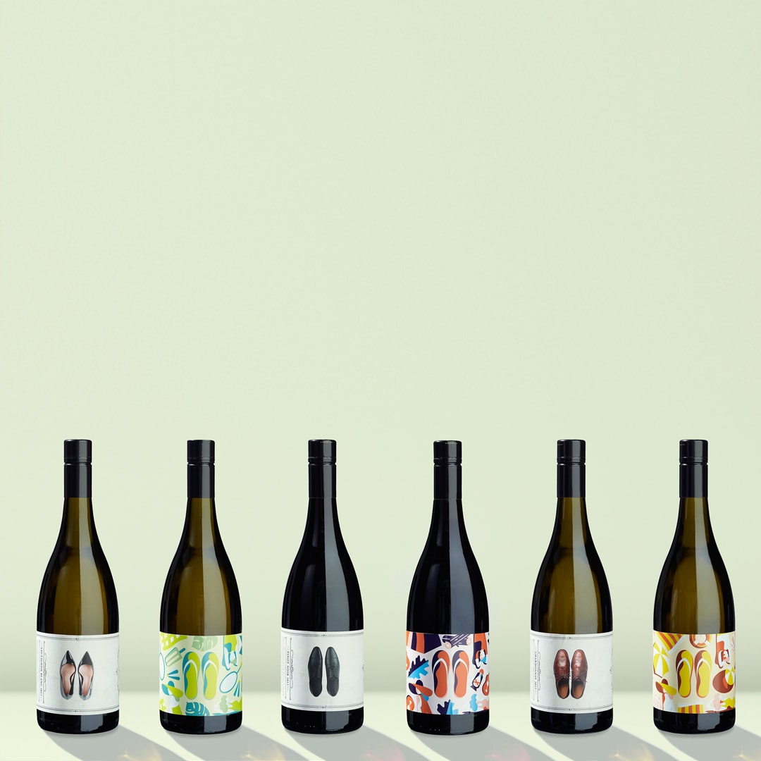
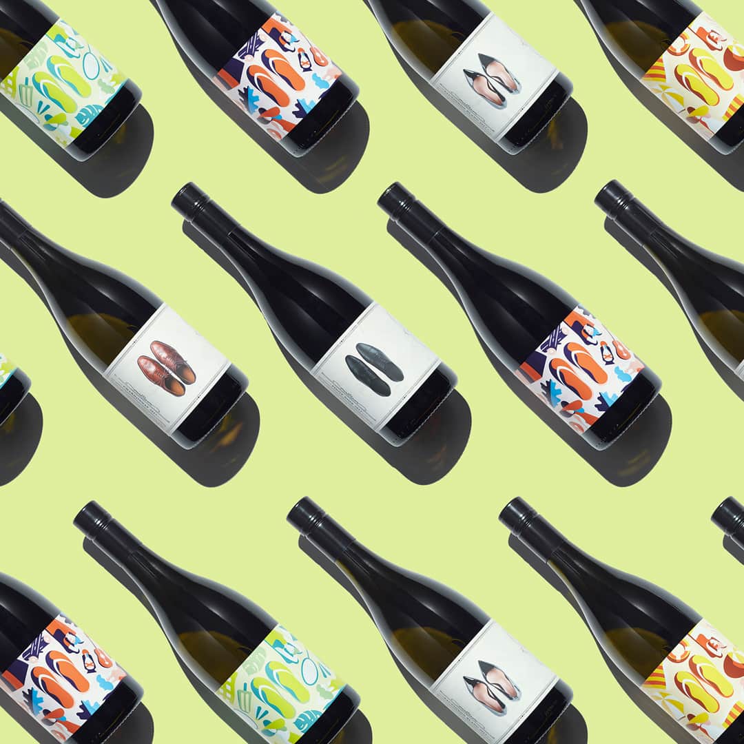
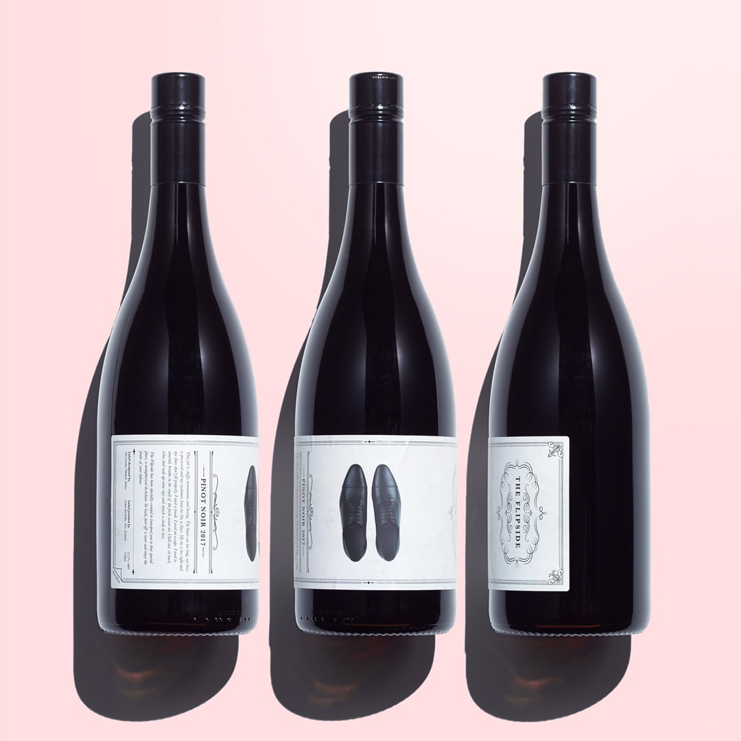
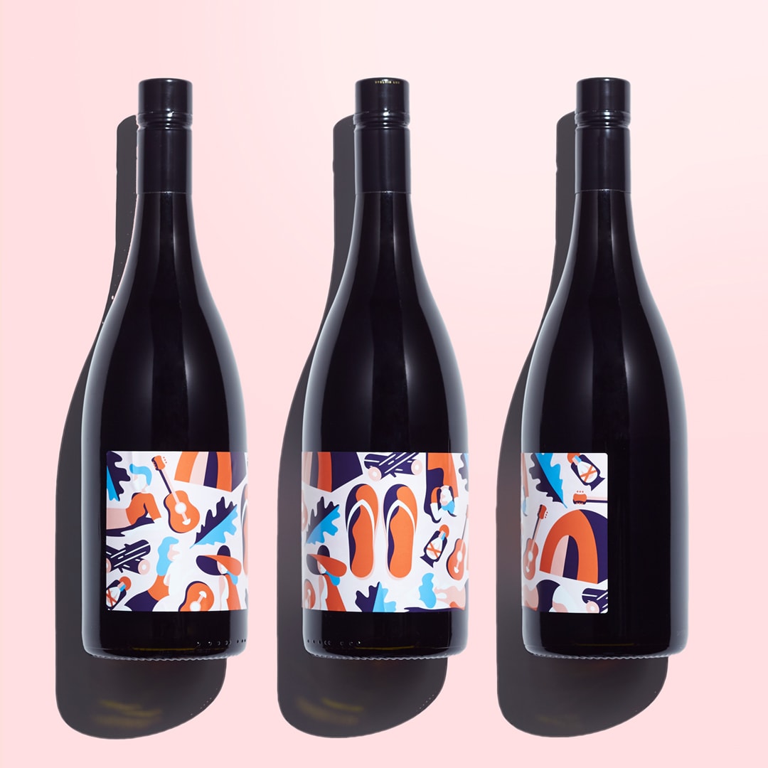
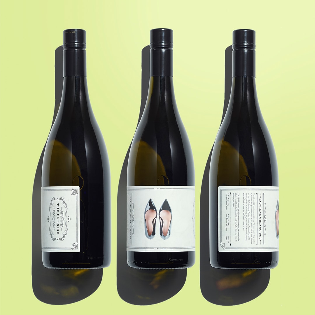
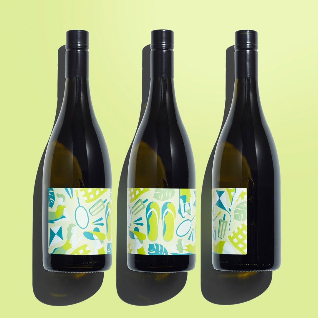
To name and create a wine brand for specialist label printers located in New Zealand, that can be used as a gift to all of their current and future clients. They wanted a label that could celebrate the upcoming summer holidays while also drawing attention to their specialist printing capabilities. The area of focus was on a new dual adhesive label technique where the top layer could be removed revealing another print underneath.The idea was based around the transition from work to the beach and the part wine can play in facilitating an enjoyable break. The name ‘Flipside’ is a nod to ‘flip flops’ the preferred footwear of the holiday occasion. The front label is more traditional detailed and regimented showing a different style of footwear for each style of wine. When the top label is peeled back, it reveals the full colour holiday scene underneath where the stuffy work shoes have been replaced by the bold and bright flip flop. The colours underneath reflect the flavours of the wine.
CREDIT
- Agency/Creative: The Creative Method
- Article Title: The Flipside Duel Label Packaging for Nz Label Printers
- Organisation/Entity: In-house, Published Commercial Design
- Project Type: Packaging
- Agency/Creative Country: Australia
- Market Region: Oceania
- Format: Bottle
- Substrate: Glass


