There are different reasons why people start to develop and promote their personal brands. Some want to be famous and earn money. Some want to find the job of their dream, and some have a solid aesthetical need — to have a style that fits them great. I firmly believe that all these three human needs are essential to the modern world, but the final goal of personal brand development is to become yourself.
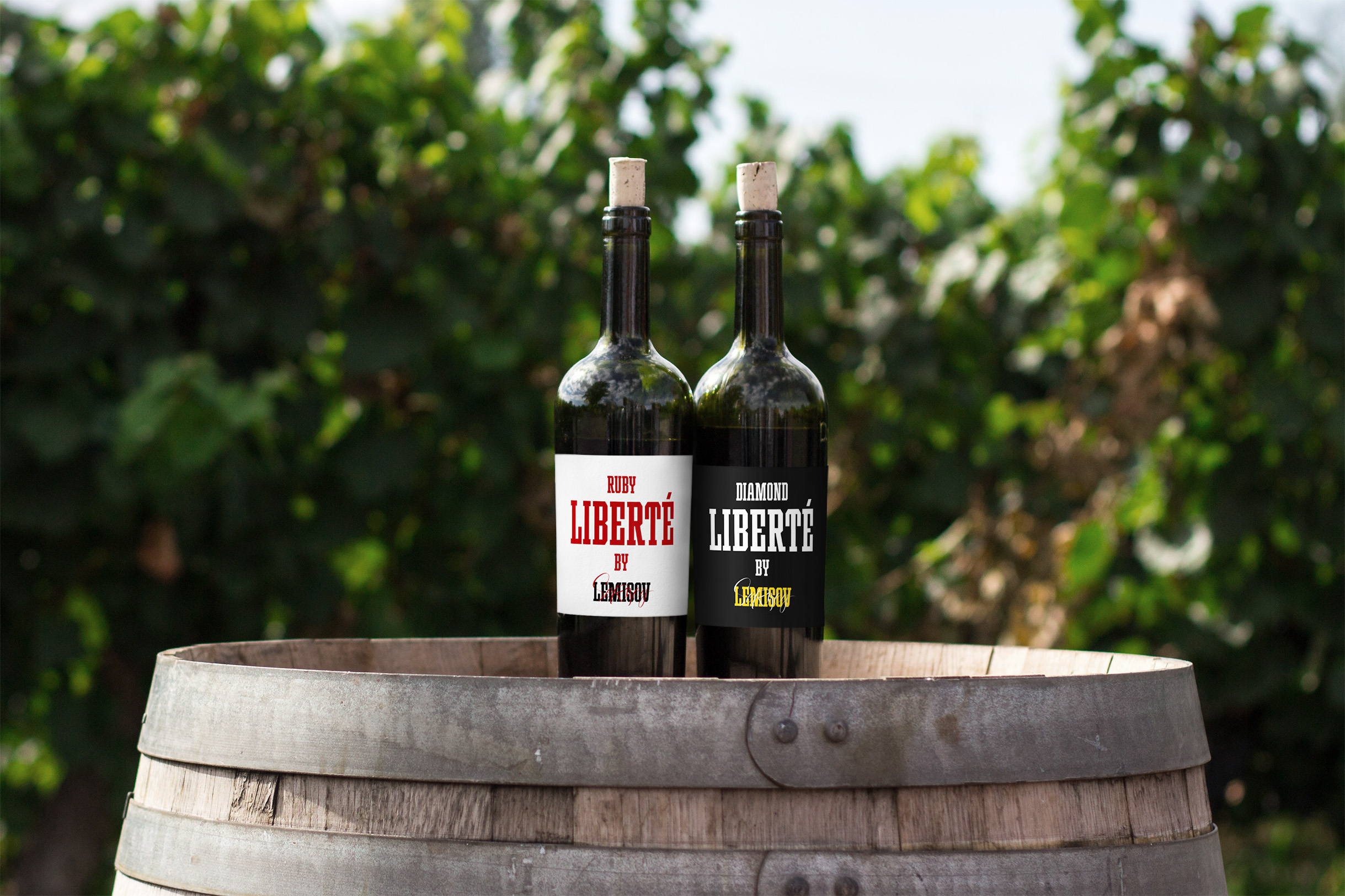
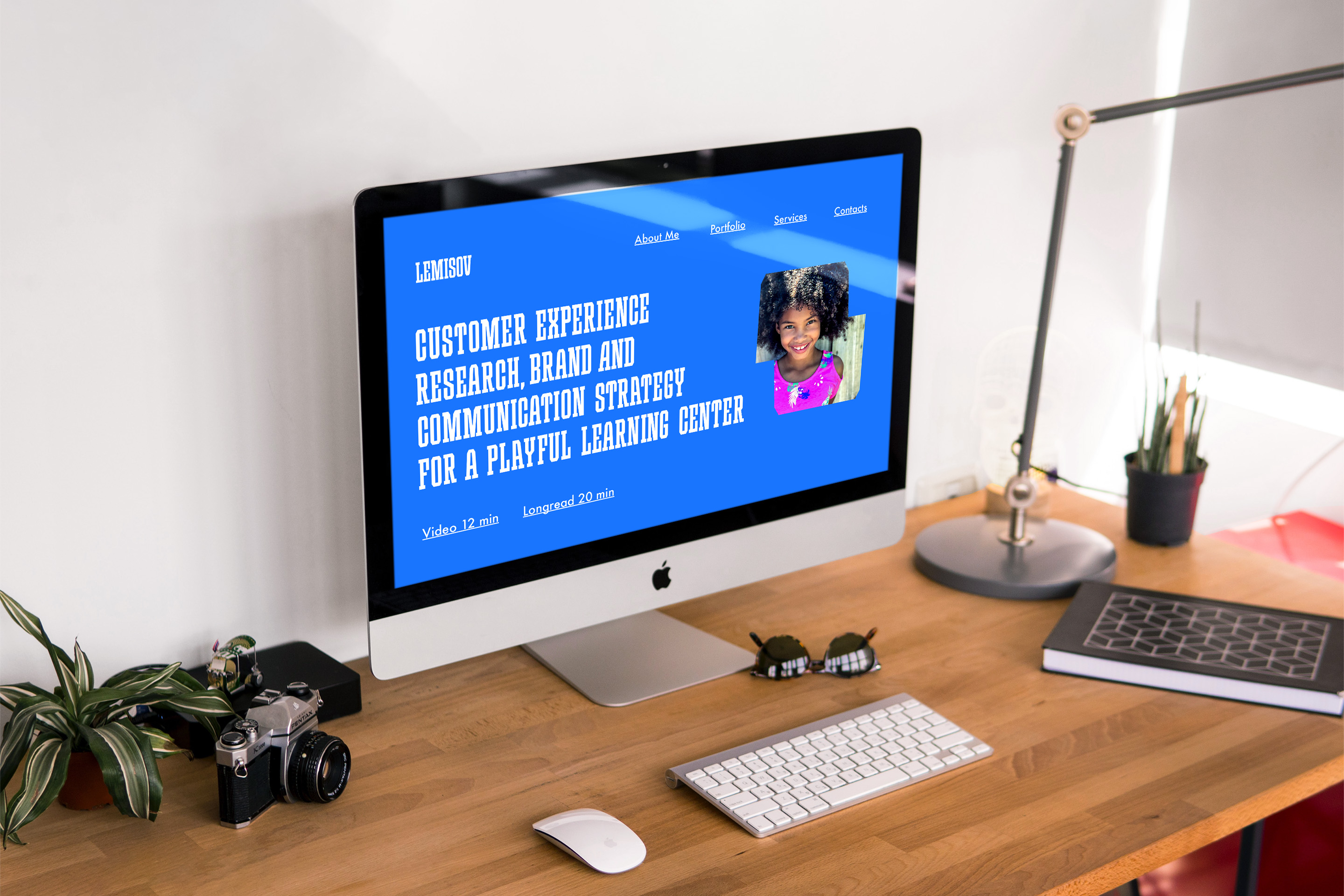
According to my values and brand character, the visual identity had to be sturdy, bold, and straightforward. It also had to be very flexible and comfortable to use. Because I was oriented on the North American market, I thought there had to be something connected with the Slab Serif font. Slab also was very suitable for broadcasting my strategic background. I also thought about farm-style photos for my family to broadcast our values and preferred lifestyle in harmony with the earth and nature. It all had to create a vision of a handy guy who is not afraid of intellectual and physical work and is not scared of challenges.
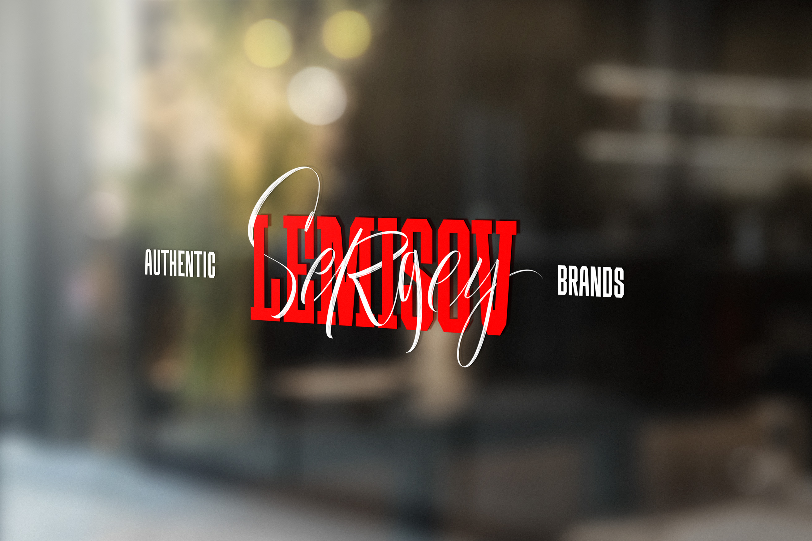
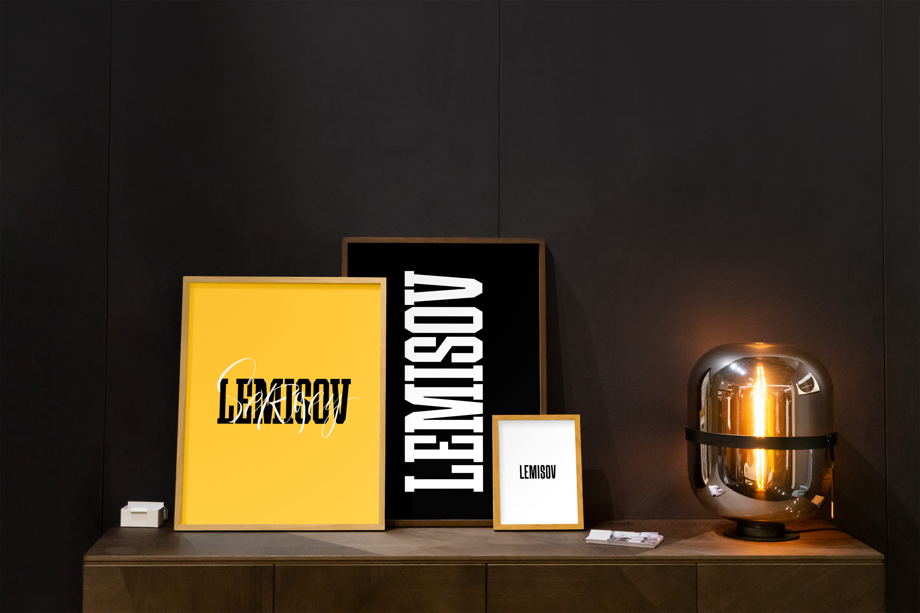
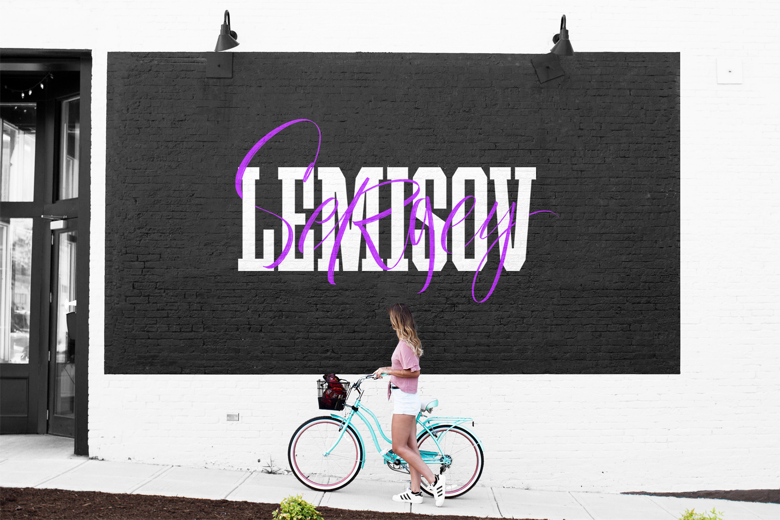
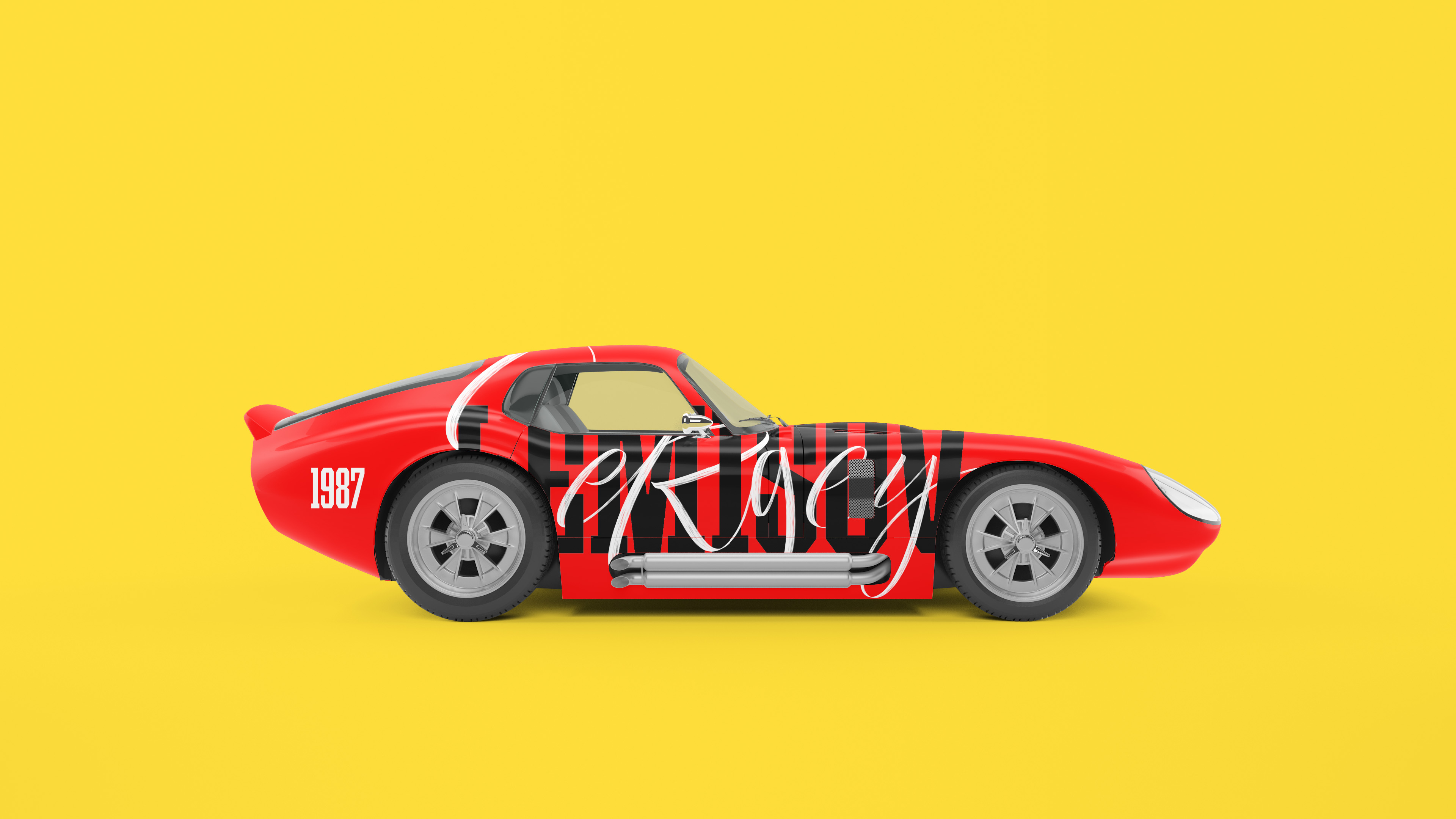
I’ve started experimenting with the logo, making some drafts, trying not only to find the character that would match the brand platform but also to imagine how it can be applied to various communication channels. The surname looked well-nit, as strategies that I developed. But it lacked a creative component that would be contrasting and bring a little creative mess into it. I thought that a calligraphy name element would be an excellent addition. So, I asked lettering and calligraphy designer Julia Kuznetsova to help me with that work. She designed different angled and proportioned expressive letters to show the creative part of my personality. Depending on the size of the graphic layout, the logo can be transformed and simplified by removing serifs.
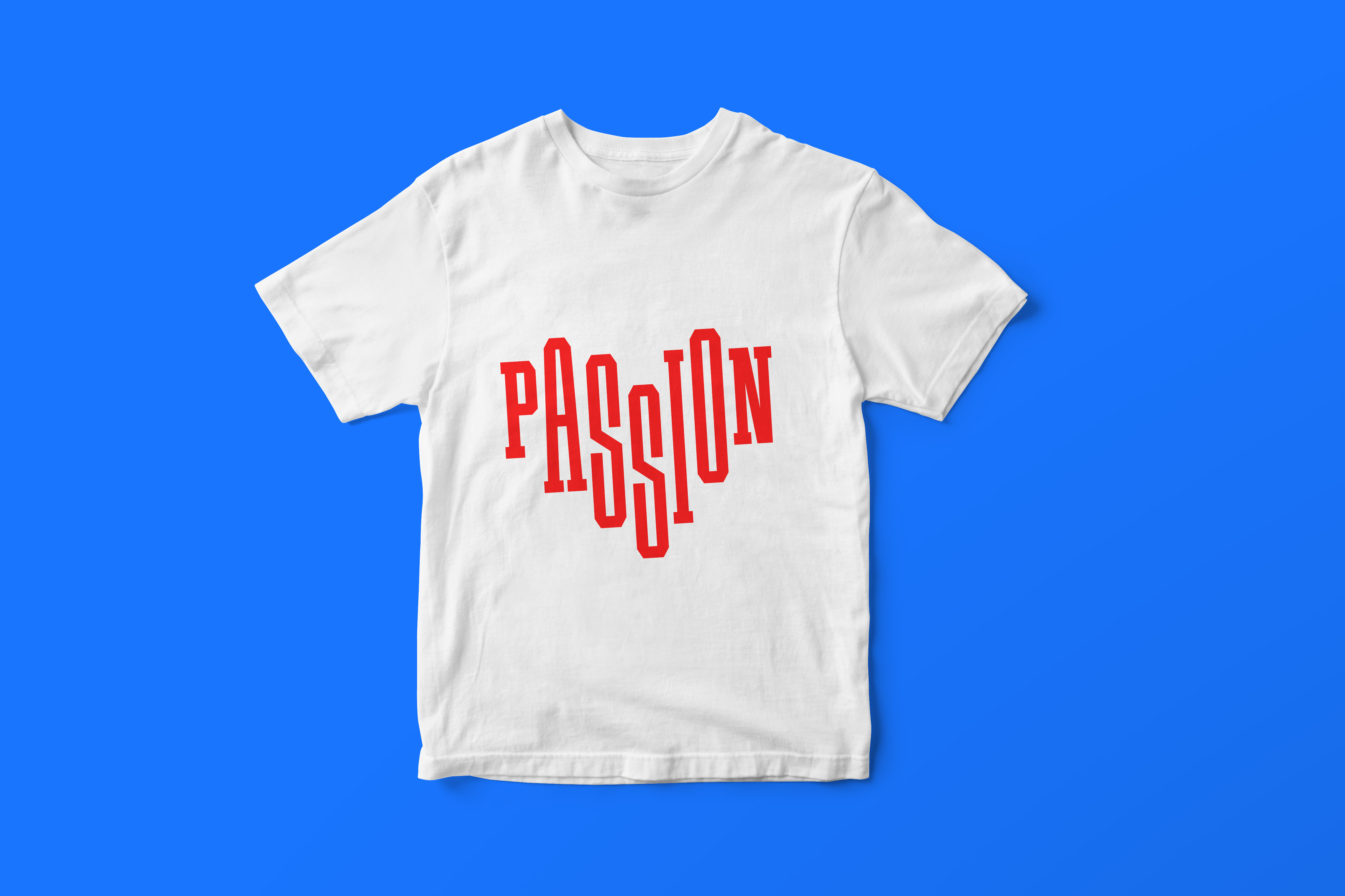
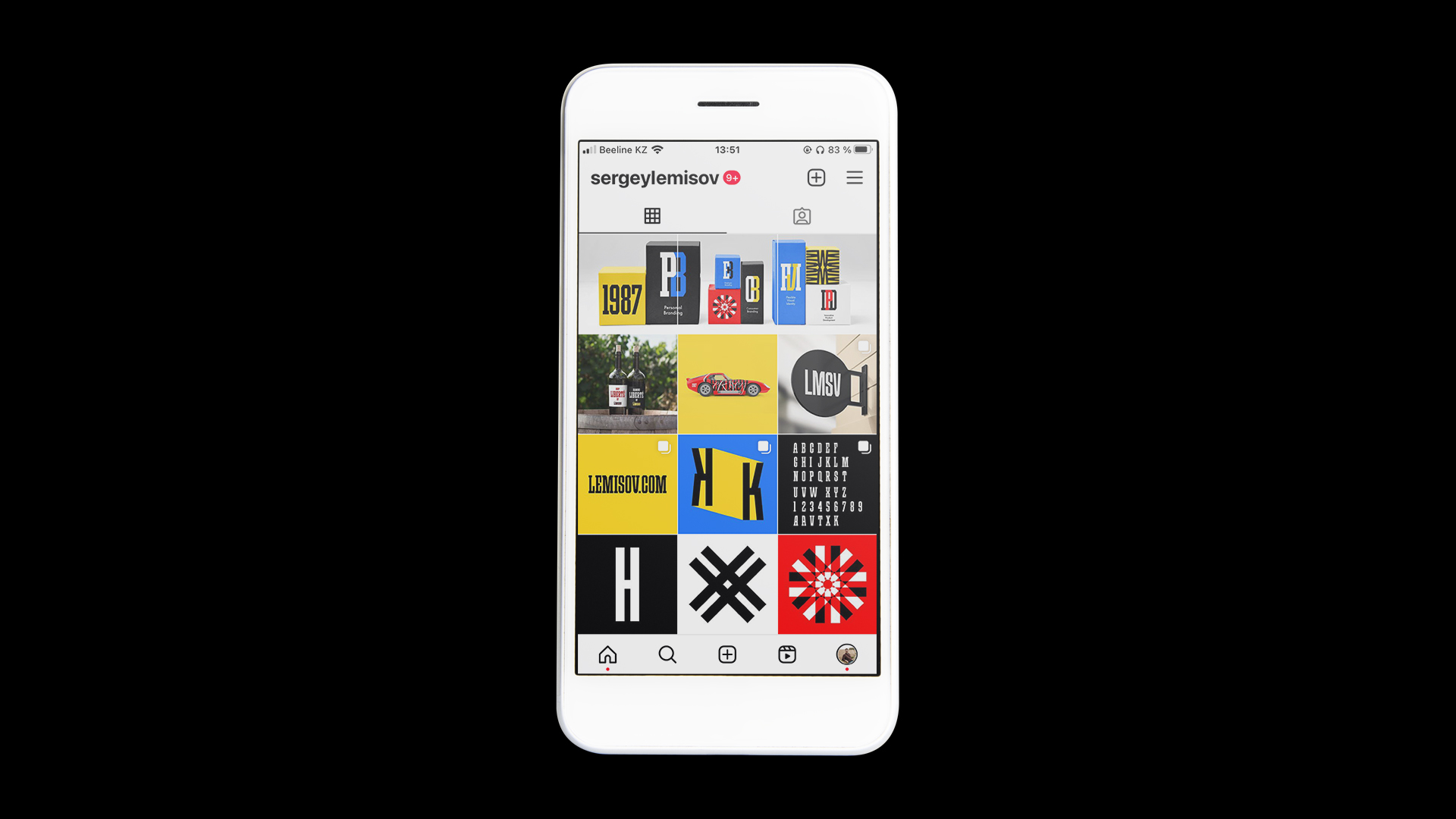
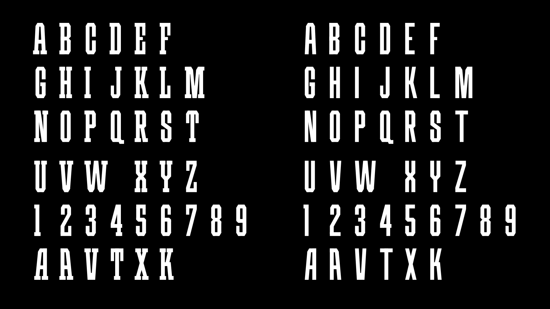
Based on the logo, I designed two alphabets — with and without serifs. The alphabet with serifs is made for large-size objects, like posters, murals, and… spaceships (haha, why not?), and the alphabet without serifs will be more useful in small formats. Font characteristics change depending on the task and context, allowing me to use my visual identity as a flexible verbal and visual language.
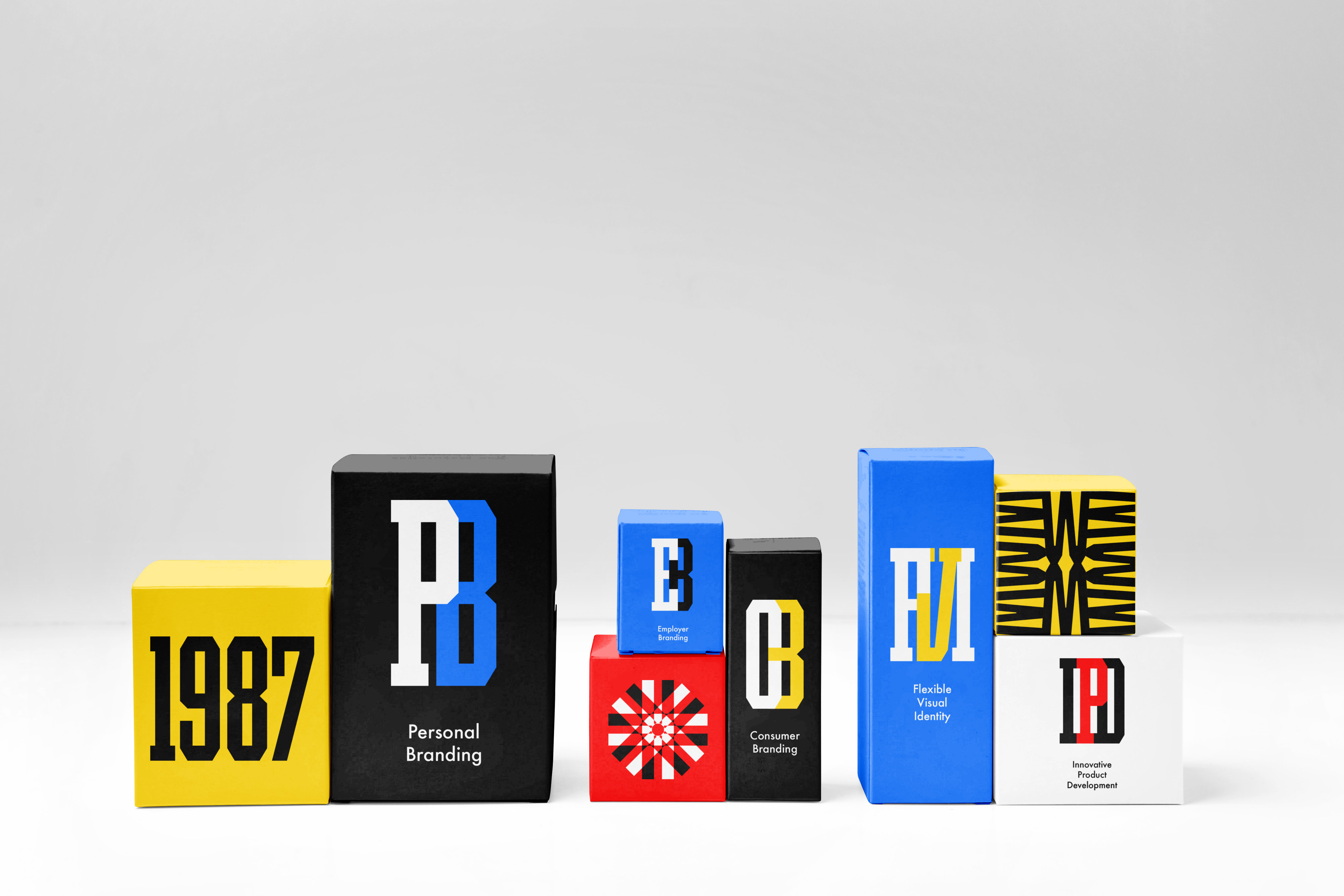
I chose the letters as the central point of a flexible visual system. That allows me to create infinite combinations, patterns, and shapes by combining them in various ways.
CREDIT
- Agency/Creative: Sergey Lemisov
- Article Title: The Flexible Visual Identity for a Personal Brand
- Organisation/Entity: Freelance
- Project Type: Identity
- Project Status: Published
- Agency/Creative Country: Kazakhstan
- Agency/Creative City: Almaty
- Market Region: Global
- Project Deliverables: Brand Identity, Brand Strategy, Lettering, Typography
- Industry: Mass Media
- Keywords: brand strategy, personal brand, flexible visual identity, brand identity, typography, lettering
-
Credits:
Brand Strategy and Flexible Visual Identity: Sergey Lemisov


