


Agate (“Агат” if written in the Cyrillic alphabet) is a construction materials supplier. It is a family company with a 30-year history led by Vladimir Markov and his daughter Barbara. Barbara asked my colleague Den Lazarev and me to do a customer experience research and develop a brand strategy to update Agate’s brand positioning and communication messages. After that well-done work, we made a deal for a flexible visual identity design.
According to the brand strategy we developed, Agate’s visual identity had to broadcast a human-centric approach, friendliness, and positivity. There were also 3 main requirements for the design system. First, it has to be simple to implement because the client doesn’t have a large design department. Second, it has to stay actual for an extended period because the company has no budget to make rebranding every year or two. And finally, it has to have an extensive usage range according to the brand touch points.
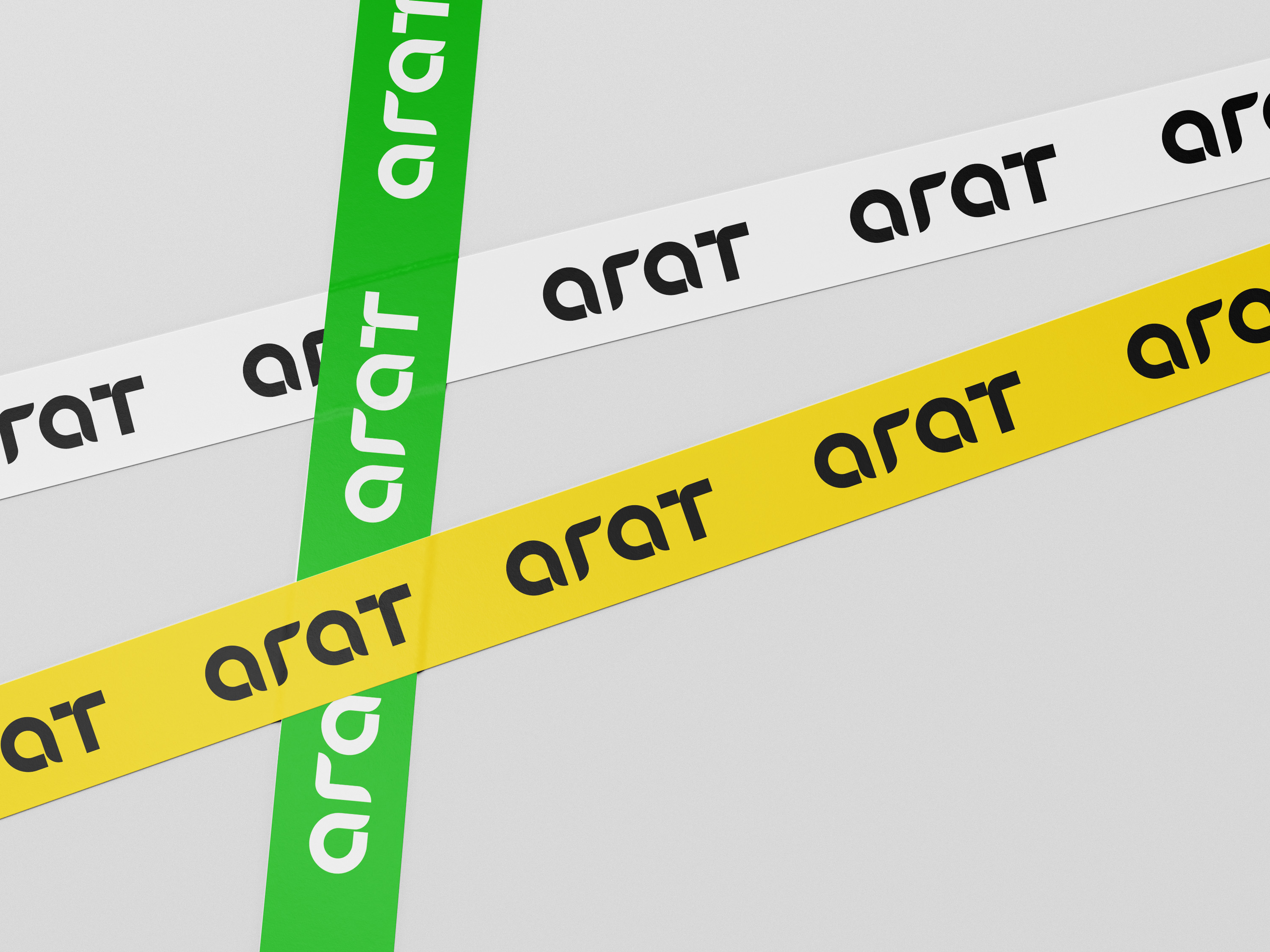
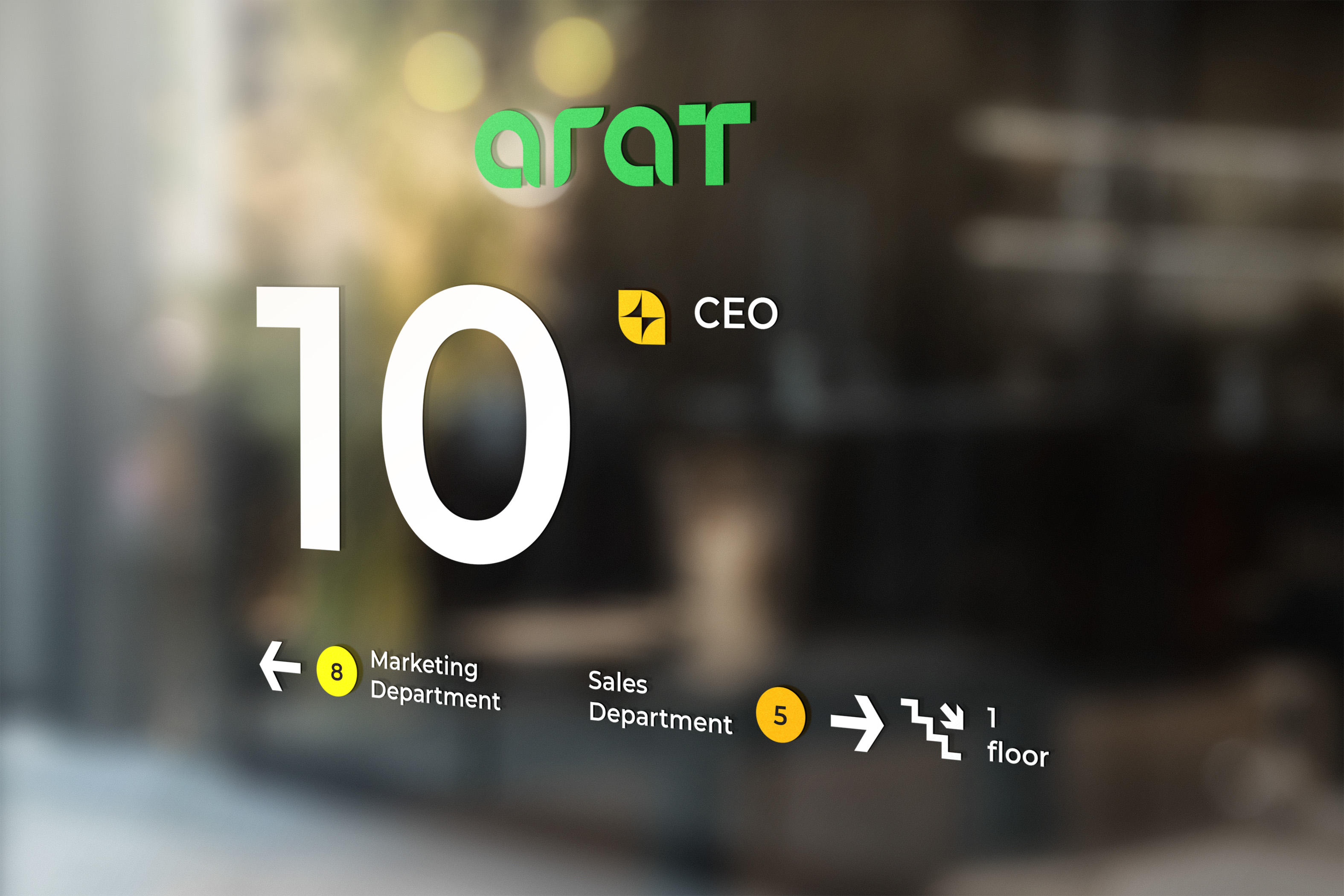
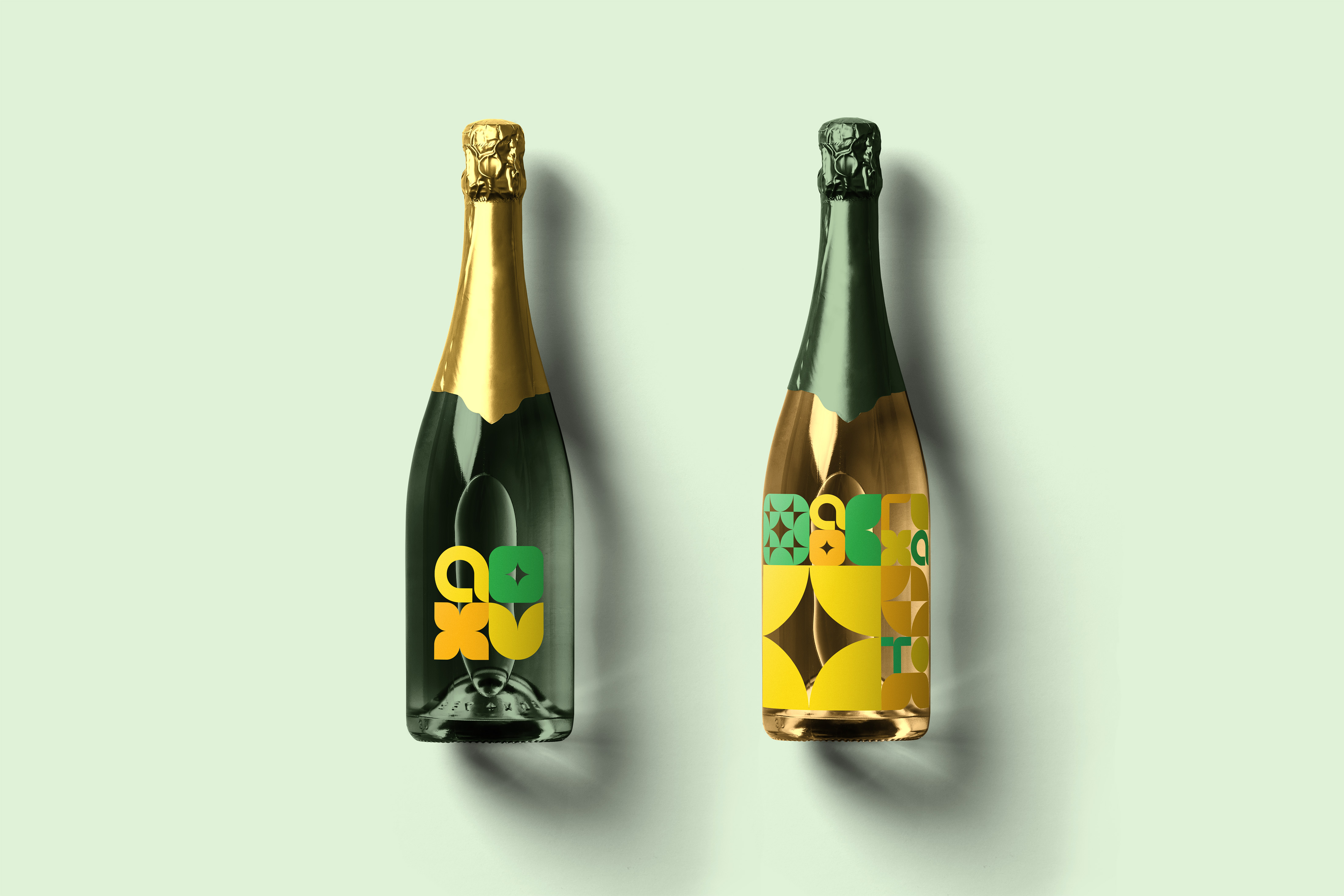
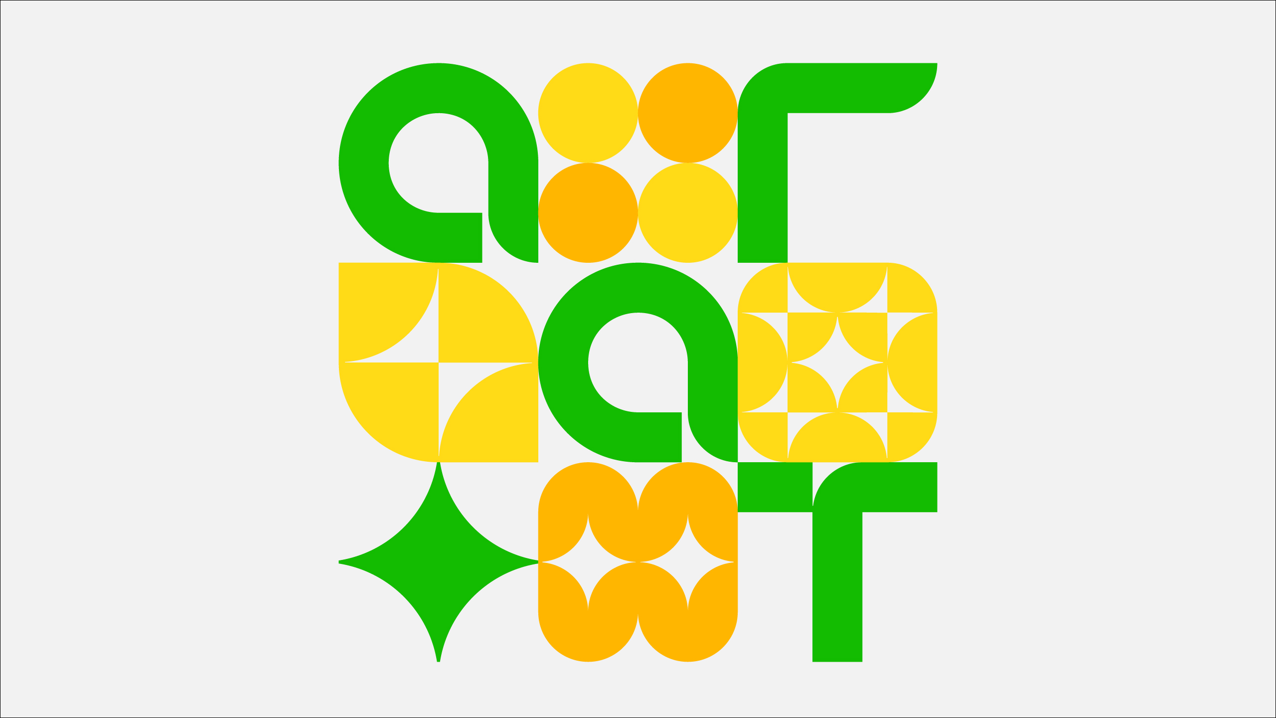
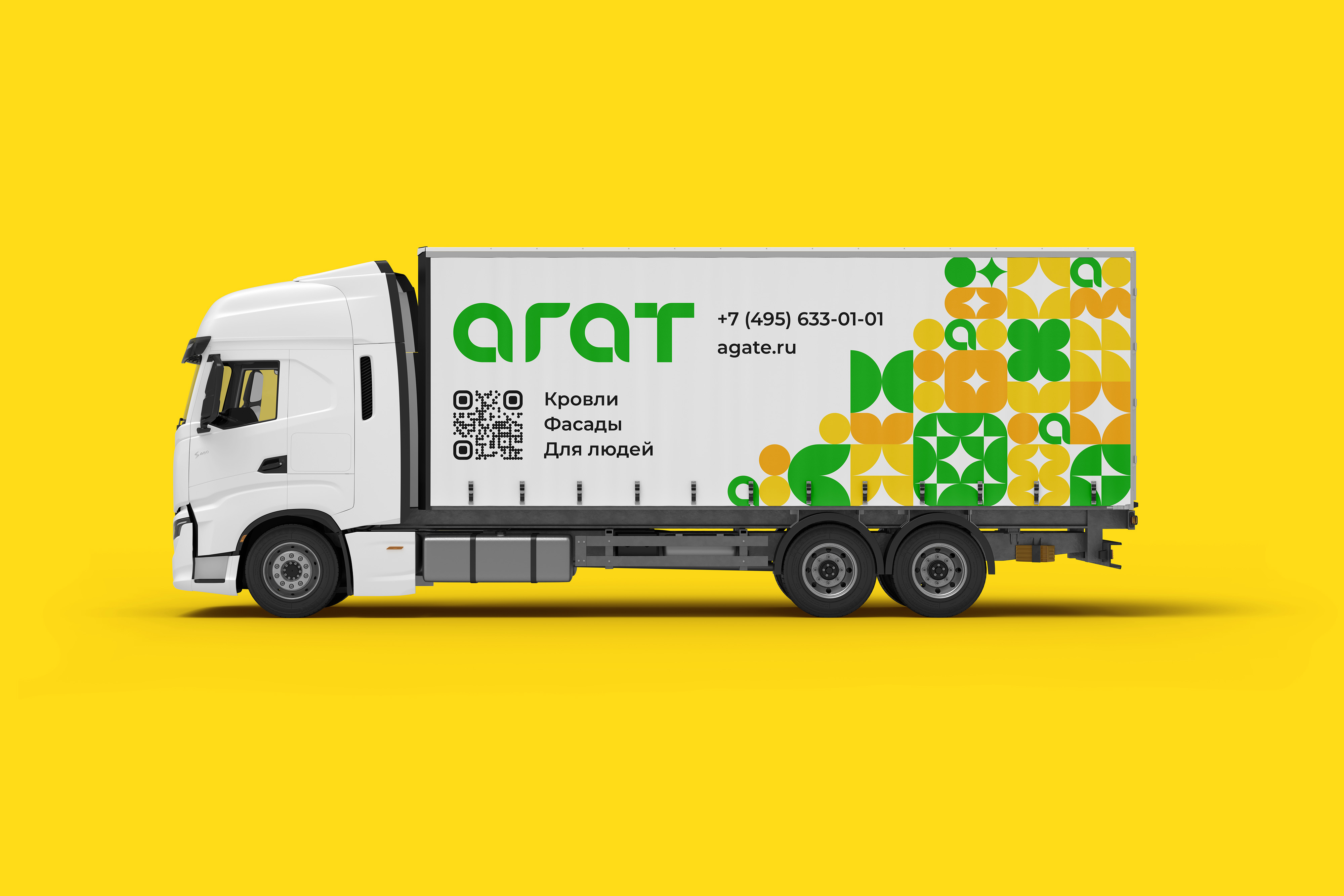
I chose a circle as a primary graphic element, divided it into parts, and rearranged them after creating graphical modules. The brand can design modular sets and design compositions or patterns using those sets. Using the same quarter circles and rectangles, I designed a logo and alphabet based on the same shapes. I also used graphical modules to create bright backgrounds for employees’ photos. So, all elements of the design system are connected with each other and based on the same principles. But even more importantly, the brand identity is connected with a brand character and a corporate culture, making it a powerful communication tool.


CREDIT
- Agency/Creative: Sergey Lemisov
- Article Title: The Flexible Visual Identity for a Construction Materials Distributor
- Organisation/Entity: Freelance
- Project Type: Identity
- Project Status: Published
- Agency/Creative Country: Kazakhstan
- Agency/Creative City: Alamaty
- Market Region: Europe
- Project Deliverables: Brand Identity, Brand Strategy, Typography
- Industry: Construction
- Keywords: brand strategy, brand identity, flexible visual identity, typography
-
Credits:
Brand Strategy and Brand Identity: Sergey Lemisov
CX Research and Brand Strategy: Denis Lazarev


