


Putting the Fun Back into ‘Allen’s’, Australia’s Favourite Lollies
Background
Allen’s has been Australia’s favourite lolly brand for more than a century, deeply woven into the nation’s childhood memories. Despite this strong heritage, the brand risked losing relevance. Its expression of fun had become dated, and cultural perceptions of play had shifted around it. Competitors were thriving with bold, modern interpretations of fun, while Allen’s struggled to maintain its iconic status. To safeguard its leadership and reconnect with Australians, Allen’s partnered with The Edison Agency to reimagine what fun could mean in a contemporary world.
Brief
The challenge was to articulate a new essence of fun that felt both modern and authentically Allen’s. The project required a refreshed brand identity system that could deliver stronger distinctiveness across touchpoints, introduce new visual codes, and build consistency where previously only the logo and core colours had acted as recognisable assets. With strict restrictions on advertising to children, Allen’s also needed to find ways of expressing fun beyond child-like characters, ensuring appeal to broader audiences while retaining its joyful, iconic spirit.
Strategy
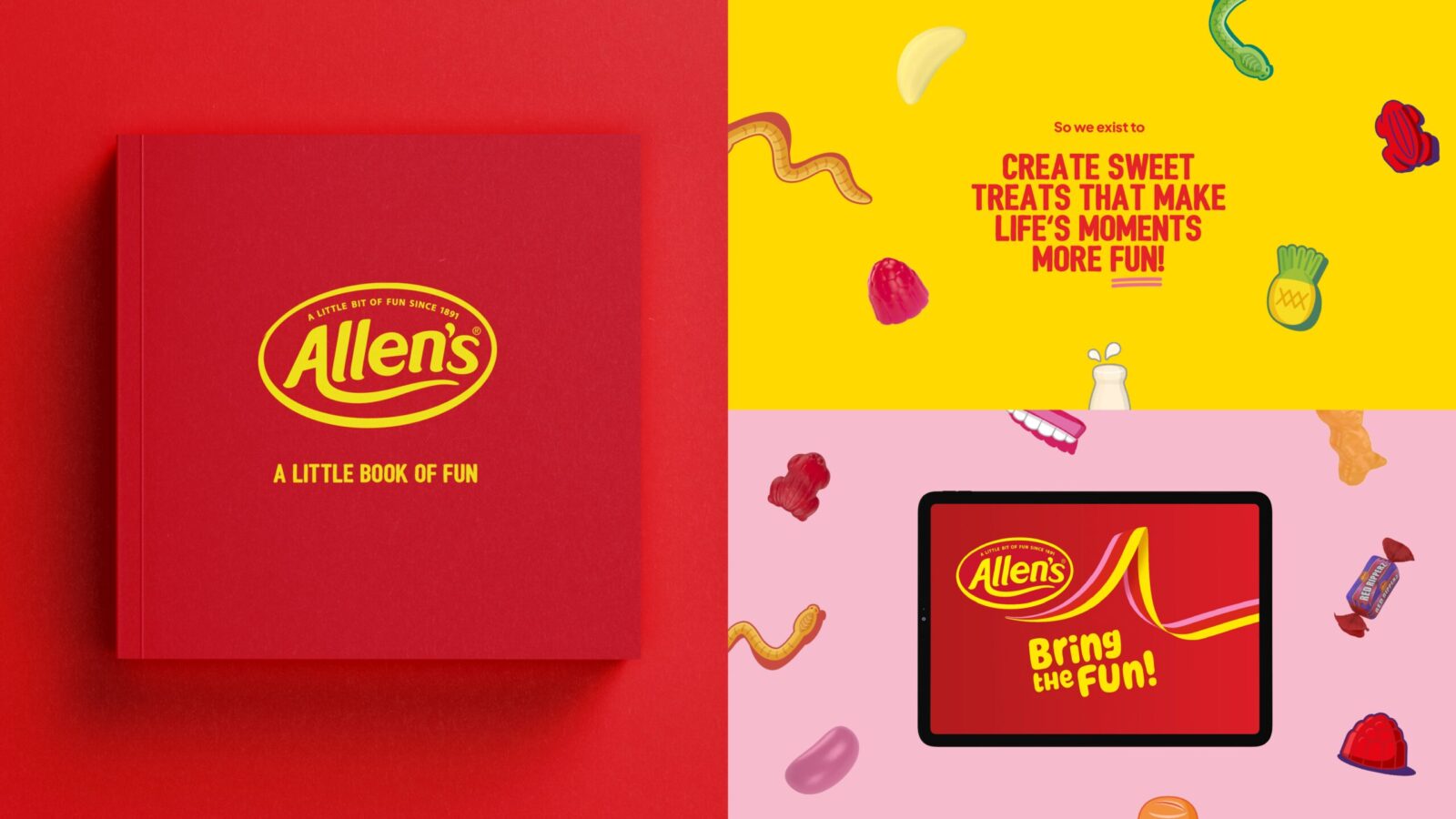
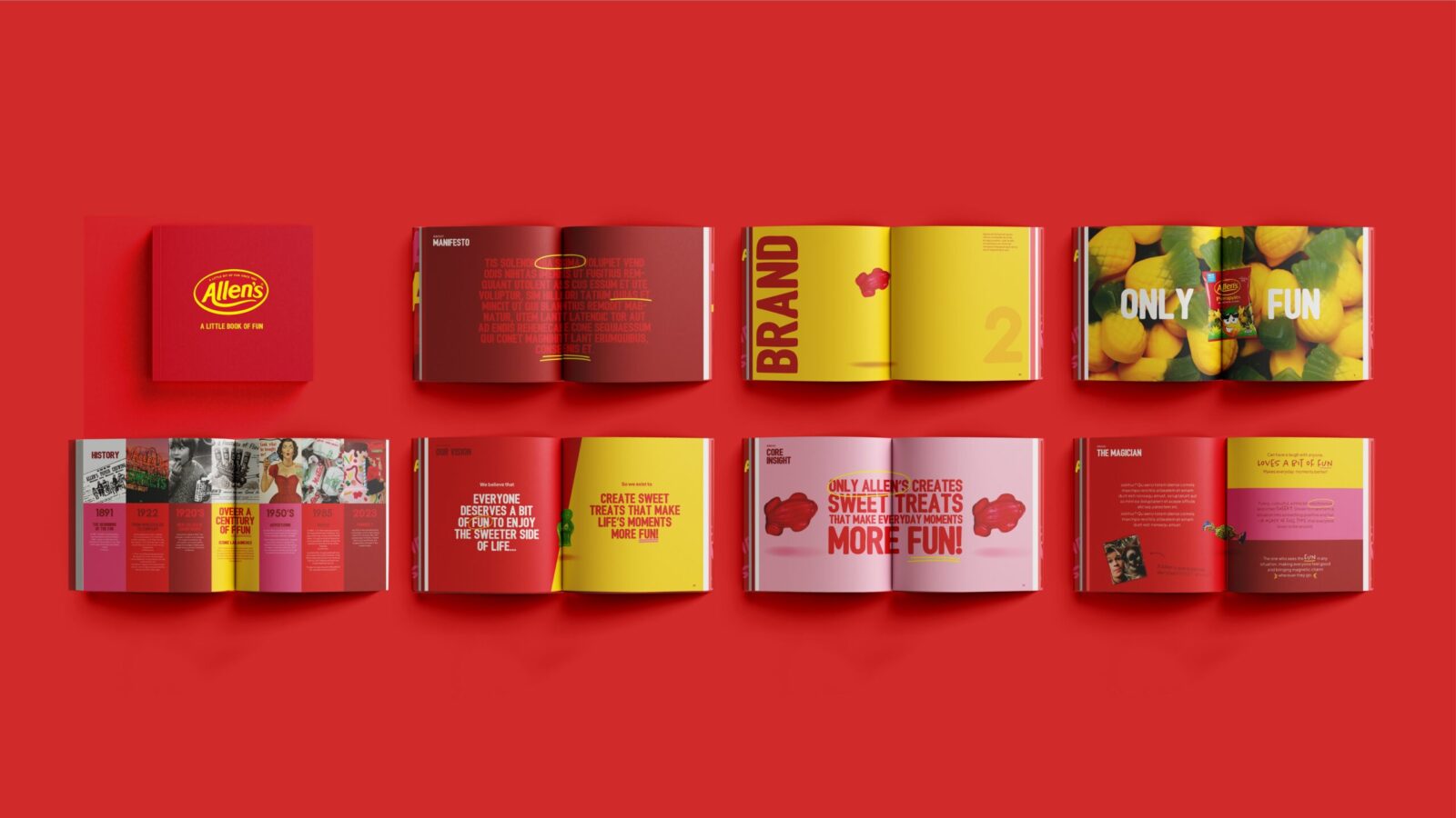
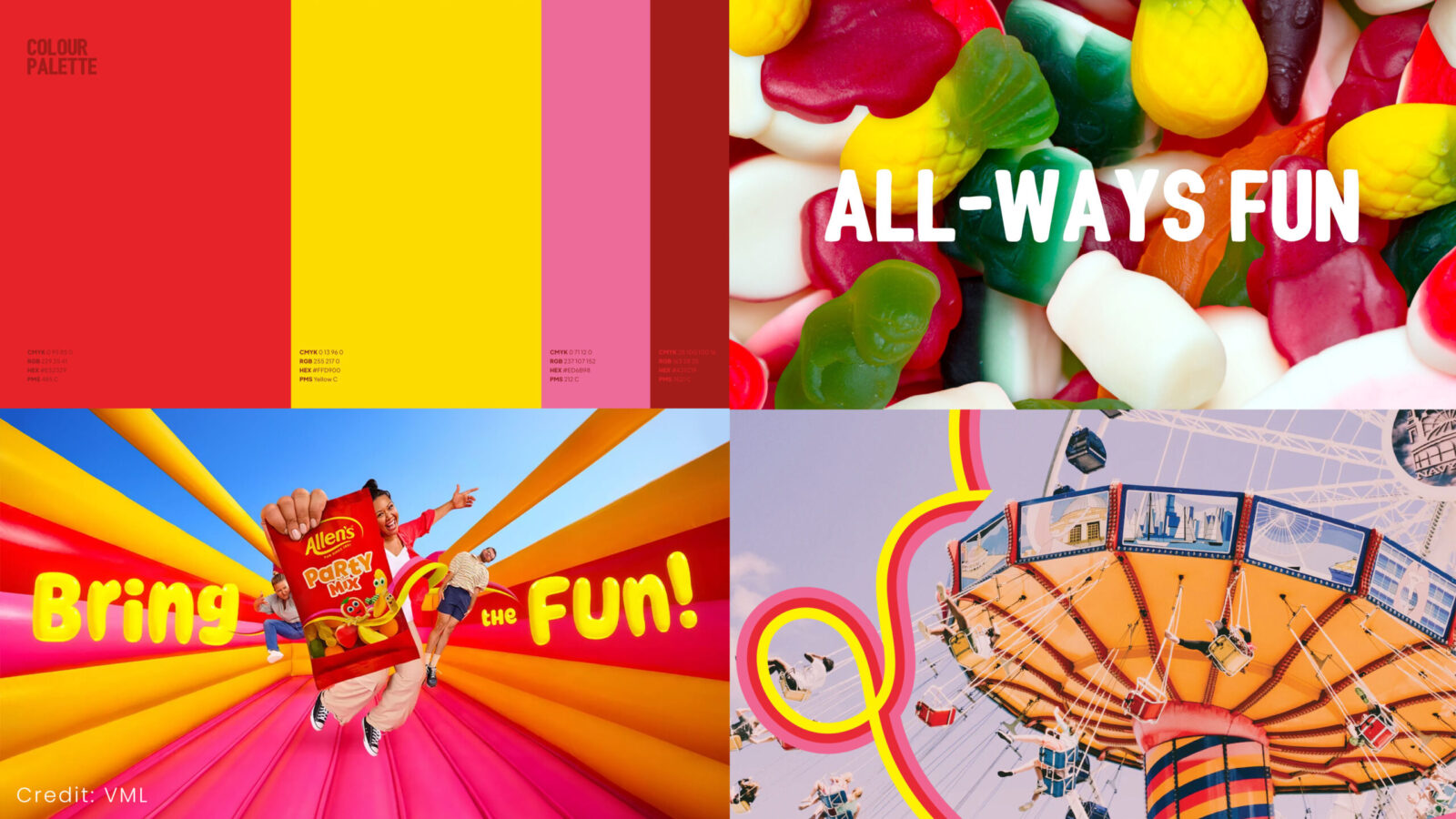
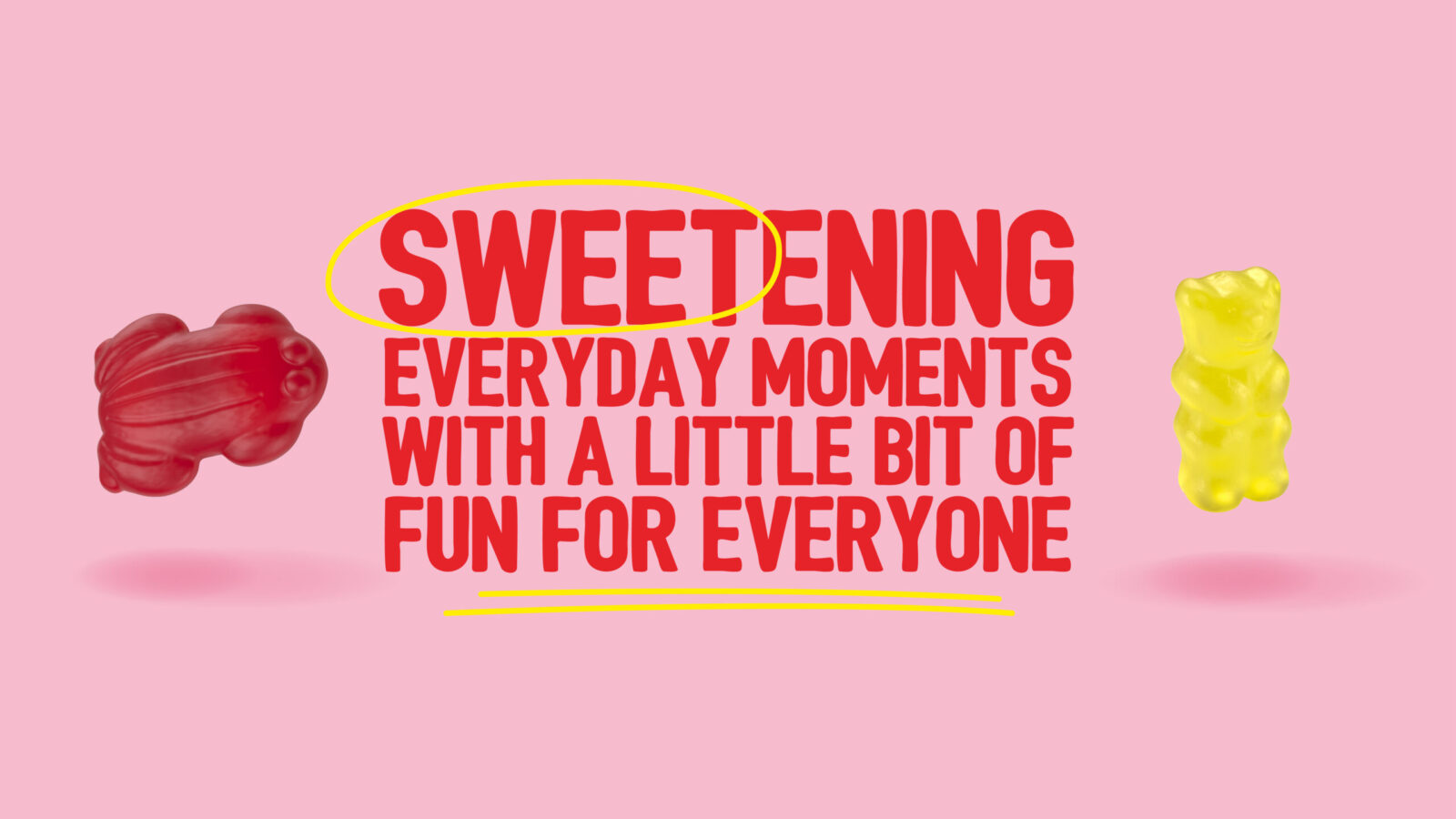
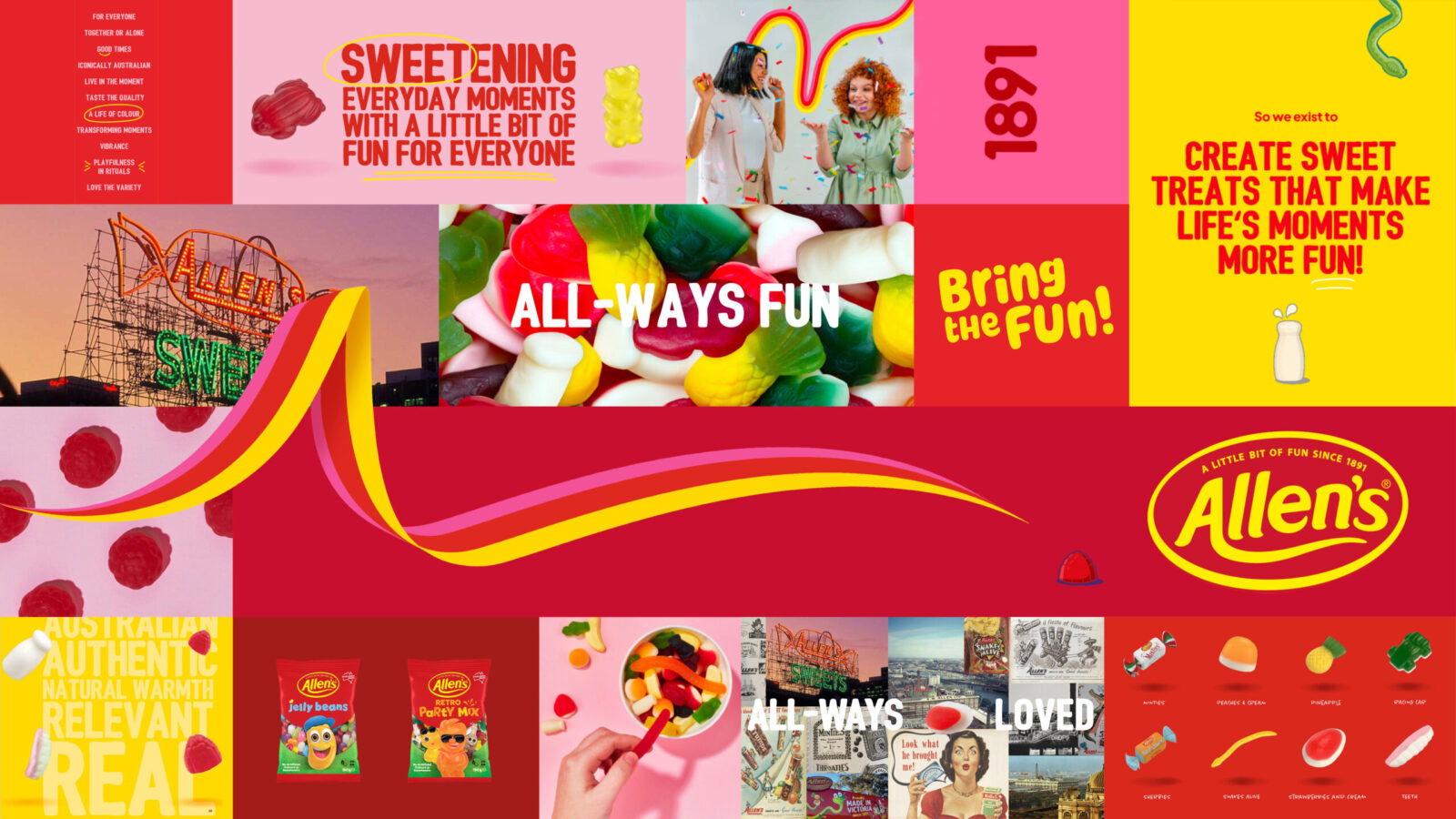
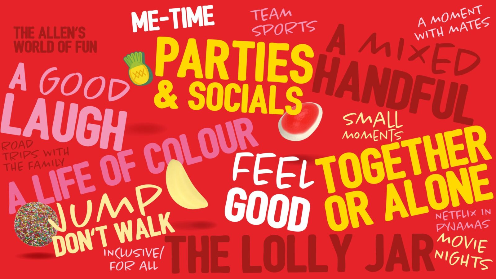
Edison began by interrogating the brand’s rich history and the role it has always played in people’s lives. At the heart of every bag of Allen’s lollies was an invitation for Australians to let a little bit of fun in. From this insight came a new purpose and positioning: Open up your fun side. This was not a borrowed idea of fun but a definition that belonged uniquely to Allen’s. To ensure credibility and cut-through, Edison conducted an exhaustive category audit, mapping every visual code and storytelling device used across the global lolly market. This ensured the new design system would not only stand apart but would embed new distinctive brand assets that could only ever belong to Allen’s.
The Outcome
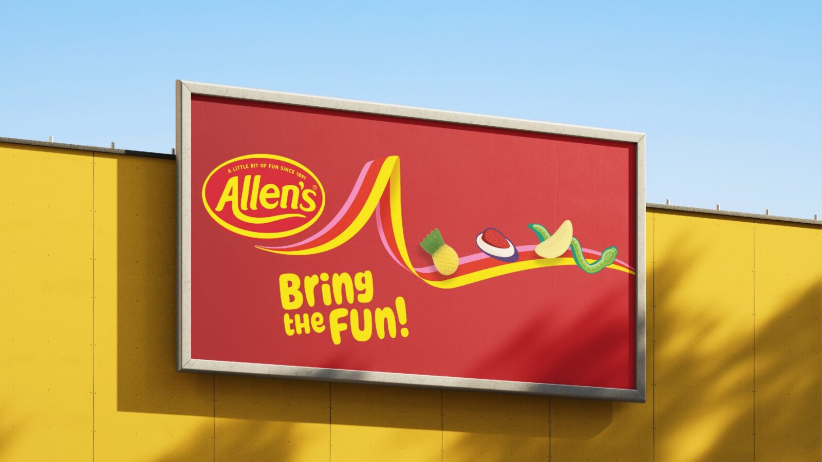
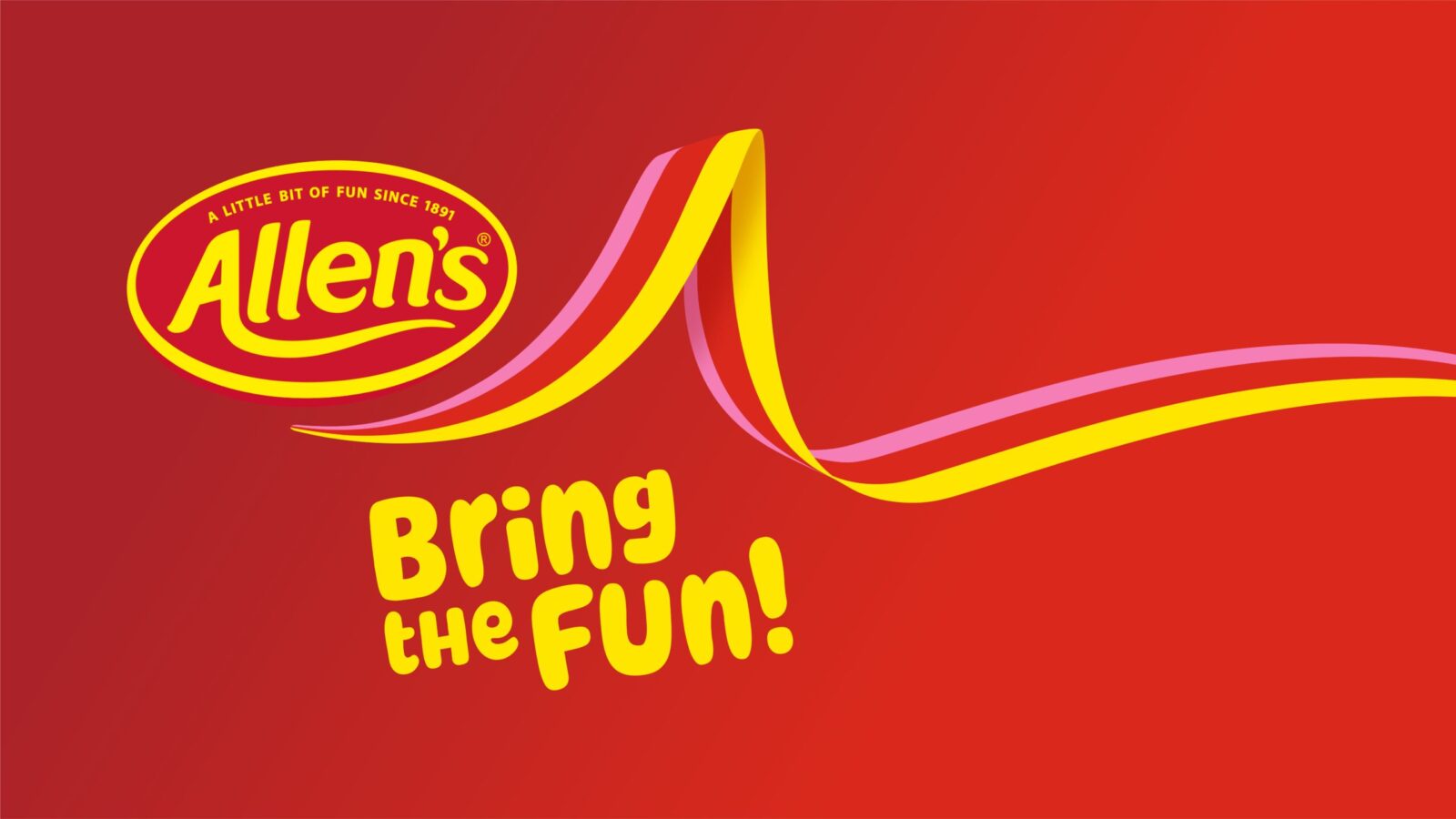
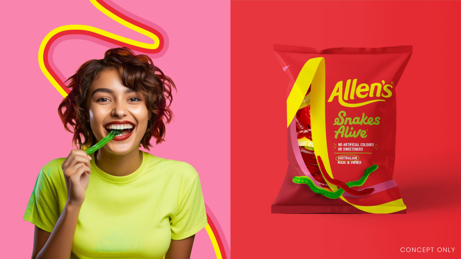
The creative exploration focused on discovering a modern and authentically Australian sense of fun that would resonate with new generations while preserving Allen’s heritage. The solution was a revitalised identity centred on a dynamic new brand asset: the “Fun Side” ribbon. Bursting from the Allen’s logo, the ribbon introduced a flexible and energetic design element that could act as a frame, crop into the signature “A” for Allen’s, or transform into playful shapes and images. It carried colour, movement, and magic into every execution, giving the brand a new language of fun that could flex across packaging, campaigns, and experiences. Alongside this, the identity system was expanded with fresh codes that balanced vibrancy with consistency, ensuring Allen’s could now own its space with confidence.
Results & Impact
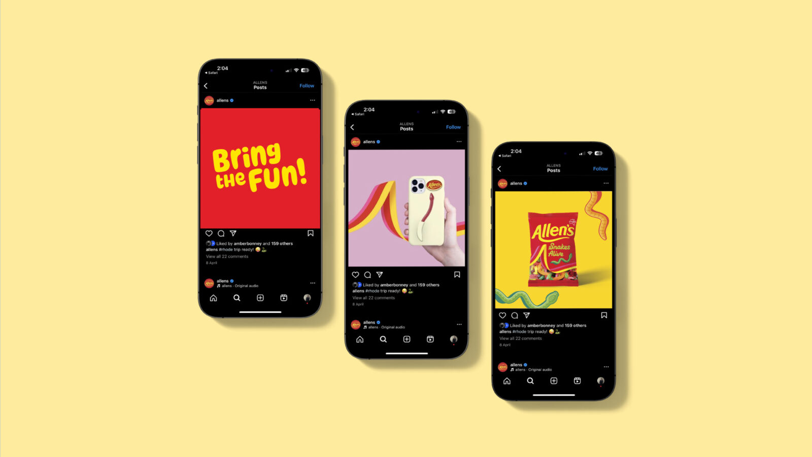
The new brand identity re-established Allen’s as Australia’s definitive lolly brand by reintroducing fun in a way that was clear, distinct, and unmistakably its own. The ribbon has become a unifying brand asset, driving recognition across channels and audiences while offering flexibility for both playful and premium applications. Allen’s is once again positioned as iconic, with a coherent and future-ready design system that reconnects the brand with Australians and ensures it remains a symbol of joy for generations to come.

CREDIT
- Agency/Creative: The Edison Agency
- Article Title: The Edison Agency Transforms Allen’s Into a Culturally Relevant Brand for New Generations
- Organisation/Entity: Agency
- Project Status: Published
- Agency/Creative Country: Australia
- Agency/Creative City: Melbourne
- Market Region: Australia
- Project Deliverables: 2D Design, Brand Design, Brand Guidelines, Brand Identity, Brand Refinement, Brand Strategy, Brand Tone of Voice, Design, Graphic Design, Identity System, Illustration
- Industry: Food/Beverage
- Keywords: WBDS Agency Design Awards 2025/26 Allen's, Confectionary, Lollies, Fun, Iconic, Aussie, Candy, Nestlé, Brand, Refresh, Nostalgia, Treats, Ribbon, Modern, Packaging, Party, Heritage, Playful, Distinctive
-
Credits:
Founder, Principle Creative Director: Amber Bonney
Group Account Director: Niki Beeston
Designer: Caitlin Preyser
Designer: Nicola Crofts
TVC and Out of Home Creative: VML


