The Brief
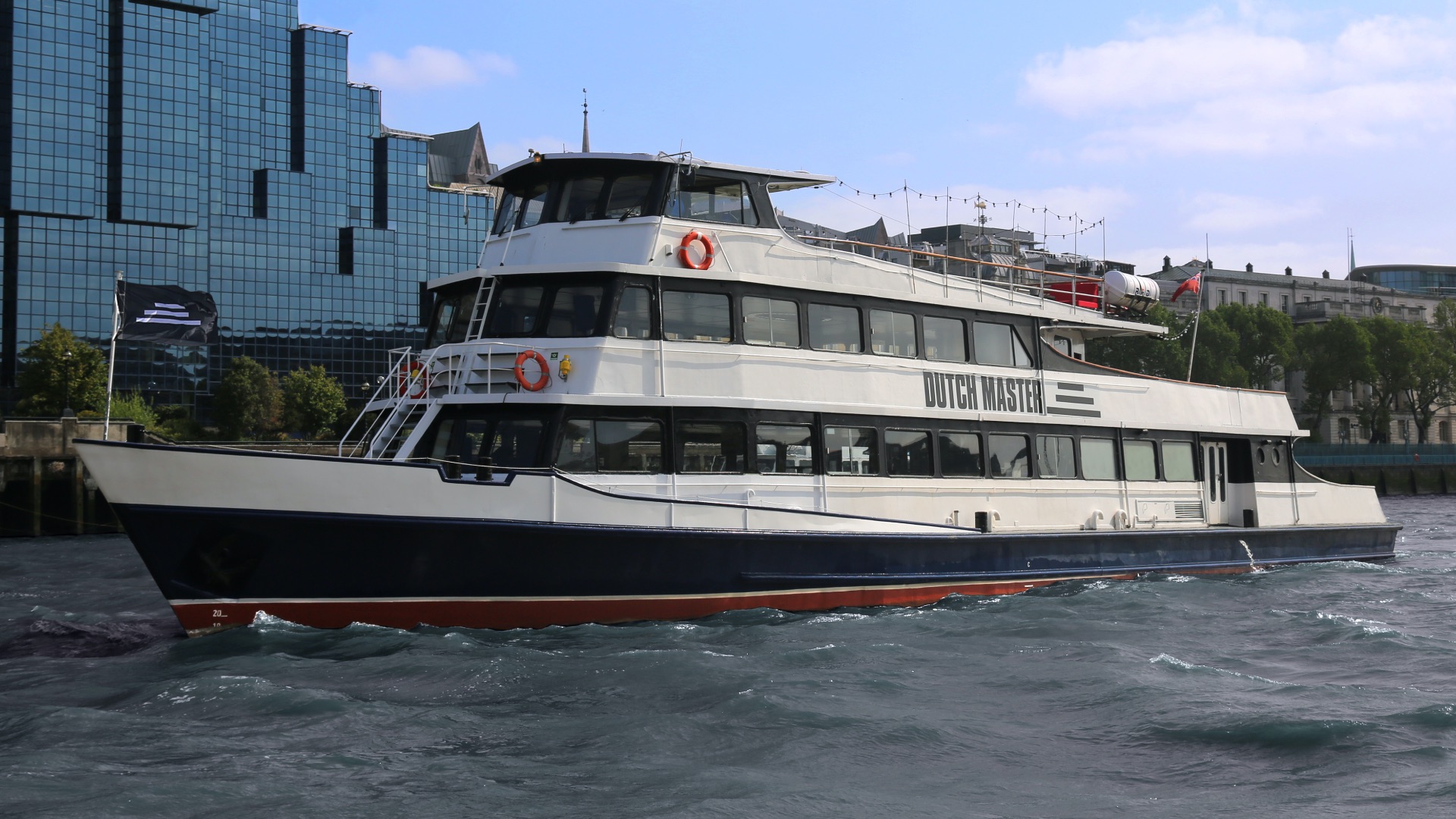
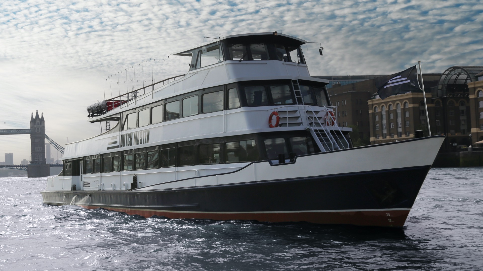
The Dutch Master is London’s largest party boat. She has been in service since 1961 and has hosted internationally renowned DJs and artists. Under new ownership, the Dutch Master has recently had a complete nightclub refurbishment and a change of artistic direction to tailor to less corporate clientele and to attract more clubgoers. The brief was to create an identity for the party boat that made her feel more underground and in line with the lights of Fabric or Ministry of Sound, whilst also hinting at the master element in the name.
The Design
Due to the complete change in target audience, it was decided that a full rebrand was the only way forward. The starting point for this identity was to look back into the history of the boat. The Dutch Master was built in 1961 and to ground the identity within history the typeface ‘Compacta’ was selected. Not only was the typeface created at almost the same period in time as the boat but this heavy domineering font gave precisely the strong master tone to the brand that all of the other elements could work from.
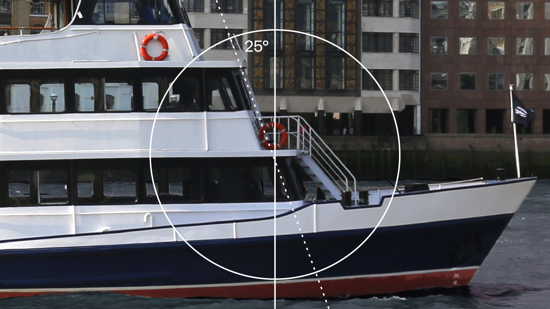
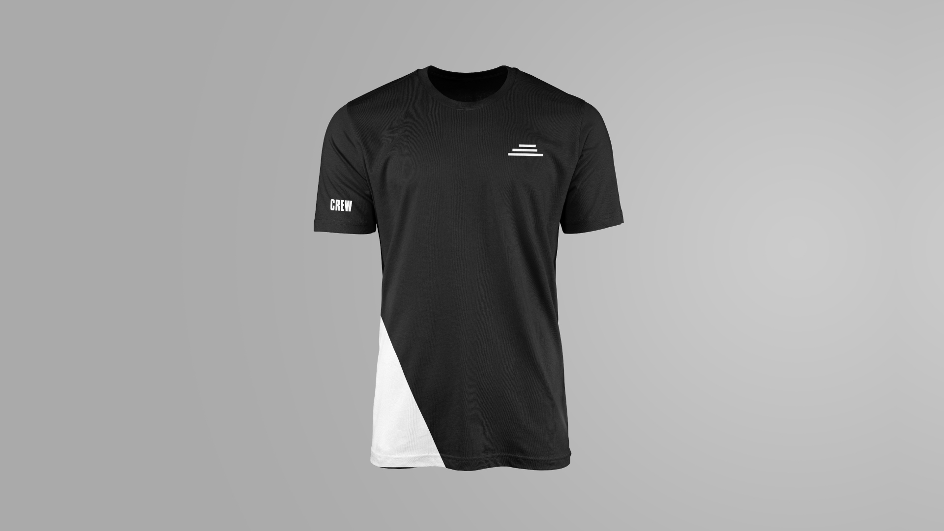
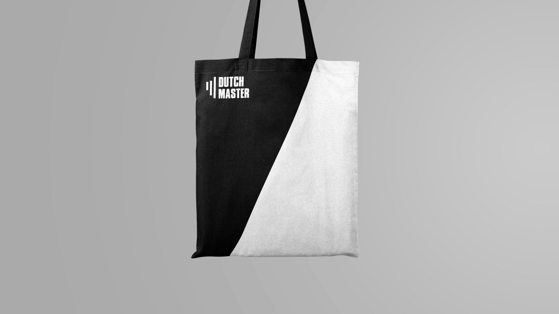
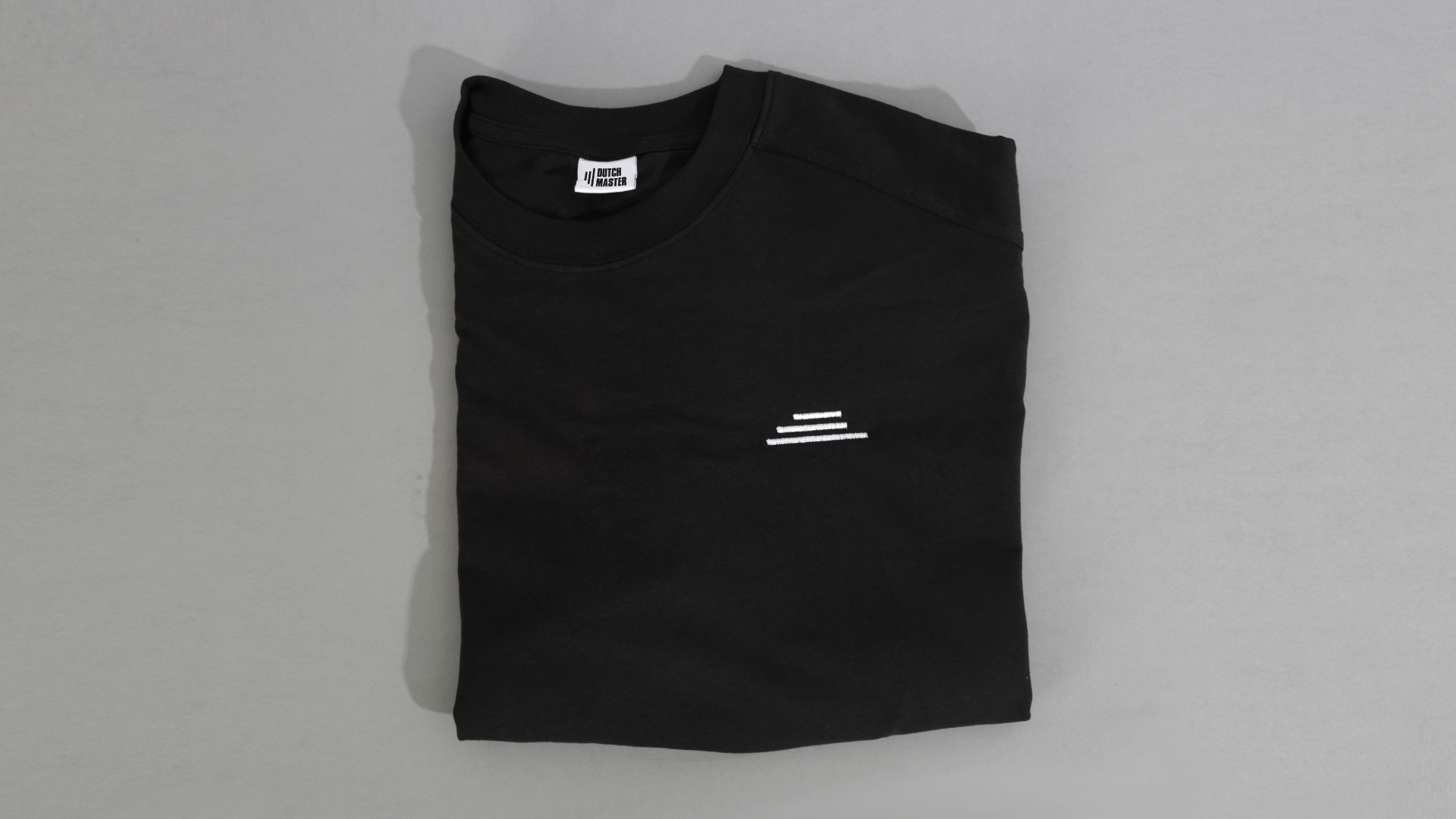
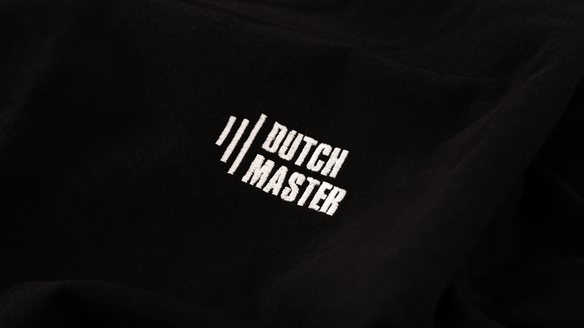
As the boat is the only three-tier vessel in London the mark played off the iconic shape and three bold lines accompanied the typeface in creating the logotype. The 25° front angle of the boat then formed the graphic element to tie the identity together. The angle is used to bind the iconography, livery, website and advertising making it a fully cohesive brand.
The monochromatic colour pallet for the Dutch is the element that gives the brand its underground look and feel. The heavy base pallet for the identity is accompanied by a bright set of highlighting colours that are used sparingly throughout the brand to help subdivide the different offerings of the business.
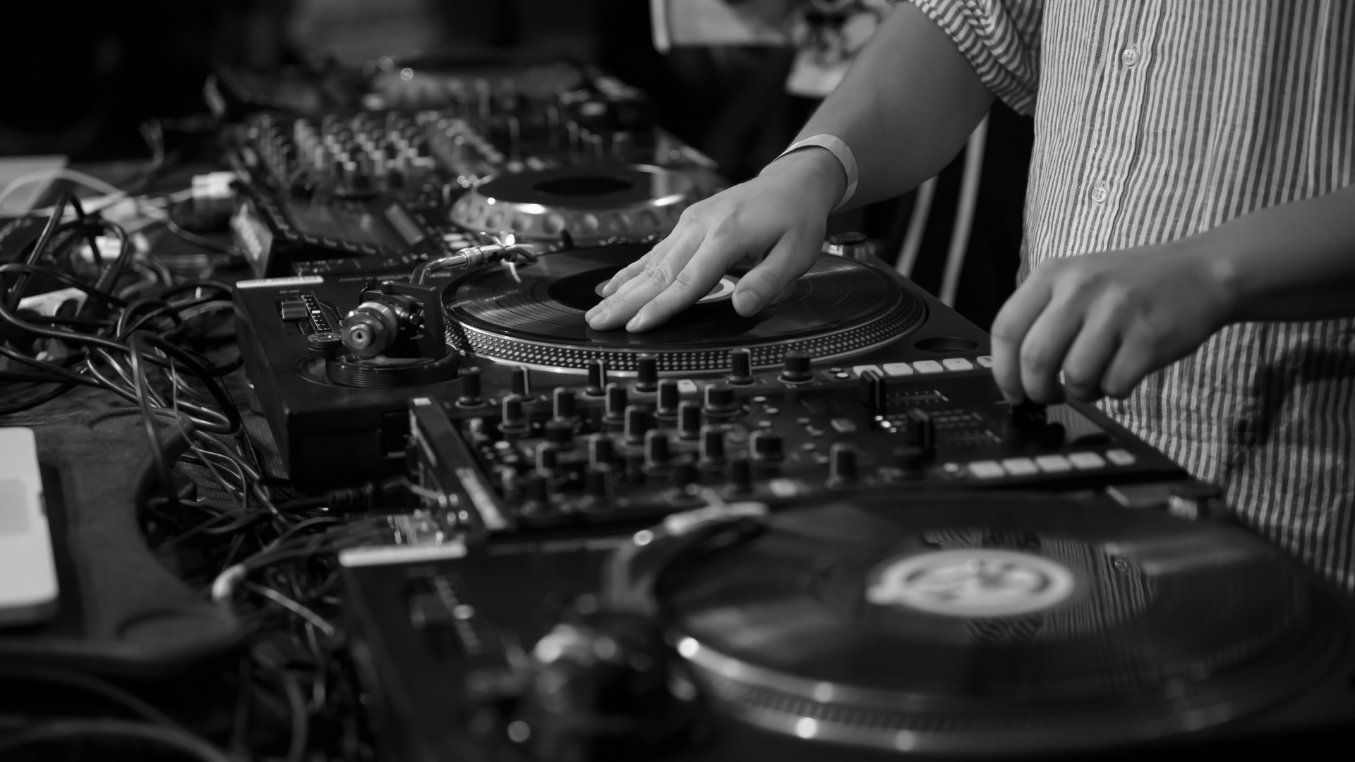
The identity is then brought to life in motion where the connection to underground music and the River Thames is made. Music is the element that is the unsung centrepiece of this identity. Manuel Tur’s 121BPM is the driving force behind this brand. The music is heavy, bold and in places dynamic just as the visual identity is, so securing the rights for this piece of music was essential.
(I would like to thank Manuel Tur, Running Back Records, Cassy, Kwench Records, Jimpster and the Freerange record label for granting the licence to use their music for this identity).
CREDIT
- Agency/Creative: Daniel Britton
- Article Title: The Dutch Master
- Organisation/Entity: Freelance
- Project Type: Identity
- Project Status: Non Published
- Agency/Creative Country: United Kingdom
- Agency/Creative City: London
- Market Region: Europe
- Project Deliverables: Advertising, Animation, Art Direction, Brand Architecture, Brand Creation, Brand Design, Brand Experience, Brand Identity, Brand Mark, Brand Redesign, Brand Strategy, Brand Tone of Voice, Brand World, Branding, Cinematography, Design, Graphic Design, Icon Design, Logo Design, Music, Photography, Retouching, Tone of Voice, User Experience, Web Design
- Industry: Entertainment
- Keywords: Party Boat Rebrand
-
Credits:
Music: Manuel Tur


