Getbrand – EpicaTeasy Branding
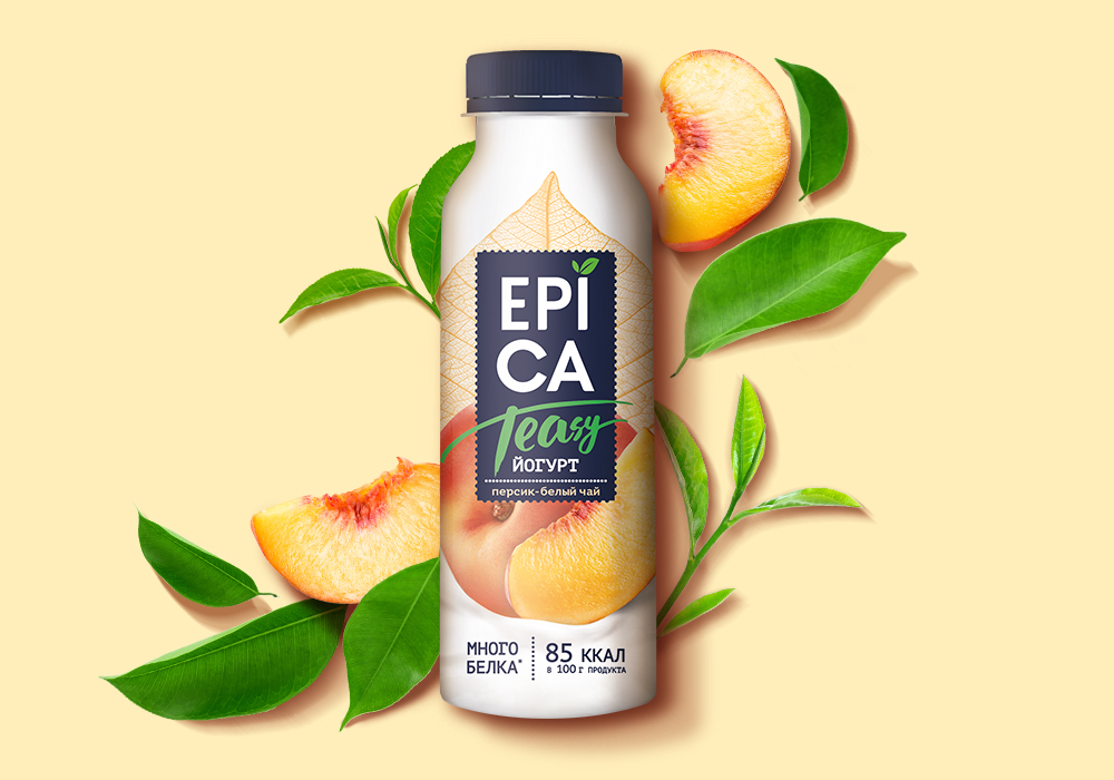
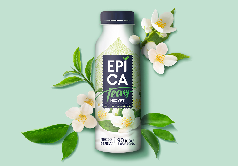
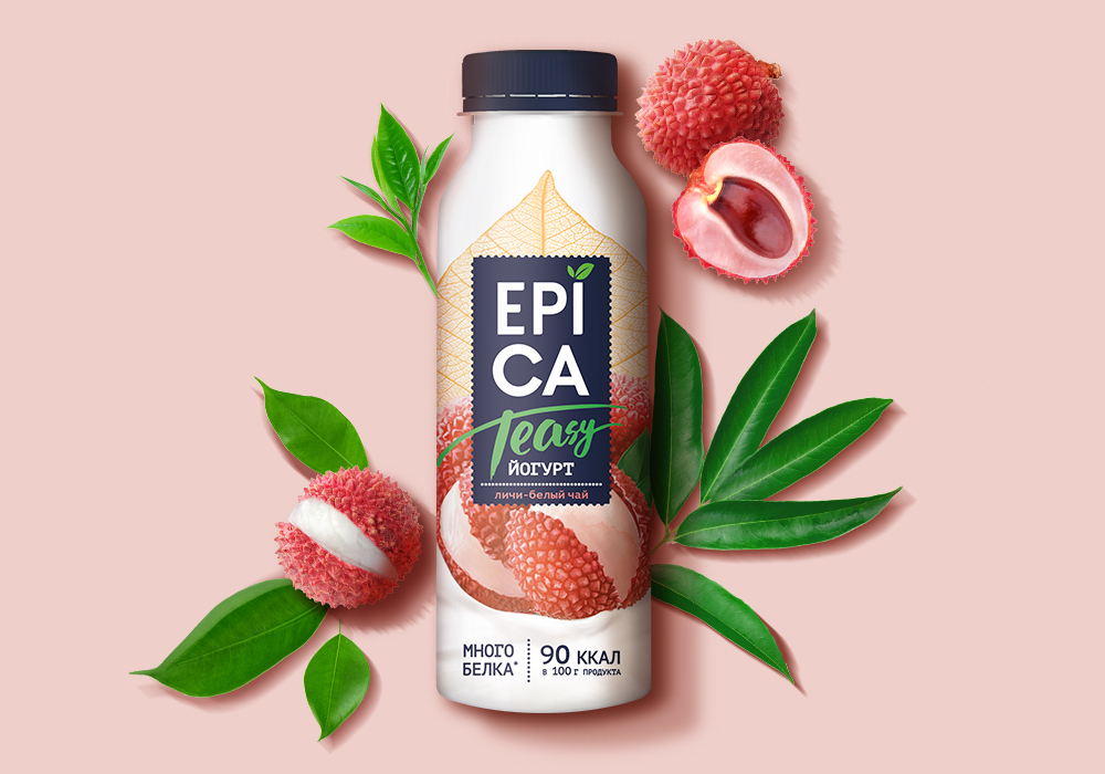
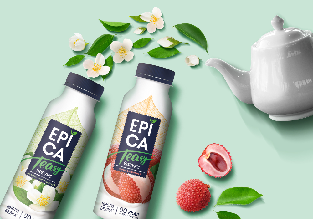
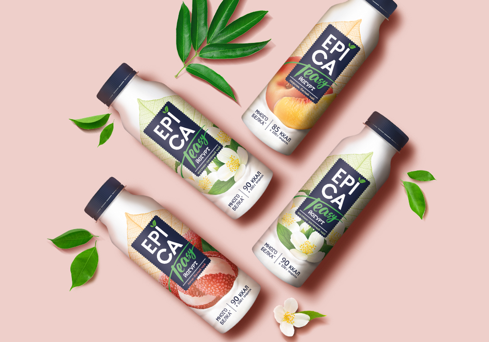
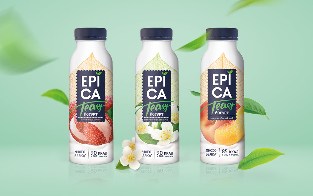
“ Ehrmann decided to make a new sub brand for the Epica line and commissioned us for design and naming.A task:After the success of Epica, Ehrmann decided to expand the line of the successful brand and launched a line of drinking yoghurts with a high protein content and unique tea and fruit flavors. We had to develop design and naming. The new product as well as the main line aimed at modern women who follow trends and choose unusual flavor combinations.Decision:It was important for us to stay within the Epica design, so we kept a branded color palette and brand architecture.White color was and remains a classic for milk packaging, which causes an association of purity and a feeling of freshness. Blue ribbon on a white background is an excellent contrast solution in order to attract the buyer’s attention.The key element of the composition was the image of a tea leaf made in fine and elegant technique. At the bottom of the packaging we placed a composition of fruits and berries, which are used in the product.Memorable naming «Teasy» contains 3 associations: tease, easy, tea.The elegant inscription «Teasy» emphasizes the idea of roduct exclusivity and helps to highlight the sub brand in the main line.The Epica Teasy collection consists of three flavors:Peach – White teaLychee – White teaJasmine – Green teaEpica Teasy – a sub brand, designed to highlight a new direction of taste and functional yogurt in the Epica line. We hope that women will appreciate it because it is a truly exclusive product. And we are proud that we are cooperating with a company that introduces revolutionary tastes among traditional dairy products.”
