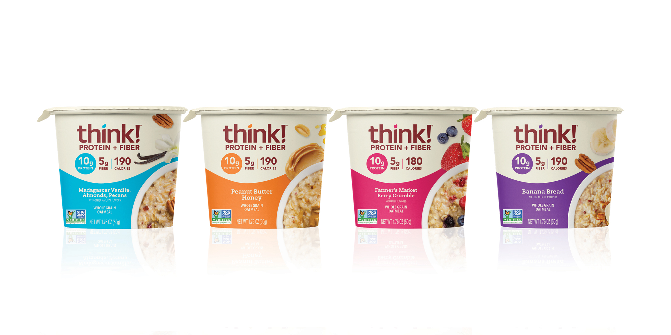
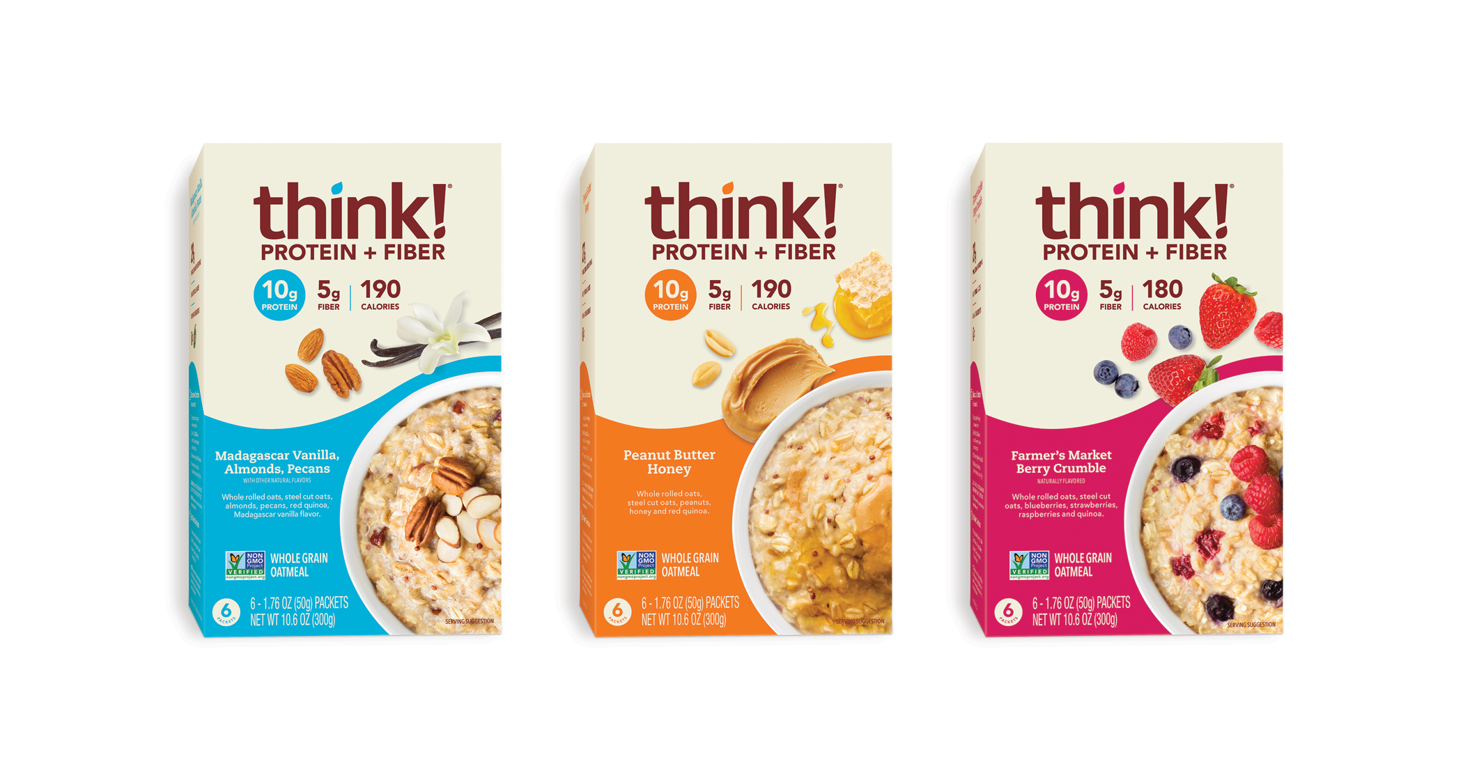
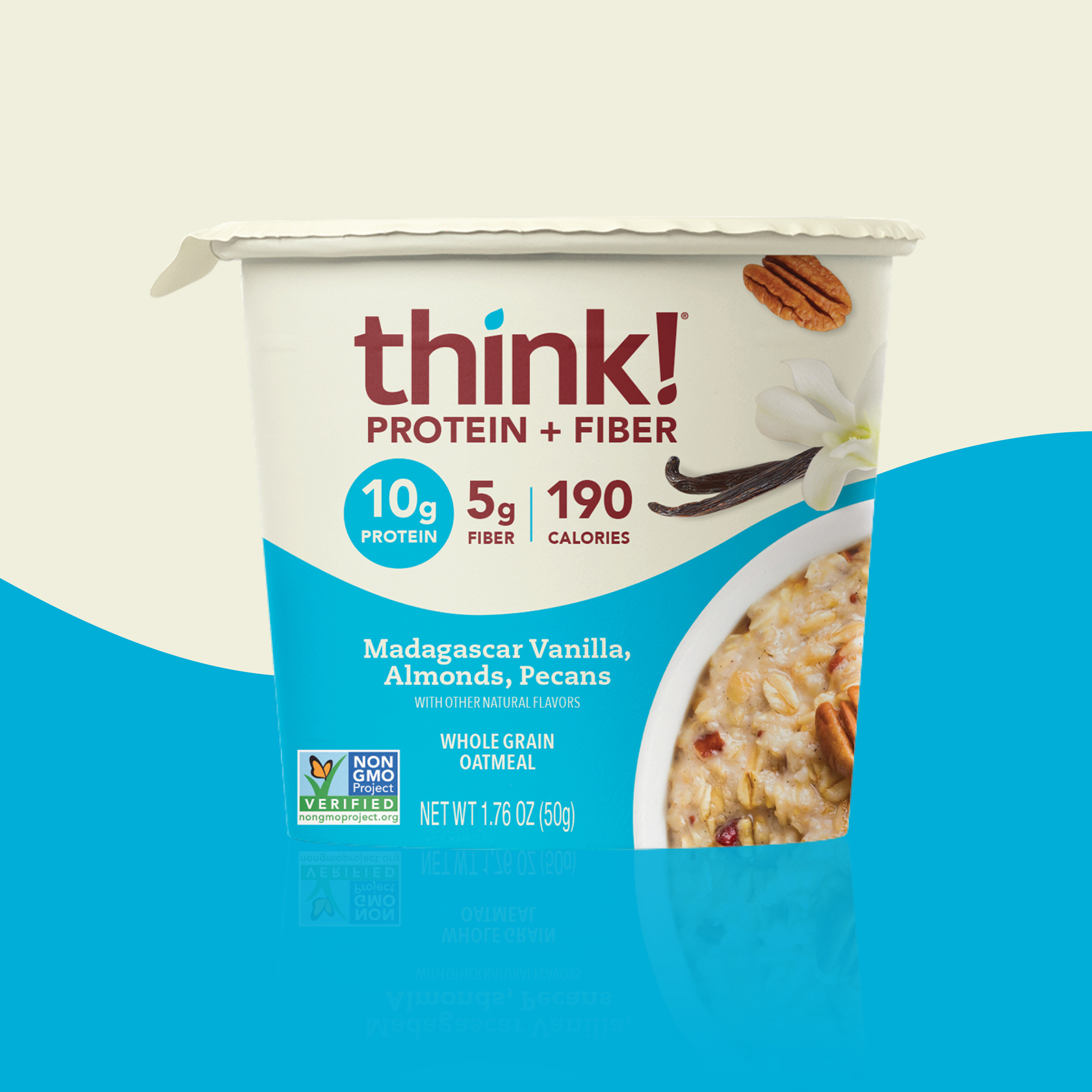
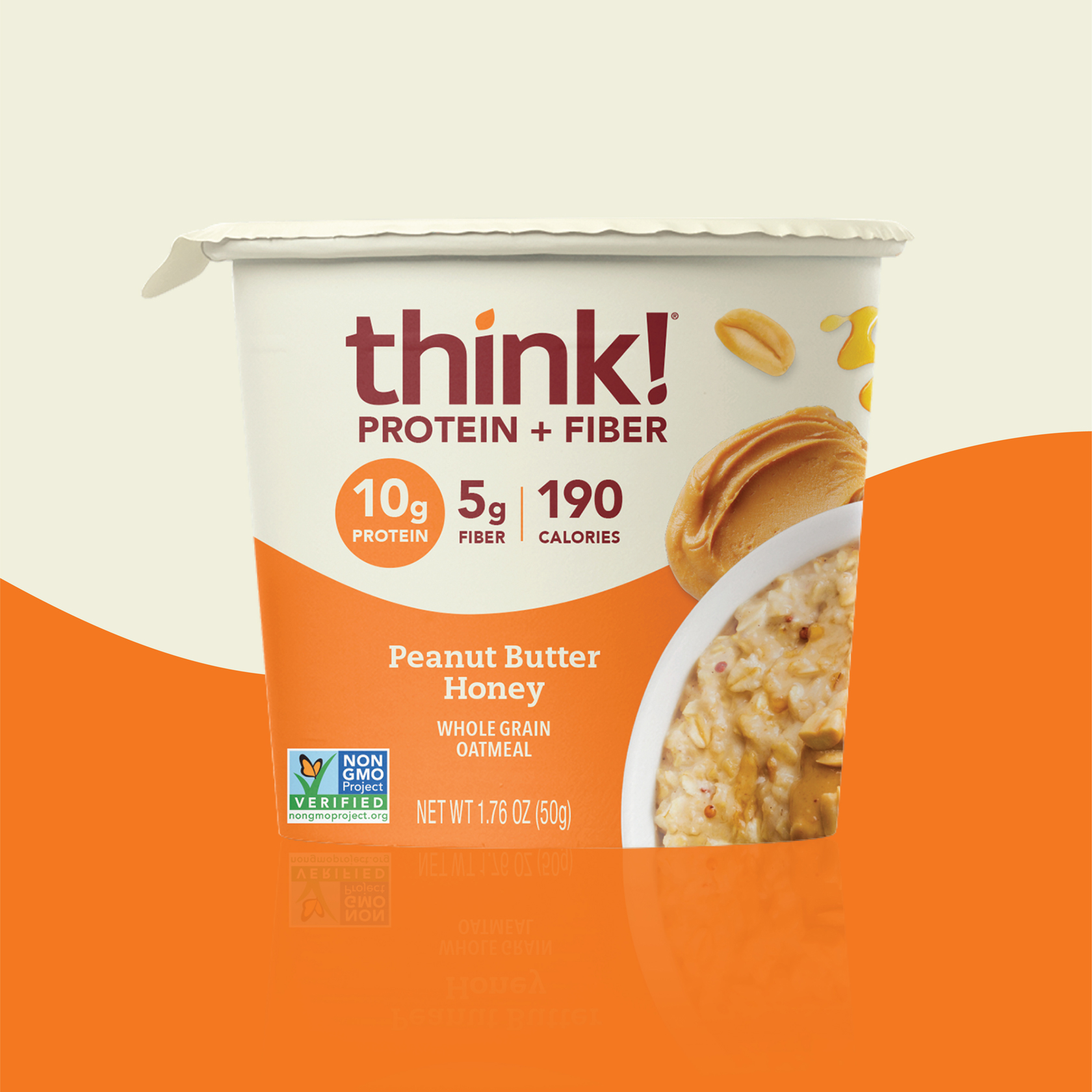
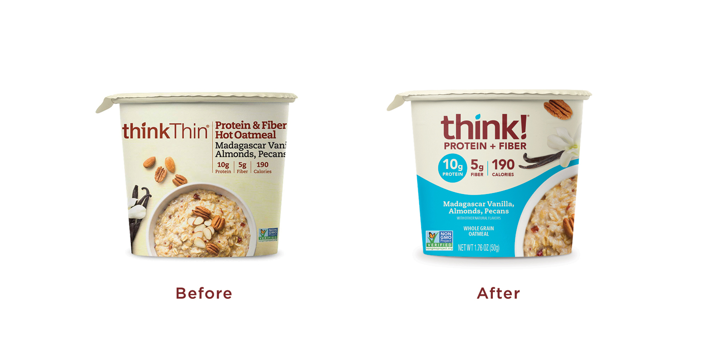
‘Eat well, live well, feel great!’ are words to live by according to health conscious brand, think!® (formerly thinkThin). Following a recent redesign to their famous High Protein Bars, we partnered with think!® to update their line of Protein + Fiber Oatmeal Cups and Cartons. To make this product range look cohesive with the new design, but also stand out independently. The design objective was to integrate their new colourful branding and maximise shelf standout across a range of 4 flavour profiles, 7 SKUs in total: Madagascar Vanilla, Almonds, Pecans
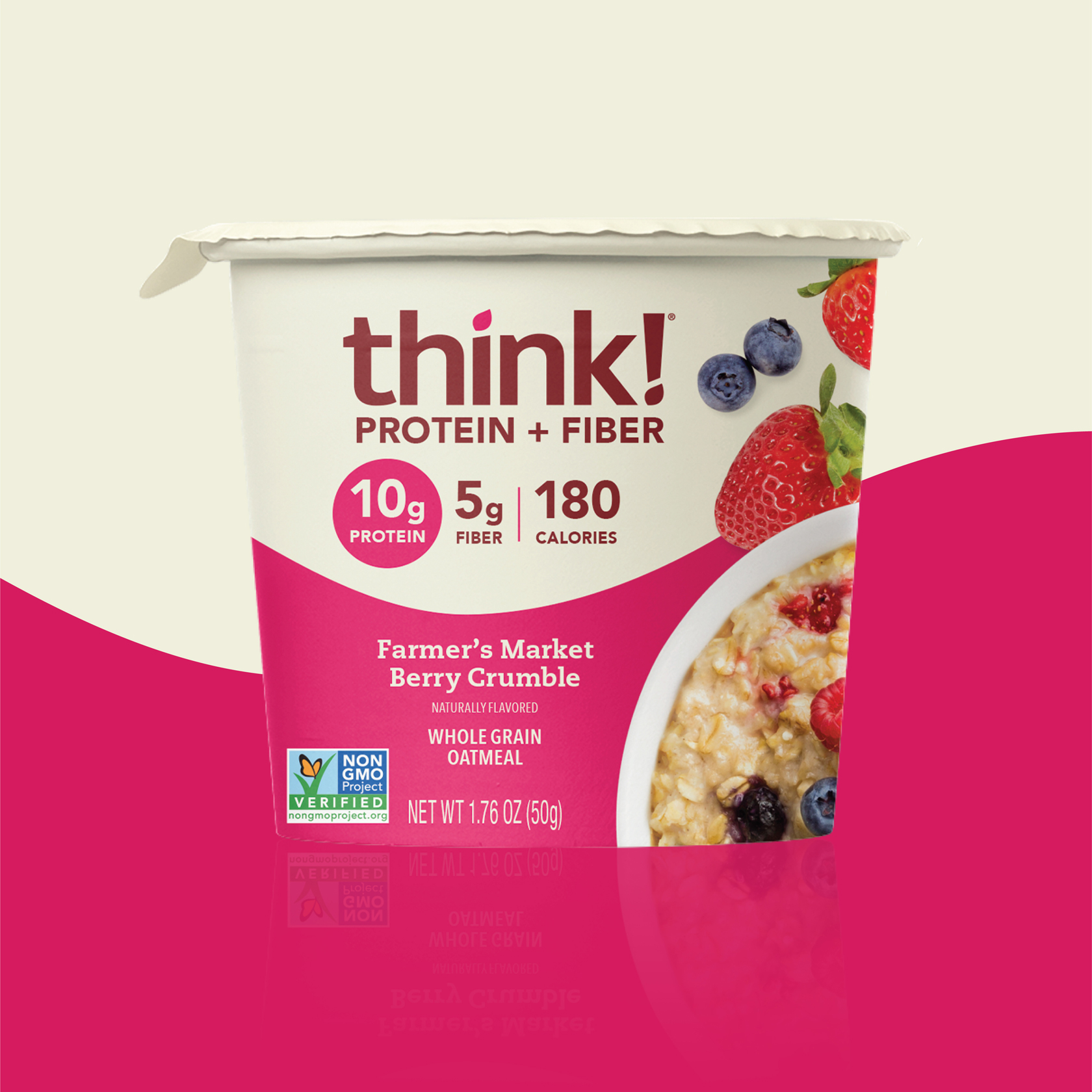
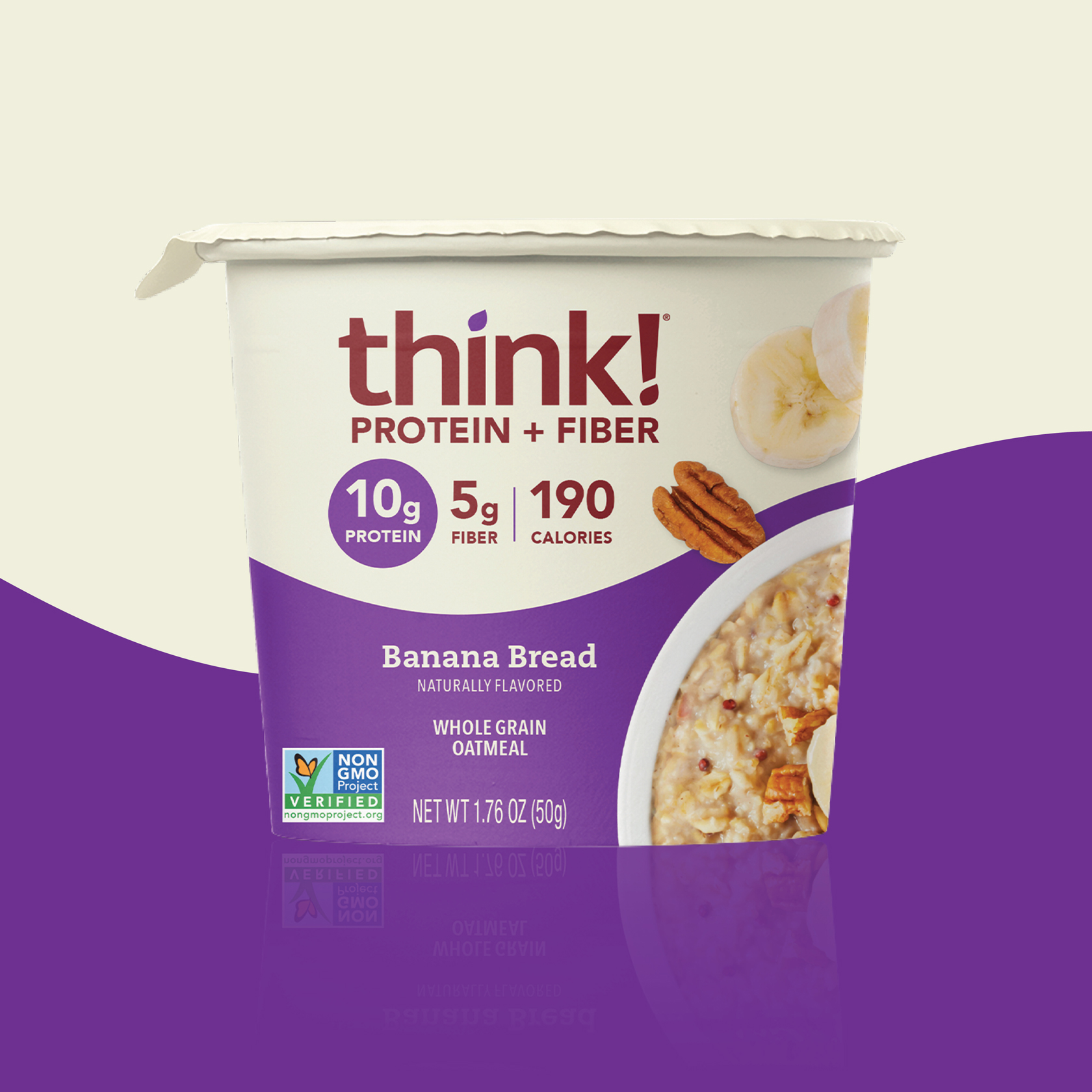
Peanut Butter & Honey, Farmer’s Market Berry Crumble and Banana Bread.
With an influx of healthful Breakfast Oat brands crowding the shelves as of late, think!® wanted to ensure their Oatmeal Cups and Cartons could visually compete on shelf while also highlighting their product’s premium inclusions. In order to entice customers, each product now features beautiful photography of scattered ingredients next to a bowl of warm, freshly prepared oatmeal, giving a quick read on each flavor profile. Bringing extra visual appeal on pack. Additionally, the hierarchy of product attributes and flow of information were revisited with improved prioritization across all 7 Oatmeal SKUs. For example, it was crucial for protein to be highlighted given this is a Protein + Fiber Oatmeal, which now is called out in a circular color-coded holding device. Another big consideration was to distinguish flavor. By utilizing the think!® color wave horizontally, the Oatmeal range is now visually connected through a band of vibrant colors, while also making it visually easier for customers to distinguish flavor. Adding a punch of bold color to the design really helps to make it stand out on shelf and add so much life to the packaging. This eye-catching design delivers renewal and vibrancy to an already tasteful and trusted wellness brand. This modern and bold design is sure to create an impact in the market today and years from now – making it future proof.
CREDIT
- Agency/Creative: The Creative Pack
- Article Title: The Creative Pack Redesign of Think! Fiber and Protein Oatmeal
- Organisation/Entity: Agency, Published Commercial Design
- Project Type: Packaging
- Agency/Creative Country: United States
- Market Region: North America
- Project Deliverables: Brand Architecture, Brand Redesign, Brand Strategy, Brand World, Packaging Design, Product Architecture, Tone of Voice
- Format: Cup, Pouch
- Substrate: Plastic, Pulp Carton


