The Creative Pack – Nekter Juice Bar Grab N’ Go Packaging
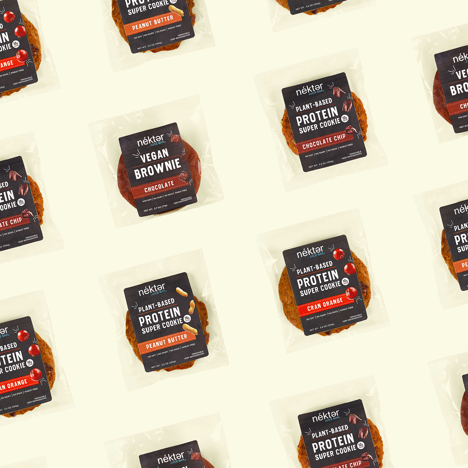
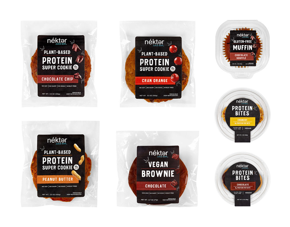
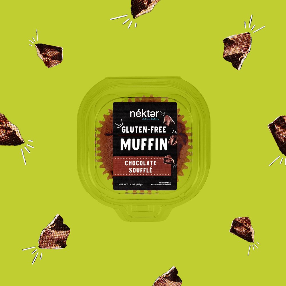
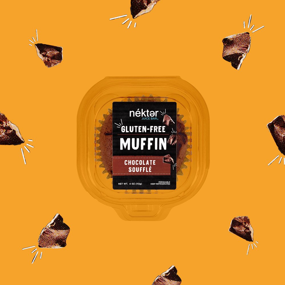
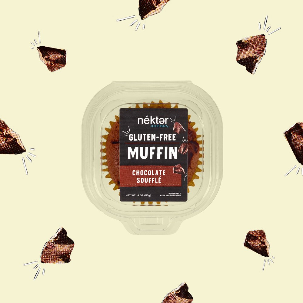
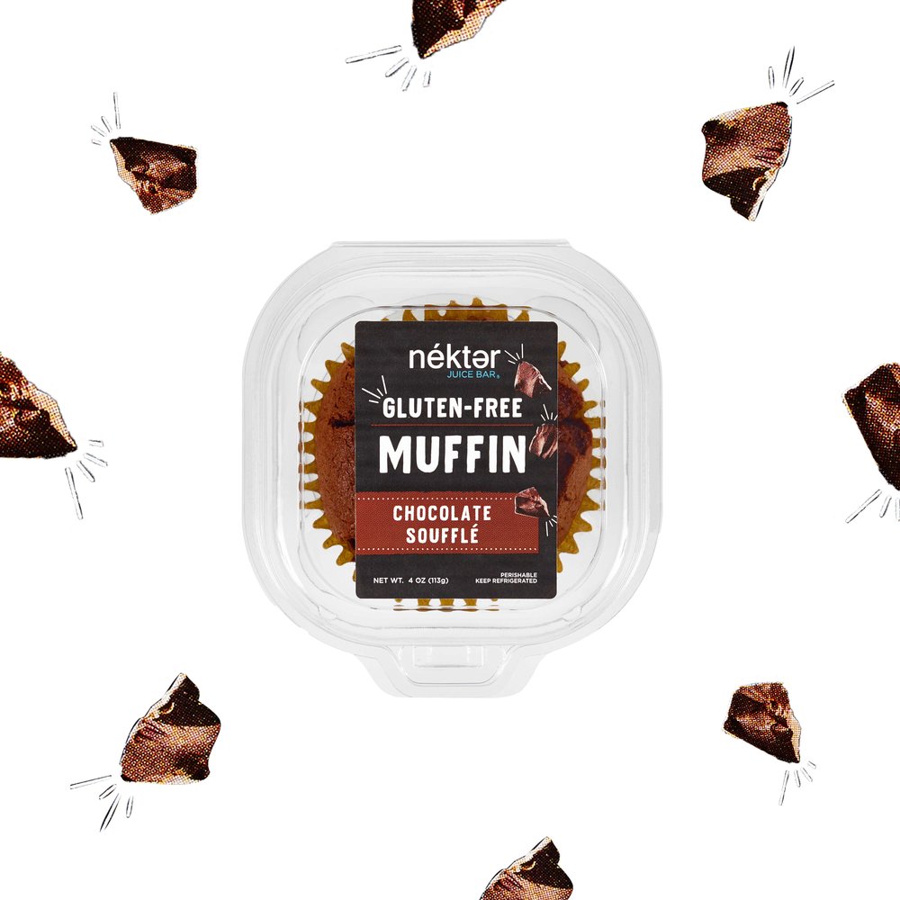
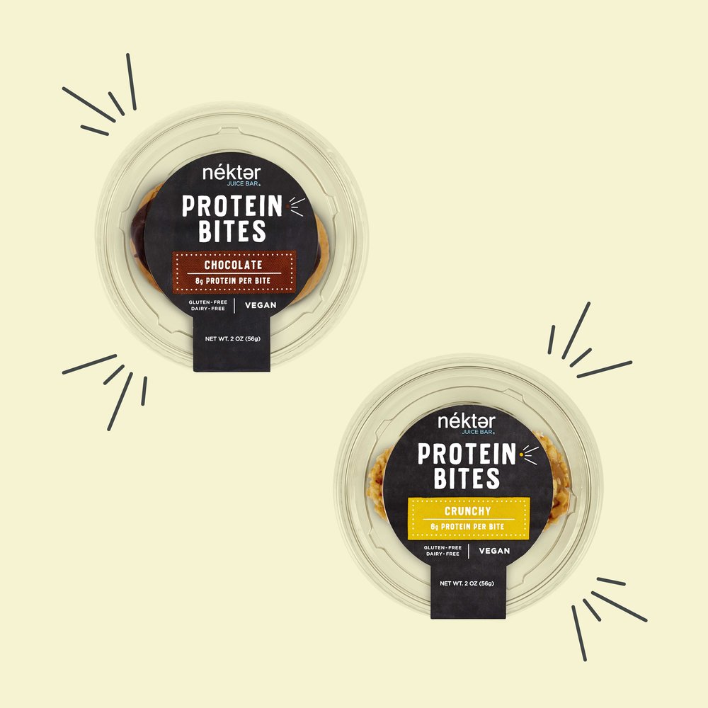
Following a recent brand redesign, Nekter Juice Bar asked The Creative Pack to design their grab n’ go healthy snack packaging to match their fresh new look. Nekter’s branding captures how fun and easy being healthy can be because healthy food can not only tastes good but it feels good too. Using elements found in their new branding, an eye-catching, lively, bold design was created that really pops on shelf and highlights “Living the Nekter Life,”embracing healthy living as a sustainable lifestyle. Like the unique products, the labels were placed in an unexpected slate color background, one of the Nekter’s brand colors. The white typography, doodle embellishments and colored etched tag really pop against the darker background, making the packaging bold and graphic.The doodle details create a more fun and lively design. Nekter’s goal is to easily show how healthy can be affordable, taste good and create ultimate happiness and well-being. It doesn’t have to be serious and boring to do this. The packaging design needed to reflect this attitude. To express this personality and liveliness, the label design has burst details interacting with the product name and ingredient shots to mimic the energy the products would give customers. The dotted white line border and colored line details, not only bring extra life to the design, but also emphasizes certain elements on the labels such as the flavor and healthy product details (plant-based or gluten free). A clear hierarchy of information was made to easily communicate what Nekter’s unconventional products are and the benefits of them. The product title is centered large in their bold handwritten font as if drawn on a chalkboard. It is designed to be the most prominent for easy shop ability. Directly following is the flavor name placed inside a color-coded tag to draw attention to the individual product. The vibrant colors stand out on shelf and correlate to the color of the natural ingredients inside. Photographic scattered ingredient shots aid to easily identify flavors. As if dancing around the packaging, the ingredient shots interact with the drawn embellishments, adding liveliness and personality to the packaging. A crucial part to highlight on the packaging is the is nutritional information that emphasizes the products health benefits – a must-know for Nekter customers. Why should one eat this Protein Super Cookie over a chocolate chip cookie? Free-from callouts like no dairy or wheat free are added across the bottom of the packaging, while the protein levels is given its own circle callout. Nekter’s passion and positive energy towards healthy living is captured in its new bold, fun and fresh packaging. Its friendly and lively design is one that will grab customers’ attention when picking up their favorite smoothie, paving the way to easily start eating healthy. The Results The new grab n’ go packaging can be seen in all Nekter stores.
CREDIT
- Agency/Creative: The Creative Pack
- Article Title: The Creative Pack Designs Fresh And Fun Grab N’ Go Food Packaging For Nekter Juice Bar
- Organisation/Entity: Agency, Published Commercial Design
- Project Type: Packaging
- Agency/Creative Country: United States America
- Market Region: North America
- Format: Clamshell, Sachet
- Substrate: Plastic


