*The phrase ‘Crane in the Sky’ is a literal translation of a Russian idiom that holds the same meaning as the English expression ‘a pie in the sky.’ It signifies something unrealistic or unattainable, often hinting at dreams or aspirations that may never come to fruition.
“The Crane in the Sky” is an ancient order of feathered seers — mystical creatures that have long been the keepers of the secret knowledge of the future. For centuries, these enigmatic beings have invisibly safeguarded the peace of humanity, guiding individuals along the right path through intricate signs and omens that only the most astute can decipher. The wisest among humankind have long discerned that these birds are not as simple as they may outwardly appear. With considerable accuracy and remarkable insight, they have described the principles of this mysterious organization in superstition and folklore that have endured through generations. It is time for these clairvoyant birds to lift the veil of secrecy that has shrouded them for so long and to finally introduce themselves to their earthly brethren, illuminating their profound wisdom and insights.
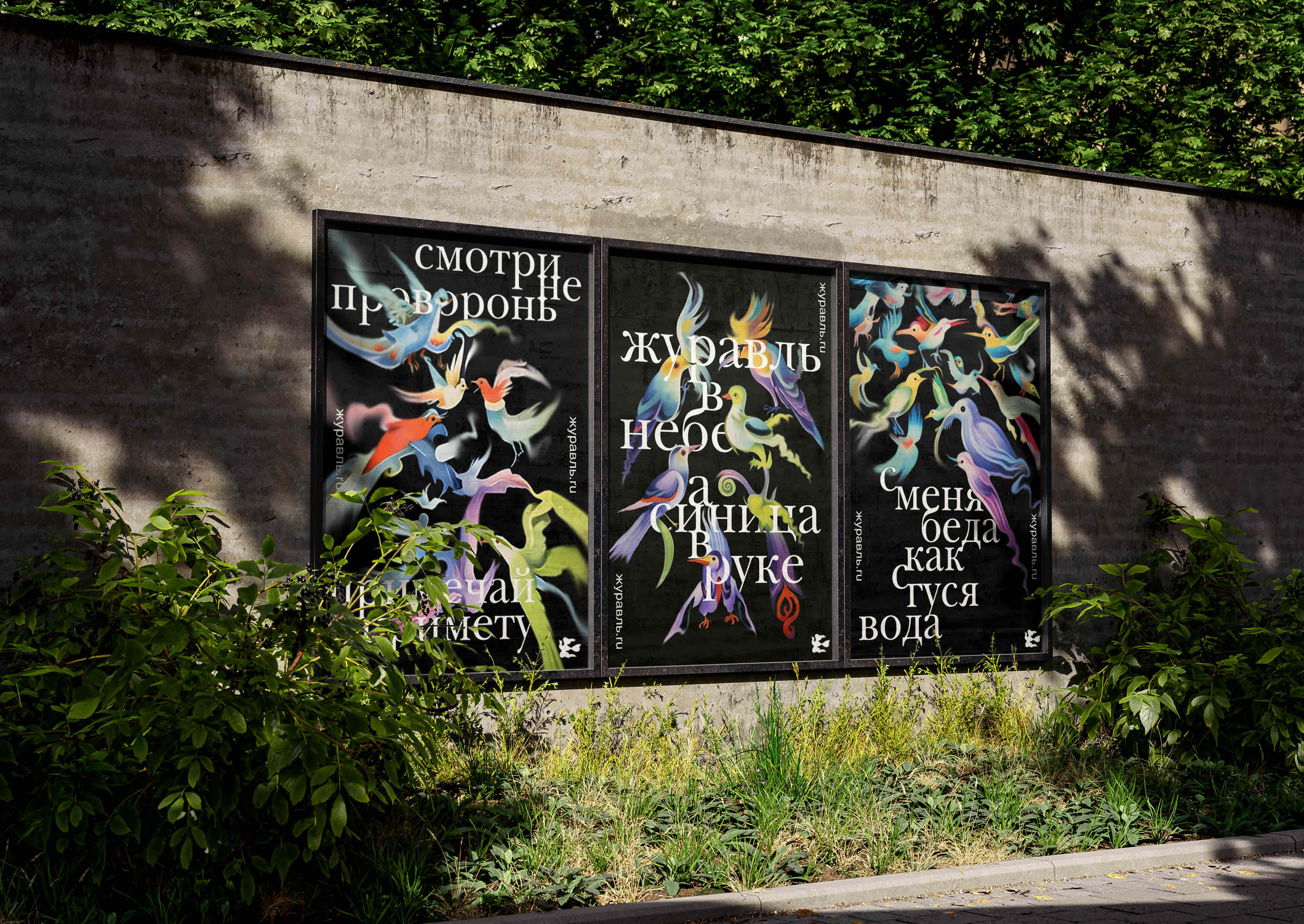
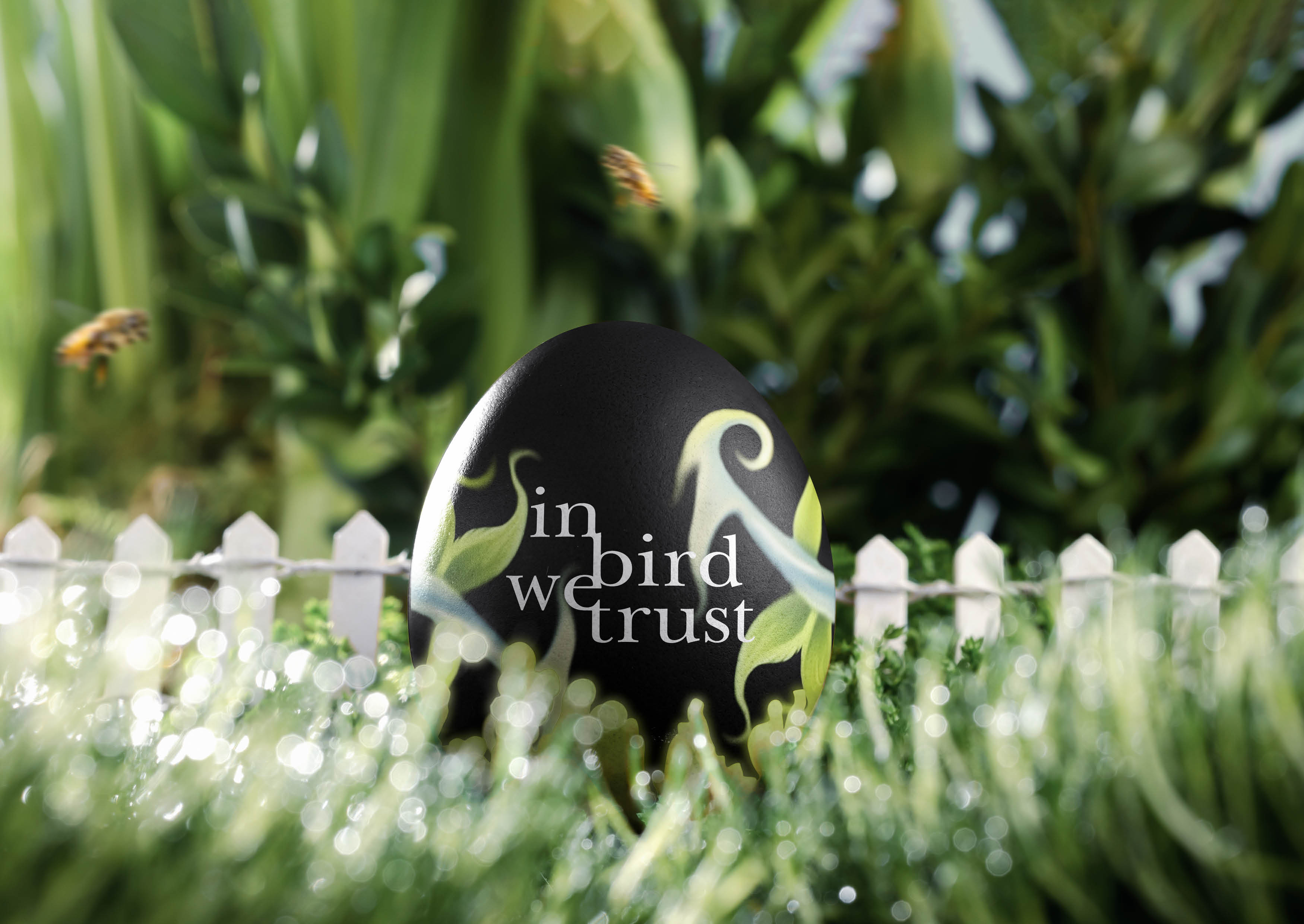
The project embodies a compelling visual style through a captivating dialogue between tradition and modernity. The use of antiquarian typefaces, adorned with elegant ligatures, evokes a deep sense of antiquity while simultaneously symbolizing the unity of birds that yearn to help humanity thrive. This typography provides a tactile connection to history, reminding us of the timeless nature of storytelling and knowledge.
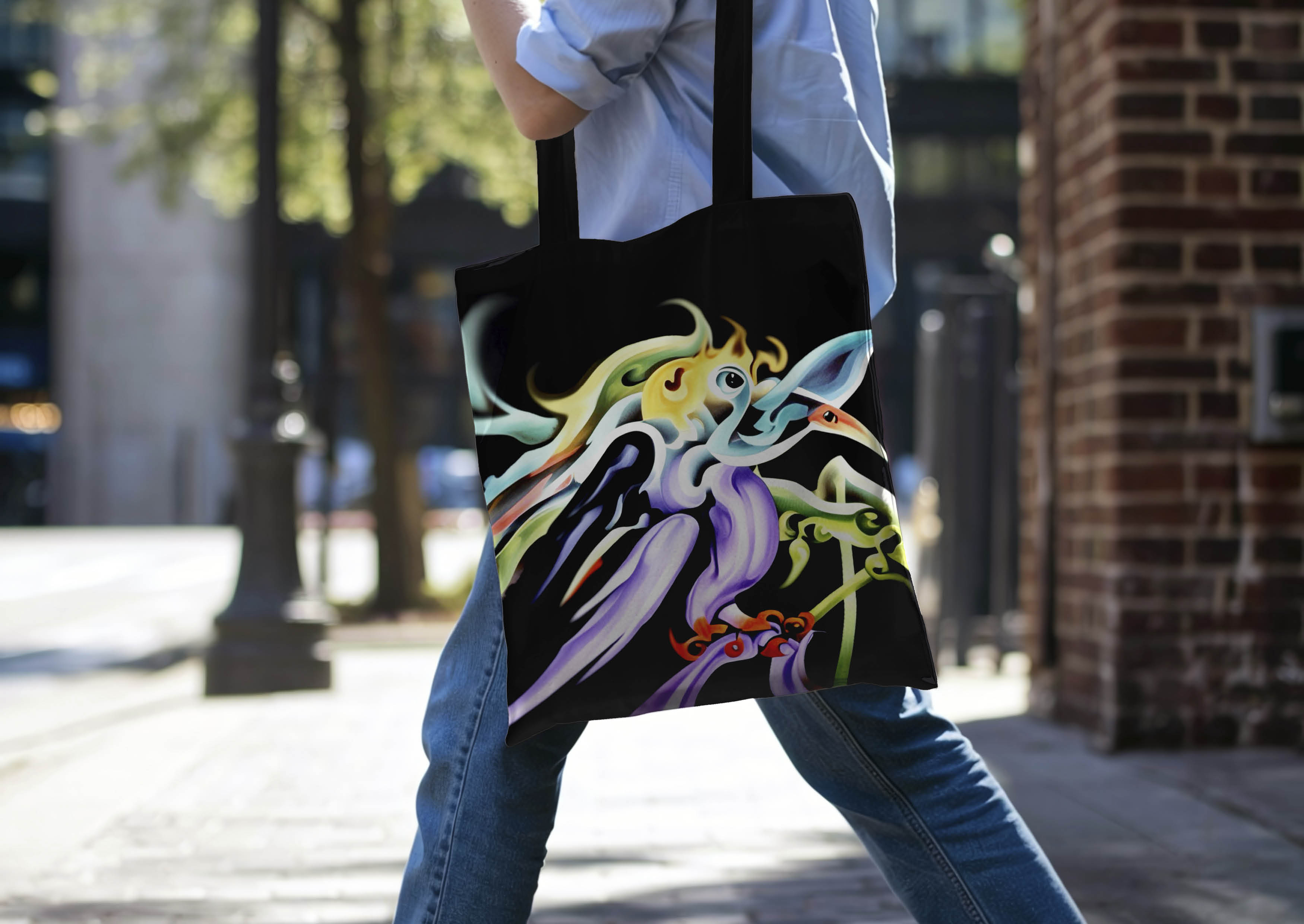
Neural network graphics serve as a modern counterpart, beautifully blurring the boundaries of reality and fantasy. These graphics create a layered, mystical collective image of birds – vivid, fluid, and changeable, capturing the essence of their ethereal nature. The integration of such technology highlights the interplay between the past and the future.
Moreover, the interaction of text and illustrations breathes life into these mythologized birds balancing between specificity and imagination. This dynamic relationship allows them to exist in a liminal space that straddles the realms of the real and the imaginary. As they engage with this work, audiences are encouraged to ponder the deeper meanings behind the imagery and the stories that unfold, discovering a world where dreams, aspirations, and the natural world intersect in a harmonious and thought-provoking manner.


CREDIT
- Agency/Creative: Veronika Kiseleva
- Article Title: “The Crane in the Sky” Student Brand Identity that Balances Reality and Fantasy with Neural Network Graphics and Antique Fonts
- Organisation/Entity: Student
- Project Type: Graphic
- Project Status: Published
- Agency/Creative Country: Russia
- Agency/Creative City: -
- Market Region: Global
- Project Deliverables: 2D Design, Art, Brand Creation, Brand Design, Brand Identity, Branding, Design, Graphic Design
- Industry: Entertainment
- Keywords: birds, misticism, ai, superstition
-
Credits:
Designer: Veronika Kiseleva
Tutor: Yaroslav Subbotin
University: HSE ART & DESIGN SCHOOL


