Some brands and industries have stood the test of time, and periods of national economic challenges, and have not only survived but flourished. These corporations right from inception have played a fundamental part in building India over several decades and have become the backbone of the Indian economy.
While the last decade has been the decade of startups, and app-based services have become the ‘pop culture’ of business and journalistic efforts, these legacy brands, while being the crucial drivers of the economy, have suffered disproportionally in terms of media coverage.
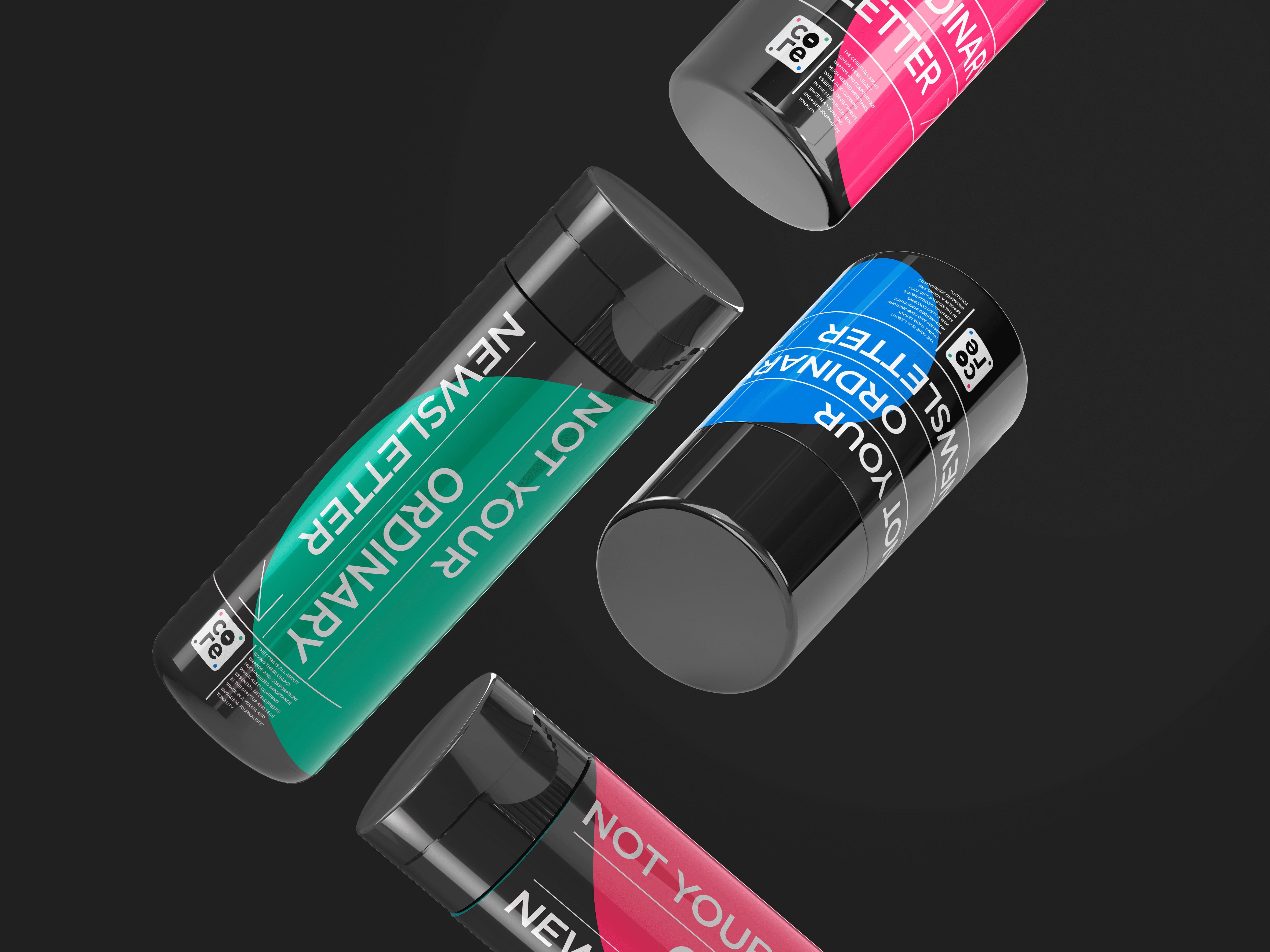
The Core is all about giving these legacy brands and corporations much-needed importance, while also covering essential developments in the startup and tech space in a young and engaging journalistic tonality.
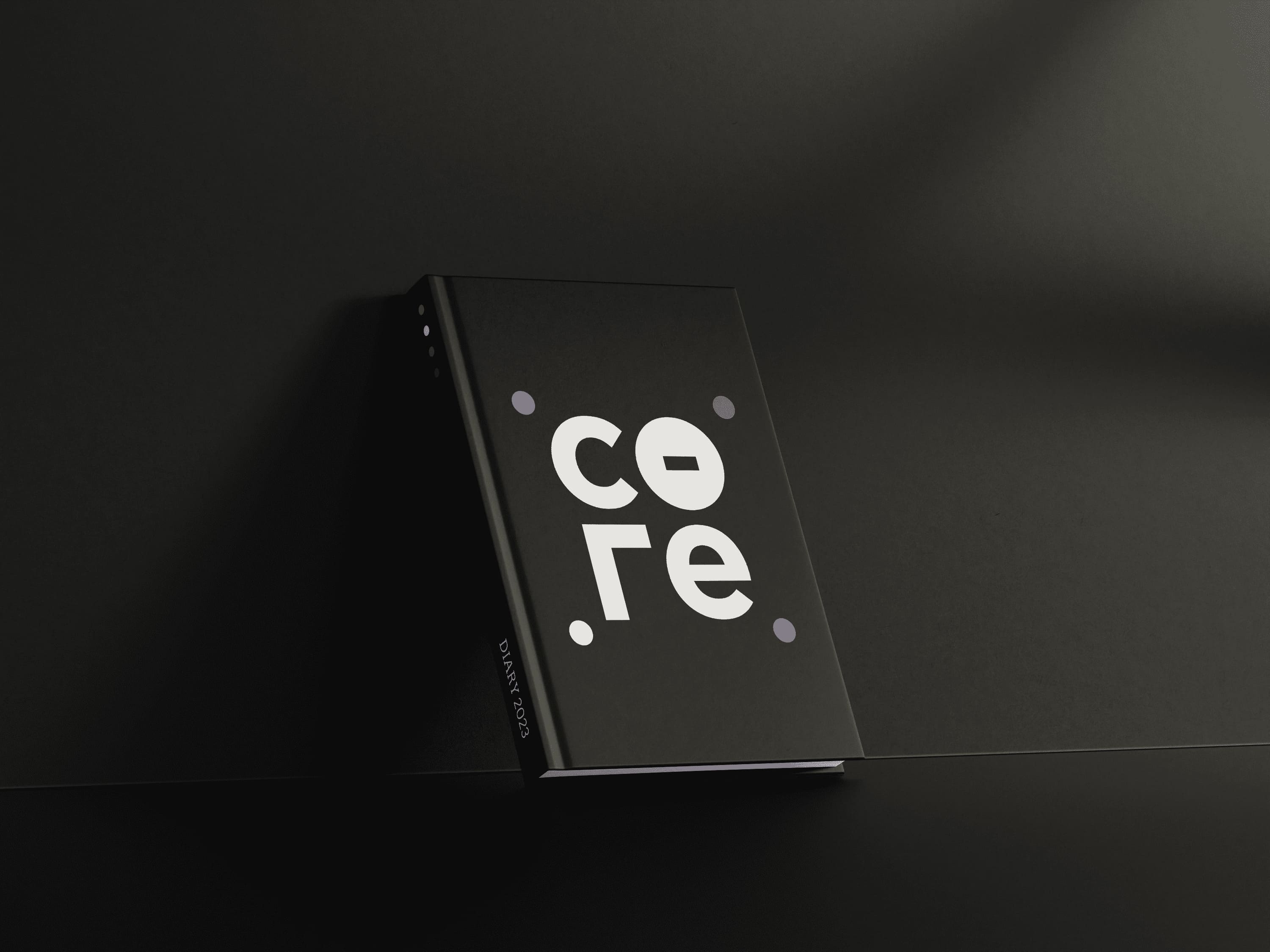
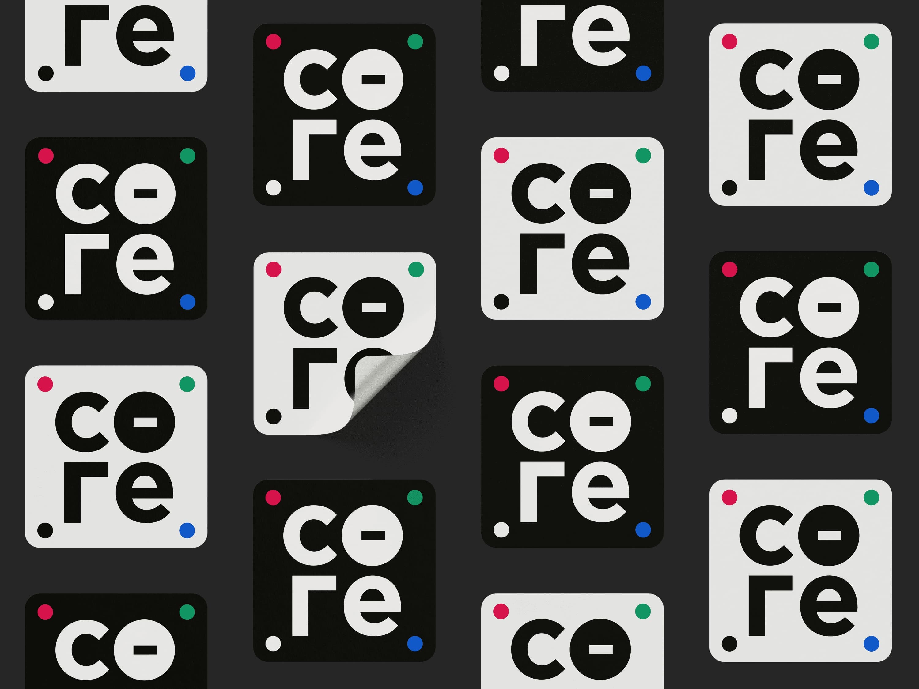
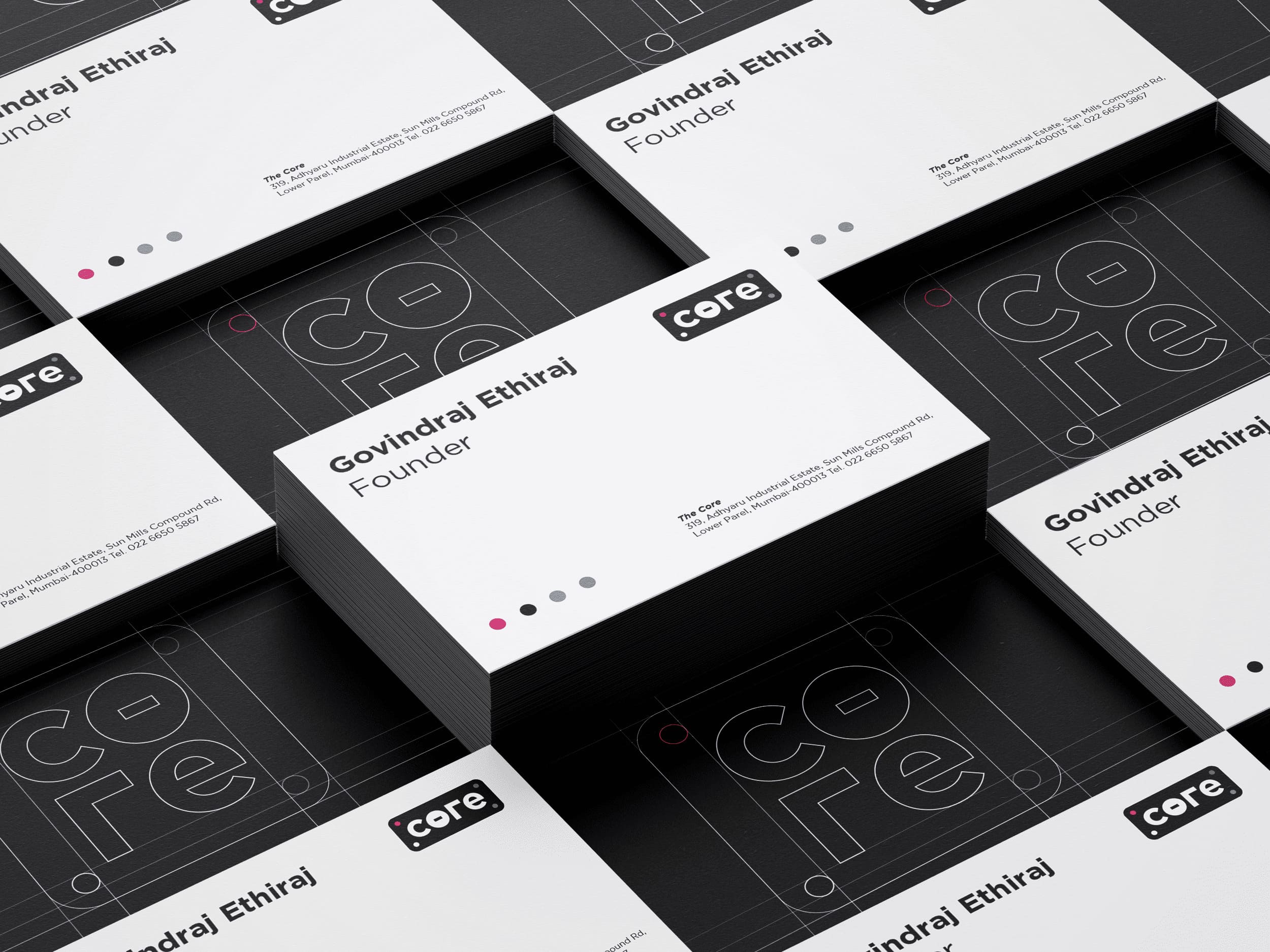
The logo of The Core has been designed to be simple, recognizable, and versatile. A logo that fits in with its peers but hones a personality so distinct that it’s impossible to confuse with anything else. The influence that black and white have on a subconscious level is extraordinarily strong. Black and white embody the relevance of complexity and duality. These colors challenge the visual references of our reality, giving us an aesthetic that is anything but empty. The color black is symbolic of mystery and authority, and the contrasting white color signifies optimism, equality, and clarity, all key elements that form the dynamics of business.
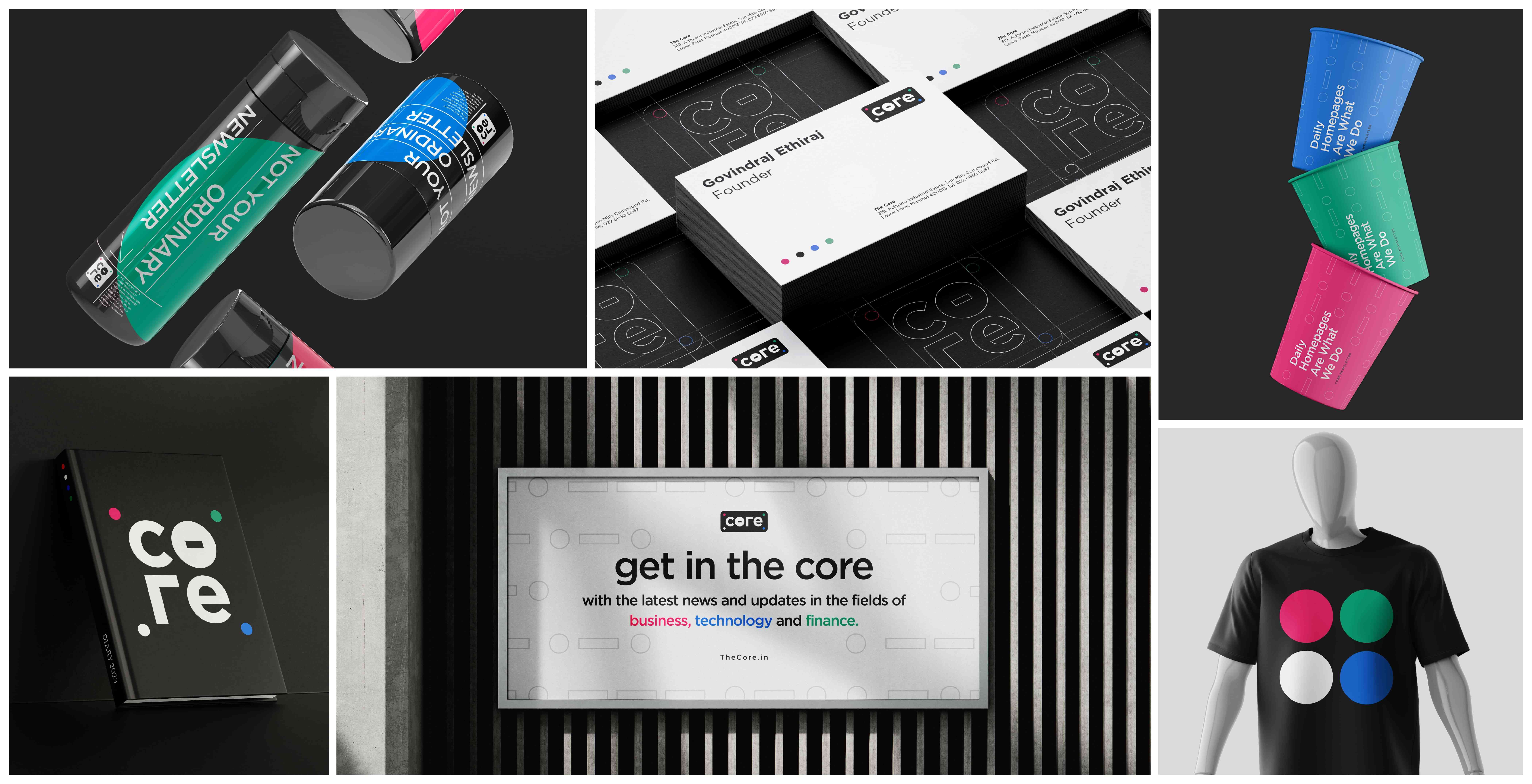
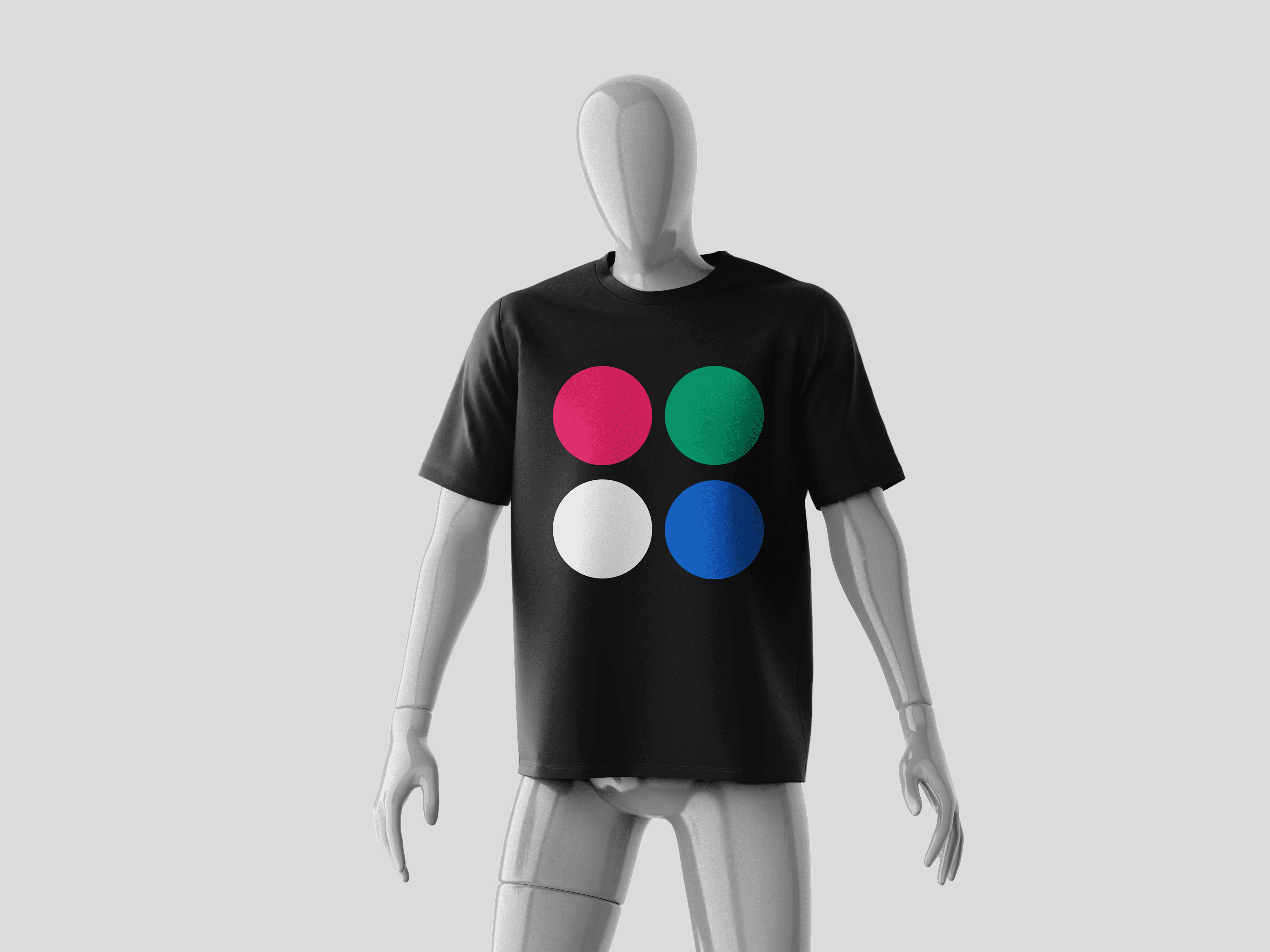
Adding a pop of color to our monochrome aesthetic, we’ve incorporated the 3 primary colors Red Blue and Green to signify Business, Technology, and Finance. The intersection of these three colors gives us pure white, which is incorporated as the fourth dot in the logo. Inspired by the nucleus of an atom, which is the very core of every element in the universe, the alphabets are tightly packed in together with 4 colored dots surrounding the monogram. Three dots are colored to form an upward arrow, denoting growth and progress.
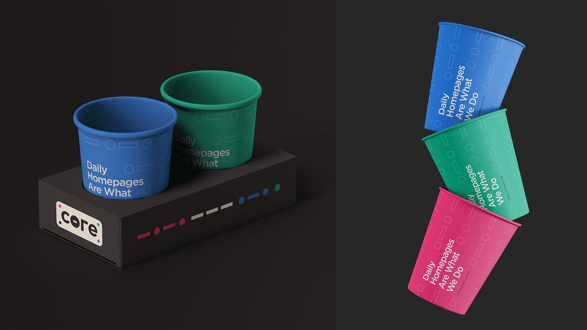
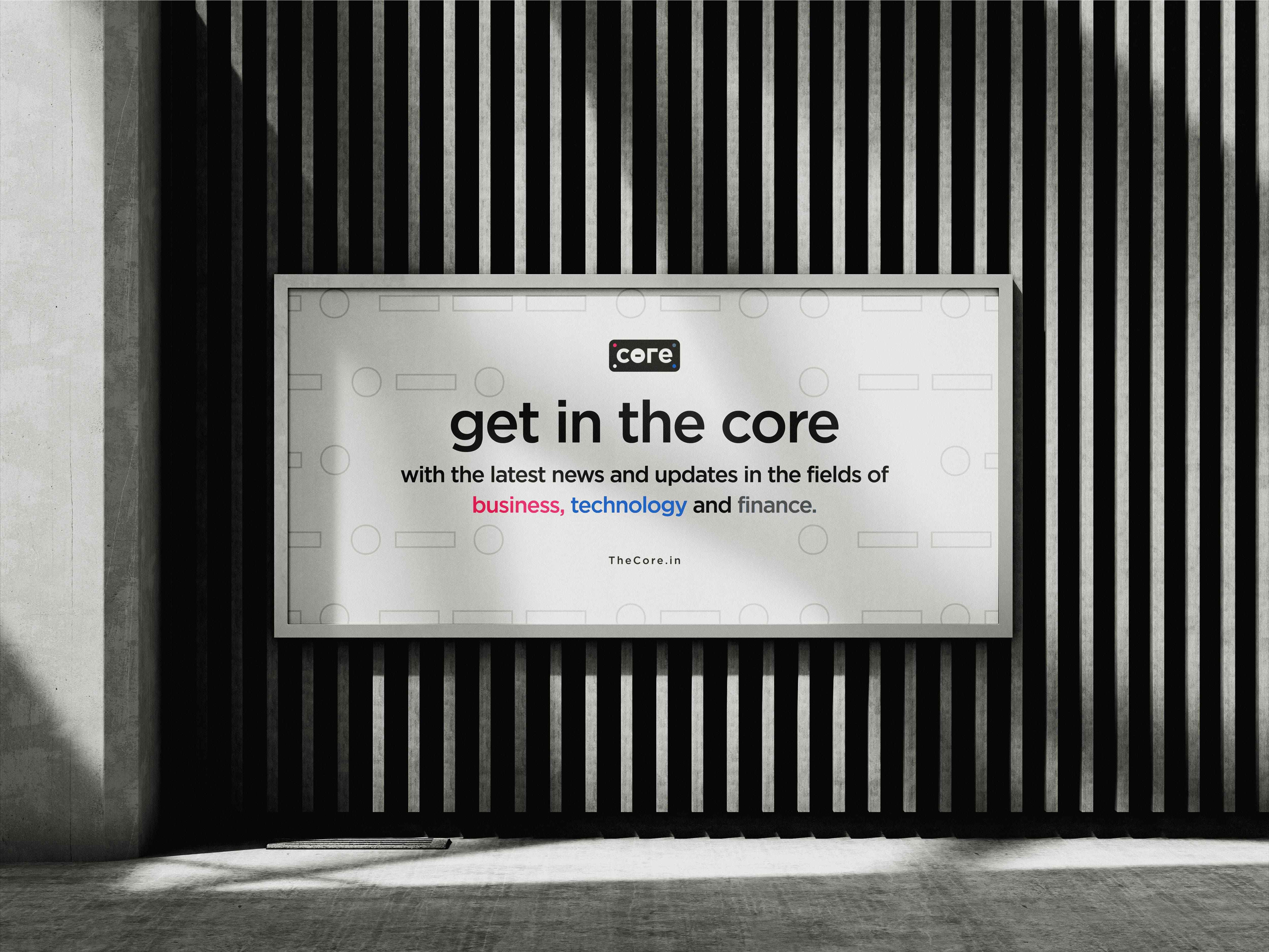
The telegraph was the earliest mode of telecommunication, used to communicate important and relevant information across long distances efficiently. We’ve incorporated the ‘dots & dashes’ of the morse code in the logo, to signify our key value of effectively decoding important information for our readers. A pattern comprising a series of ‘dots and dashes’ shall be a part of our core brand identity, flowing into our website, newsletter, and merchandise. To the unsuspecting eye, the pattern shall be an interesting and intriguing design element, but for the select few who can read the code, the patterns spell out C-O-R-E in Morse.

CREDIT
- Agency/Creative: Wife
- Article Title: The Core Brand Design
- Organisation/Entity: Agency
- Project Type: Identity
- Project Status: Published
- Agency/Creative Country: India
- Agency/Creative City: Mumbai
- Market Region: Asia
- Project Deliverables: Brand Design, Brand Guidelines, Brand Identity, Branding, Graphic Design, Logo Design
- Industry: Information
- Keywords: Views, Insights And Investigations in Business, Tech and Finance.
-
Credits:
Design Lead: Akshat Patil
Senior Creative Designer: Vishwatej Patil


