


Reimagining sesame oil for the U.S. market (Sooki Sesame Oil brand identity + packaging)
Sooki set out to introduce a premium Korean sesame oil to a U.S. market where the category is largely commoditized and, honestly, pretty misunderstood. For most people, sesame oil just lives in the background — a quick finishing drizzle rather than a star ingredient. Joseph and Hannah Choi, founders of Sooki Foods, describe their oil as “small-batch Korean sesame oil, roasted with whole seeds low and slow in Gyeonggi-do, South Korea” — but most American consumers have never encountered anything like that level of care in this category.
Our challenge was to shift that perception. We needed to bring forward its nuance, versatility, and cultural depth while honoring its Korean roots and making the whole experience feel fresh and accessible to a broader audience.
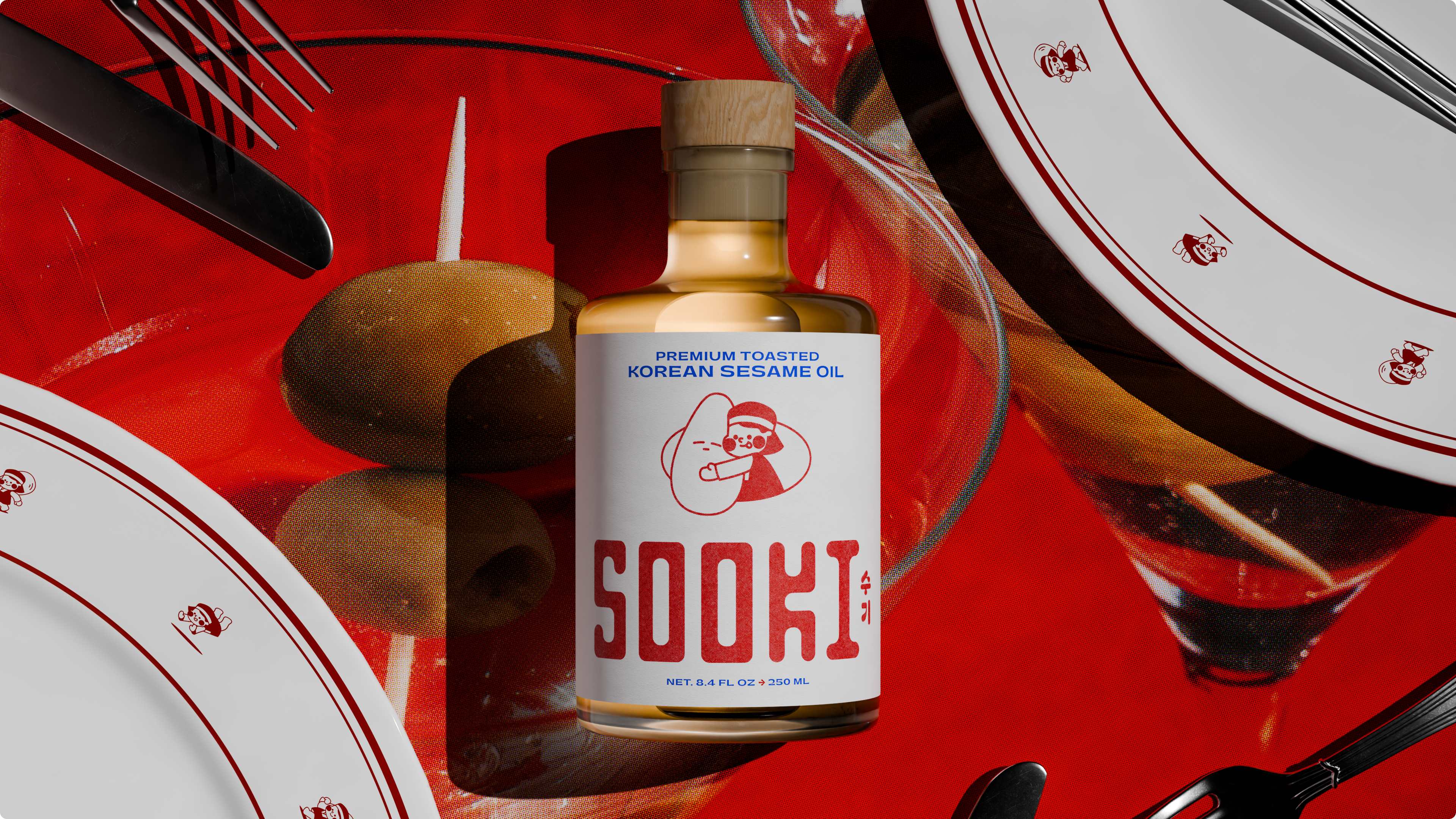
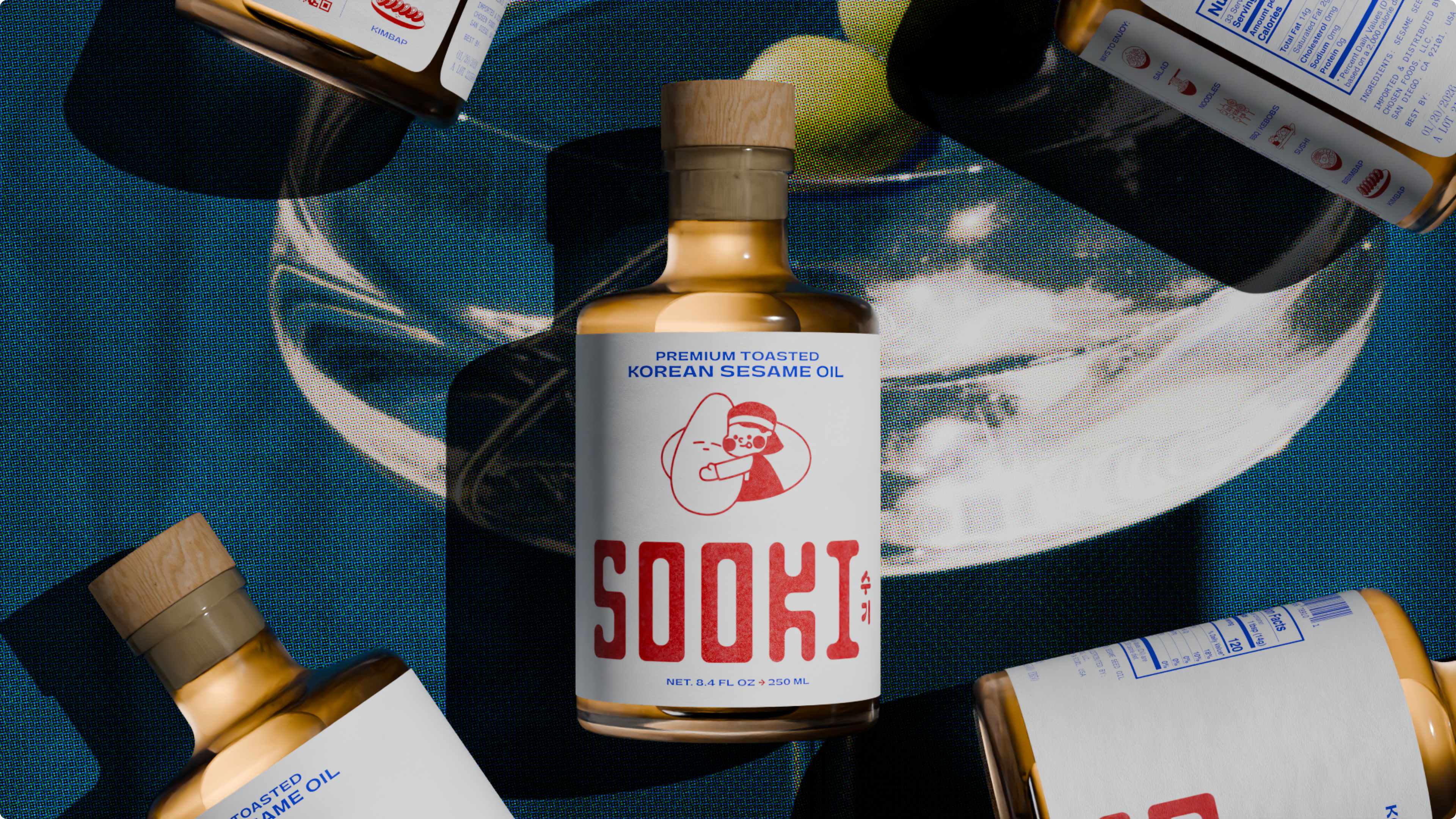
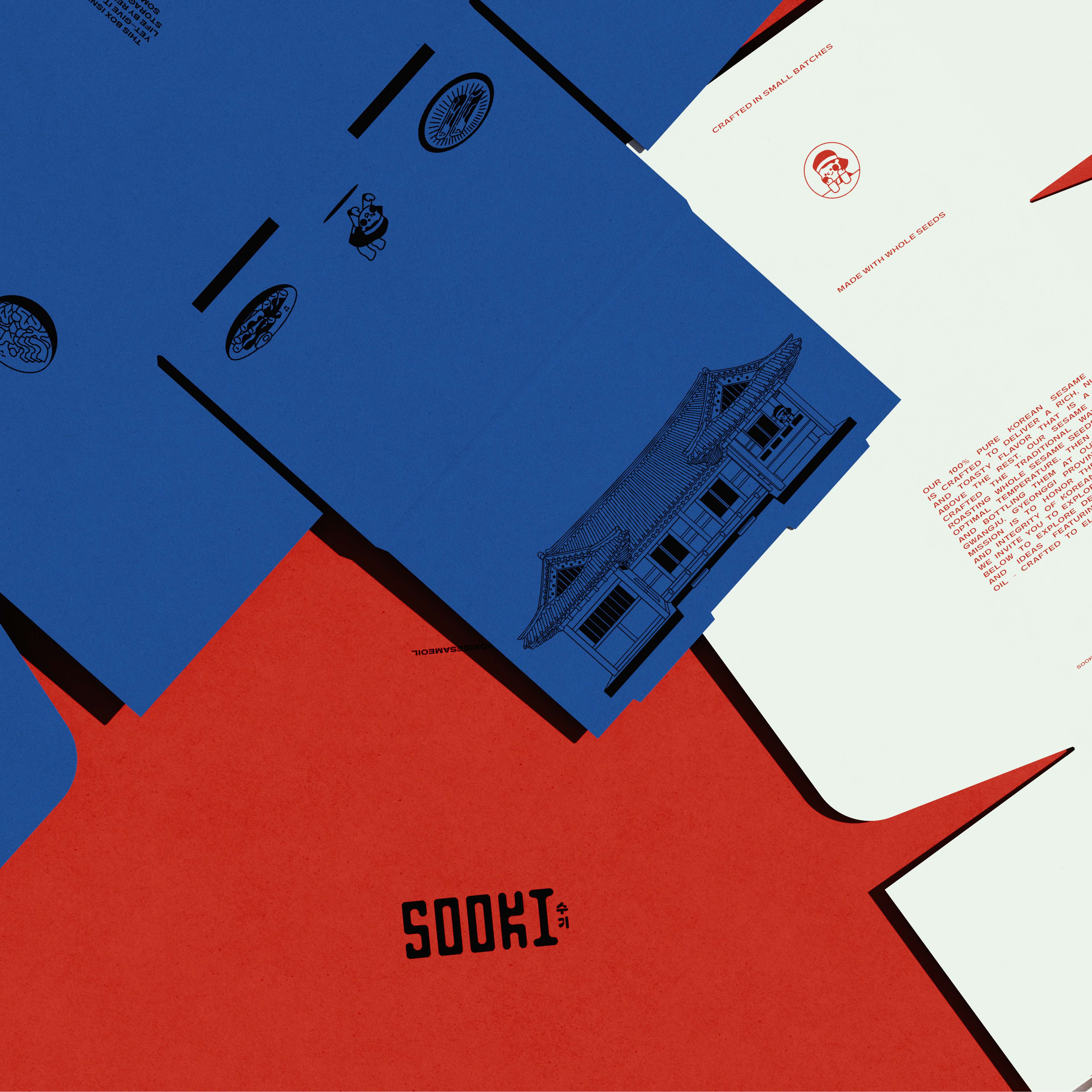
To make that happen, we built a brand that gives sesame oil a well-earned promotion. The foundation of the identity is firmly grounded in Sooki’s family story — the name itself is the family’s nickname for their mother — and their traditional production methods. Their sesame seeds are “roasted at a lower temperature than most commercial oils — about ten degrees cooler — allowing the natural sweetness and nutty aroma to develop without bitterness.” The oil is mechanically pressed and filtered using traditional Korean methods, never touching chemical solvents like hexane or refining agents. The result is what they describe as “a golden, balanced oil that feels vibrant and alive,” with a flavor “reminiscent of high-quality melted butter layered with a subtle nuttiness.”
But instead of leaning into a purely historical or overly traditional look, the branding balances that rich heritage with a really modern expression. The concept pairs warm, authentic cues with contemporary restraint — so it reads traditional without looking old-fashioned.
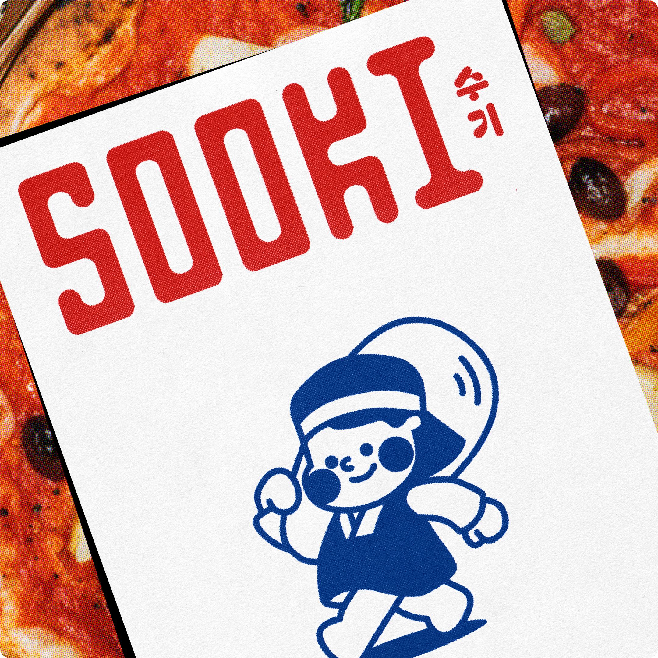
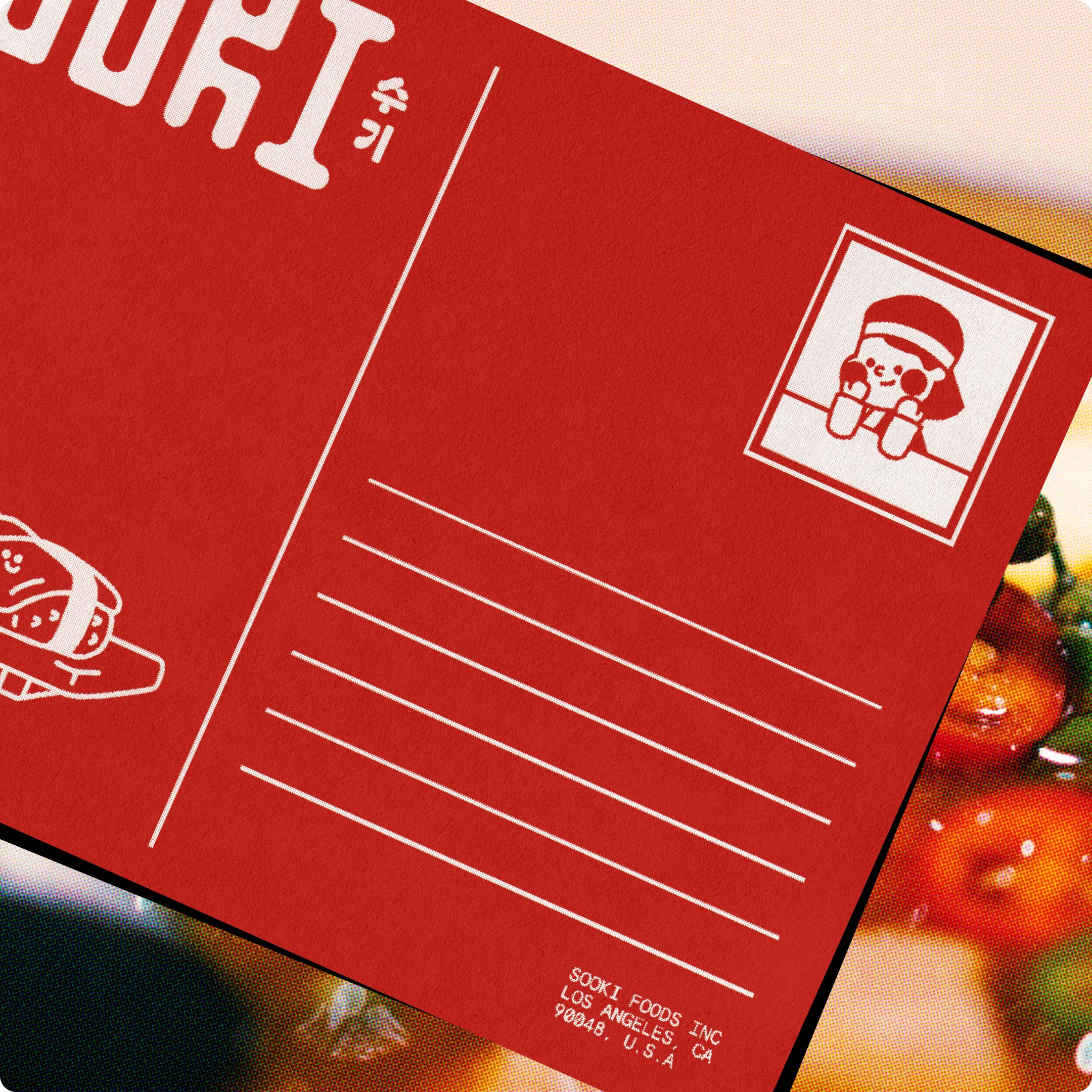
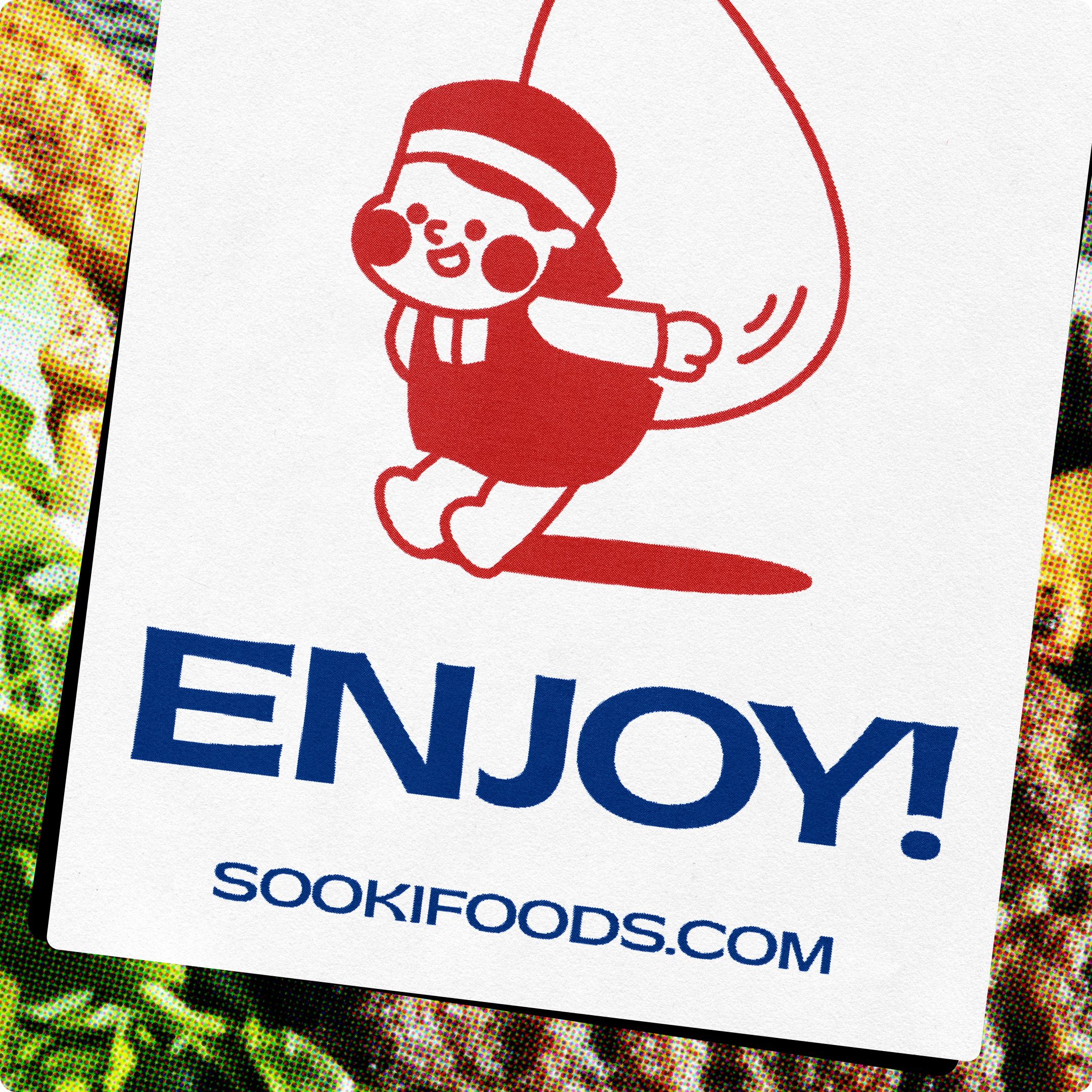
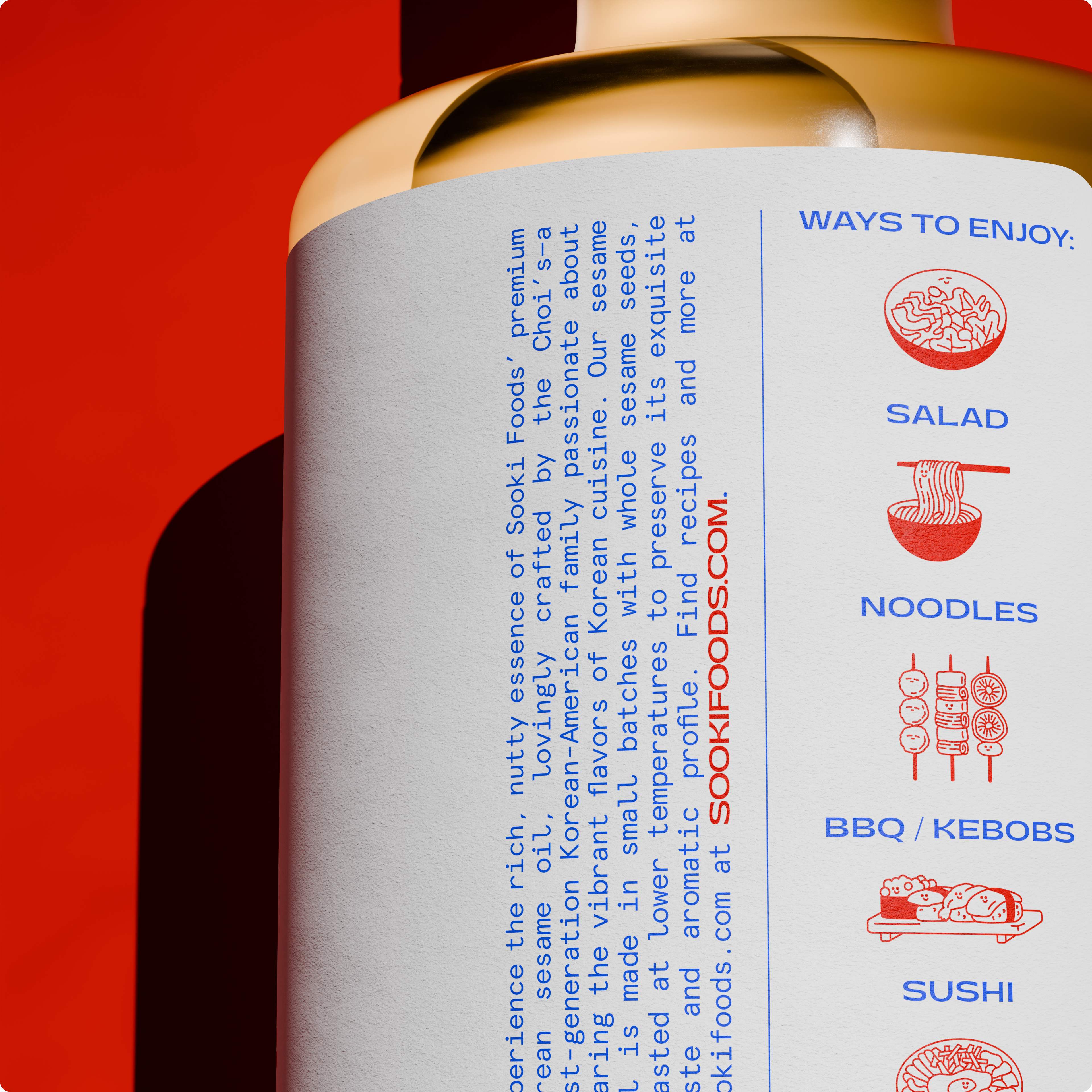
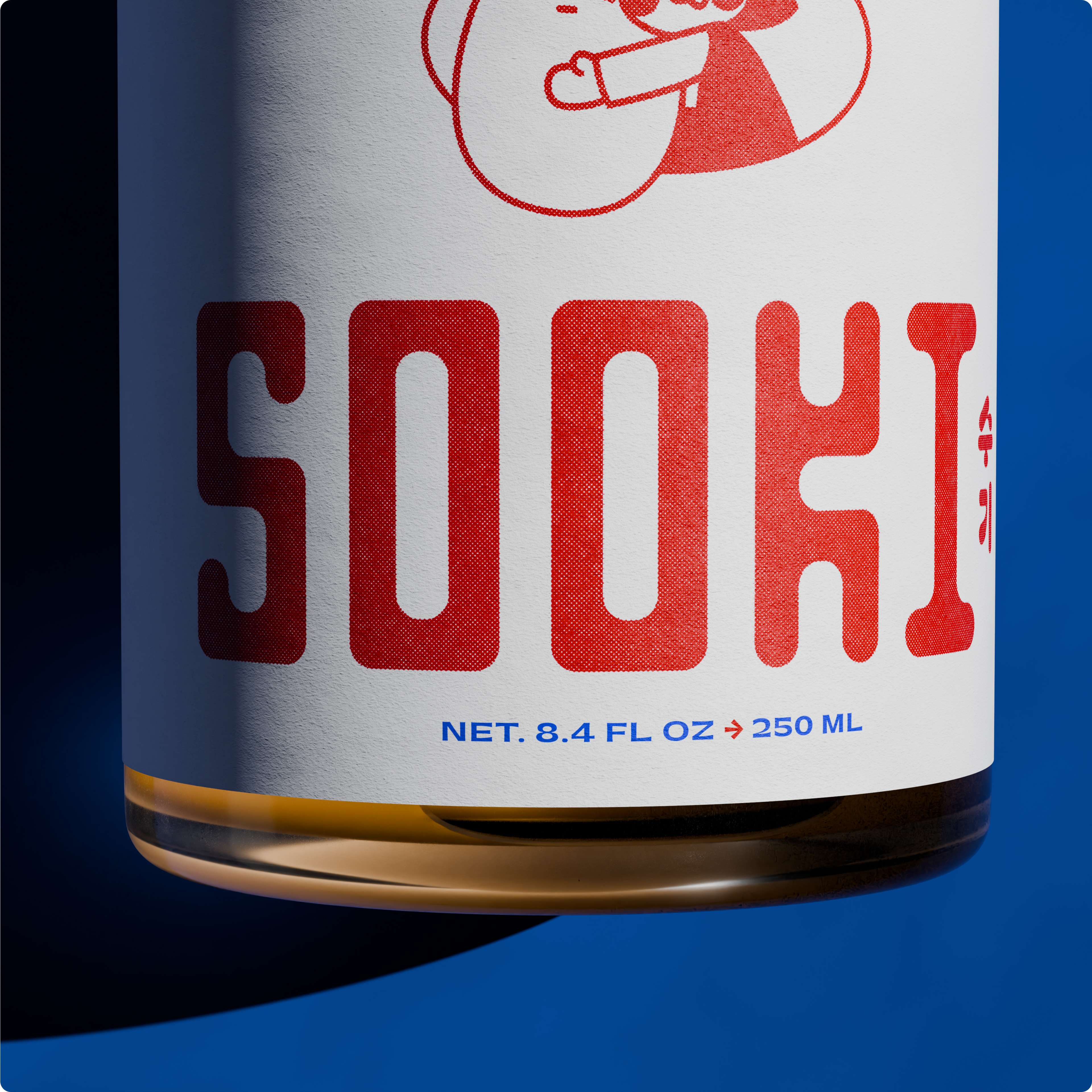
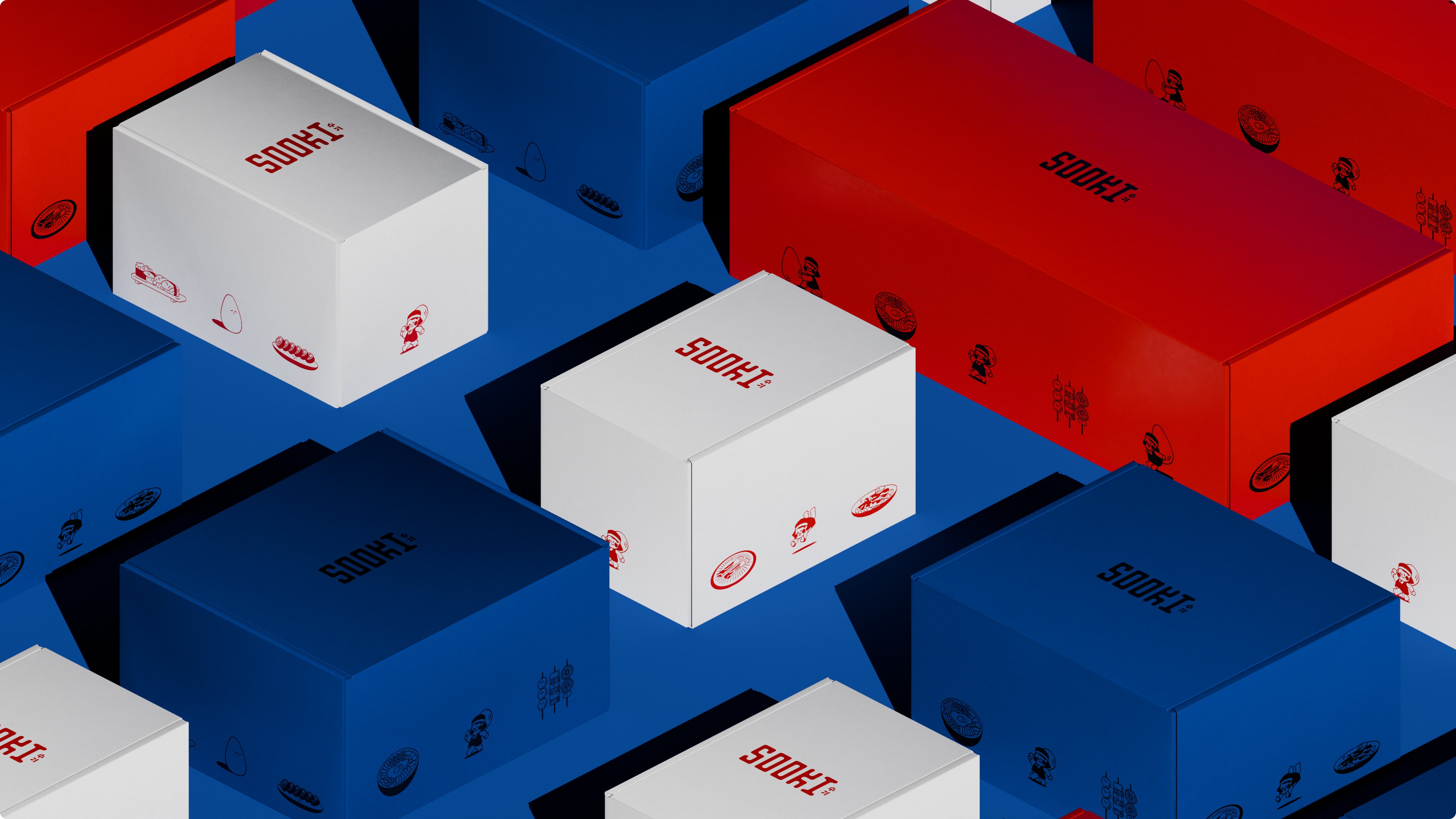
We brought the brand to life through thoughtful character work, refined design, and a warm, approachable tone. A mascot-led identity, a restrained few-color system, and confident lettering carry the premium feel without visual clutter. It’s not just about a nice label; the entire visual and verbal identity works together to make the product feel inviting.
The Chois’ own messaging reinforces the idea that this isn’t an intimidating, single-use pantry item — it’s a versatile creative tool you can reach for every day. As they put it, the oil is “just as at home brushed over grilled vegetables, folded into vinaigrettes, drizzled over eggs, or even paired with desserts or a slice of good bread.” Their philosophy of “Nothing added. Nothing stripped away” guided us throughout — the branding needed that same purity and confidence.
Ultimately, the work positions Sooki as both culturally authentic and creatively versatile. From the core branding to the physical packaging, we helped transform the product from a supporting player into a premium, display-worthy staple — a counter-ready bottle designed to stay out, not get tucked away. It’s built to earn a permanent spot on the kitchen counter, not just a quick cameo at the end of a dish.
CREDIT
- Agency/Creative: The Collected Works
- Article Title: The Collected Works Develops Sooki Sesame Oil as a Premium Korean Brand Elevating Category Perception in the U S Market
- Organisation/Entity: Agency
- Project Type: Packaging
- Project Status: Published
- Agency/Creative Country: United States
- Agency/Creative City: New York
- Market Region: North America
- Project Deliverables: 2D Design, 3D Art, Animation, Brand Guidelines, Brand Identity, Brand Mark, Branding, Character Design, Creative Direction, Illustration, Logo Design, Packaging Design, Typography
- Format: Bottle
- Industry: Food/Beverage
- Keywords: Sesame Oil, packaging, Korean, Korean American, premium
-
Credits:
Creative Direction: Justin Colt
Creative Direction: Jose Fresneda
Design, Illustration and Motion: Zedan Peng
Design: Christian Townsend
Design: Vincent Drayne
Design: Yasmin Mukino
Project Management: Justin Raymond Park


