About the project.
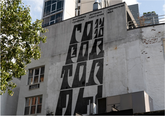
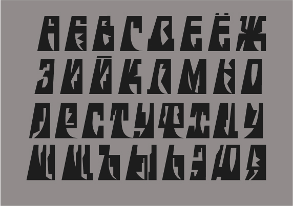
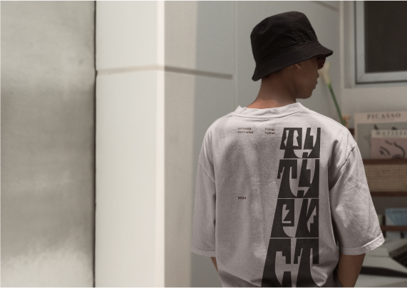
The identity for Antonio Sant’Elia’s exhibition, according to the brief, was to be based solely on typography. For this task it was necessary to develop a custom font that would reflect the essence of the era, as well as the nature of the artist’s artistic technique.
About the architect.
Antonio Sant’Elia was an Italian futurist with a difficult fate. His early death was linked to the ideas he espoused. Despite this, his works were very humanistic. He dreamed of creating megalithic houses that would contain the functions of an entire city.
Typography.
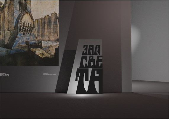
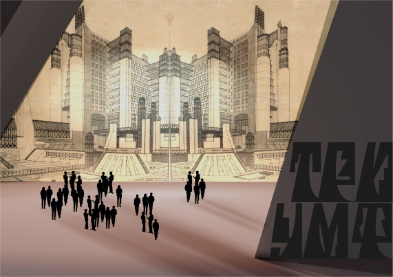
Since the artist-architect’s main idea was the idea of creating megalithic houses, it was decided to “build” letters as if they were those huge buildings. The typeface is designed on a special slanted grid, which makes it possible, by gradually reducing the size of the letters, to build molded typographic structures with equal angles of inclination.
About the exhibit.
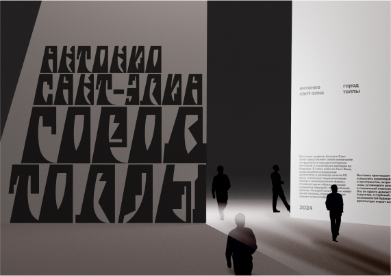
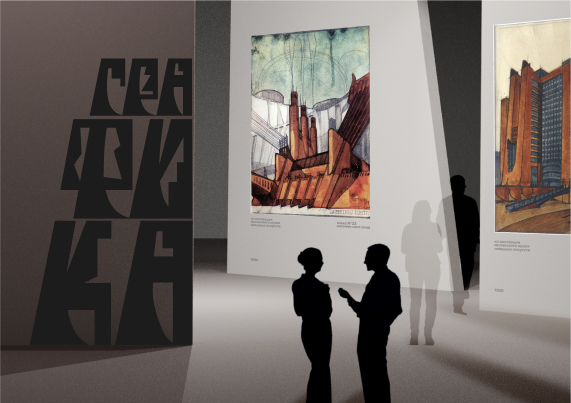
The space itself was designed using 3D to make the project as close to reality as possible. The finished images were not suitable. Inside, special forms of partitions were used to support the typographic idea. The main idea of the space is to immerse the viewer in the atmosphere that could exist inside that very house-machine, house-megalith. The whole space seems to put a little pressure on the little person inside, just like the typography used as navigation and futuristic statements.
About the global idea.
As an author, it was important for me to convey the importance of the art director’s work at all levels of running the project. From designing the typeface to the reception, from designing the advertisement to designing the space. I am convinced that it is definitely important to carry the corporate identity through the entire project. This is the only way to immerse the viewer (or user) in the right atmosphere and convey the right experience.



CREDIT
- Agency/Creative: Lizaveta Kharitonyuk
- Article Title: The City of Crowds Identity for The Exhibition Antonio Sant’Elia by Lizaveta Kharitonyuk
- Organisation/Entity: Student
- Project Type: Identity
- Project Status: Non Published
- Agency/Creative Country: Russia
- Agency/Creative City: Москва
- Market Region: Europe
- Project Deliverables: Art Direction
- Industry: Entertainment
- Keywords: Art-direction, exhibition, identity, typography, font, 3D
-
Credits:
Supervisor: Leonid Slavin


