


This is a project dedicated to resolving mental health tension and isolation. To inspire people to reconnect in-person post pandemic. The brief that was asked of me was to create an invitation to an experience of shared enjoyment. A festival of music, ideas, cultures with five artists and performers.
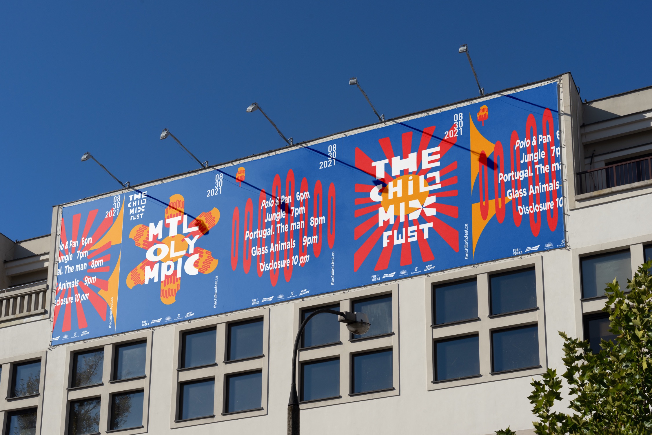
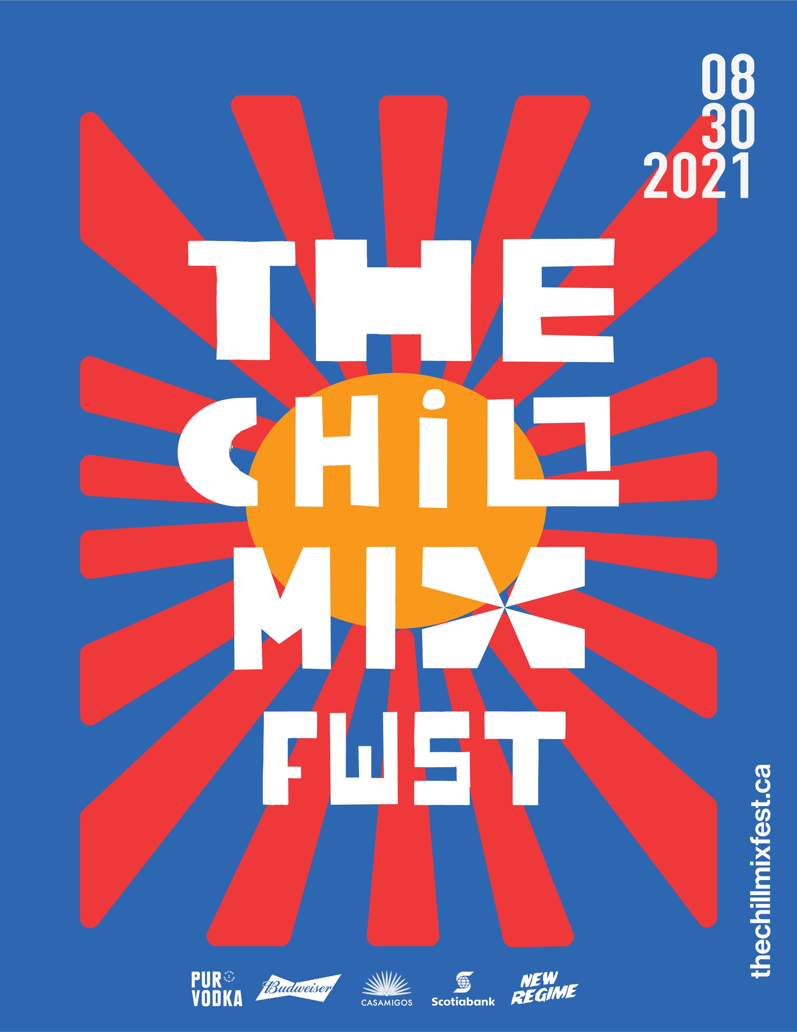
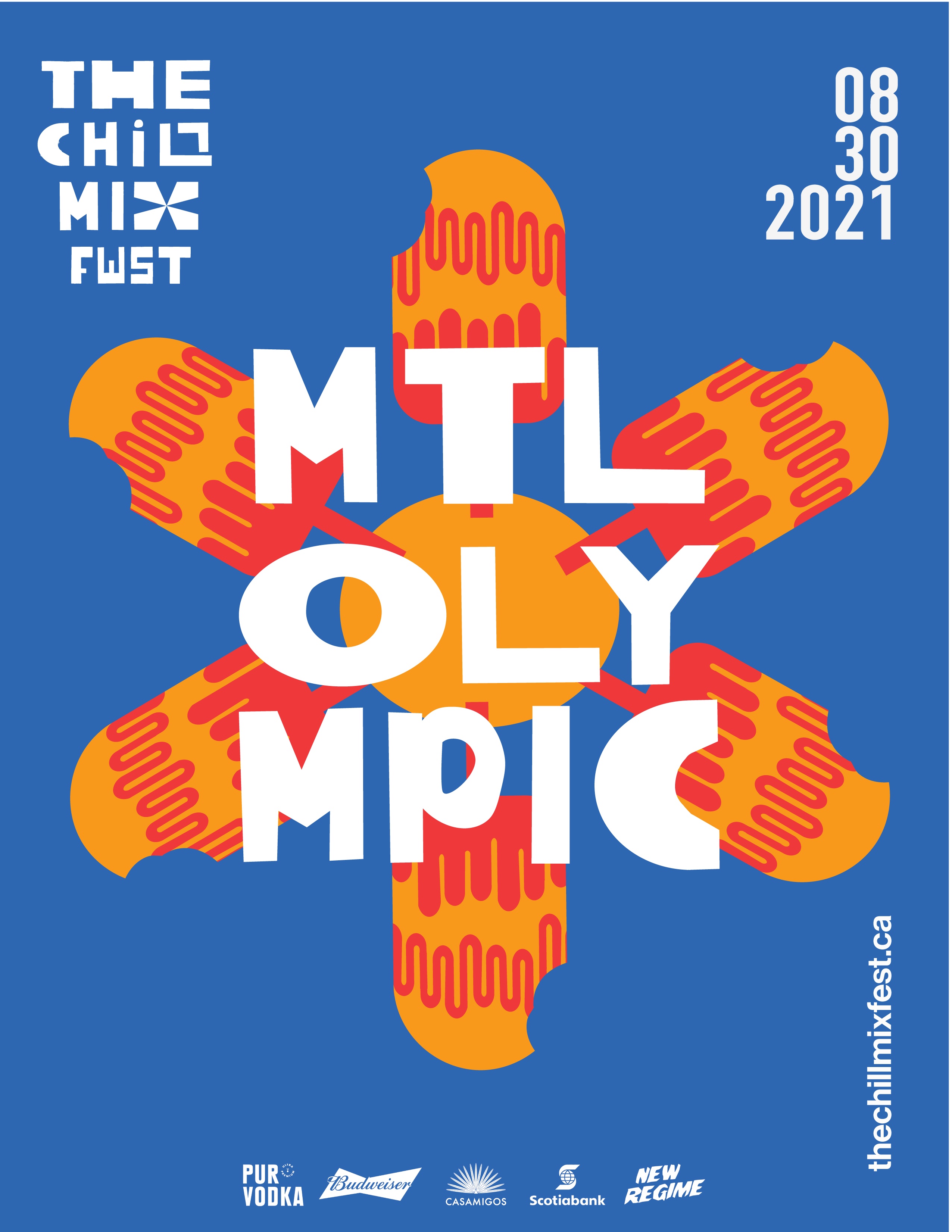
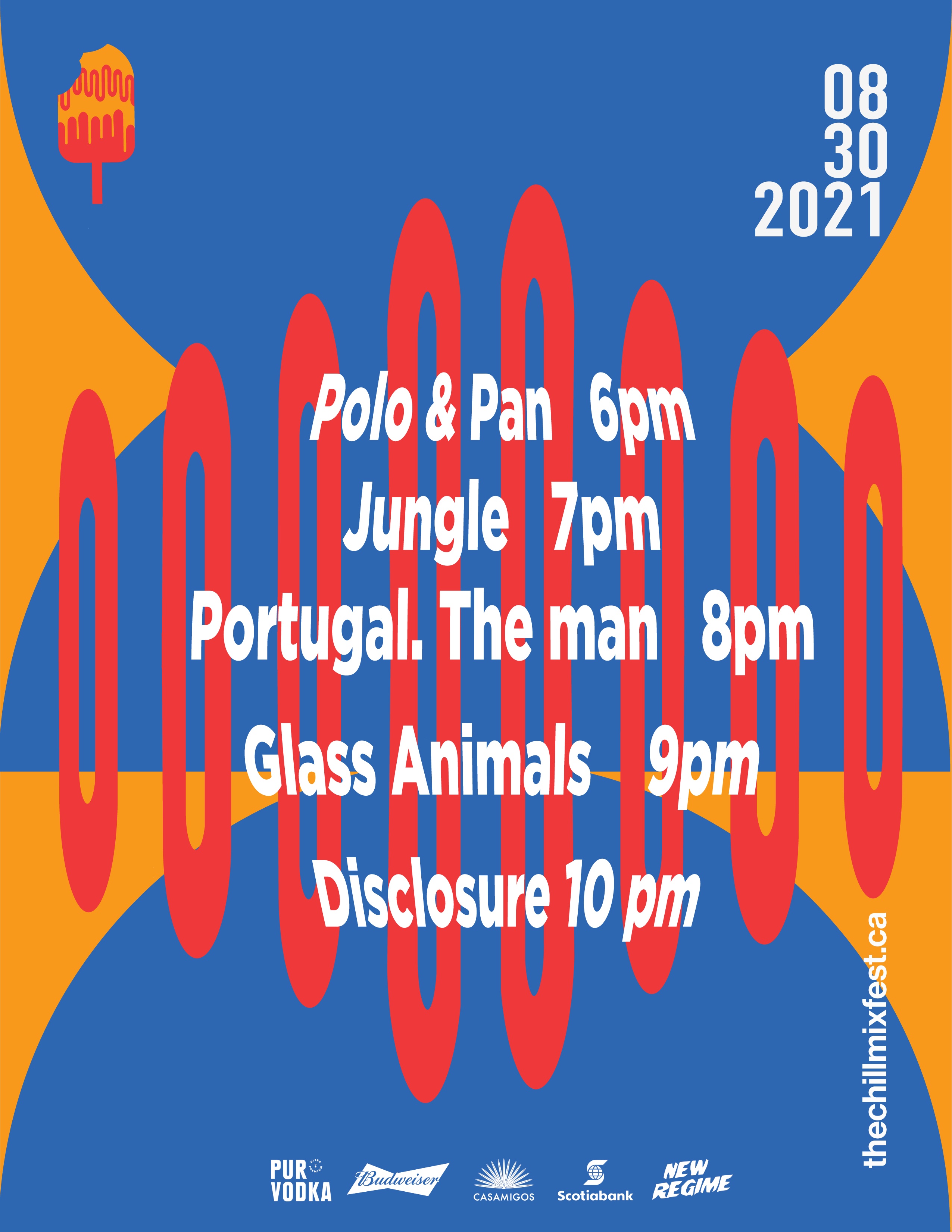
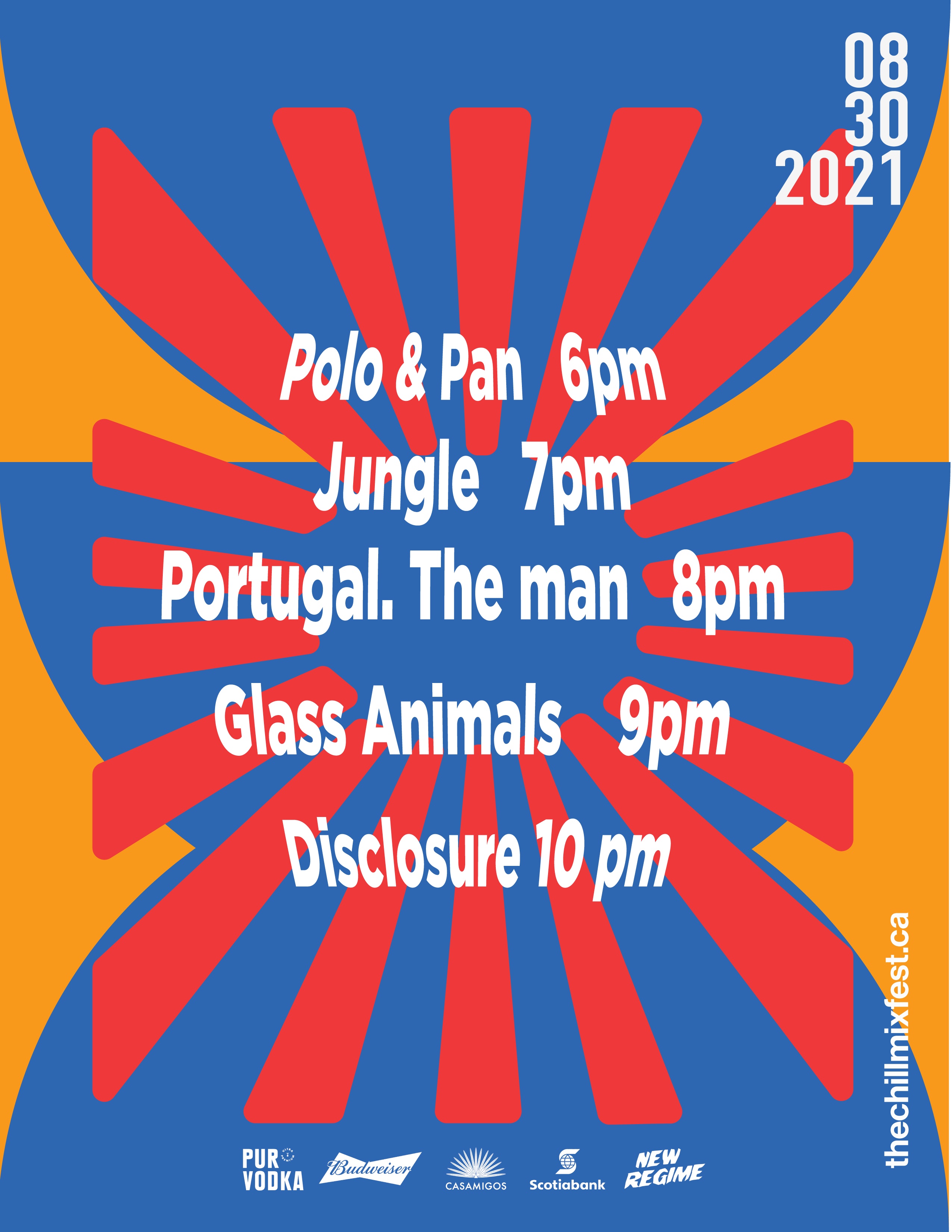
The Chill Mix Fest is a festival of bright colors and chill music. Potentially set at the Montreal Olympic stadium on 30th of August, 2021. Montreal is a city that has a vibrant music culture and energy. During the month of August, the city’s filled with activities and festivals, but is missing a more low-key event. With a line-up of five guests including: Polo & Pan, Jungle, Portugal.The Man, Glass Animals, and Disclosure, you will find a more reverberating festival. All artists bring a touch of their own personality and music that spark creativity and good energy.
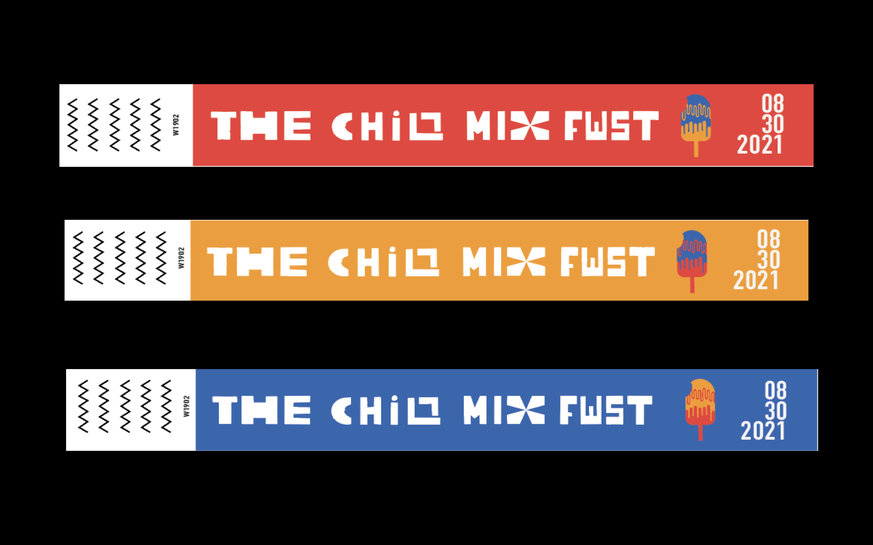
The five poster series match together or stand alone. The main poster gives all the information with potential sponsors, date, title, website. The chill mix fest and Mtl olympic are hand-drawn typography giving the posters a unique typeface is something I thought to be essential. It is a way to bring in the sense of creativity and release the rigid styles of certain typefaces. Also, to add a playful touch to the designs. The colors are simple. The blue reminds us of the clear sky. The yellow/orange mimics the sun setting at the horizon. The red brings us to the night, with the strobe lights and the acoustic waves coming from the live music and DJ booth. The logo of the festival is the popsicle. It signifies the last bite of the summer, before the colder nights of the fall. What a bitter sweet way to end Montreal’s summer festival season, then at the Chill Mix Fest.
CREDIT
- Agency/Creative: Sarah Bahsali
- Article Title: The Chill Mix Fest Brand Design
- Organisation/Entity: Student
- Project Type: Identity
- Project Status: Non Published
- Agency/Creative Country: Canada
- Agency/Creative City: Laval
- Market Region: Global
- Project Deliverables: Brand Design, Graphic Design, Typography
- Industry: Entertainment
- Keywords: WBDS Awards Nominee , student,
-
Credits:
Educational Institution Name: Miami Ad School - Toronto - Art Direction
Educator's Name: Ben Weeks


