


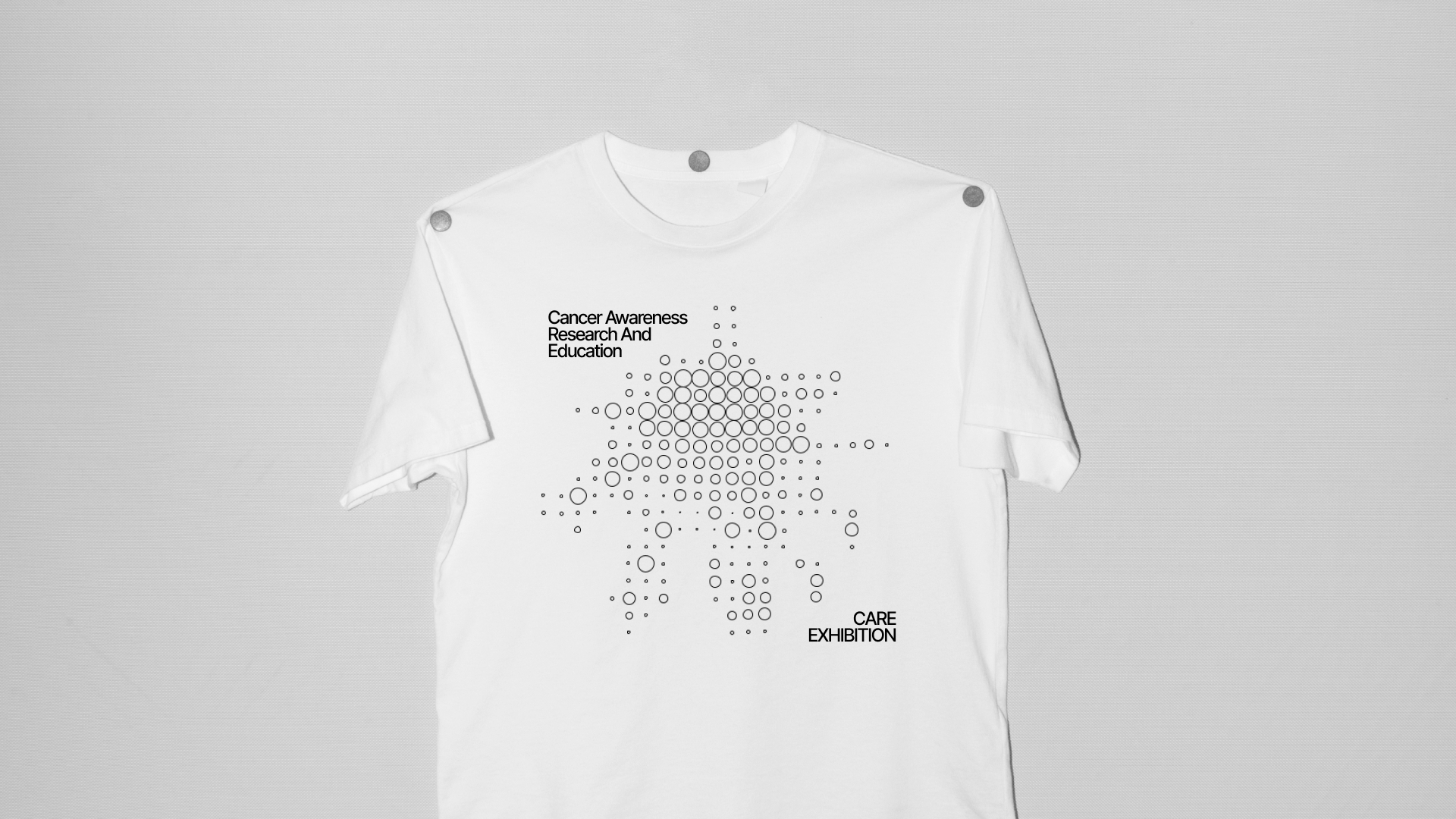
The “Care” exhibition, which stands for Cancer Awareness Research and Education, represents a significant initiative in the realm of public health awareness. This exhibition is not just an event; it’s a comprehensive educational experience dedicated to shedding light on the complexities and various stages of cancer. It aims to enhance public knowledge and understanding of this challenging disease, thereby playing a crucial role in cancer education and awareness.
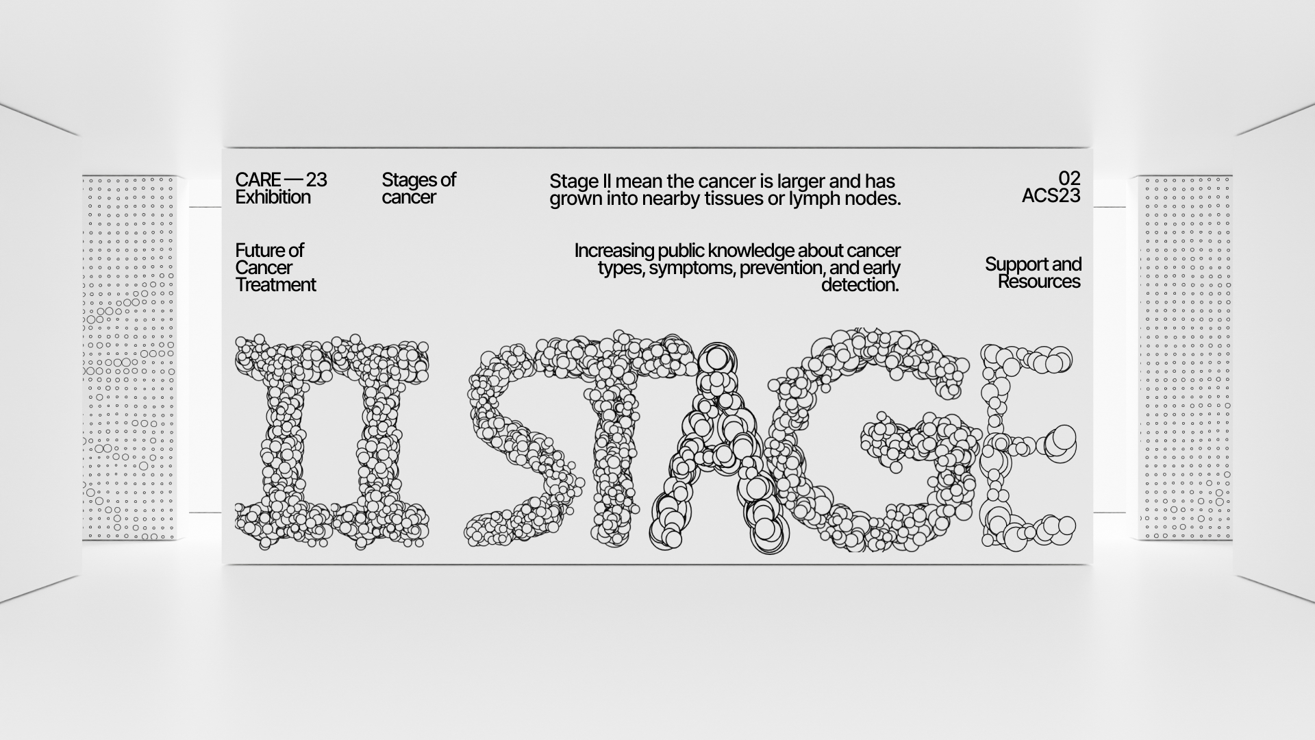
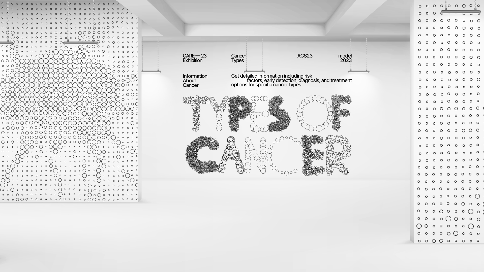
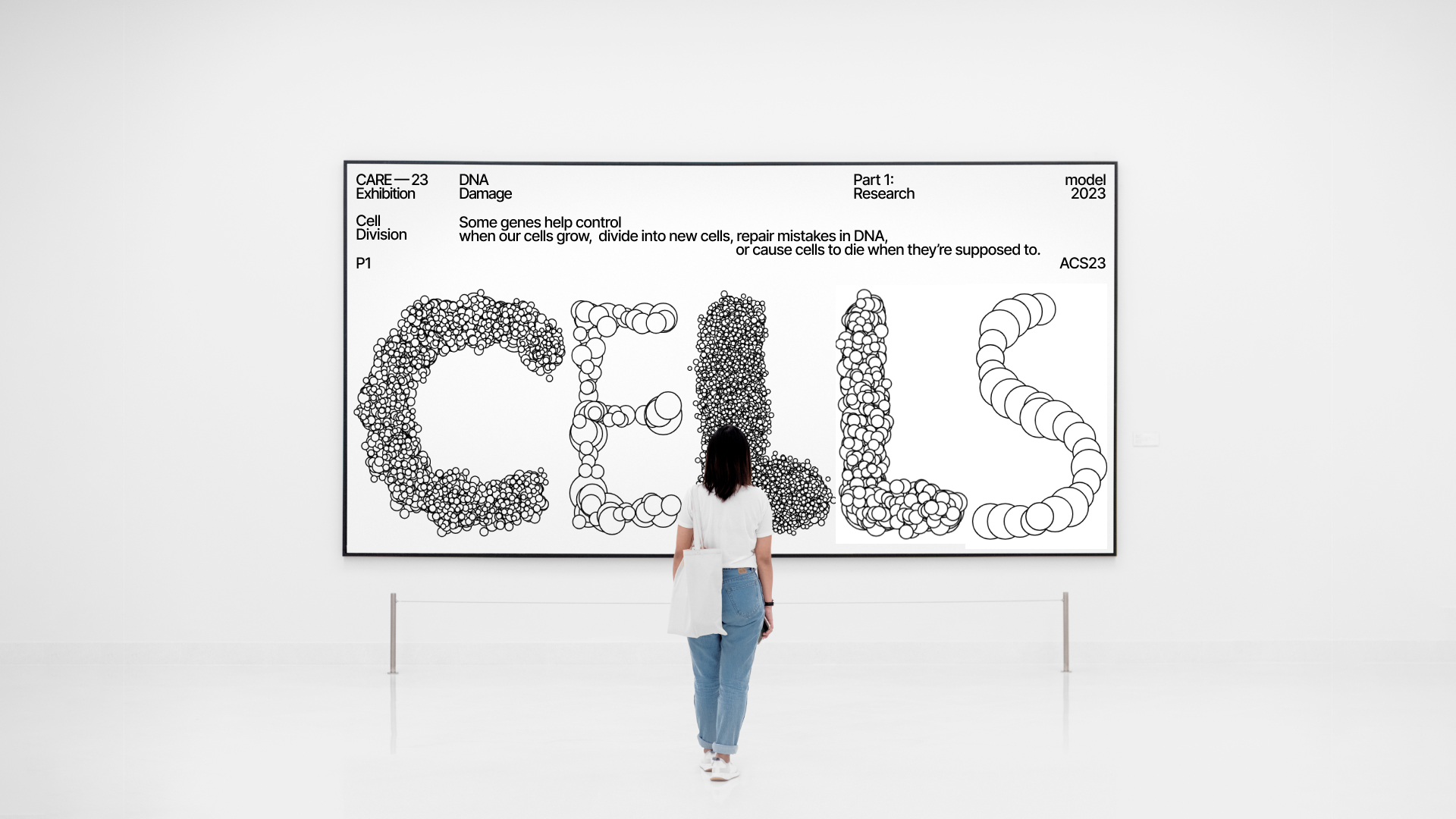
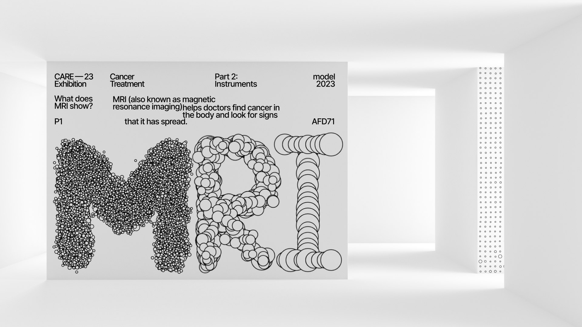
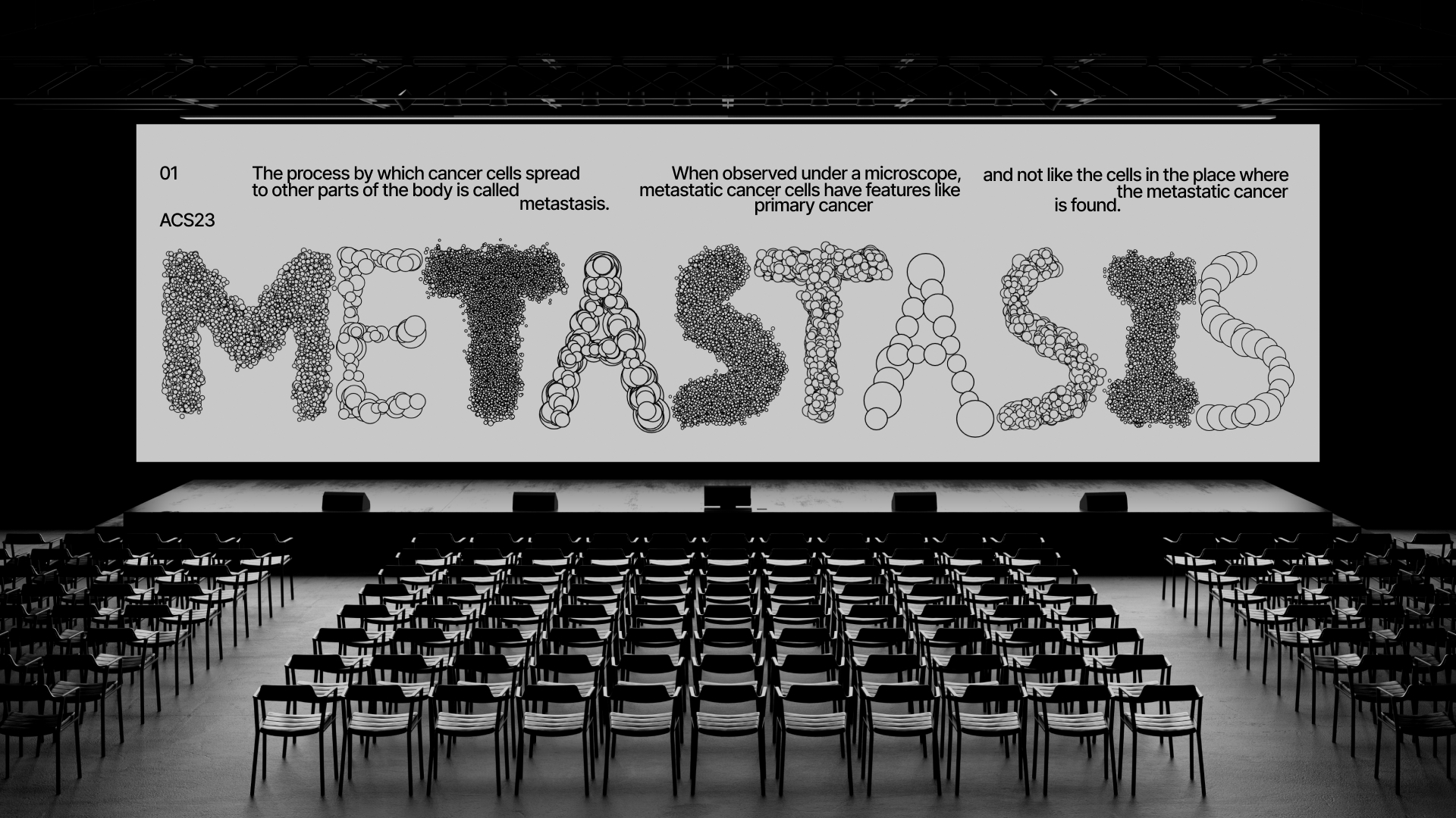
At the heart of the exhibition’s unique identity is the innovative use of typography. Through the advanced technique of processing, four distinctive fonts have been meticulously crafted. Each of these fonts is more than just a stylistic choice; they are imbued with meaning, with each one symbolizing a different stage of cancer’s progression. This thoughtful design choice serves not only as an artistic expression but also as an informative tool, providing visual cues about the nature and progression of the disease.
The exhibition space itself is designed to be an immersive educational environment. Visitors are taken on an informative journey through various aspects of cancer, ranging from the biological mechanisms behind the formation of cancer cells to the emotional and physical impact of the disease. Interactive exhibits, including detailed models of cancer cells, provide a tangible understanding of the subject matter. The information is presented in a manner that is accessible to both medical professionals and the general public, ensuring that the message of awareness and education reaches a wide audience.
Furthermore, the exhibition’s dynamic use of the specially designed fonts adds an extra layer of engagement. In discussions or displays focusing on a specific stage of cancer, the corresponding font is employed, providing a visual representation of that stage’s characteristics. In other parts of the exhibition, a blend of these fonts is used, symbolizing the diverse and multifaceted nature of cancer. This approach not only enhances the aesthetic appeal of the exhibition but also reinforces its educational message.
In summary, the “Care” exhibition, through its innovative use of design and typography, offers a powerful and engaging platform for cancer awareness and education. By integrating artistic elements with medical information, it creates an impactful and memorable experience that furthers understanding of a complex and significant health issue.
Special thanks should be given to the Russian Higher School of Economics (HSE Art and Design School) and to the tutor Tanya Dunaeva

CREDIT
- Agency/Creative: Elena Jung
- Article Title: The “Care” Exhibition’s Branding by Elena Jung
- Organisation/Entity: Student
- Project Type: Graphic
- Project Status: Non Published
- Agency/Creative Country: Russia
- Agency/Creative City: Moscow
- Market Region: Global
- Project Deliverables: Brand Identity
- Industry: Education
- Keywords: graphic design, exhibition design, brand identity, cancer
-
Credits:
Curator: Tanya Dunaeva


