


Renewing your own brand for design studios or branding agencies is a long and painful process. It’s hard to look at yourself critically, and it’s even harder to find time for your own project. But we have found time, strength and ideas. Now we want to share the result with you!
Why we did it?
We weren’t just based on feelings and desires that it was time to change something. The decision on the need for refreshing was influenced by a lot of internal and external factors.
There were changes in the structure of our work. Renewal and creation of many processes from scratch led to a rethinking of the DEZA brand. Therefore, everyone needed an updated, clear and understandable system of visual and verbal coordinates for transmission to the external environment.
Proceeding from the existing prerequisites, we defined the main qualities of the new positioning of the studio: honesty, openness, consistency, service.
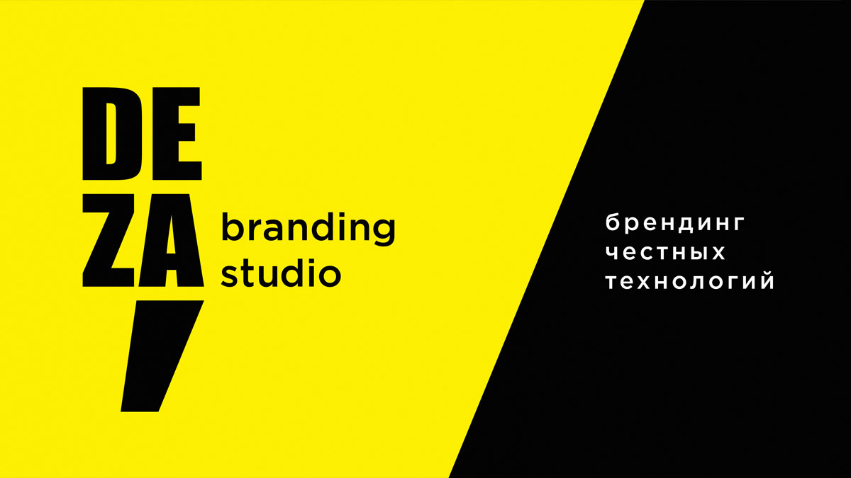
Positioning and brand essence of the DEZA
Our new positioning sounds like this: honest technology branding.
Today, the high quality of the result as such has become a market qualifier, a musthave. Attention and expectations shift to the quality of the process. We know how important open relations, clear understanding and substantiation of the project stages, their cost and results are for our clients. Of course, without fanaticism and immersion in all the details of branding kitchen.
Tone of voice or how we communicate with the world
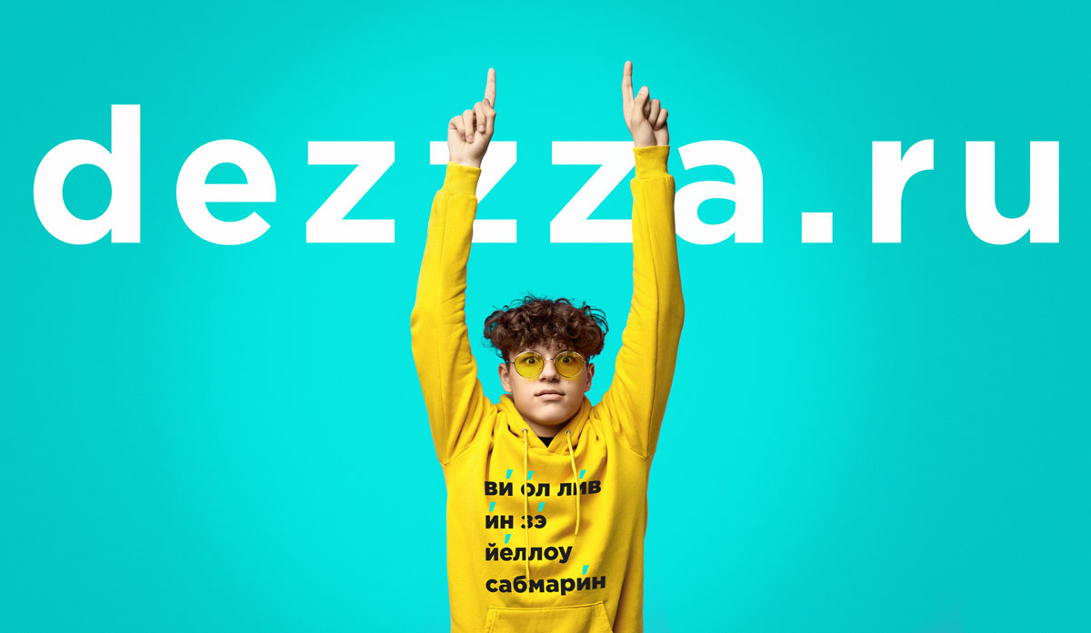
DEZA — is a team, not just a company.
We do not have a dialogue with the company, but with people. Humanly, boldly, directly and temperamentally.
It is easy and interesting for us to work together and enjoy the process, exchanging experiences and filling in new knowledge in an atmosphere of openness and friendliness. We are free in creative manifestations, and very clear and systematic where necessary.
We sincerely talk about what we believe in. And we believe in what we are talking about.
Converting a verbal into a visual
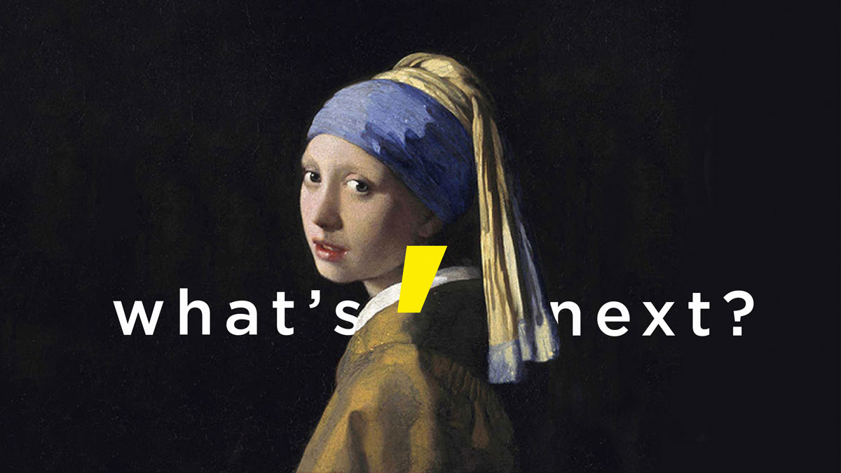
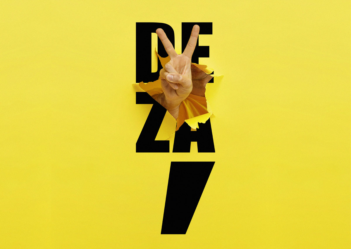
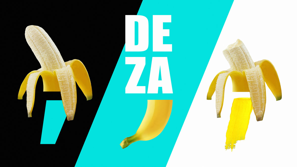
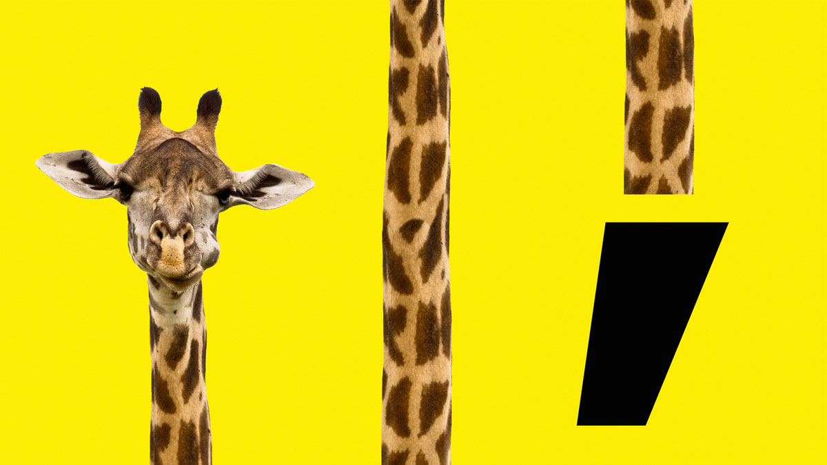
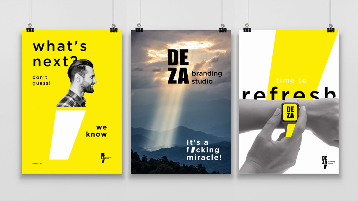
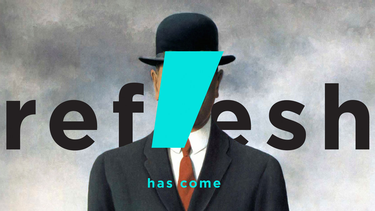
In the process of finding solutions, the most attractive was the vertical version of the logo, where all the emphasis shifts to the comma. The comma is an integral attribute of DEZA, and we did not want to give it up. In the new logo, DEZA becomes the comma. We have become more open, energetic and direct about who we are, what we do and what we do great.
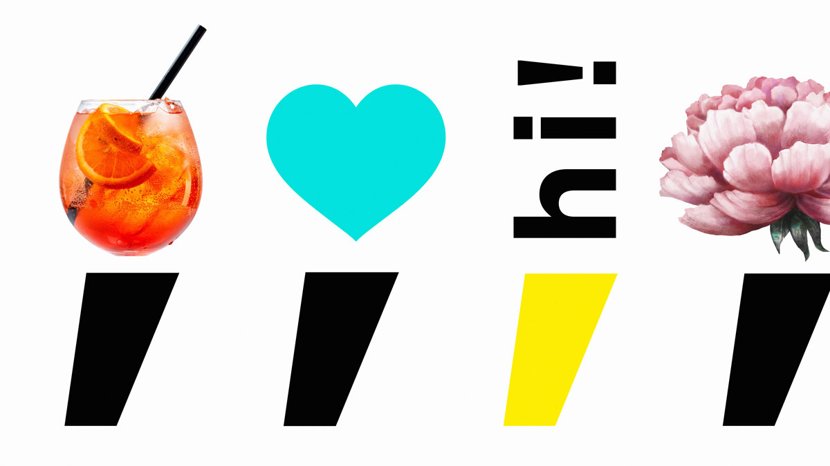
The idea of the two-part logo was based on the fact that the comma consists of two parts: the head and the tail. The head is just a point, a point of departure; the tail is further movement.
Given the meaning of the comma and the fact that it is divided into two parts, we decided to make our new “acquaintance” to do the same. Both parts of the new sign of DEZA are dynamic and in constant motion. Each part can change depending on the message or our desire (at the same time both parts are always together), to carry or not to carry meaning – this is what our creative freedom of our team is reflected in.
Now the new logo and style represent real us: new, cheerful, bold, aspiring to development, cohesive guys.
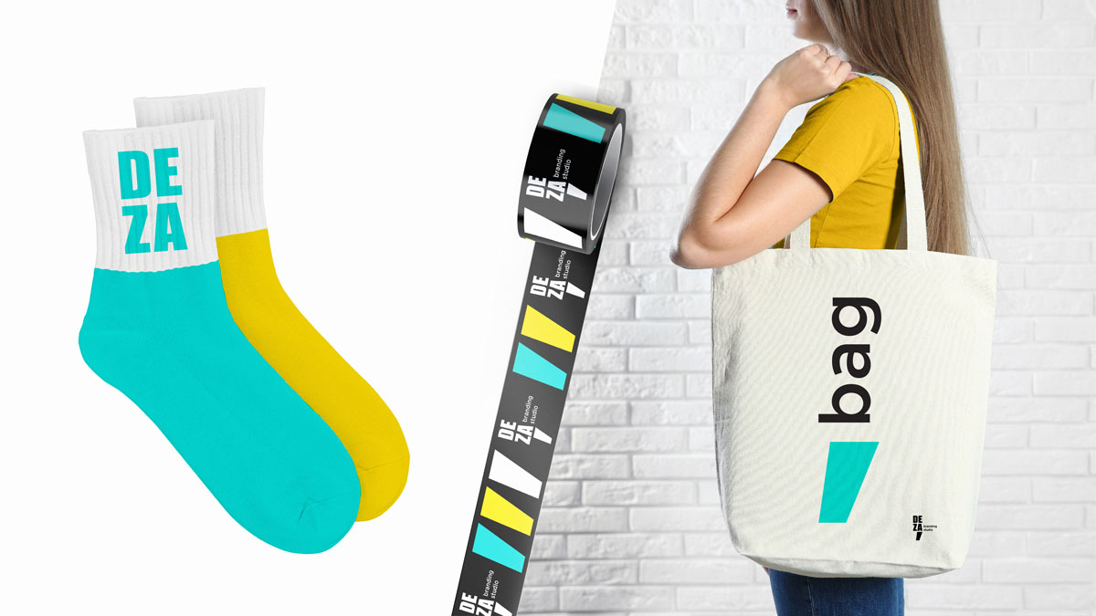
Turquoise is the new
We have added a new color to the identity — turquoise. On the one hand, it gives freshness and lightness, diluting the usual black and yellow colors. On the other hand, it symbolizes the movement of the studio towards the status of a “turquoise” company. There is also a third reason: this is the favorite color of our art director!
Now we are the system, the technology and the brains. Freedom, excitement and love.
CREDIT
- Agency/Creative: DEZA
- Article Title: The Branding Studio Deza Refreshed Itself
- Organisation/Entity: Agency, Published Commercial Design
- Project Type: Identity
- Agency/Creative Country: Russia
- Market Region: Europe
- Project Deliverables: Brand Architecture, Brand Identity, Branding, Graphic Design, Identity System, Rebranding, Research, Tone of Voice
- Industry: Technology
- Keywords: Branding, Agency, Rebranding, Logotype, Identity, Design, Russia


