Indulging in our cravings has proven to be an age-old dilemma. From guilt to regret and everything in between, giving our tastebuds a little bit of love has always gone a long way in making us feel not-so-great about ourselves. Trying to find the guiltless in a sea artificial solutions to this problem has always been a challenge. Nowadays, more and more health-based food and drink brands are evolving to meet the cravings of our culinary palettes as well as our brand experience. This rings true to the health industry as a whole, and in light of this we wanted to create something fresh… really fresh.
Clean Cravings was born out of the desire to make healthy funky again. We wanted to peel back the layers and find out what could make this hearty brand resonate with health-junkies and serial-snackers alike. Being a sub-brand of ‘The Grocer,’ a premium, fresh and healthy grocery brand in Egypt, we wanted to give this brand its own iconic and unique identity that helps it stand out amongst its competitors on the shelf. We needed to keep that objective in mind to create a brand that would be strong enough to stand strongly on its own.
To start, we created a unique word-mark that gives Clean Cravings a bold presence that’s as loud, proud and as endowed as its artificial rival brands. Starting with the ‘C,’ we personified it as a wide, gaping mouth that’s as comical as it is glutinous. We designed the letter with a small but sharp tongue that sticks out, calling for more, hungry and ready to eat. Seeing it in this way, we’ve characterised the ‘C,’ and used it as our mouth in various forms of communication, paired with sweet and tart messages like “I’m Hangryyyy” or functional messages that tell the consumer what they’re about to indulge in with “Wrap of the Day”.
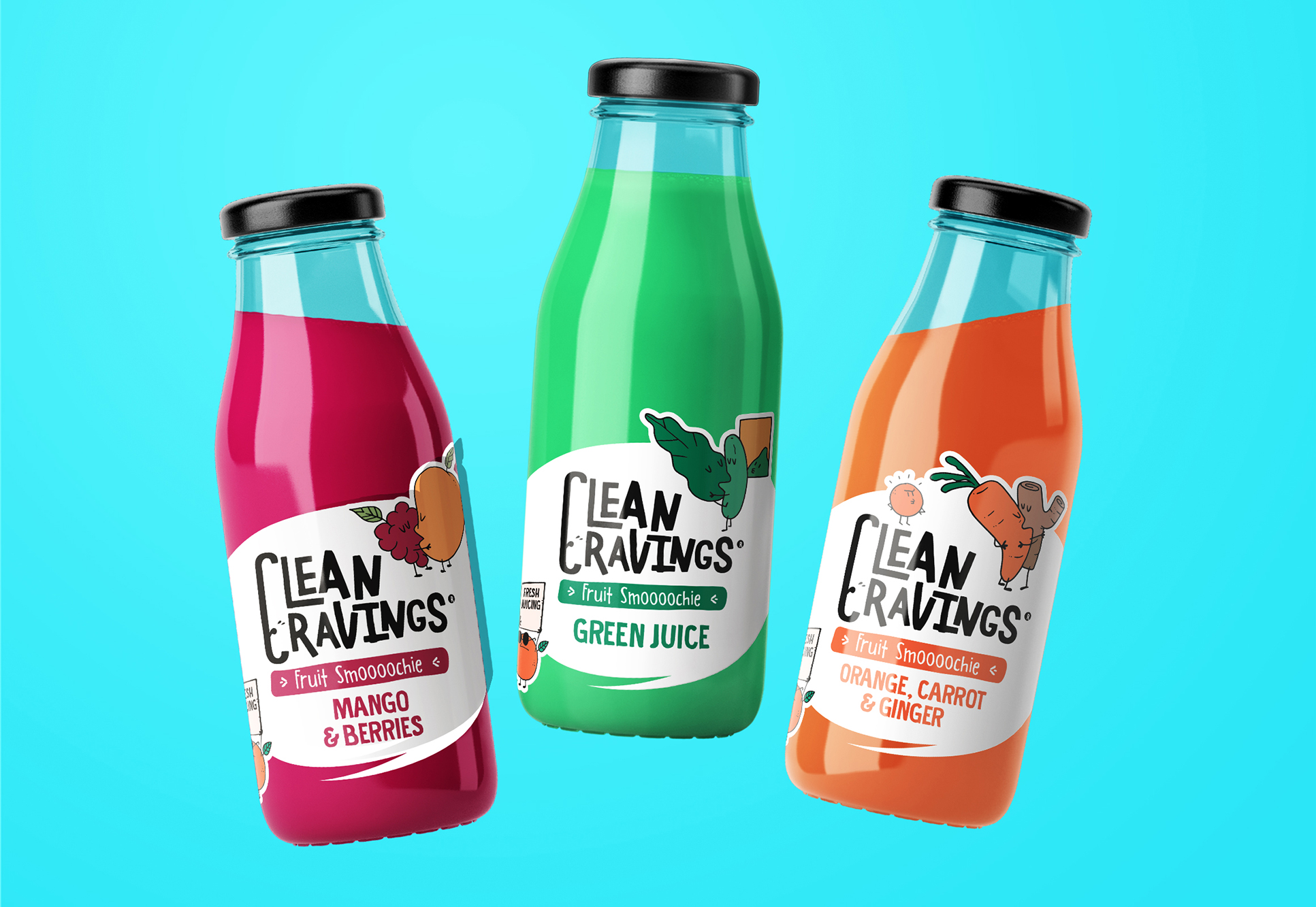
We’ve paired this hero element with a typeface that’s irregular and playful – moving away from the dull and reserved nature of generic healthy brands. We did so in order to give the brand a bit of a childlike innocence to it that makes it hard not to love. The typeface is consistently black throughout the various SKUs and variants in order to give room for the logo devices to speak for themselves and maintain some form of inherent uniqueness.
Taking a closer look at these logo devices, we wanted to give them their own aura of freedom and irregularity. This was achieved by designing them as if they were fruit juice and salad dressing stains – perfect imperfections – that encapsulate the logo a whole.
Now we move to the fruits and vegetables, the apparent troublemakers in this whole thing. Looking at some of the most successful snack brands, we find a common trail of iconic and personified characters that bring the brand to life. In our case, our troublemakers are the good guys, with a hint of naughtiness. Depending on the SKU in question, we gave each their own unique visual narrative and scenes that speak to the qualities found in the products themselves:
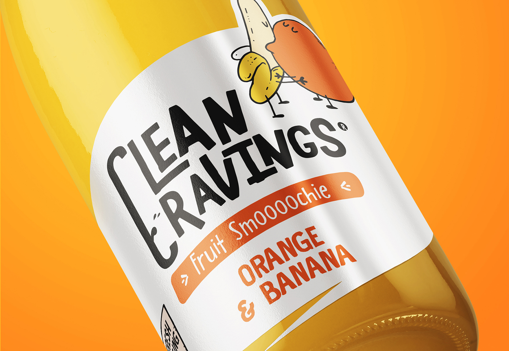
‘Fruit Smoooochies’ Pucker up, sugar. This lines consists of smoothies made up of two varieties of fruits. Each of the varying flavours see a pair of fruits getting hot and heavy, with a nosey bystander that’s not too happy in the background.
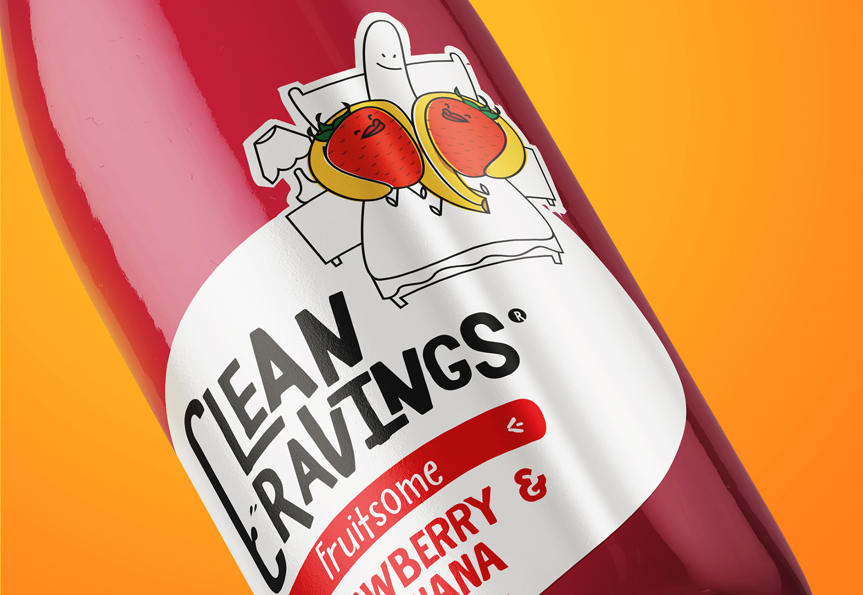
‘Fruitsomes’ 2’s a crowd but 3’s a party. This line of smoothies takes things to another level by having 3 or more fruits in a bunch. We see a couple of strawberries get down and dirty with a fortunate banana.
‘Raps of the Day’ Twists and turns for these wraps. These on-the-go meals consist of a variety of healthy goodies in a soft tortilla. Our line here see the vegetables all rapped up spitting some fire (FYI – that’s millennial for rapping).
‘Saladbomb’ Did someone say skinny dip? A range of salads that are ready to run wild, these veggie bowls depict a range of greens about to make a mess, with a wild avocado jumping her troubles – and bikini – away.
‘Fruitbomb’ Fructose central. Our range of fruit salads come in a wide array; from melon mix to carrot sticks. We see the bowls of fruit up top with the relevant player making a run for it. We’ve also paired them an apple holing a sign that reads “Blame Eve not me!!”
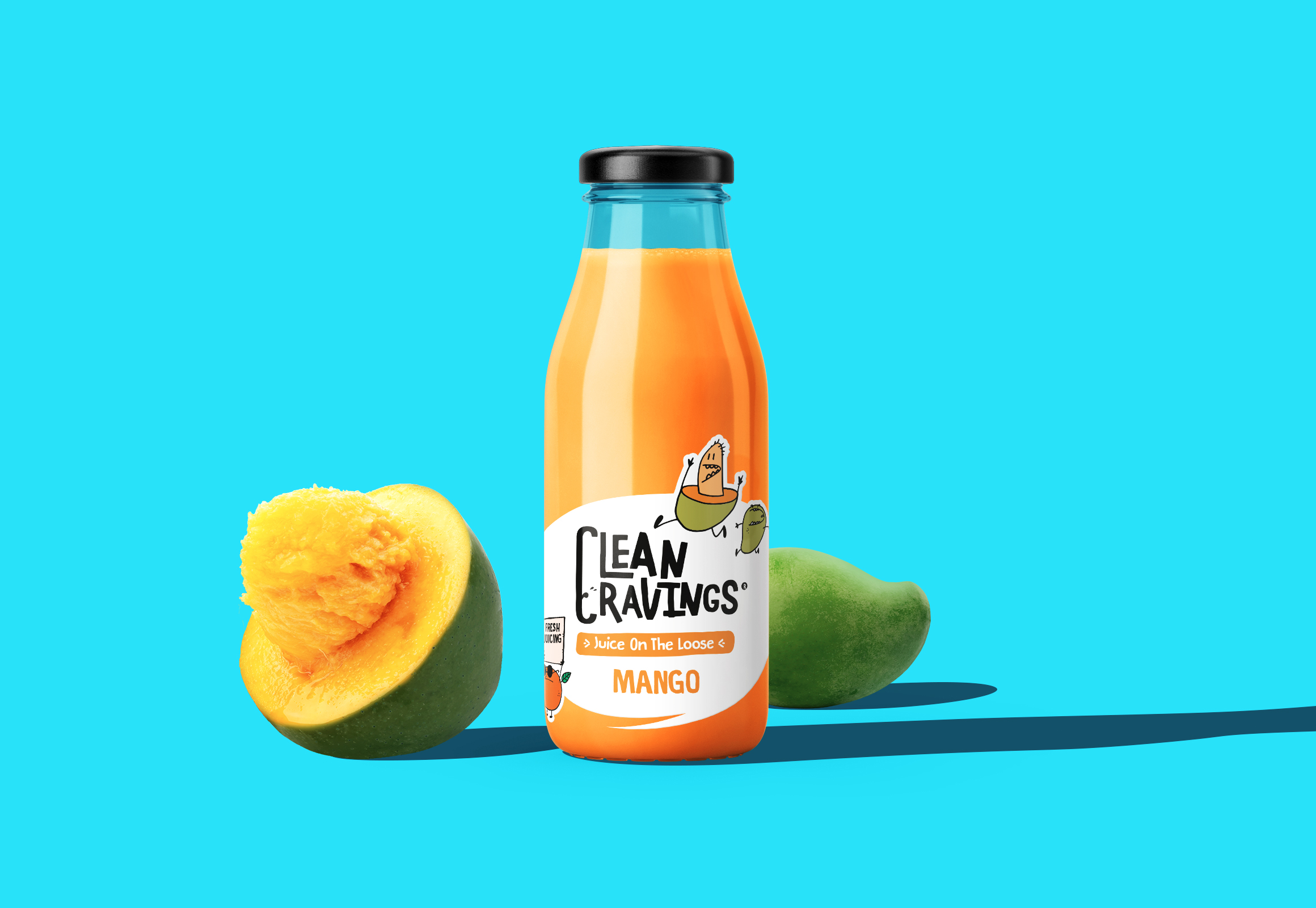
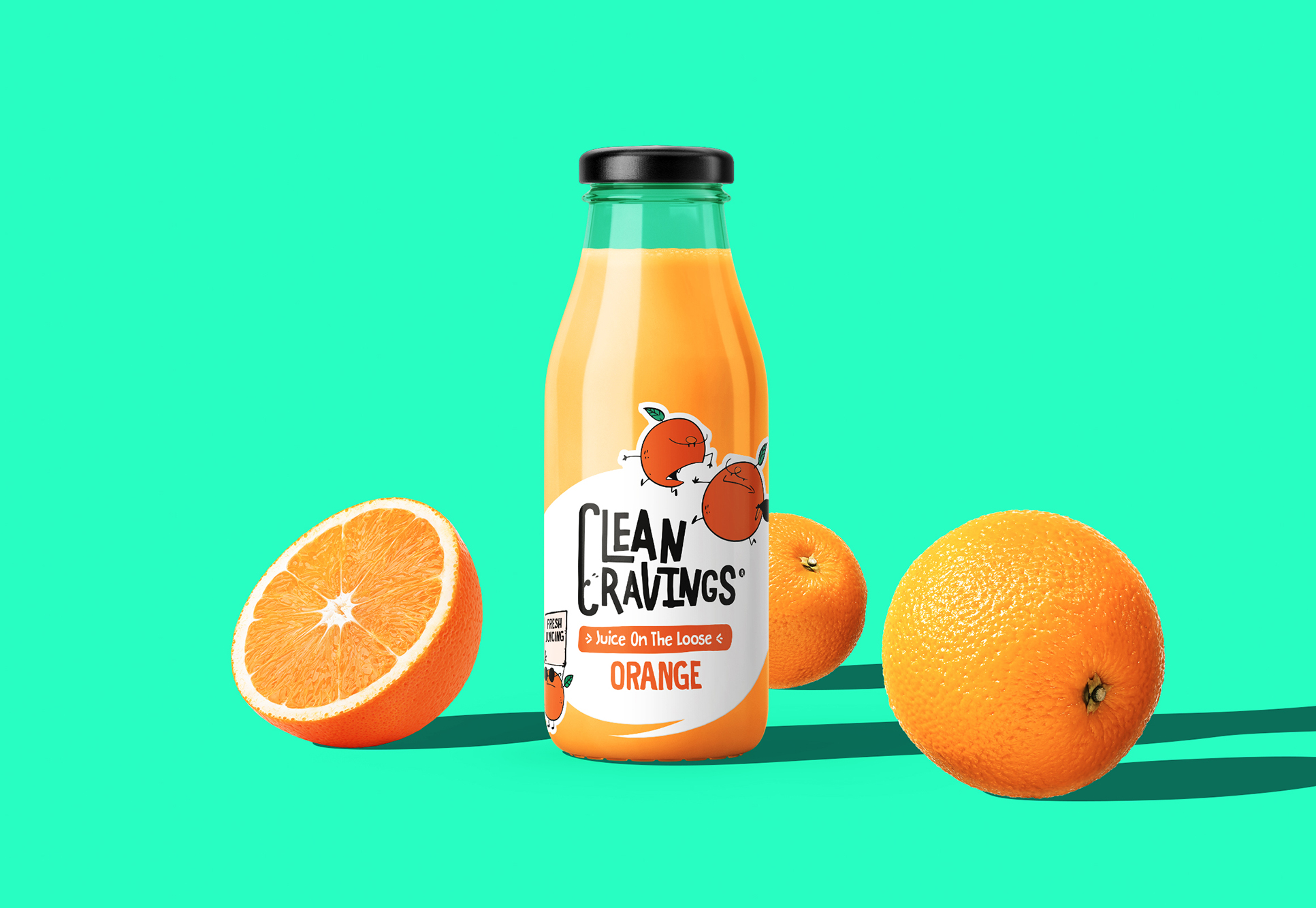
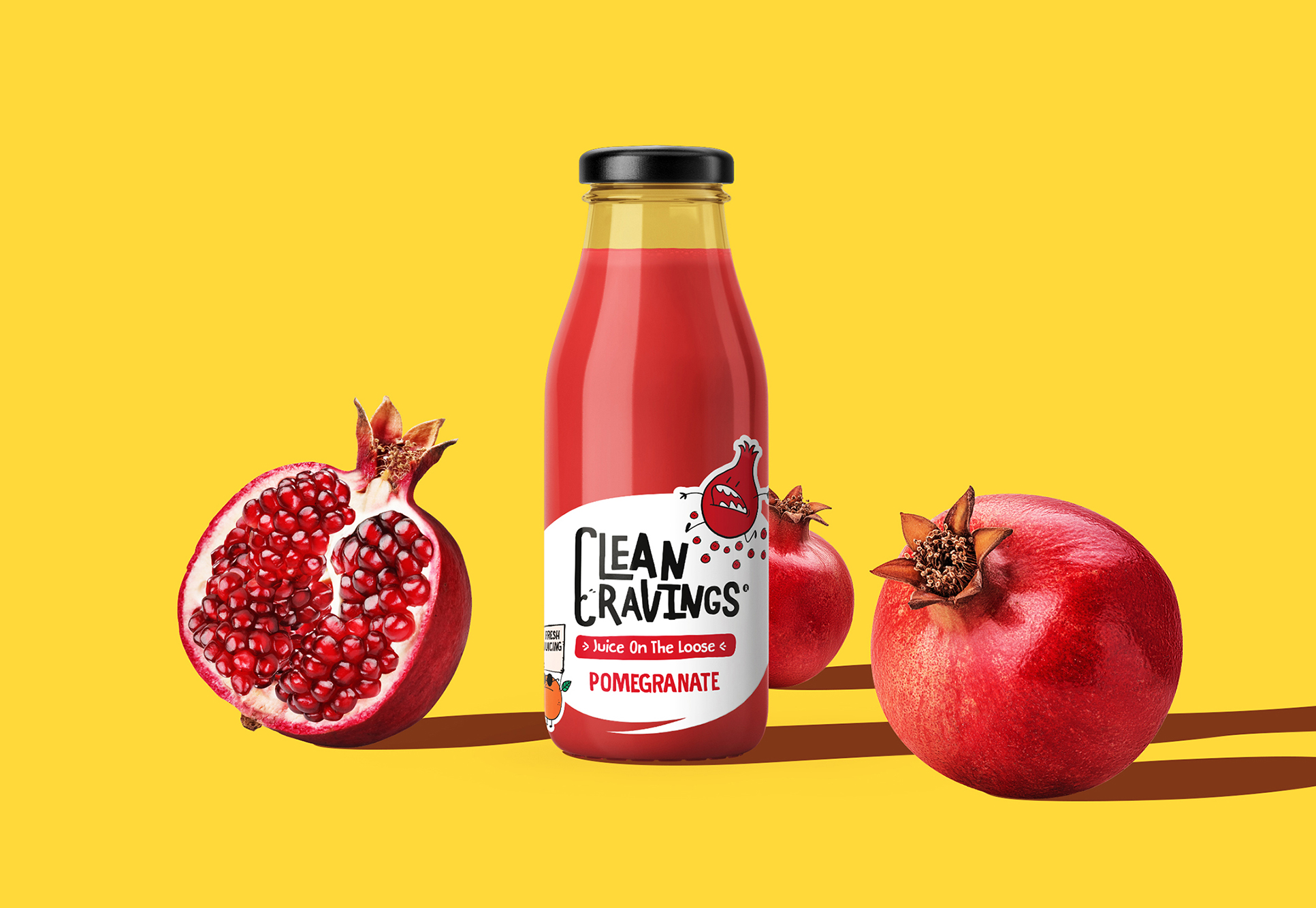
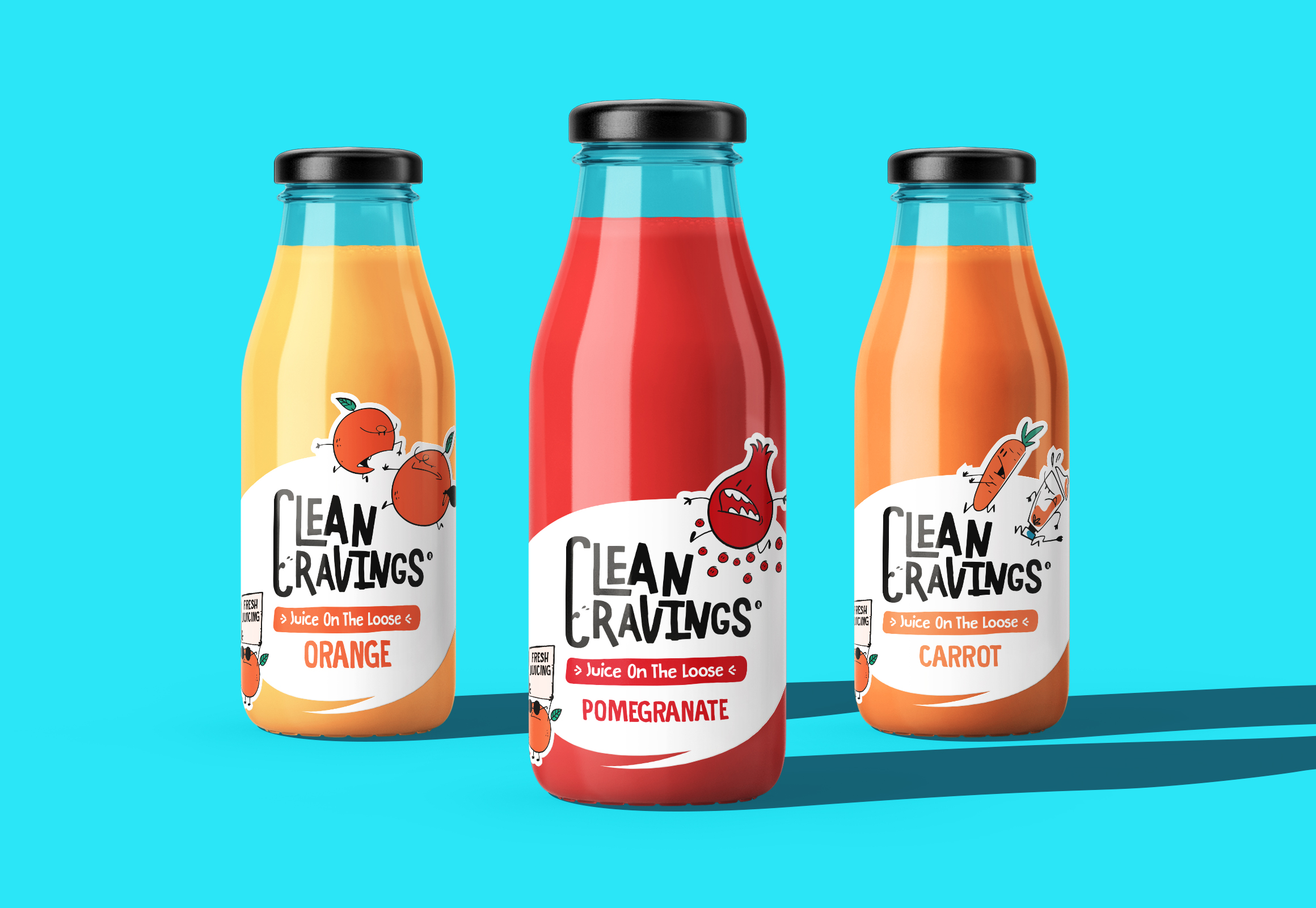
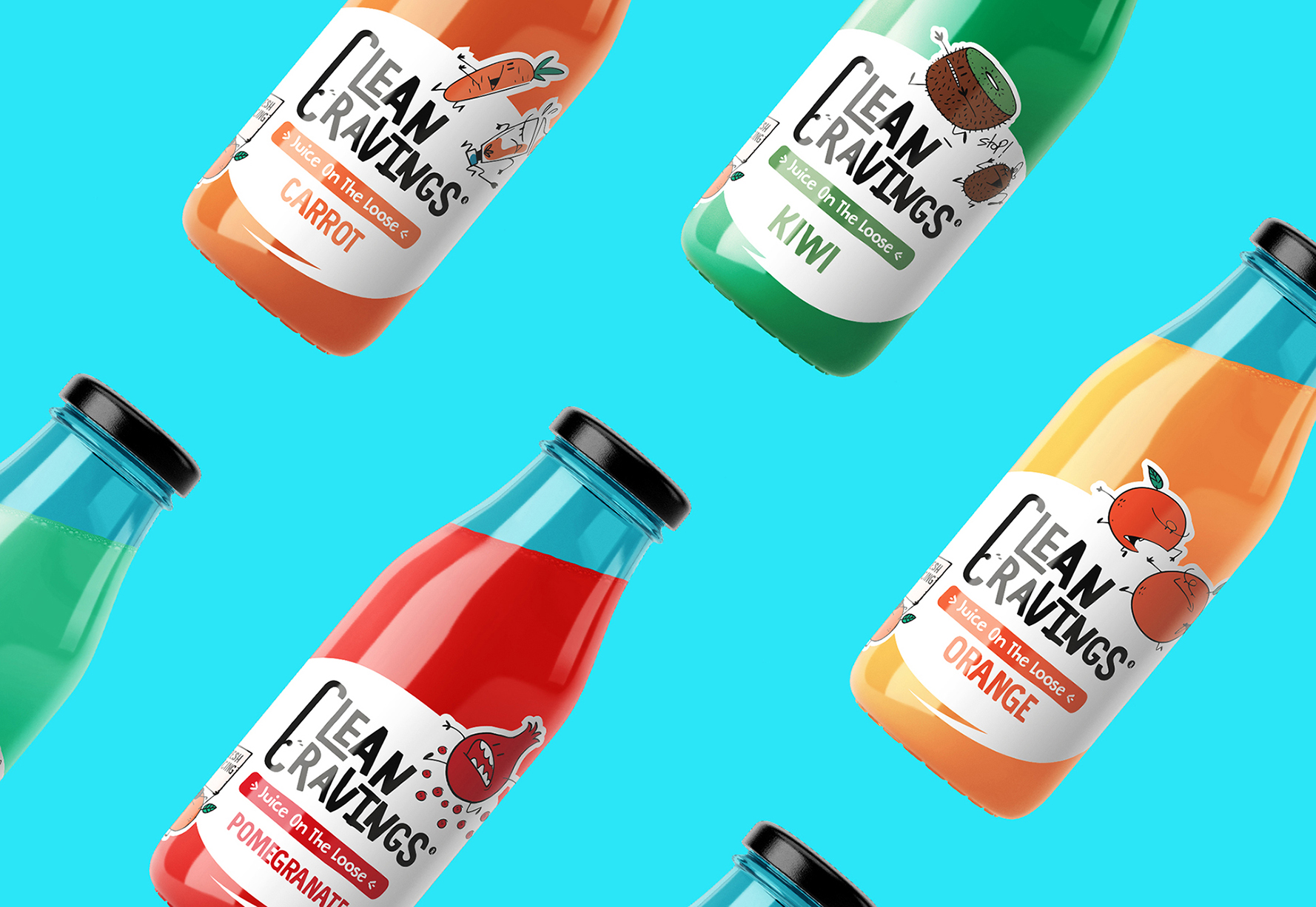
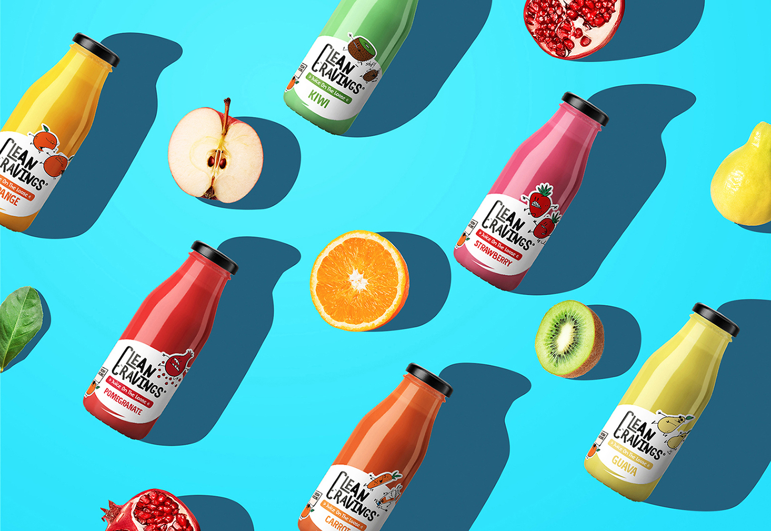
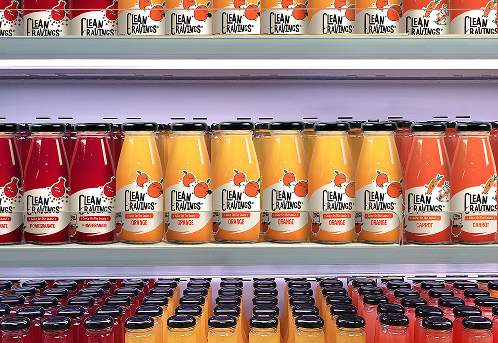
Juice on the loose’
Fresh AF. This line fresh juices, made of a single type of fruit, sees a pair of the fruit running after one another, presumably trying to get a taste of that natural goodness. We’ve paired them with a cool orange with a sign reading “Fresh Juicing”, with an even fresher pair of shades.
Looking at this brand’s journey as a whole, we planted the seeds and nurtured what would become the forbidden fruit of the health-snack industry in Egypt. Flavoring the brand identity with hints of goodness and a fun-loving nature that would give any competitor a run for its money, or should we say juices? Every touchpoint was as critical as the last and in light of the desire to make healthy cool again, we delved deep and whole-heartedly to produce something we, and our consumers, can be proud of. Enjoy the fruits of our labour.

CREDIT
- Agency/Creative: The Brand company
- Article Title: The Brand Company Designs Clean Cravings Juices Packaging
- Organisation/Entity: Agency, Published Commercial Design
- Project Type: Packaging
- Agency/Creative Country: Egypt
- Market Region: Middle East
- Project Deliverables: Brand Naming, Brand Strategy, Branding, Illustration, Packaging Design, Product Naming, Tone of Voice
- Format: Bottle
- Substrate: Glass Bottle


