VAVI is a brand specializing in providing typical Vietnamese agricultural products, including the procurement, sorting, and distribution to domestic stores and supermarkets, as well as exporting to international markets. The main products distributed by VAVI are high-quality fruits, harvested from farms in Vietnam. This contributes to building a positive image of Vietnamese agricultural products and supports the development of the country’s agricultural industry.
Logo
The logo is inspired by the image of a fence, which is a common sight at many farms, and combines two interlocking “V” letters. The fence symbolizes protection and safety throughout the process of producing and transporting agricultural products, evoking a sense of closeness and trust with both farmers and partners. This conveys reliability to customers and reinforces confidence in the brand.
The design is minimalist, modern, sophisticated, and professional, emphasising the value of organic products and effectively conveying the message of clean, nutrient-rich, and chemical-free agricultural goods.
Pattern
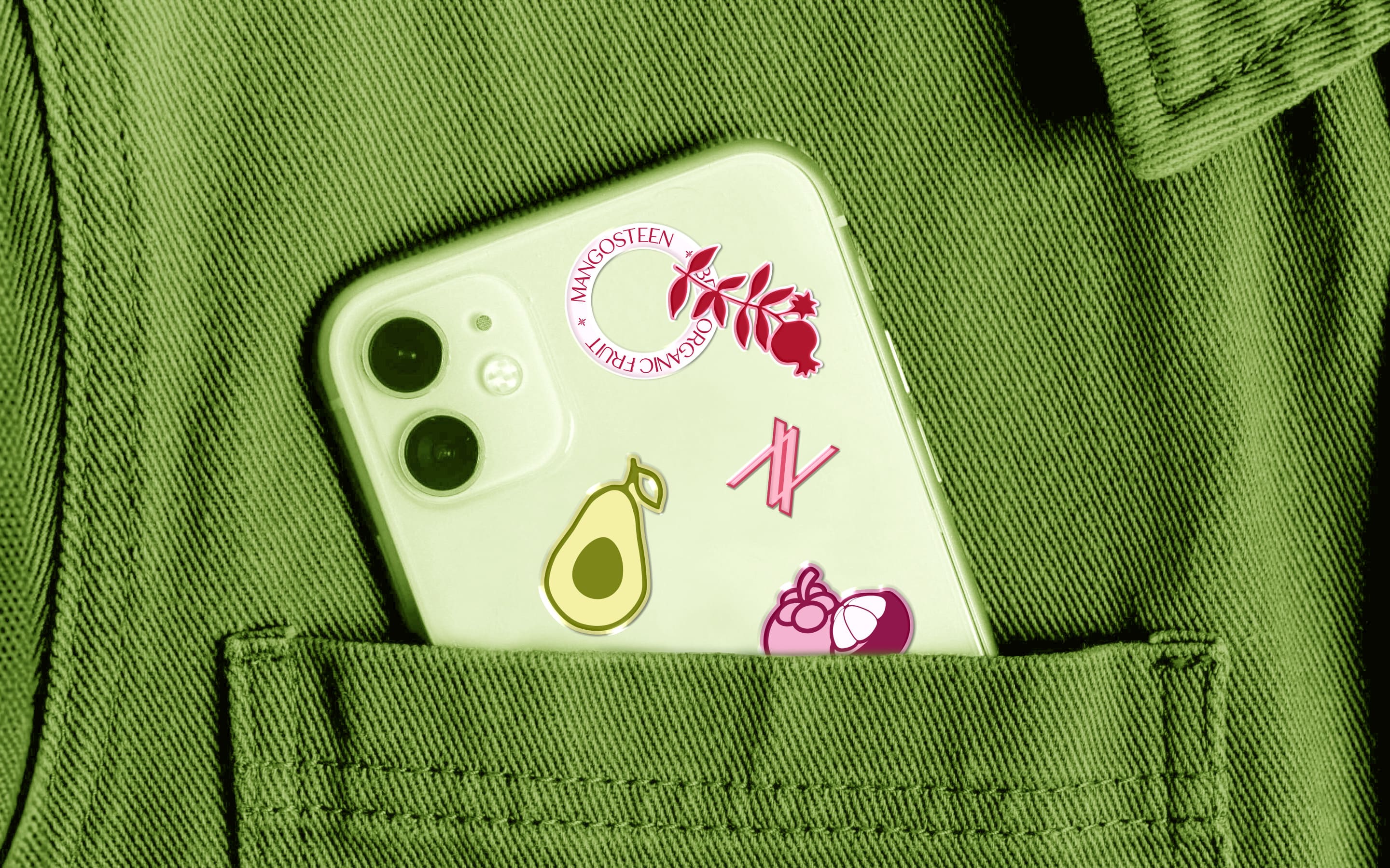
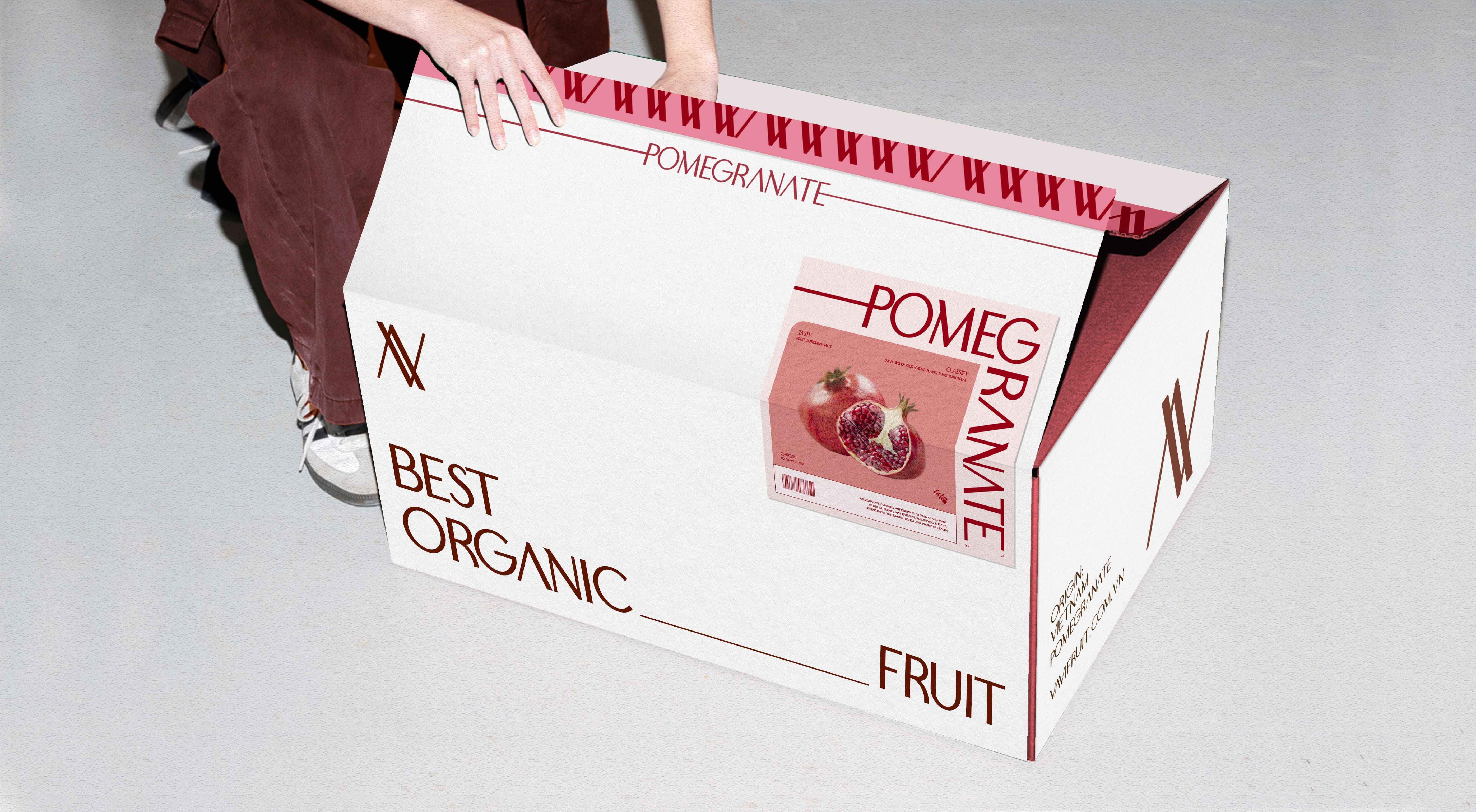
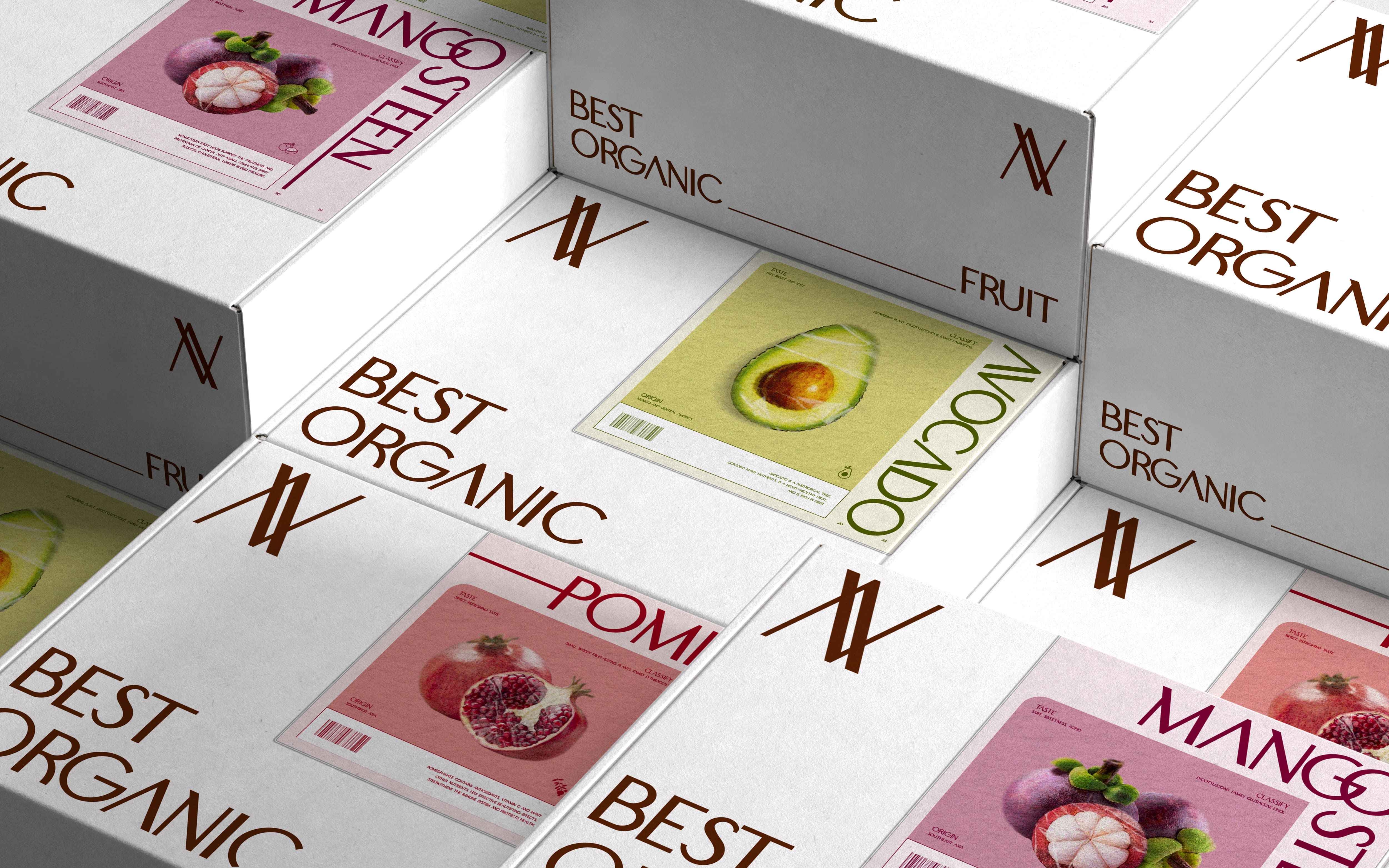
This pattern consists of multiple logo symbols interwoven with each other. They are arranged carefully in an organised and systematic way, resulting in a harmonious, balanced, and visually appealing design.
Typography
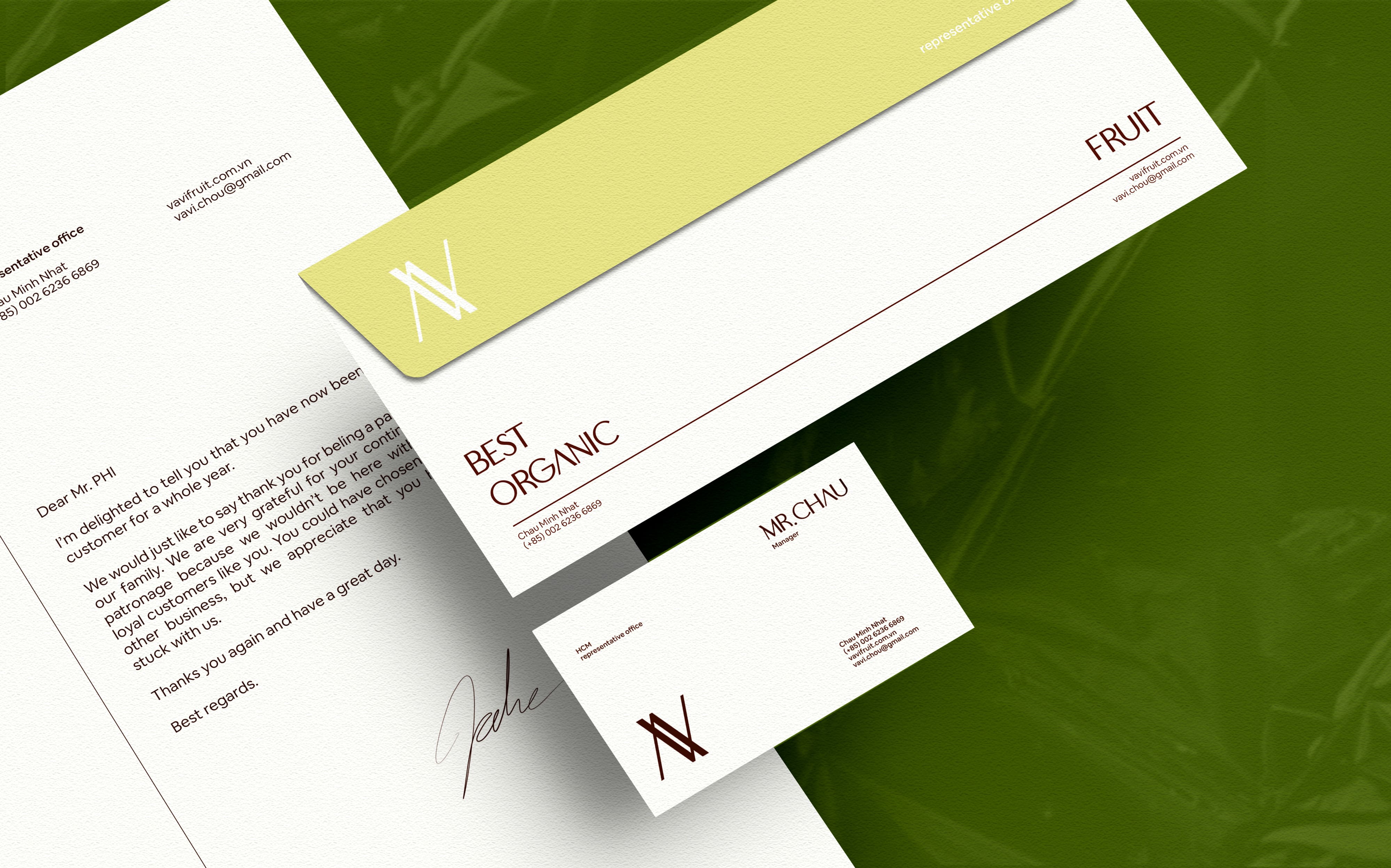
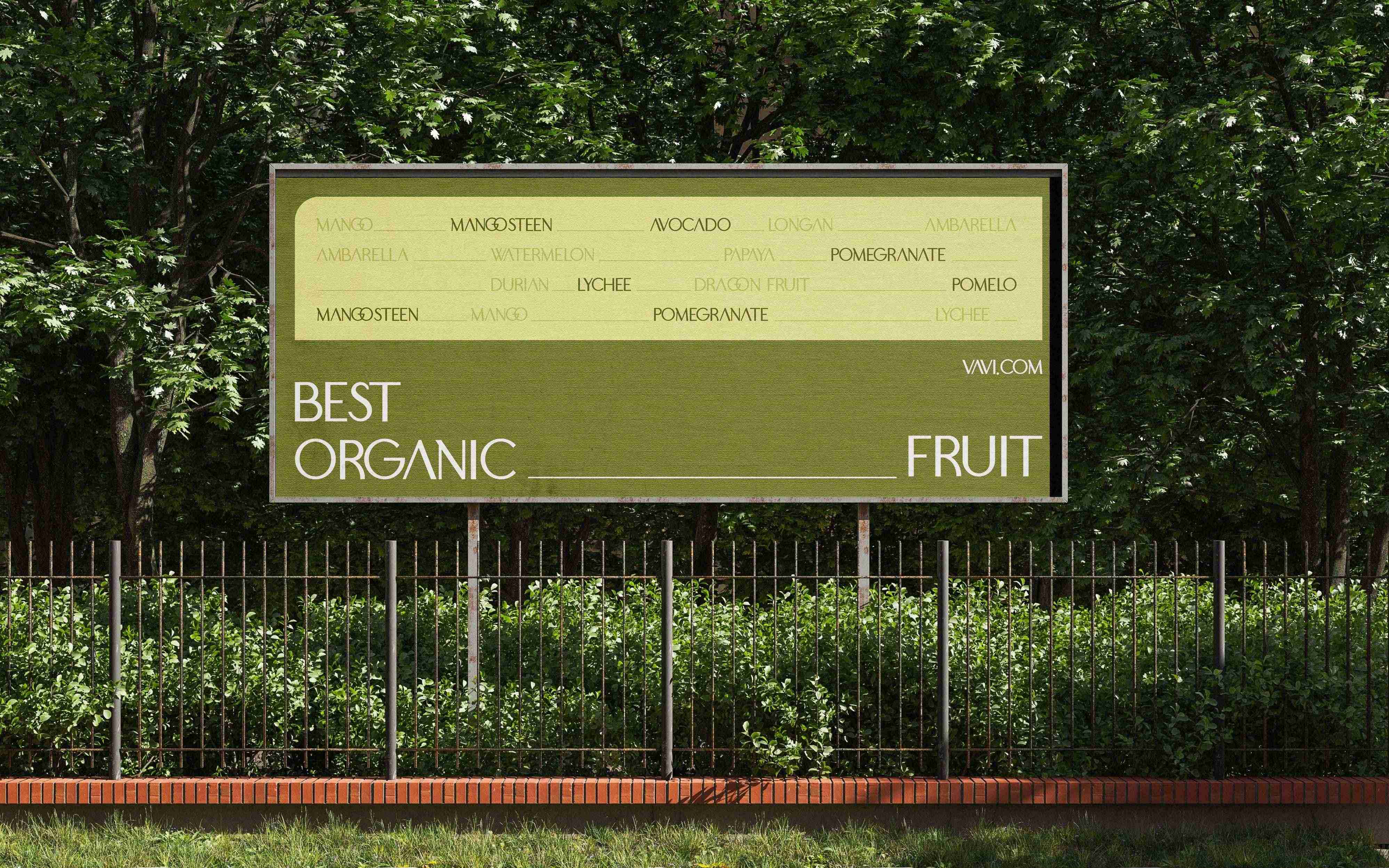
The use of a sans-serif typeface with thin yet sturdy strokes conveys a sense of interweaving, reminiscent of a fence, while also working effectively and seamlessly in print and across a variety of platforms.
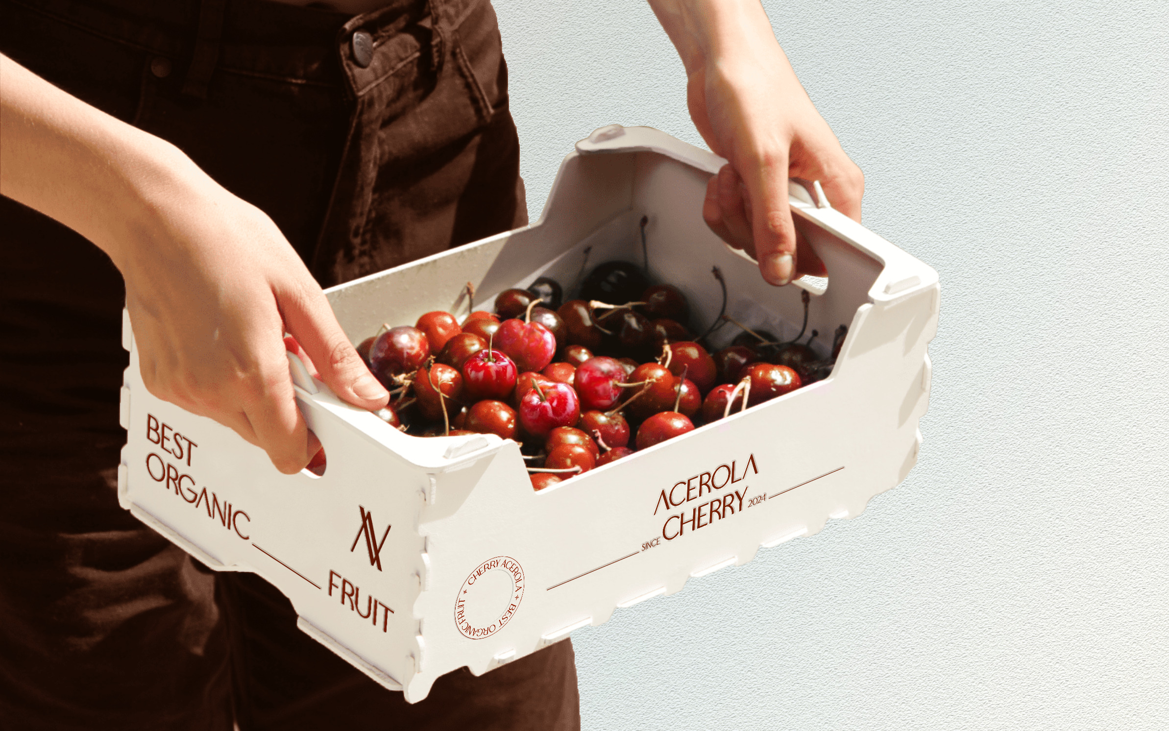
With small details on the packaging, such as stripe patterns, a well-balanced layout, and the thoughtful use of white space, it creates a clean, modern, and professional feel, focusing on systematisation and consistency.
Colour
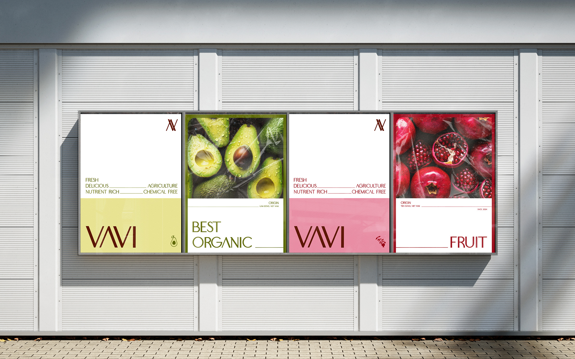
The color palette, inspired by the many different colors found in agricultural products, emphasises the simplicity and naturalness of the fruit, with the tones graded to vividly represent the dynamic and varied nature of the agricultural landscape. This arrangement helps evoke the richness and diversity of the agricultural world, highlighting the vitality, freshness, and quality of the fruits.

CREDIT
- Agency/Creative: Huong Chau
- Article Title: The Brand and Packaging Design for VAVI’s Agricultural Products was Created by Huong Chau
- Organisation/Entity: Freelance
- Project Type: Identity
- Project Status: Published
- Agency/Creative Country: Vietnam
- Agency/Creative City: Huong Chau
- Market Region: Asia
- Project Deliverables: Brand Design
- Industry: Agriculture
- Keywords: fruit, organic, farm, agricultural, brand design
-
Credits:
Designer: Huong Chau


