


Cerveja 048 began as the brainchild of an engineer with a vision to create a compact, automated machine for crafting beer at home, aimed at simplifying the lives of experimental brewers and providing large breweries with an avenue for experimenting with new recipes on a smaller scale.
Numerous tests were conducted to perfect the machinery, resulting in the production of numerous beers that garnered widespread acclaim among those close to the project. This was in 2016 when the craft beer market was not yet widespread. With such positive reception, the company shifted its focus from manufacturing the machine to establishing a craft beer brand. They chose the name “048” in homage to Florianópolis, its birthplace. The task at hand was to create the entire visual identity and packaging.
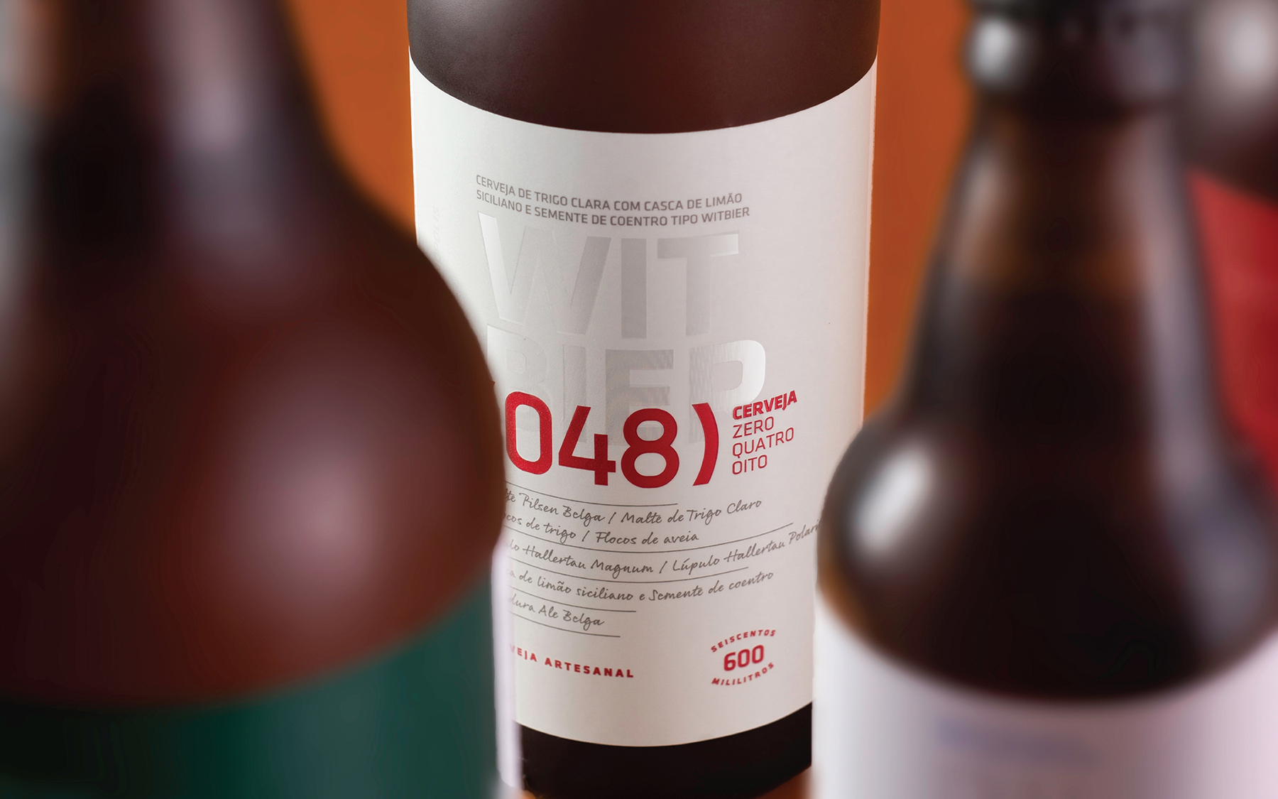
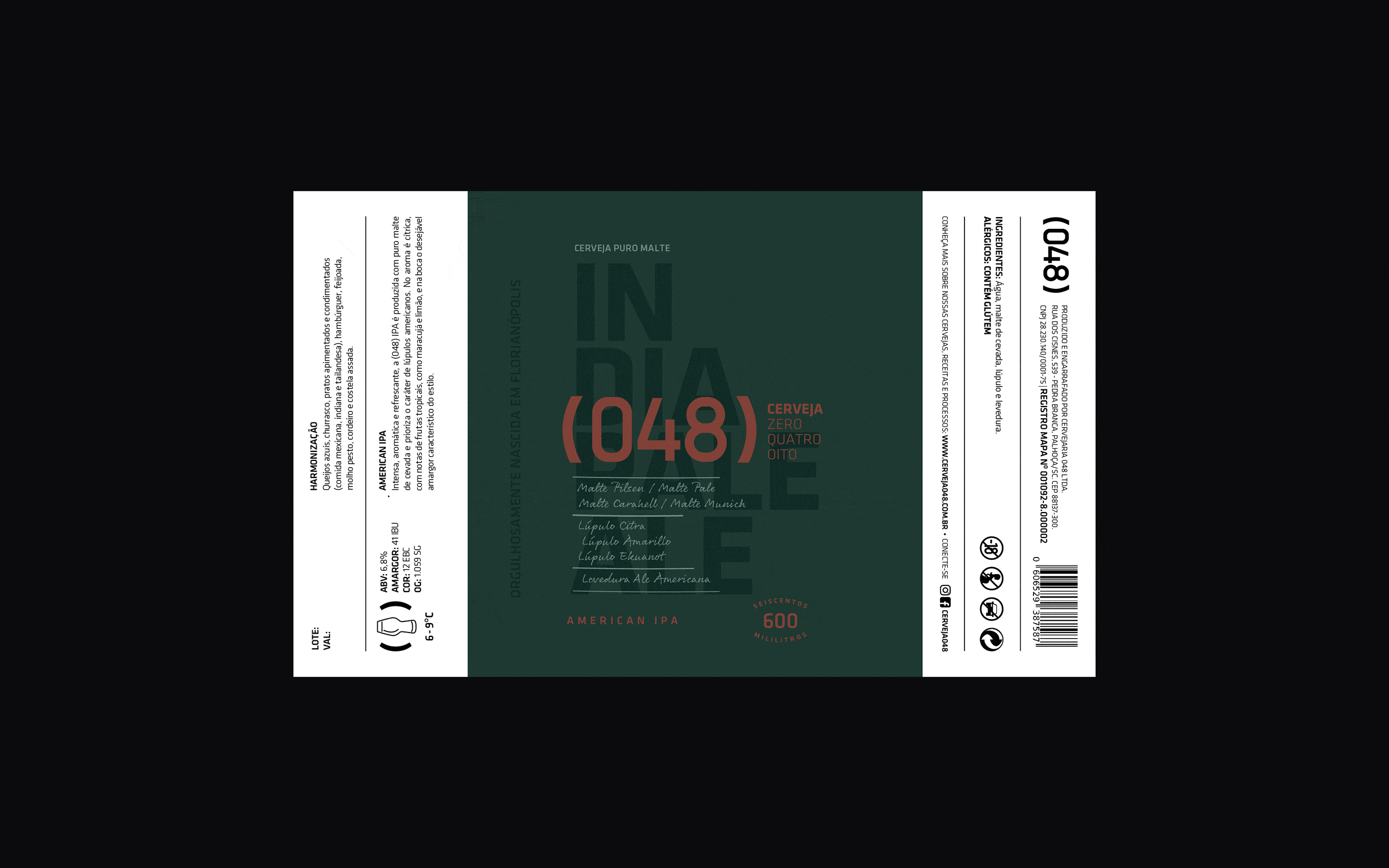
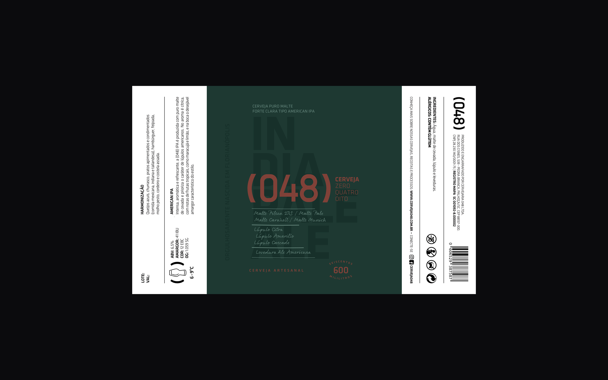
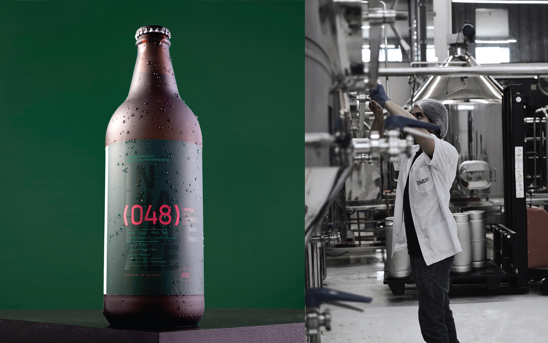
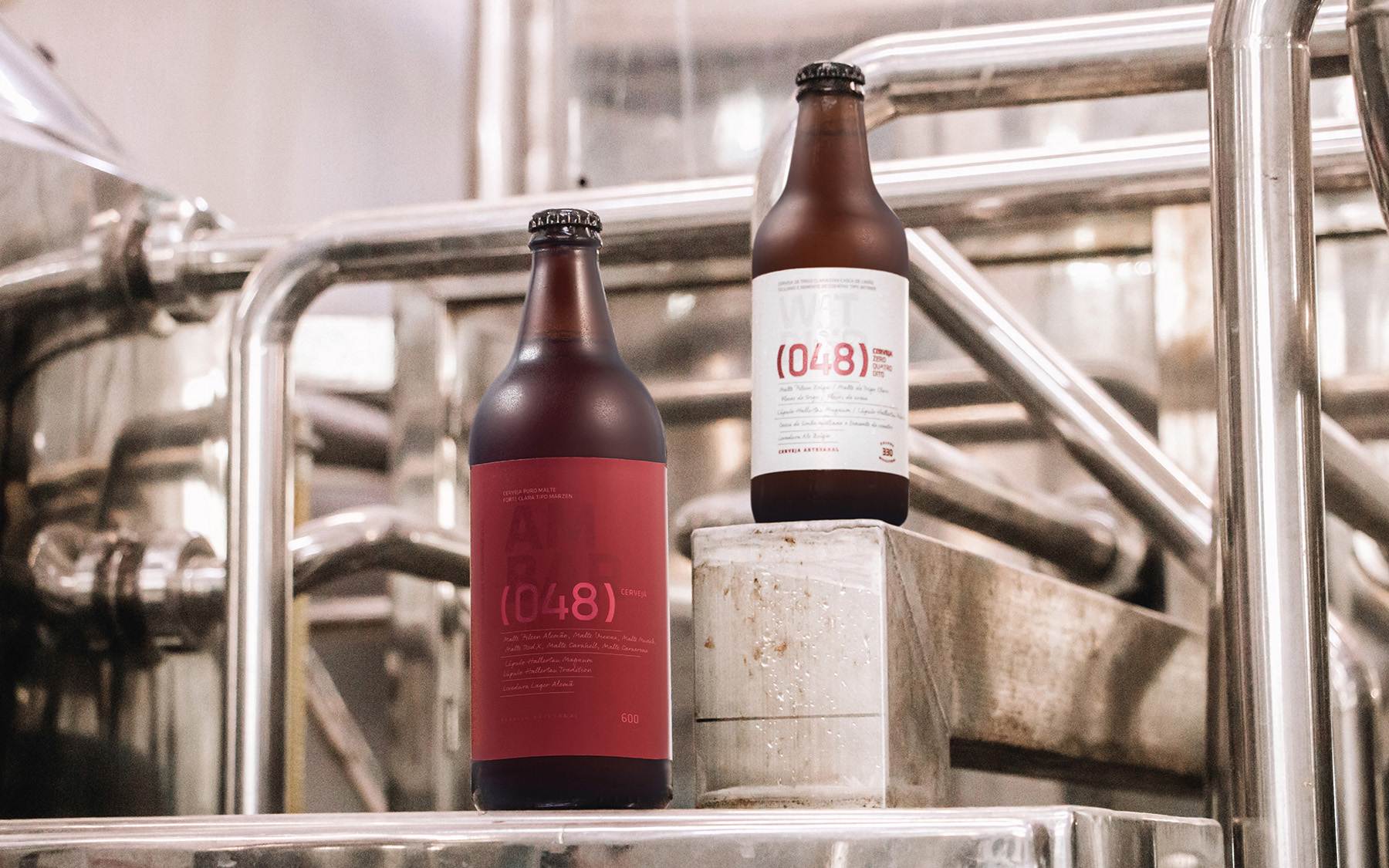
The primary goal was to establish a distinct identity that deviated from the traditional aesthetics of craft beers. This was achieved through the use of illustrations and a “handcrafted” feel. The brewery, rooted in the engineer’s vision, carried an essence of a laboratory with well-defined processes, emphasizing a pursuit of excellence. This led to the creation of a minimalist identity exuding sophistication, featuring elements reminiscent of formulas and processes.
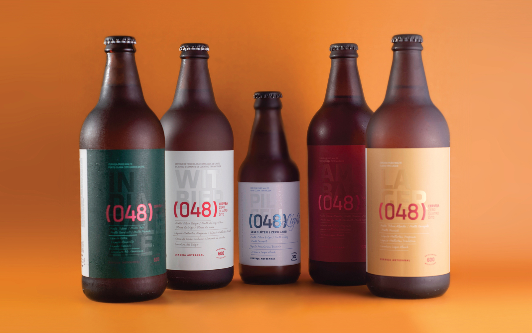
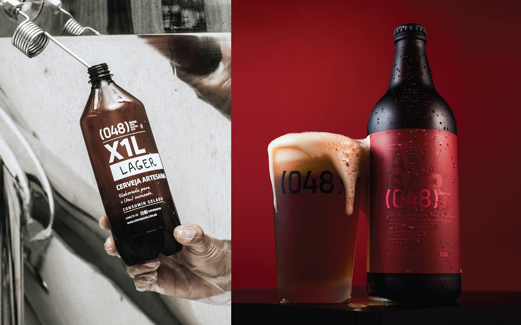
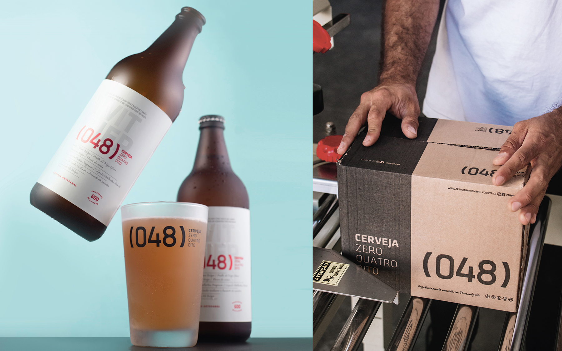
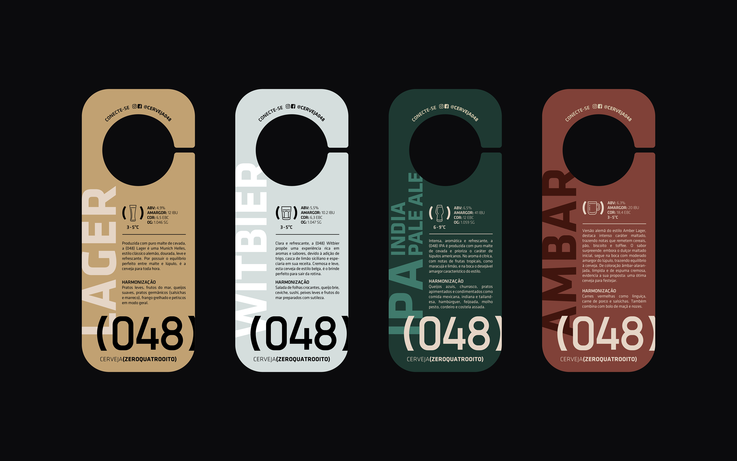
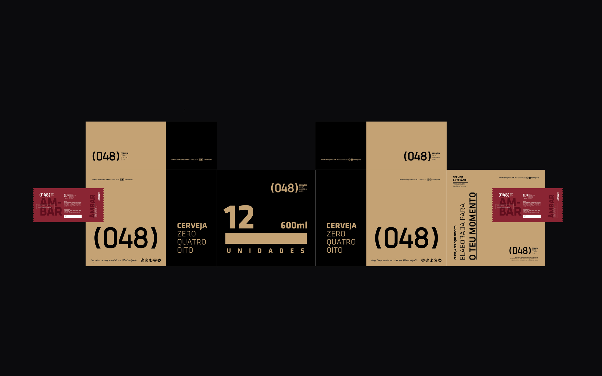
The company’s focus on affordability without compromising on premium quality led to the prioritization of 600ml bottles as the flagship product. Attention to graphic finishes of the labels was paramount. Color became the distinguishing feature of the labels, reflecting the attributes of each beer style through the choice of palettes.
Typography played a significant role in branding, using a classical, technical font for the brand and technical details and a calligraphic font to convey the handmade aspect, reinforcing the idea of a person meticulously crafting the recipes and production. The decision to include the recipe on the packaging aimed to convey transparency.
The product’s launch captivated the target audience, with initial batches selling out rapidly. It stood out among other craft beers on the shelf, known for their rustic or vibrant, attention-grabbing designs. The elegant and friendly appearance of the packaging became a game-changer, attracting numerous points of sale and serving as a cornerstone for the company’s branding and communication strategies.
CREDIT
- Agency/Creative: FatFaceStudio
- Article Title: The Art and Science Behind Cerveja 048’s Distinctive Beer Branding and Packaging
- Organisation/Entity: Agency
- Project Type: Packaging
- Project Status: Published
- Agency/Creative Country: Brazil
- Agency/Creative City: Florianópolis
- Market Region: South America
- Project Deliverables: Branding, Packaging Design
- Format: Bottle
- Industry: Food/Beverage
- Keywords: beer alcohol
-
Credits:
Creative Director: Luiz Pegoraro


