


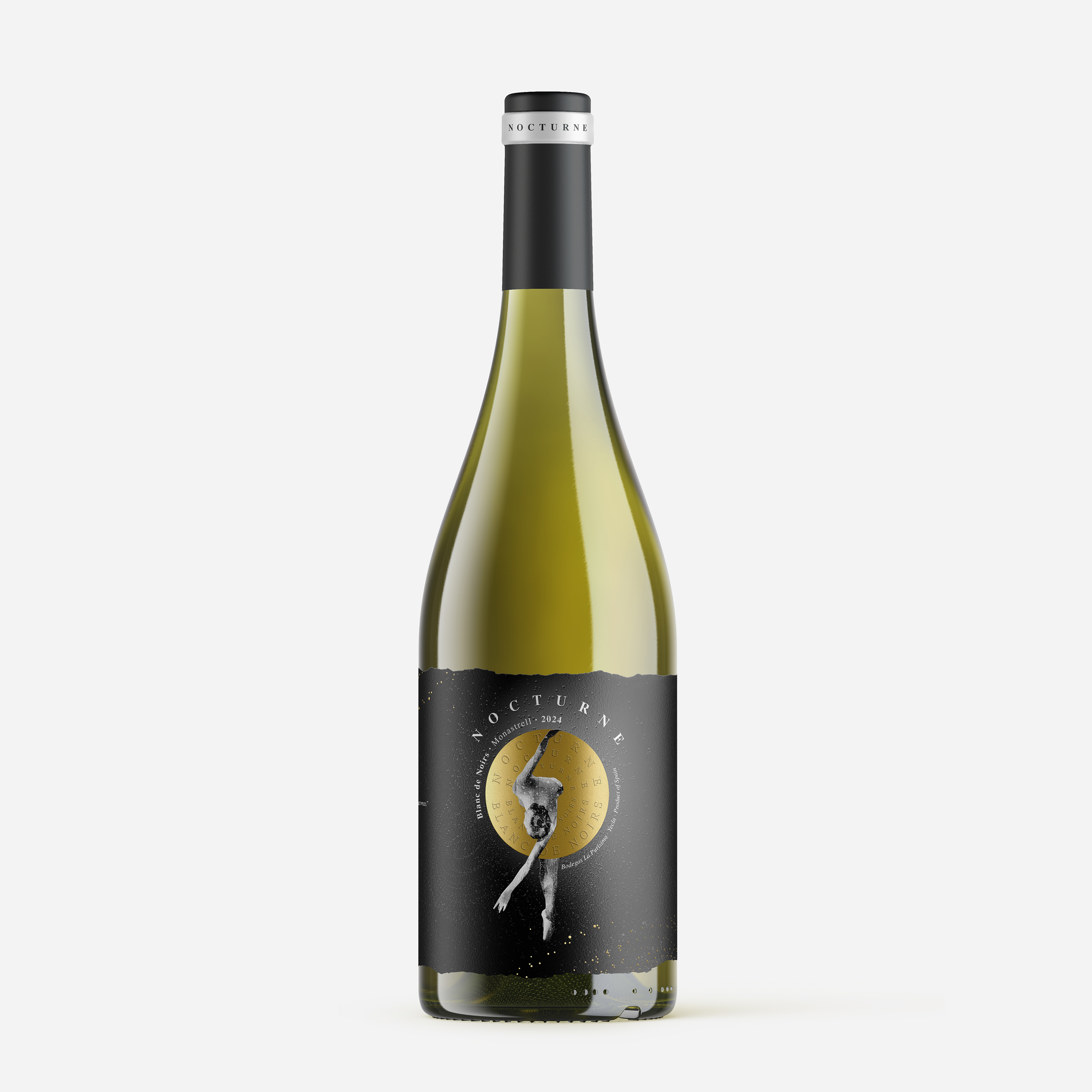
At our design studio, Armoder, specializing in branding and packaging for the wine industry, we developed the visual identity for a Blanc de Noirs wine project made entirely from Monastrell grapes, harvested during the night. This wine, from Bodegas La Purísima, captures elegance and dynamism in its essence, and our design reflects these characteristics through a carefully crafted visual narrative.
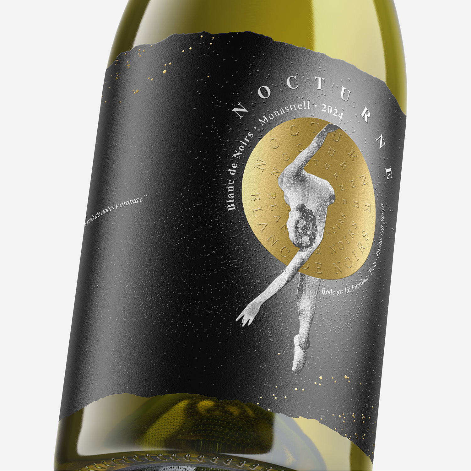
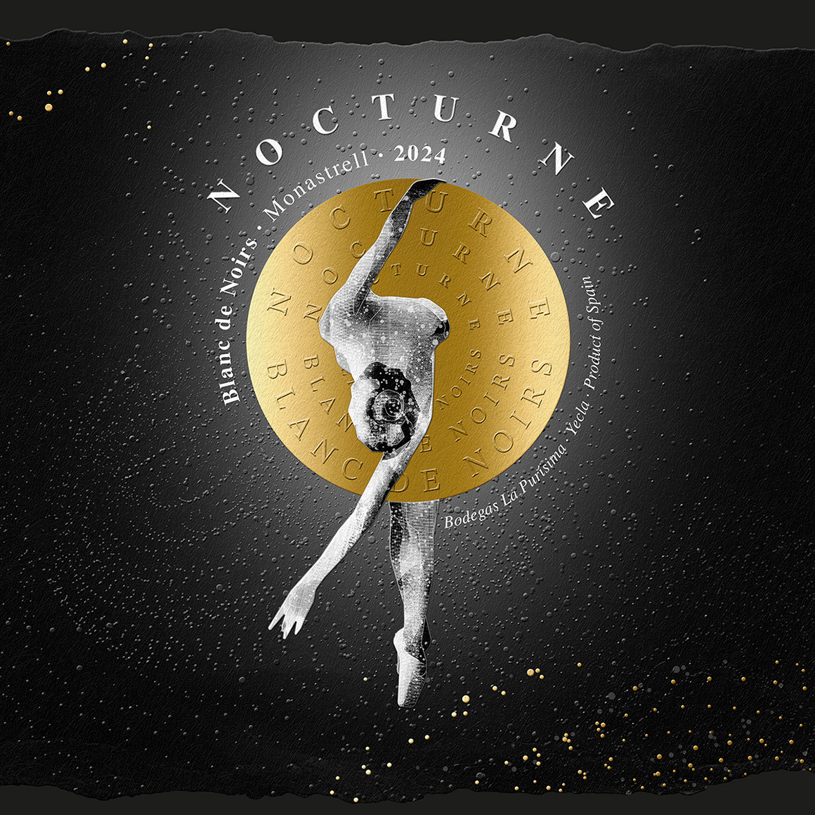
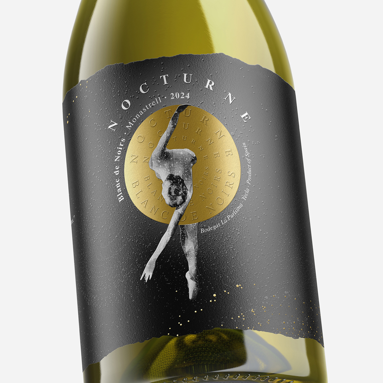
The image is inspired by a classical ballerina, whose delicate dance under the September moon evokes the elegant notes and technical precision of this wine. The label translates this dance into visual form through details that capture movement and the golden light that illuminates the night. Every design element, from colors to finishes, was thoughtfully chosen to convey the story behind this wine.
The label, designed entirely on a black background, symbolizes the stillness of the night—the perfect stage for the ballerina to perform her choreography. This dark backdrop highlights the central figure of the ballerina, depicted in black and white in a classical pose that symbolizes balance, grace, and precision.
In the design, the golden circle representing the moon holds a dual meaning: beyond illuminating the scene, it visually suggests the ballerina’s dress. This element features a glossy finish, adding a premium touch to the overall composition.
Surrounding the ballerina, we designed an arrangement of dots in varying sizes, strategically placed to represent the trail of movement left by her dance. These raised dots add dynamism to the design and create a tactile experience that enhances interaction with the bottle.
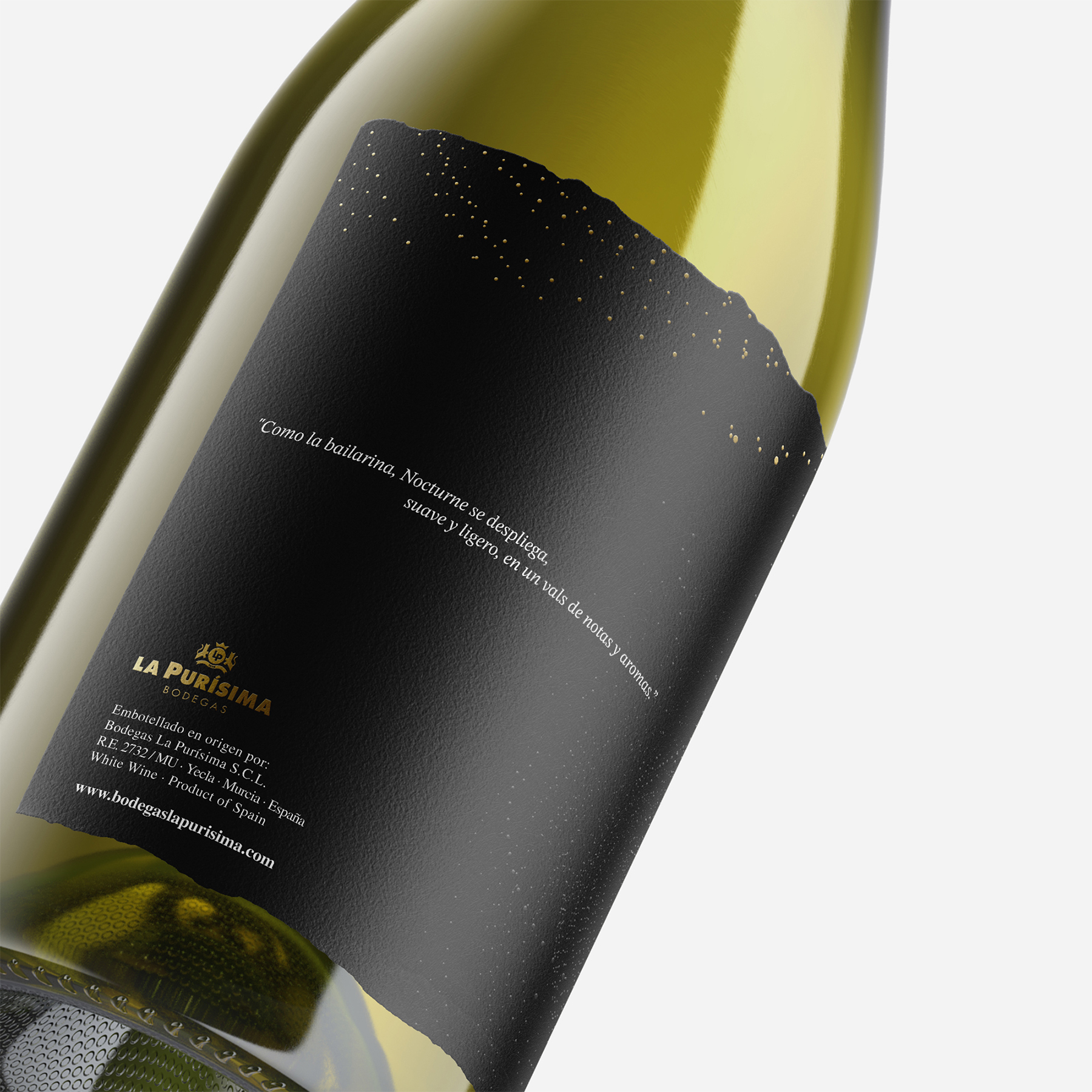
The label is conceived as a wraparound piece with “torn” edges at the top and bottom, reinforcing the idea of carefully crafted work. The entire label illustration was created in our studio, where each element—the ballerina, the golden moon, and the movement-symbolizing dots—was designed to reflect the essence of the wine. This texture, combined with the embossed wine name and illustration details, invites consumers to engage with the design.
As described in the tasting note, this wine unfolds a combination of tropical aromas such as pineapple and mango, with a citrusy grapefruit background that evokes freshness and character. These notes are visually translated into the golden details and flowing dots, while its acidity and smoothness are reflected in the balanced composition of design elements. The precise fermentation process, carried out below 16°C, and the various battonnages that enhance the wine’s elegance and uniqueness find their visual counterpart in the balance between dark tones, golden highlights, and tactile embossing. With every glass, a unique choreography—Nocturne Blanc de Noirs.
CREDIT
- Agency/Creative: Armoder Arte y Diseño
- Article Title: The Armoder Studio Creates the Image of Blanc de Noirs Nocturne Wine
- Organisation/Entity: Agency
- Project Type: Packaging
- Project Status: Published
- Agency/Creative Country: Spain
- Agency/Creative City: Valencia
- Market Region: Global
- Project Deliverables: Branding, Illustration, Label Design, Packaging Design
- Format: Bottle
- Industry: Food/Beverage
- Keywords: Armoder, packaging design, label design, Spain, Wine label design
-
Credits:
Creativity / Design: Giovanni Acquaviva
Illustration: Giovanni Acquaviva


