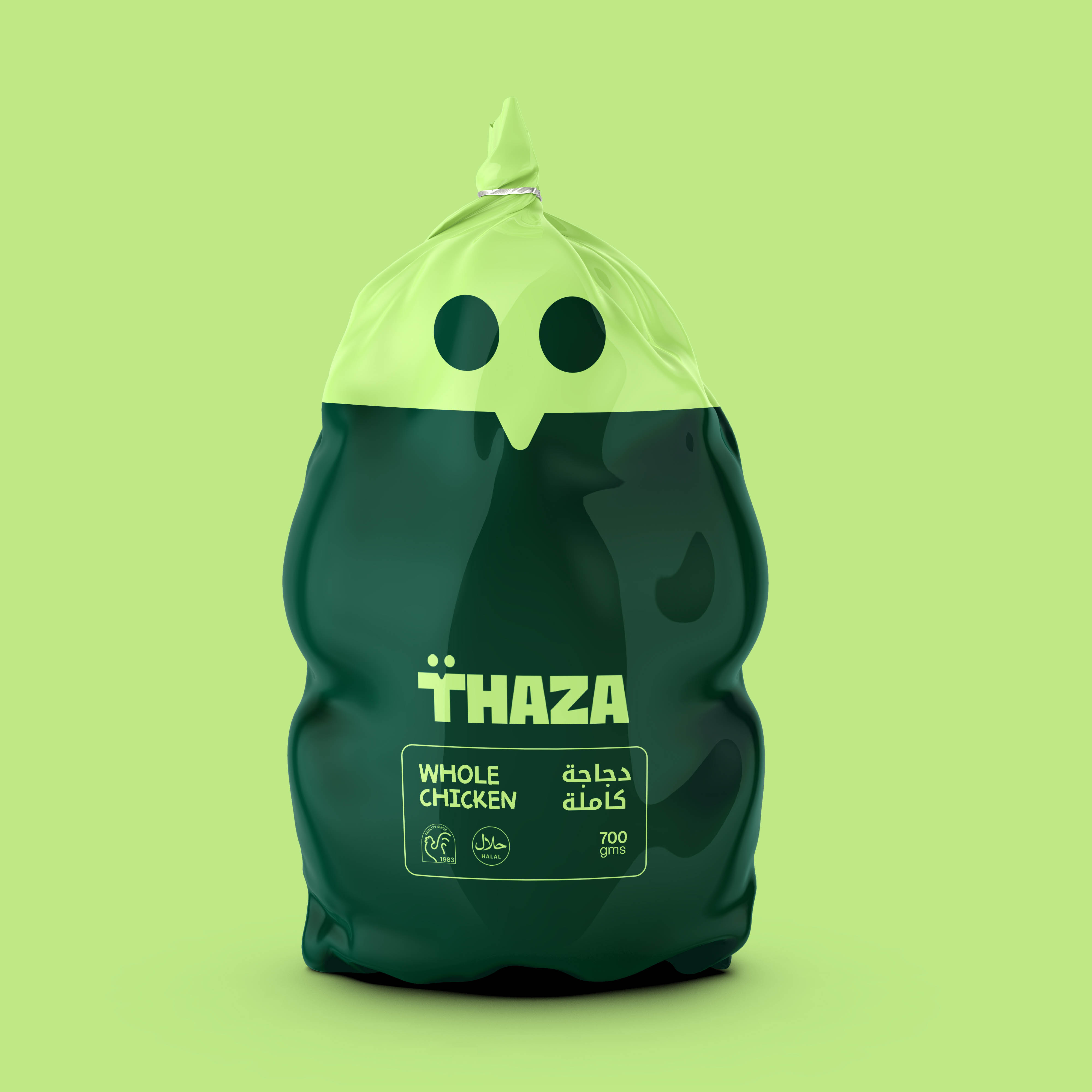
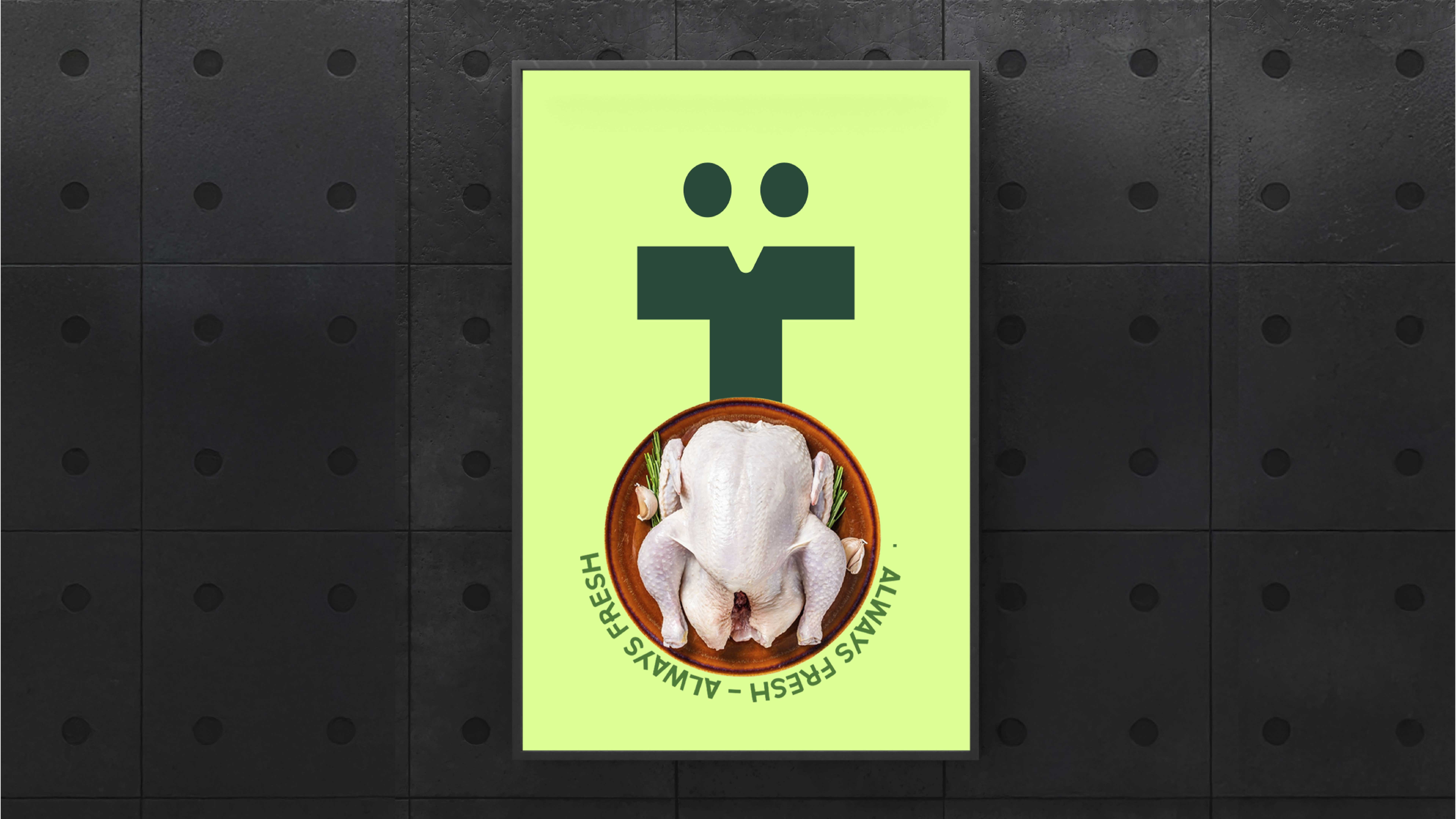
At the core of Thaza’s transformation lies the conviction that freshness transcends mere quality; it embodies a promise. Given the responsibility of redefining the visual identity of a legacy brand established in 1983, our objective was to meticulously craft a design system that encapsulates Thaza’s essence: trust, quality, and unparalleled freshness. The newly crafted brand identity harmoniously integrates tradition with modernity, weaving a cohesive and compelling narrative that resonates with a global audience. From the bold “T” icon, which symbolizes trust and precision, to the vibrant packaging system that exudes freshness, every meticulously designed element elevates Thaza into a contemporary, customer-centric brand.
Thaza, a household name in fresh chicken products since 1983, has consistently provided communities with high-quality, delectable chicken cuts. As the brand expanded its reach and entered international markets, particularly the GCC region, its identity encountered challenges in maintaining relevance amidst a competitive landscape. Recognizing the need for a modern identity that reflected its legacy while resonating with diverse cultures and reinforcing its market position as a symbol of trust and freshness, Thaza embarked on a transformative journey.
Our task was to construct a design system that honored Thaza’s heritage while positioning it as a future-oriented, globally appealing brand. The focus extended beyond creating a logo; it encompassed the development of a comprehensive identity system that would permeate every customer interaction, infusing freshness into every touchpoint.
Concept: “Freshness Reimagined”
The creative foundation of Thaza’s rebranding was the concept of “Freshness Reimagined.” We envisioned every aspect of the brand to embody freshness—visually, emotionally, and functionally. To achieve this, we anchored the identity around the “T” icon, which encapsulates trust, quality, and innovation.
Key Themes:
1. Freshness at Every Cut: The design system draws inspiration from Thaza’s unwavering commitment to delivering freshness in every chicken cut.
2. Cultural Connection: The incorporation of the Arabic letter “Tha” honors Thaza’s name origin and establishes a connection between the brand’s legacy and its global audience.
4. Modern Simplicity: The bold typography and streamlined design system create a universally recognizable and scalable identity.
Strategic Objectives:
– Reinforce Thaza’s market leadership in the freshness category.
– Distinguish the brand through a distinctive visual identity that is adaptable across markets.
– Evoke emotional resonance by harmonizing modern aesthetics with cultural authenticity.
Design Execution:
The design process centered on constructing an adaptable and scalable system that embodies the essence of freshness.
Icon: “The T”
The “T” icon serves as the linchpin of Thaza’s new identity. It meticulously captures the essence of a chicken’s face, incorporating its eyes and beak subtly into the design. The icon’s simplicity ensures its widespread recognition, scalability, and versatility across various applications, including packaging, digital interfaces, and merchandise.
Wordmark:
The wordmark harmoniously combines bold, geometric typography with modern simplicity. Its seamless integration with the “T” icon creates a cohesive system. The inclusion of the Arabic element underscores cultural relevance, particularly in the GCC market, where Thaza is expanding its presence.
The rebranding strategy will implemented comprehensively across all touchpoints, ensuring consistency and impact.
Thaza’s rebranding journey transcends a mere visual transformation, embodying a redefinition of freshness for a global audience. The bold “T” icon, unified visual identity, and cultural authenticity have solidified Thaza’s position as a leader in the fresh food industry. This project exemplifies the transformative power of thoughtful design, bridging heritage and innovation to create a timeless yet contemporary brand.
Thaza transcends mere branding; it embodies a promise of quality, trust, and freshness. This rebranding stands as a testament to the profound impact of creative design in fostering enduring connections with customers.


CREDIT
- Agency/Creative: Mindcrafter
- Article Title: Thaza’s New Brand Identity by Mindcrafter Redefines Freshness for the Modern Market
- Organisation/Entity: Agency
- Project Type: Identity
- Project Status: Published
- Agency/Creative Country: India
- Agency/Creative City: kozhikode
- Market Region: Asia, Middle East
- Project Deliverables: Brand Design, Brand Identity
- Industry: Food/Beverage
- Keywords: Poultry Industry Branding Food Industry Branding Fresh Food Branding Packaging for Poultry Products Chicken Branding Design Modern Poultry Logos
-
Credits:
Creative director: Musahib Mubarak


