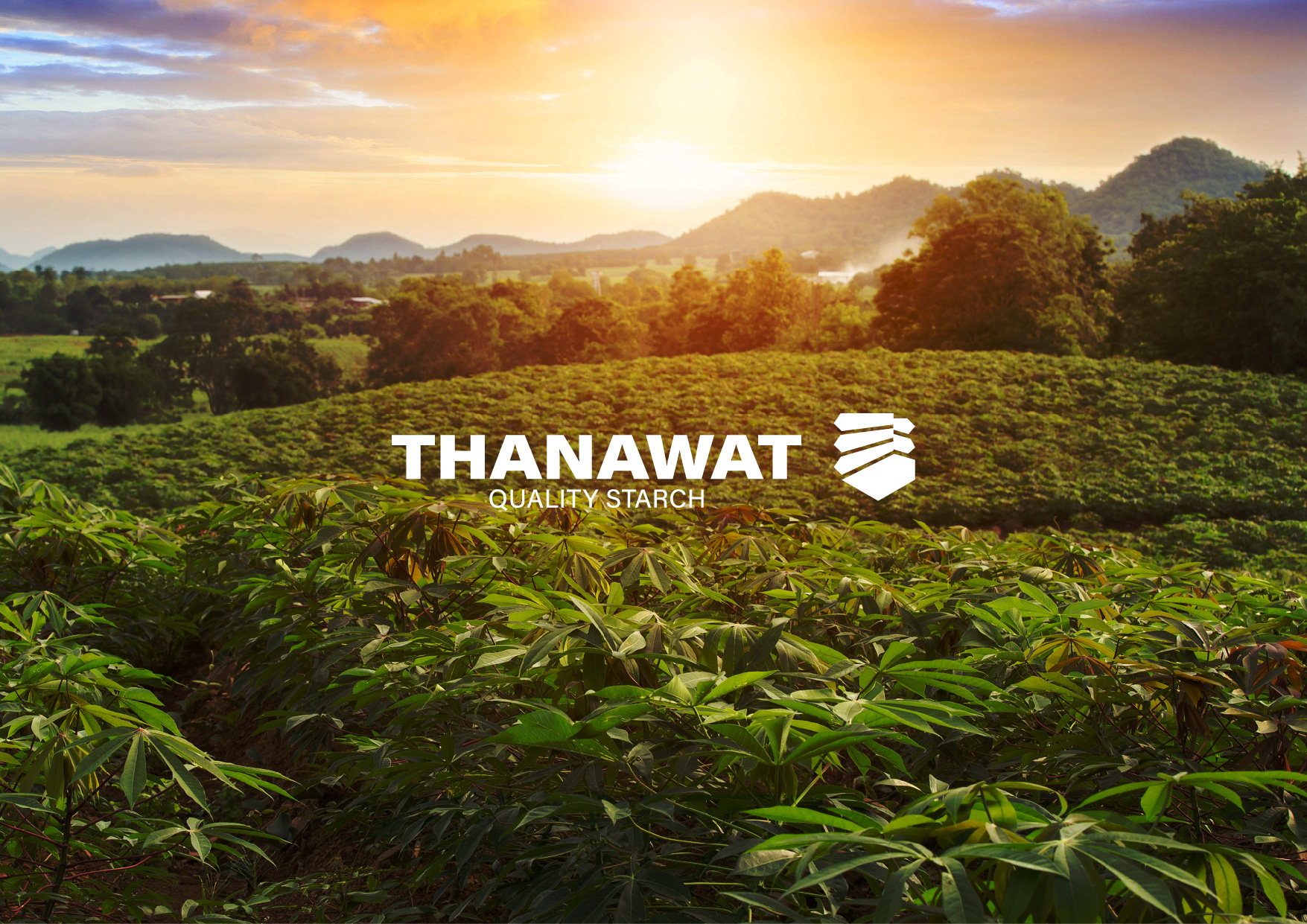
Objective: Project to rebrand the identity of a tapioca starch manufacturer in Kamphaeng Phet province Thailand. which send raw materials to customers both in the country and global which has been in business for more than 17 years.
After not adjusting the corporate image for a long time, the factory decided to create an image of the factory with international standards, modernity, and refined industrialization. This is in line with the new goal of expanding the customer base to other products in the future. And value the raw material and premium customer the is a new strategy of the brand. And make brand awareness for old customer
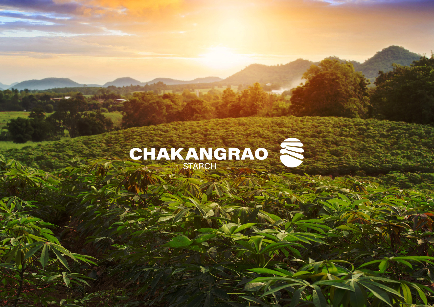
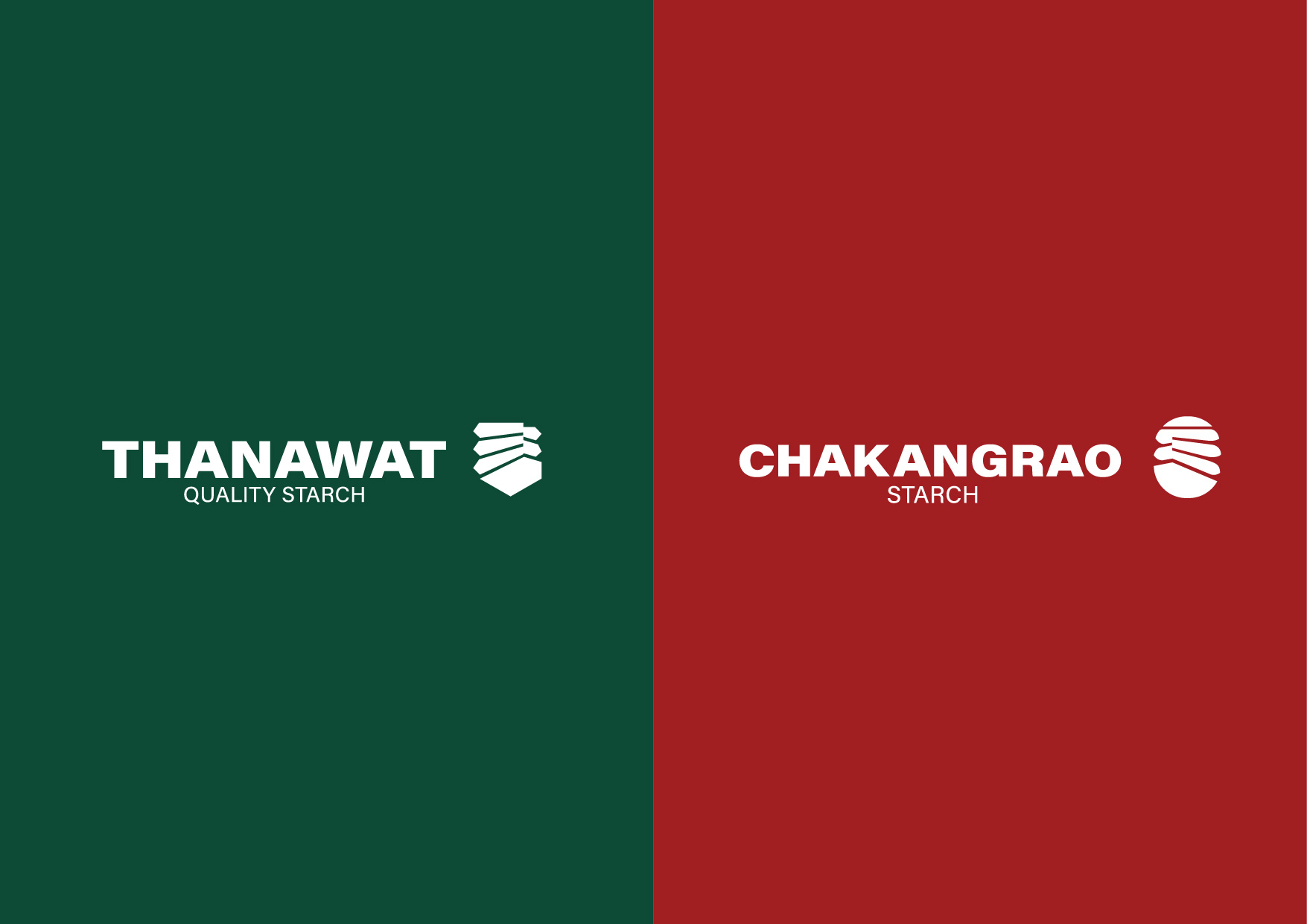
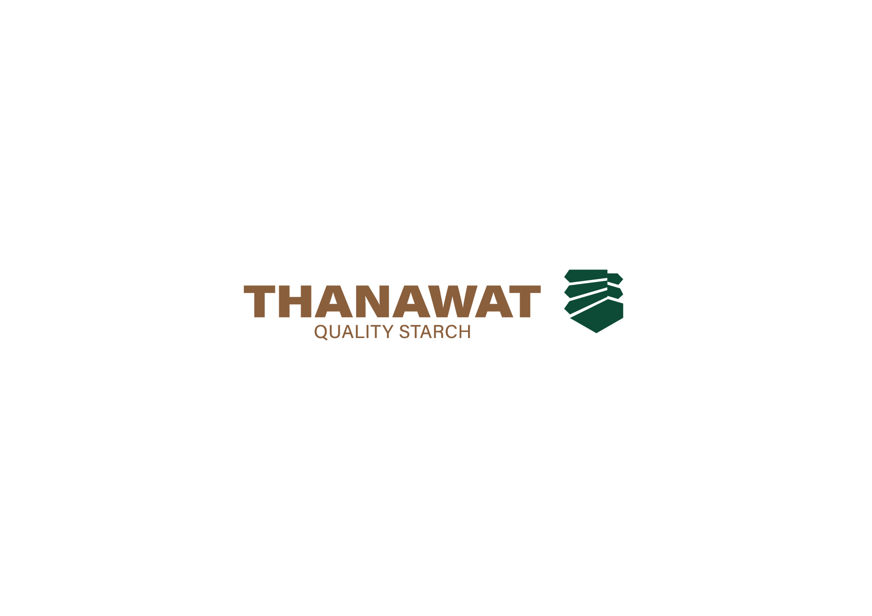
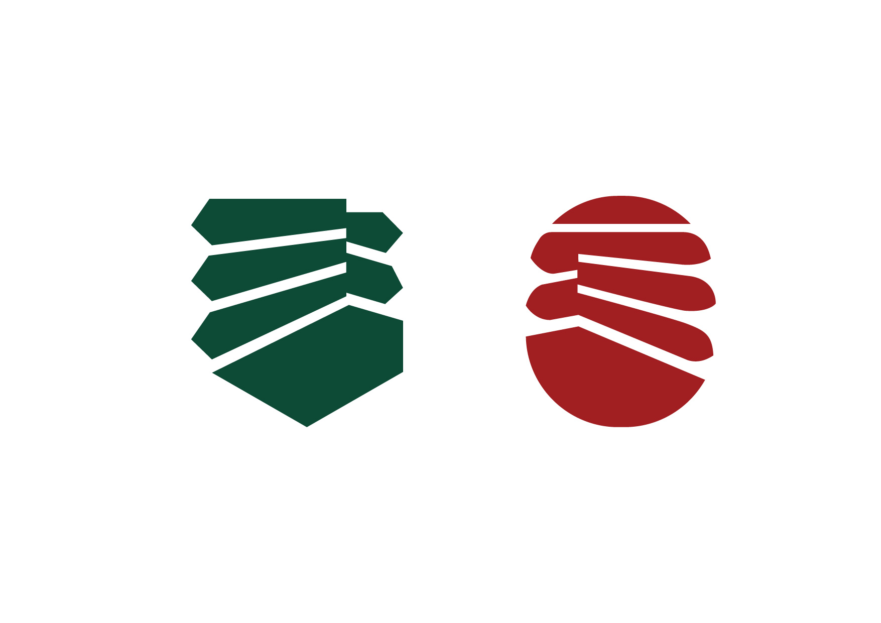
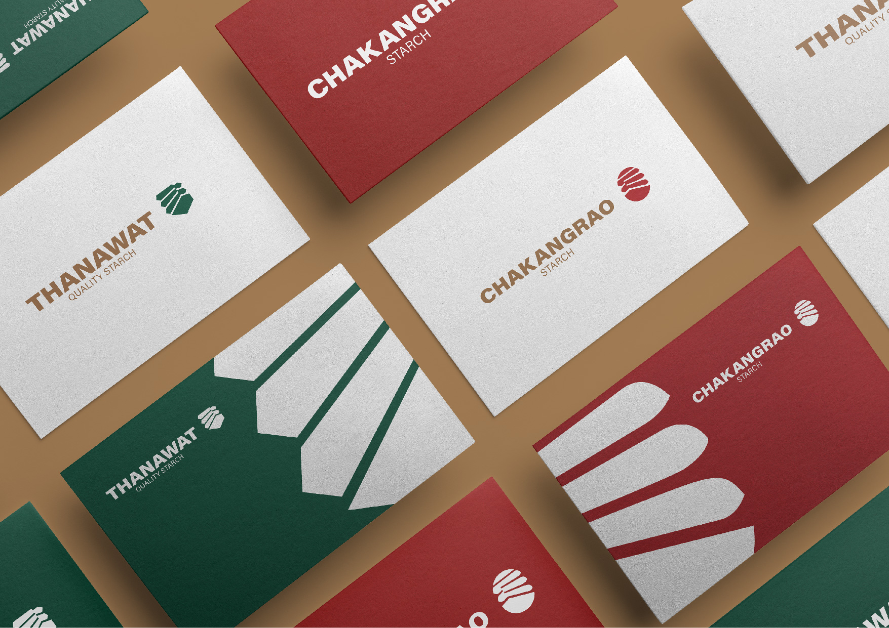
Design: The design must be designed the 2 factories are related because both factories are from the family business and supply to each other also. The design must have different tastes than the normal tapioca mills. The design must not look like a factory’s images. But it must show a taste of the process. The knowledge that finds from over the world will produce the best flour. In the conceptual process. We use the form of a classic western logo. Come as the main idea to do the heraldry. Meaning becomes from the brand establishes from the family’s business. Second, we think, how we add something that prefers cassava business? Both heraldries must compose of cassava leaves as the main elements. And a bit different from each other. We choose Thanawat to shield’s shape and Chakangrao to oval’s shape. And designed to pair beautifully when using together.


CREDIT
- Agency/Creative: ihapstudio
- Article Title: Thanawat Quality Starch and Chakangrao Starch Manufacturer Re-Branding
- Organisation/Entity: Agency
- Project Type: Identity
- Project Status: Published
- Agency/Creative Country: Thailand
- Agency/Creative City: Bangkok
- Market Region: Global
- Project Deliverables: Branding
- Industry: Manufacturing
- Keywords: Cassava, Tapioca, Factory, Manufacturer, Branding, Brand Identity, Logo
-
Credits:
Ihapstudio Co., Ltd.: Ihapstudio Co., Ltd.


