


TEHUL is a wine packaging project that translates Mendoza’s layered soils and Huarpe heritage into a tactile, contemporary expression of place.
TEHUL is a holistic wine packaging project rooted in Mendoza, Argentina, and shaped by the idea that identity is built in layers. Rather than focusing on a single graphic element, the project approaches packaging as a system—where concept, materiality, form, and surface work together to express origin.
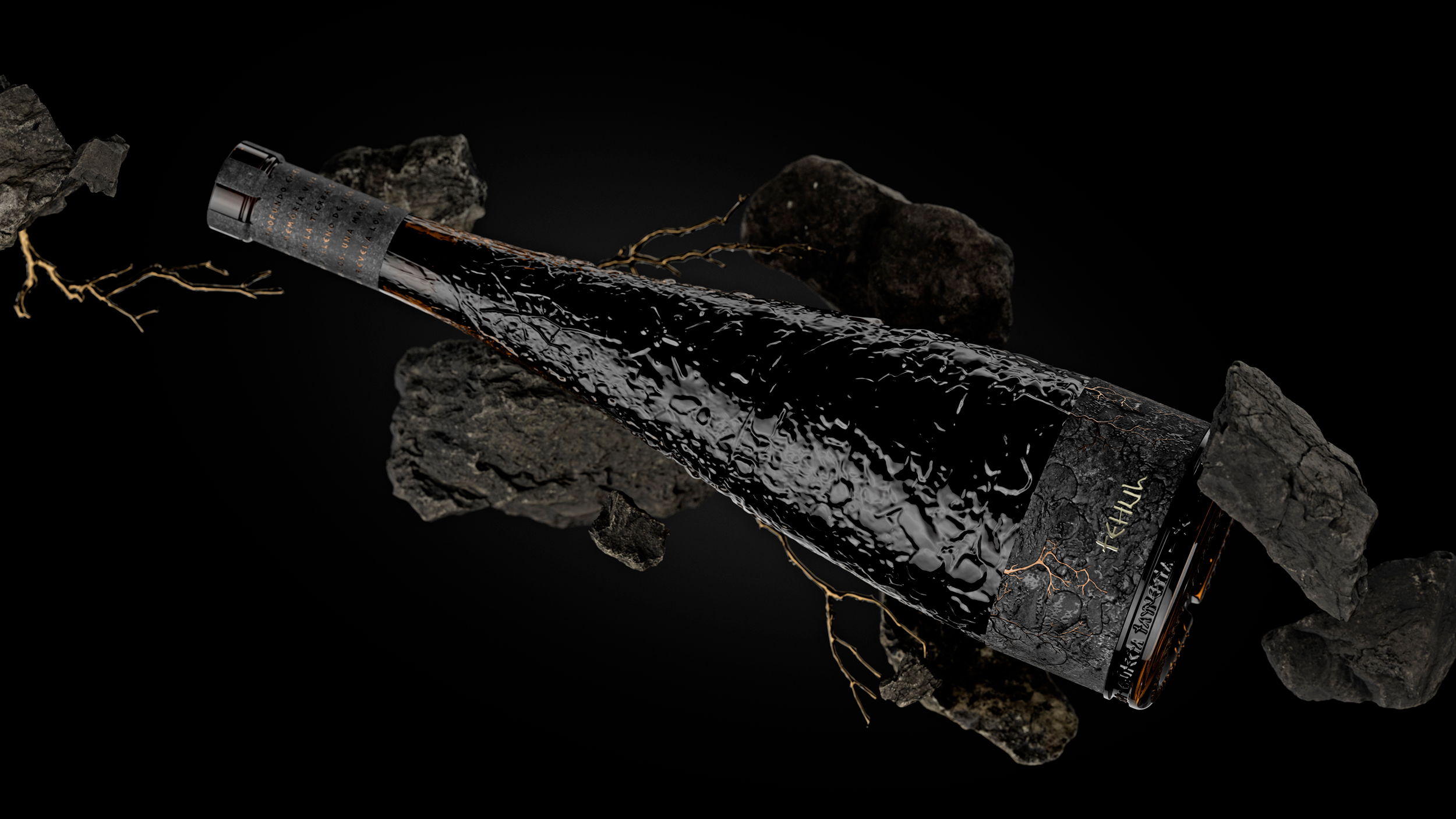
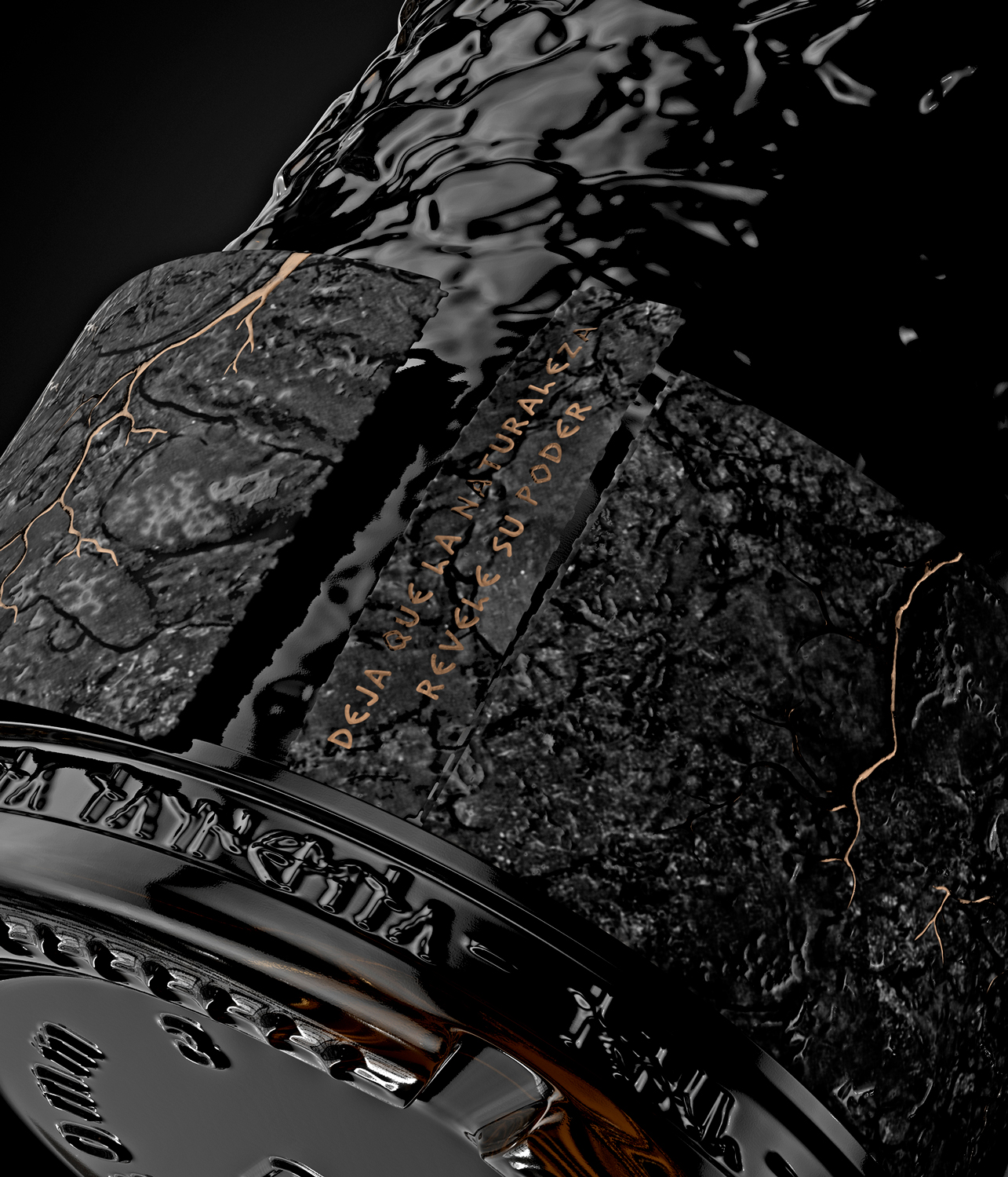
The name TEHUL comes from the Huarpe language and refers to the idea of “depth” or “what lies beneath.” It was chosen as a conceptual anchor for the project, reflecting both the physical structure of Mendoza’s stratified soils and the cultural depth of the territory itself—layers of land, memory, and time accumulated over generations.
The narrative draws inspiration from two inseparable forces of the region: the layered soils of Mendoza and the cultural legacy of the Huarpe people, the original inhabitants of this territory. These references are not used as folklore or decoration, but as a quiet and respectful foundation guiding every design decision.
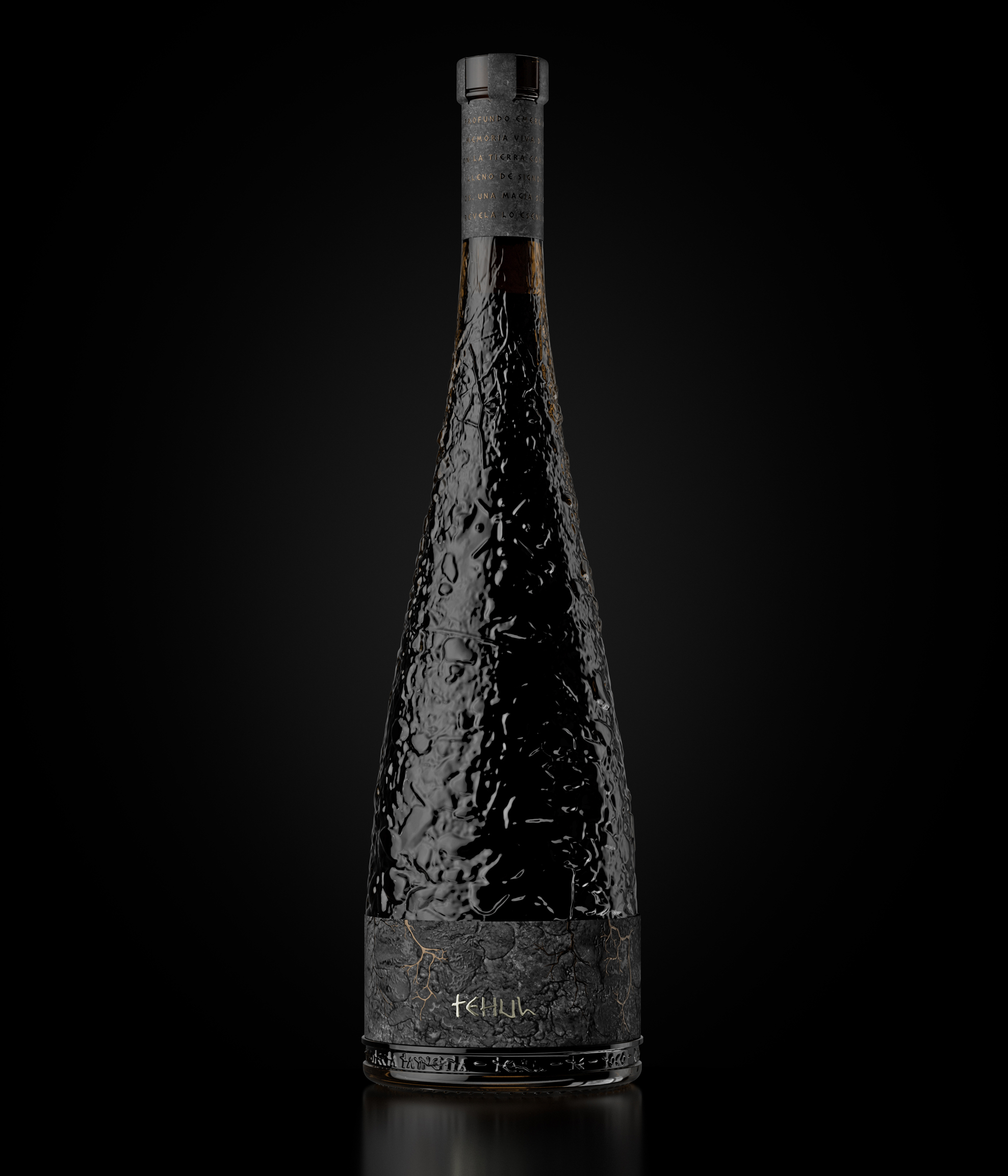
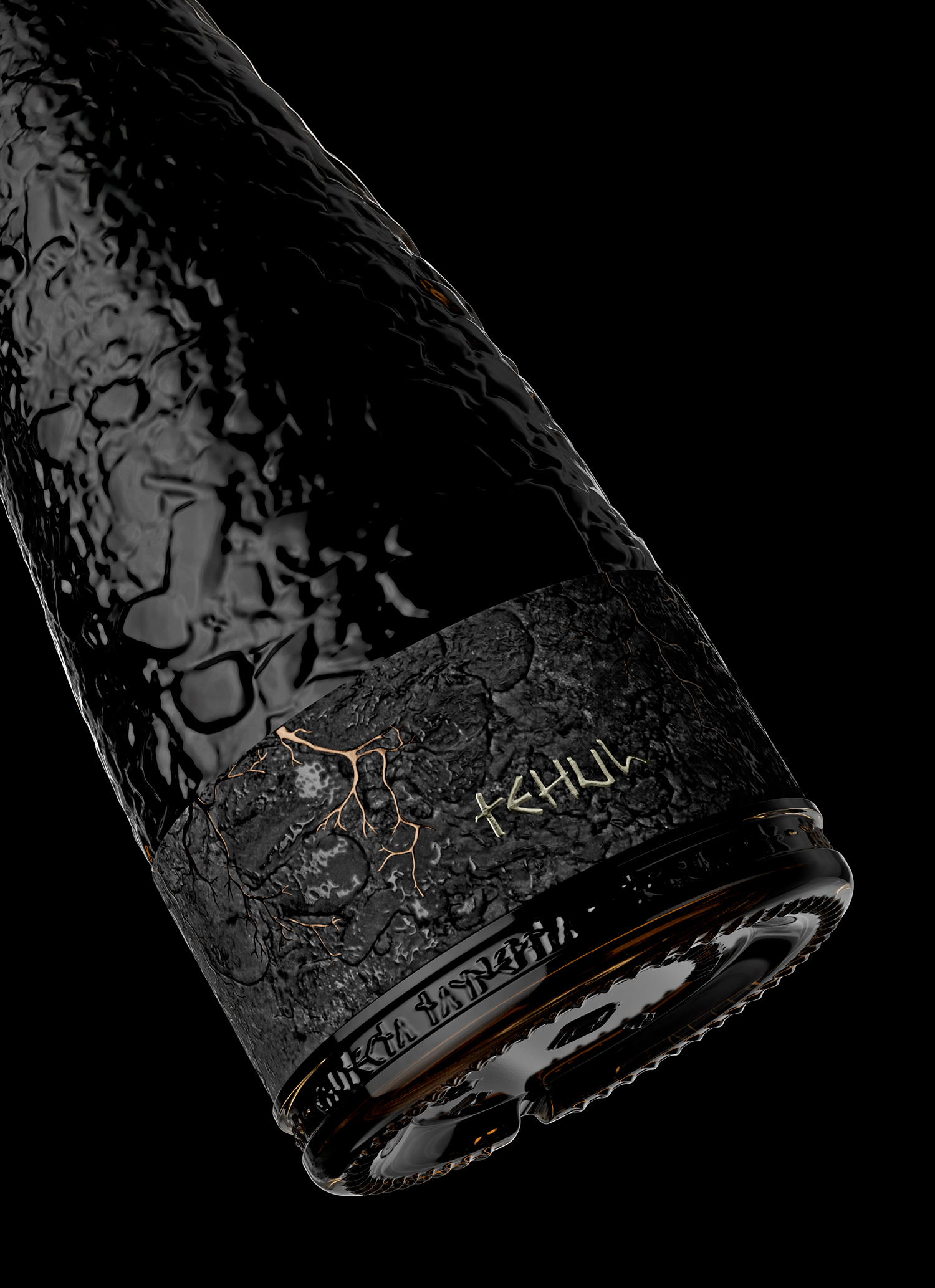
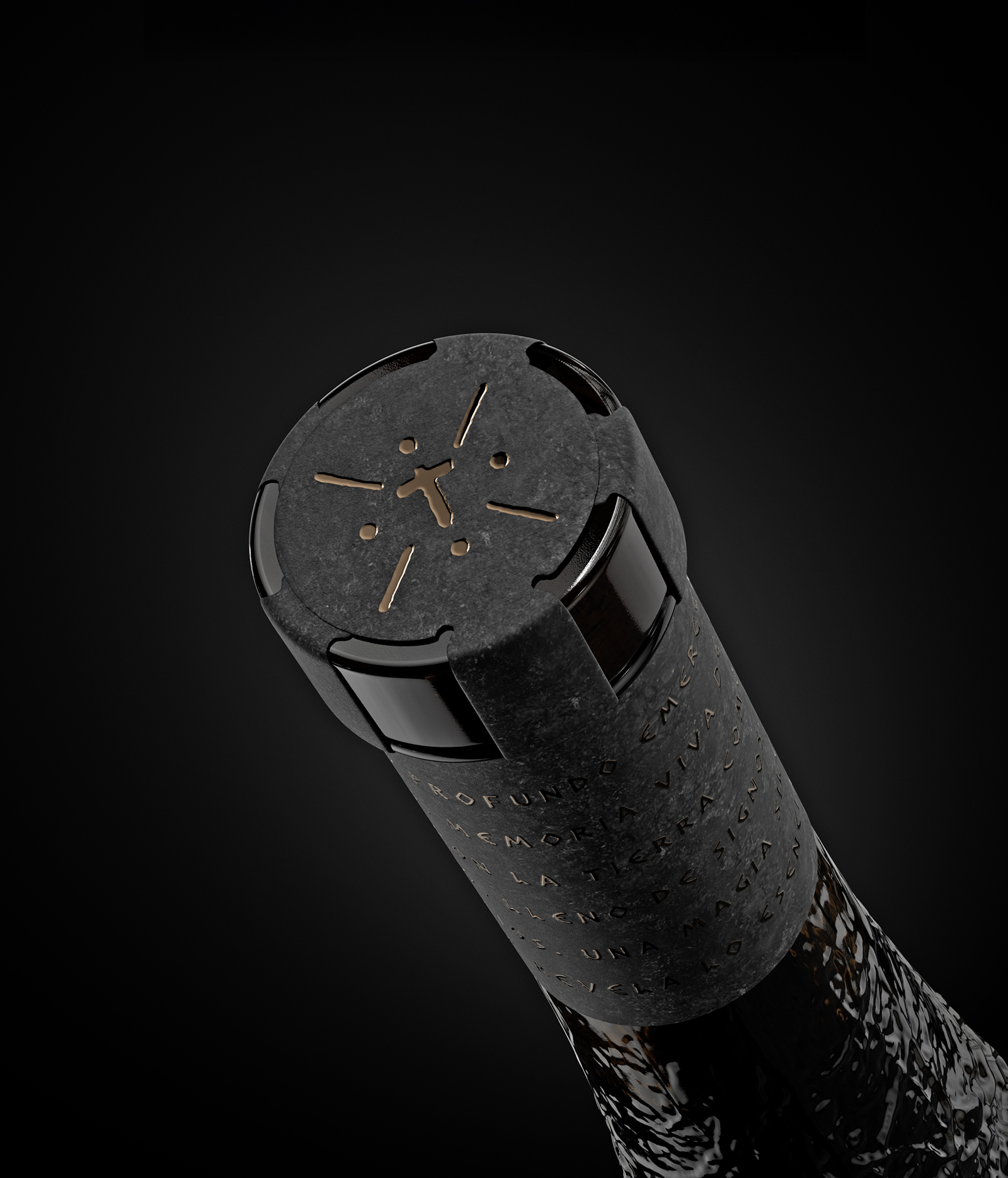
Visually, the packaging translates geological depth into a tactile language. Layers, textures, and subtle variations evoke soil cross-sections, sediments, and mineral traces, creating a sense of verticality and time embedded in the surface. The result feels unearthed rather than illustrated, allowing the packaging to communicate place without literal imagery or narrative overload.
Typography and graphic elements remain restrained, acting as structural anchors rather than focal points. This balance allows material choices and depth to carry the emotional weight of the project, reinforcing the idea that identity is discovered through proximity and touch rather than excess.
TEHUL positions packaging as an object of meaning—where territory, memory, and time coexist—offering a contemporary expression of Mendoza that is silent, precise, and enduring.
CREDIT
- Agency/Creative: Nano Alfonsin Studio
- Article Title: Tehul Wine Packaging by Nano Alfonsin Studio Translates Mendoza Soil Layers Into Tactile Contemporary Design
- Organisation/Entity: Agency
- Project Type: Packaging
- Project Status: Published
- Agency/Creative Country: Argentina
- Agency/Creative City: Mendoza
- Market Region: Global
- Project Deliverables: Brand Design, Label Design, Packaging Design, Structural Design
- Format: Bottle
- Industry: Food/Beverage
- Keywords: Wine Packaging, Argentina, Mendoza, Make a Mark, Huarpe Heritage, Cultural Identity, Textured Label, Premium Wine, Contemporary Packaging, Terroir, Storytelling
-
Credits:
Creative Direction & DEsign: Nano Alfonsin
CGI / Visualization: Manuel Garcia Pividal
Prepress & Production Artwork: Ricardo Antonelli


