


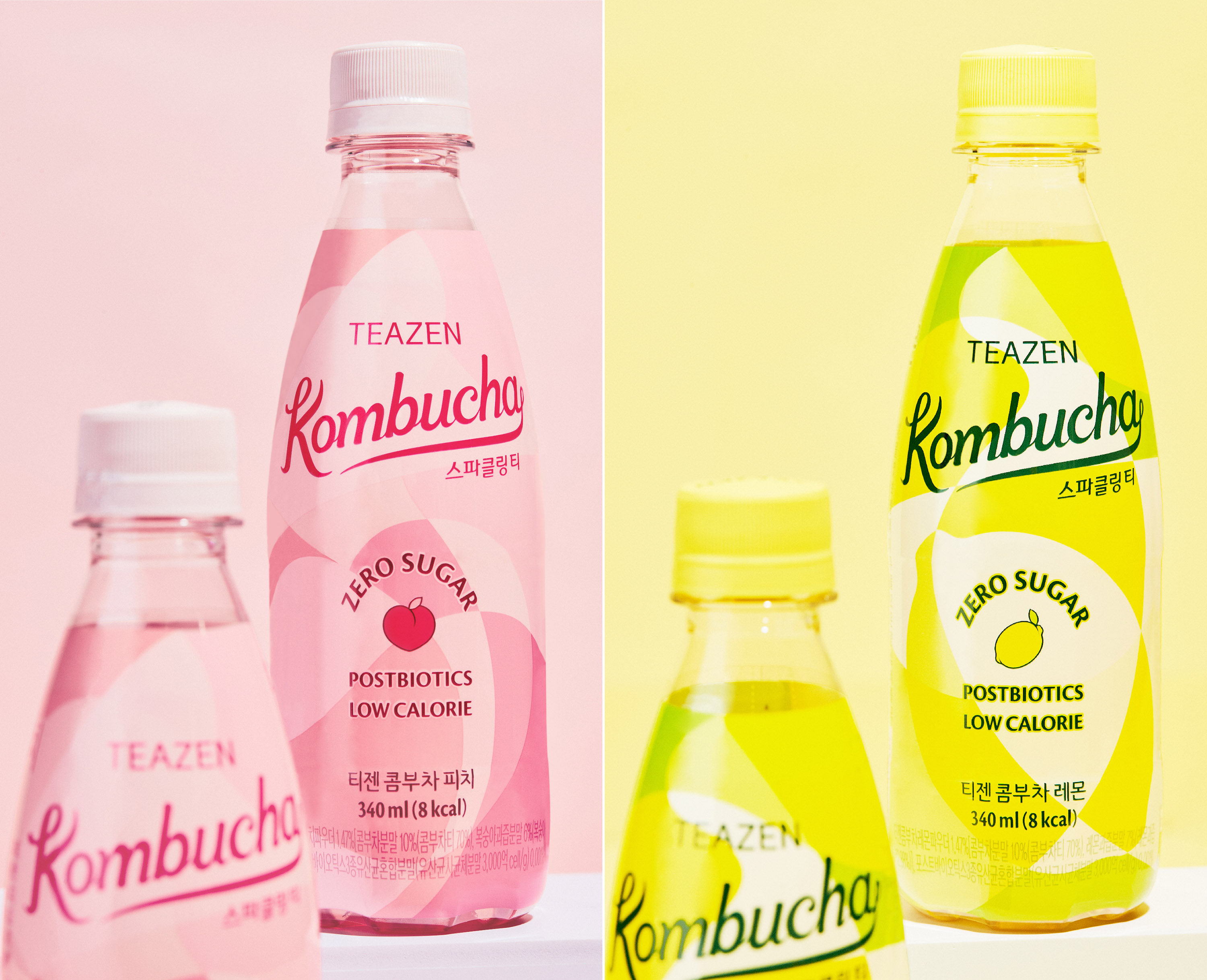
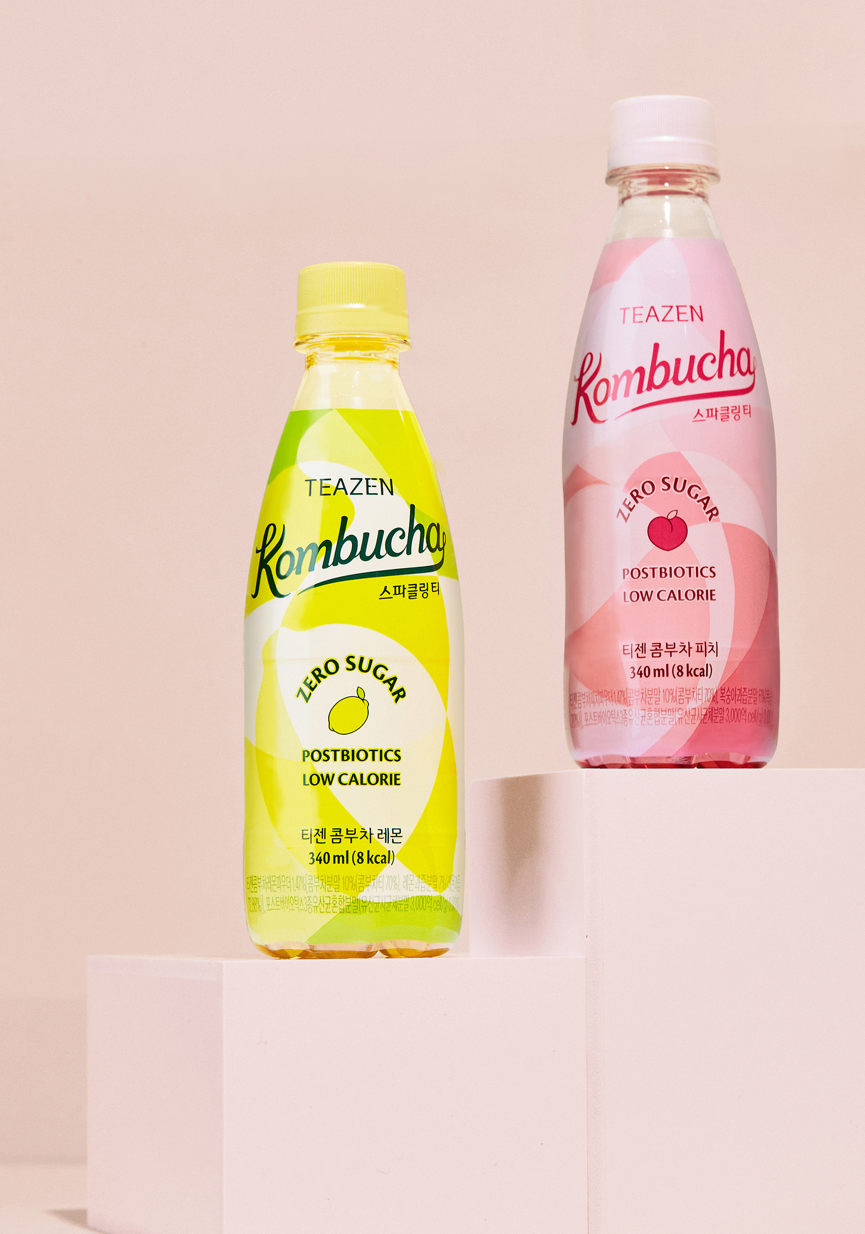
Teazen is a tea specialty company that pursues a healthy and energetic lifestyle based on tea. They have launched a popular stick drink brand, Kombucha, and have a market share of 7-80%. This product is established as a healthy drink by reducing sugar and calories and adding probiotics, and they also offer RTD (Ready-To-Drink) products that can be conveniently enjoyed in busy daily life.
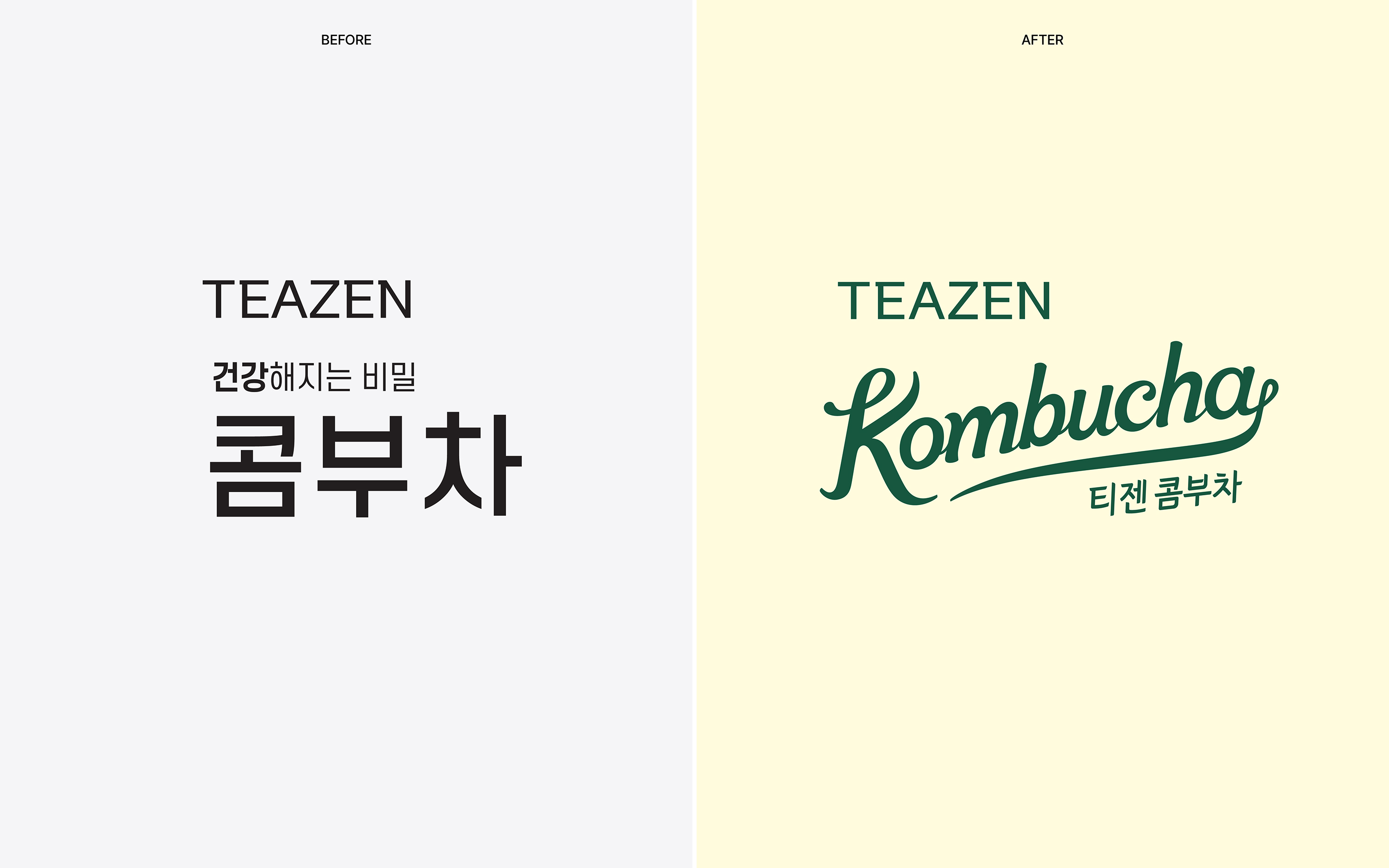
Teazen Kombucha offers various flavours to provide customers with their preferences and strives to have competitiveness as the next-generation tea. YNL Design is building a brand concept based on the new Kombucha Culture led by Teazen , providing an iconic BI (brand identity) and artistic graphic motifs that can appeal to the MZ generation. The existing Teazen Kombucha brand image tended to rely heavily on models, making the brand model more of an identity than the product’s unique features. Therefore, YNL Design aims to establish a strong brand identity that can capture the attention of the young MZ generation through a robust BI that leads Kombucha Culture and eye-catching artistic graphic motifs. Through this, they aim to show more than just drinking Kombucha, but also showcasing one’s personality and proposing an Instagrammable and attractive drink culture.
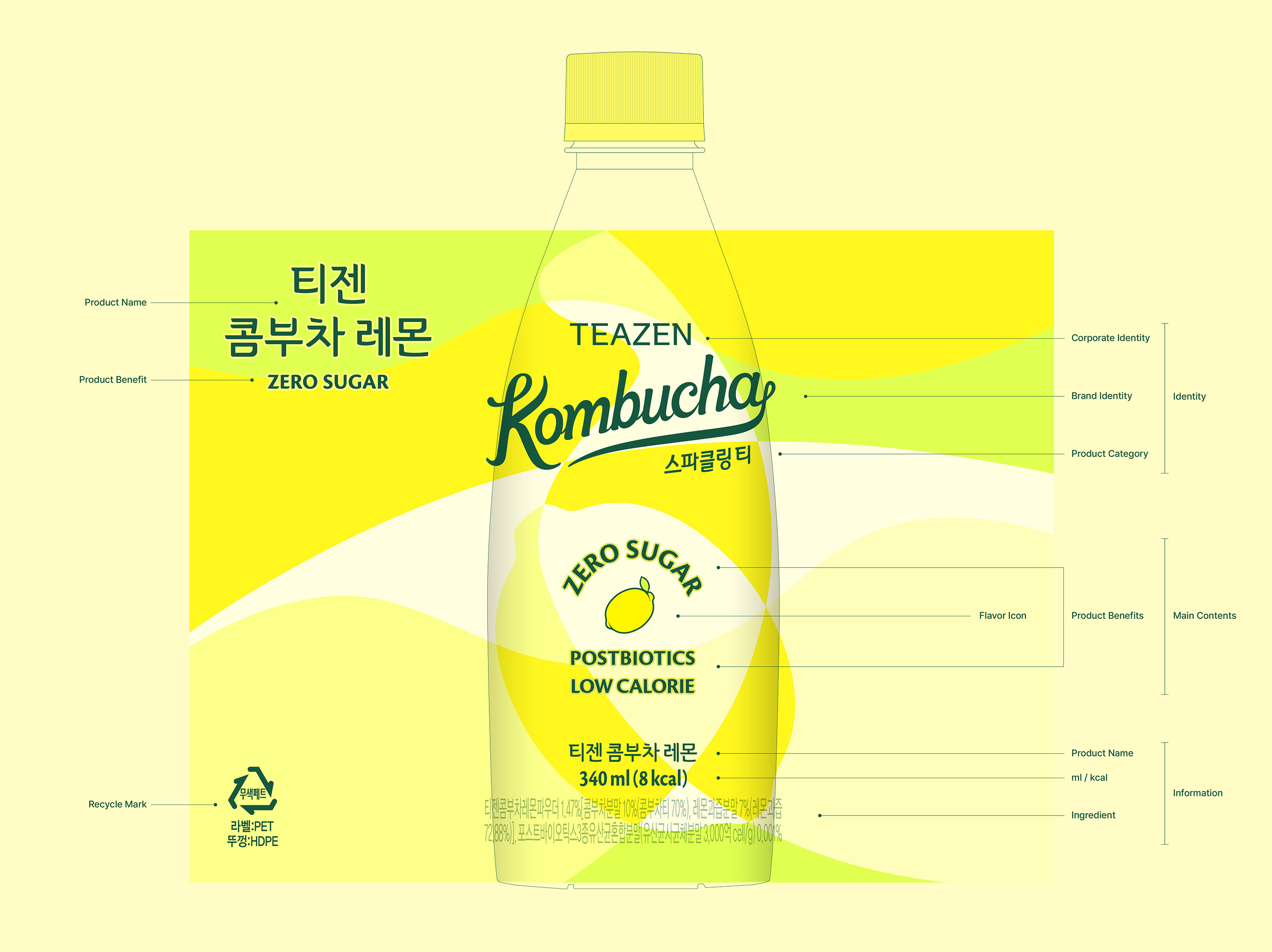
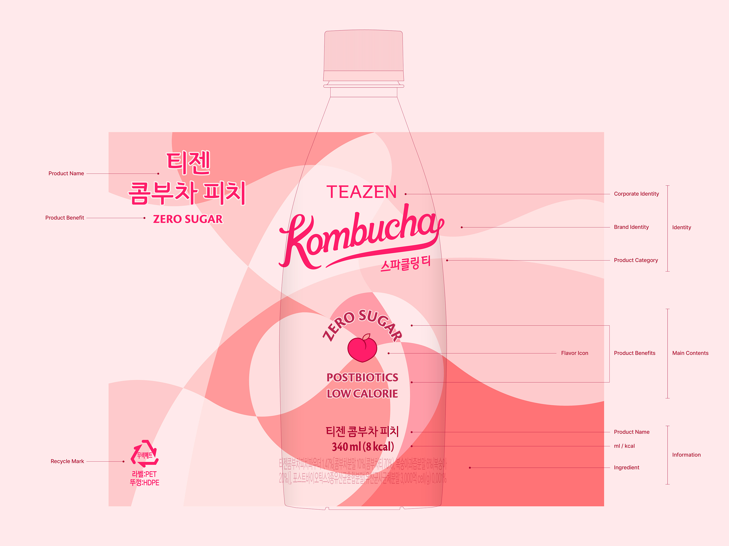
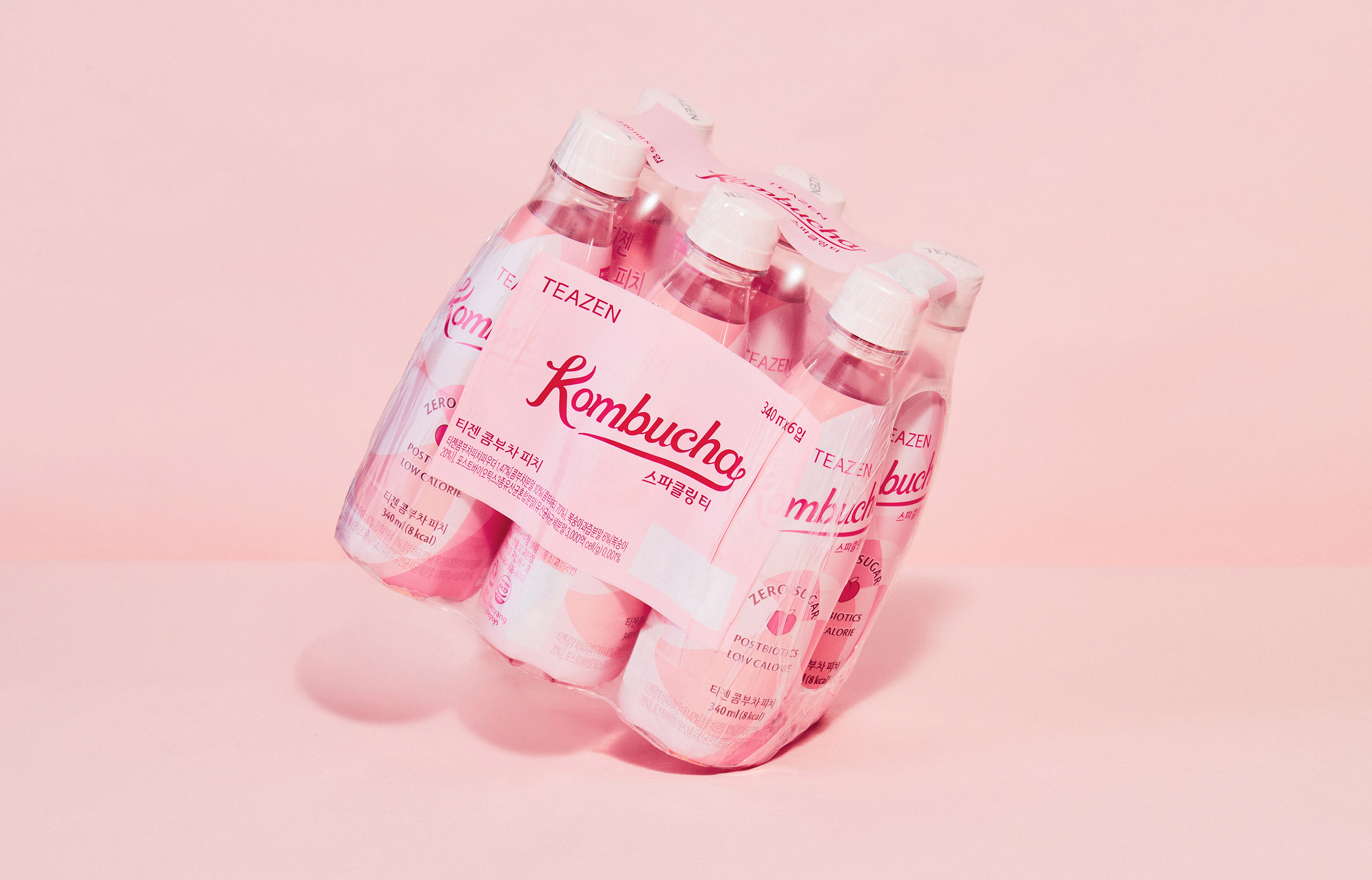
YNL Design actively utilized the ‘Kombucha Culture’ concept to develop a free-spirited and artistic BI and graphic motif with a new pop-art feel. These design elements convey a creative and unique sensation that cannot be found in the existing beverage market and were strategically used to achieve the goal of making Teazen Kombucha a popular and trendy brand. The ‘Kombucha Culture’ BI is a logo type that contains a free-spirited emotion and artistic aesthetic and is designed in a rising script form. This fits well with Teazen Kombucha’s brand vision targeting the MZ generation, conveying a modern and trendy image. The graphic motif reinterprets the shape of fruit into a design that utilizes gentle curves. This visually represents the fresh and sweet taste of Teazen Kombucha, conveying a refreshing and lively sensation. Furthermore, YNL Design developed package designs for Teazen Kombucha’s five flavors. These design elements utilize a colorful system of intuitive associations with each flavor, visually expressing the lively and lively drink culture of the MZ generation. Additionally, the overall package family system was systematically established, considering the scalability for future flavor expansions.


CREDIT
- Agency/Creative: YNL Design
- Article Title: Teazen Kombucha Sparkling Tea Packaging Design by YNL Design
- Organisation/Entity: Agency
- Project Type: Packaging
- Project Status: Published
- Agency/Creative Country: South Korea
- Agency/Creative City: Seoul
- Market Region: Asia
- Project Deliverables: Brand Creation, Brand Design, Brand Identity, Brand Redesign, Brand Strategy, Branding, Creative Direction, Design, Graphic Design, Identity System, Logo Design, Packaging Design, Packaging Guidelines, Pattern Design, Rebranding
- Format: Bottle, Box
- Industry: Food/Beverage
- Keywords: YNL Design, Brand Creation, Brand Design, Brand Identity, Brand Redesign, Brand Strategy, Branding, Creative Direction, Design, Graphic Design, Identity System, Logo Design, Packaging Design, Packaging Guidelines, Pattern Design, Rebranding
-
Credits:
Creative Director: Liz Yoona Lee
Brand Design: Kwangsu Shin
Brand Design: Sohee Kim
Brand Design: Eunah Kim
Brand Design: Minji Seo


