


43oz.com – Design Studio – Hyson
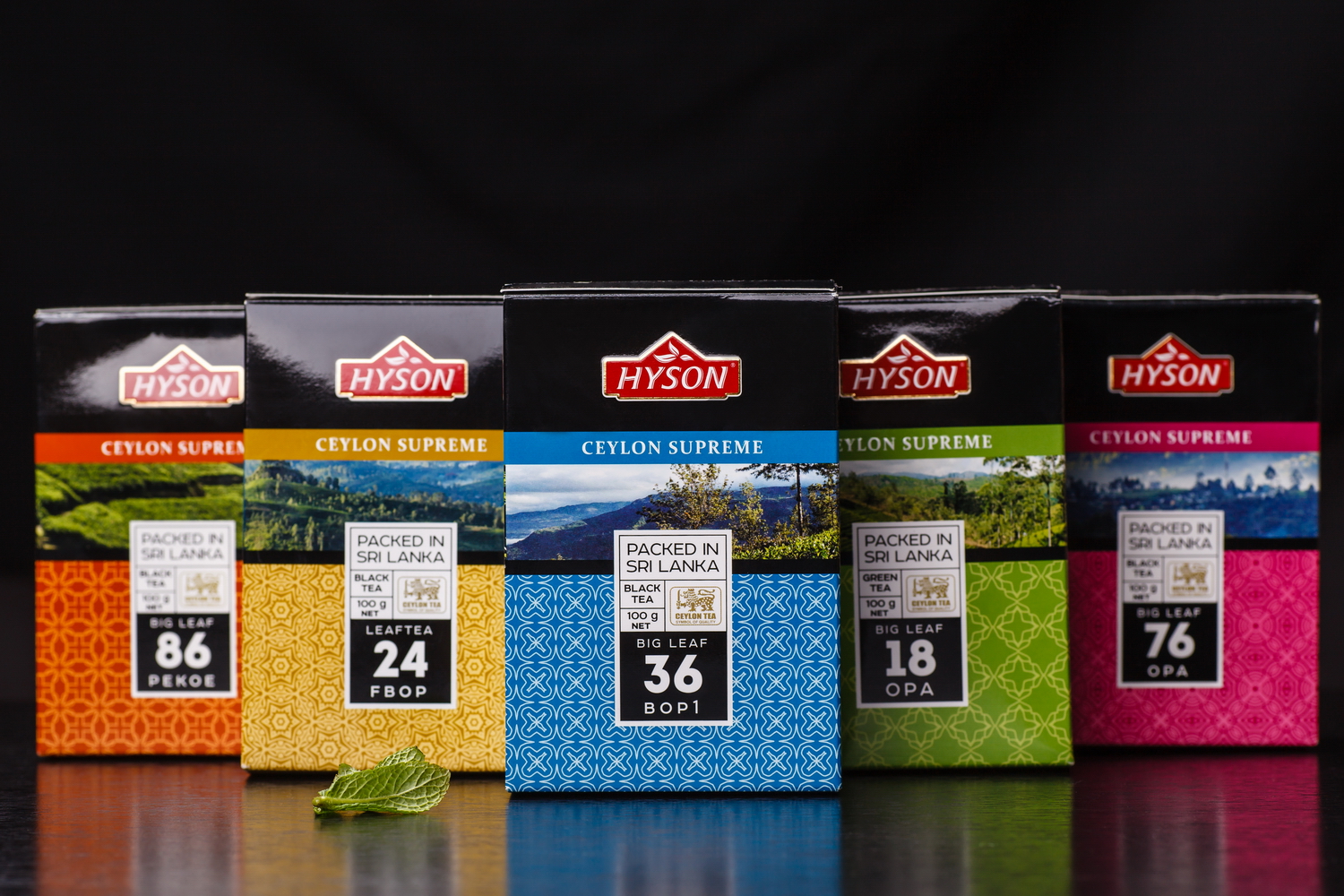
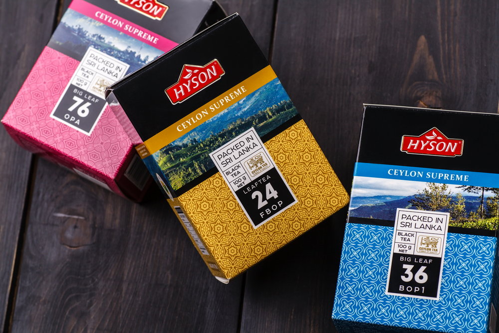
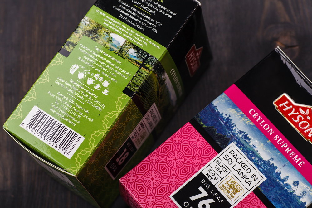
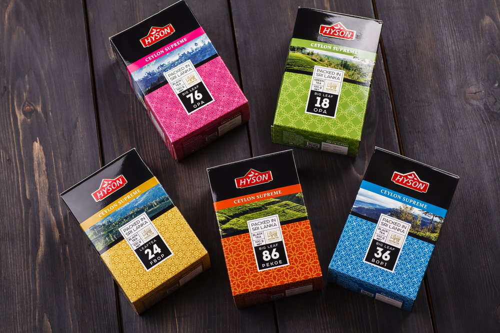
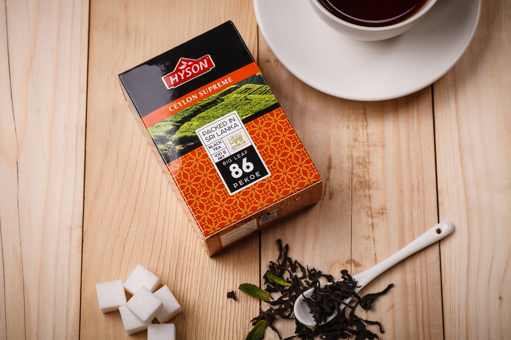
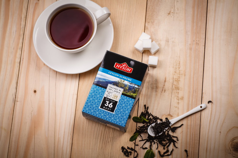
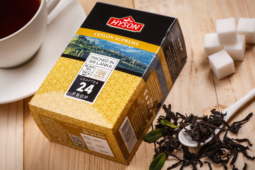
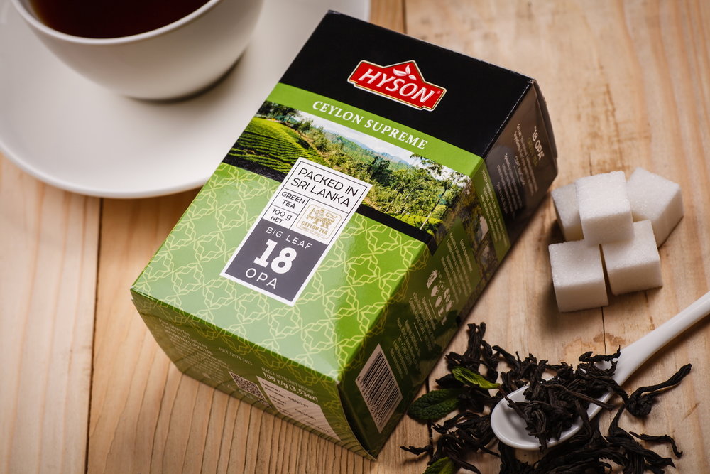
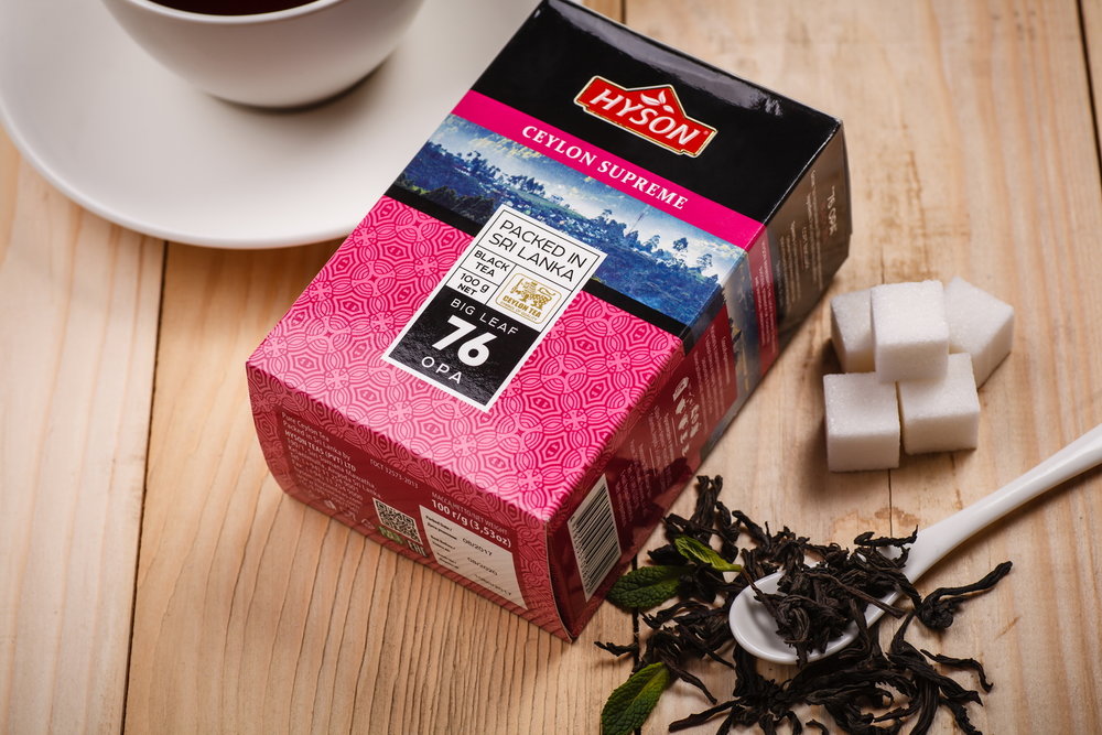
“The development of packaging design for Hyson tea became a part of the overall rebranding effort by the Russian company that grows and packages its products in Shri Lanka. The company’s specialists have developed a detailed plan regarding the expansion of their product line, introducing color and numeric coding, which serves the purpose of making it easier for the consumer to identify their favorite positions. The design we’ve developed is based on the client’s marketing requests and reflects the main traits of the product itself.
The visual design for Hyson teas comes in 5 different variations corresponding to the main positions in the client’s product line. The main accent is placed on photorealistic images of tea plantations, which emphasize the natural character and high quality of the product. Different patterns and color schemes allow to easily identify each product in the overall line. As a result, the packaging looks vivid, memorable, and attracts the consumer’s attention on the product shelf.”
CREDIT
- Agency/Creative: 43oz.com - Design Studio
- Article Title: Tea Packaging Redesign – Hyson
- Organisation/Entity: Agency Commercial / Published
- Project Type: Packaging
- Agency/Creative Country: Moldova
- Market Region: Europe
- Format: Box
- Substrate: Pulp Paper


