


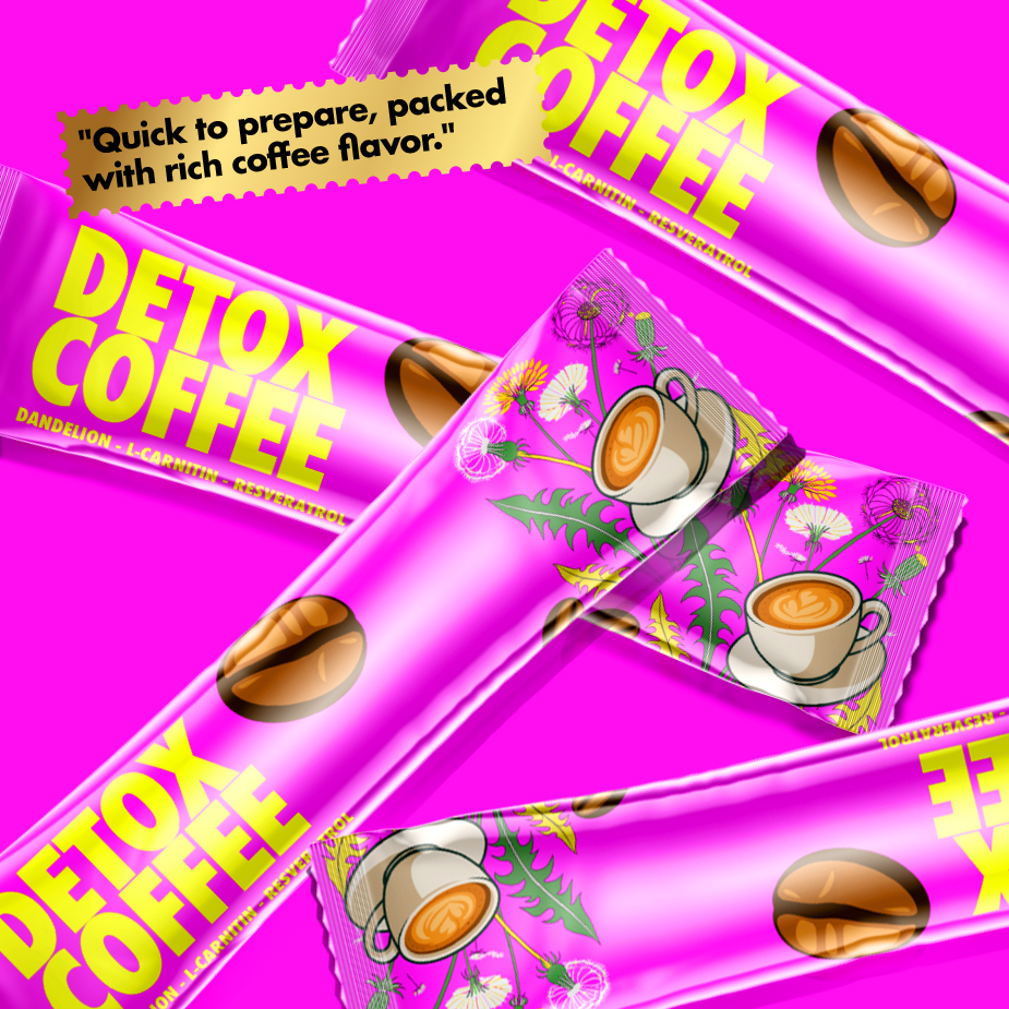
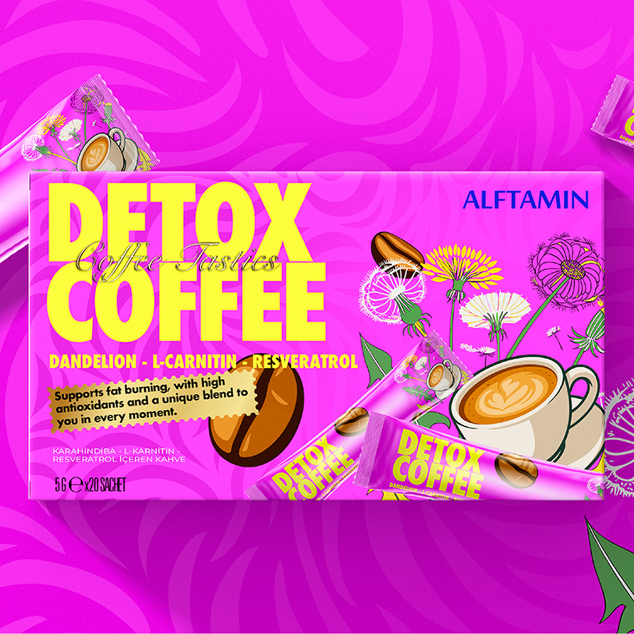
This packaging design for “Detox Coffee” by Alftamin showcases a bold, energetic, and highly contemporary visual identity, crafted to immediately capture consumer attention on the shelf. Utilizing a vibrant neon pink as the dominant background color, the design creates a strong emotional impact while simultaneously suggesting energy, vitality, and a youthful, modern lifestyle. This is further reinforced by the sharp contrast of the bold yellow typography, making the product name unmistakably visible even from a distance.
The choice of colors is not accidental — neon pink and bright yellow are associated with energy, optimism, and health-focused products in modern packaging trends. When combined with high-quality offset printing techniques, these colors achieve maximum vibrancy and saturation. Additional printing effects, such as UV spot gloss on the brand name or coffee illustrations, would further enhance the visual depth, creating tactile contrasts between matte and glossy surfaces.
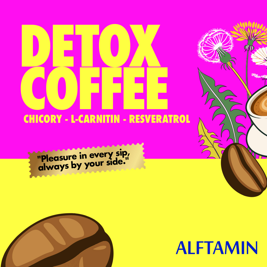
The illustrative elements — coffee beans, latte art, and hand-drawn dandelion flowers — bring a playful and organic touch to the packaging. These details soften the boldness of the typography and connect visually to the product’s functional promises: detoxification, fat-burning, and antioxidant benefits. The flowers, rendered in delicate lines and bright accents, not only support the visual hierarchy but also subtly communicate the botanical, health-focused nature of the ingredients.
Typography plays a crucial role here. The oversized, uppercase “Detox Coffee” in bold yellow sans-serif exudes confidence and clarity. Meanwhile, the italic “Coffee Tastes” overlay adds a contrasting softness and handwritten flair, bringing warmth to the otherwise assertive design. This typographic contrast ensures the packaging feels both dynamic and approachable.
Structurally, the design effectively balances information hierarchy with aesthetic appeal. Key ingredients (Dandelion, L-Carnitine, Resveratrol) are highlighted in a clear and accessible manner. Supporting copy emphasizes the product benefits in a conversational tone, adding relatability to the functional claims.
When produced with modern packaging techniques — including vibrant CMYK or Pantone inks, gloss varnishes, and potentially holographic foil elements — this packaging would achieve a highly premium, eye-catching finish. The playful yet health-driven aesthetic aligns perfectly with wellness trends and would position the product strongly within health-conscious, style-savvy consumer segments.

CREDIT
- Agency/Creative: TDN Creative Solutions
- Article Title: TDN Creative Solutions Energizes Alftamin Detox Coffee with a Vibrant Wellness-Driven Identity
- Organisation/Entity: Agency
- Project Type: Packaging
- Project Status: Published
- Agency/Creative Country: Turkey
- Agency/Creative City: ISTANBUL
- Market Region: Global
- Project Deliverables: 3D Design, Packaging Design, Packaging Guidelines
- Format: Bottle, Box, Wrap
- Industry: Food/Beverage
- Keywords: graphic, packaging design,
-
Credits:
Founder: Tugsadhan daltaban


