


Today Indian consumers are mostly young, more literate and urbanised so they focus on quality, availability, convenience and hygiene of the food product. So there are good chances of acceptance of bakery products by the new generation in India.
Changing lifestyle, urbanisation, increase in per capita income and working spouse – these all have made bread a staple food in India as in other western countries. We are now eating bread for breakfast luncheon and dinner as well.
Catering to the increasing market for the bakery products, Fabsta planned to launch a range of bakery products including a variety of bread, cakes and other baked goods.
We discussed the brief in detail and did the digging of our own, we gathered that Baked goods are not similar to FMCG products due to the difference in their price range, TG range and shelf life. Bakery range from Fabsta needed a different identity yet it needed to fall under the same brand. We zeroed in on calling it ‘Fabsta Bakery’ – direct and simple! Our Challenge was to create a design in which the visual cues should suggest the bakery aspect and yet it should not deviate completely from the Fabsta branding and architecture. At the same time, the packaging needed to bring in the premium look and not the value range.
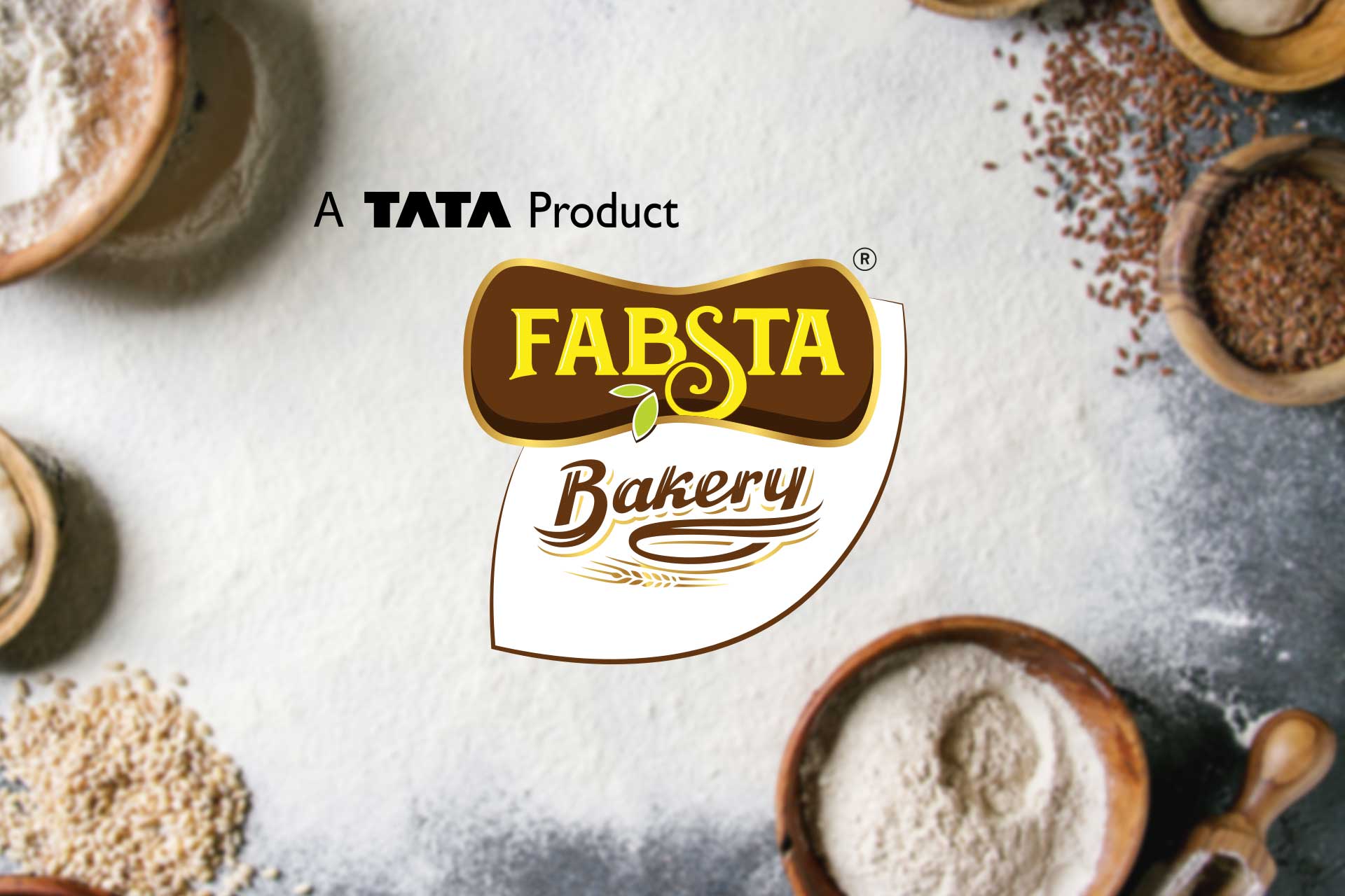
After a thorough take on different design angles, we decided on a brilliantly uncomplicated Brand Architecture. It was the Fabsta Logo in a brown version created specifically for bakery range locked with the word ‘Bakery’ written in very stylized typography using brown and gold, on the Fabsta trademark leaf structure in white. The brown colour brought out the feel of the baked goods and wood-fired oven. The gold colour ornamenting gave it a rich look and premiumness. The wheat shaft at the bottom fused with the outlines of typography cued in the wholesome aspect of the products. Even for Goodness Guarantee logo colour scheme was changed to brown and gold to make it more of a wholesomeness seal.
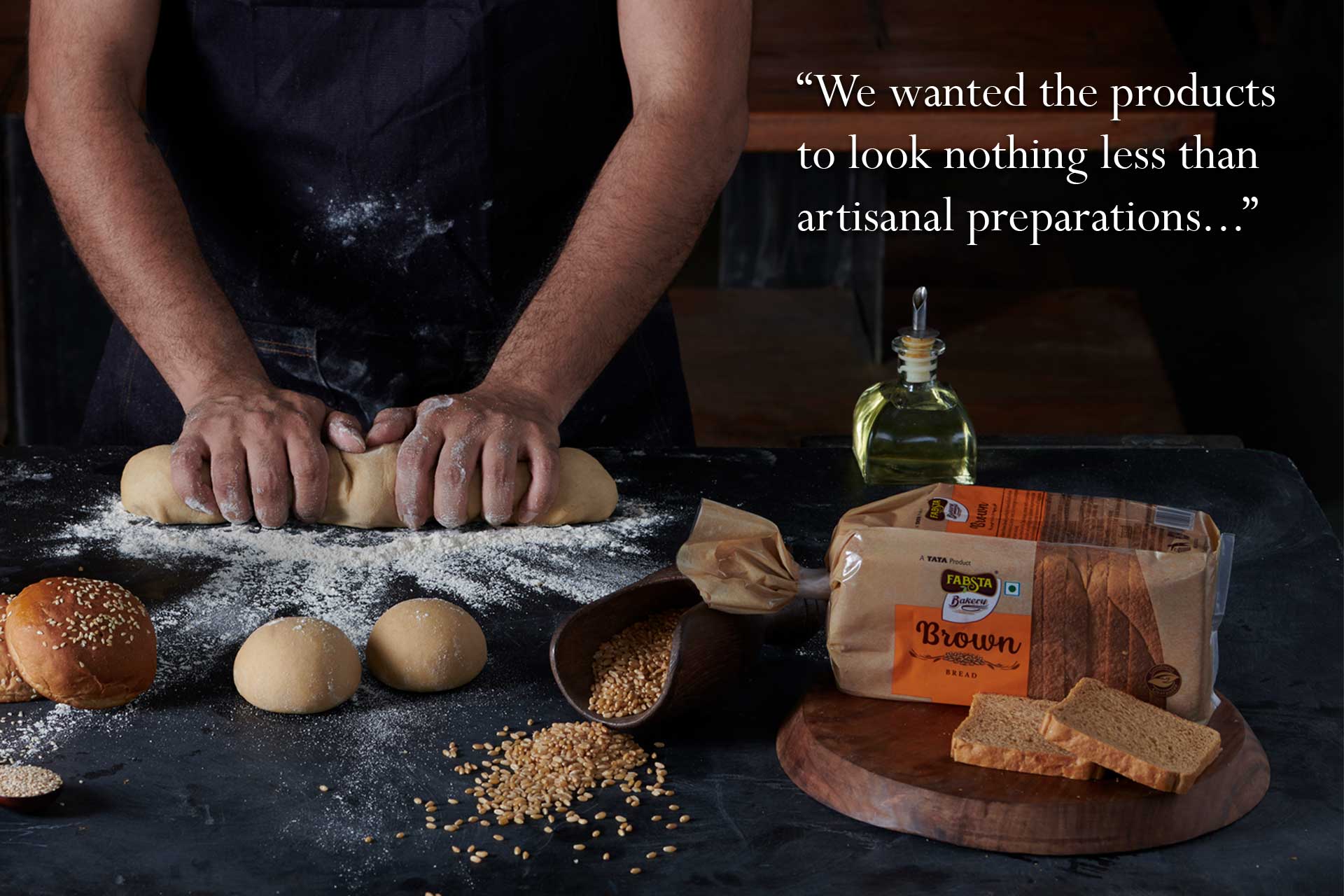
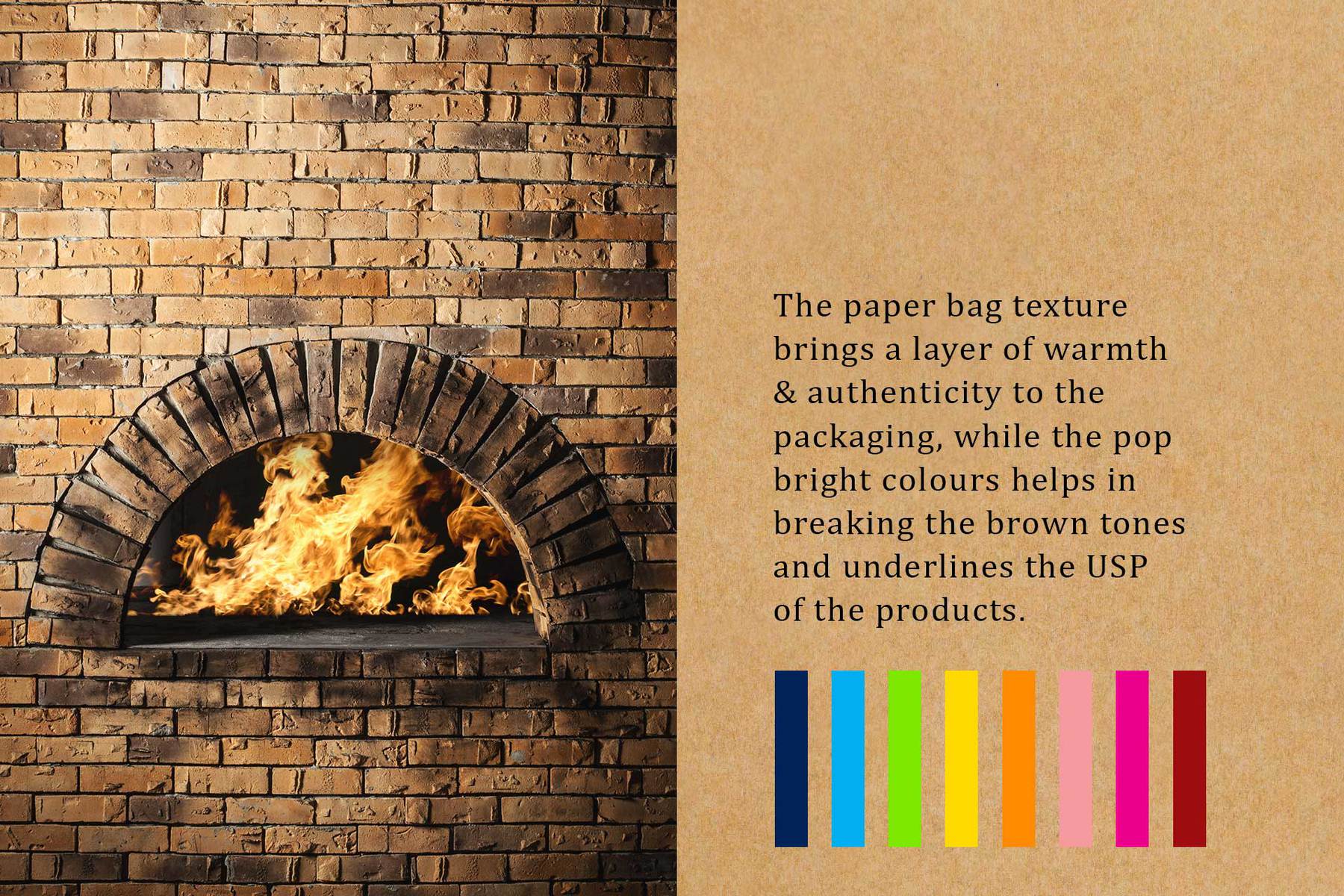
We decided to carry forward with the premium rustic theme for the whole product line. We wanted the products to look nothing less than artisanal preparations as Fabsta was putting in that much efforts onto the authenticity of recipes and production. Hence for packaging, we used the brown paper bag texture as the background bringing in the authenticity factor along with the freshness aspect. The buyer will feel just like one gets a freshly baked bread in an artisanal bakery wrapped in a nice brown bag. It also brought a certain warmth to the packaging. We strategically kept a sufficient transparent area in the packaging to flaunt the delicious product inside.
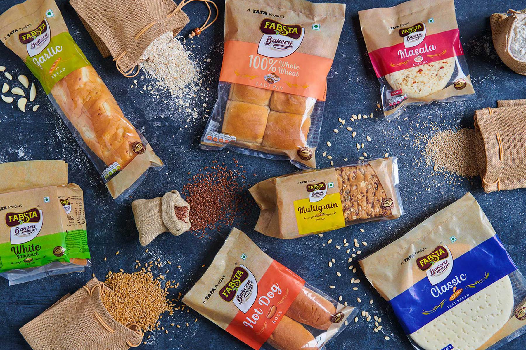
To make the packs look distinguished from each other and to make the identification easier for the consumers, we used the bands of very unique and bright colours for each product. The choice of colours for the packets also underlined the USP of the products.
For the product name typography, we gave a handwriting alike treatment bringing the old school bakery menu-boards nostalgia. Along with the product names, the clean and unfussy illustrations were placed depicting the ingredients or the product servings, whichever brought out the USP essence of that particular product. The packaging was completed with maintaining a similar artisanal and freshness feel throughout the SOP and BOP.
The Fabsta Bakery was launched with a boom and the empty shelves on the launch day itself sang the success of the rustic yet attractive premium packaging of the bakery range!

CREDIT
- Agency/Creative: TCT Strategic Branding
- Article Title: TCT Strategic Branding baking the identity of Fabsta Bakery to perfection
- Organisation/Entity: Agency, Published Commercial Design
- Project Type: Packaging
- Agency/Creative Country: India
- Market Region: Asia
- Project Deliverables: Brand Architecture, Brand Creation, Brand Identity, Brand Naming, Brand Strategy, Branding, Illustration, Packaging Design, Product Naming, Research
- Format: Flow-Pack, Pouch
- Substrate: Plastic


