


Rumble Harbor is the second mysterious »story-spirit« that the scientists Gabriel Copper and Tyler Brave found on their dangerous time travels to parallel universes.
Brand Story:
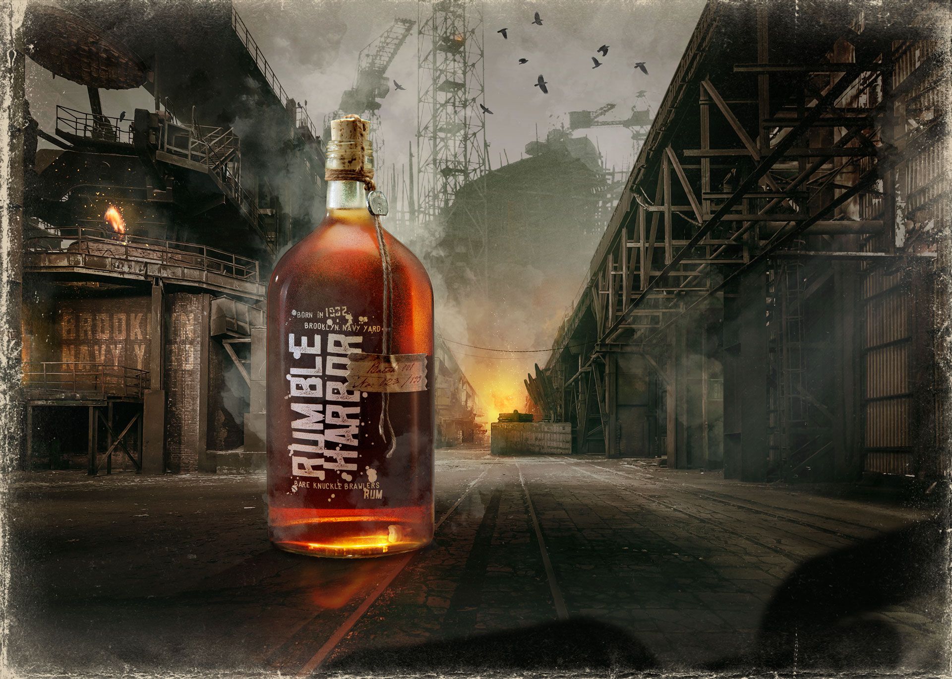
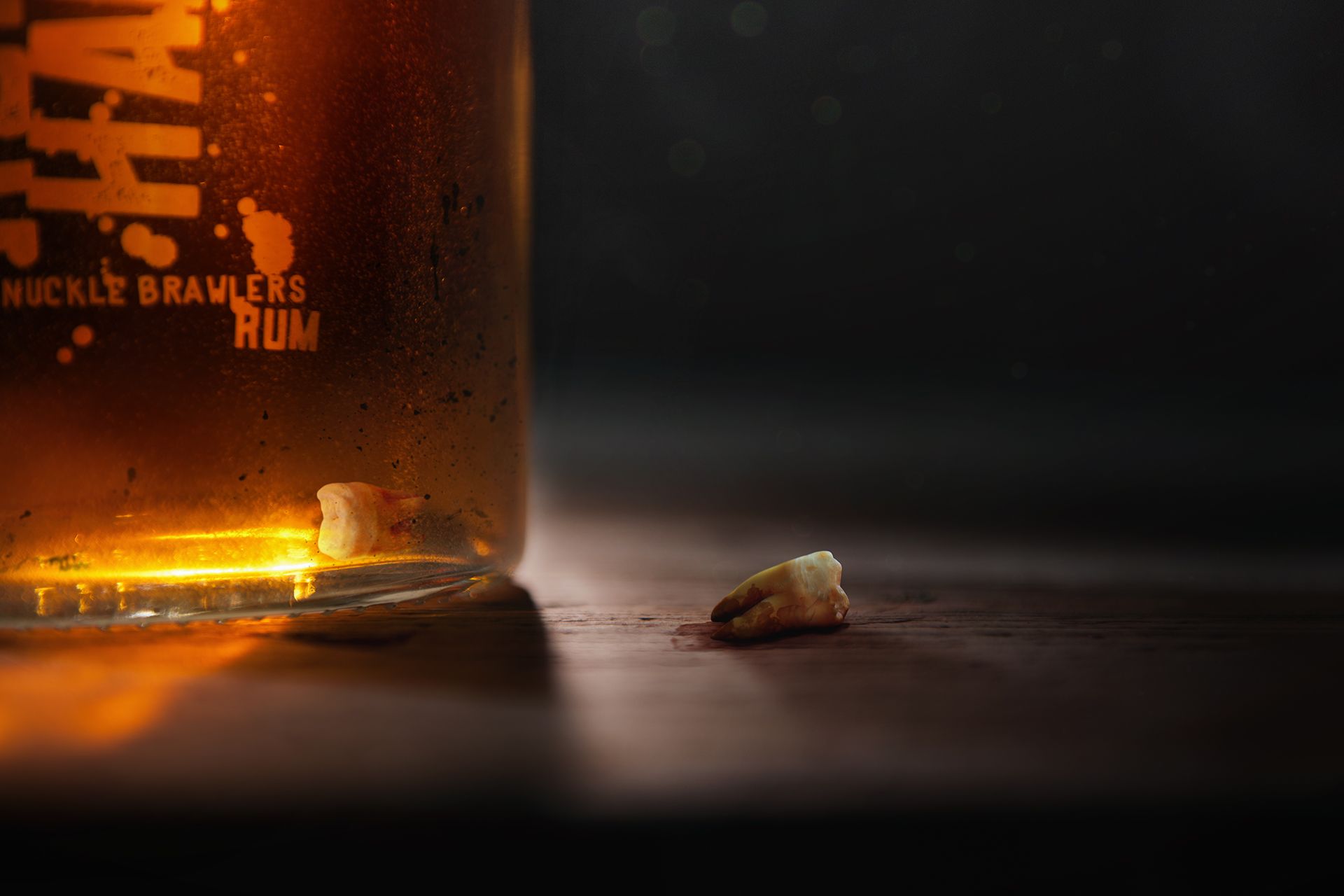
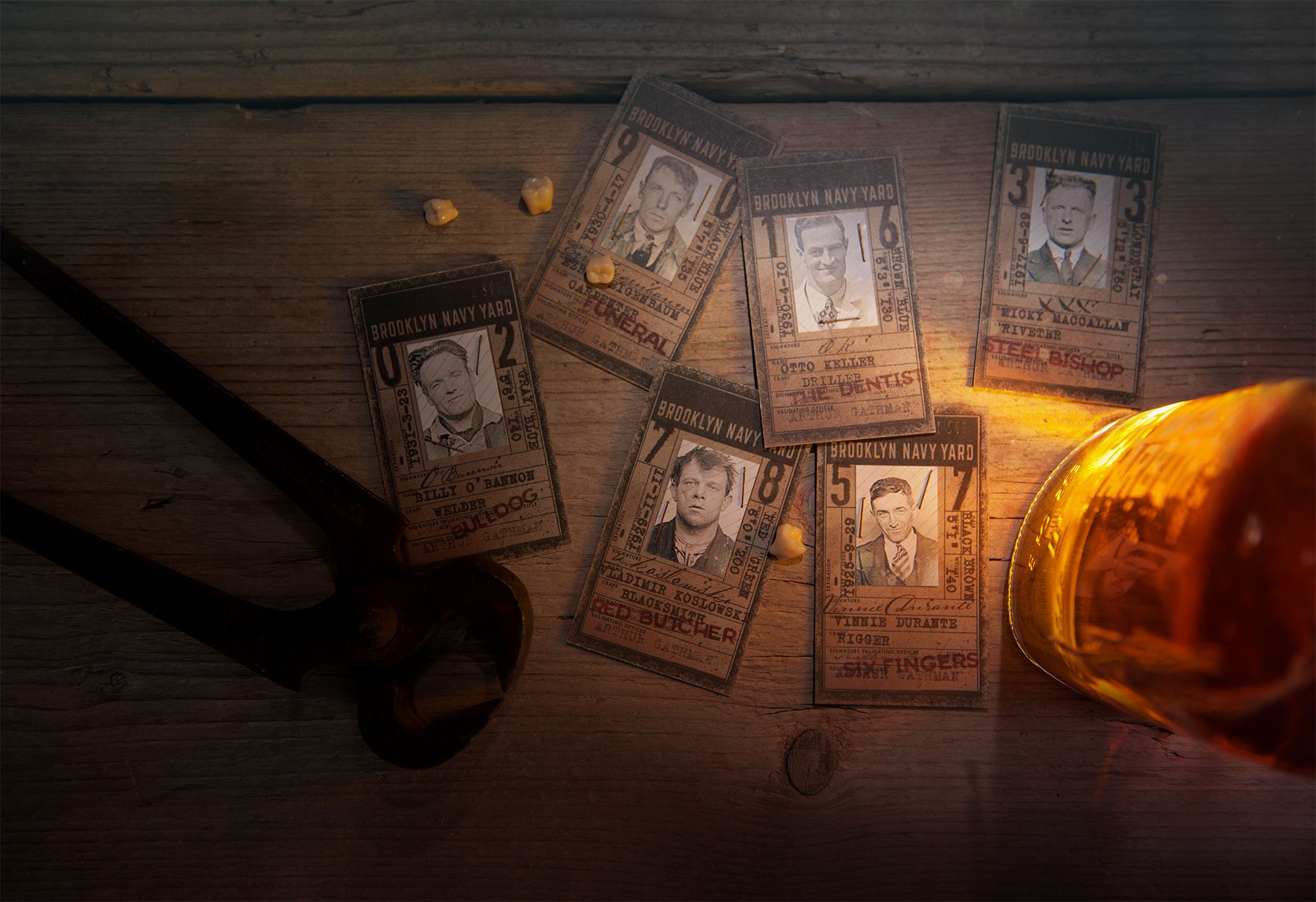
The story is about an illegal boxing tournament on the Brooklyn Navy Yard in New York in the 1930s, at the time of Prohibition. The shipyard workers are working hard and yet have no chance of a brighter future. So they organize a boxing tournament that attracts a lot of shady audiences. The six best fighters of the shipyard, all very bizarre contemporaries, box for a better life to get free from the inhuman drudgery. To numb oneself against the hard punches, they drink a very special rum before each round – each in their own unique way. Of course, the audience is intoxicated with liquor too – a great spectacle for all. There is only one rule: whoever loses a tooth first loses the fight. Then the gong rings …
Packaging:
The entire packaging should convey the highest amount of authentic detail possible to whomever drinks Rumble Harbor, making him believe that he himself is part of the audience of an illegal box fight in a parallel universe, cheering for his particular favorite fighter. None of the objects used for the bottle have decorative purposes only but rather serve as little helpers to pack the overall story.
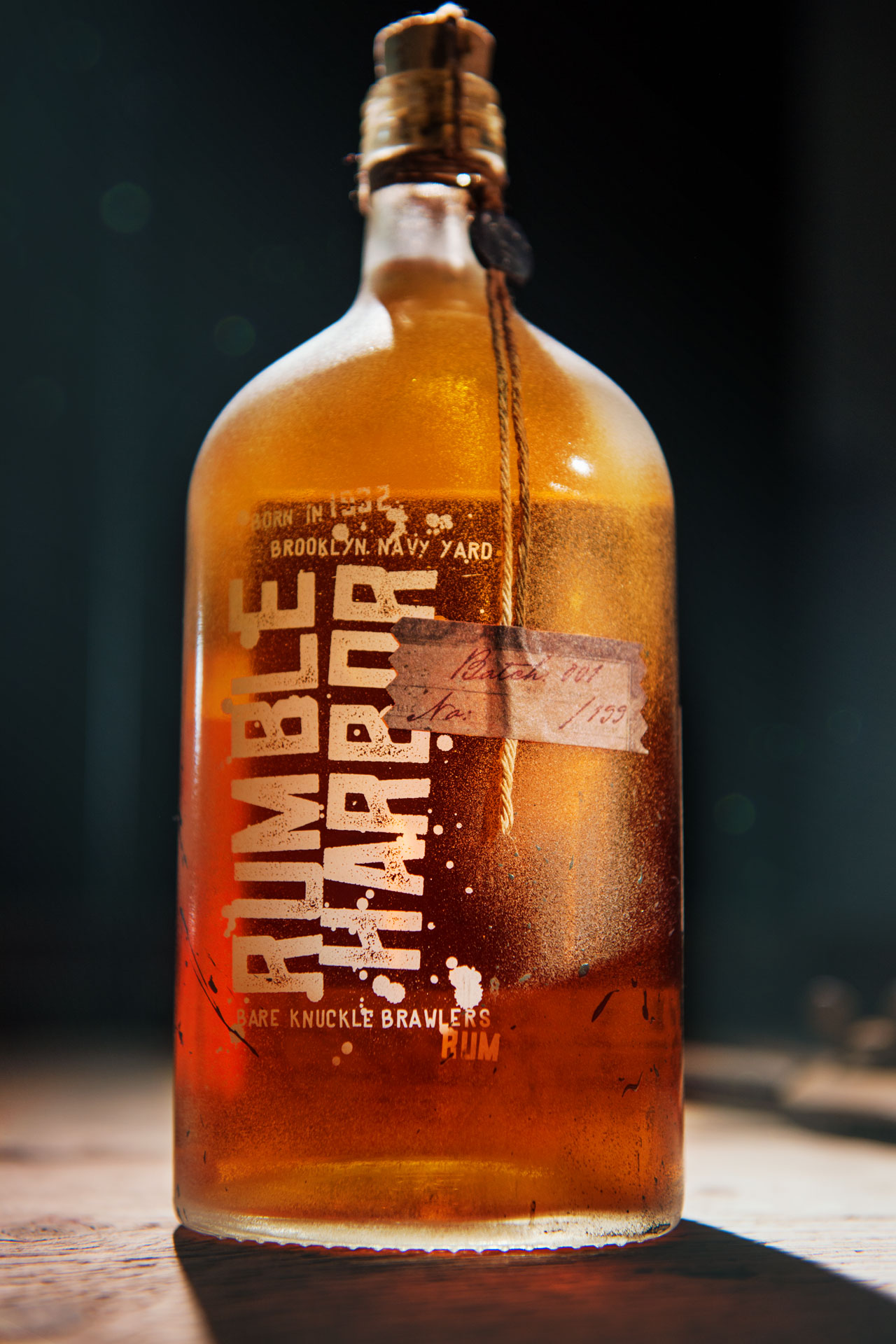
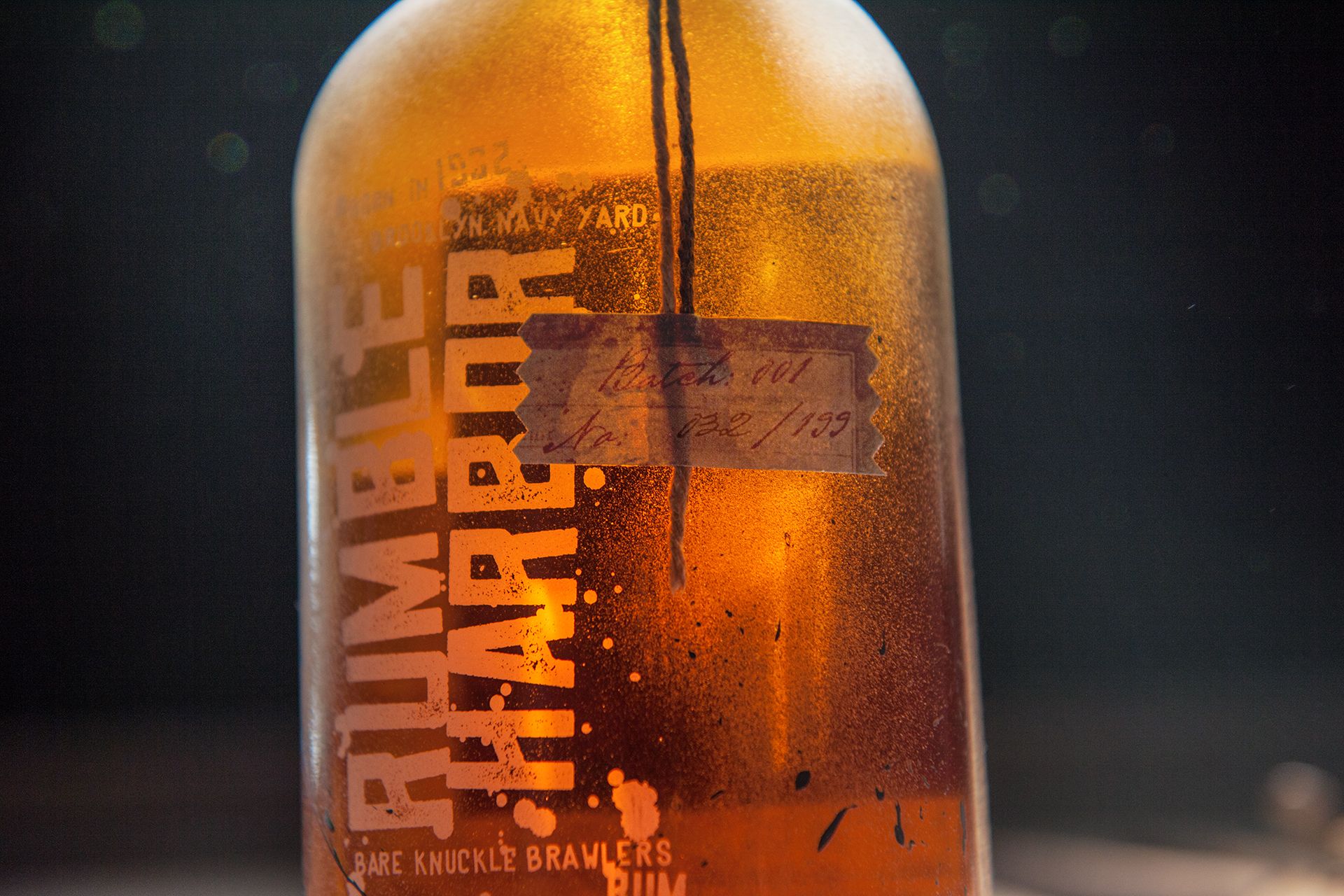
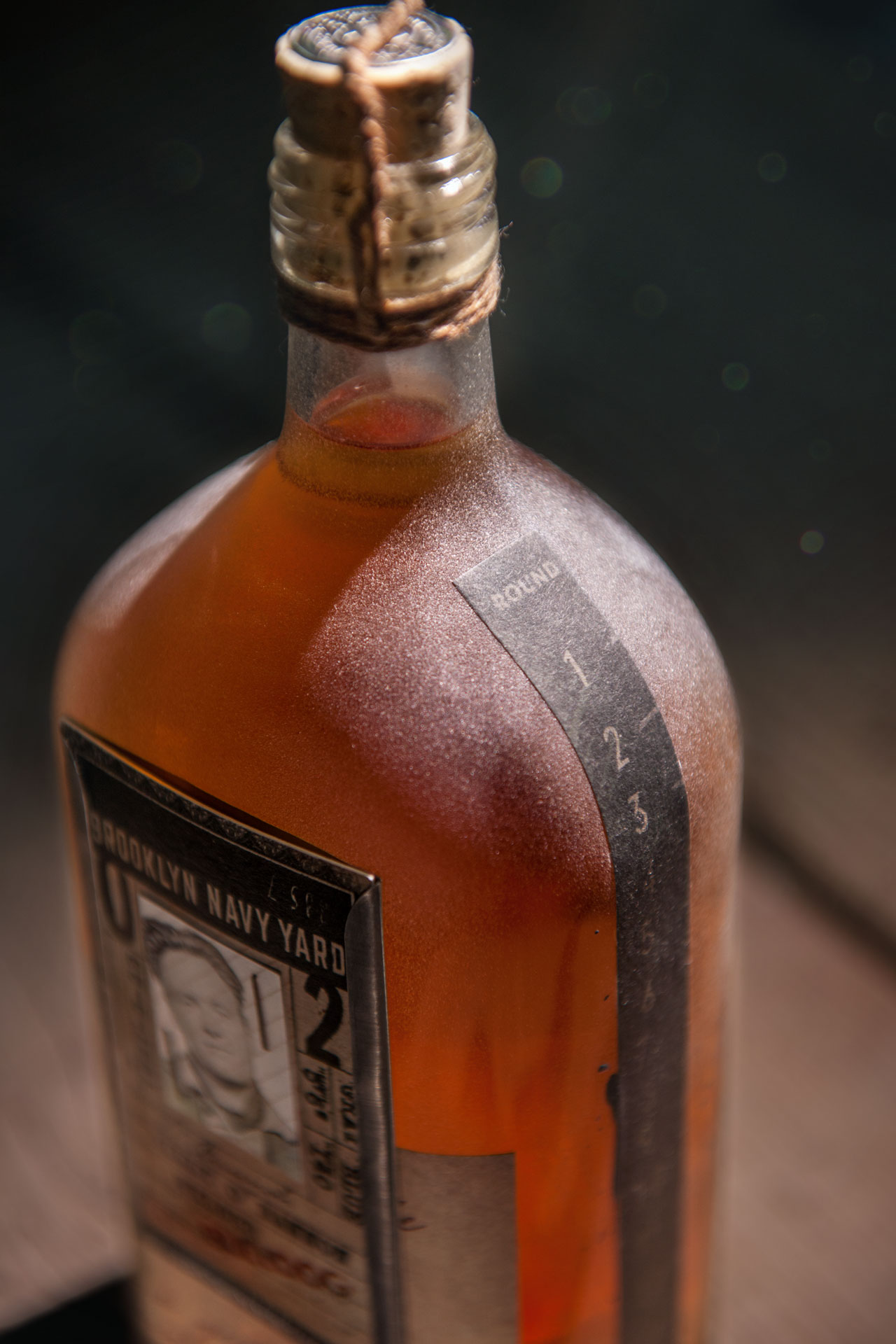
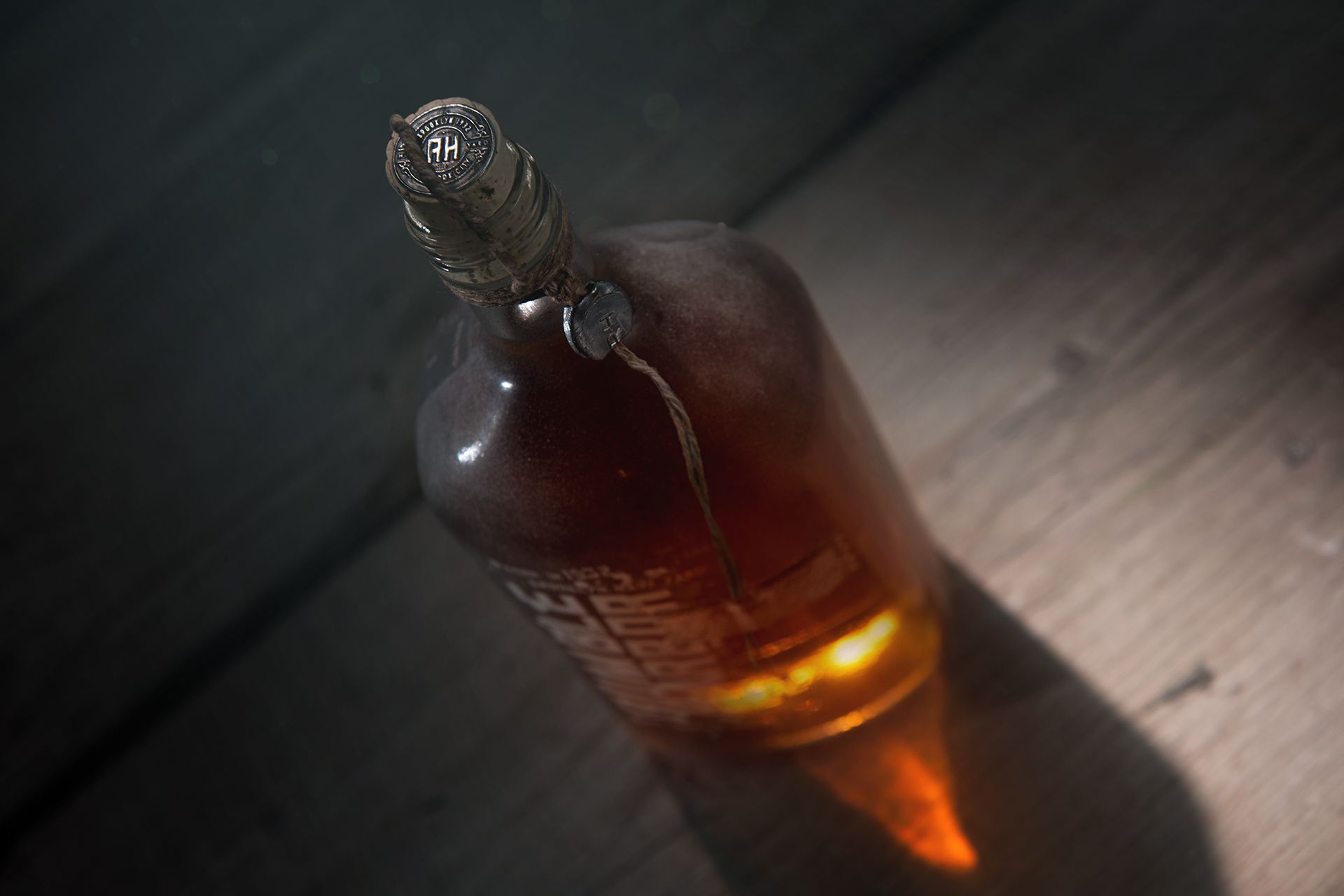
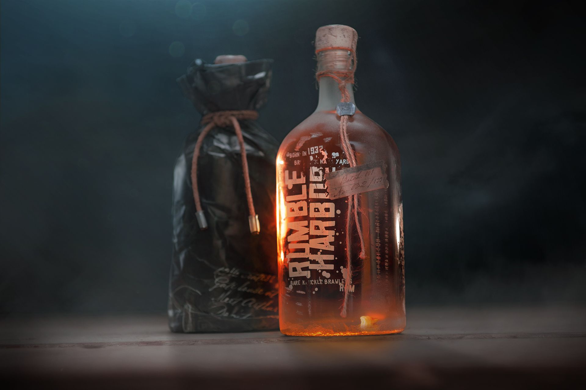
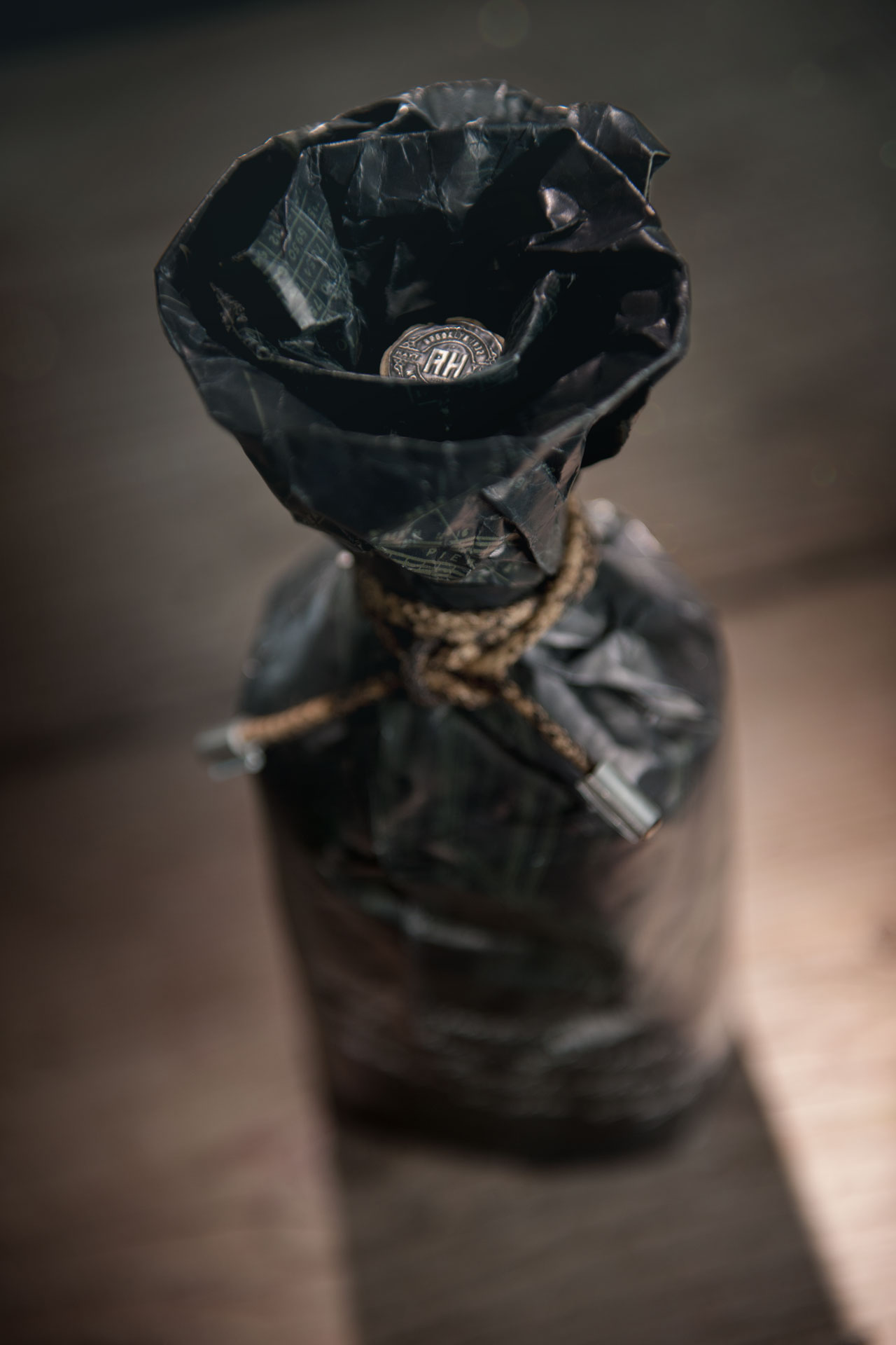
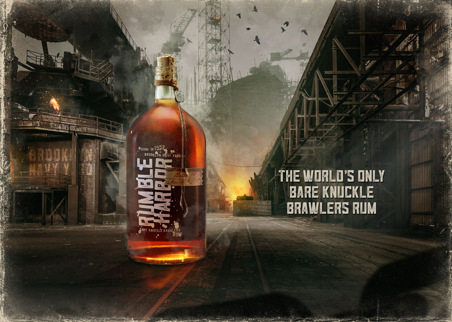
The bottle itself is heavily sand-blasted and chipped in places to let it look like an old authentic artifact. It’s closed with a natural cork on which a round tin badge with the logo of the shipyard is applied. The cork itself is additionally protected by a complex knotted bast string – both aged artificially. This in turn is held together with a lead seal on which the initials »RH« are coined. The bast string is fixed on the bottle’s shoulder by a small paper label showing the batch and bottle number.
Furthermore the brand’s name is screen printed in white on the frontside. It looks as if it was painted by using a thick brush and a stencil – again things that can easily be found on a shipyard.
At it’s side the bottle has a scale showing the current depth of fill. This is, as in boxing, divided into 15 rounds and ends, of course, with the K.O., when the rum was consumed completely. At the back there is an always different part of an old ship construction printed on it.
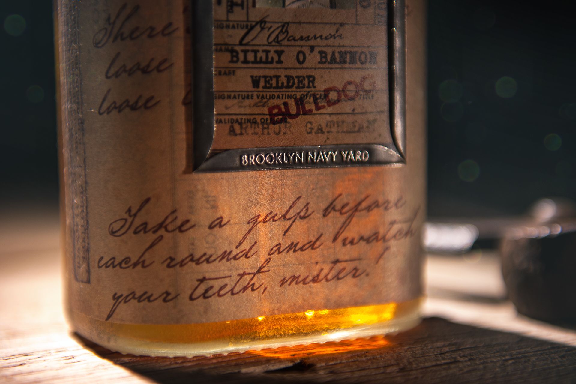
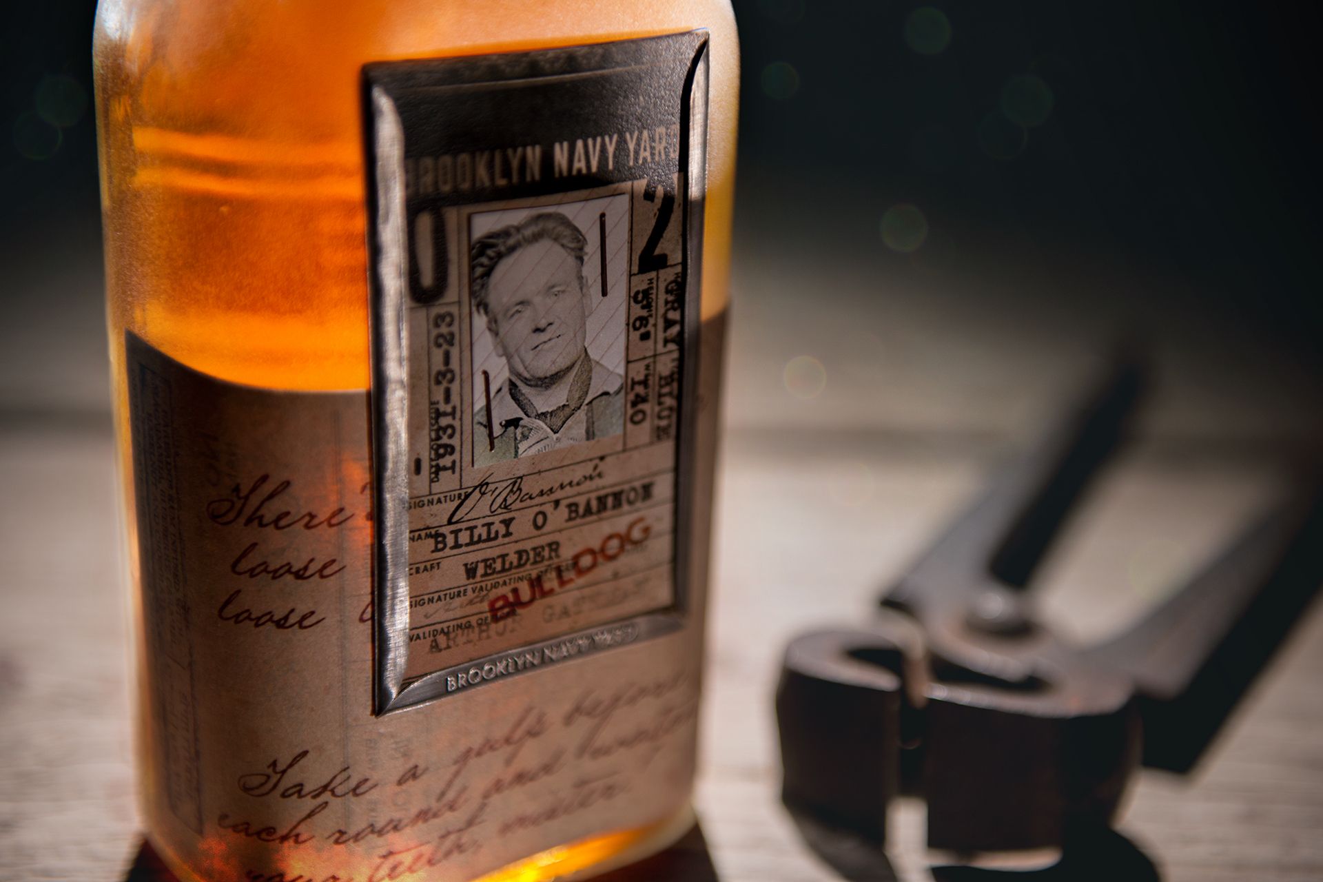
On the back of the bottle, the shipyard ID cards of the six participating fighters are applied. These are based on original ID cards from this period. The pictures are authentic portraits from that time sticked with rusty staples on the ID cards. Typically, these shipyard ID cards are also clamped in a tin frame on which the words »Brooklyn Naval Yard« are coined. This frame can be opened to take the ID card out for your own collection.
Also on the back of the bottle, the time stamp card of each fighter is glued. There you can read the ingredients and the following handwritten note: »There’s only one rule loose a tooth – loose the fight. Take a gulp before each round and watch your teeth, mister!«
The bizarre highlight of Rumble Harbor is undoubtedly a tooth on the bottom of each bottle, which always provides for enthusiasm and astonishment. These are dental ceramic teeth, which are actually used for the production of prostheses.
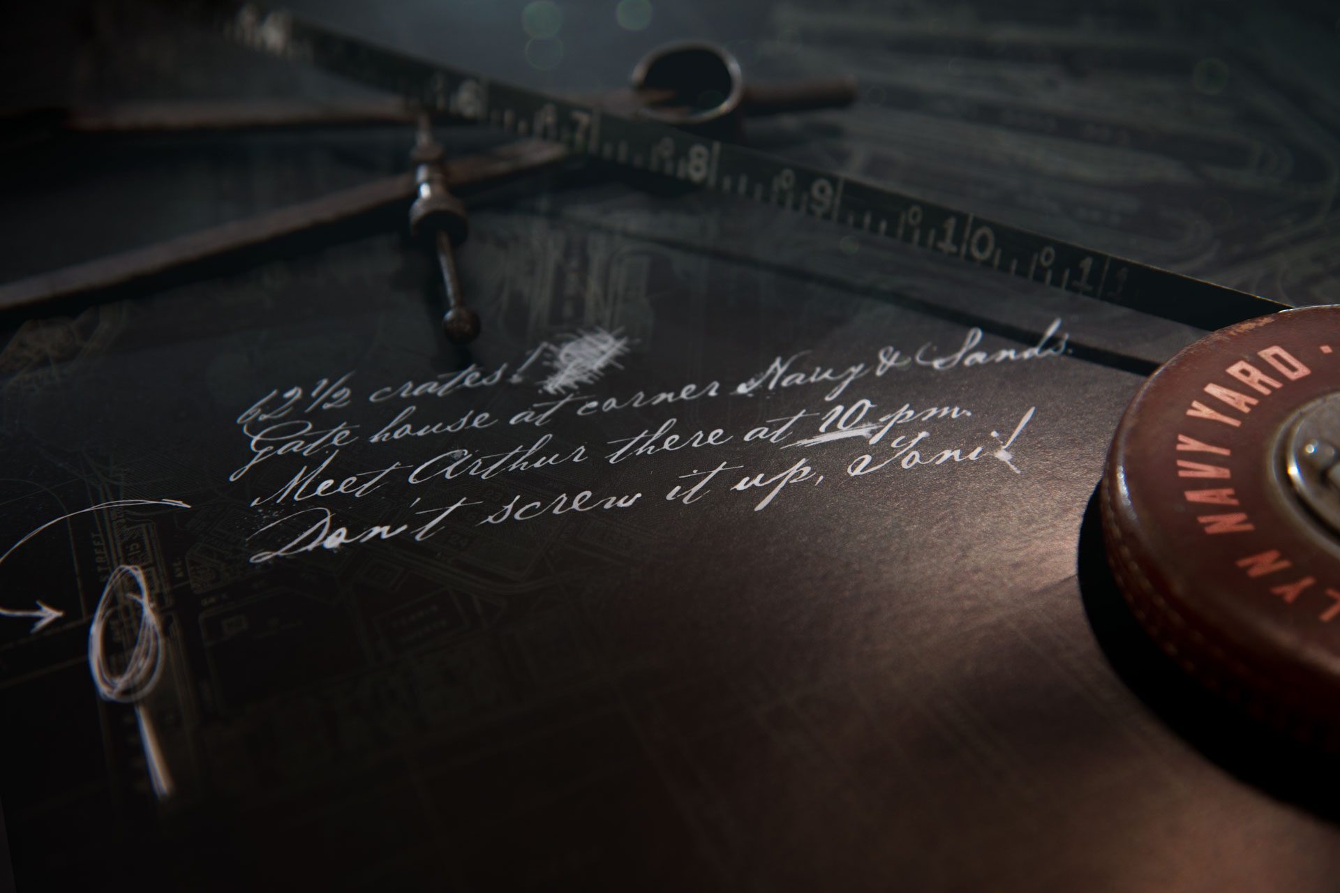
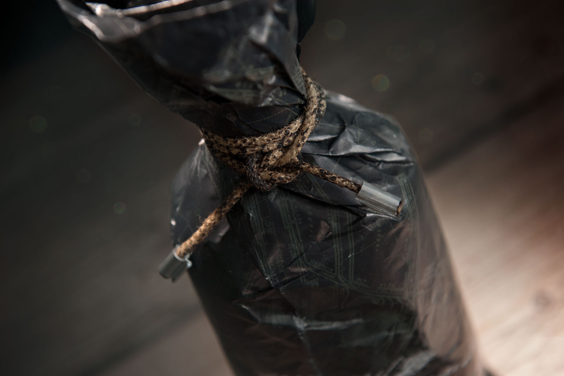
The Rumble Harbor Special Gift Edition will be wrapped in a large-format site map of the shipyard. The plan is fixed to the bottleneck with an aged solid rope. The rope’s ends are protected against splicing with metal sleeves. The Special Gift Edition also includes a 48-page booklet that further introduces you to the world of Rumble Harbor, the fighters and their favorite drinks.
As well as Voodoo Priest, Rumble Harbor’s packaging is hand-crafted, giving each bottle its unique character.

CREDIT
- Agency/Creative: Braue Marken-Experten
- Article Title: Tasty Until Knockout
- Organisation/Entity: In-house, Published Commercial Design
- Project Type: Packaging
- Agency/Creative Country: Germany
- Market Region: Europe
- Project Deliverables: Brand Creation, Brand Design, Brand Identity, Brand Strategy, Brand World, Branding, Graphic Design, Packaging Design, Product Naming
- Format: Bottle, Wrap
- Substrate: Glass Bottle, Metal


