Named after the local forest in the South Island of New Zealand, Talbot Forest Cheese was established in 2000 as a producer of high-quality, speciality cheeses by cheesemaker Paul Fitzsimons and product development expert Angela Veales. After modest beginnings, Talbot Forest Cheese was soon making a significant number of tonnes of cheese annually, across a range of firm, hard, soft, fresh and blue styles. However, since its inception, the brand has not had any development work and in the face of growing competition, the brand lacks any compelling story, reasons-to-believe and shelf impact. In 2019 the brand was purchased by a well-known New Zealdairy producer to turn it from a ‘manufacturer’ brand into an iconic New Zealand brand with substance which is loved for its wide range of cheese offerings.
We were tasked with breathing new, relevant life into the brand. Retaining the name, but with the remit to revolutionise all other brand elements to create disruption in the cheese category.
There is a wide variety of speciality cheese brands in New Zealand and Australia. The majority of which align with heartfelt craft stories and brand elements. This is perceived as a sign of quality, artisan values and craft. But has resulted in a commoditised look which as subsequently resulted in most brands being interchangeable with their close competitors. With the Talbot Forest name, and the future brand strategy of offshore market growth, this gave us the insight to turn the volume up on its origins – so we returned to the forest.
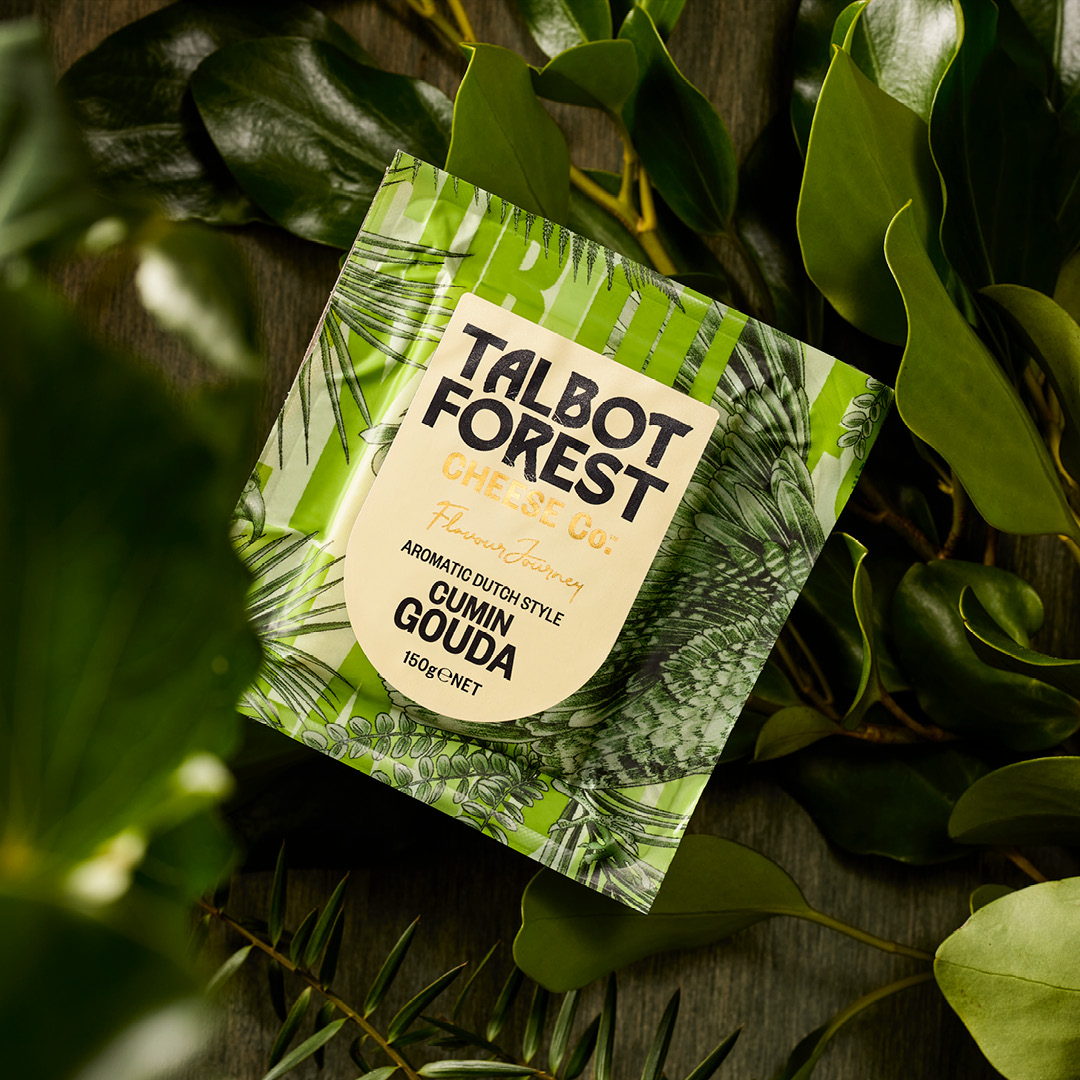
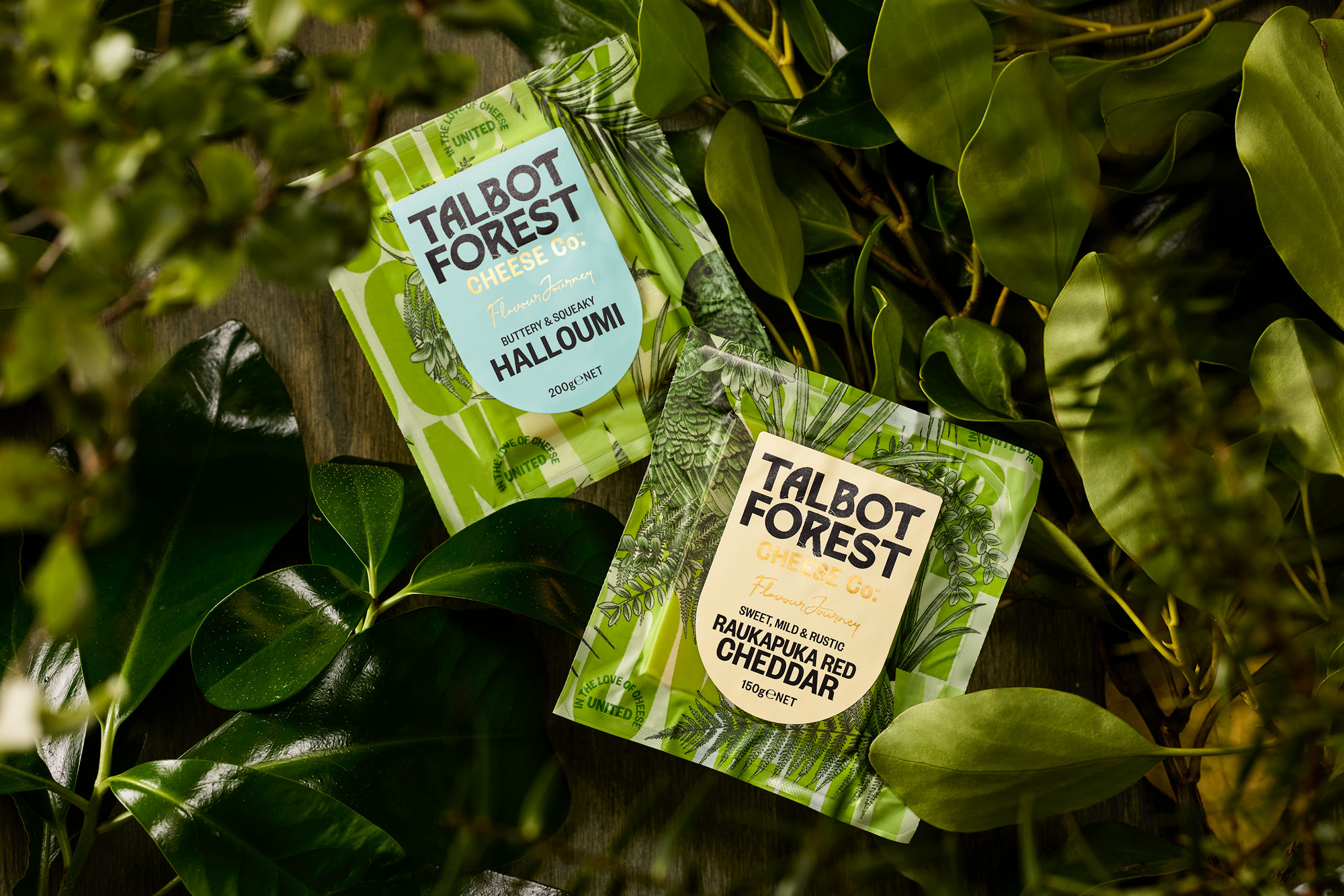
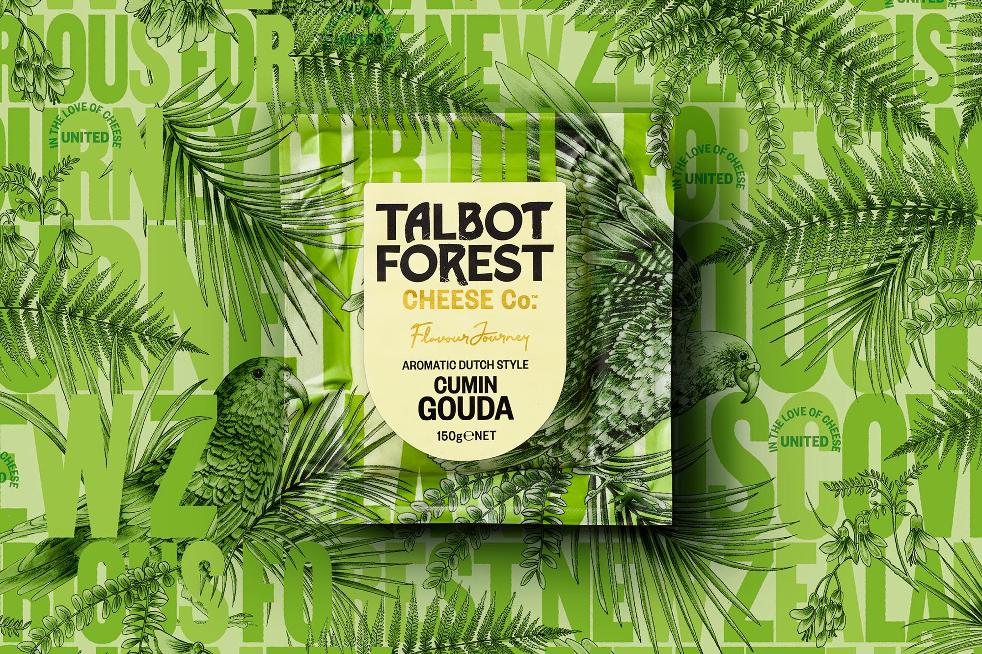
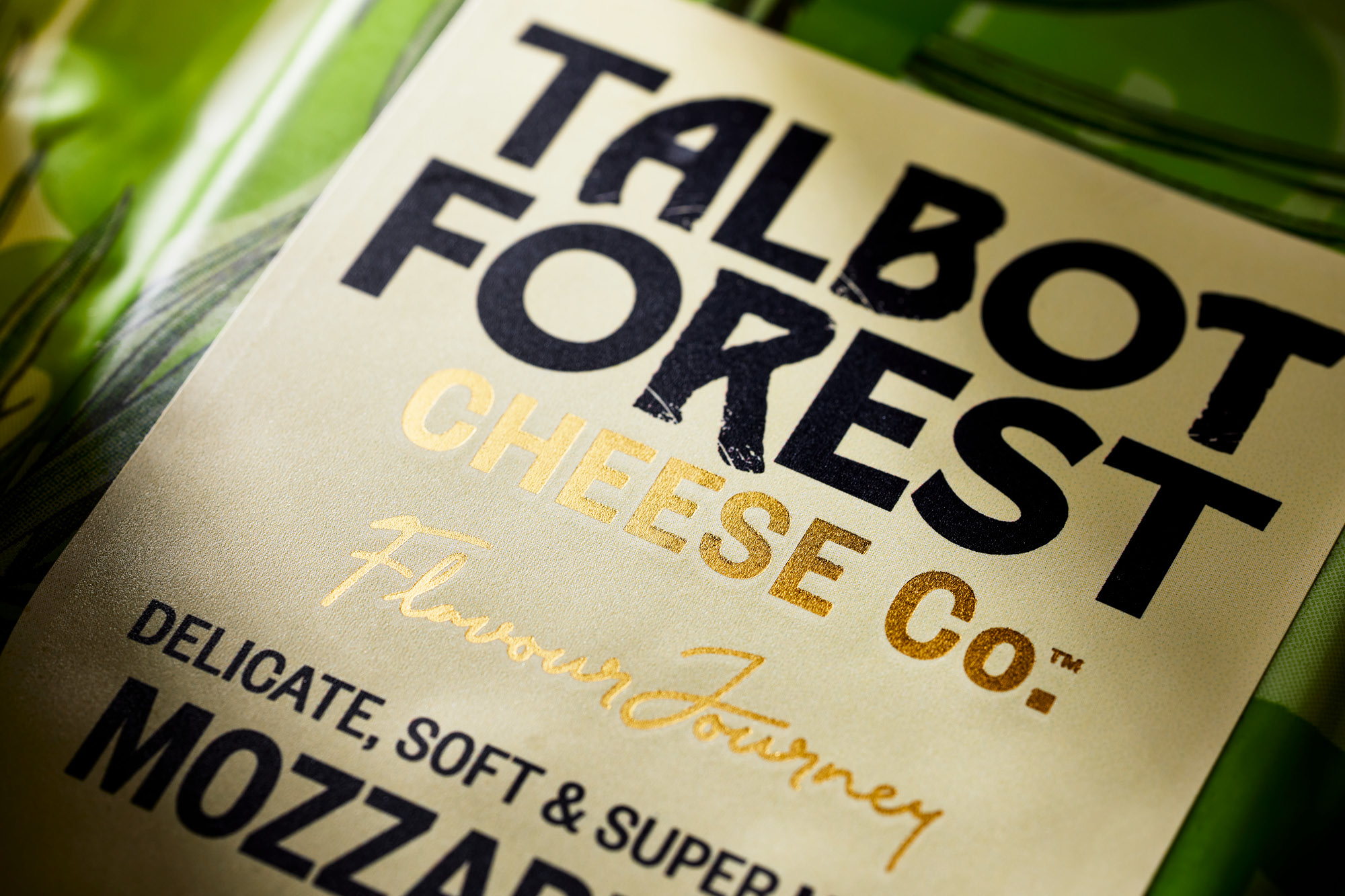
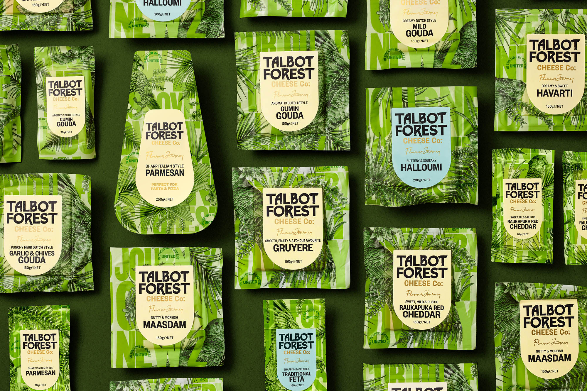
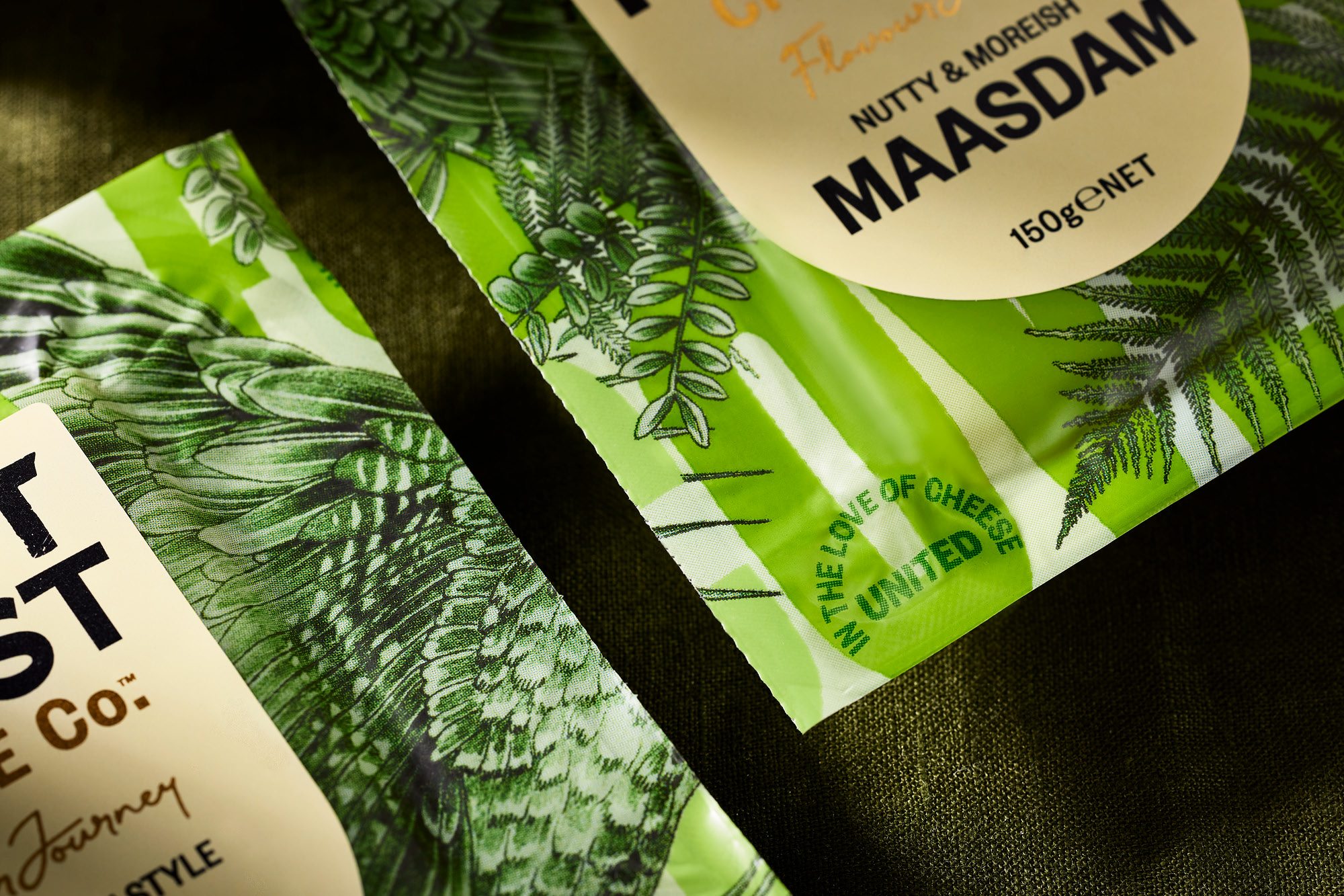
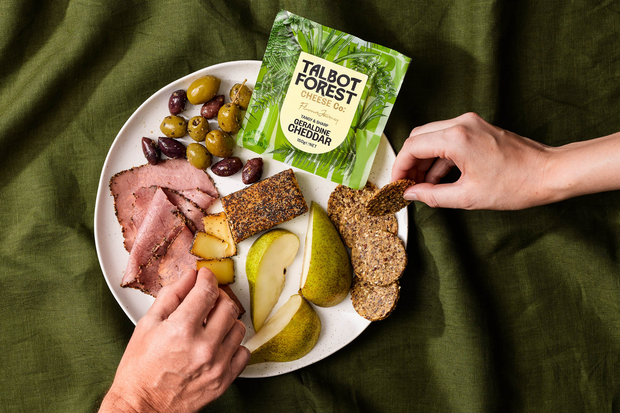
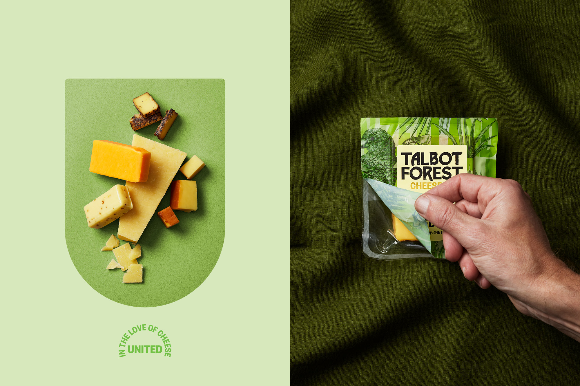
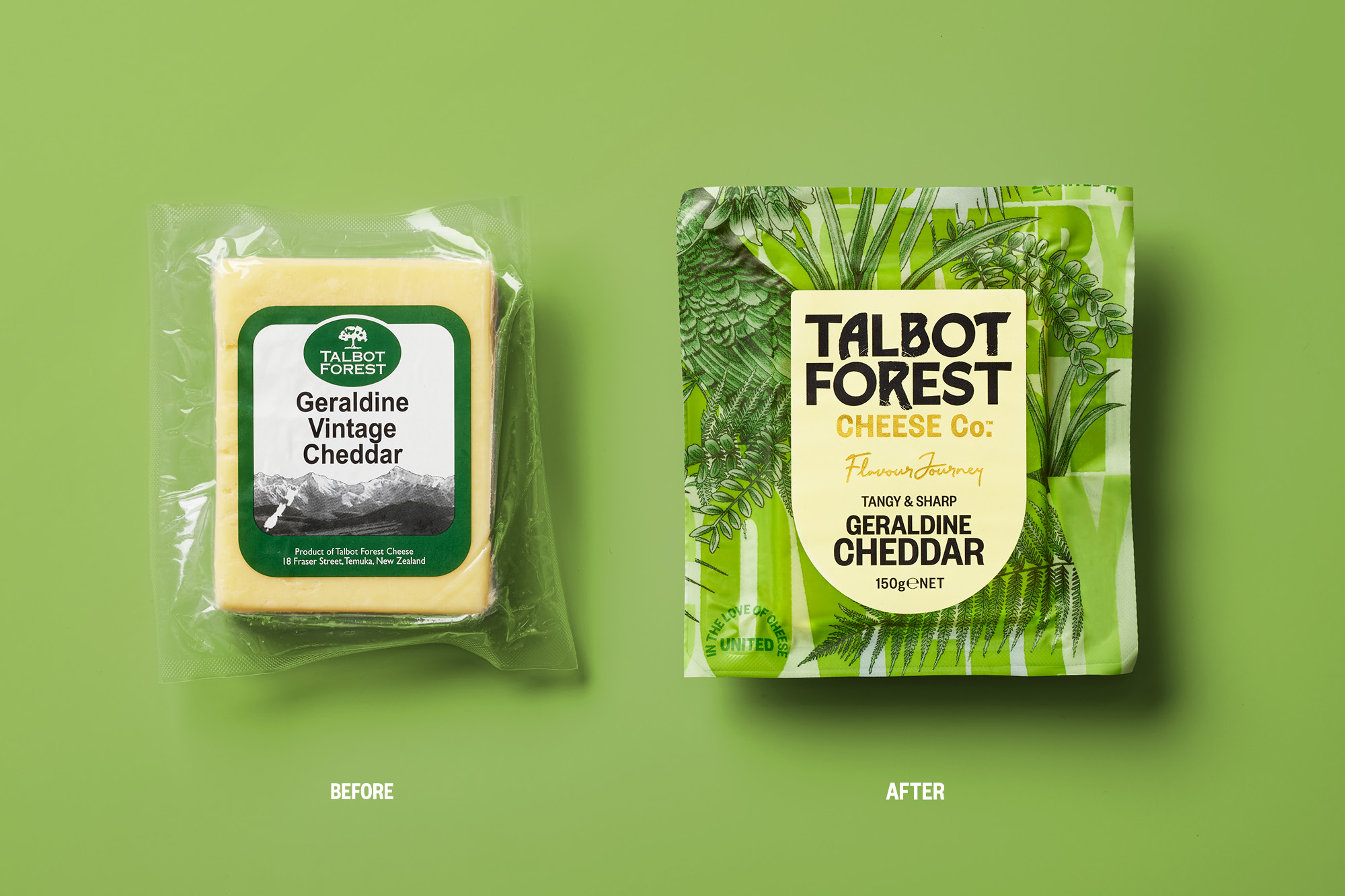
The brand was released from its restrictive and dated, lozenge. Allowing it to be used at scale across all pack formats. The balance between craft, refinement and the forest was achieved through the mix of letter forms to create a new and ownable wordmark. The idea of the forest was brought to life with the exuberant topweb design. We created a large typographic pattern with woodblock inspired wording taken from brand values and provenance, then sprinkled with botanical illustrations that grow through the letterforms showcasing New Zealand birdlife, flora and fauna. The size of the illustration stretches across the entire printable web, which, when cut, meant that nearly every pack contained different parts of the pattern. While united by the green colour palette, each pack was unique in its own way. A shield-shaped sticker is then applied on all packs – the shape is a nod to the idea of everyone being united in their love of cheese, no matter what their cheese choice is. Hints of gold foil nod to the quality, while product descriptors are purposefully clean and easy to navigate. Colour changeouts denote cheese styles; yellow, blue and white labels are the subtle colour codes for the entire range.
Undeniably New Zealand, vibrant, bold and sparking intrigue – the packs were relaunched into the New Zealand market. To be quickly followed by launches in Australia and Asia.
CREDIT
- Agency/Creative: Onfire Design
- Article Title: Talbot Forest Cheese Co. Branding and Packaging Design by Onfire Design
- Organisation/Entity: Agency
- Project Type: Packaging
- Project Status: Published
- Agency/Creative Country: New Zealand
- Agency/Creative City: Onfire Design / Auckland
- Market Region: Oceania
- Project Deliverables: Brand Design, Brand Experience, Brand Guidelines, Brand Identity, Brand Mark, Brand Rejuvenation, Brand Strategy, Brand Tone of Voice, Brand World, Copywriting, Illustration, Label Design, Packaging Design
- Format: Sleeve
- Substrate: Plastic
- Industry: Food/Beverage
- Keywords: WBDS Agency Design Awards 2021/22
-
Credits:
Creative Director: Matt Grantham
Art Director: Sam Allan
Design: Matt Grantham
Account management: Jade Woods


