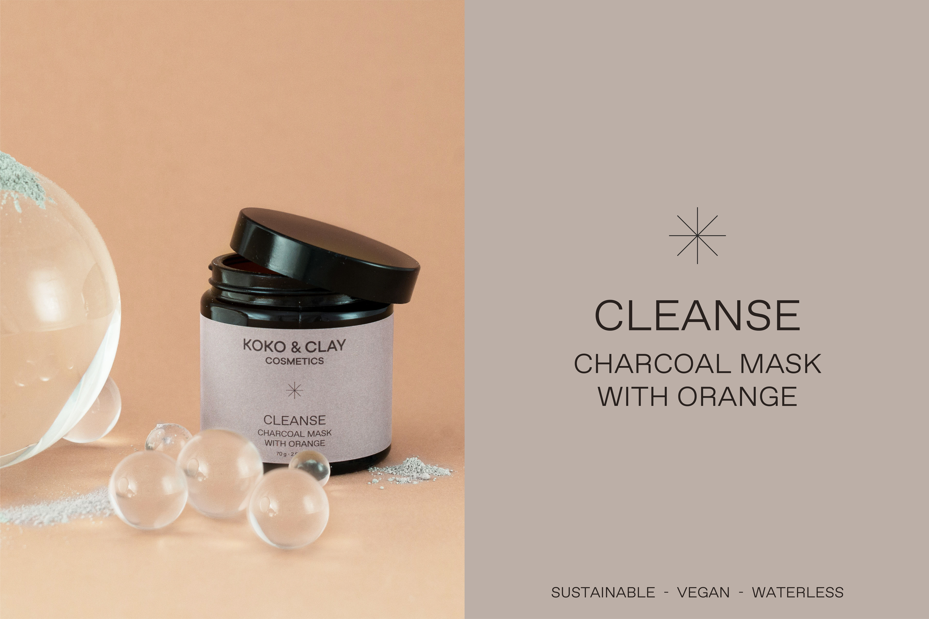
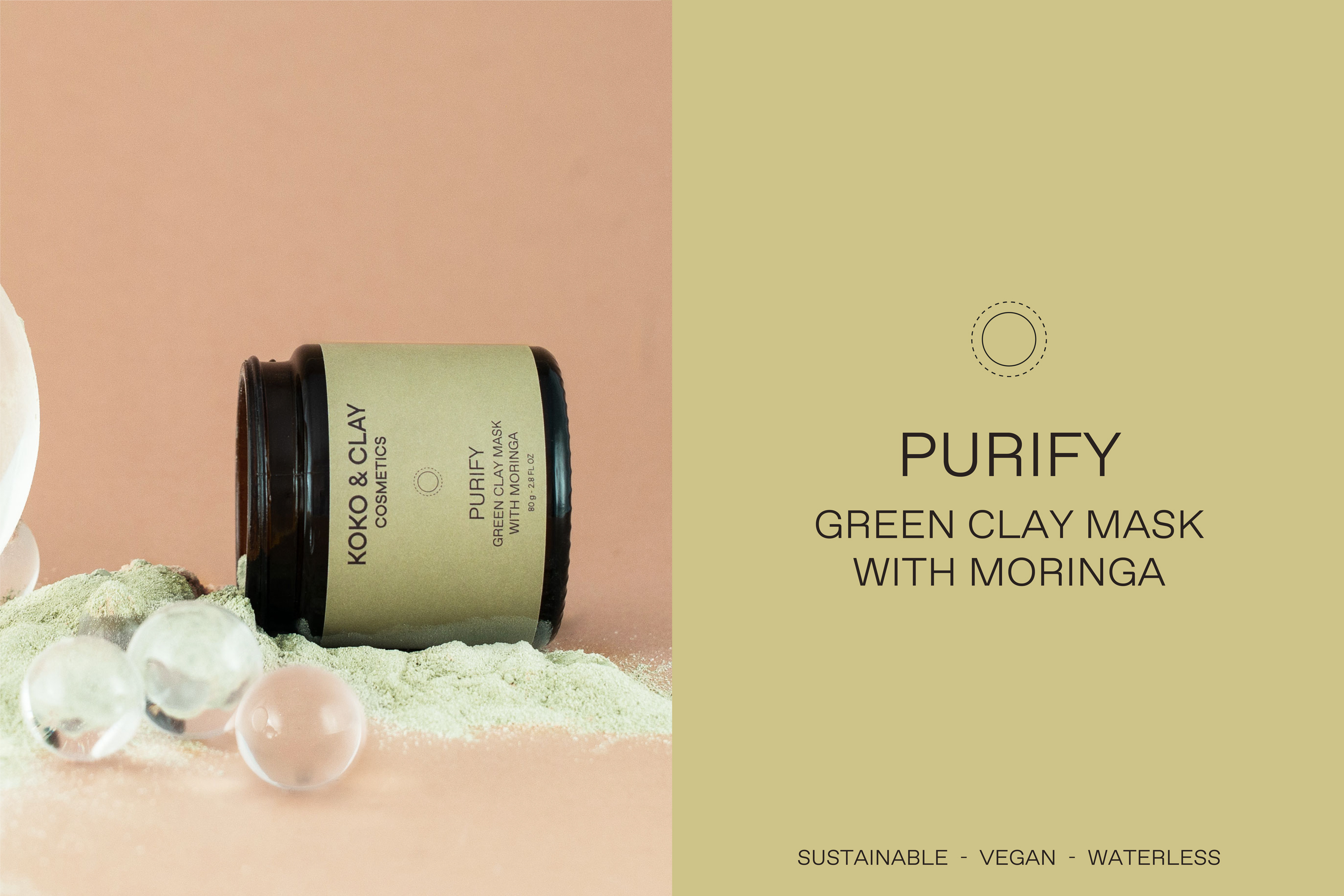
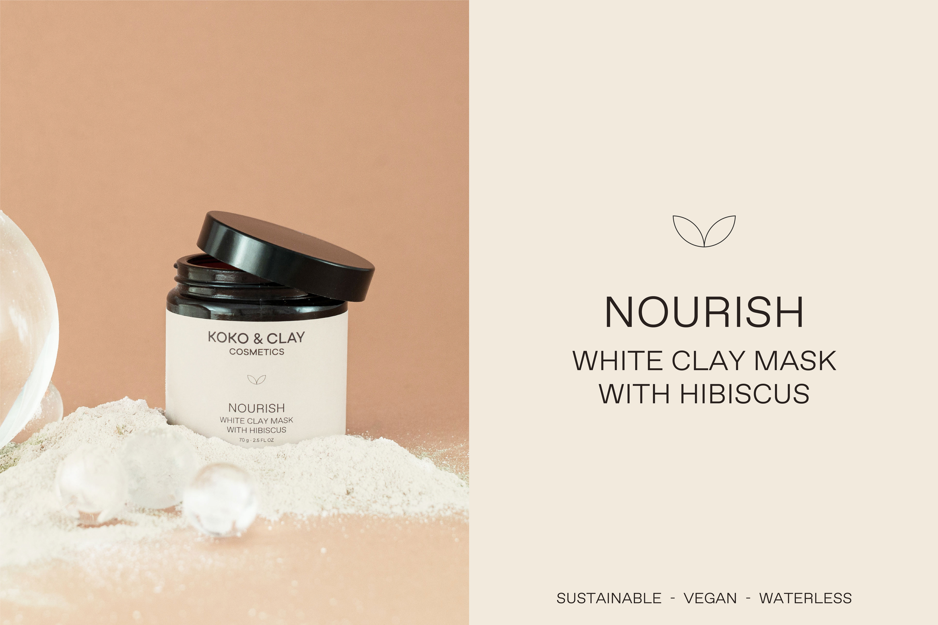
koko&clay is a cosmetic brand based in Germany and it is all about conscious, natural, mindful beauty. The products are made out of a unique formula created by the founder, inspired by ancient beauty and traditions from all around the world, and are made with all natural ingredients, giving back the power to the nature.
For the rebrand my goal was to express the simplicity and honesty behind the brand and highlight the natural aspect. Therefor I played with the
typography of the logo, making the „k“ have the shape of a plant. Koko&clay wants to bring back skincare to its roots, and the logo wants
to be a visual expressions of it.
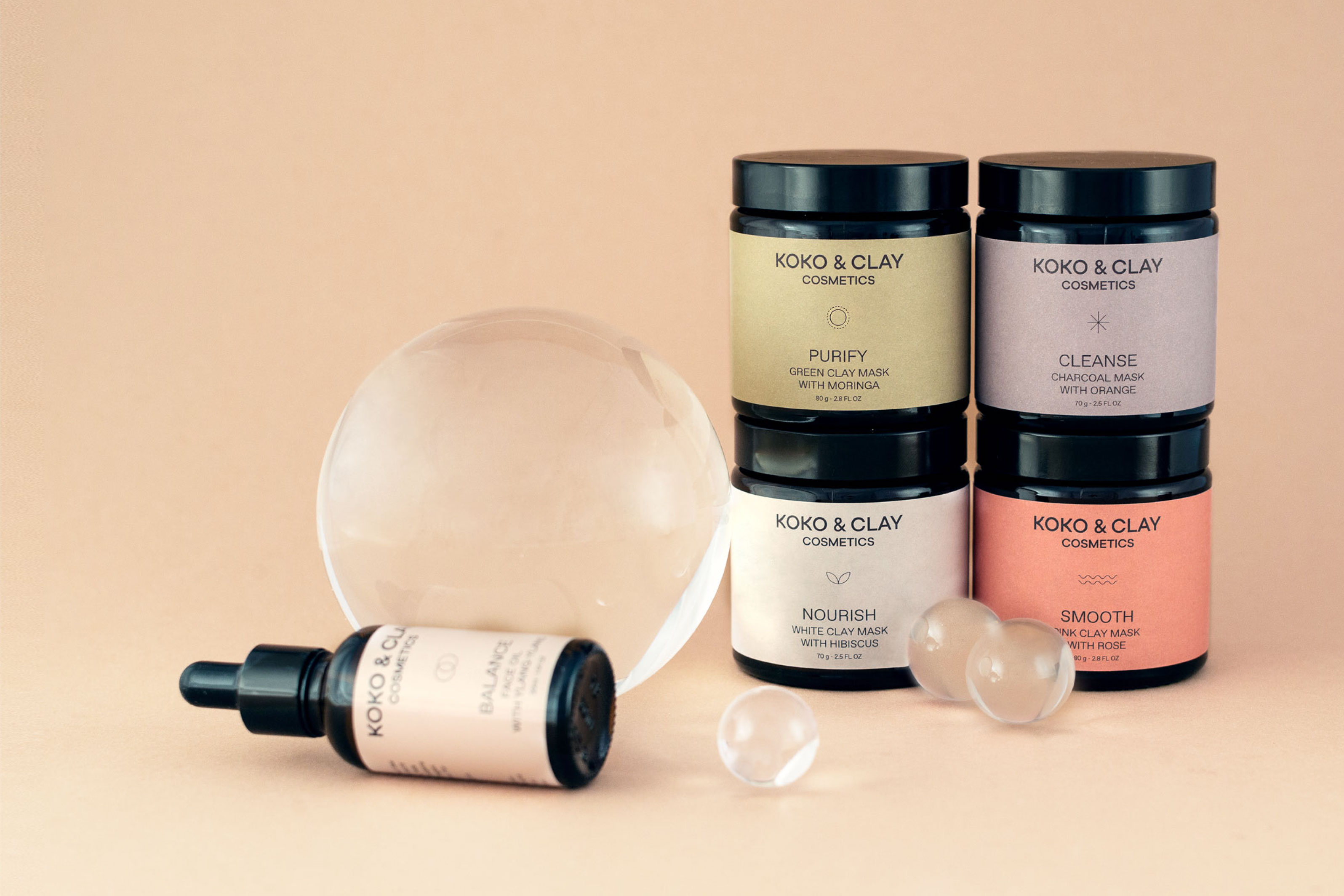
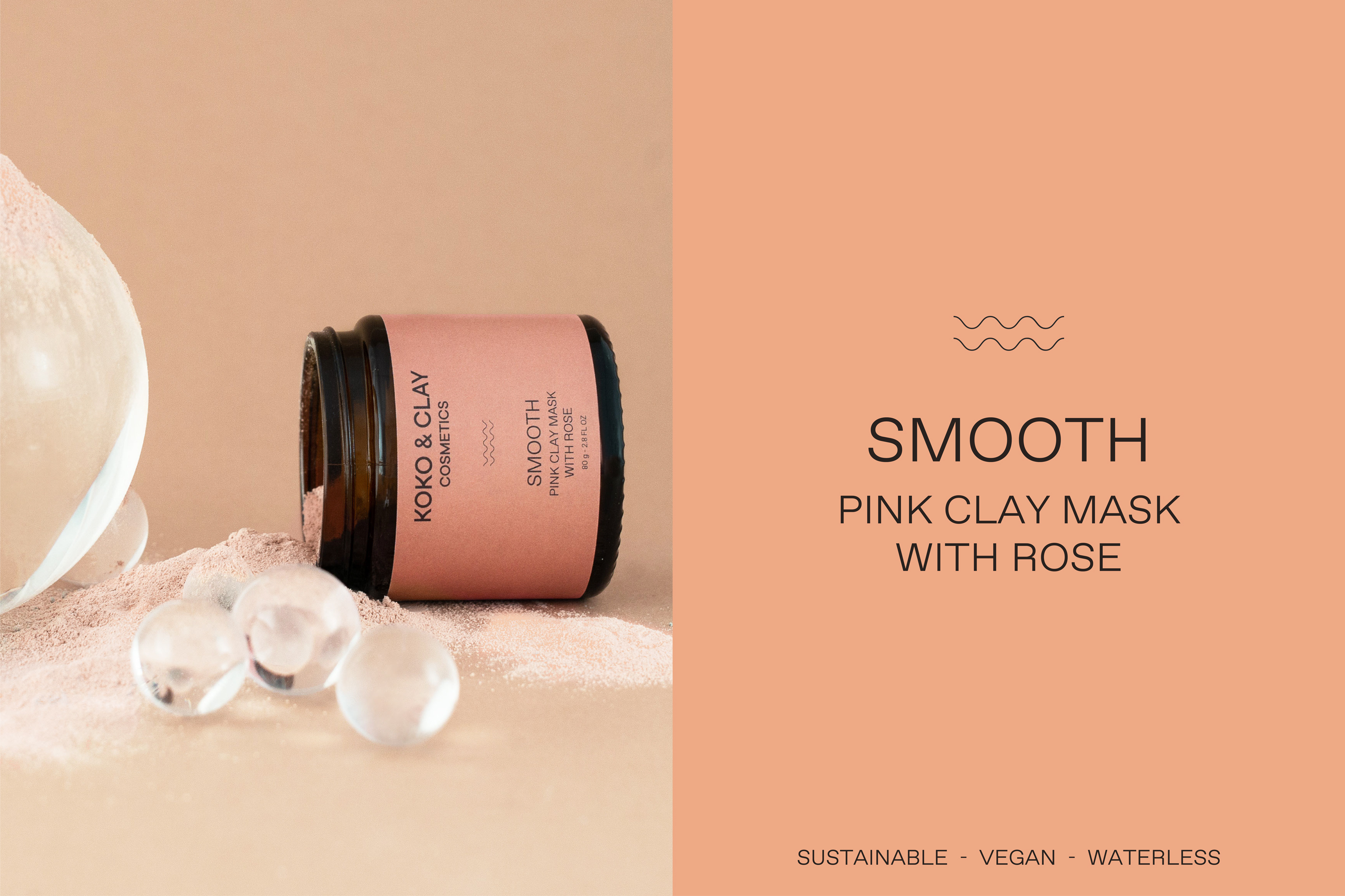
When comes to the labels, the goal was to highlight the specific benefit of each facemask as well as the natural ingredients of them. Therefor the colour of each label is a reflection of the main ingredient of the facemask and also has a link to the color of the product itself.
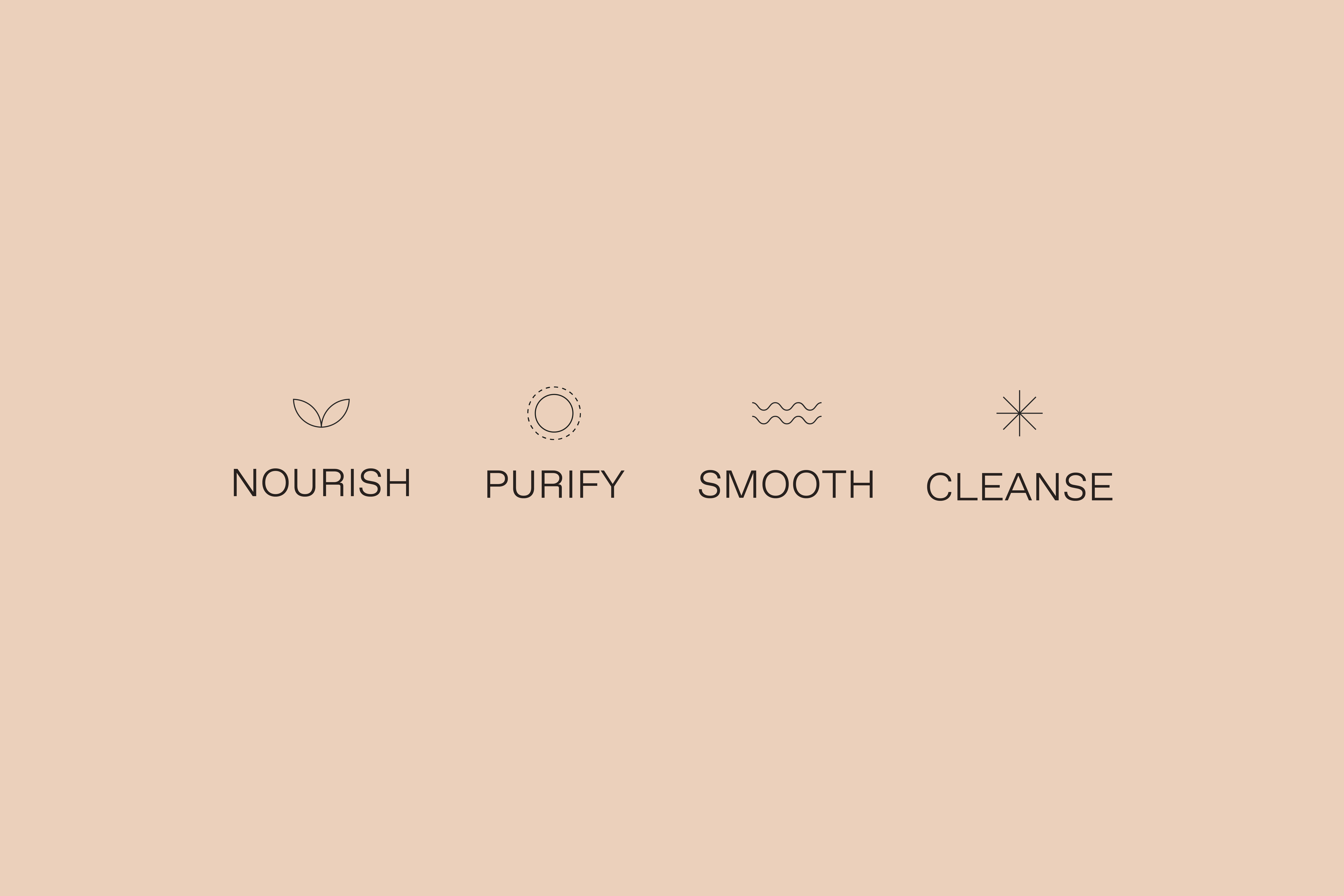
To highlight each specific benefit I came up with a set of icons. The design is really simple and clean, in order to be connected to the simplicity of the products. I choose Favorit STD Light from abc dinamo as a typeface to give a modern but still sophisticated look to the labels. Also, the structure of the typeface and its geometry is a way to highlight the sincerity of the brand.
CREDIT
- Agency/Creative: Rosalba Porpora
- Article Title: Taking Skincare Back to Its Roots – Brand and Packaging Designed by Rosalba Porpora
- Organisation/Entity: Freelance, Published Commercial Design
- Project Type: Packaging
- Agency/Creative Country: Germany
- Market Region: Europe
- Project Deliverables: Brand Identity, Brand Redesign, Brand Strategy, Brand World, Branding, Graphic Design, Packaging Design, Rebranding
- Format: Jar
- Substrate: Glass Bottle


