


tāi is an innovative beverage concept that reimagines the essence of Thai Iced Tea through a bold and modern brand identity. The challenge was to create a visual system that not only communicates the diversity of flavors but also translates the cultural roots of Thailand into a playful and contemporary design language.
The approach: Make flavor tangible. tāi is more than just iced tea—it’s a multi-sensory experience. The design conveys the character of each flavor through a powerful visual language that combines color psychology, dynamic typography, and illustrative storytelling.
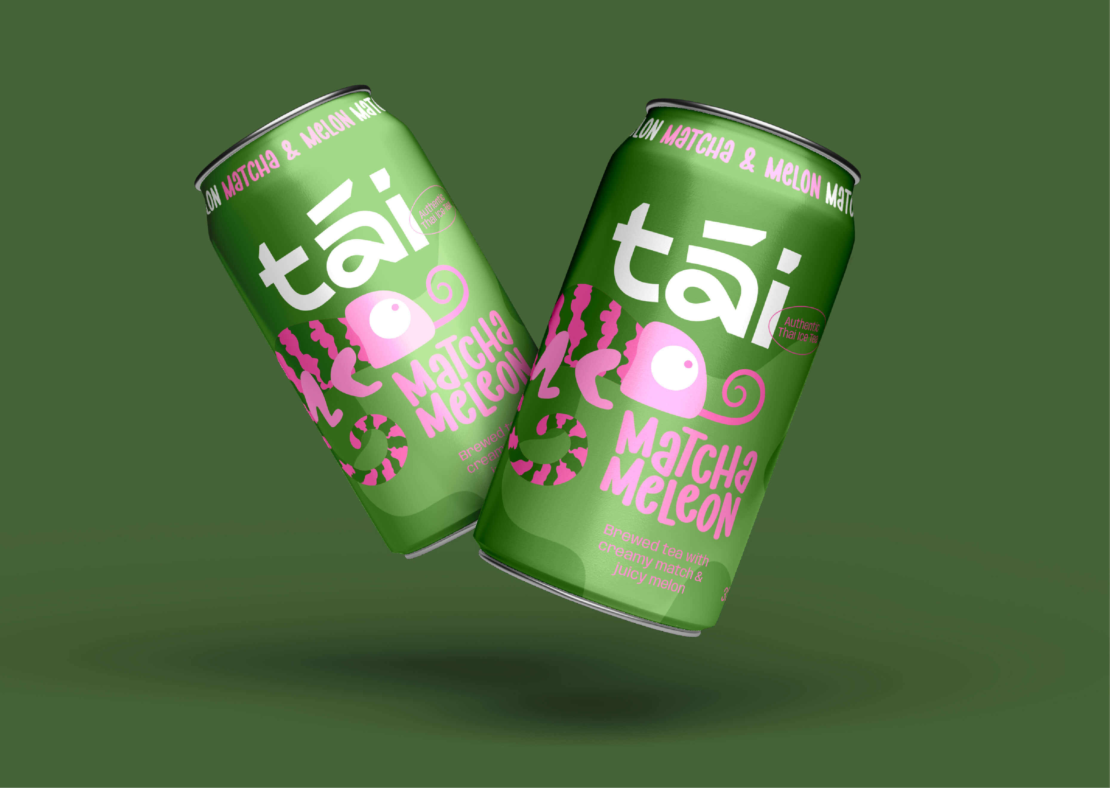
The brand name tāi is short, memorable, and phonetically echoes the word “Thai,” creating an immediate association with the drink’s origin. The logotype takes inspiration from traditional Thai script, incorporating its curved, flowing structure while maintaining a modern, minimalistic aesthetic. This fusion of heritage and contemporary design ensures a strong cultural connection while making the brand feel fresh, youthful, and internationally appealing.
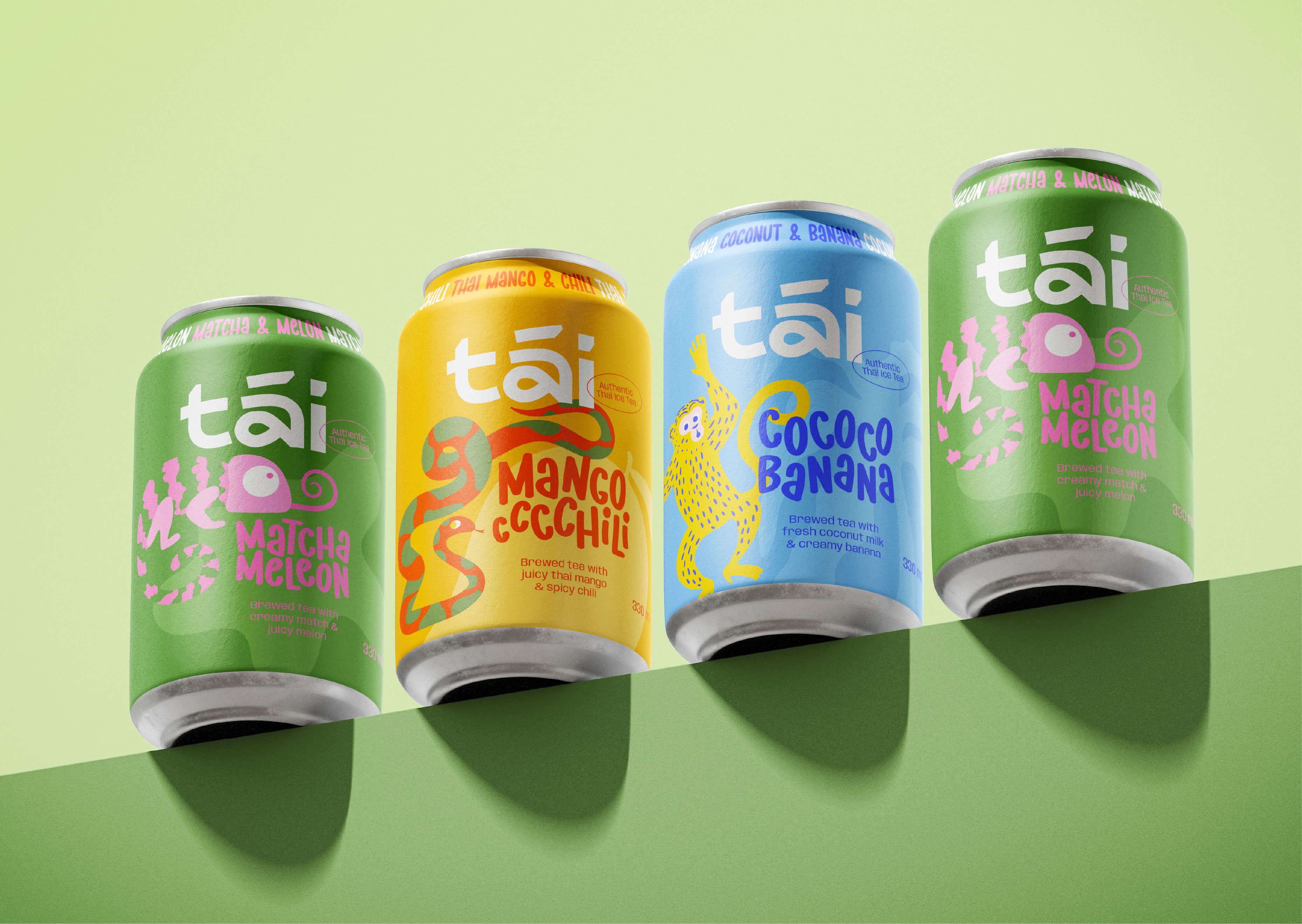
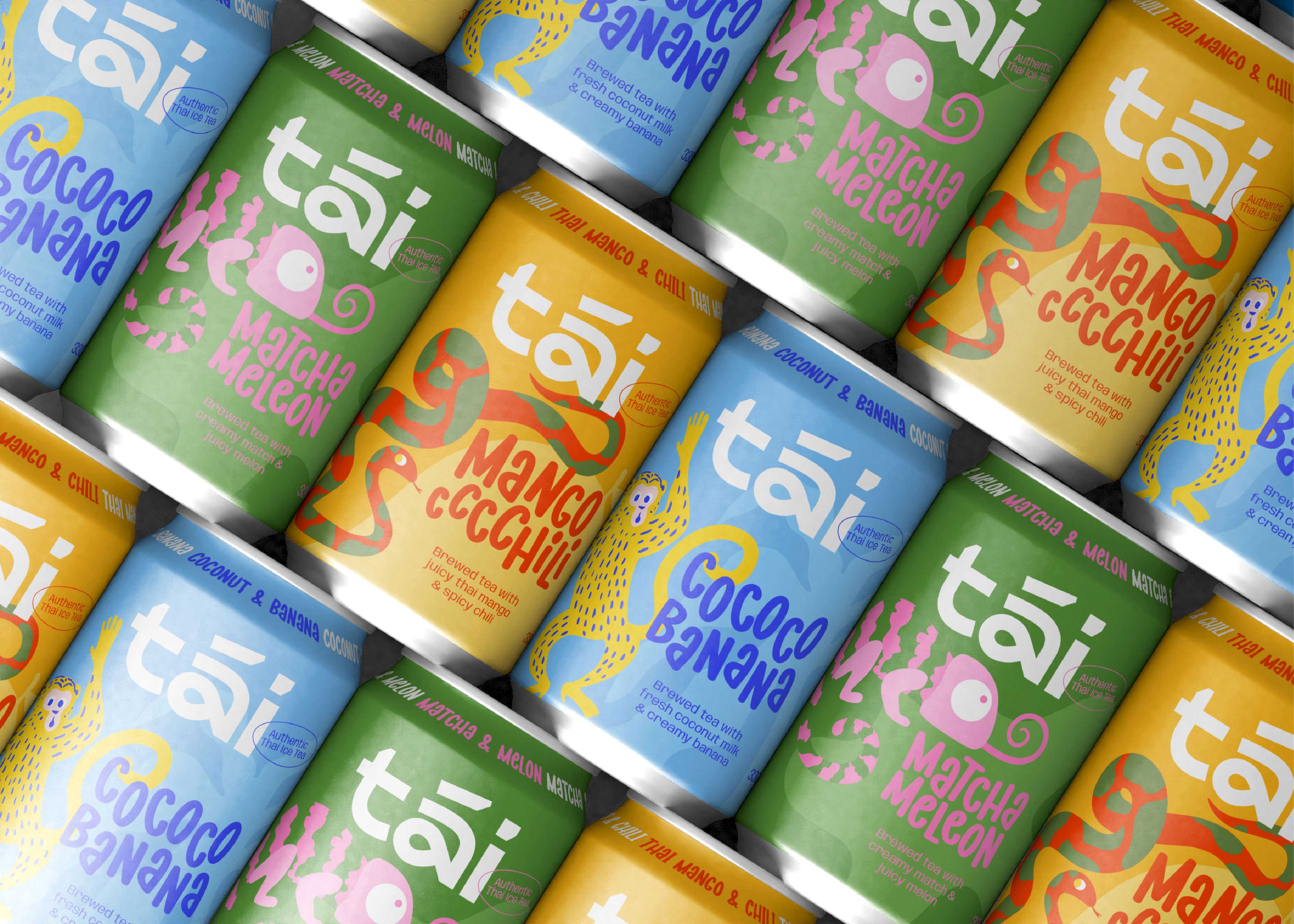
The color palette was strategically developed to distinguish the three flavors while maintaining a cohesive brand identity:
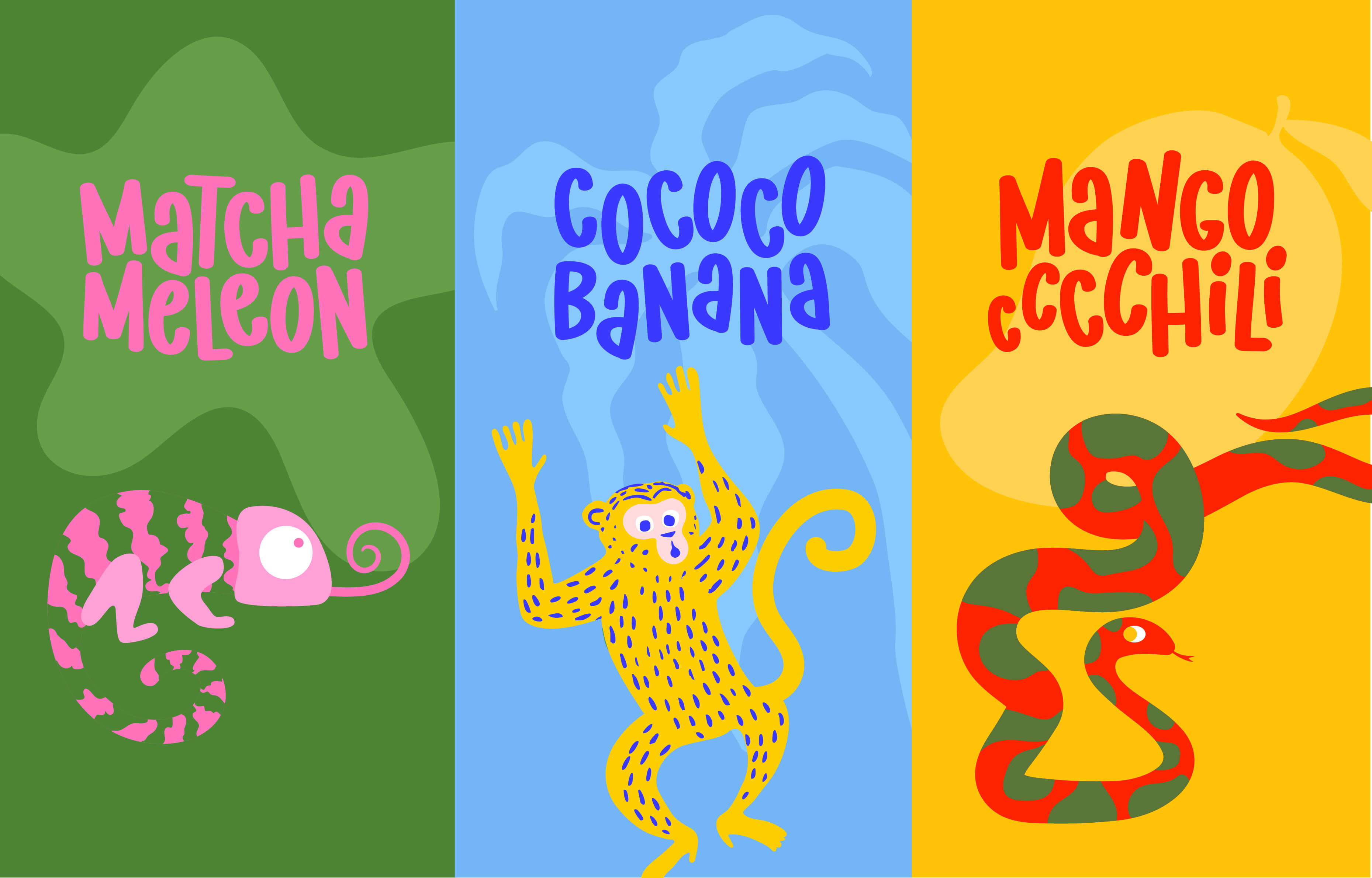
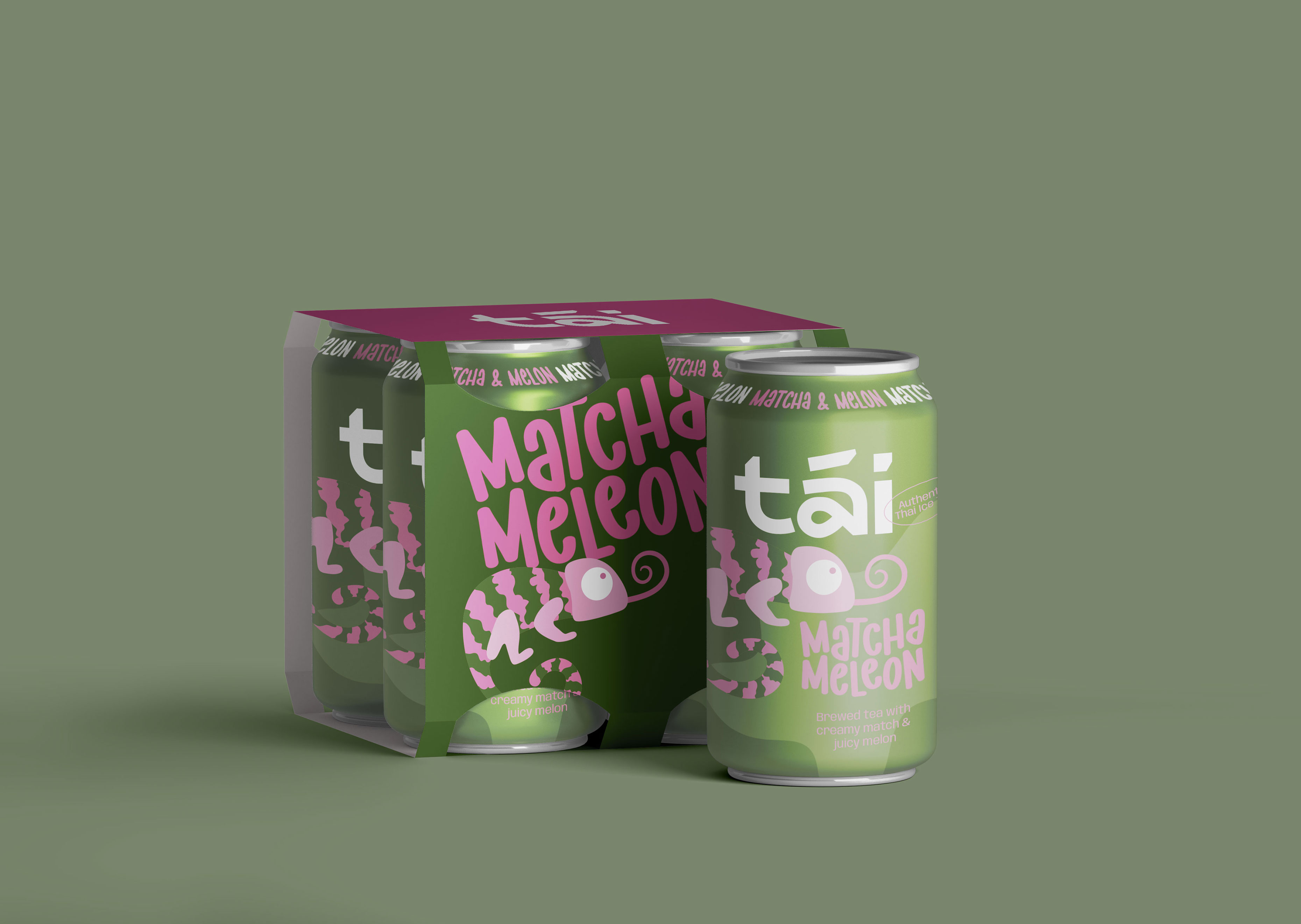
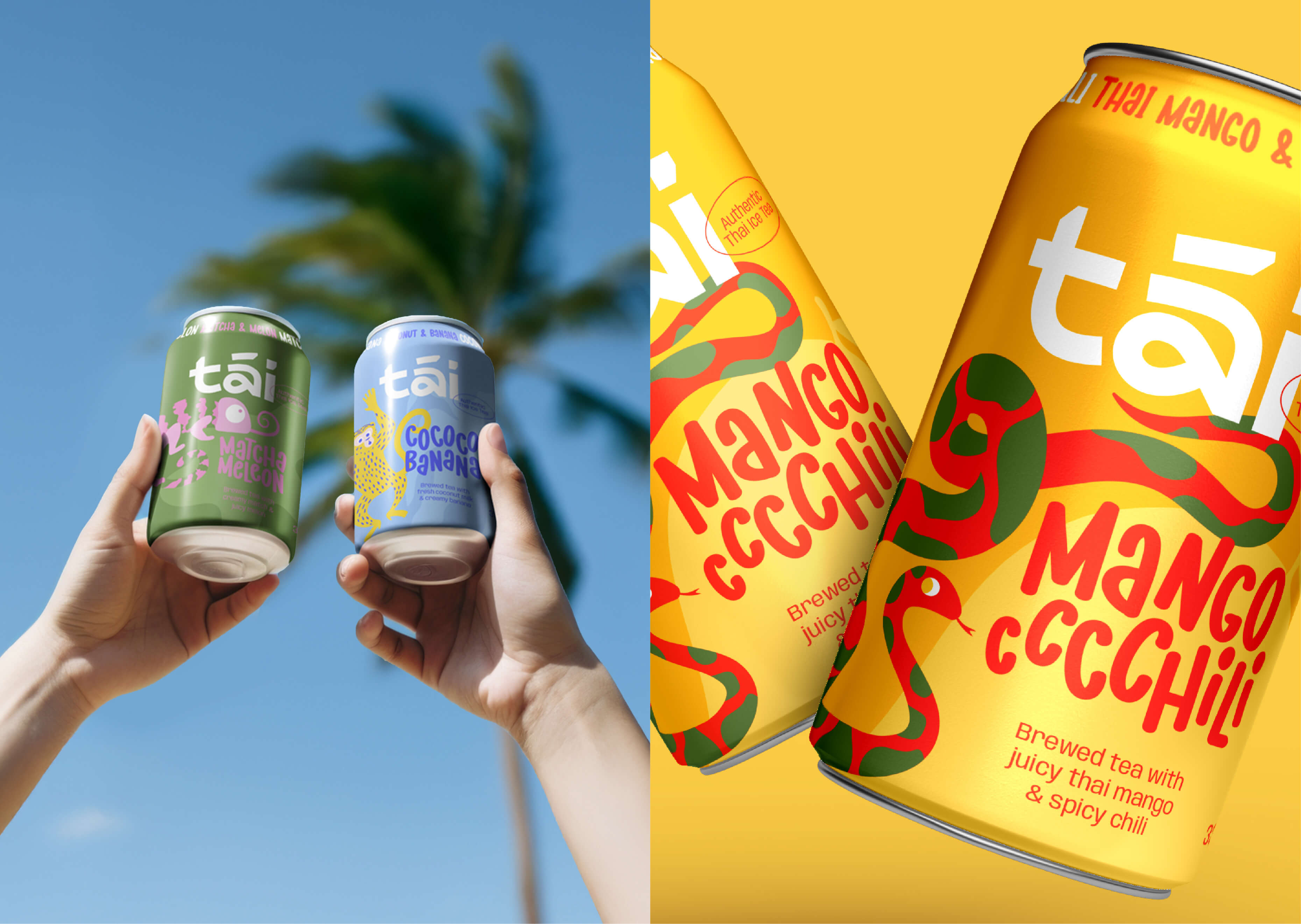
Matcha Meleon – A vibrant green and bold pink combination, reflecting the fusion of earthy matcha with juicy, sweet melon.
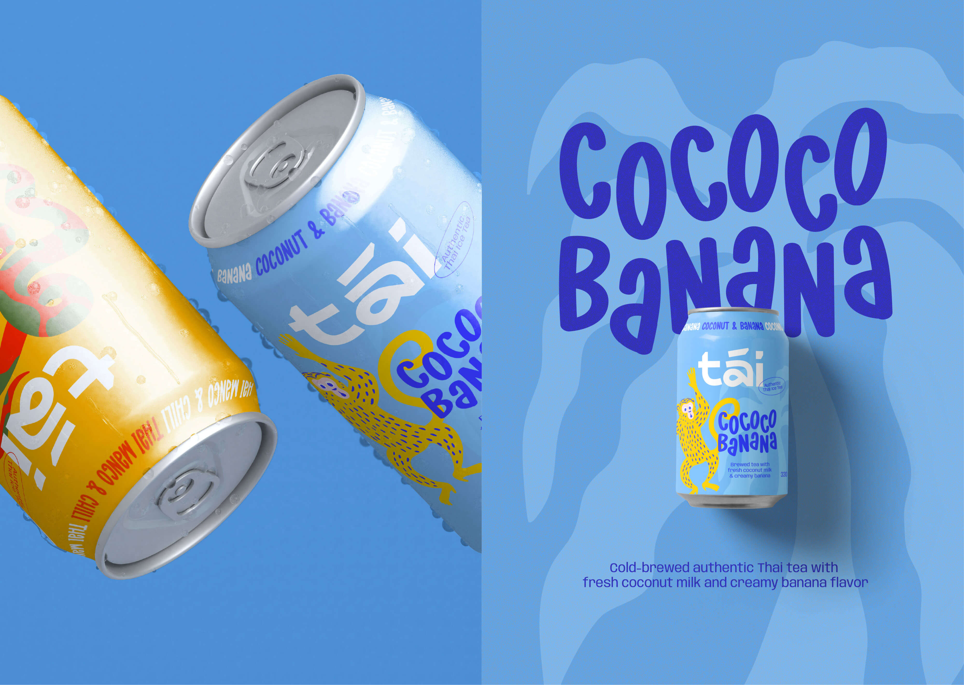
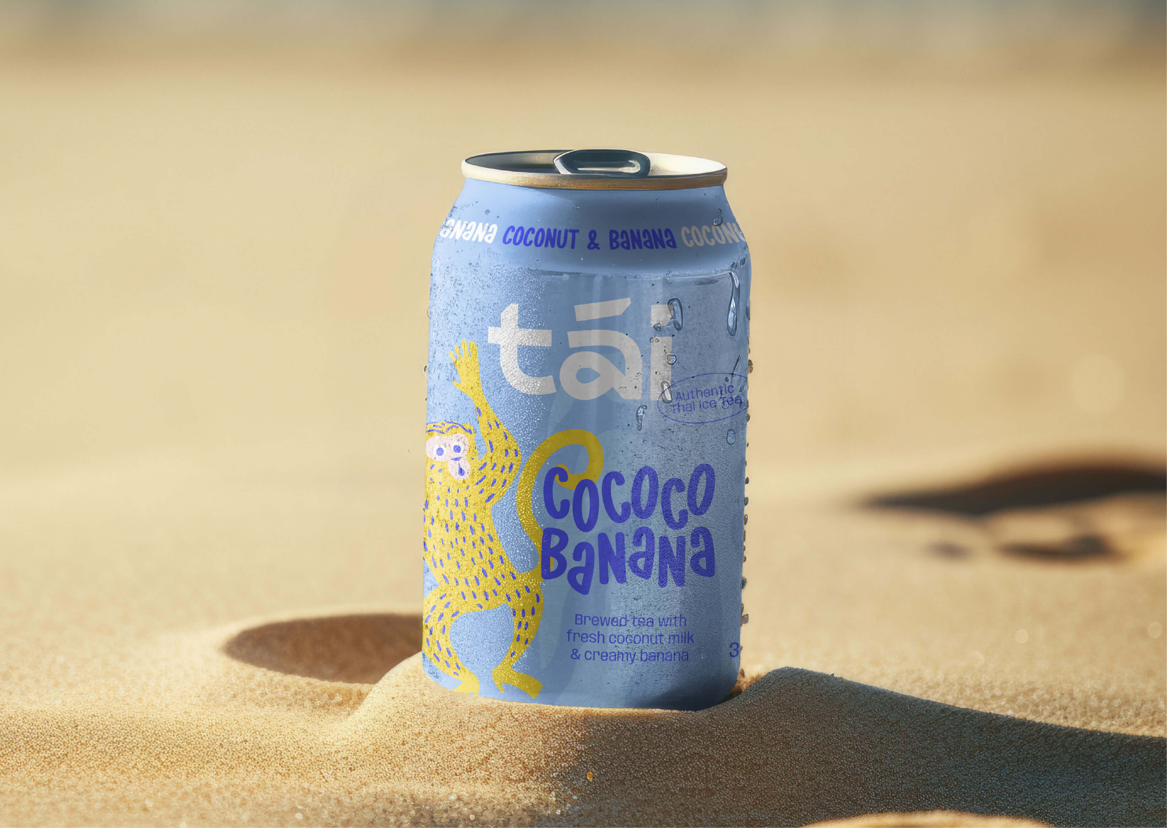
Cococo Banana – A vibrant electric blue paired with a striking neon yellow, embodying the bold tropical sweetness of coconut and banana while creating a strong visual contrast.
Mango Cccchili – A rich orange-red with fiery accents, perfectly capturing the sweet and spicy balance of mango and chili.
To further strengthen each flavor’s identity, I created unique character illustrations that bring the taste of each drink to life in an intuitive way. A key aspect of the illustration concept was ensuring that each animal is native to Thailand, reinforcing the drink’s authenticity and cultural connection. Also the illustrations are not just decorative elements but an essential part of the brand’s storytelling. They interact directly with the product names, reinforcing the flavor experience and creating a deeper emotional connection with the consumer.
The typography plays a crucial role in enhancing the brand’s playful and dynamic identity. For tāi, I deliberately chose rounded, playful fonts that reflect the drink’s approachable and fun personality. Instead of a rigid structure, the typography is arranged in a lively, slightly irregular composition, making each label feel energetic and unique. This organic and flowing text arrangement mirrors the movement of the illustrated animals, reinforcing the vibrancy of the brand.
tāi is a packaging design that goes far beyond simple product presentation. By combining vibrant colors, playful illustrations, and strong storytelling, it successfully reinterprets the diverse flavors of Thai Iced Tea in a completely new way.
The design blends bold, colorful branding with expressive illustrations and typographic accents, making it highly engaging for a young, trend-conscious audience. The overall composition ensures high shelf visibility, while the unique characters enhance brand recognition and build a strong visual personality.
This concept is all about experience, curiosity, and visual intensity—and every design element reflects that.
CREDIT
- Agency/Creative: Dominika Kupietz
- Article Title: “tāi Icetea” Brand and Packaging Design by Dominika Kupietz
- Organisation/Entity: Freelance
- Project Type: Packaging
- Project Status: Non Published
- Agency/Creative Country: Germany
- Agency/Creative City: Berlin - Kreuzberg
- Market Region: Europe
- Project Deliverables: Illustration, Logo Design, Packaging Design
- Format: Can
- Industry: Food/Beverage
- Keywords: Icetea, Thai Tea, Can, Branding, Packaging Design, Cold drink, Illustration, Berlin
-
Credits:
Brand Designer: Dominika Burek


