


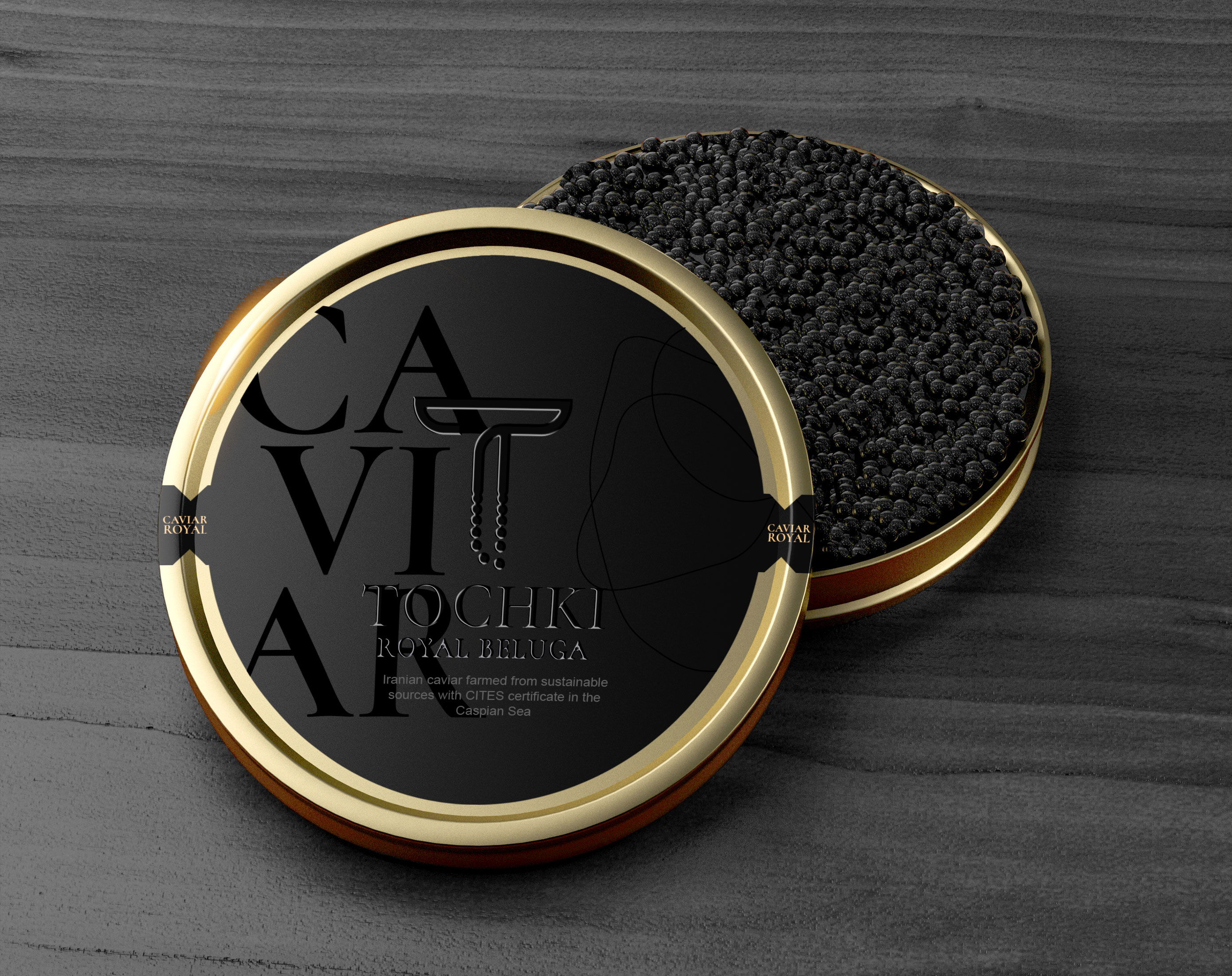
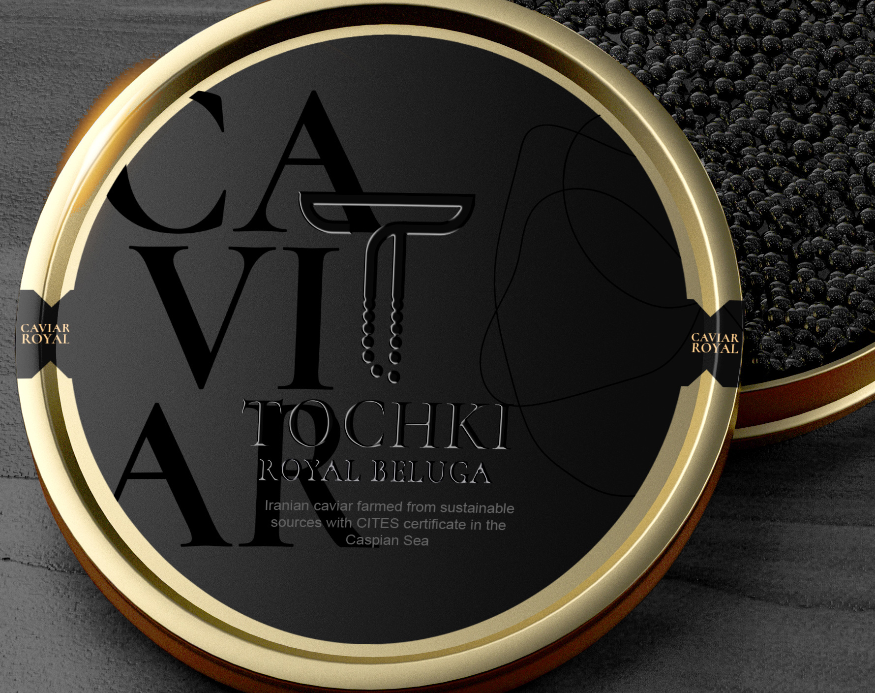
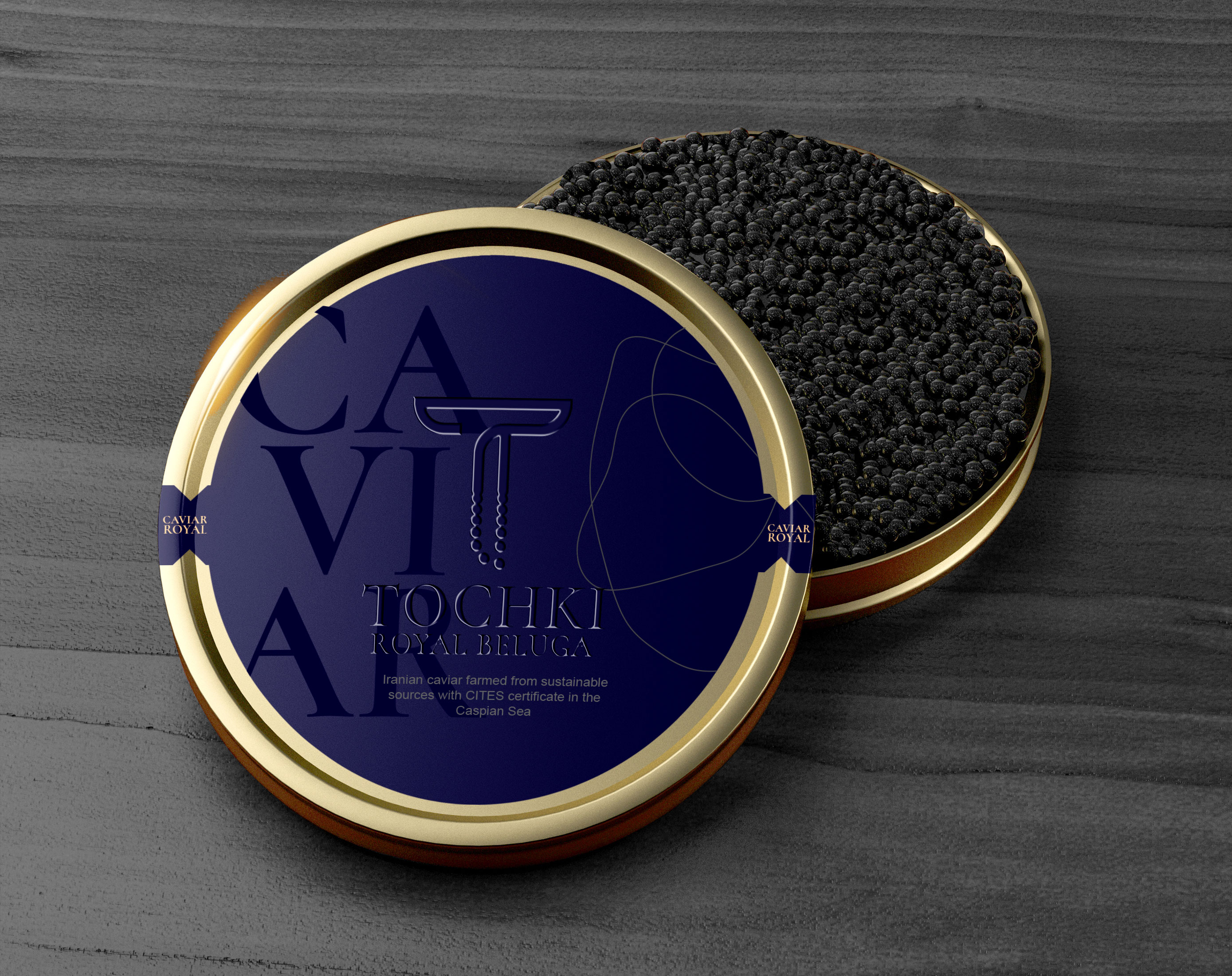
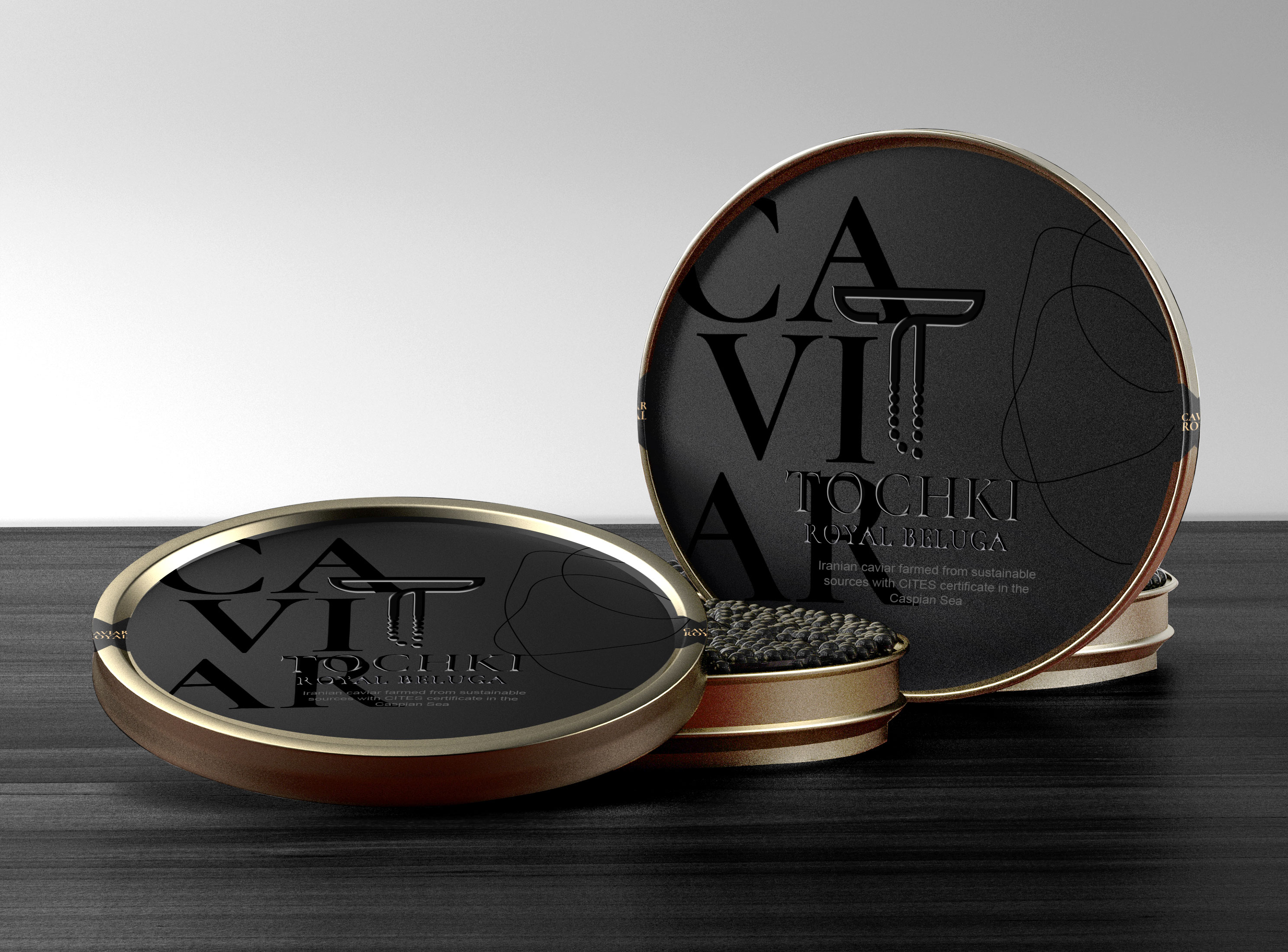
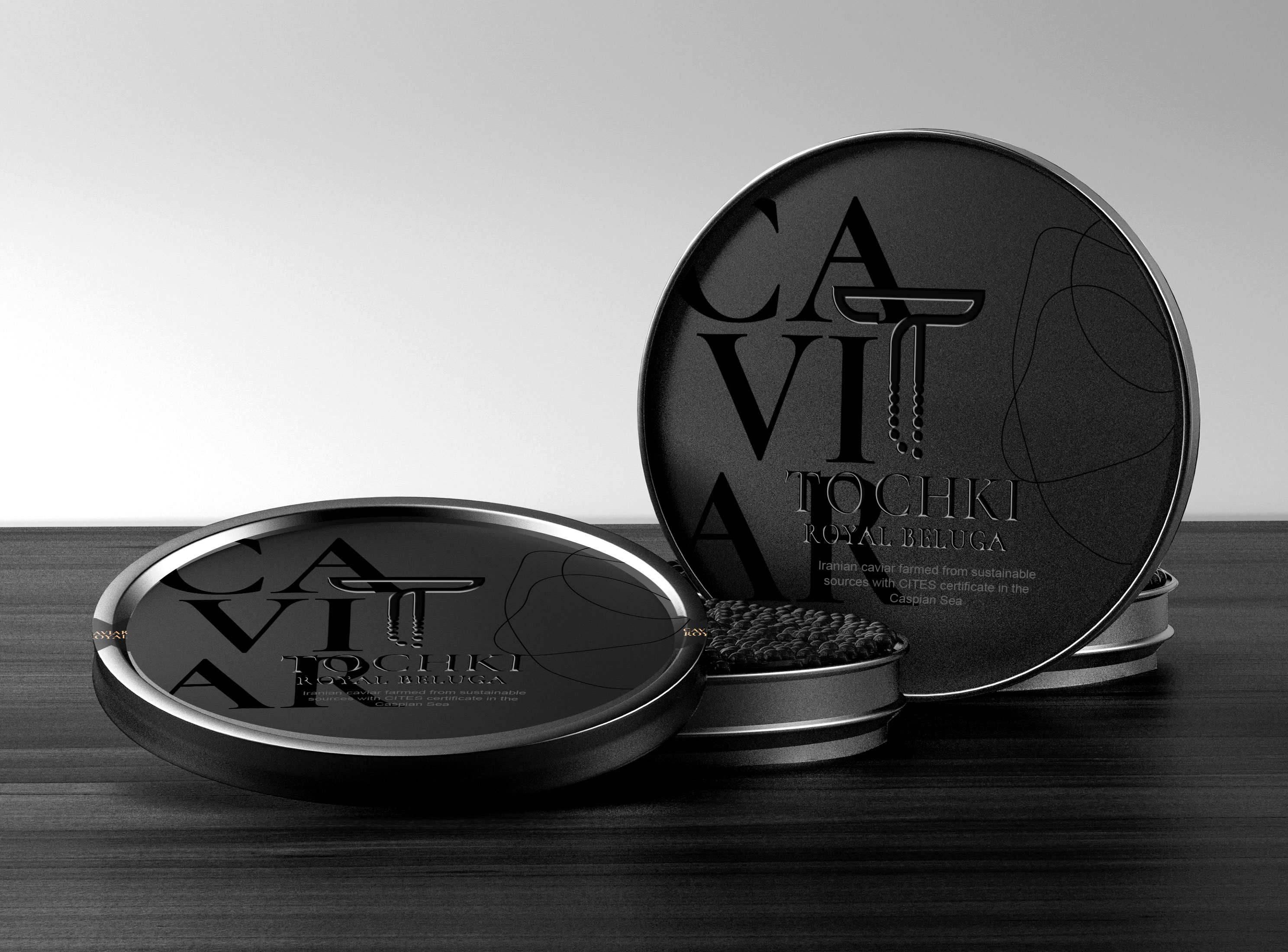
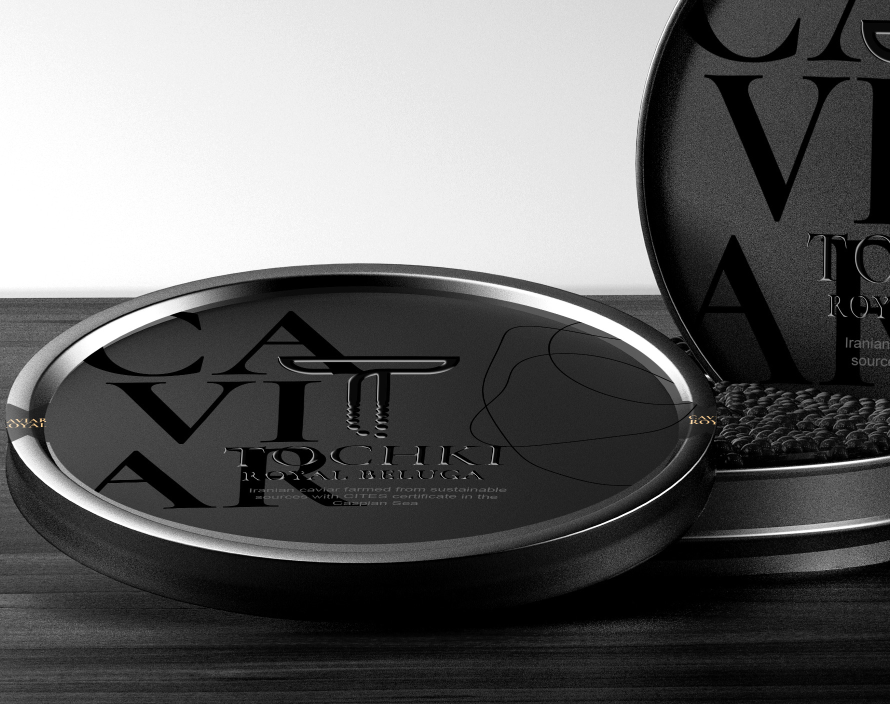
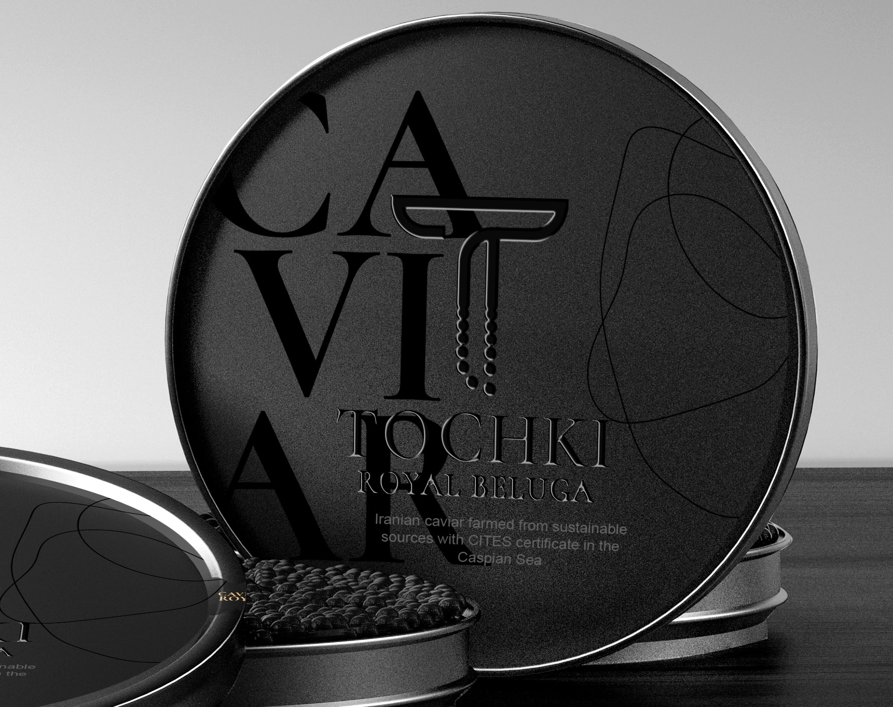
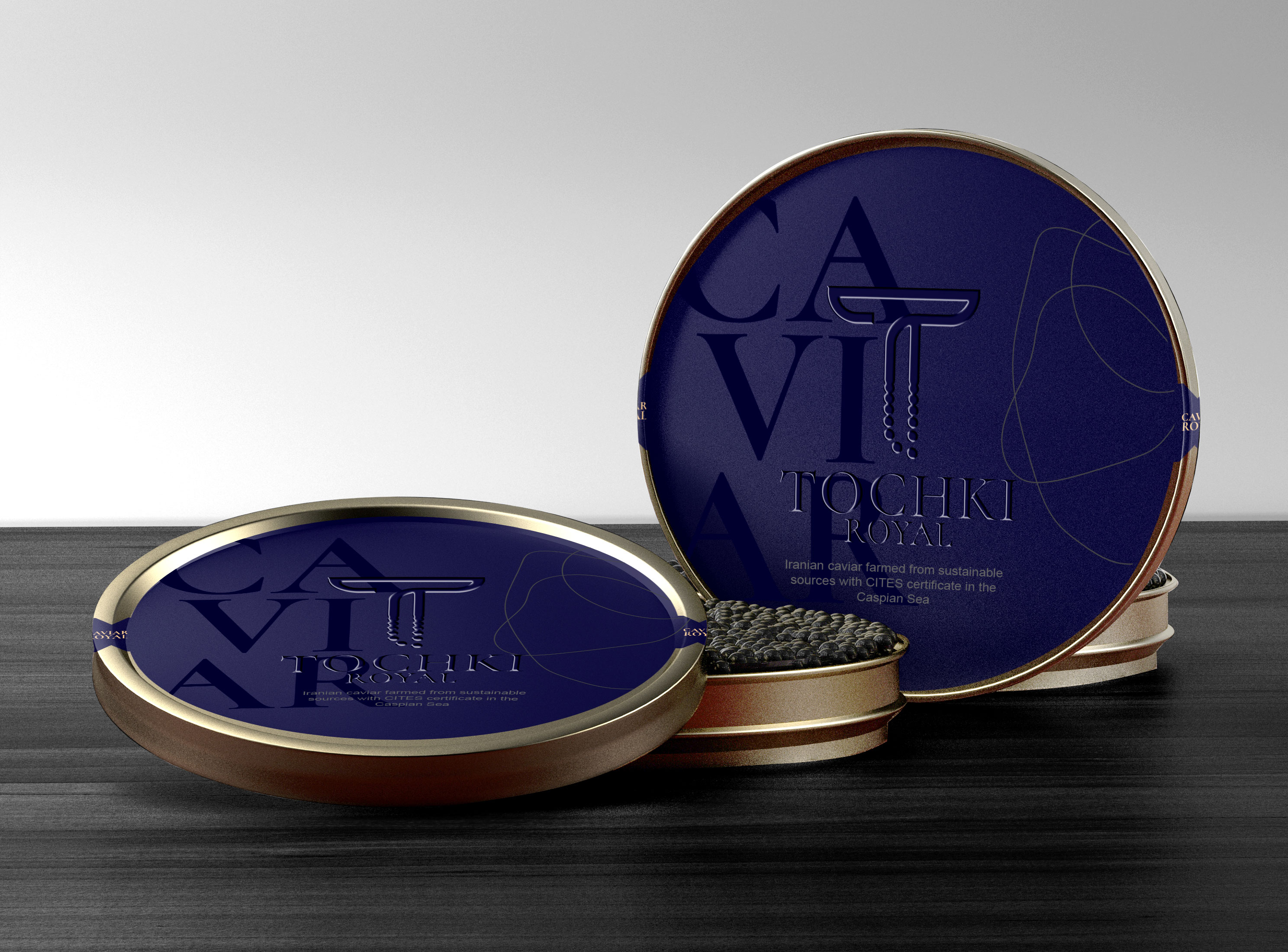
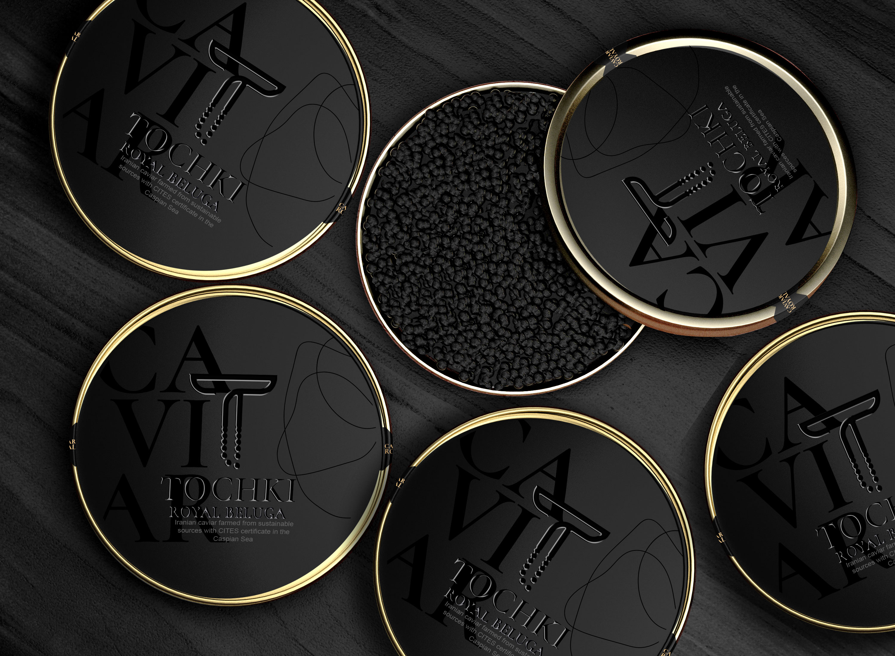
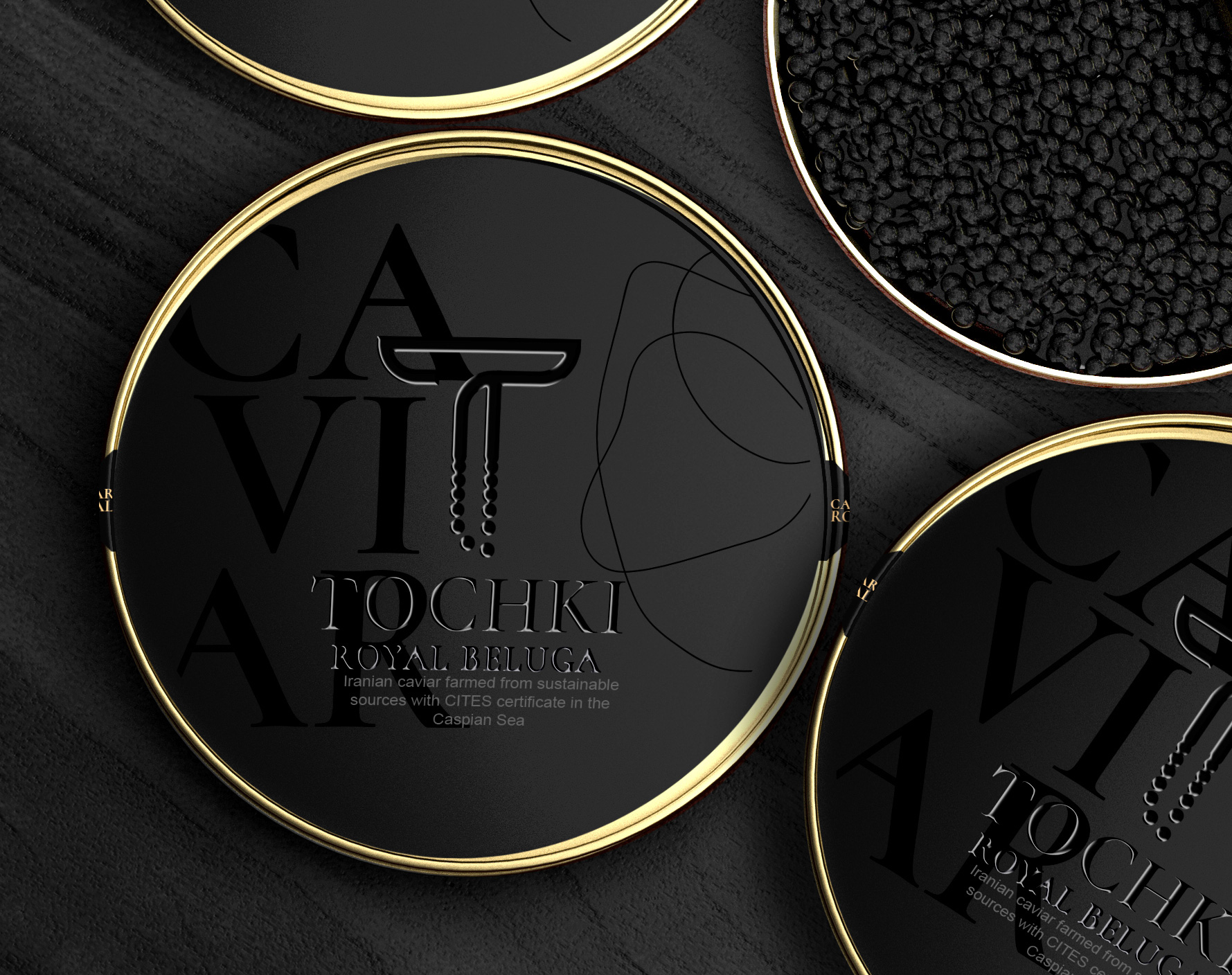
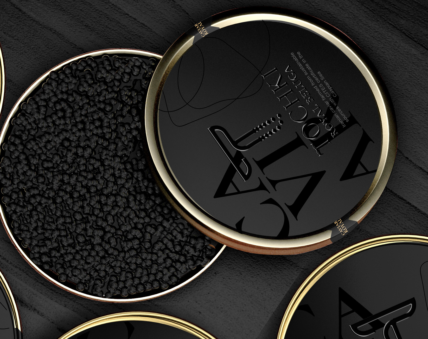
The Brief: Tochki means dot, so we chose the name based on the caviar product which has a circular shape and a dot, then we tried to design a project whose caviar products are by creating a story. Even in the design of the logo, we used the initial letter of Tochki and the caviar form, both of which are completely related to each other.
Design: Examining the characteristics of caviar, we found that this product, like valuable pearl grains, lies in the inside of a fish, so in the design of the name of caviar in a large but hidden pearl, but shiny in the design of the label and also to distinguish and bold From other brands, we highlighted the relevant logo to have its own personality, and also to reduce costs, we printed it on the label, but by presenting a special form and design, we tried to cause at first glance Attract visual attention and customer purchase, use a special design to create more interaction with the product.
CREDIT
- Agency/Creative: Taha Fakouri
- Article Title: Taha Fakouri Creates New Caviar Label Design – Tochki
- Organisation/Entity: Freelance, Published Commercial Design
- Project Type: Packaging
- Agency/Creative Country: Canada
- Market Region: Global
- Project Deliverables: Brand Identity, Brand Naming, Brand Refinement, Brand Strategy, Branding, Packaging Design, Product Naming, Retail Brand Design
- Format: Can, Tin
- Substrate: Pulp Board, Pulp Paper


