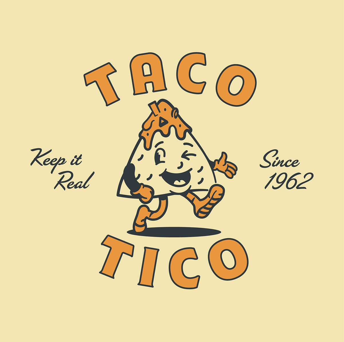
Your friendly neighborhood taco joint is back. Taco Tico has been doling out grab-and-go Mexican staples since the 60s. Despite a few management changes, Taco Tico has maintained its reputation as one of North Lexington’s essential fast-food spots, but in recent years, its branding was left at somewhat of a standstill.
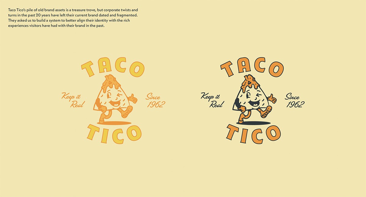
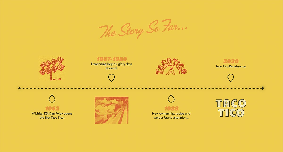
Taco Tico’s pile of old brand assets is a treasure trove, but corporate twists and turns in the past 20 years have left their current brand dated and fragmented. They asked us to build a system to better align their identity with the past rich experiences visitors have had with their brand. So we needed to make a system that was easier to use consistently. It needed to have the potential to unite multiple stores in various states of branding and consistency without breaking the bank at each of those previously-independent locations.
Our team took a fresh, clean take on midcentury American eatery logos, mascots, and typography to create an updated look that emits a nostalgic vibe but also adheres to Taco Tico’s standards of quality: dedication to consistent ingredients, fun atmosphere, and attention to detail. We wanted to create a look for them that brings their patrons back to the restaurant’s glory days and feels as fresh as their food.
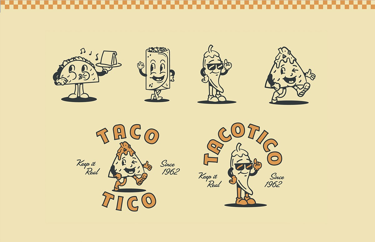
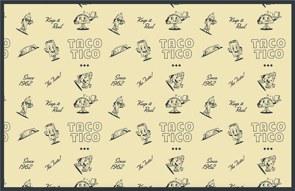
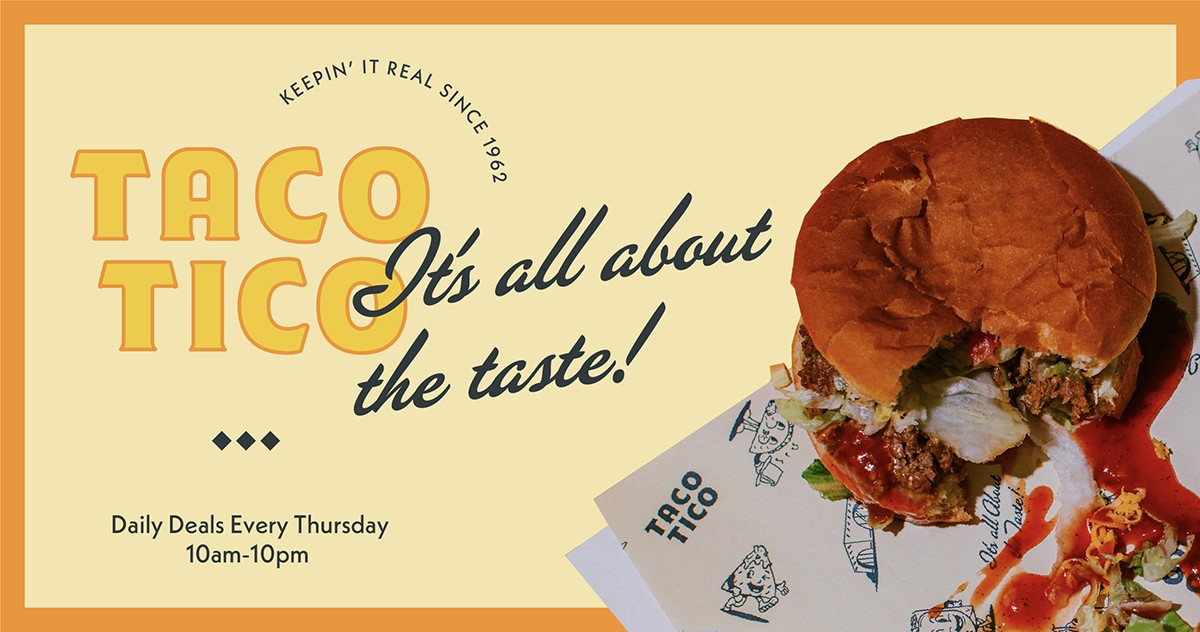
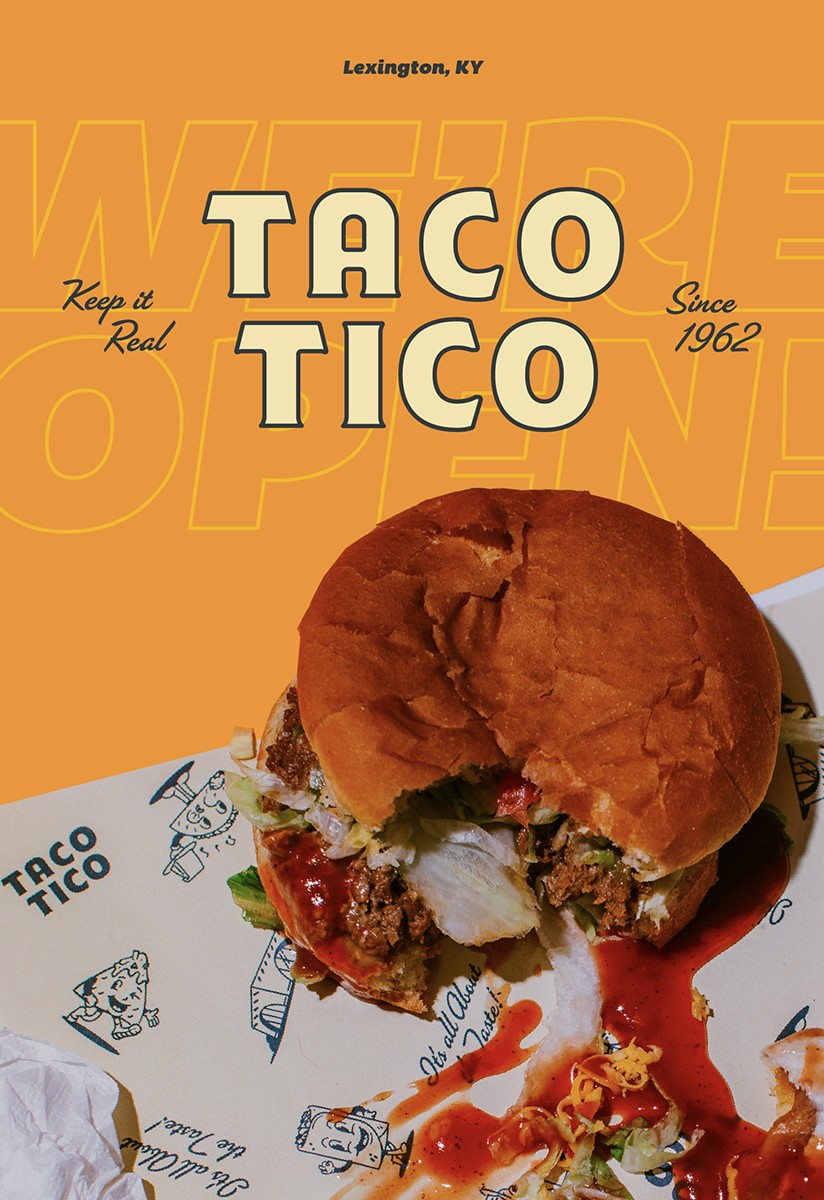
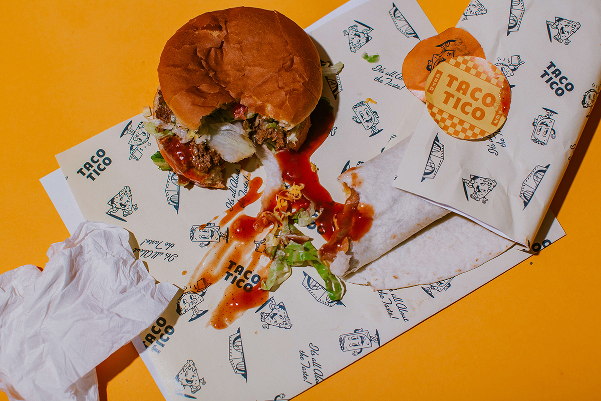
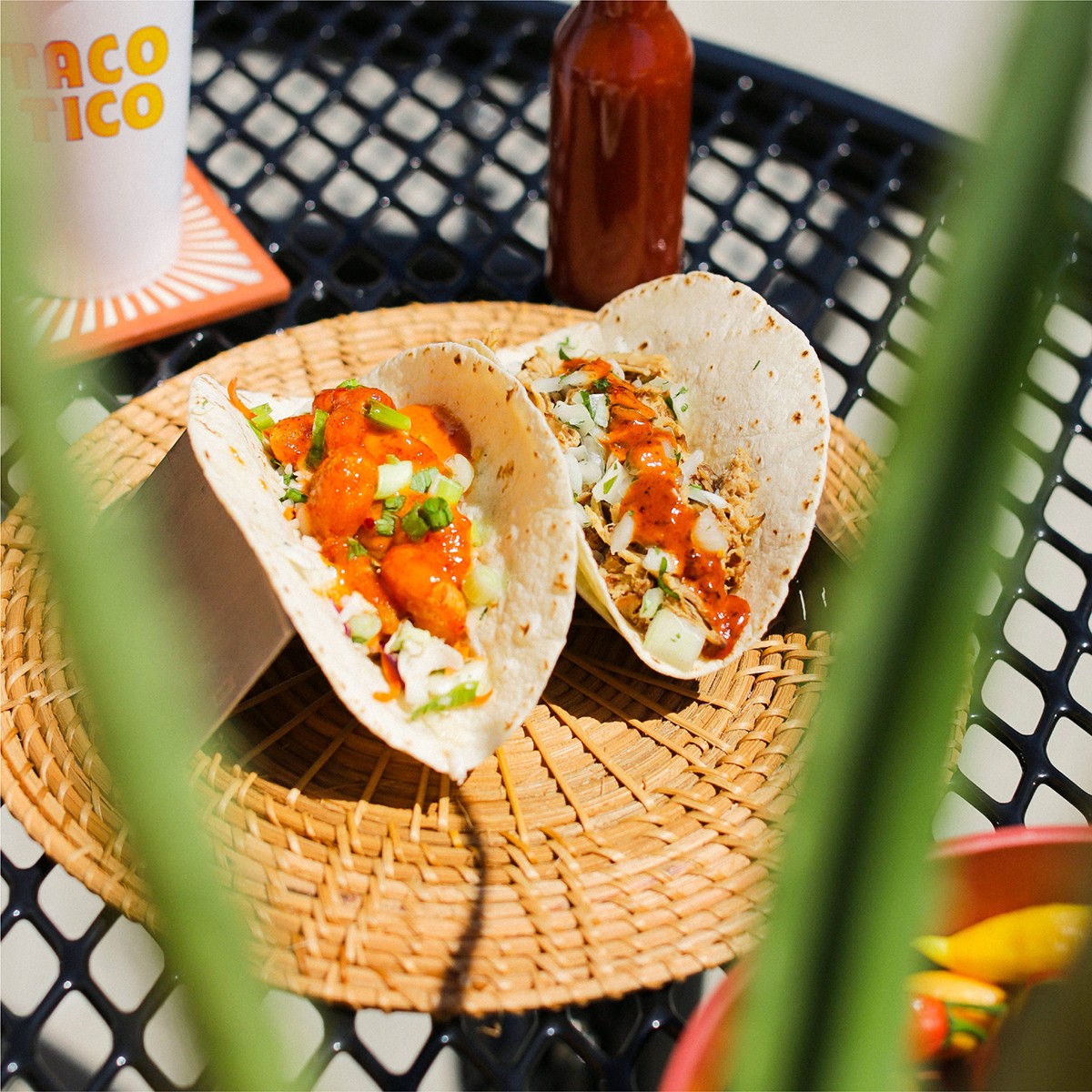
We created a system that felt like “coming home” for the brand, elevating Taco Tico’s visual identity’s classic, exciting, and generally-cool parts. Entirely new, hand-drawn illustrations celebrate select can’t-not-have-a-good-time menu items, and the system frames easily-captured photography (a must with a project that would need to gain momentum mid-lockdown). This system allows an in-house team to make a large volume of content with limited time and still present the brand as next-level but not overcomplicated.
The bright, playful mascots we created served as our foundation that supported the overall approach to encapsulating the fun, nostalgic atmosphere and underpinned the more oversized items like wordmarks and various collateral like stickers, patterned paper, and menus.
The mascots and other iconography venture back to an era that incorporated more play in branding – something you might expect to find at an old burger stand or diner.
CREDIT
- Agency/Creative: Mediocre Creative
- Article Title: Taco Tico Brand Redesign by Mediocre Creative
- Organisation/Entity: Agency
- Project Type: Identity
- Project Status: Published
- Agency/Creative Country: United States of America
- Agency/Creative City: Lexington, KY
- Industry: Food/Beverage
- Keywords: WBDS Agency Design Awards 2022/23
-
Credits:
Creative: Ethan Wooldridge
Principal: Shawn Saylor


