
Stratedgy – T – Organic Blends of Fine Tea
On the eve of our 10th year in the design industry, we, at Stratedgy created a self promotion project. We decided to break things down, personify, and provide insights into the what, why and how of who we are.
The Challenge:
We wanted to create something that was unique, memorable, and something very closely related to design. Moreover, as a giveaway, we had a find a product that would add value to the recipient.
The Insight:
We are an Indian company, talking predominantly to an Indian audience. We decided to go back to our roots. Delving into Indian mythology, one of the concepts that stood out the most was that of cyclical time or the Wheel of Time– called Kalachakra in Sanskrit. It defines time as cyclical – consisting of repeating ages. Our journey led us to draw an analogy with the process of design, leading to the Idea of ‘The Dual Nature of Design’.
The Idea:
Mythology is one of the richest elements of Indian culture, making the art of storytelling our way of life. The fascinating aspect of mythological stories is that they are usually meant to convey subtle facts and rules that guide daily life. Learnings from mythology can be adopted to every aspect of life.
We have built characters rooted in mythology that define the multiple the roles of designers.
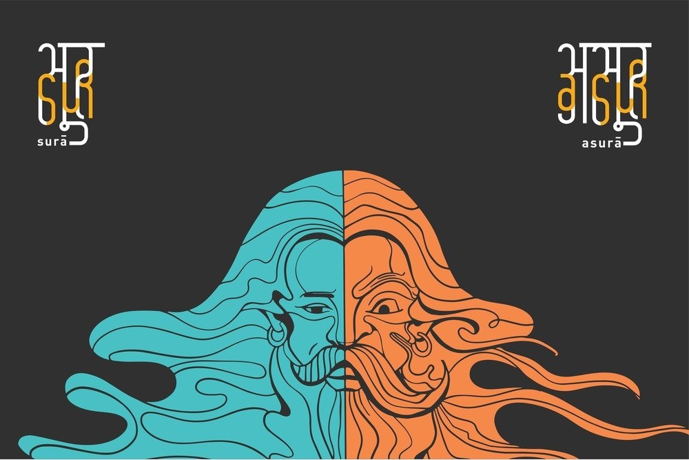
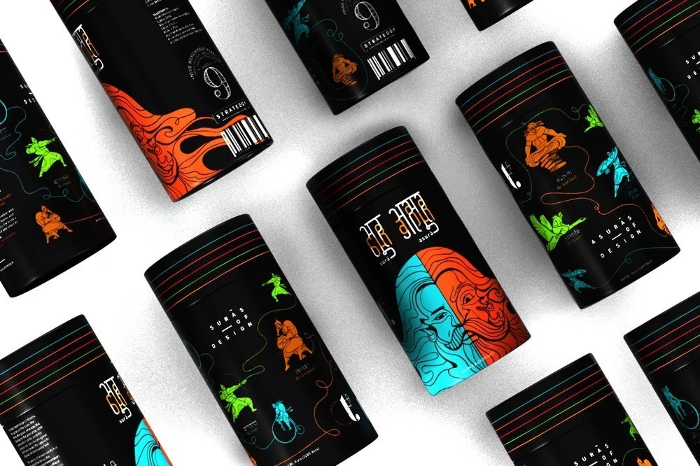
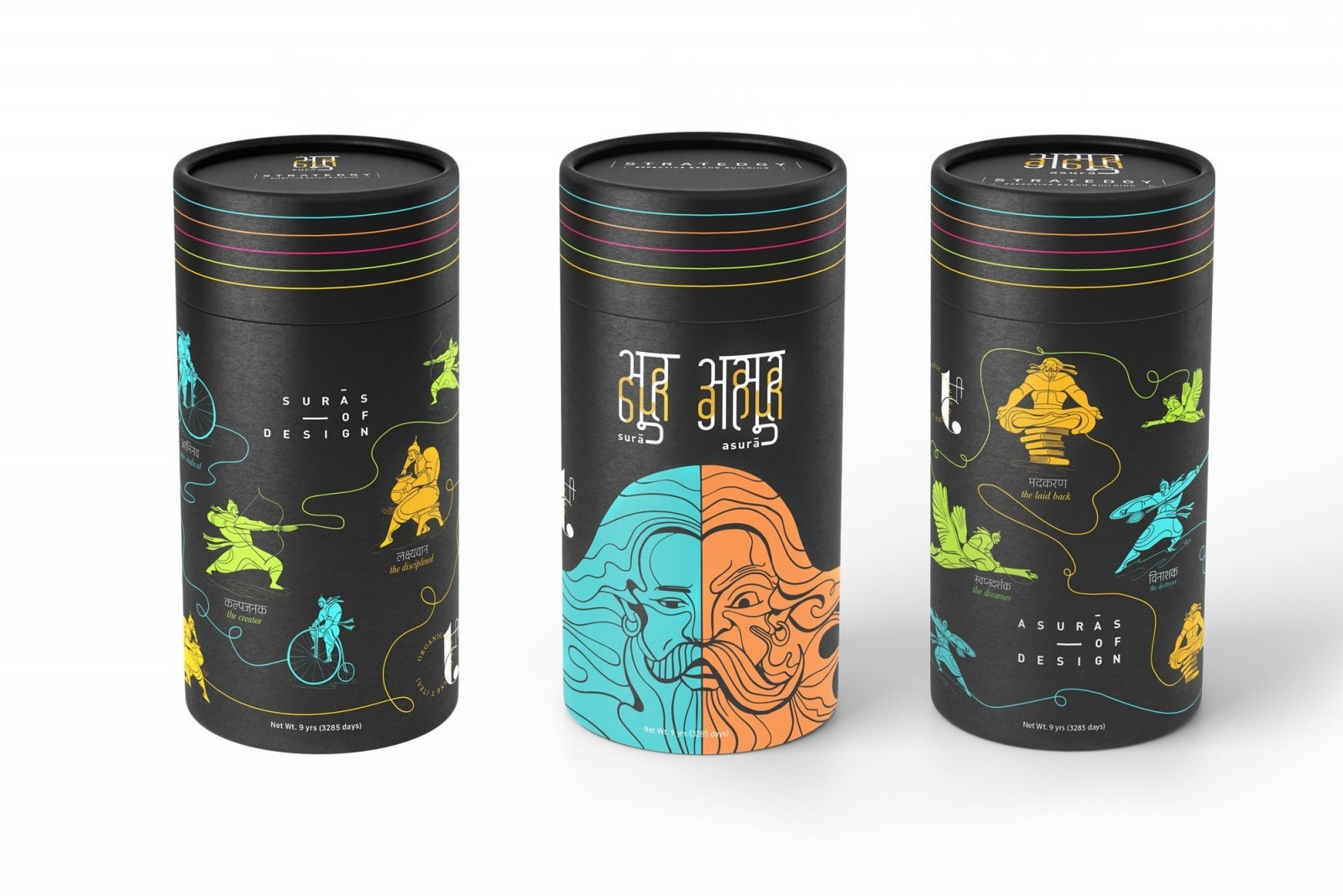
In Indian mythology, the Surās are the pure, the divine, the good. The Asurās are the grey areas… They have powers that can be used for good or evil. While Surā means good, Asurā means the opposite of good, but not necessarily bad.
Drawing this parallel, the process of design is a cyclical one. There are two sides to our process, the good: the creation, the focus, the experimentation. However, without opposing factors, the process becomes complacent. This is the dual nature of design. One needs to destroy to create, one needs to step back to focus, and one needs to dream to experiment.
Both sides ebb and flow, one giving way to the other. They exist in opposition, but also in cohesion. This is our take on personifying the characteristics that make us, break us, and remake us.
THE EXECUTION:
To support this idea, we were on the look out for a product that would have a strong cultural relevance at the same time be universally accepted.
After much pondering, we narrowed down on tea.
Tea is a prominent part of Indian culture and lifestyle, and can be made as per the the liking of the drinker. It was a perfect fit.
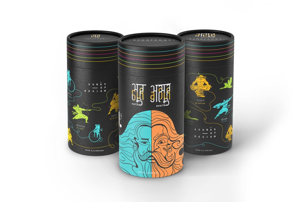
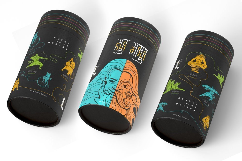
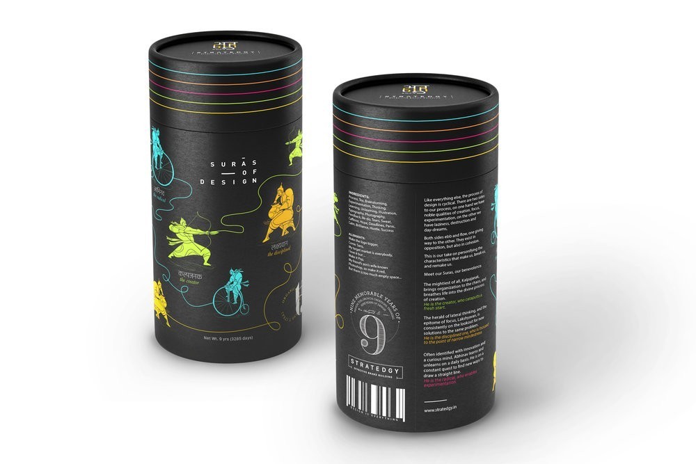
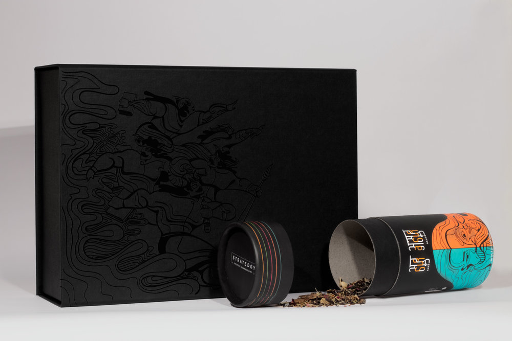
We took this idea forward by creating custom packaging for a set of fine tea blends. Three cans, one for the Surās, one for the Asurās, and the third one explaining the concept and context.
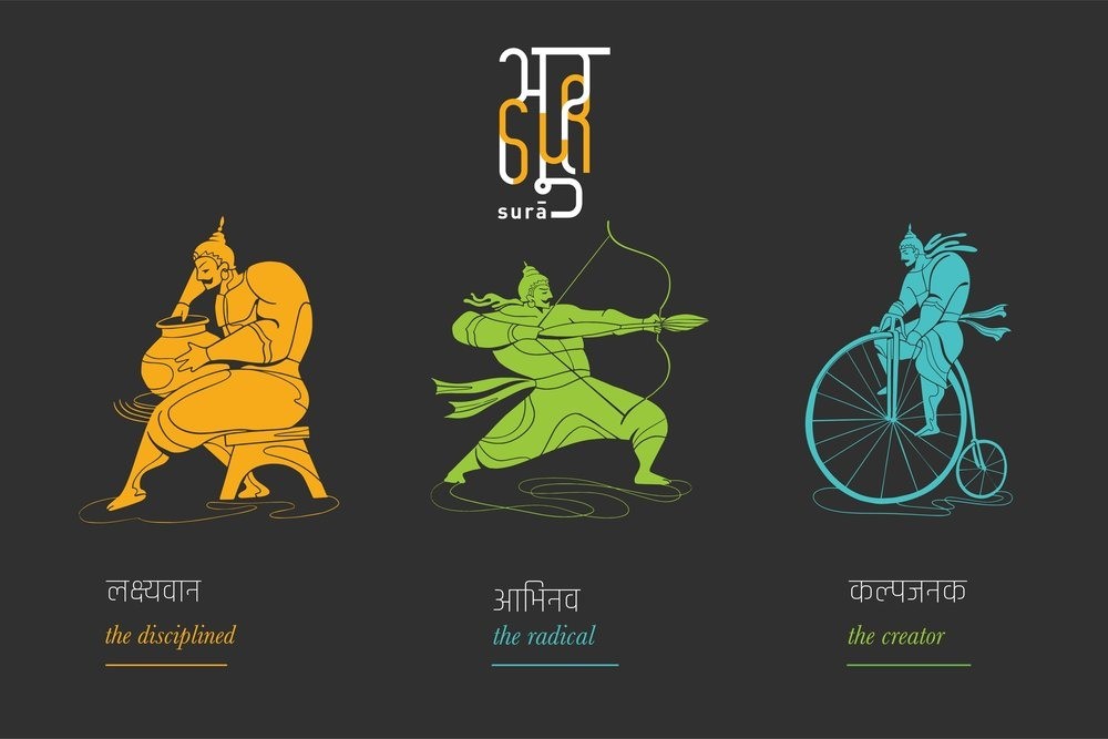
Meet our Suras, our benevolence:
The mightiest of all, Kalpajanak, brings organization to the chaos, and breathes life into the divine process of creation.
He is the creator, who catapults a fresh start.
—
The herald of lateral thinking, and the epitome of focus, Lakshyavan, is consistently on the lookout for new solutions to the same problem.
He is the disciplined one, who is focused to the point of narrow mindedness
—
Often identified with innovation and a curious mind, Abhinav learns and unlearns on a daily basis. He is on a constant quest to find new ways to draw a straight line.
He is the radical, who enables experimentation.
——
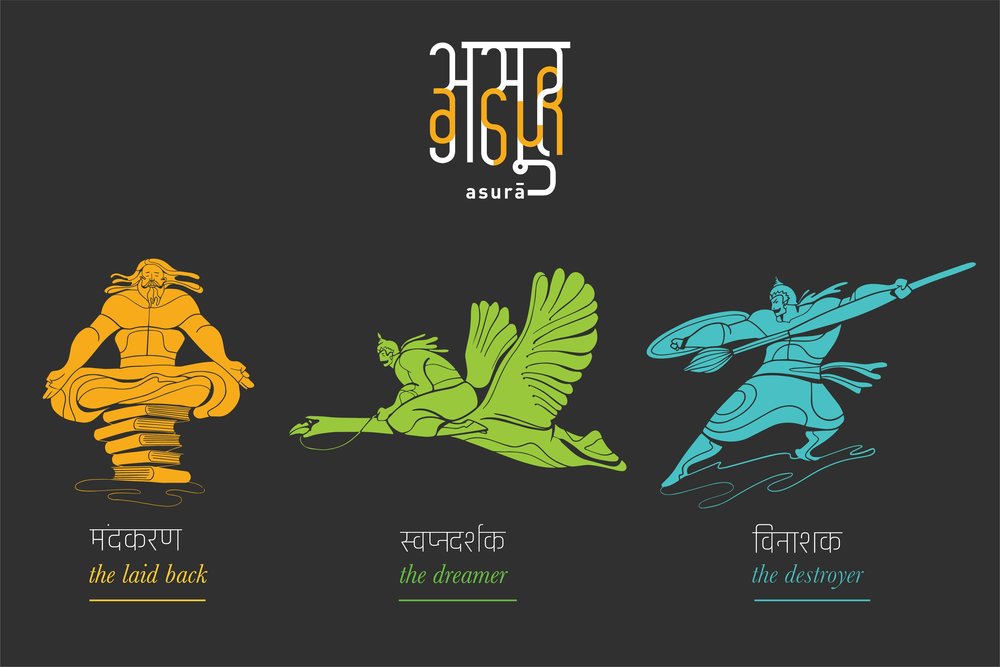
Meet our Asuras – our challengers.
Vinashak is on a constant quest to destroy the old, to make place for the new.
He is the destroyer who is the catalyst for a fresh start.
Immersed in his world, Svapnadarshak, often fathoms ideas that are unthinkable.
He is the dreamer who pushes boundaries.
Often identified with laziness, Mandkhand, passive and stationary, constantly works towards uncluttering the mind.
He is the laid back one, who wipes the slate clean.