Systemic Bio™ is a 3D Systems company based in Houston, Texas, focused on the development of vascularized organ models made out of hydrogels and human cells to be used for drug discovery and development. The ability to accurately simulate human response to an experimental drug in the laboratory, early in the development process, offers the potential to significantly reduce both the high costs and extended times required for pharmaceutical companies to bring a new drug to market. In addition, this approach could eventually reduce or even eliminate the need for animal testing as a precursor to full-scale human trials for new drug development.
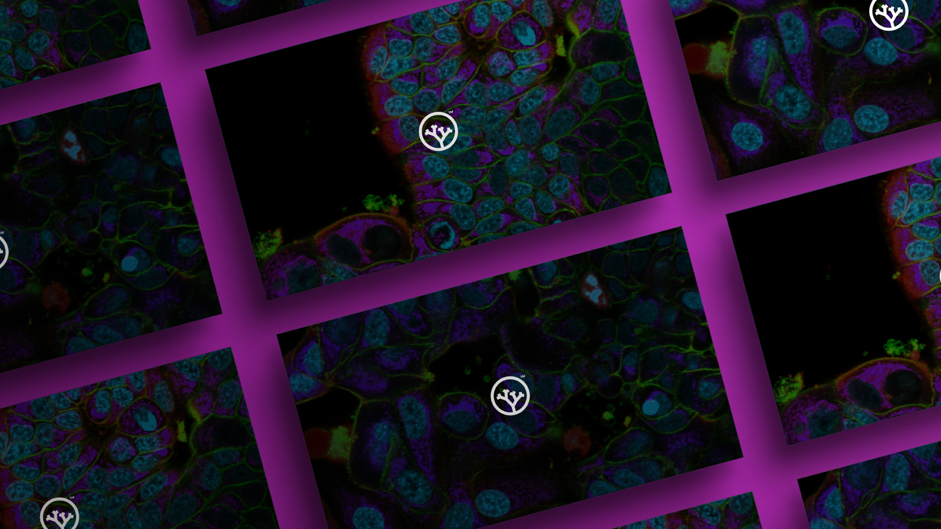
The h-VIOS (human vascularized integrated organ systems) organ-on-a-chip platform comprises plates of cellularized or acellular vascularized three-dimensional scaffolds, and accompanying accessories needed for drug testing. Unlike other currently available models which are created from synthetic materials such as silicone, h-VIOS uses hydrogels that much more closely resemble human tissues. The combination of these hydrogels with 3D Systems’ Print to Perfusion process for cellularization, enables 3D printing of high-resolution scaffolds that very closely mimic human tissues. A critical differentiator of this technology over competing historical tissue engineering approaches is the precision of the printing process with these unique hydrogel materials. These bioprinted scaffolds can be seeded with human cells from different organs, including both healthy and diseased, creating tissues to screen drug candidates for safety and efficacy.
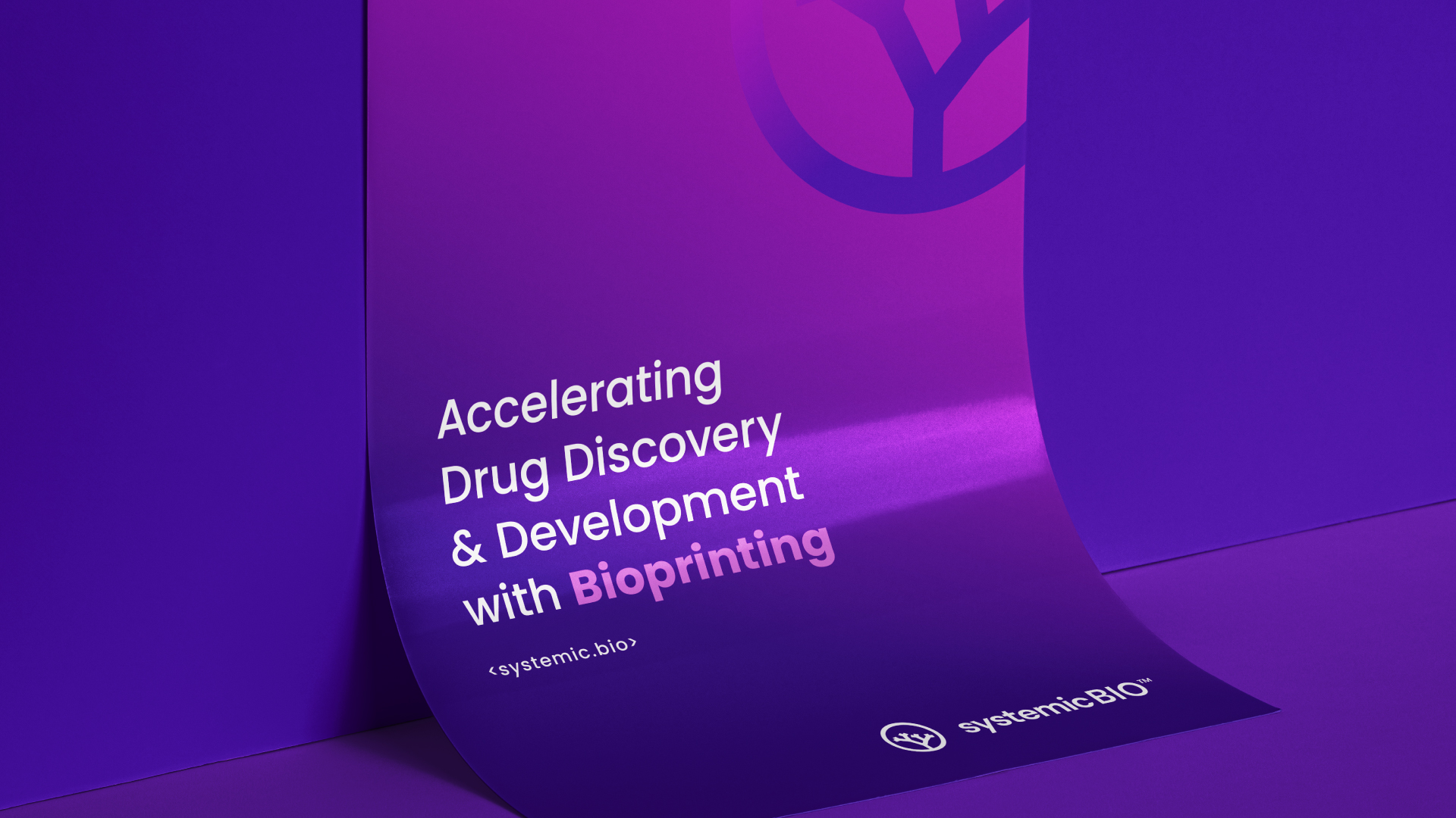
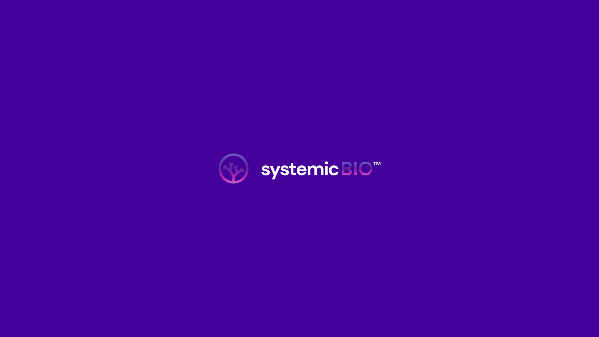
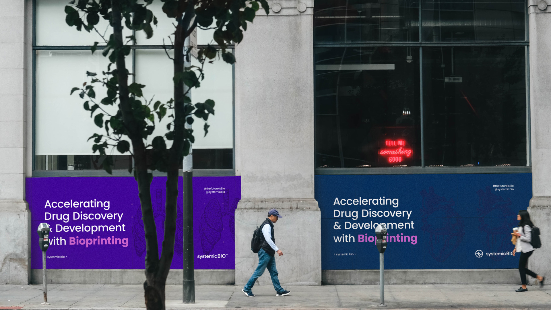
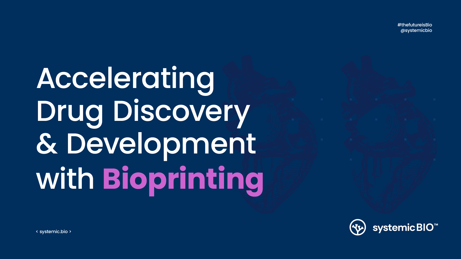
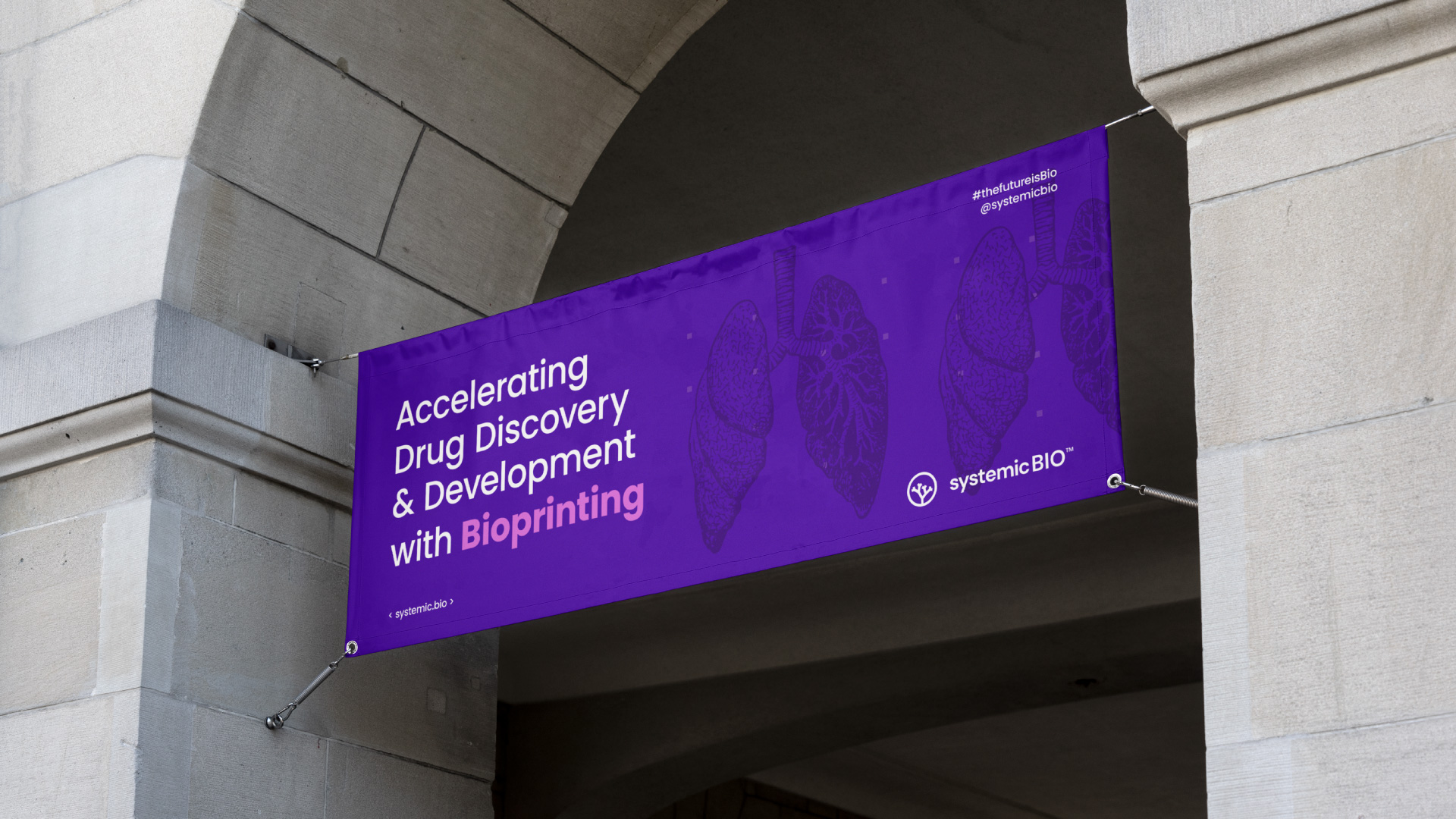
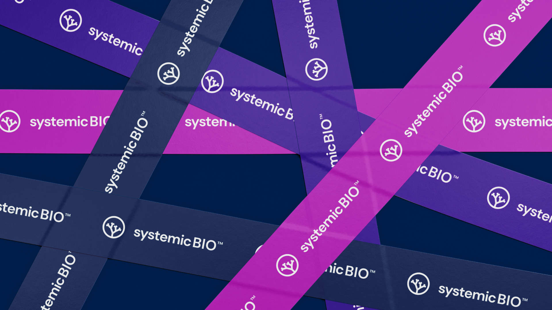
The Design Project aimed to create a complete visual identity for the brand, communicating the modern side of the company associated with an image of solidity and reliability. The symbol was inspired by the stem concept, using as reference the structure of a vascular network. A stem can be described as a central part of something, from which other parts can
develop or grow, or which forms a support. The lowercase letters bring the feeling of closeness, while the emphasis on the word BIO highlights the brand’s differential. Finally, the chosen color palette brings vibrant tones that reinforce the modern personality while helping to differentiate the visual identity from its competitors.



CREDIT
- Agency/Creative: Nicole Gröff Design
- Article Title: Systemic Bio Visual Identity and Brand Design
- Organisation/Entity: Freelance
- Project Type: Identity
- Project Status: Published
- Agency/Creative Country: Brazil
- Agency/Creative City: Novo Hamburgo
- Market Region: North America
- Project Deliverables: Brand Design, Brand Guidelines, Icon Design, Logo Design, Web Design
- Industry: Technology
- Keywords: bioengineering, organ-on-a-chip, drug discovery, drug development, biotech
-
Credits:
Graphic Designer: Nicole Gröff Design


