


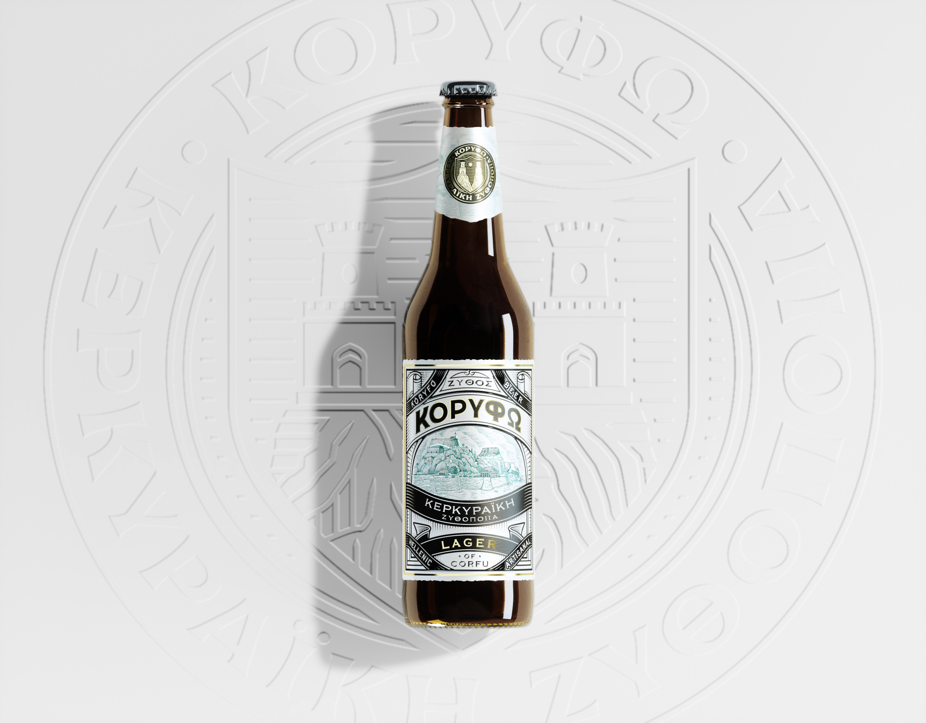
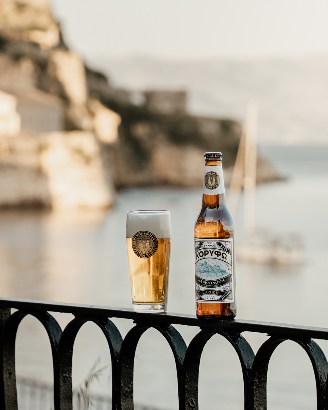
Koryfo is a premium lager brewed on the island of Corfu, taking its name from the island’s medieval title, “Κορυφώ,” a reference to the twin peaks that sailors once sighted as their first landmark on approach. This naming choice anchors the brand in the island’s geography and history, creating an immediate link between product and place. Developed as part of the Corfu Beer portfolio, Koryfo represents a more refined, design-led product within the range, created for discerning visitors who seek a memorable keepsake of their time on the island. More than just a beverage, it is intended as a tangible souvenir, something that can be taken home as a lasting reminder of Corfu.
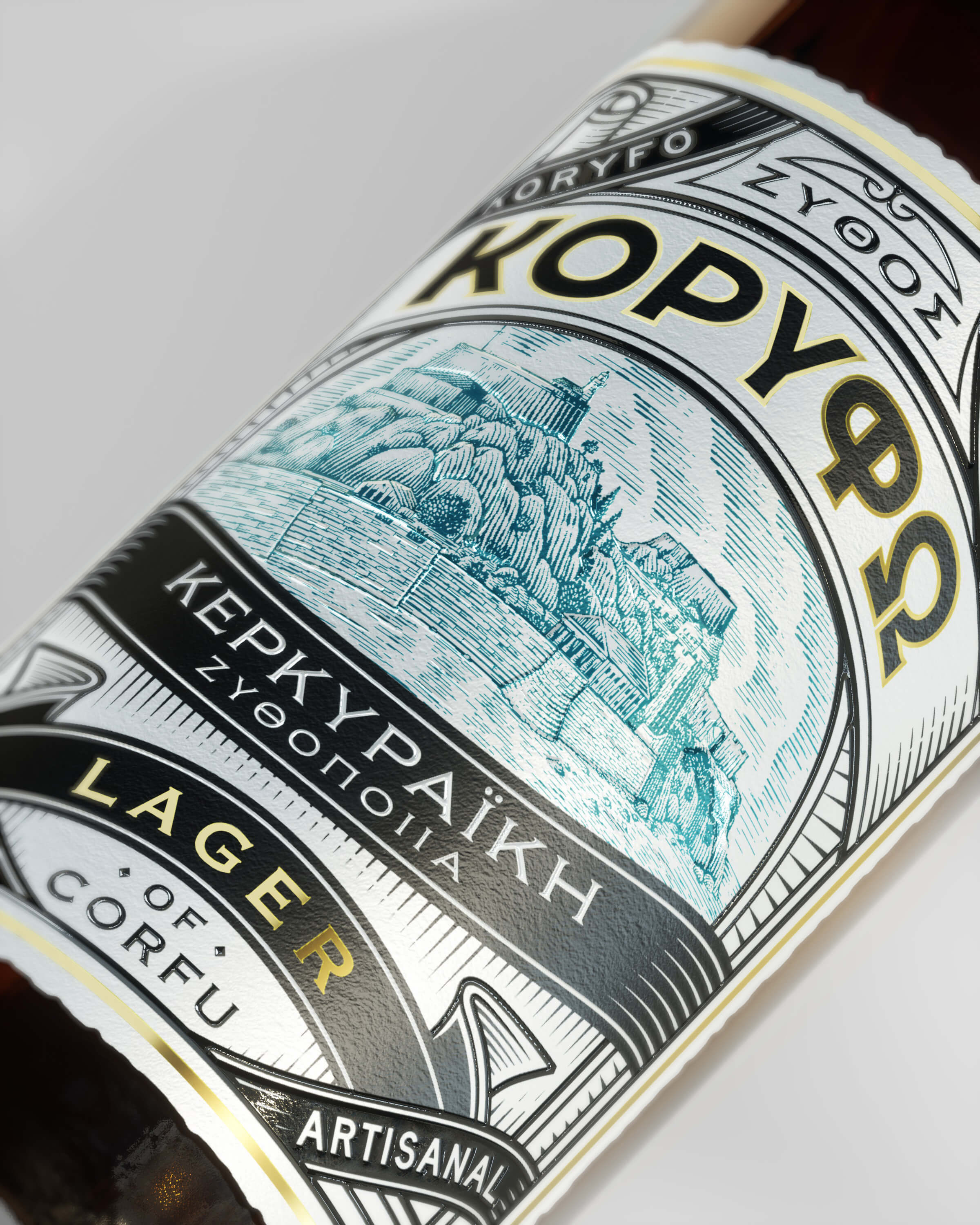
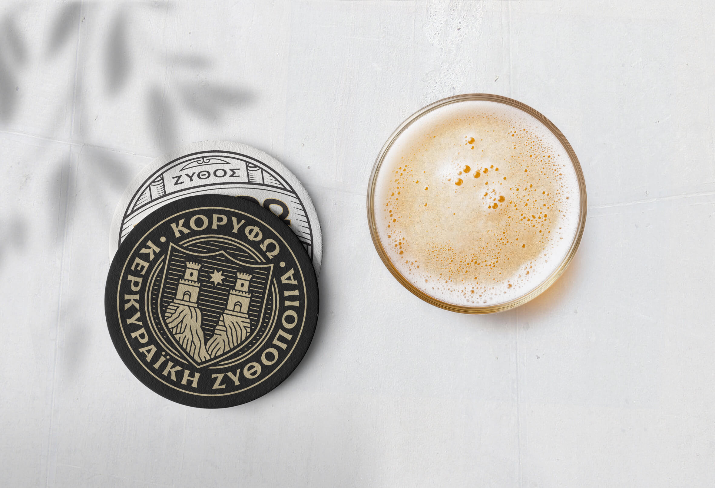
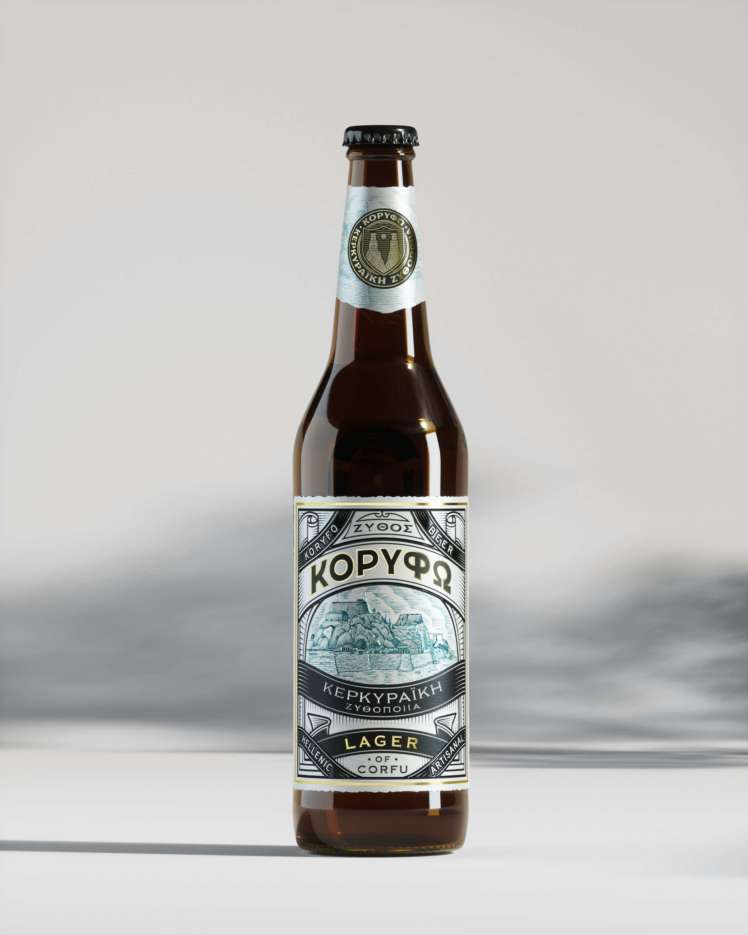
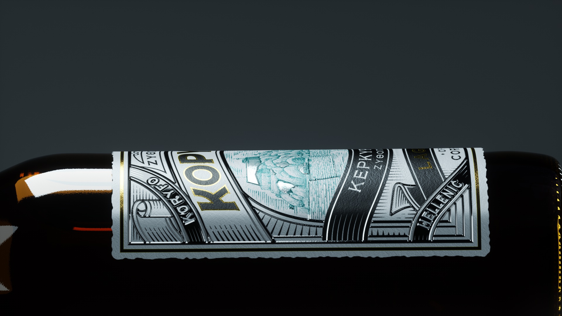
The logotype draws from the island’s two iconic fortresses, merging these architectural silhouettes with the precision of a modern engraving style. Flared serif letterforms were selected to introduce a contemporary premium feel while retaining subtle connections to the medieval character of the city. This typographic approach reflects both structural stability and refined craftsmanship, aligning with the brand’s positioning.
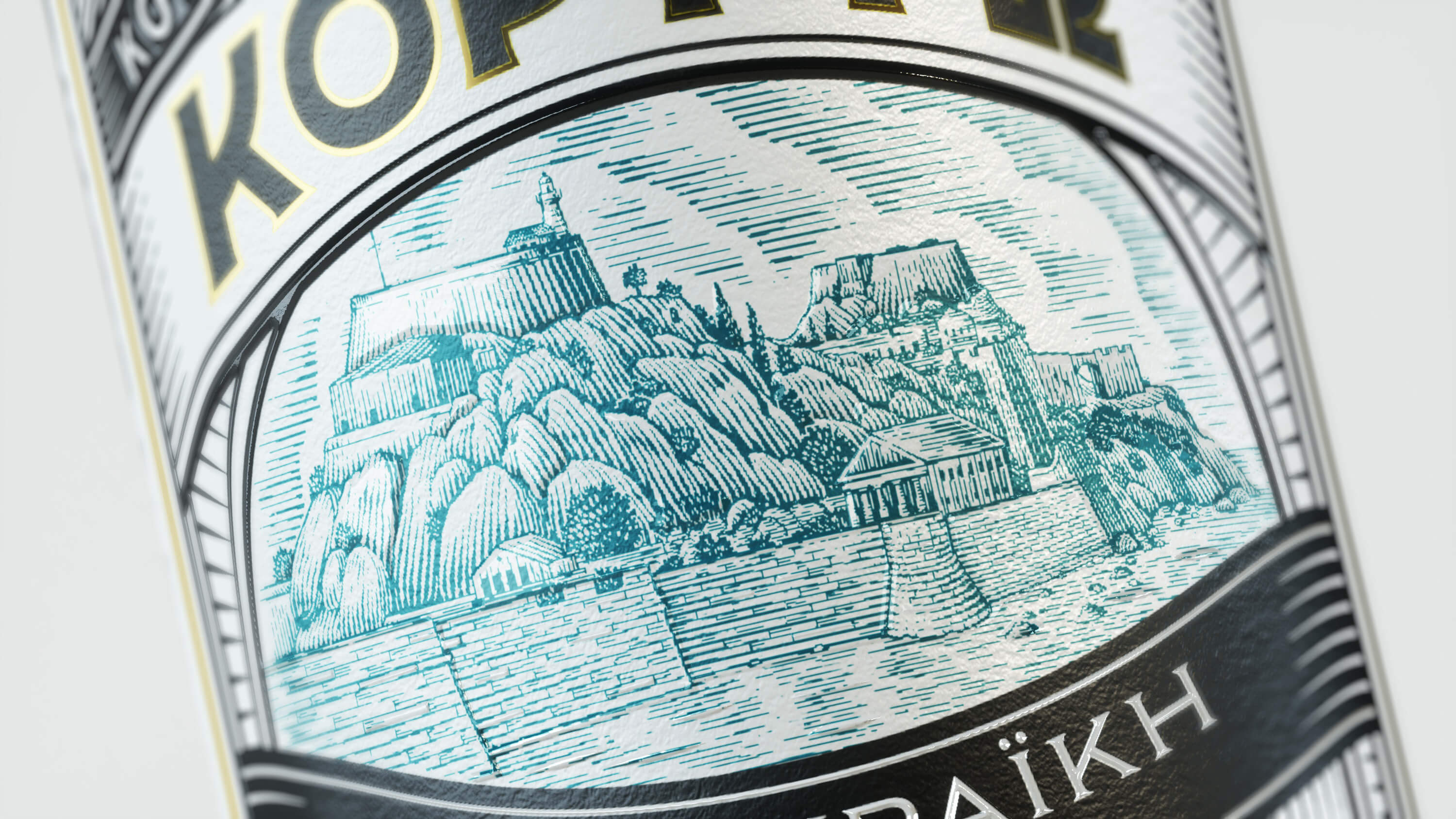
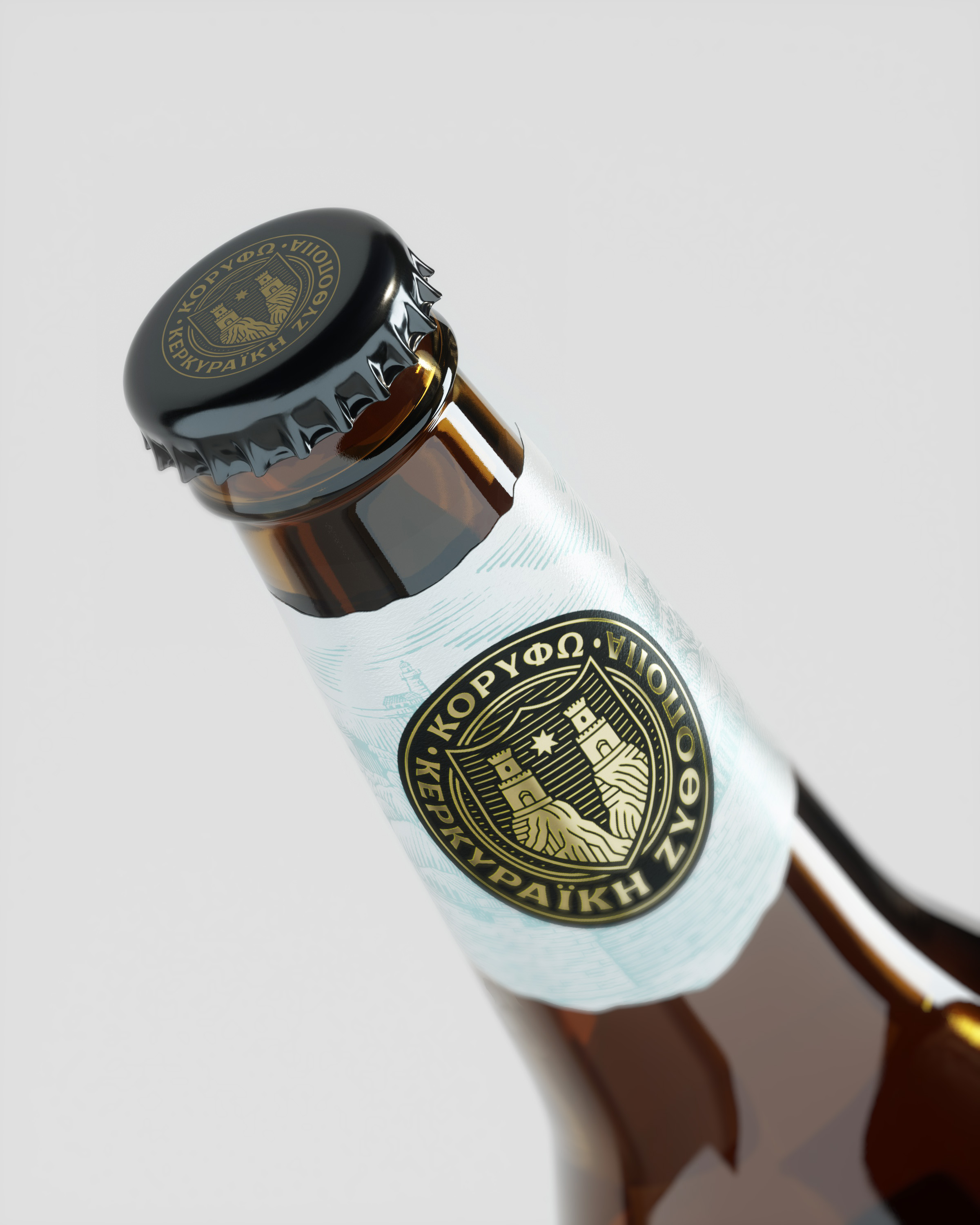
The packaging employs a richly detailed vintage aesthetic. A custom engraving of Corfu’s old town captures its layered rooftops, winding alleyways, and fortified skyline, placing the product firmly within its cultural and geographical context. This is complemented by bold, stamp-inspired typography reminiscent of classic travel ephemera, reinforcing the sense of place and heritage. Gold foil accents selectively highlight the brand name and key details, adding a tactile and visual layer of sophistication without unnecessary embellishment.
A notable element of the project was the collaboration with Poppy Studio, whose CGI renders and motion design work played a critical role in the presentation and communication of the brand. Their photorealistic product imagery and dynamic animations brought the packaging to life, allowing the intricate details, textures, and metallic finishes to be experienced beyond static visuals. This enhanced the brand’s visibility across digital platforms and in promotional materials, ensuring that Koryfo’s refined identity was consistently conveyed.
By combining cultural storytelling, careful typographic detailing, and high-quality visualisation, the Koryfo identity balances heritage with contemporary appeal. As part of the Corfu Beer family, it occupies a distinct position—crafted for those who appreciate both the quality of the beer and the story it tells about the island. Whether enjoyed on Corfu or carried away as a souvenir, Koryfo is designed to be both a premium product and a lasting reminder of place.
CREDIT
- Agency/Creative: Symbolic
- Article Title: Symbolic Shapes Koryfo Lager into a Premium Tribute to Corfu’s Heritage
- Organisation/Entity: Agency
- Project Type: Packaging
- Project Status: Published
- Agency/Creative Country: Greece
- Agency/Creative City: Athens
- Market Region: Europe
- Project Deliverables: Brand Creation, Packaging Design
- Format: Bottle
- Industry: Food/Beverage
- Keywords: BEER GREECE CORFU KORYFO
-
Credits:
illustrator: nikos mavrikakis
3d renders: popy studio


