


Swisscom is among the world’s strongest brands. In 2008 we launched the first dynamic brand and set new standards. Now we take the next step: carrying that legacy into a digital world with resolve and closeness. We made a complete revamp of Swisscom’s brand positioning. The brand Swisscom that is limited to the Swiss market has a 6 billion USD evaluation and has been rated as the strongest telco brand in the world (by Brand Finance). Nonetheless, we saw some points where we could improve the brand to stay in that position for the next 10 years ahead. Through multiple external researches & internal stakeholder interviews, we identified that we need to enrich our brand with “approachability, confidence and dynamism”. Moreover, we identified which assets and colours have the best association with Swisscom. The result: A bold rebranding of a Swiss Icon.
The project evolves Swisscom without compromising substance. With 98% recognition, trust is our foundation. We protect our heritage, and move ahead: from the moment of ‘Ready, together’ to an active promise that moves people and business forward.
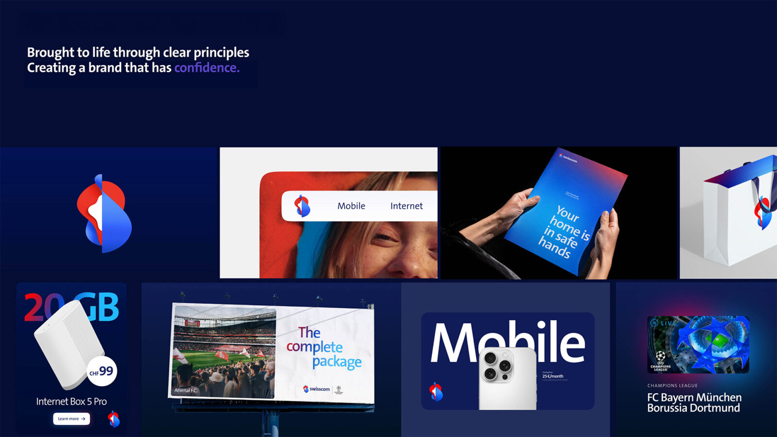
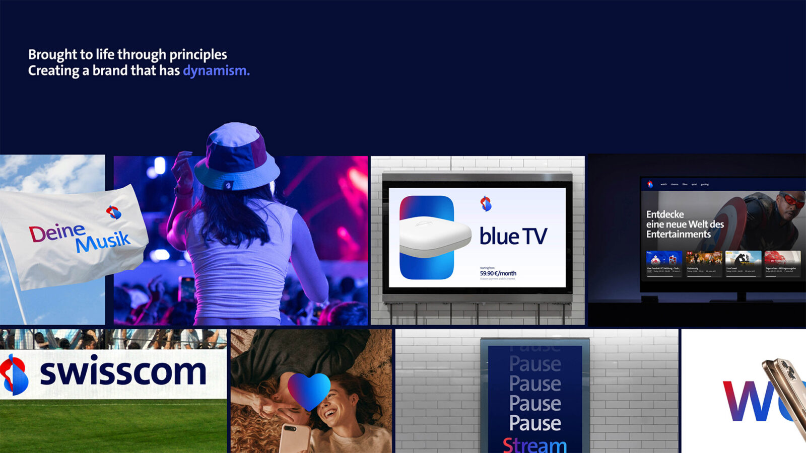
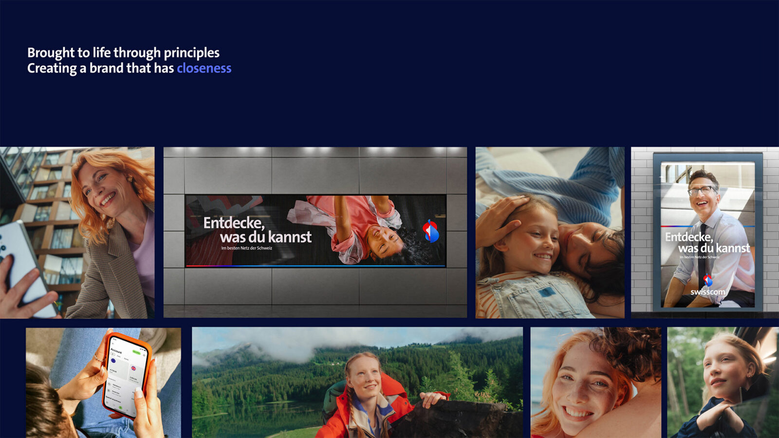
The principles guide every workstream: Approachable (warm, human, by your side), Confident (assured, leading, clear), Dynamic (energetic, progressive, in motion). Supporting traits reinforce our stance: Leading in quality, Reliable, Motivating — best-in-class network, dependable experiences, and the spark for the ‘I’ll do it now’ moment.
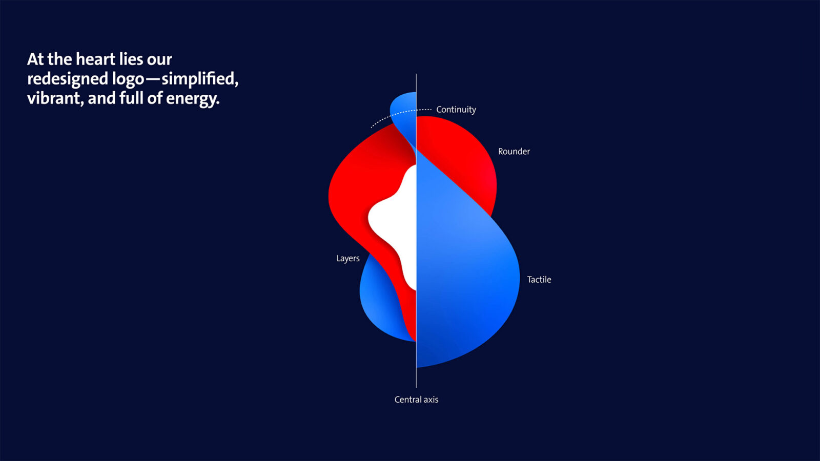
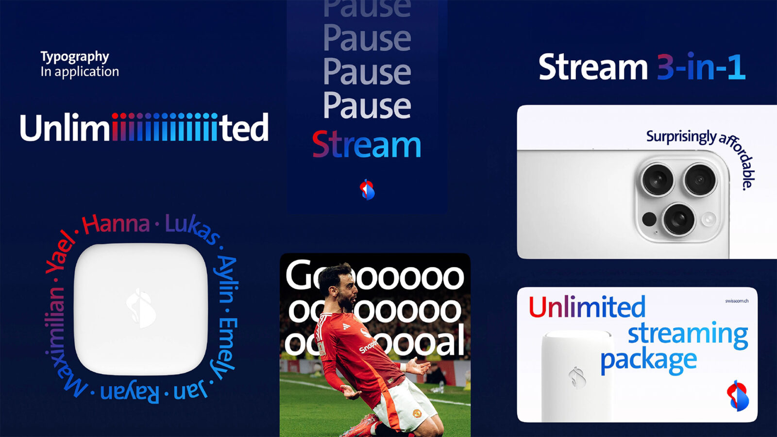
Deliverables: a refreshed, future-facing logo — vibrant and in motion; a simplified, accessible colour palette; signature Swisscom gradients adding depth, tactility and closeness; typography as a clear, human voice; art direction that unites Dynamism (energy, spontaneity) and Closeness (a by-your-side perspective). A modular design system translates our promise across touchpoints: connection and entertainment for everyday life, and scalable services for business.
The outcome is a new Swissness: progressive, bold, self-assured — and unmistakably Swisscom. We are not just a provider but a companion. Not distant, but close. The result: greater distinction in the market, more relevance in people’s lives, and motivation to discover what you can do.
Approach: discovery and heritage audit; strategy anchored in Approachable, Confident, Dynamic; design development and prototyping with accessibility by design; pilot and roll-out via guidelines and toolkits; measurement of preference, NPS, performance and consistency. We enable teams with guidelines and toolkits; progress is measured and reported on.
CREDIT
- Agency/Creative: Swisscom Schweiz AG
- Article Title: Swisscom Schweiz AG Elevates Swisscom With a Future-Facing, Approachable, and Dynamic Brand Identity
- Organisation/Entity: In-House
- Project Status: Published
- Agency/Creative Country: Switzerland
- Agency/Creative City: Zurich
- Market Region: Switzerland
- Project Deliverables: Art Direction, Brand Architecture, Brand Creation, Brand Design, Brand Guidelines, Brand Identity, Brand Redesign, Brand Refinement, Brand Strategy, Brand Tone of Voice, Branding, Design, Graphic Design, Identity System, Logo Design, Rebranding
- Industry: Telecoms
- Keywords: WBDS In-House Design Awards 2025/26 , #Branding #Swisscom #Branding #PascalFrey #switzerland #nicolaireuland
-
Credits:
Creative Director Swisscom: Pascal Frey
Lead Brand Manager & Co-Lead Campagne: Nicolai Reuland
Head of Brand: Olaf Geuer
Creative Director Wolff Olins: Jan Eumann
Creative Director Wolff Olins: Steward Davies
Art Director: Joe Waterfield
Project Lead: Iona MacDonald


