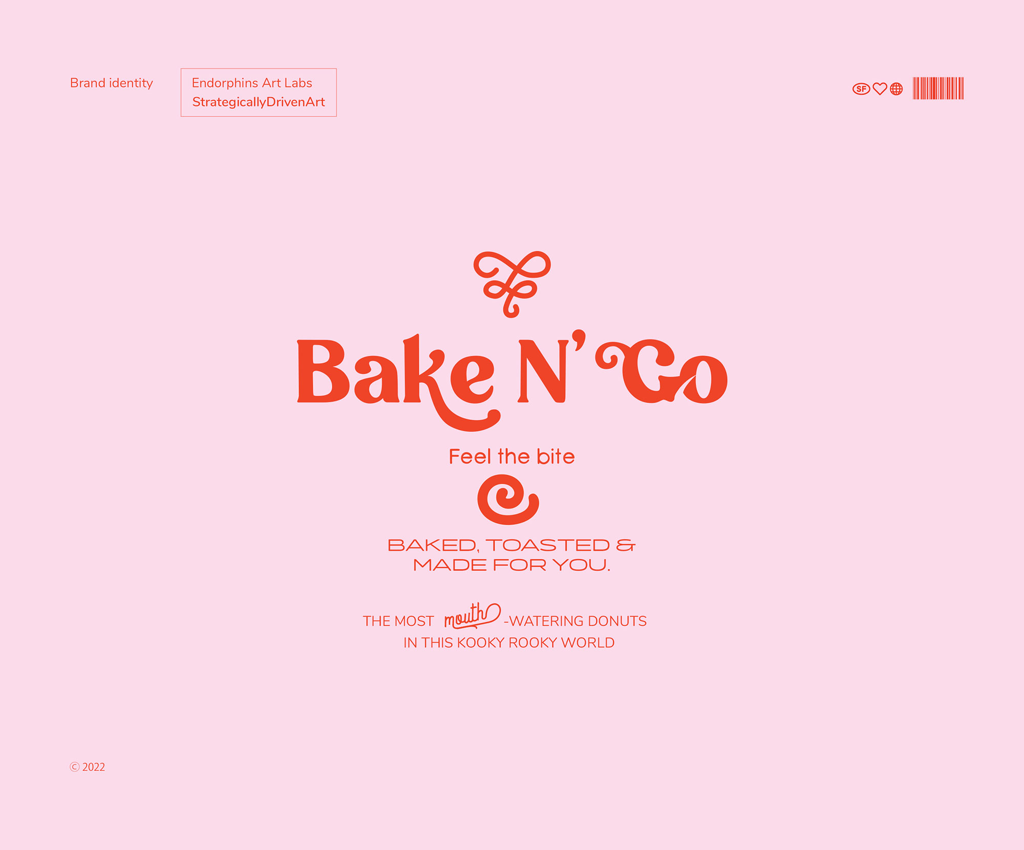
Bake N’ Go is a brand that specializes in donuts of all flavors with coffee on the side to set a snackable balance all over. Bake N’ Go is based on the cart element in which the donuts are sold. The cart is mainly placed in active areas where the brand’s young target audience is usually recurring; like at social clubs, public gathering spots, and coastal cities. Bake N’ Go is part of a small market where little competition exists as no previous local brand has made donuts its main specialty.
The challenge here was in reaching an unaware audience, unfamiliar with the brand’s innovational take on the donuts and their flavors. From there, a visual take would best attract the younger crowd and motivate them to try the donuts and get to know the brand. This visual was attained after extensive research through a few takes on color and design.
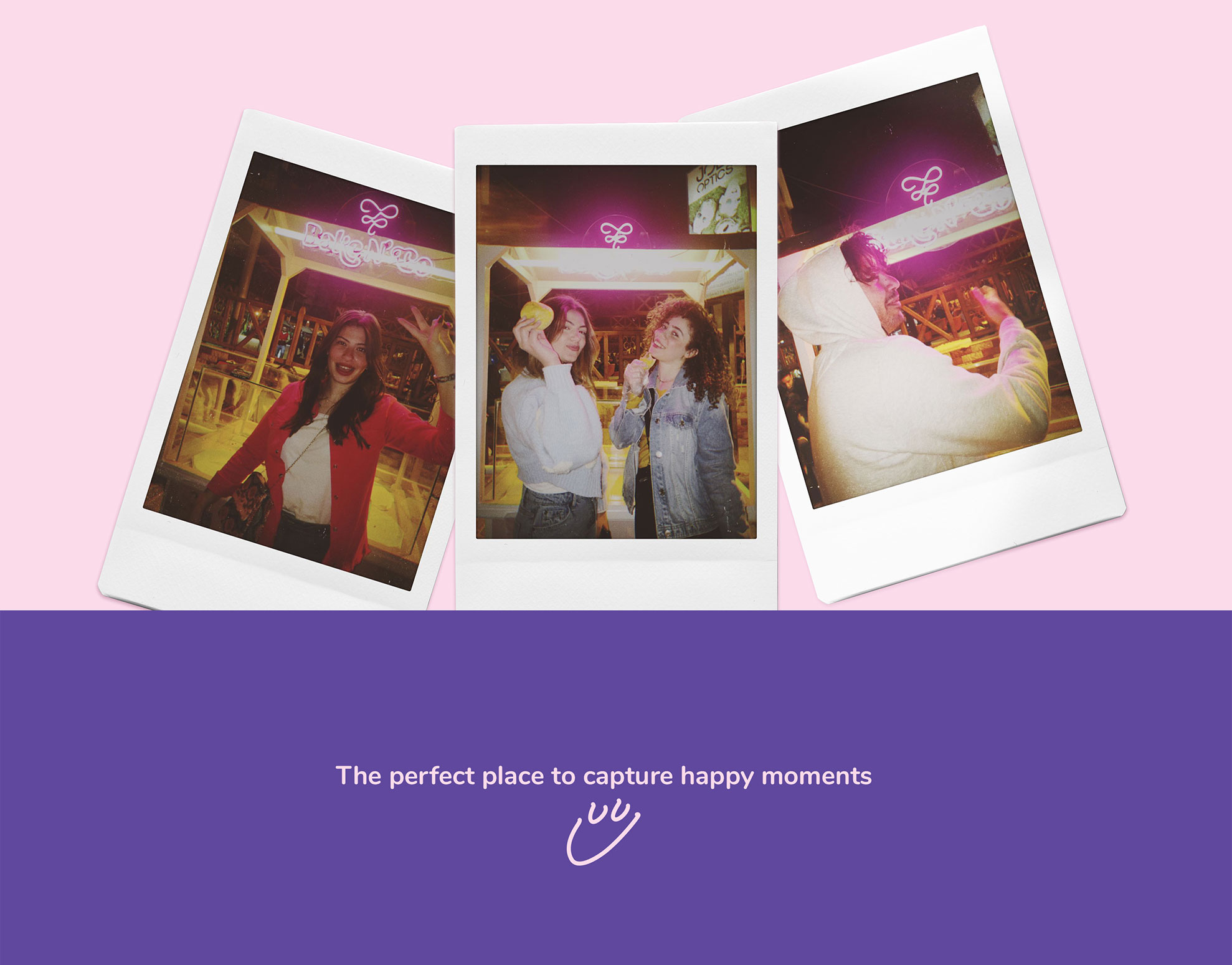
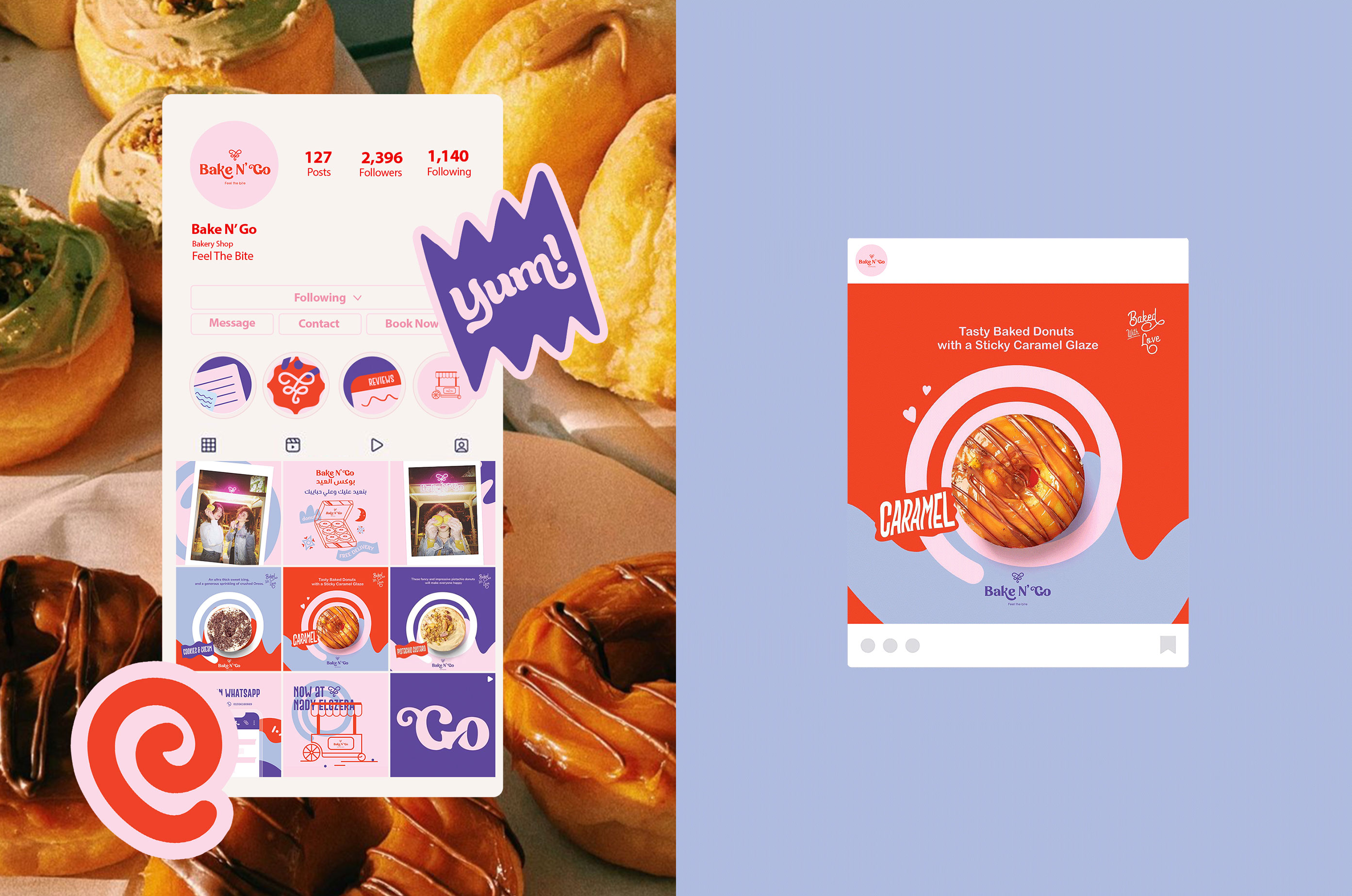
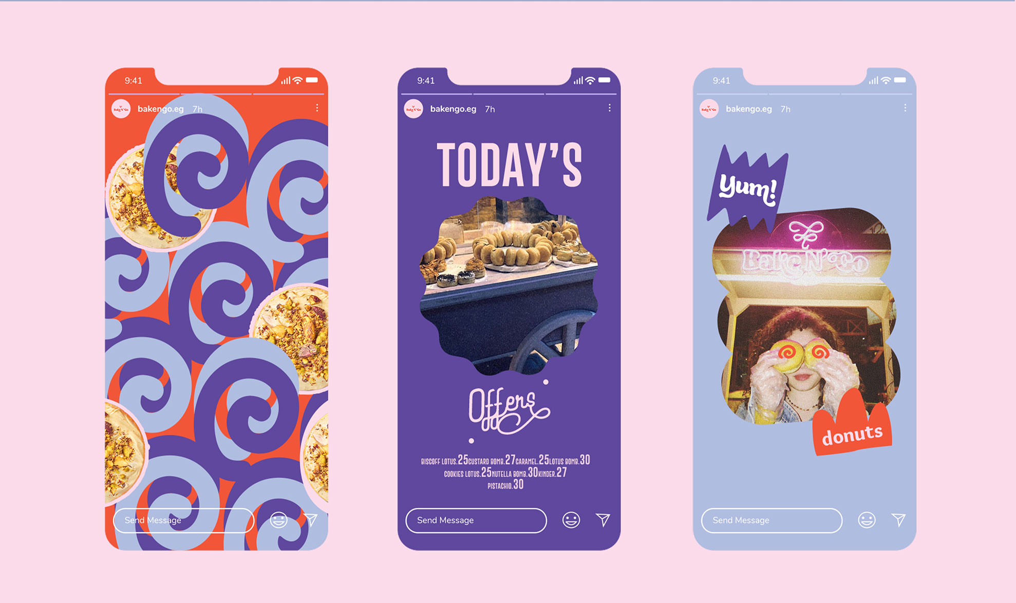
The Bake N’ Go kickoff campaign was focused on two parallel aspects; brand awareness and setting the brand as a lively and fun gathering spot. While the first was set through design and donut descriptions, the second was set through posting fun polaroid pictures of young people eating the donuts in front of the Bake N’ Go cart.
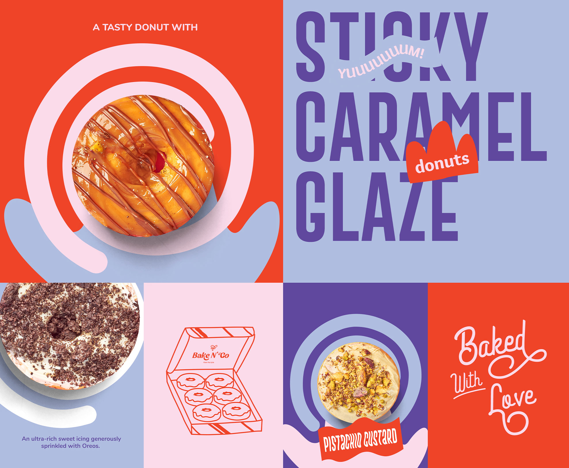
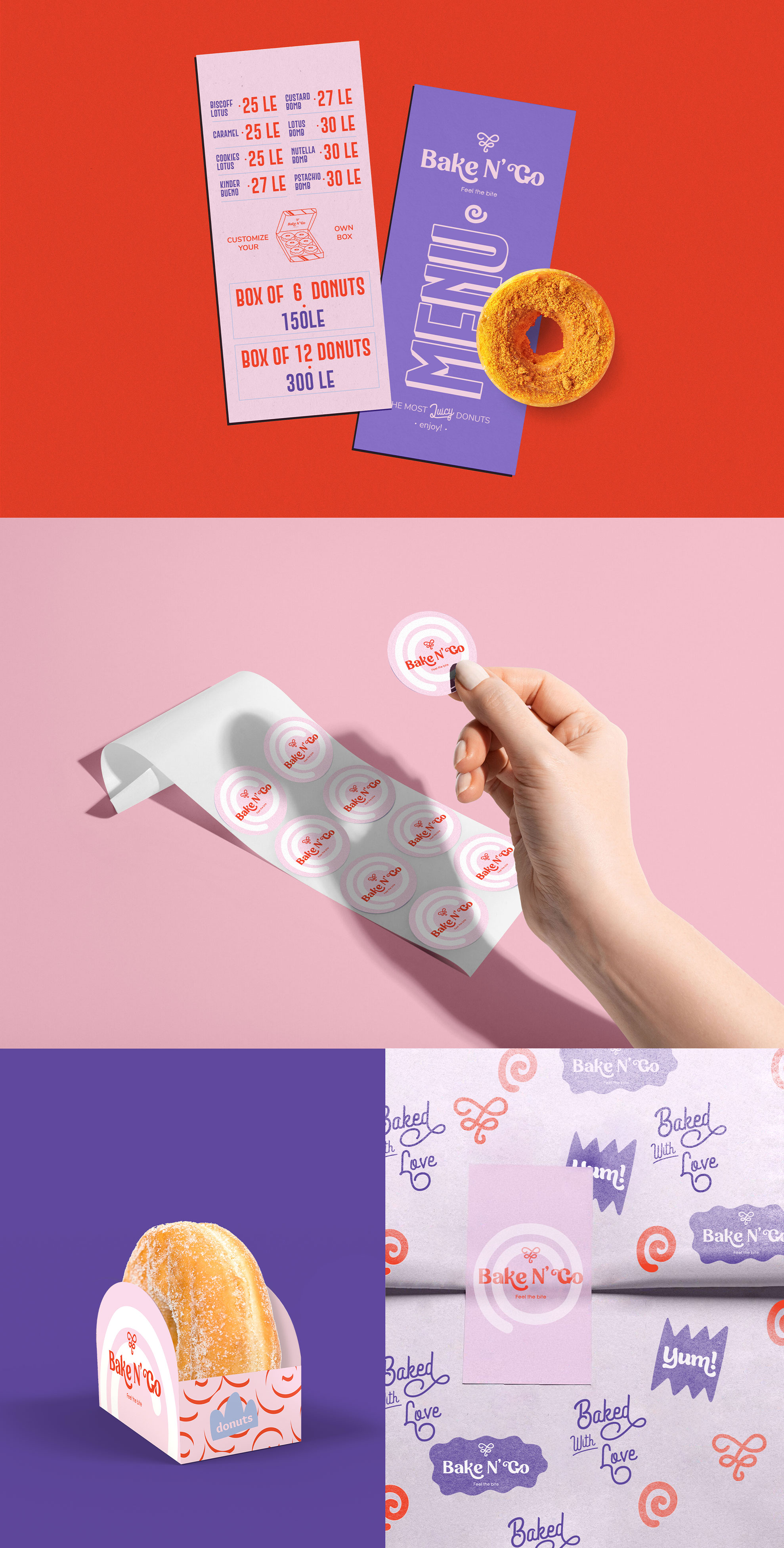
Bright and vibrant colors were chosen to portray the joyful and sweet experience of the brand, and the color diversity mirrors the various flavors of the Bake N’ Go donuts.
The donut cart was developed by following a simple and classic design that is familiar to the eyes, with bright colors that lift it to a unique and fun aspect. The result was a cart that stood out and caught the eye just enough to bring out the donuts without being a distraction.
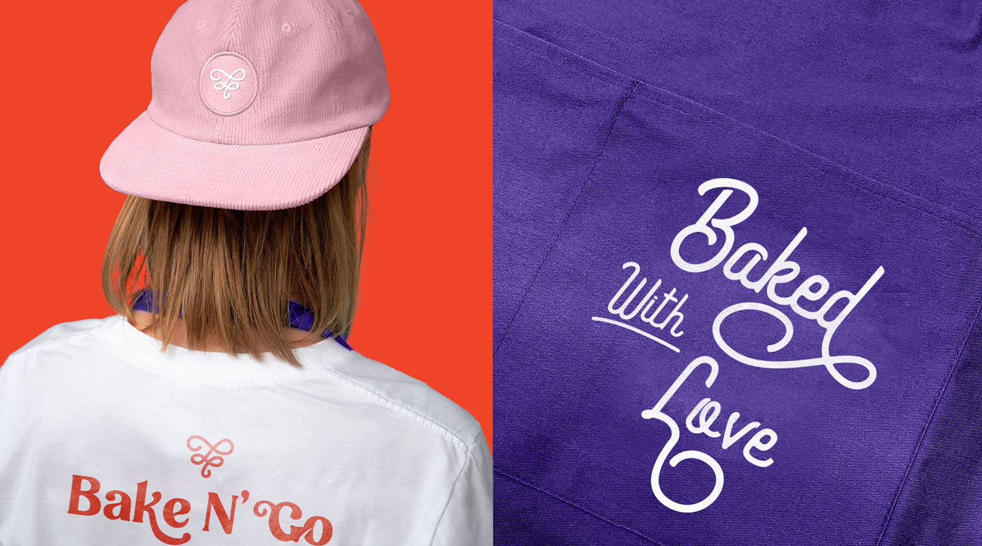
“Feel the bite.” The Bake N’ Go slogan was positioned to highlight the rich taste that each bite of the donut gives. Each bite is sweet and full of flavor. The Bake N’ Go donut itself fits the attention-grabbing visual take with its mouthwatering swirly toppings. The swirly brand icon follows suit, with a slower animation mirroring the thick and tasty topping movement. The icon creates a final outline of a classic heart shape that seamlessly relates to the word “FEEL” in the slogan.
The Bake N’ Go typography uses a lively font with occasional swirls and half circles that mimic the brand identity and gives the logo a chance to stand alone perfectly fine without the icon.
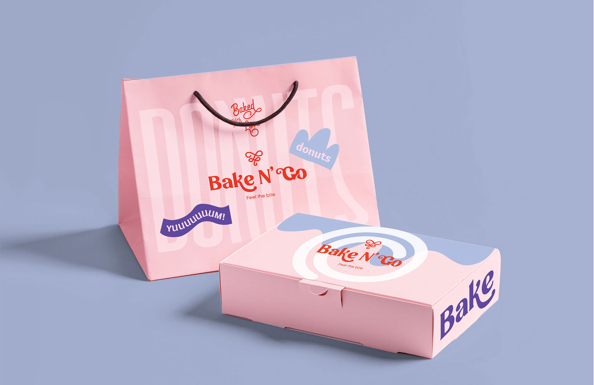
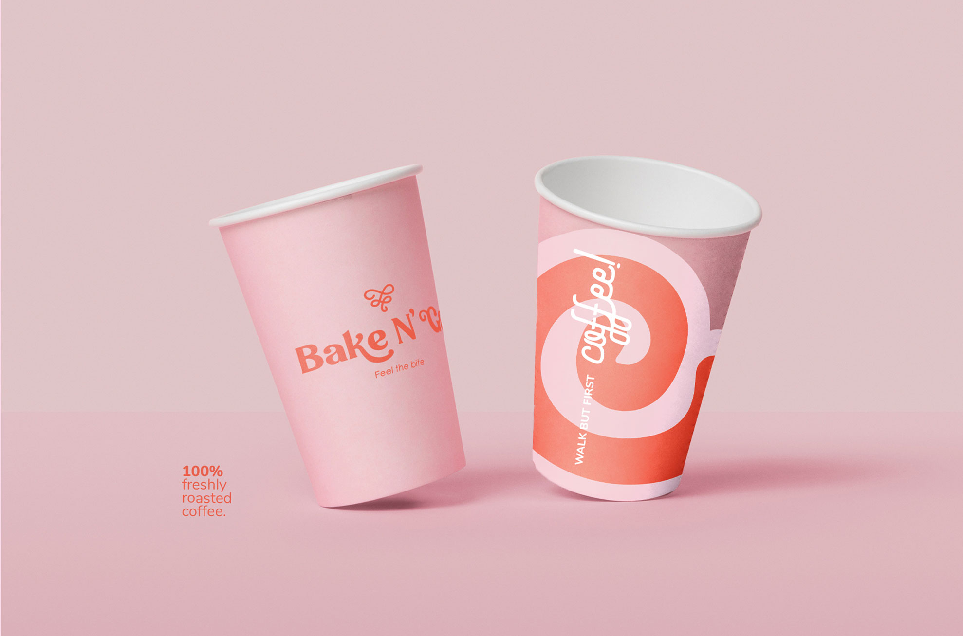
The packaging features random-looking illustrations with smooth and fun shapes showing the bouncy sweet experience of biting into the donut, tasting an explosion of flavor, and going back for more.

CREDIT
- Agency/Creative: Endorphins Art Labs
- Article Title: Sweet Visual Identity And Even Sweeter Donuts – Bake N’ Go Brand Identity By Endorphins Art Labs.
- Organisation/Entity: Agency
- Project Type: Identity
- Project Status: Published
- Agency/Creative Country: Egypt
- Agency/Creative City: Cairo
- Market Region: Middle East
- Project Deliverables: Art Direction, Brand Design, Brand Guidelines, Brand Identity, Brand Tone of Voice, Branding, Concept Art, Copywriting, Creative Direction, Packaging Design, Packaging Guidelines, Photography, Retouching, Typography
- Industry: Food/Beverage
- Keywords: Donuts, Bakery, Packaging Design, Pastery, Typography, Sweet
-
Credits:
Senior Graphic Artist: Omar Ayman
live shoots captured by: BoodyBoo
Creative director and business developer: Shika
Head of art direction: Kareem Nagy


