It’s an uphill battle for a new product trying to enter a fast-growing market.
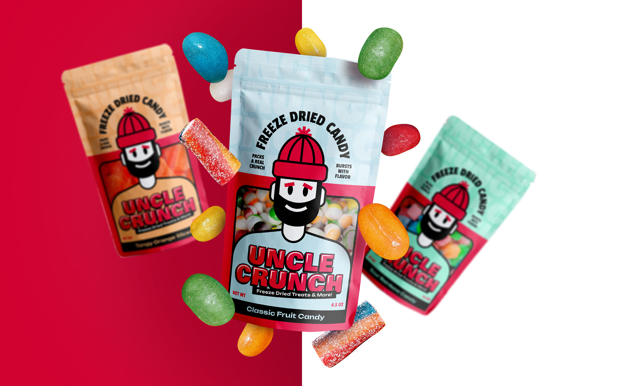
But having stand-out packaging designs is a surefire way to gain a lot of ground. Lena Wilson, owner of Uncle Crunch, knew she wanted to launch her brand with a bang. So we set out to create the perfect visual identity and package design for Uncle Crunch!
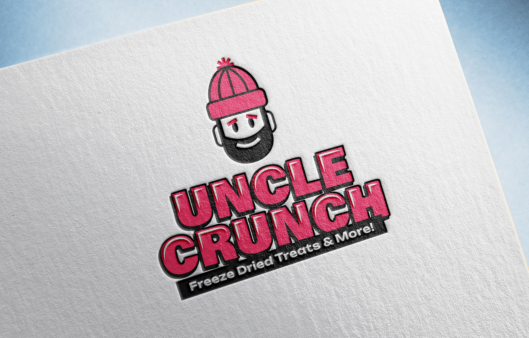
A freeze dried brand should have a warm personality. Lena had a vision of a red beanie being the heart of the brand, for its warmth and eye-catching color. Her old logo showcased a beanie, but it was far too detailed and lacked energy and polish. And with a name like Uncle Crunch, it’d be a shame to not have a character driving the identity. We gave a crack at elevating the old logo, but also opened the door to a mascot.
And that’s when the right ingredients started to come together. After putting three ideas in front of Lena, we had a clear direction of what the Uncle Crunch brand should look like.
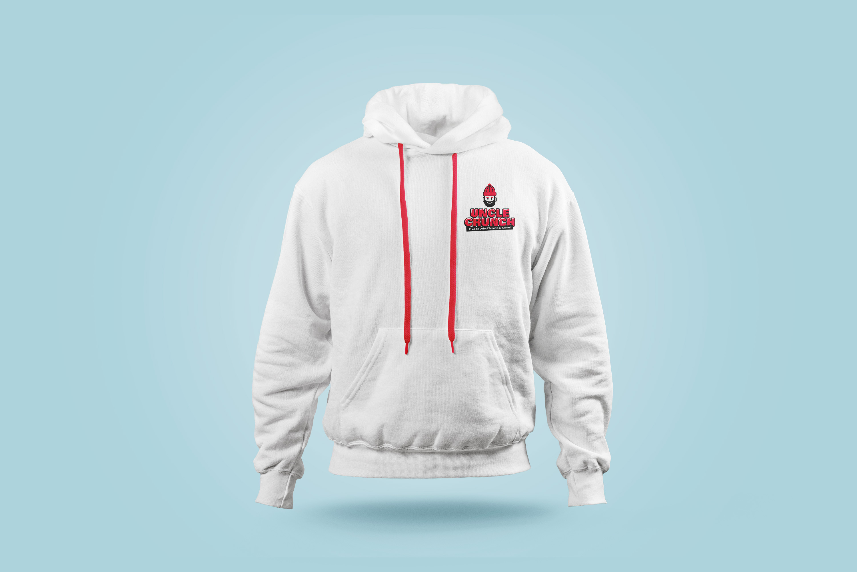
We took some bold, retro typography and turned it into an impactful wordmark. The best approach to Uncle Crunch was a simple, minimalist character with strong lines and eye-catching dashes of red. Then we let the new Uncle Crunch beam with pride over his name. As Lena put it, “WOW! It looks amazing!” The final logo has personality, ownability, and functionality; everything needed in a logo that can support a long-lasting brand.
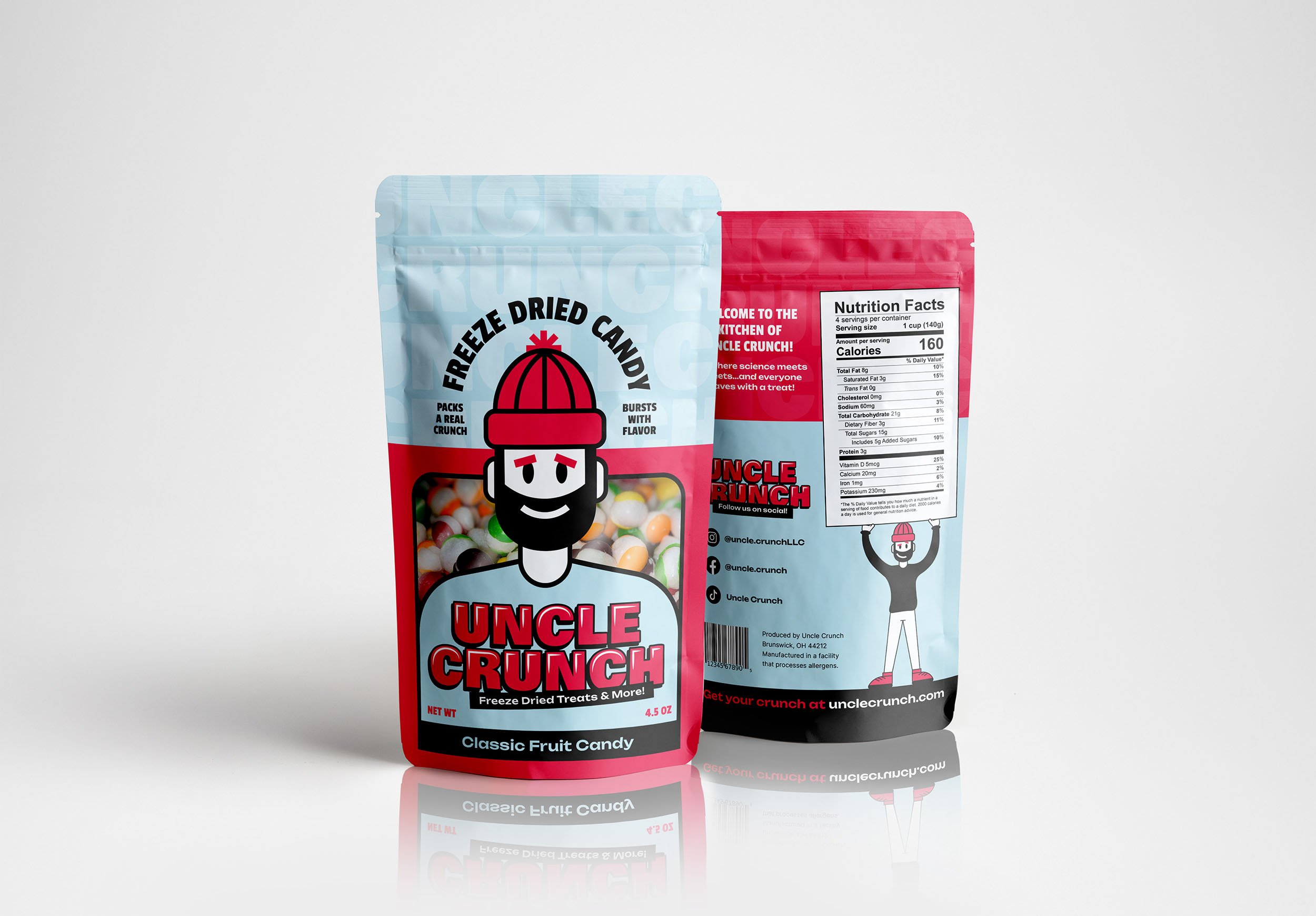
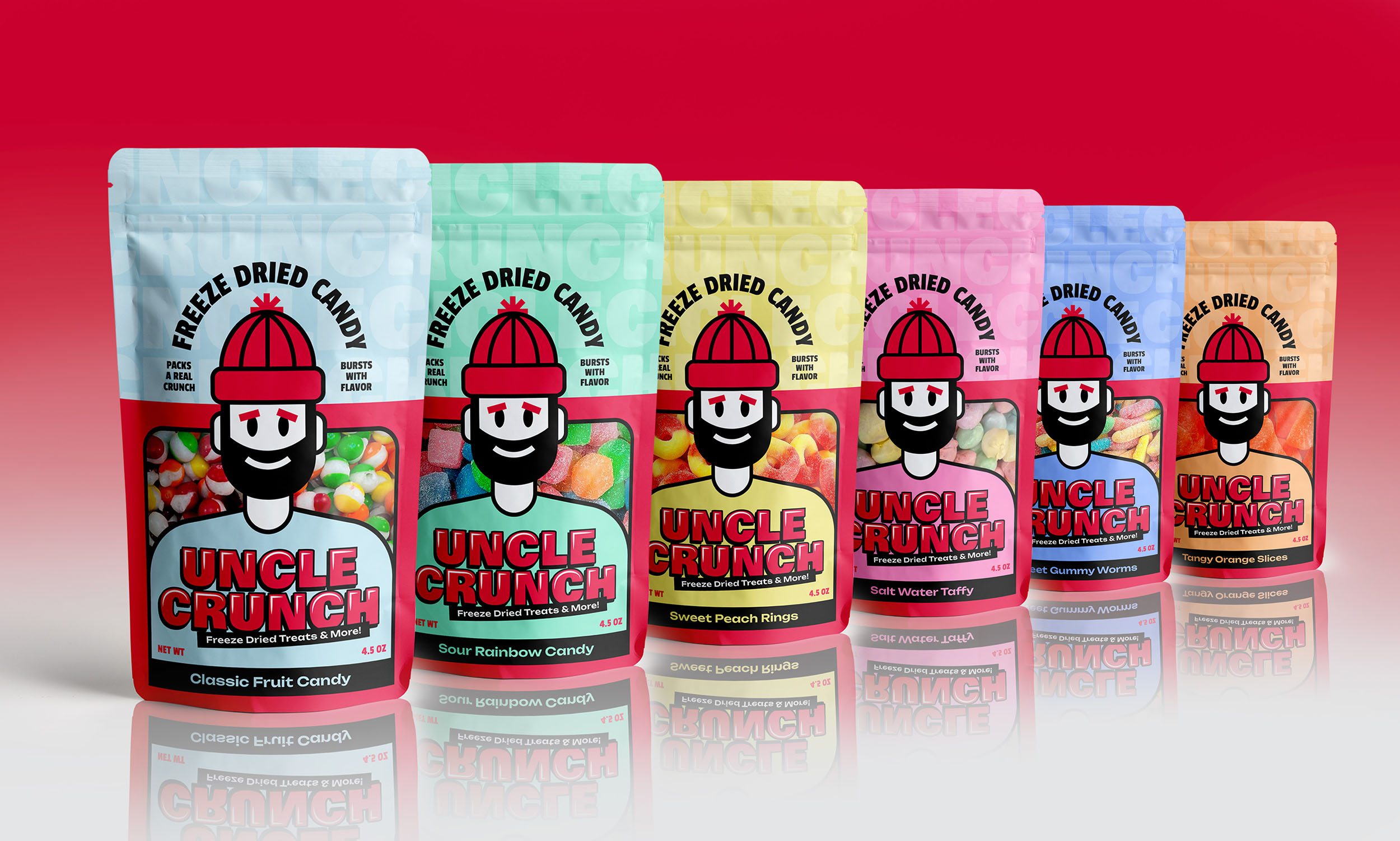
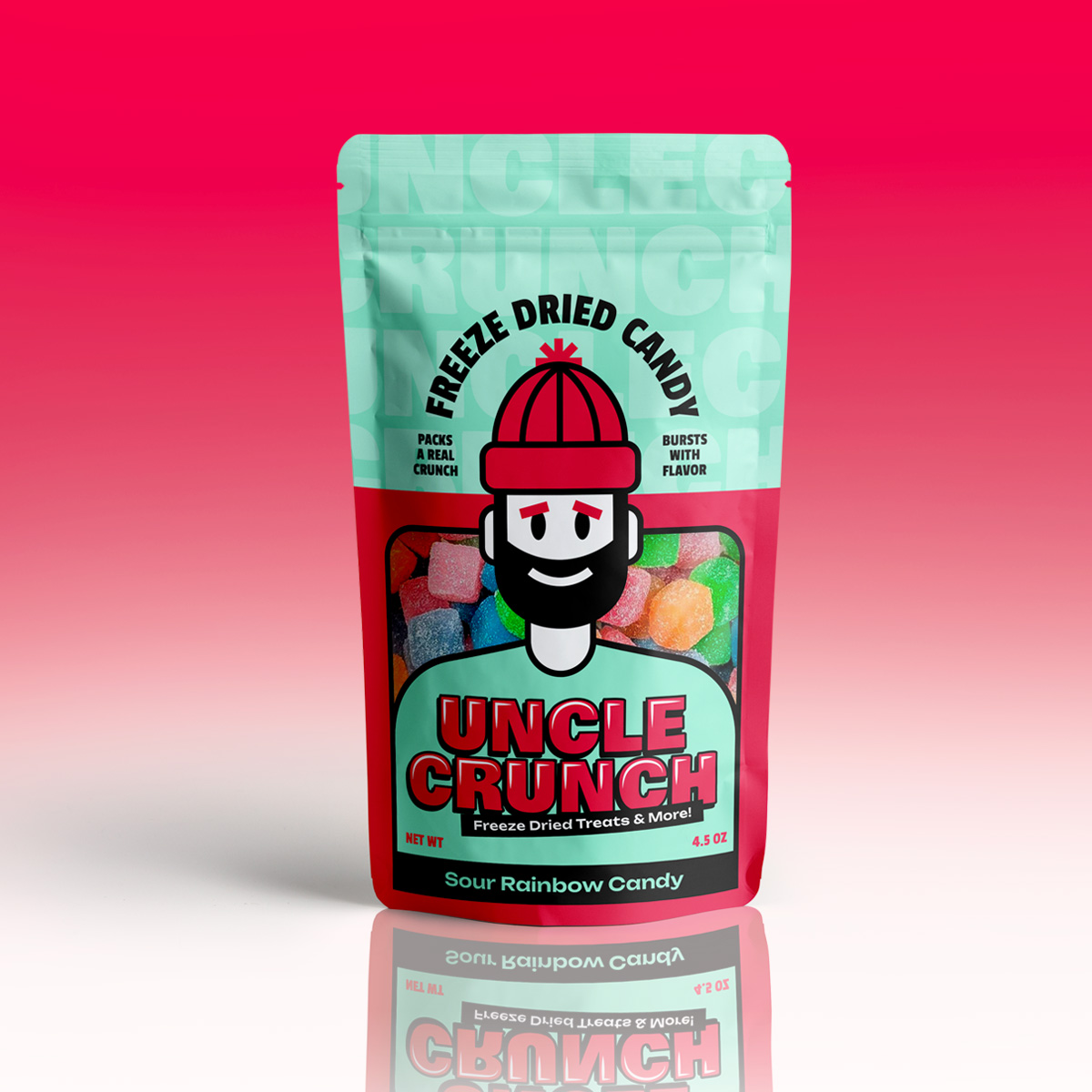
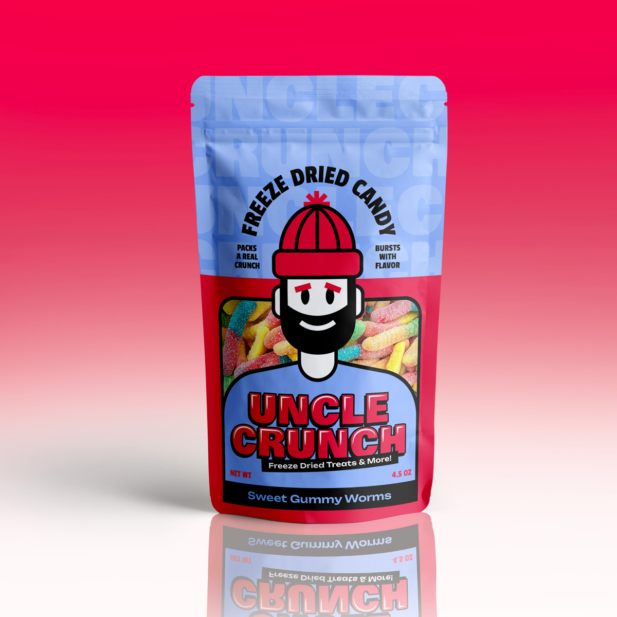
With a logo in hand, we crafted a flexible package design. Lena knew she was going to have a large variety of candy to offer. So she needed a base design for the bag that could easily adapt for whatever sweet concoctions
she dreamed up. With Uncle Crunch front and center, we laid out a package design with clear hierarchy and a peak into the tasty goodness inside.
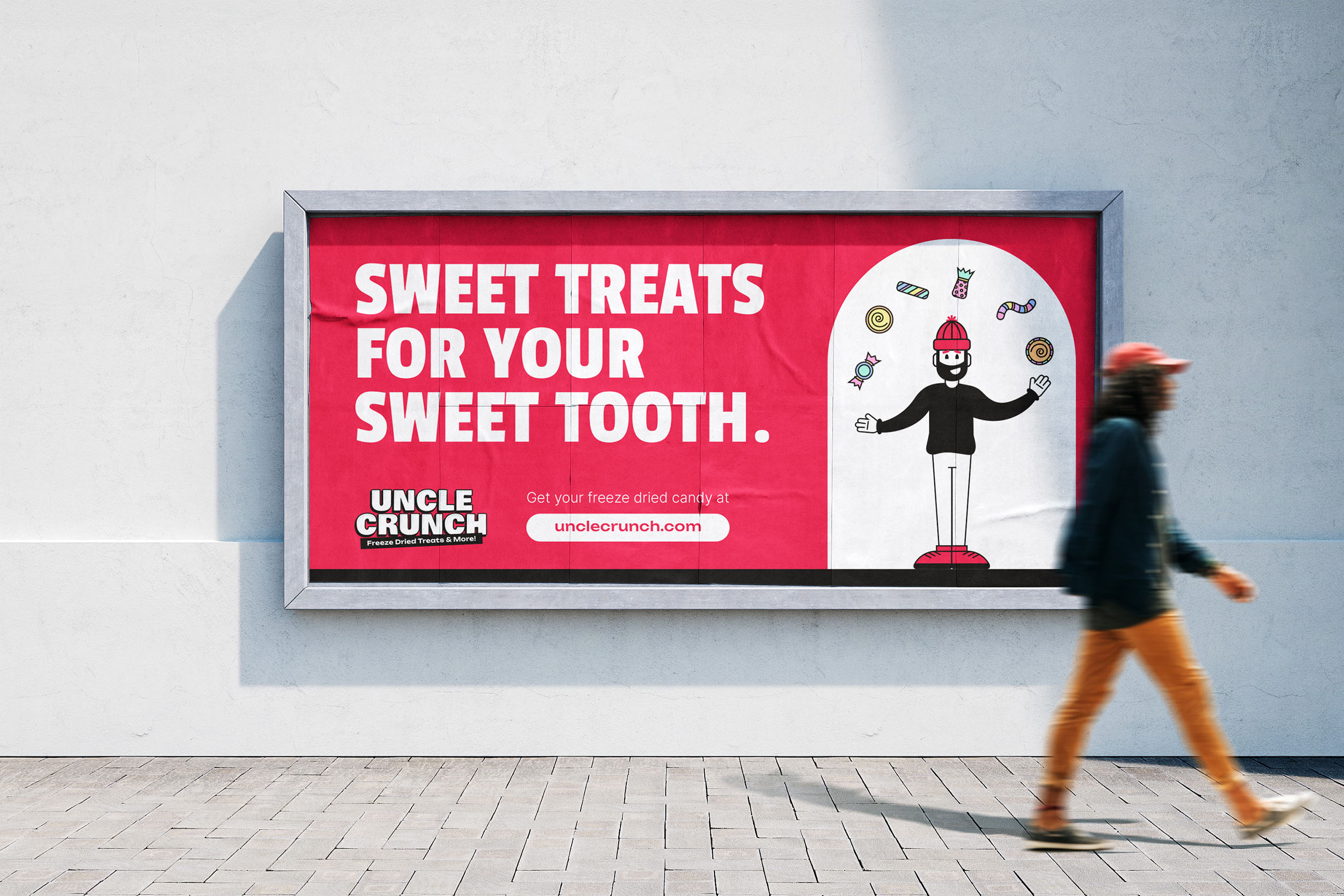
Uncle Crunch is ready to take the market by storm! With a new look and packaging in hand, Uncle Crunch is positioned for growth. As new lines of sweet treats go out, the brand has a flexible, expansive identity that can grow with it. We gave Uncle Crunch a few different poses, infusing him with a personality that will make the brand shine.
CREDIT
- Agency/Creative: Creative Chameleon Studio
- Article Title: Sweet Designs For Freeze Dried Candy Created by Creative Chameleon Studio
- Organisation/Entity: Agency
- Project Type: Packaging
- Project Status: Published
- Agency/Creative Country: United States
- Agency/Creative City: Cleveland, Ohio
- Market Region: North America
- Project Deliverables: Brand Design, Brand Guidelines, Brand Identity, Branding, Creative Direction, Design, Graphic Design, Label Design, Logo Design, Packaging Design
- Format: Bag
- Industry: Food/Beverage
- Keywords: candy, package, brand, mascot
-
Credits:
Creative Director: Madison Carr


