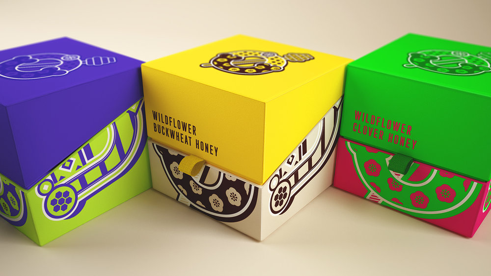
RYSKA Design – MØD – HONEYERIFFIC!
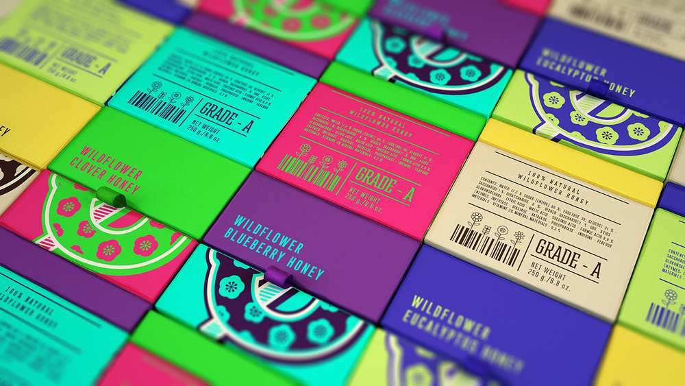
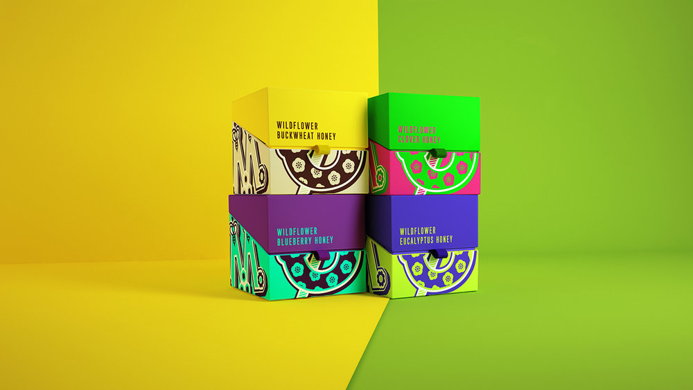
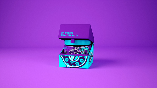
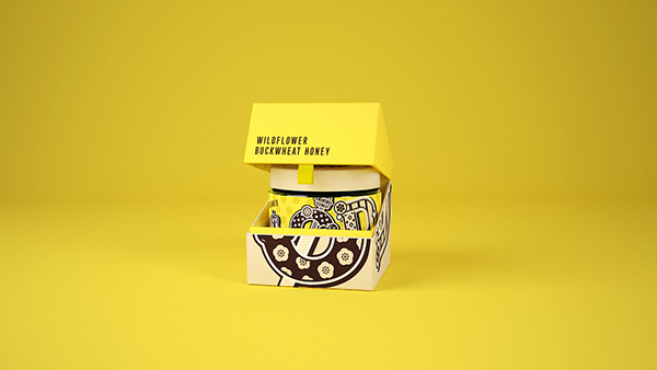
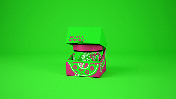
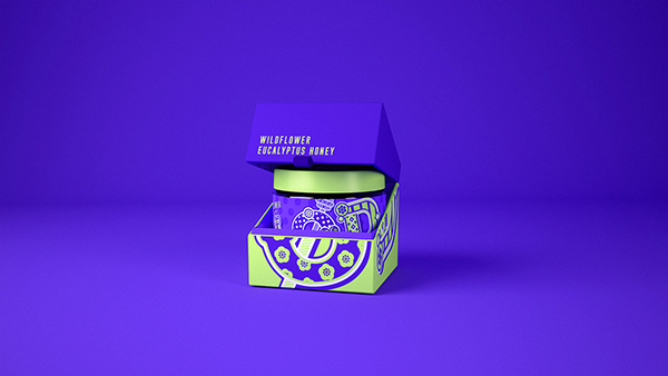
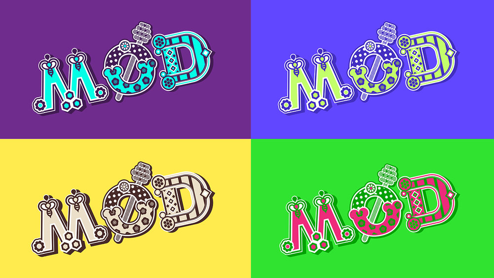
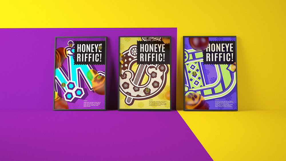
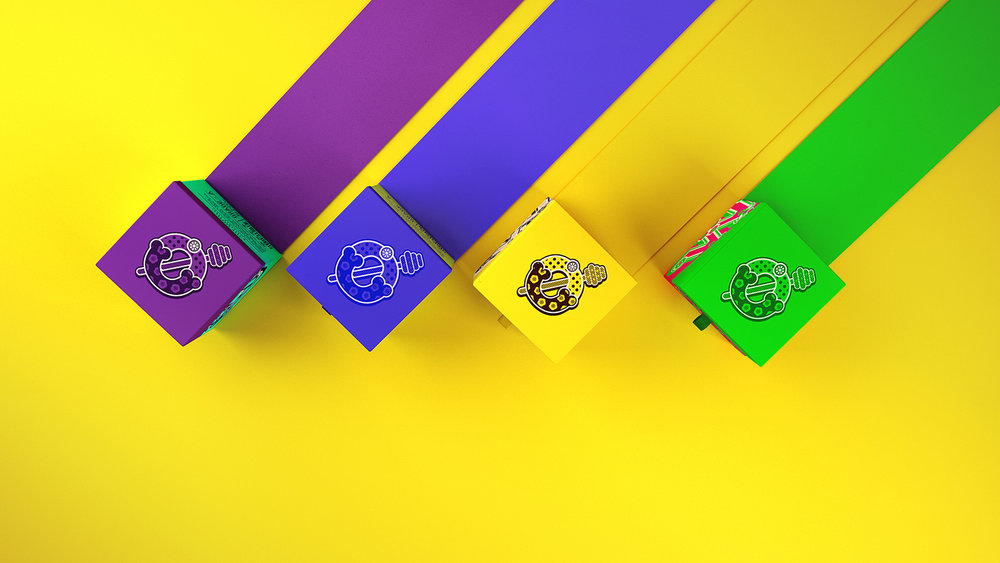
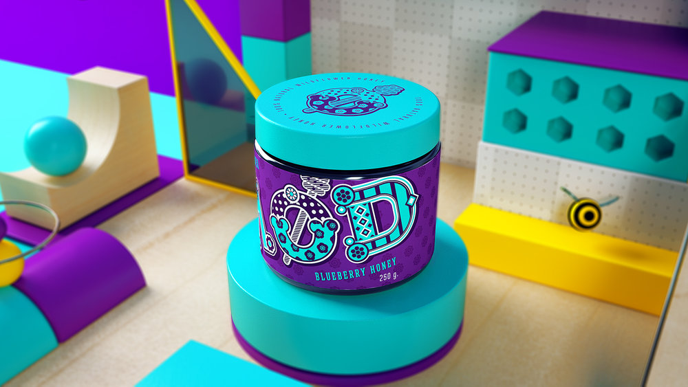
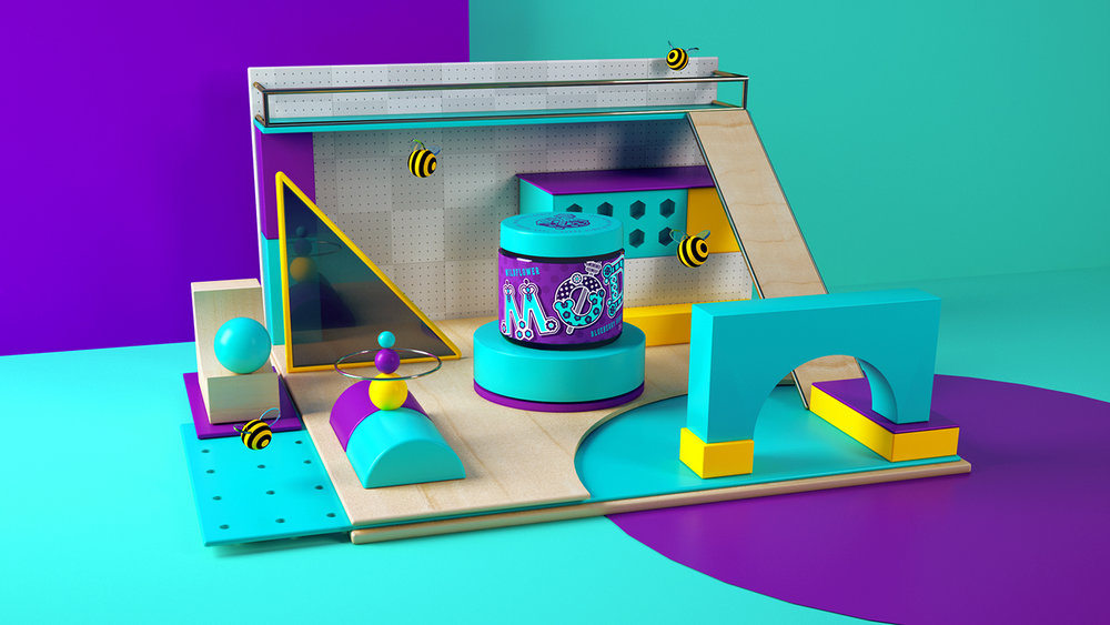
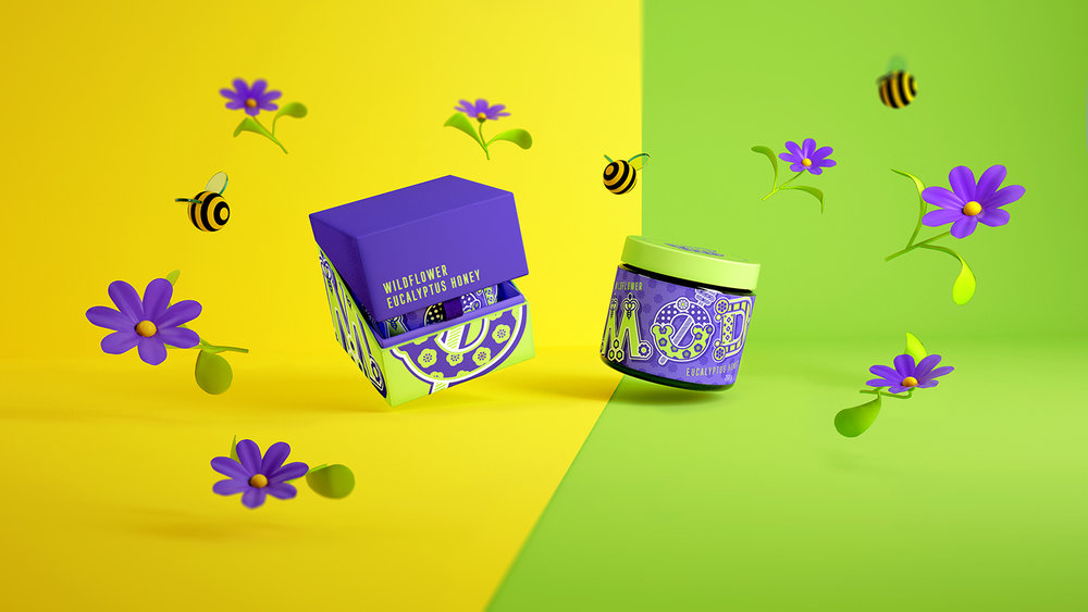
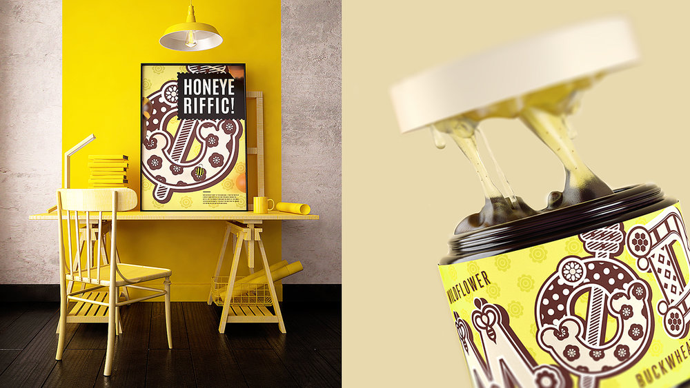
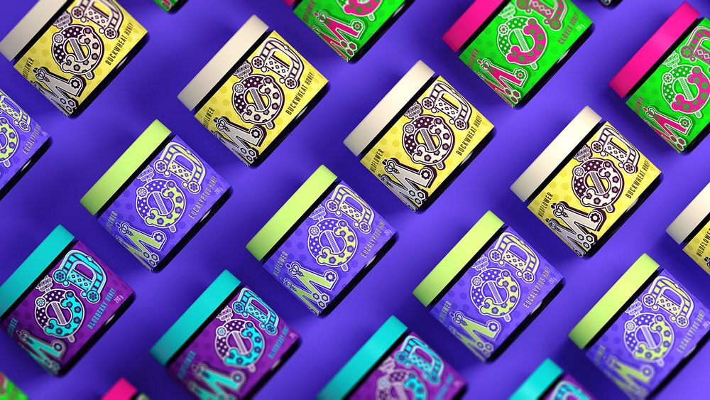
“We create a new brand of honey for kids&parents to promote it to the Skandinavian markets. With a large number of similar products on the market, we placed a bet on the brightness of the package and its originality. We thought up the original name MØD, which spelled in Swedish manner but with Slavic pronunciation. We used the same technique in logo and packing development, combining the Swedish and Slavic traditional folk patterns in beautiful typography.”

CREDIT
- Agency/Creative: RYSKA Design
- Article Title: Swedish and Slavic Traditional Folk Patterns and Beautiful Typography for a Modern Honey Brand
- Project Type: Packaging
- Agency/Creative Country: Ukraine
- Format: Box, Jar, Pot
- Substrate: Glass, Plastic, Pulp Carton, Pulp Paper
FEEDBACK
Relevance: Solution/idea in relation to brand, product or service
Implementation: Attention, detailing and finishing of final solution
Presentation: Text, visualisation and quality of the presentation


