Brief
We produced the original Svami rebrand working with them on their identity, label design, and bespoke bottle.
When we first worked with Svami, they were still a challenger brand – the first genuinely Indian tonic water in India, in a world of expensive imports.
Since then we’ve worked with Svami to extend their ranges and product offerings, and have been with them as they ventured in 0 proof drinks and no-alcohol RTDs. They are no longer the new challengers on the block but experts in mixers, elevating the drinking experience for millennials. They wanted to readdress their packaging design to refresh it for an audience that had grown with them, and be recognised as a leader in the category.
Strategy
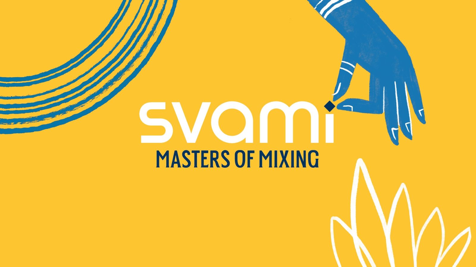
We wanted to position Svami with their new proposition of Masters of Mixing and look at their visual language on pack to better reflect this. This included:
Evolve their proposition for internal and external audiences; from a Challenger to an Established brand in the market
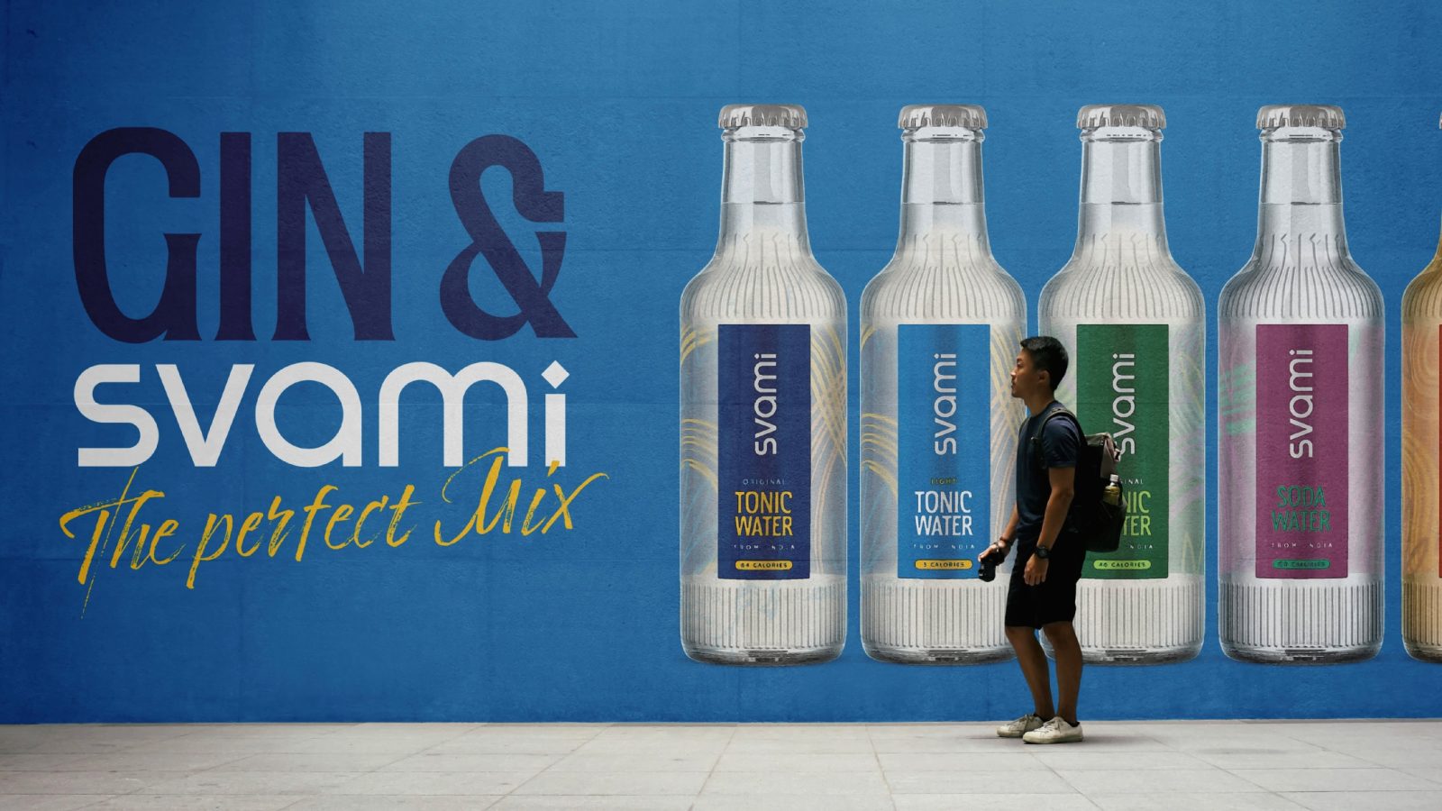
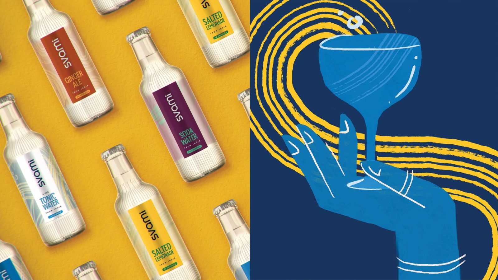
Simplify the brand architecture
Consolidate their visual language to reflect their new positioning
Their audience were young, social, tech savvy millennials living busy, modern lifestyles – we needed to connect with them as leaders in a busy ‘mixer’ category.
Design
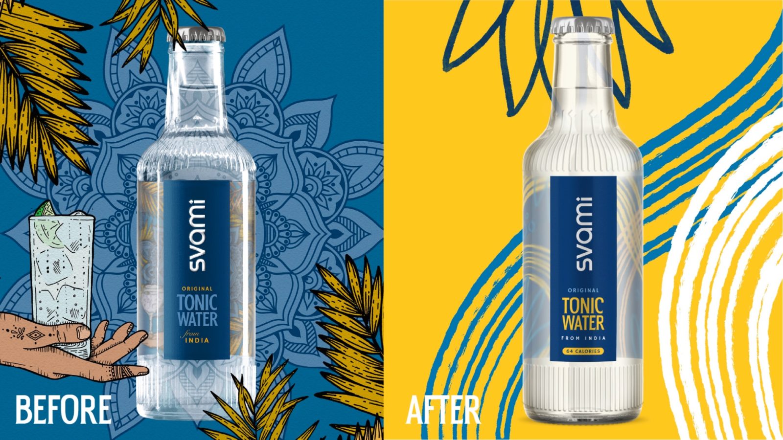
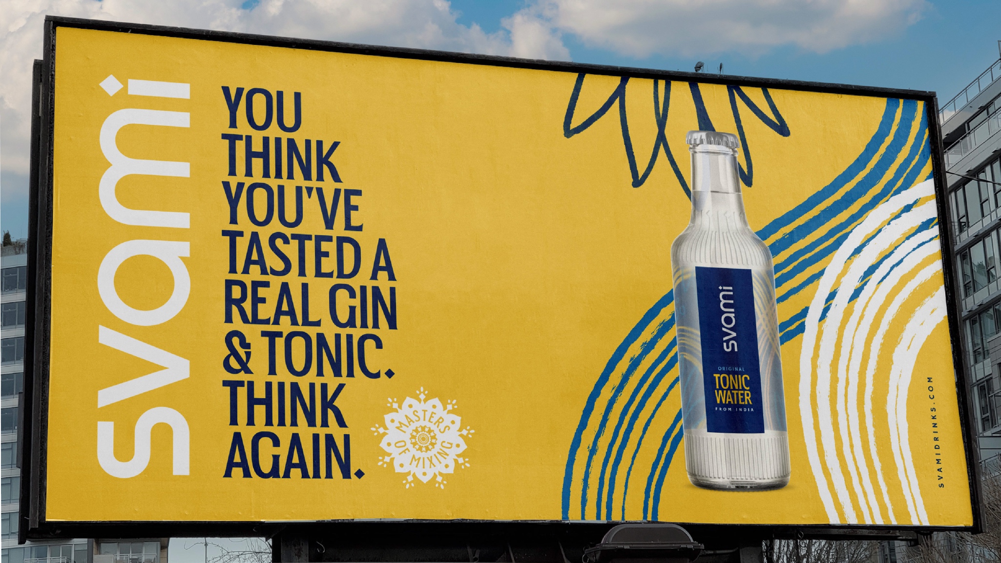
Keeping the core identity of Svami, we looked at the brand assets on and off pack for their core range. Our visual strategy was to simplify and modernise the existing brand assets which were very illustrative, detailed and reflected more traditional Indian visuals.
We looked at the typography on the front of their packaging, keeping it clean and easy to read and creating more space for it on pack. Dropping the italicised font and keeping the type friendly but bold, shows confidence and clarity for consumers.
We also looked at brighter colours that allowed the identity to pop off pack, keeping the recognisable logo and position but giving it a more standout and boldness.
We removed the detailed hands and foliage illustrations that reflected through the back of the pack to the front. Keeping this idea of reflecting through to the front of pack, we created assets that created vibrant, fluid lines to help colour navigation and add brand salience by bolstering the themes of mixing and drinking in a bold, abstract way.
Impact
Aneesh Bhasin, Co-founder Of Svami
“Our new brand, bespoke bottle and packaging stands out on a shelf or a bar anywhere in the world and competes against international players, shoulder to shoulder. We’re really happy with our experience with Kingdom & Sparrow and are pleased to be continuing to work with them to launch new products in our range.”
CREDIT
- Agency/Creative: Kingdom & Sparrow
- Article Title: Svami – From Challenger Brand, to a Master of Mixing
- Organisation/Entity: Agency, Published Commercial Design
- Project Type: Packaging
- Project Status: Published
- Agency/Creative Country: United Kingdom
- Market Region: Asia
- Project Deliverables: Packaging Design, Product Architecture, Rebranding
- Format: Bottle
- Substrate: Glass Bottle
- Keywords: WBDS Agency Design Awards 2023/24


