


Robot Food has created new branding for US-based sustainable cleaning brand Cleancult; crafting a bold, compelling brand world that works seamlessly on and off pack to create a devoted ‘following’ of consumers.
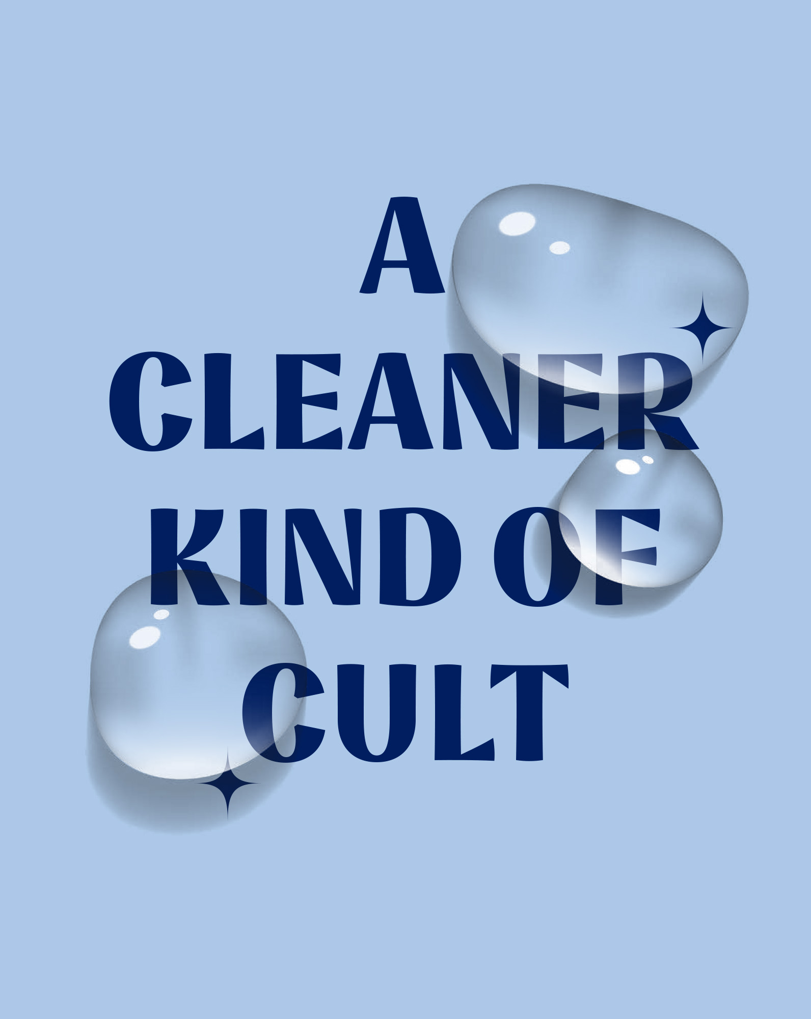
Taking the brand’s playful name, innovative approach to renewable packaging and clean formulations as a starting point, Robot Food’s identity for the brand centres on the creative concept of a ‘Cult of Clean’ – positioning the brand as a ‘movement for change’ that serves to ‘box out plastic’, while helping its ‘followers’ protect their homes as well as the planet.
Creating a Cleancult ‘following’ – no ceremonial robes required
Through initial interviews with key Cleancult stakeholders, Robot Food found that while the brand name was strong, it wasn’t doing what it set out to. “The intention behind the name was to create a following – to feel like something people wanted to get on board with,” says Natalie Redford, Robot Food senior creative strategist. “The problem was that, while their USP made them super different, it still wasn’t connecting with consumers. We needed to make them care about the cause”.
Cleancult’s target audience is predominantly those looking to adopt greener behaviours and consumers seeking a premium, affordable option that has a counter-worthy aesthetic for the design-conscious.
The new designs therefore had to look great, whilst effectively communicating their sustainable positioning, clean ingredients, trustworthiness, and efficacy.
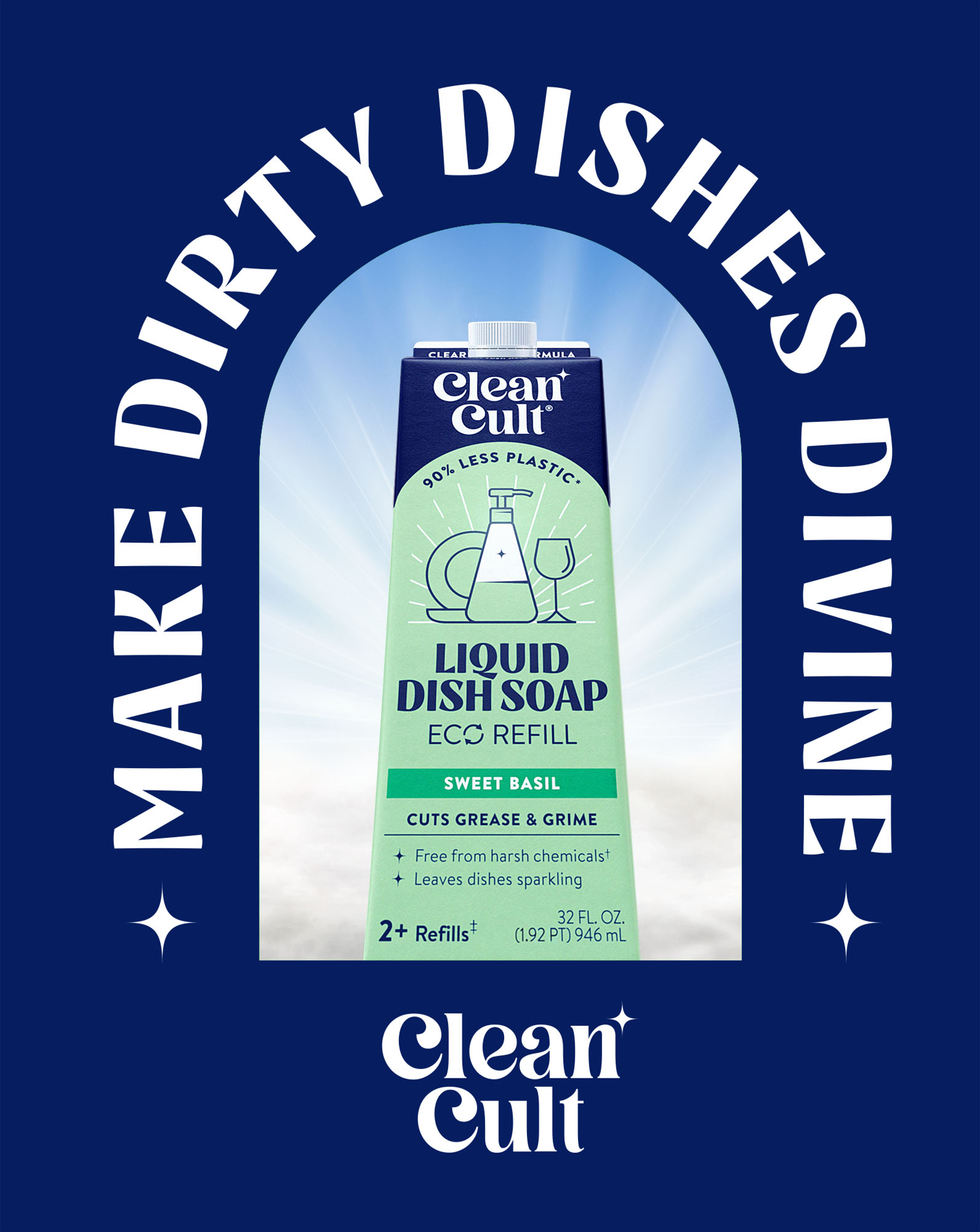
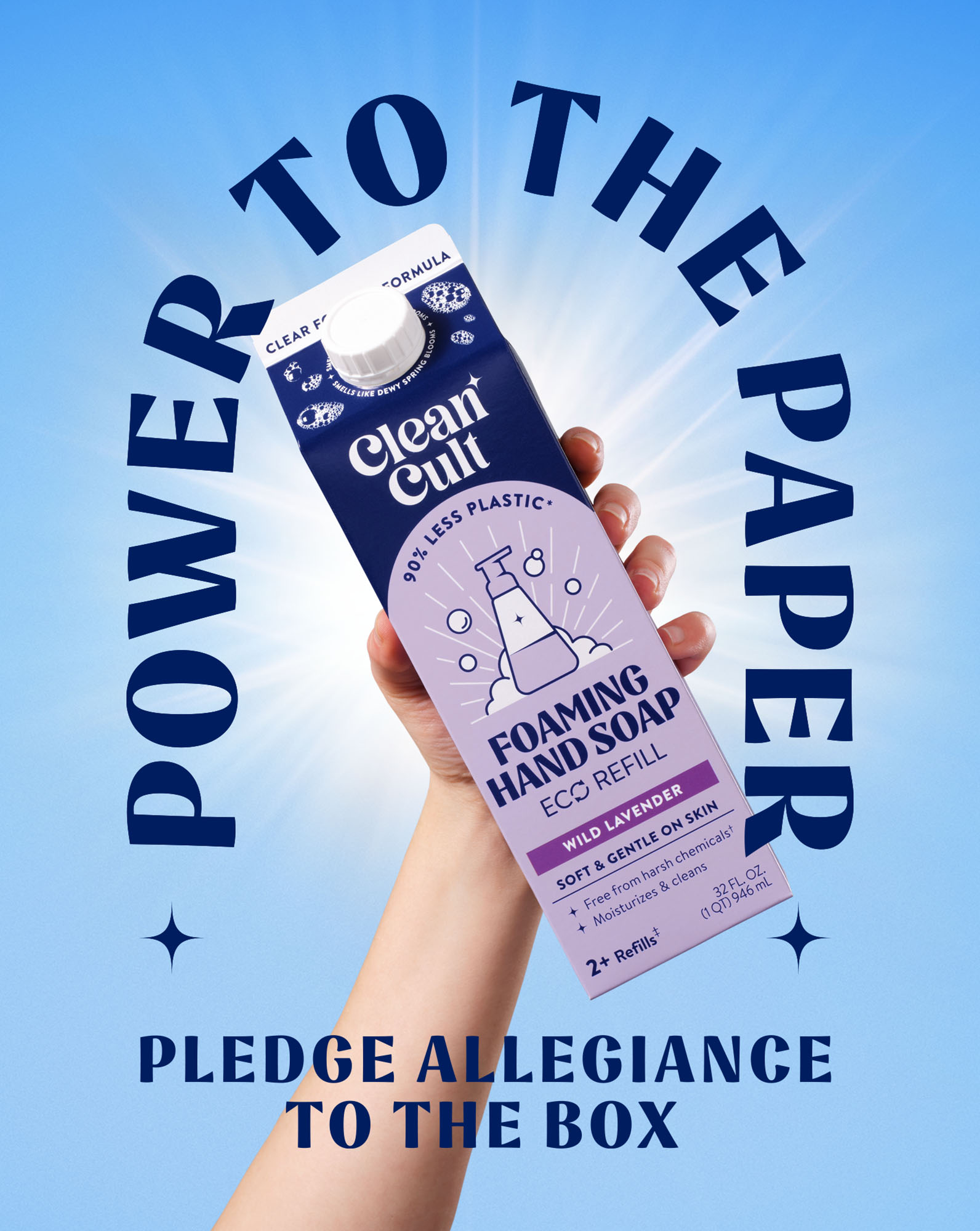
The new branding leans playfully into the ‘cult’ of the name, using various graphic devices such as the symbols and a distinctively ornate logotype. To avoid any trickier connotations of the word, Robot Food had to make clear the brand’s main mission – to convert consumers from using plastic into a sustainable paper-based refill system – and reassure them that this is a product that’s safe, heaven scented and actually works.
Tone of voice takes the role of the magnetic cult leader, building a following through playful, tongue-in cheek-copy, that’s underscored with a harder hitting message.
Eco-friendly sensibilities
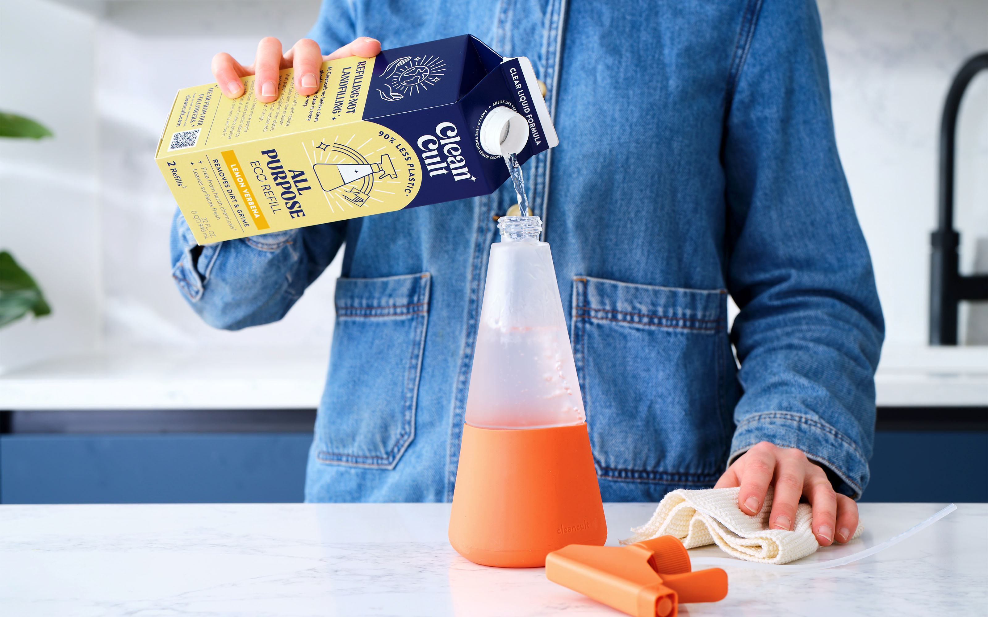
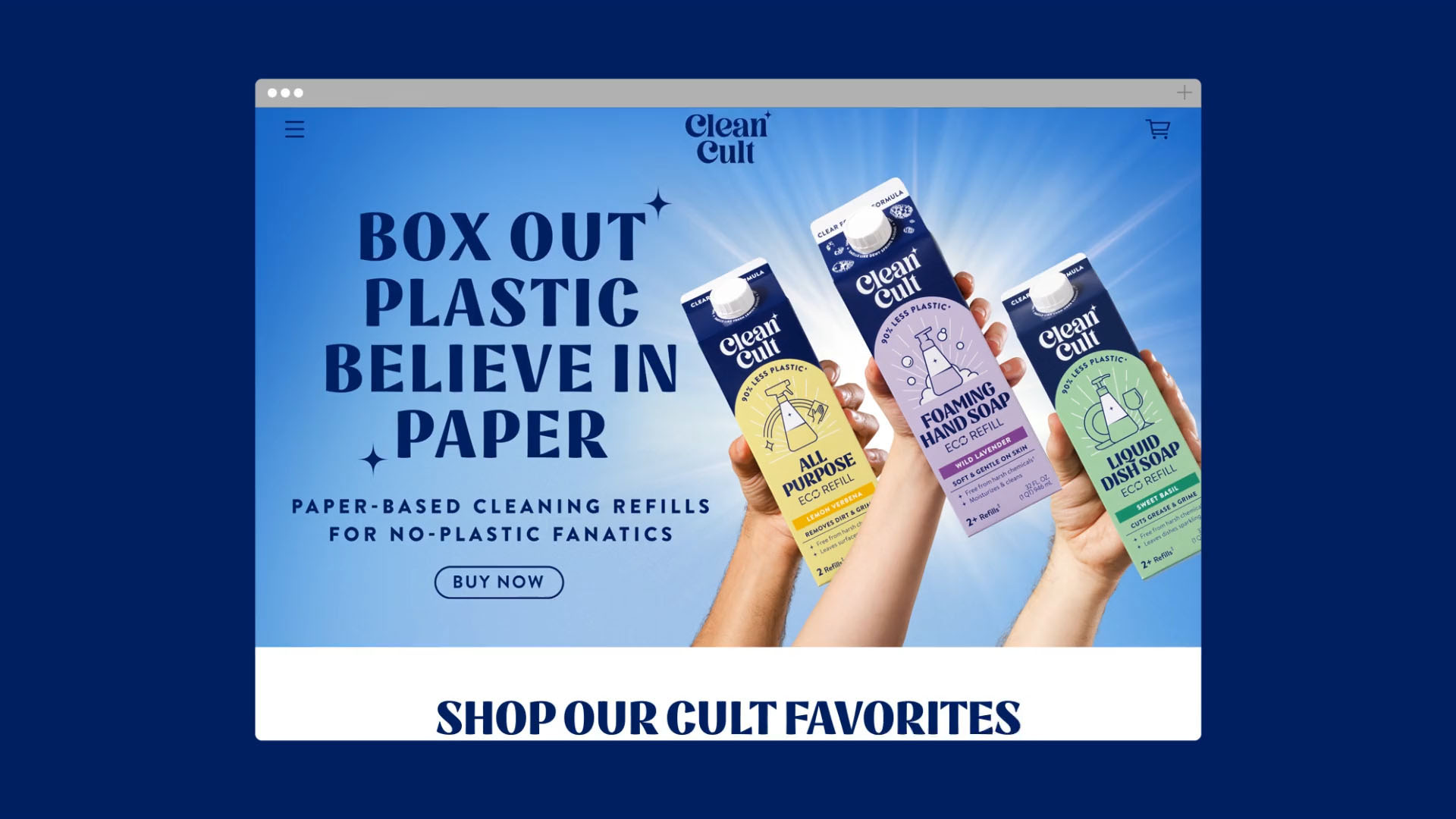
One of the biggest challenges Robot Food faced was the brand’s biggest strength and striking differentiator – its format. For many, the carton is more commonly associated with juice and milk rather than cleaning products. It also doesn’t allow consumers to see or smell the product ahead of purchase, which is a huge motivator across the cleaning category. Finally, there was no clear connection between the box refills and the refillable glass bottles, causing confusion at shelf. The team had to find a way to link the two and clearly communicate what’s expected by shoppers in the cleaning aisle.
Robot Food’s creative solution was to create a central pack icon that hero’s each products refillable glass partner. A bespoke die-cut card format for the refillables was then created to connect the brand, usage and paper based carton refills together. This gave the refill and refillables a much clearer visual connection, ensured a stronger brand imprint across the portfolio and reduced confusion.
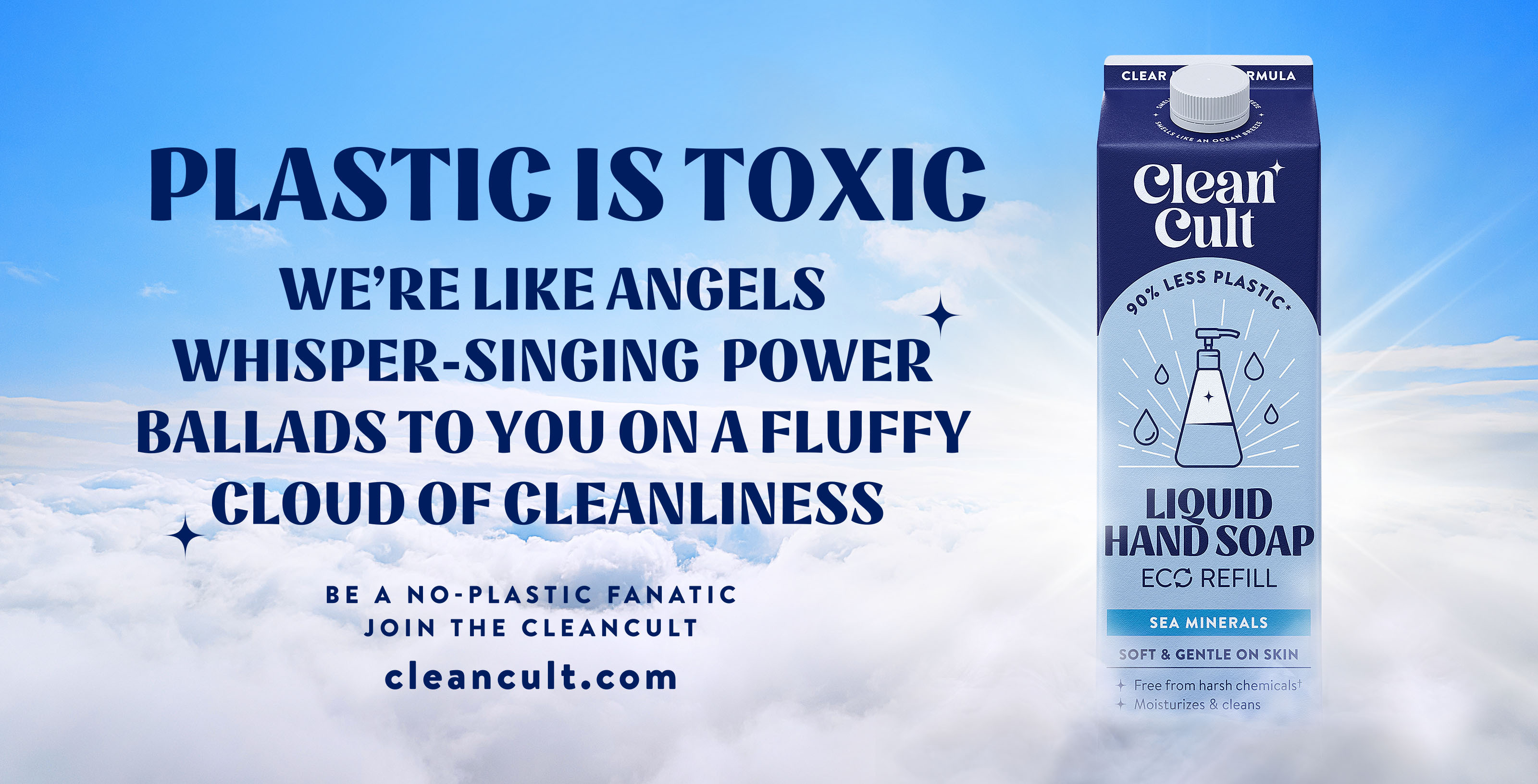
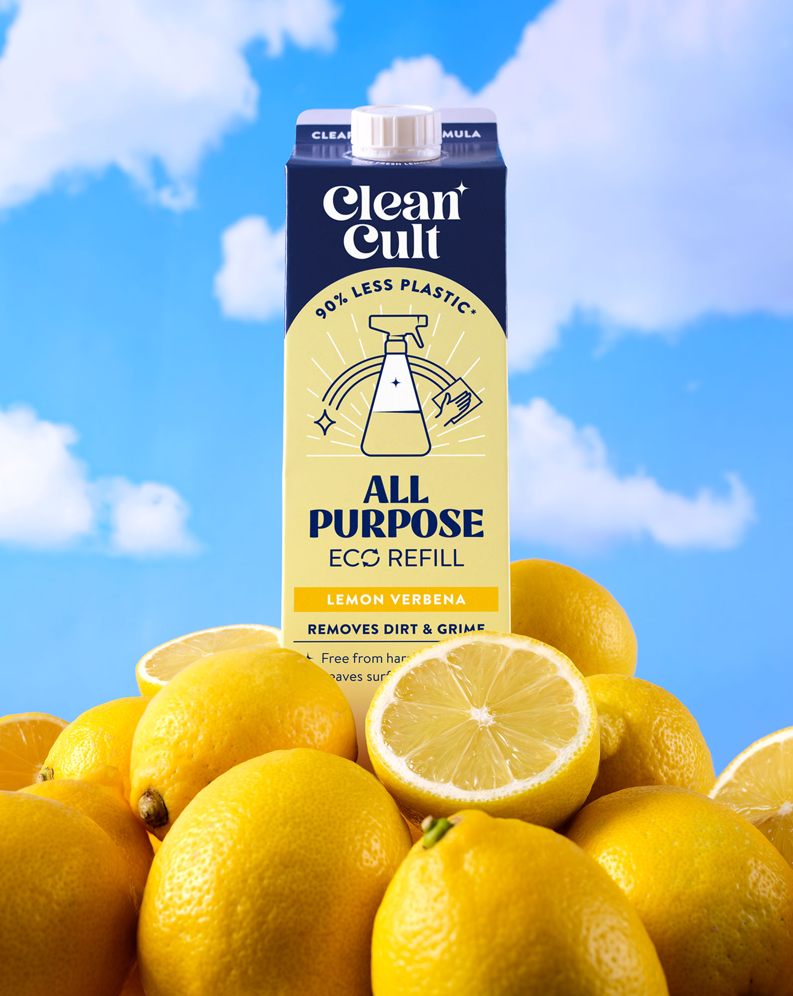
Scent is dialled up on the refills with a clear colour system to aid navigation across the range, alongside evocative copy around the lid to help bring it to life. Key efficacy claims and eco callouts sit prominently on pack to help highlight the brand’s effectiveness and point of difference.
“There’s a lot to communicate, but the brand is consistently applied across everything, on and off pack – every element has evolved from the same point,” says Simon Forster, Robot Food founder and executive creative director. “It’s all considered and unified. From the perspective of ensuring distinctiveness and building a brand world, it means that it’s going to be a lot more impactful”.
“The gleam in the clean”
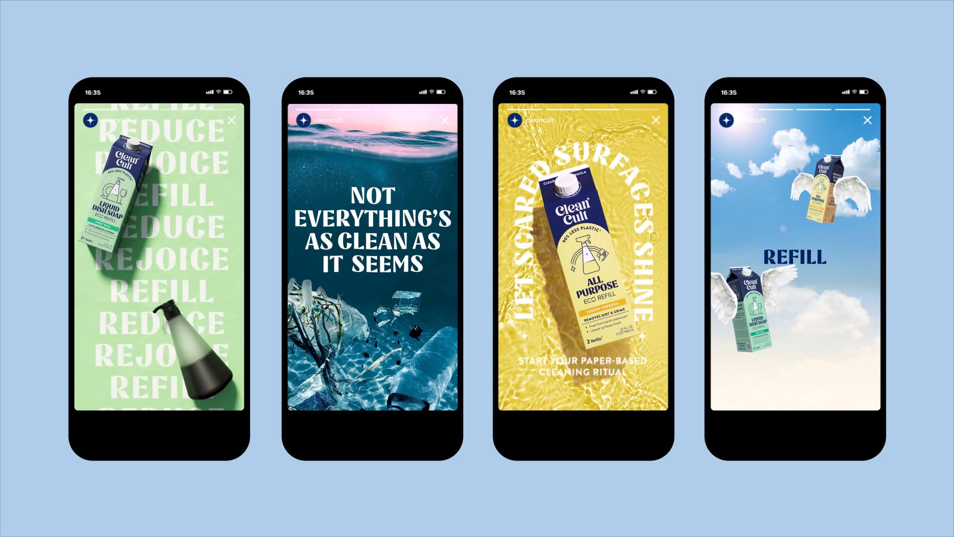
The designers created a visual identity that marries playfulness with a rigorous sense of efficacy. A number of distinctive graphic devices are used across all touchpoints – from packaging to posters, the website and social media to billboards – including the Cleancult ‘arch’, which acts as a window into the brand’s world.
The ‘ding’ – a star-like icon that sits with the brand’s striking typography – acts as “the finishing touch, the gleam in the clean,” according to Robot Food. The ‘rays’ underscore the brand’s positive, aspirational elements and category icons aid navigation across product ranges where format would traditionally play a part.
The logomark uses an eye-catching, unusual serif font; which is complemented by semi-serif font Nazare for titles and grotesque Brandon for Cleancult body copy.
The new bold blue and white primary brand colour palette gives Cleancult a dynamic, fresh look that feels trustworthy and effective; while a suite of five secondary colours to communicate scent and add further depth to the brand world.
Clean without sacrifice
Jess Cook, client director at Robot Food adds, “With cleaning products, one way or another it can feel like you have to make a sacrifice – between conventional and natural, eco-friendly and tough on germs, lemony freshness vs. dried out hands. We wanted to show Cleancult as the full solution – something we can trust without fearing we’ve made the wrong choice for ourselves, or the planet.
“People want to know what’s in it for them and feel reassured that they’re doing the right thing. The new branding really leans in to the cult to inspire consumers and prove that clean, really should mean clean”.

CREDIT
- Agency/Creative: Robot Food
- Article Title: Sustainable Cleaning Brand Cleancult Converts Consumers Into ‘No Plastic Fanatics’ With Distinctive New Identity by Robot Food
- Organisation/Entity: Agency
- Project Type: Identity
- Project Status: Published
- Agency/Creative Country: United Kingdom
- Agency/Creative City: Leeds
- Market Region: Global
- Project Deliverables: Brand Design, Brand Guidelines, Brand Identity, Brand Redesign, Brand Strategy, Brand Tone of Voice, Brand World, Branding, Copywriting, Graphic Design, Logo Design, Packaging Design, Typography
- Industry: Retail
- Keywords: Sustainable, bold, cult, playful, renewable packaging, 'Cult of Clean', scent, efficacy.
-
Credits:
Strategic branding agency: Robot Food


