


Surya Pratap – Numa – The Intersection of Design, Science and Serenity
In a world where every can on the shelf tries to outshine the next, Numa chooses a quieter way to stand out. It doesn’t chase trends or shout for attention — it whispers calm confidence. Built on the belief that hydration can be more than a habit, Numa blends science, design, and emotion into something that feels as intentional as it looks.
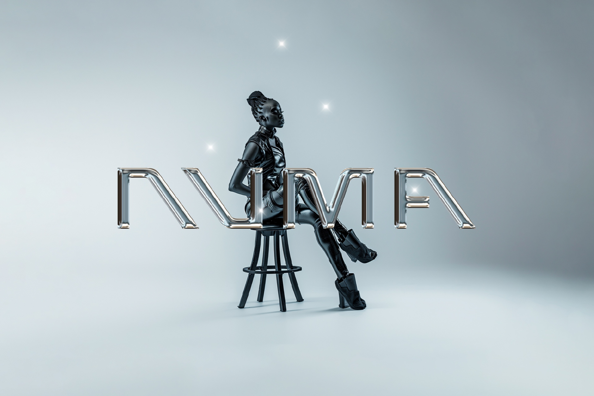
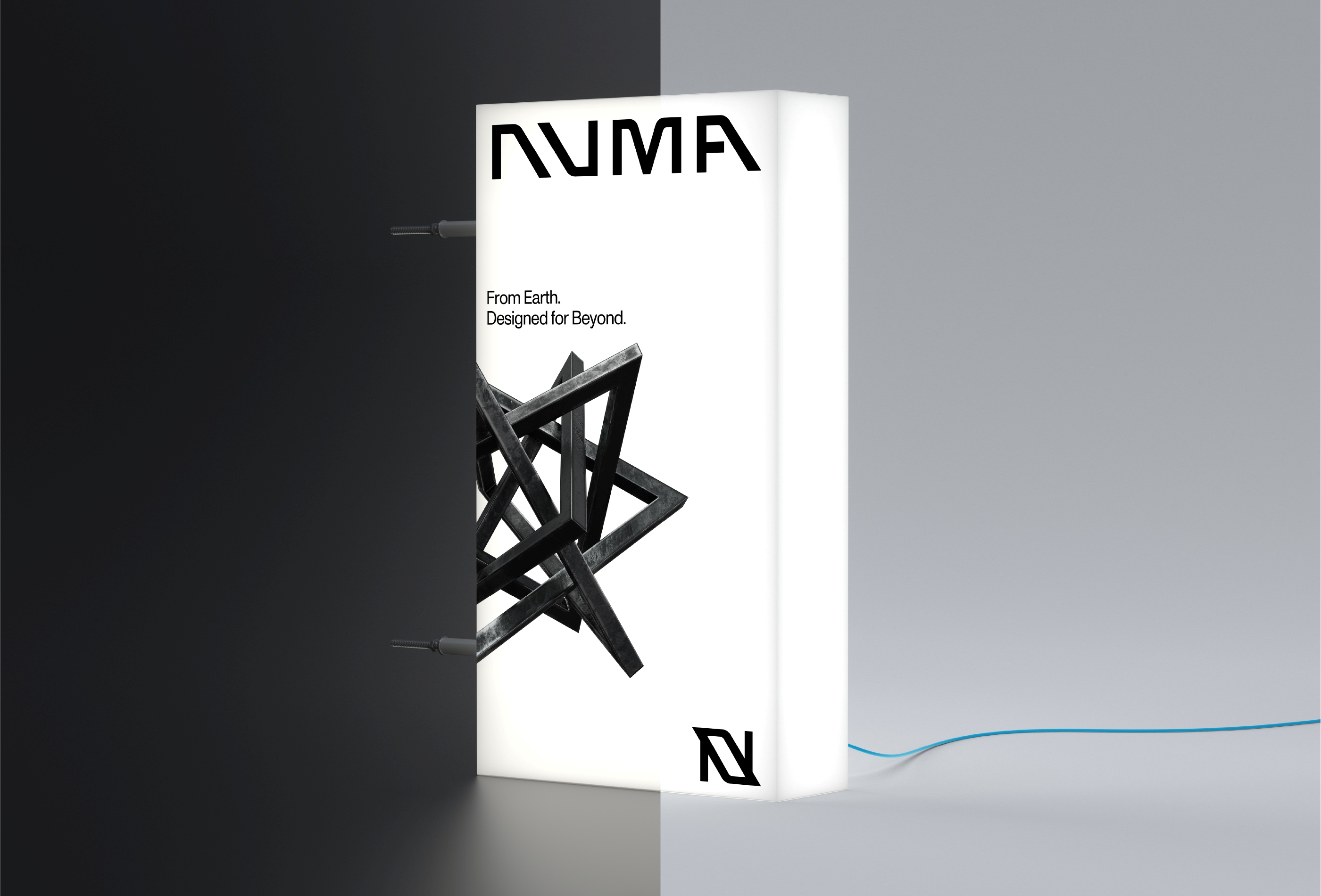
The name itself stems from the Latin “numa,” meaning breath or spirit — a fitting metaphor for a brand that treats water not just as refreshment, but as renewal. Every part of Numa’s identity mirrors that philosophy — minimal yet layered, futuristic yet human.
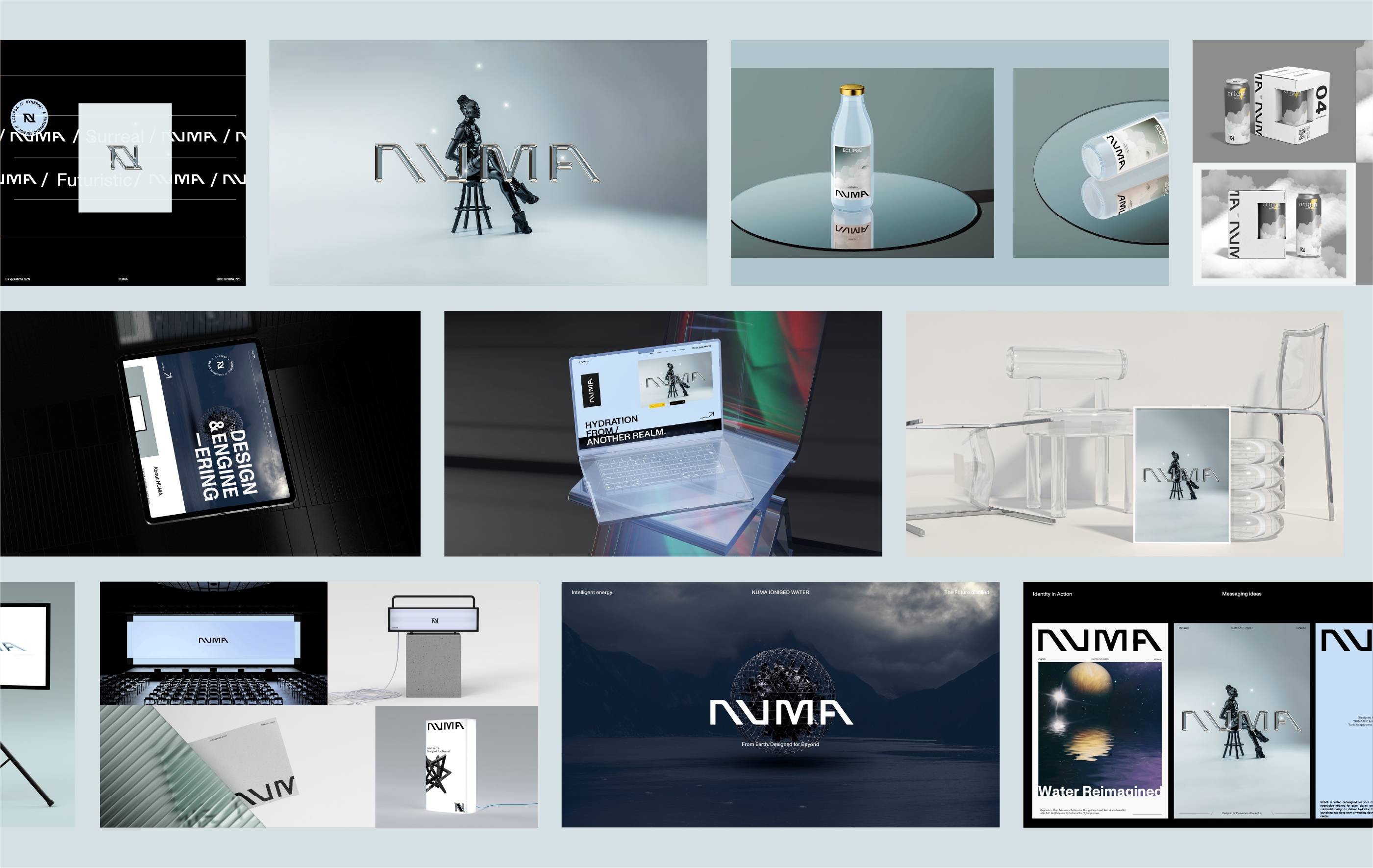
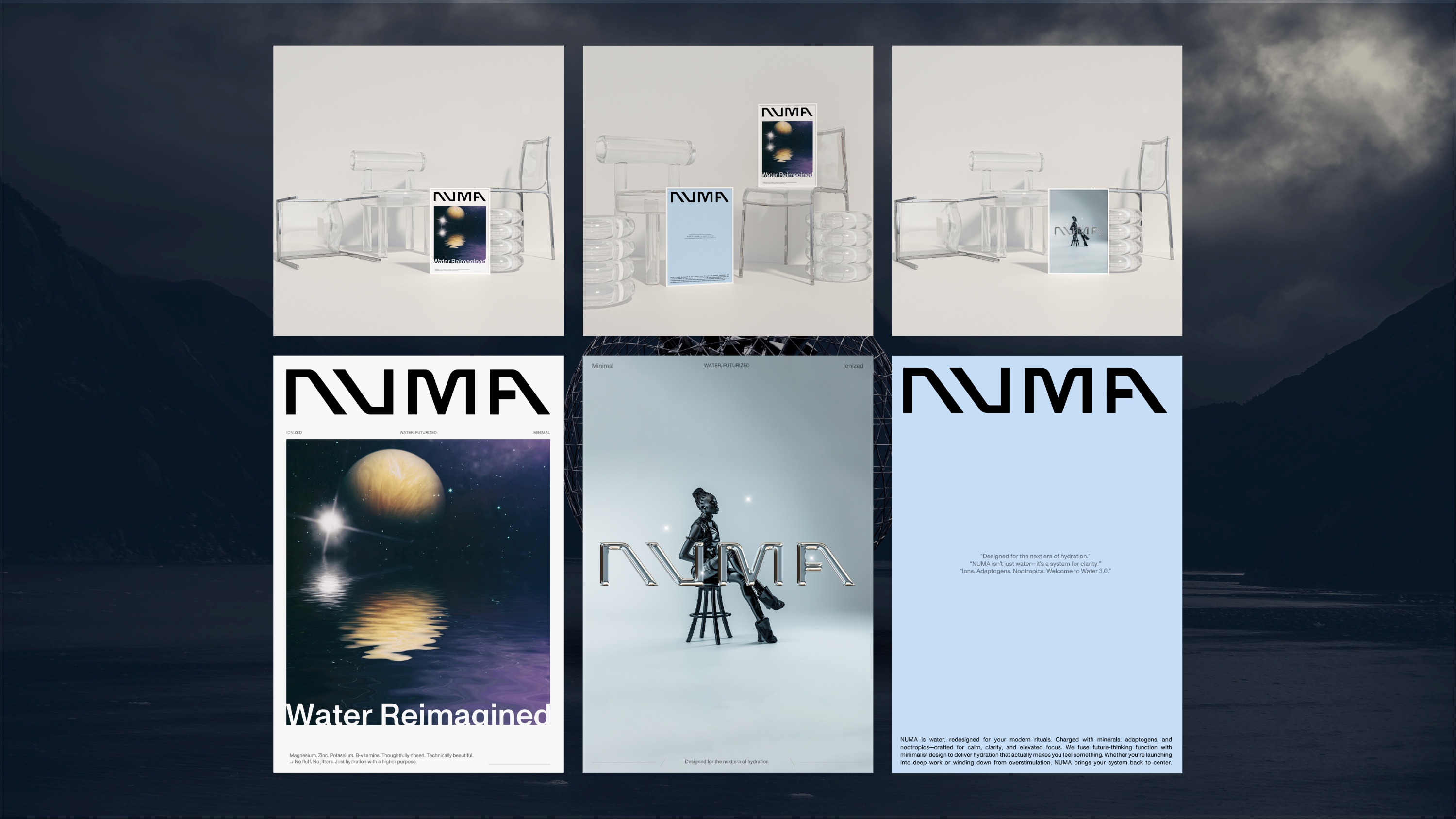
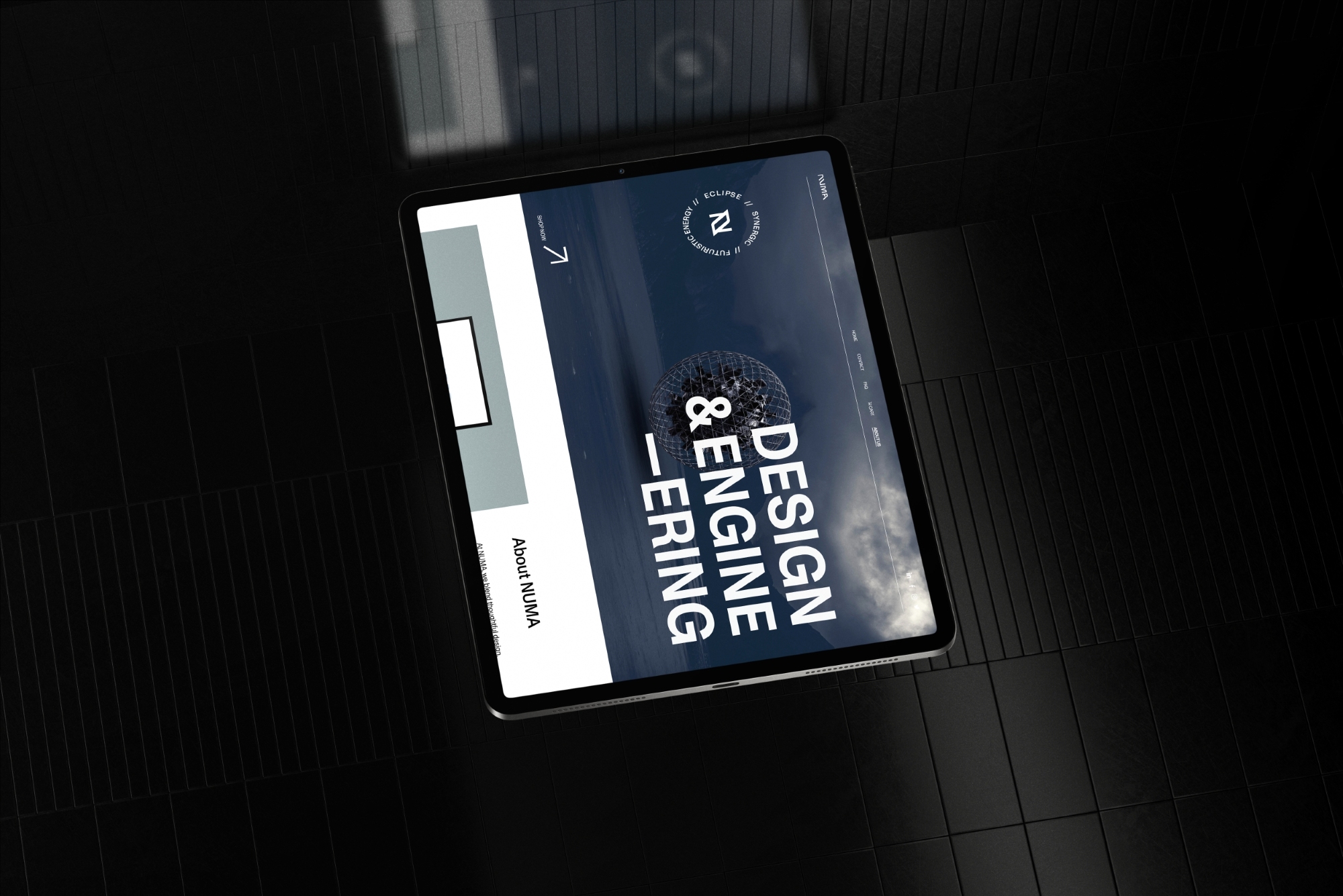
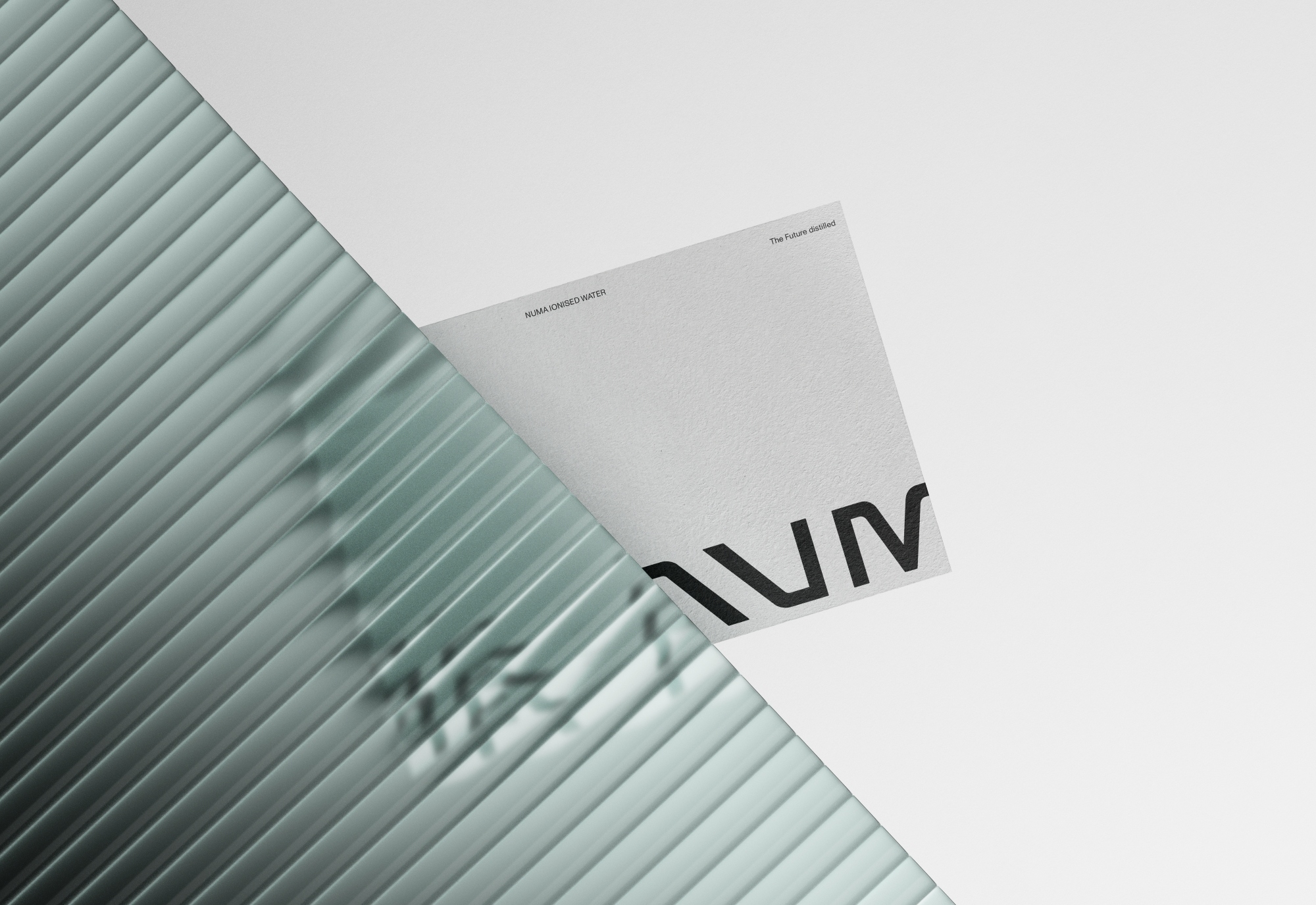
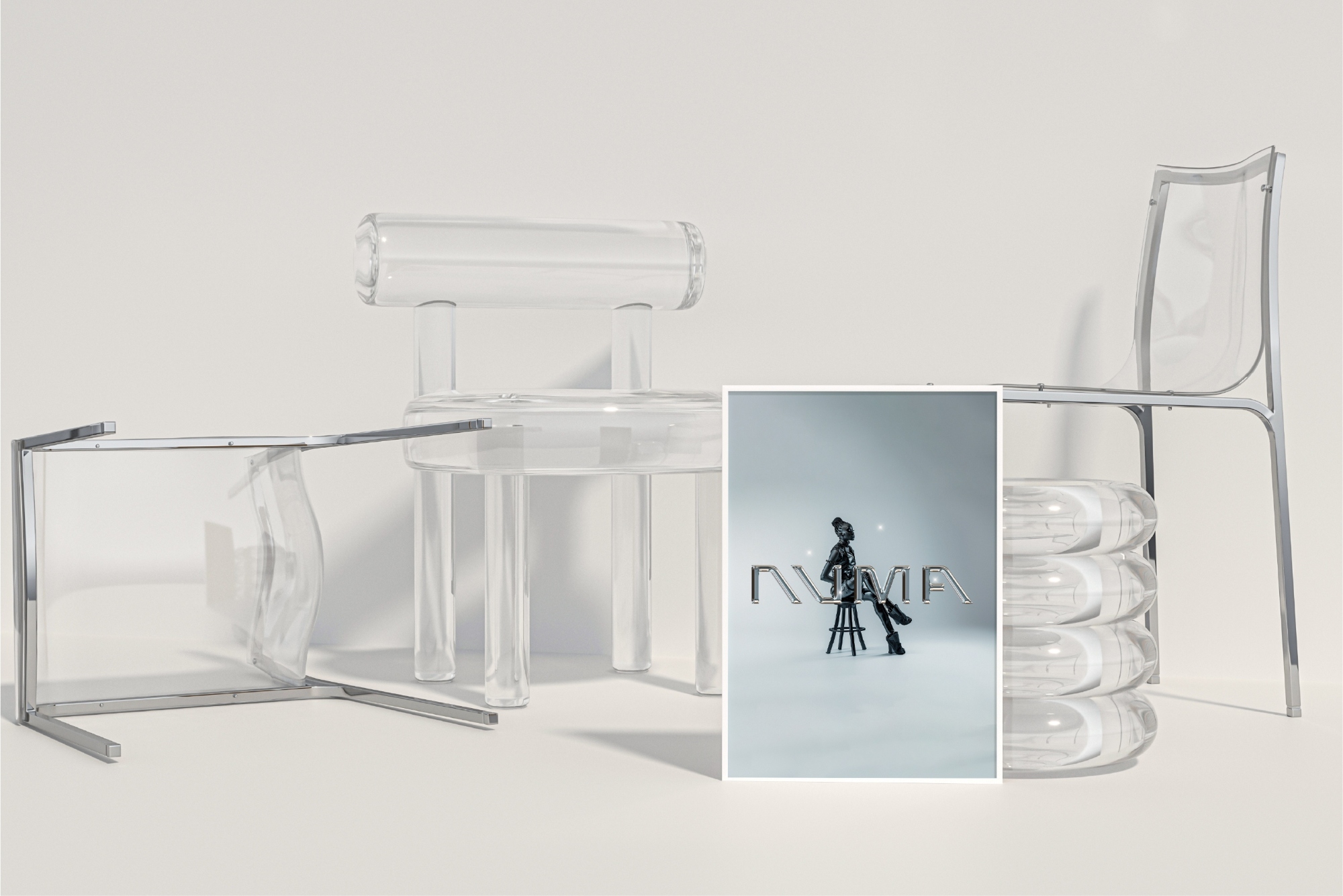
The logo, a geometric lettermark “N,” was designed to feel both tech-forward and timeless. Lettermarks have long defined technology and innovation brands for their precision and adaptability — and here, that idea carries new meaning. Numa’s mark is slanted slightly forward, symbolizing progress and flow, while subtle curves balance its edges with approachability. It’s built from the same grid as the wordmark, creating a unified visual language that feels engineered rather than decorated.
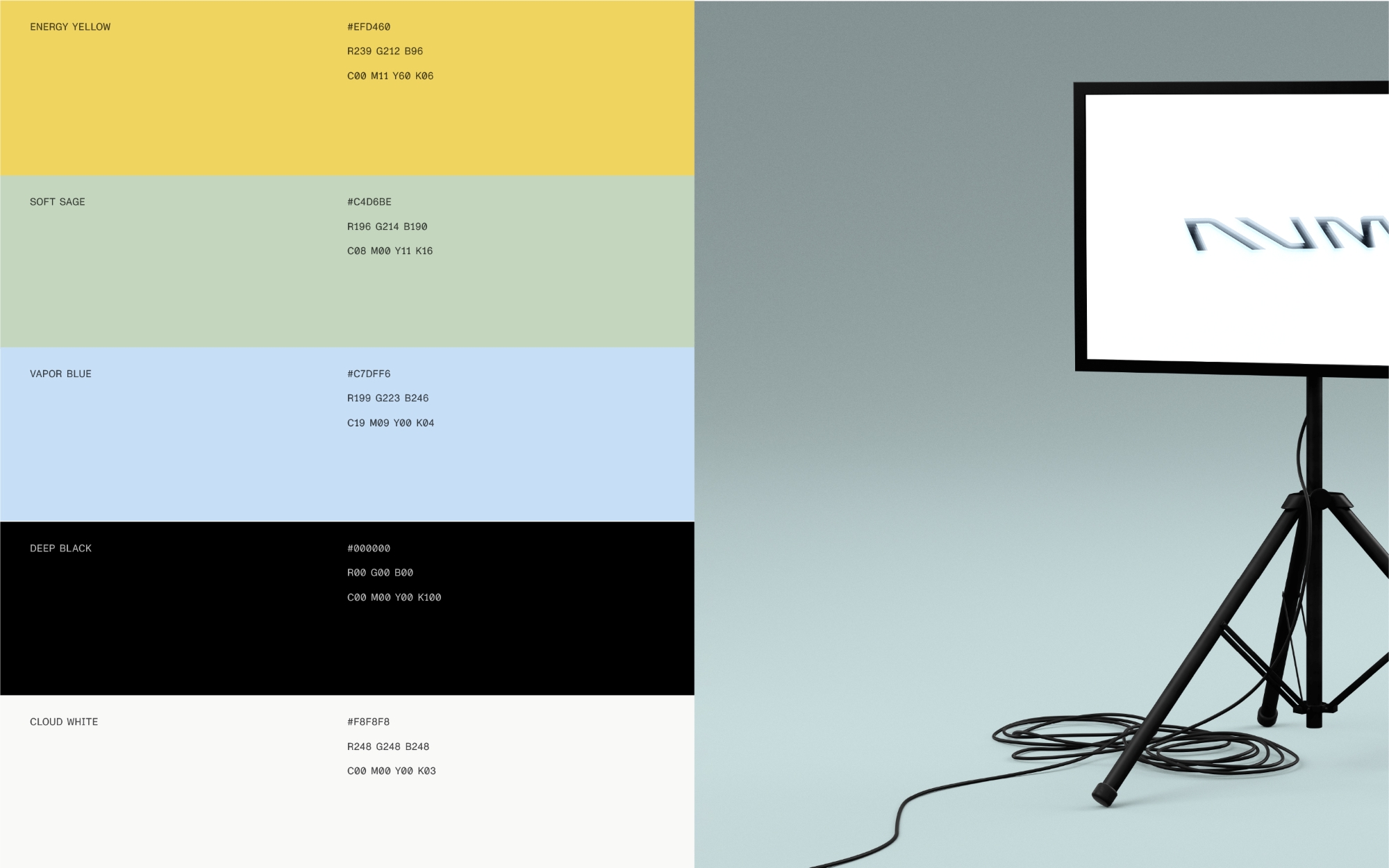
Color plays an equally deliberate role. The palette mixes soft, neutral tones with electric undertones — white and vapor blue for clarity, black for structure, muted sage for calm, and energy yellow for vitality. Together, they create a sense of tension and stillness, mirroring the product’s dual nature: grounded yet energizing. Nothing feels random — every hue has a purpose, reflecting emotion, purity, and motion.
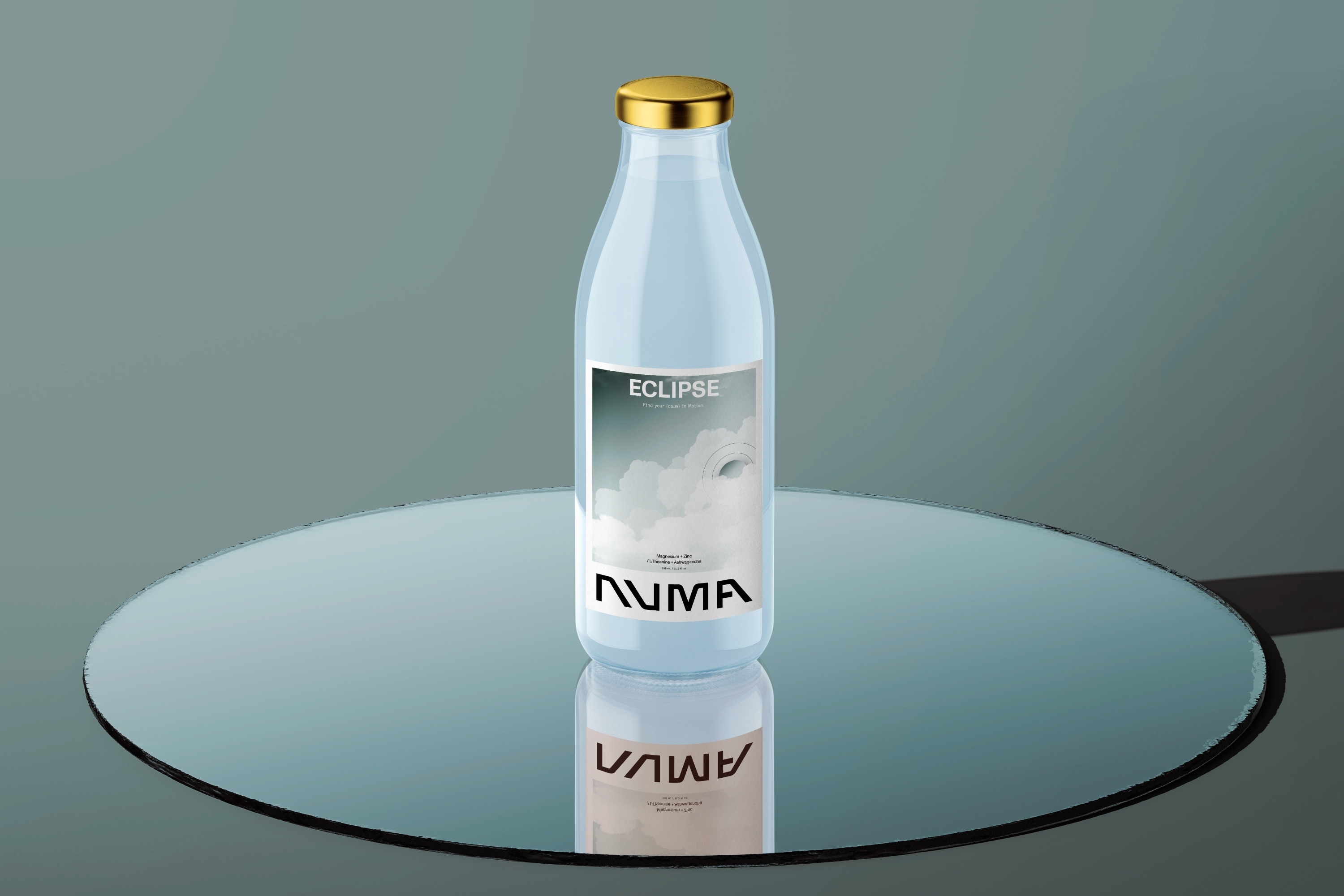
Typography continues that conversation. The chosen typeface, Monument Grotesk, balances modern utility with a human rhythm. Its mono variant emphasizes structure and control — a nod to the brand’s scientific roots — while the regular style introduces warmth and legibility. The interplay of both creates visual contrast, echoing Numa’s own balance between clarity and depth.
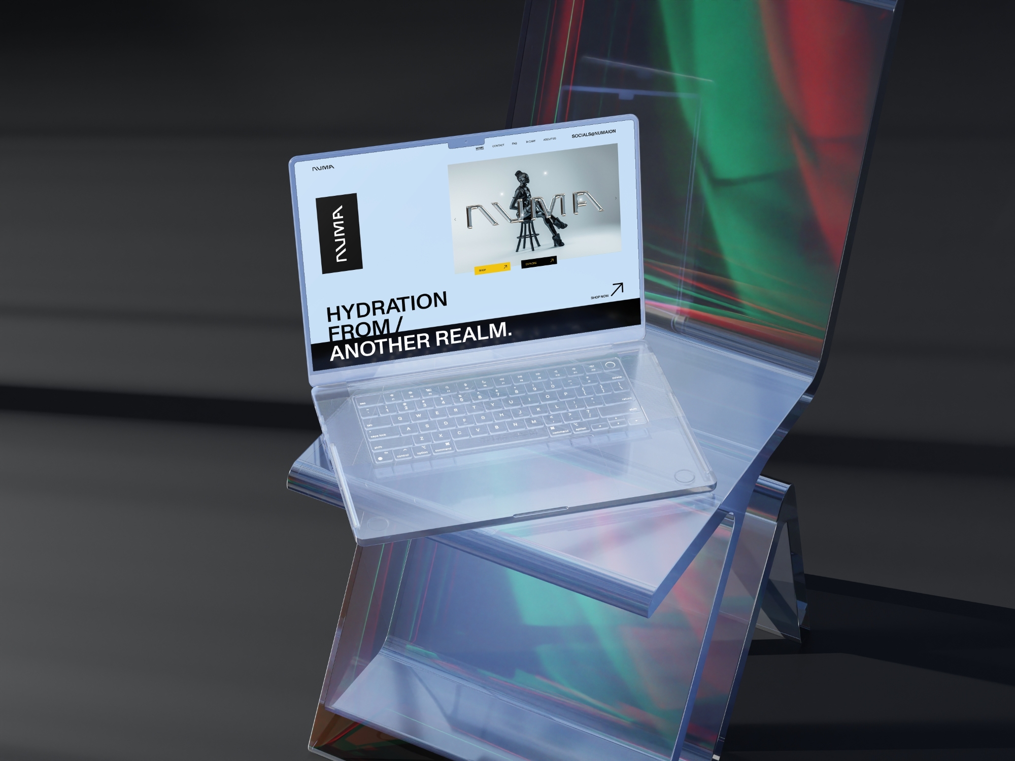
The result is a brand system that feels precise, spiritual, and contemporary — one that connects design with emotion. From packaging to storytelling, everything flows seamlessly, built on restraint and meaning. The clean layouts and futuristic composition create a sense of flow, while the restrained palette of whites, blacks, and soft blues evokes purity and clarity.
What stands out most is how design and story move together. The branding doesn’t try to sell you on hype; it invites you into an experience—hydration as presence. This subtle blend of technology and spirituality makes Numa feel like something from the near future: sleek, human, and full of intention.
CREDIT
- Agency/Creative: Surya Pratap
- Article Title: Surya Pratap Transforms Numa into a Vision of Purity and Purpose in Contemporary Beverage Design
- Organisation/Entity: Freelance
- Project Type: Identity
- Project Status: Published
- Agency/Creative Country: India
- Agency/Creative City: Patna
- Market Region: Asia, Europe, Global
- Project Deliverables: 2D Design, Animation, Art Direction, Brand Design, Brand Identity, Brand Naming, Brand Strategy, Brand Tone of Voice, Branding, Logo Design, Packaging Design, Web Design
- Industry: Food/Beverage
- Keywords: Futuristic Branding, FMCG, Beverage Branding, Sparkling water, Visual Identity, Brand Identity, Clean layout, minimalistic, Tech Inspired.
-
Credits:
Creative Director & Brand designer: Surya Pratap Singh


