


About
Ironwood Distillers is a premium single malt whisky brand born deep in the misty forests of Oregon, USA. Founded by two brothers who left their corporate life to reconnect with their roots, the brand celebrates patience, strength, and authenticity. Using pure local spring water and oak casks sourced from the region’s forests, Ironwood whisky carries the earthy, grounded soul of the
Pacific Northwest.
The creative challenge was to translate that raw, forest-born authenticity into a visual identity and packaging system that feels rugged yet refined, premium enough to compete with legacy distilleries, but approachable for a new generation of whisky drinkers.
Concept
The concept draws inspiration from ironwood trees—one of the toughest species found in Oregon’s wilderness. Just as ironwood withstands harsh conditions while retaining its beauty, the brand embodies resilience and craftsmanship.
Our goal was to create a whisky identity that looks forged by nature and perfected by human hands — balancing masculine energy with quiet sophistication.
The overall tone- Forest luxury. Bold. Authentic. Enduring.
Solution
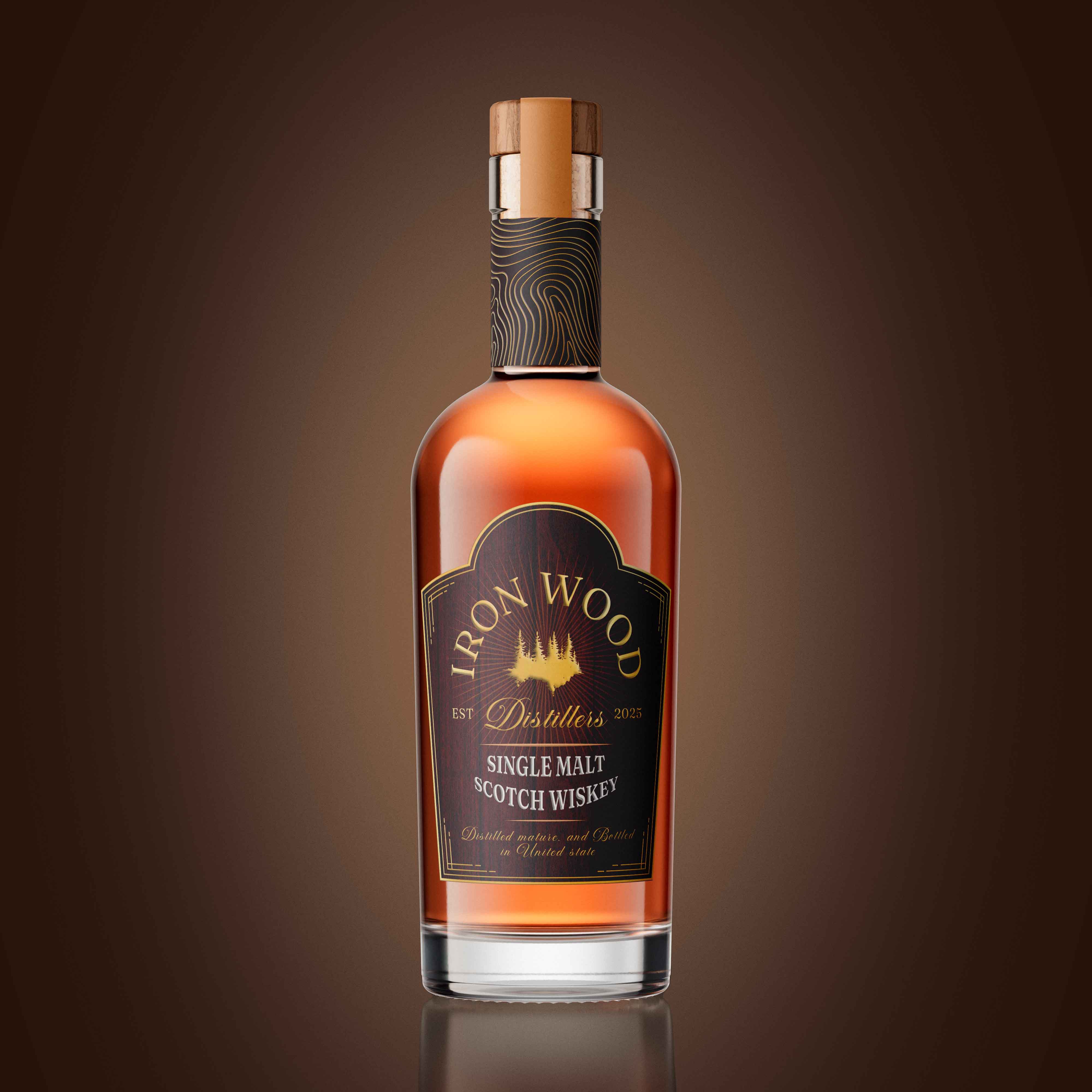
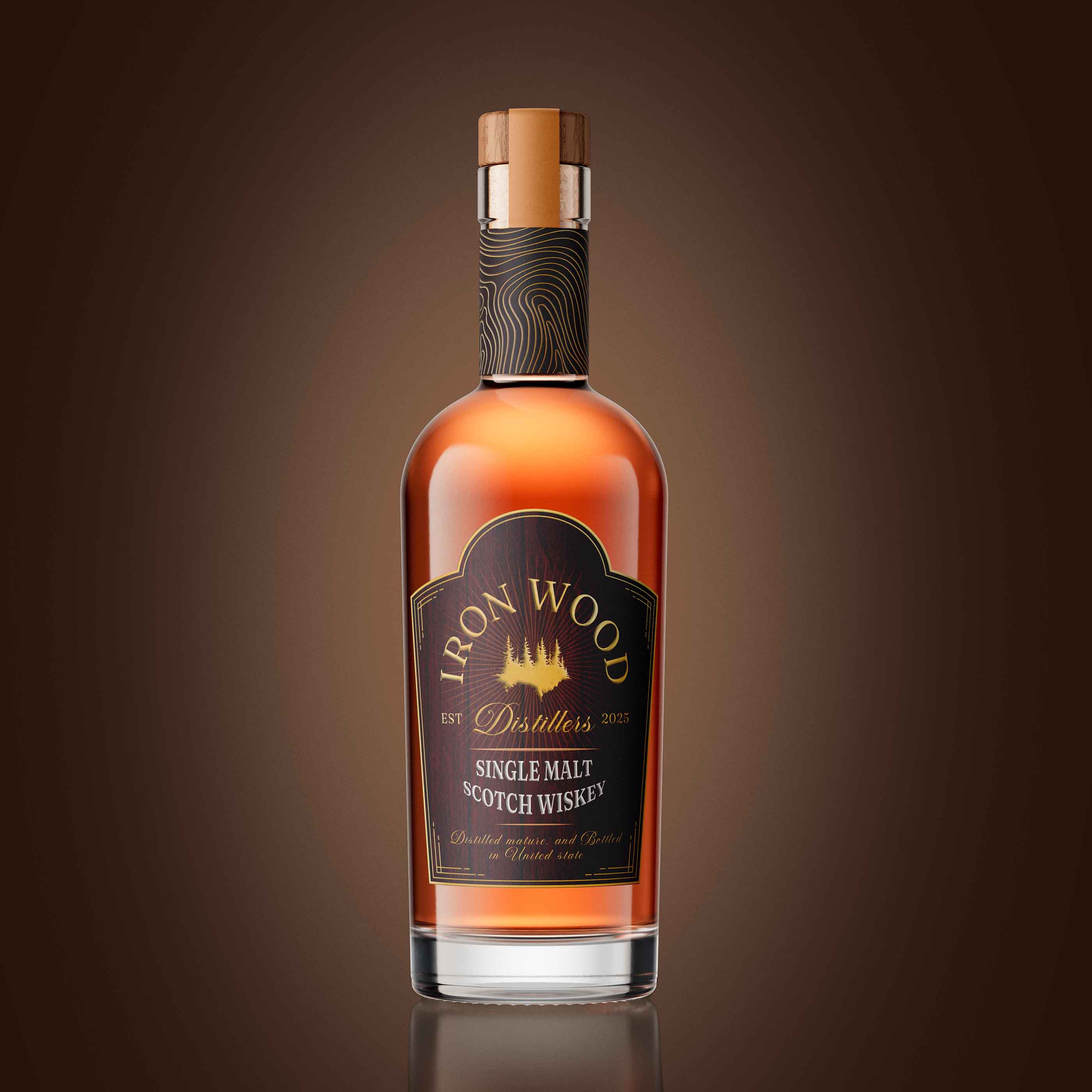
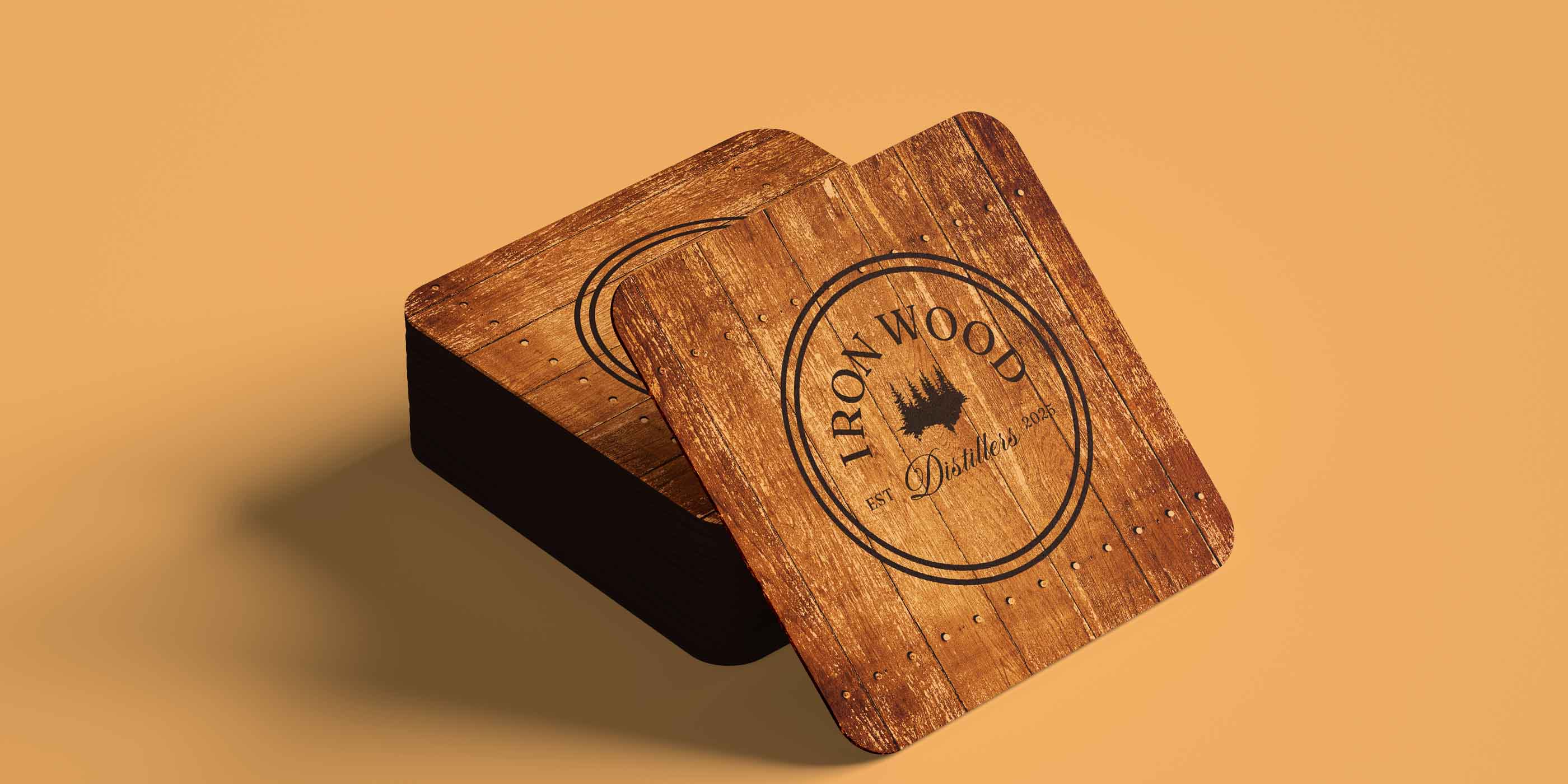
The logo mark combines iron and wood symbolism into a strong geometric monogram that feels timeless and industrial, echoing forged iron craftsmanship. Typography follows a similar philosophy, pairing a premium serif for heritage with a modern sans-serif for strength and clarity.
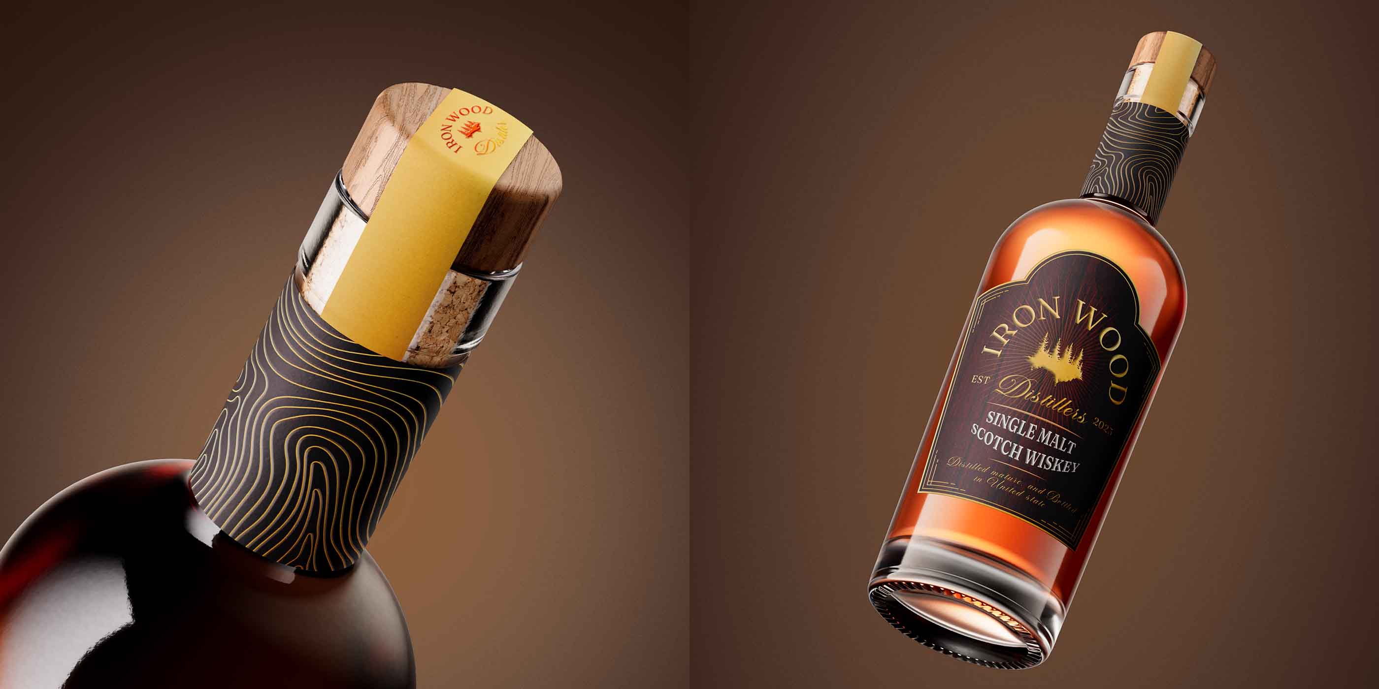
For the packaging, the label is printed on textured, uncoated paper with embossed detailing and copper foil finishes, representing the natural patina of iron over time. The earthy palette of charcoal, oak brown, and copper amber mirrors the brand’s connection to wood, fire, and craftsmanship.
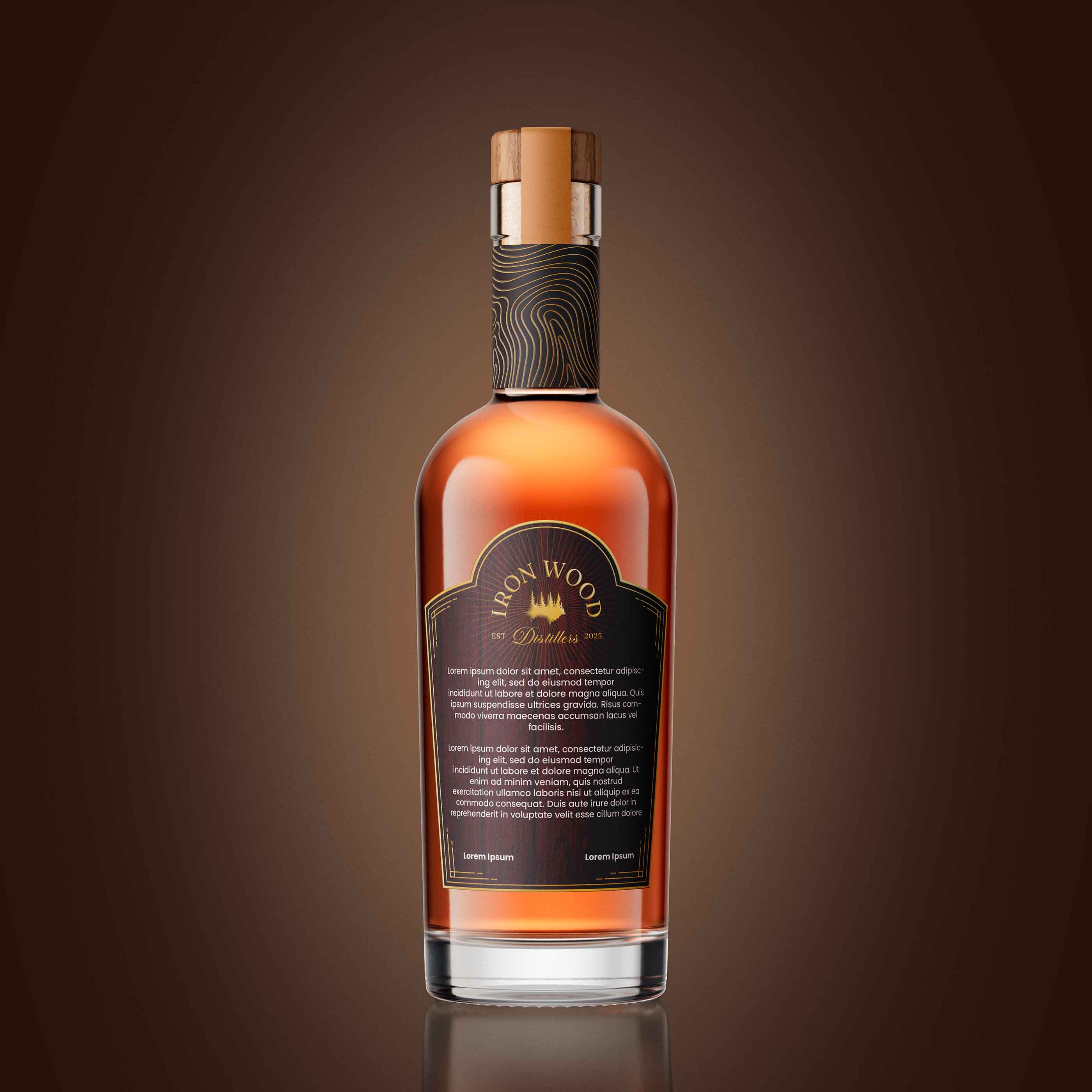
The bottle shape is broad-shouldered, communicating boldness and stability, while the copper foil neck seal adds a refined finishing touch. The back label shares the brand’s forest heritage, tying the narrative together.
Technique
The packaging was designed using a structured grid system to maintain balance and hierarchy on small label dimensions. Custom typographic adjustments were made to ensure legibility even under bar lighting. Finishing techniques-embossing, copper foil, and matte varnish were carefully selected to add depth and tactile richness without overwhelming the minimal layout.
What Makes It Unique
Ironwood Distillers breaks away from the typical glossy, traditional whisky aesthetic. Instead, it embraces the raw beauty of nature, earth textures, matte finishes, and storytelling-driven design. It feels premium not because it shouts luxury, but because it whispers craftsmanship.
Every detail, from the rugged serif typography to the subtle copper accents, reminds drinkers of Oregon’s untamed forests and the patience required to craft a truly timeless whisky.
CREDIT
- Agency/Creative: Surjyakanta Pradhan
- Article Title: Surjyakanta Pradhan – Ironwood Distiller Whisky Branding and Packaging Design
- Organisation/Entity: Freelance
- Project Type: Packaging
- Project Status: Published
- Agency/Creative Country: India
- Agency/Creative City: Jharsuguda, Odisha
- Market Region: North America
- Project Deliverables: Brand Identity, Logo Design, Packaging Design
- Format: Bottle
- Industry: Food/Beverage
- Keywords: Whiskey branding, Whiskey packaging, Whiskey logo design
-
Credits:
Brand and packaging designer: Surjyakanta Pradhan


