


Ironwood Distillers | A Modern Craft Approach to Whisky Packaging
ABOUT,
Ironwood Distillers is a modern craft whisky brand from the Pacific Northwest, created as an alternative to heritage-driven narratives. Founded by two brothers seeking a more intentional path, the brand focuses on material honesty, regional authenticity, and a contemporary expression of craftsmanship.
The challenge was to translate this grounded philosophy into a packaging system that could stand confidently within a saturated premium whisky category dominated by ornate, legacy-driven aesthetics—while maintaining credibility and shelf presence.
CONCEPT,
The concept centres on redefining premium through restraint. Rather than relying on traditional whisky cues or decorative storytelling, the direction focuses on clarity, balance, and subtle references to nature.
Inspired by the raw landscapes of the Pacific Northwest, the design avoids literal symbolism and instead expresses character through proportion, spacing, and controlled detail, creating a visual language that feels modern, confident, and enduring.
SOLUTION,
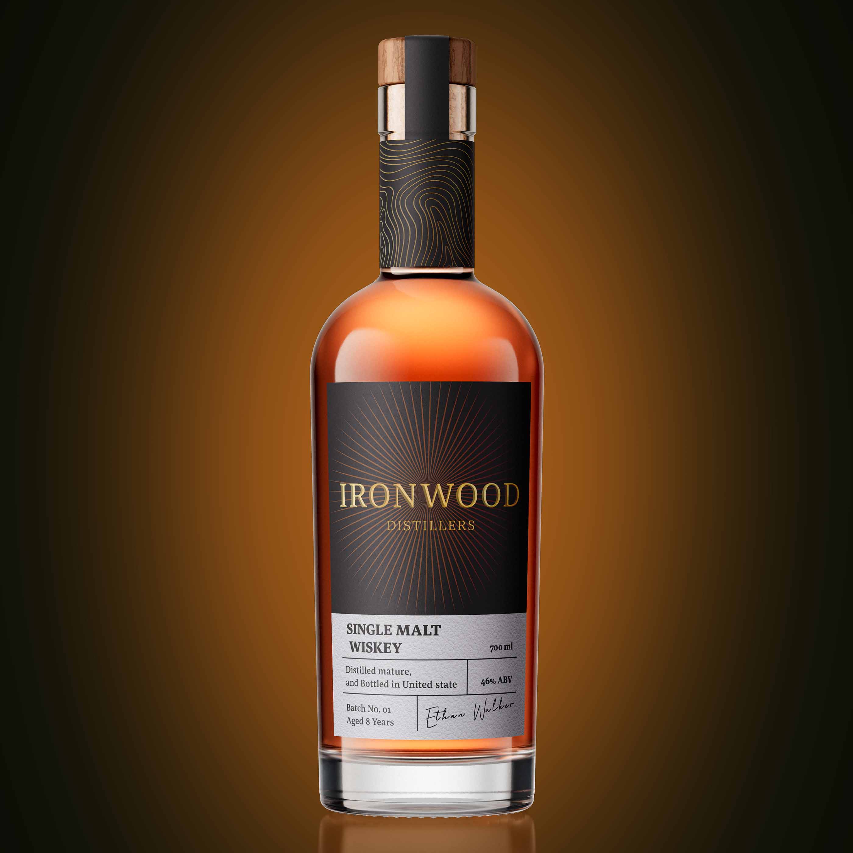
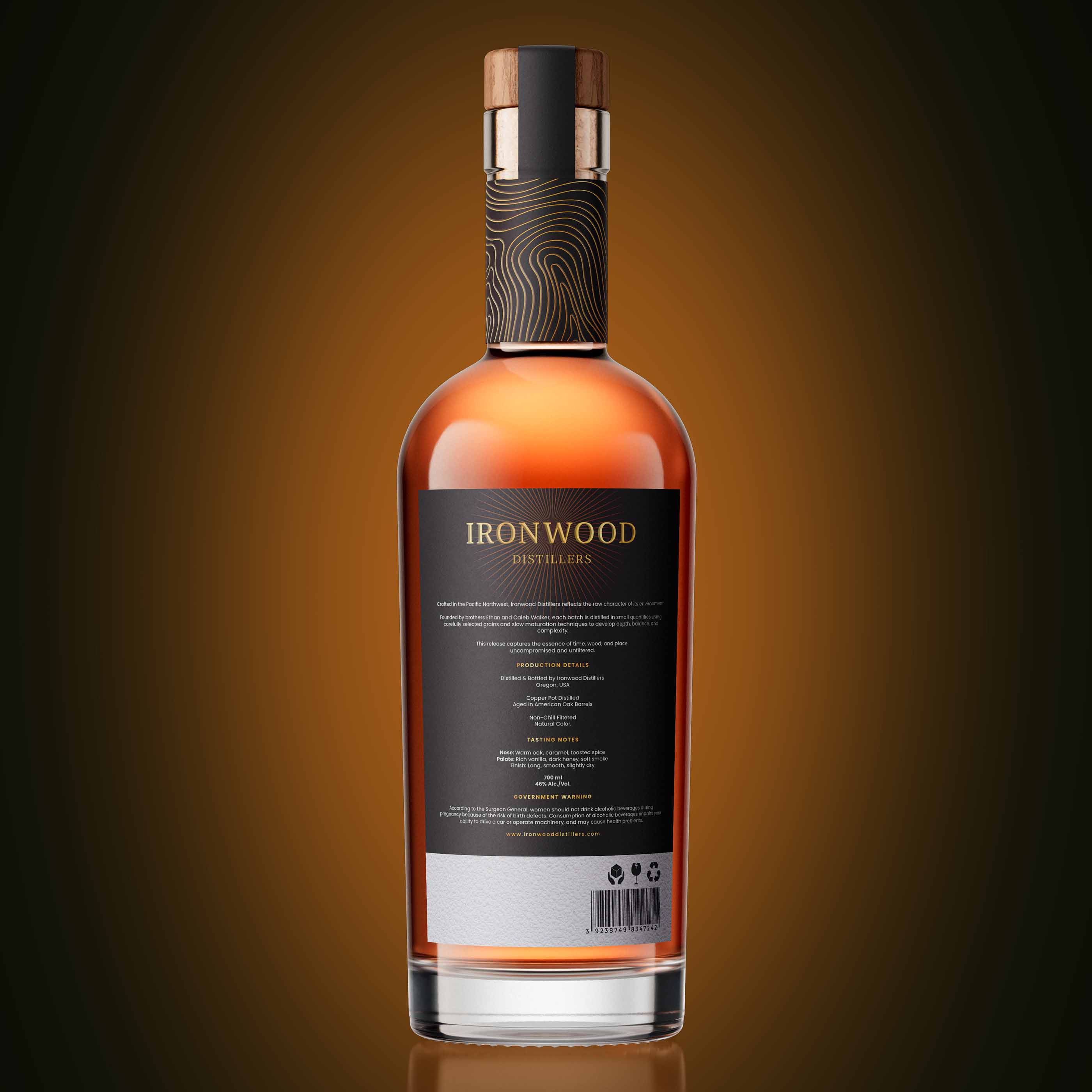
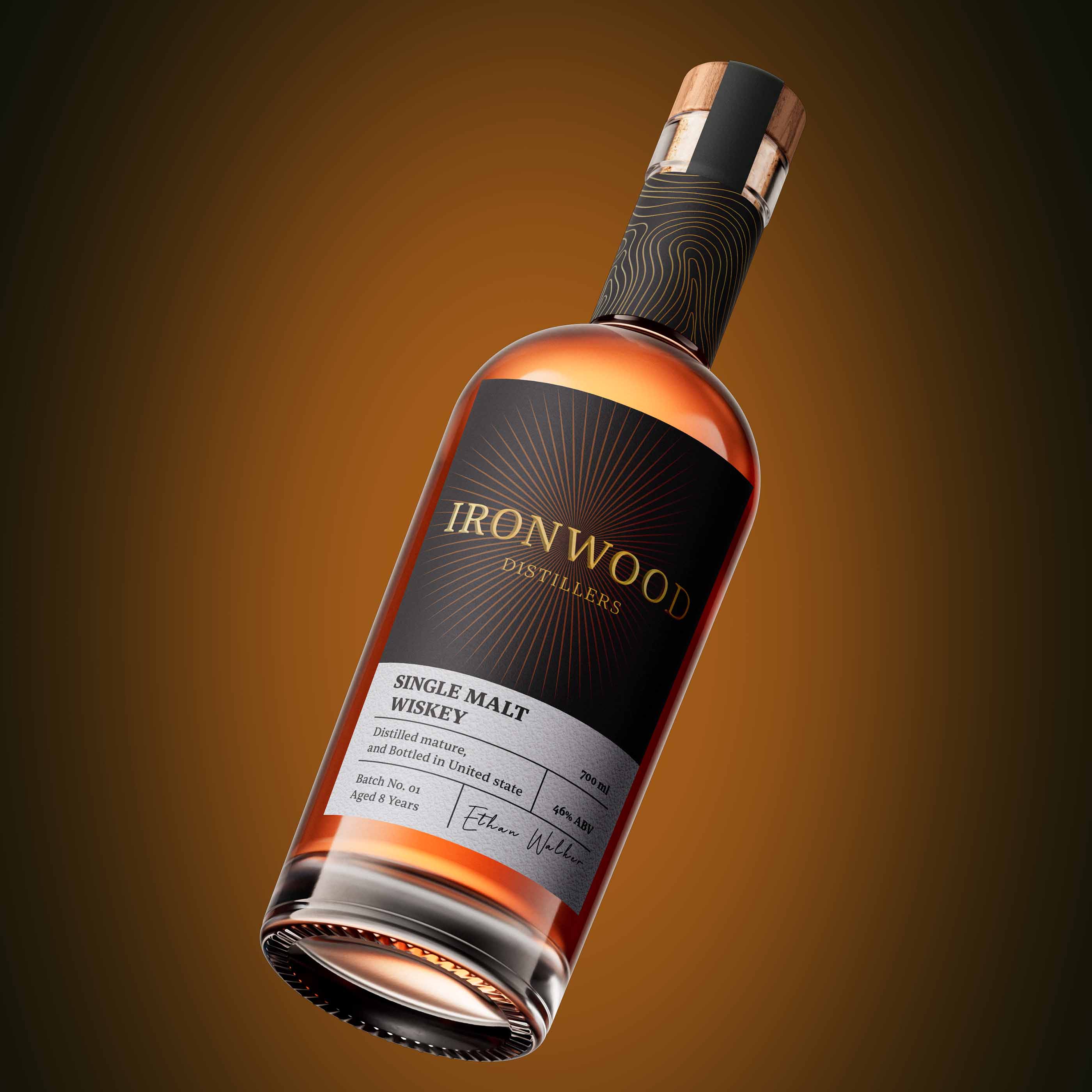
The identity is built around a refined typographic system, where the wordmark becomes the primary brand asset. Clean serif letterforms, paired with precise spacing and hierarchy, establish a strong yet understated presence.
The label design removes unnecessary elements, allowing structure and composition to lead. This restraint creates clarity at a distance while maintaining a premium feel up close.
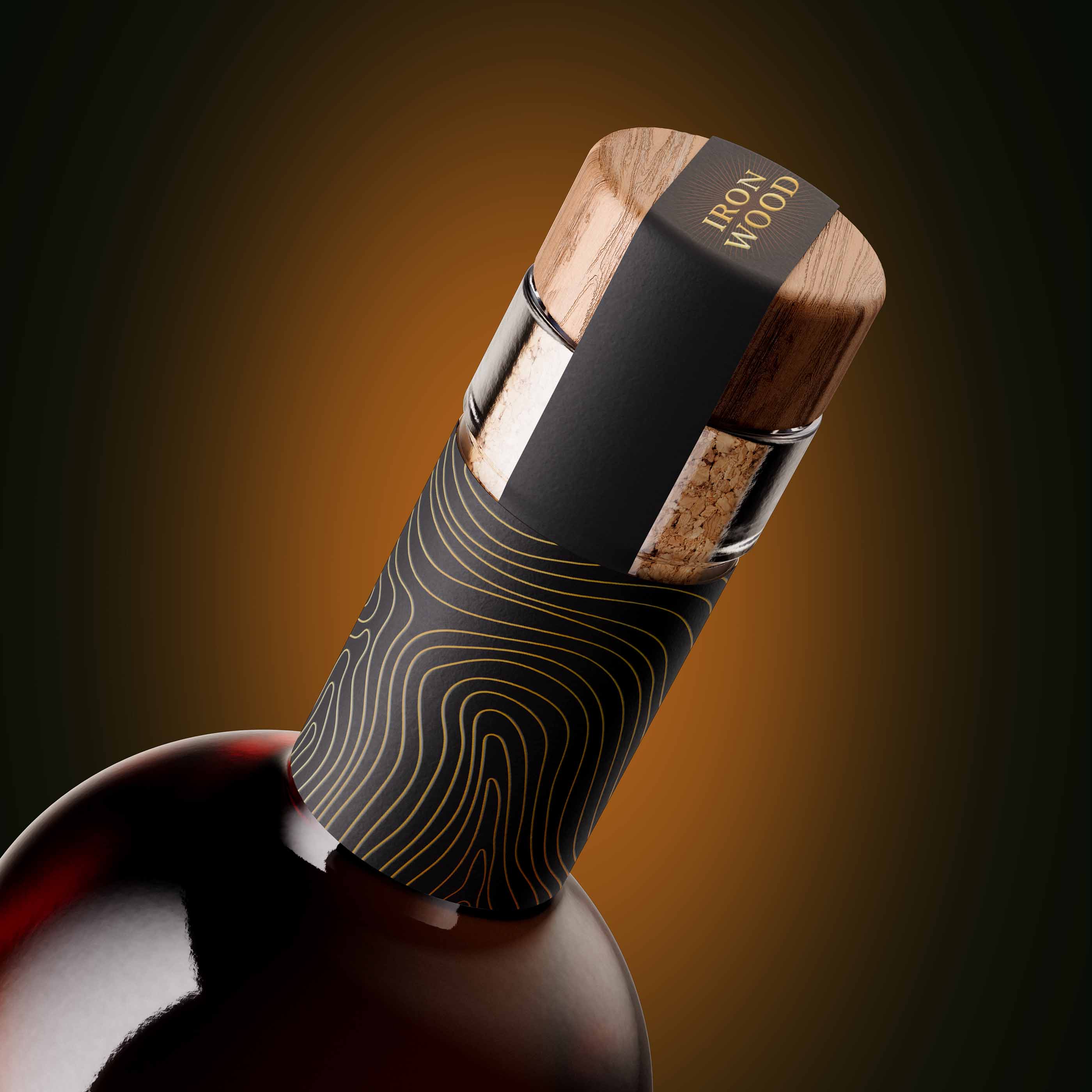
Material choices play a key role: uncoated textured paper enhances tactility and depth, while the combination of clear glass and a wooden closure reinforces the brand’s natural, grounded character. Finishes are kept minimal to preserve authenticity and avoid visual noise.
TECHNIQUE,
A structured grid system ensures consistency and balance across the label, with careful typographic adjustments for legibility at small scales. Production choices were intentionally restrained, favouring material quality and subtle detailing over heavy embellishment.
WHAT MAKES IT UNIQUE?
In a category defined by heritage and ornamentation, Ironwood Distillers stands out through clarity and control. The design avoids visual excess, instead using typography, spacing, and materiality to communicate premium value.
It feels contemporary without losing credibility, appealing to both traditional whisky consumers and a new generation of design-conscious buyers.
RESULT
The final packaging presents a confident, modern whisky identity that stands apart on the shelf through simplicity rather than complexity. By focusing on restraint and material honesty, Ironwood Distillers establishes a distinct presence within the premium category, proving that clarity can be more powerful than convention.

CREDIT
- Agency/Creative: Surjyakanta Pradhan
- Article Title: Surjyakanta Pradhan Develops Ironwood Distillers as a Modern Whisky Packaging Design Defined by Clarity and Material Honesty
- Organisation/Entity: Freelance
- Project Type: Packaging
- Project Status: Published
- Agency/Creative Country: India
- Agency/Creative City: Jharsuguda
- Market Region: Global
- Project Deliverables: 3D Design, Brand Identity, Label Design, Packaging Design
- Format: Bottle
- Industry: Food/Beverage
- Keywords: whiskey packaging, whiskey branding, premium distillery packaging, distillery packaging
-
Credits:
Brand and Packaging Designer: Surjyakanta Pradhan


